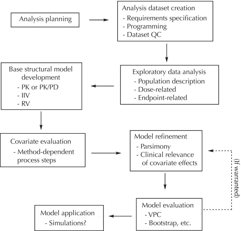
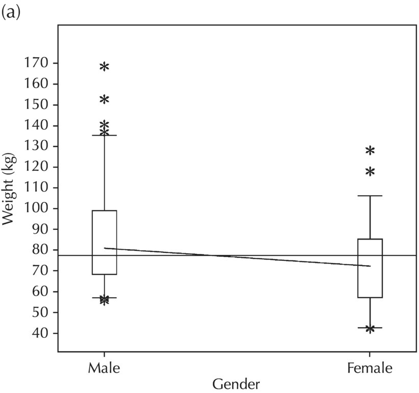
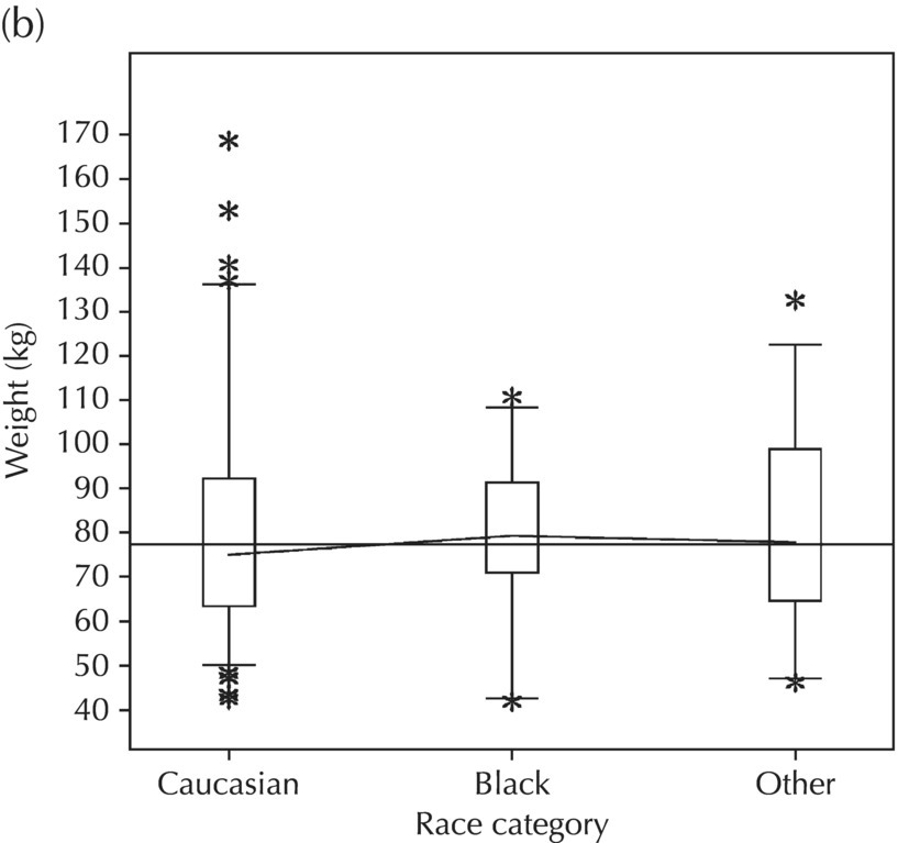
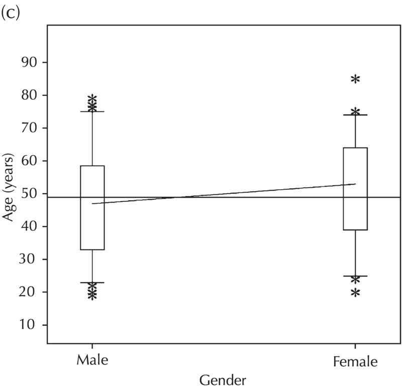
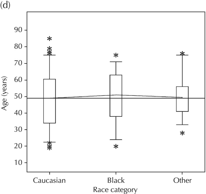
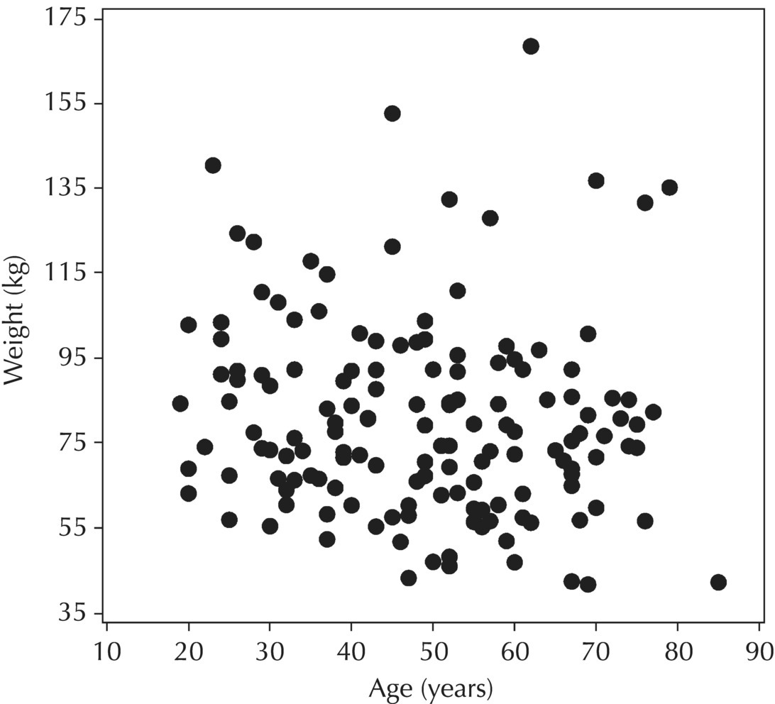
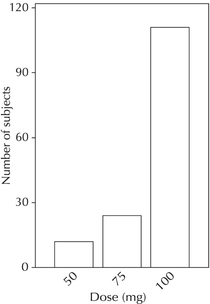
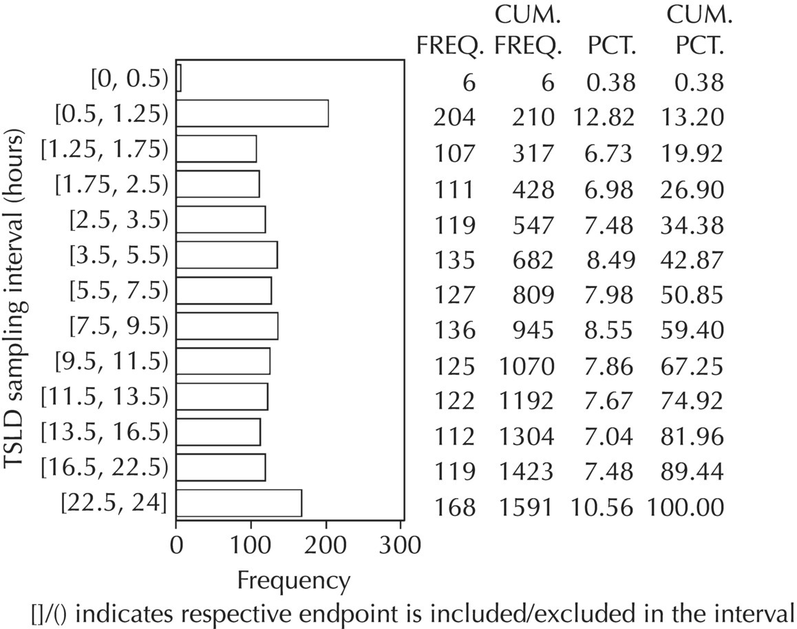
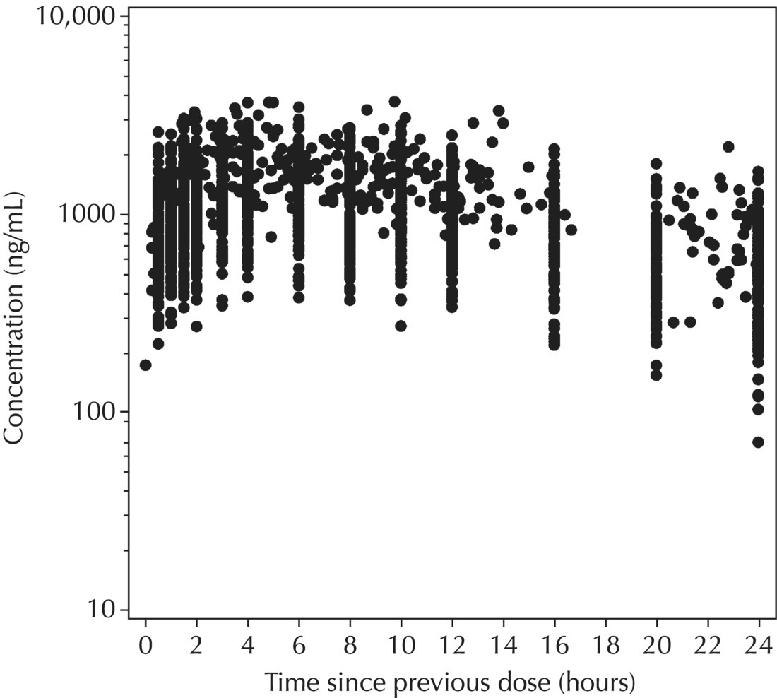
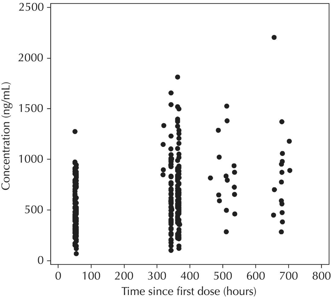
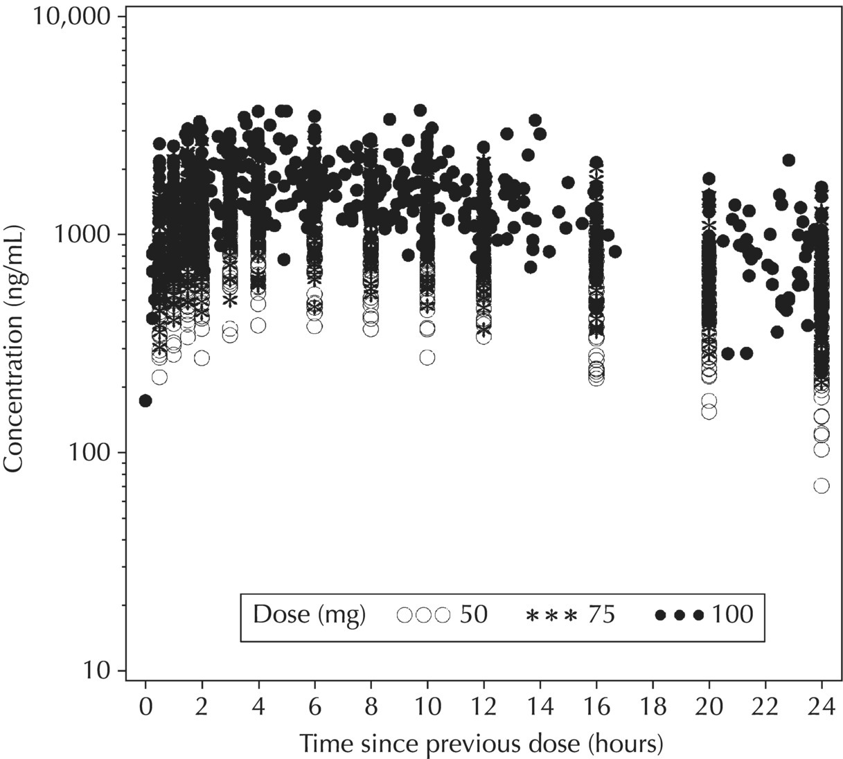
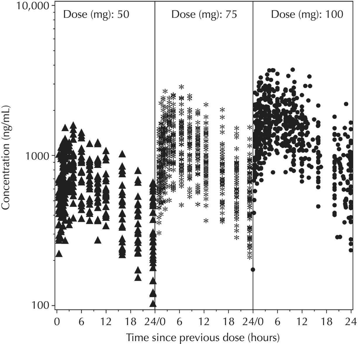
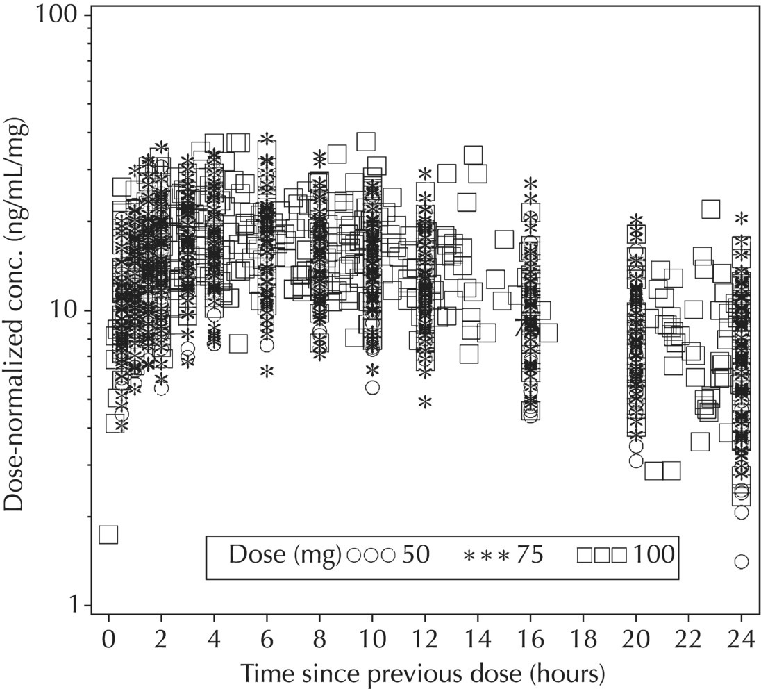
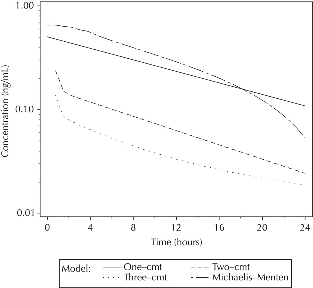
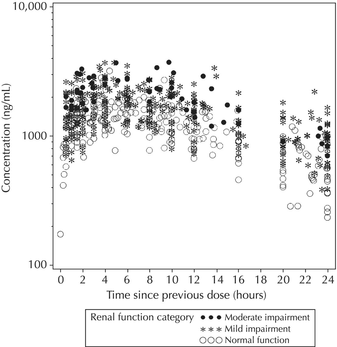
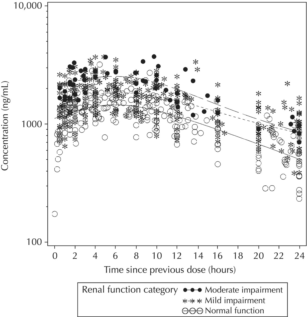
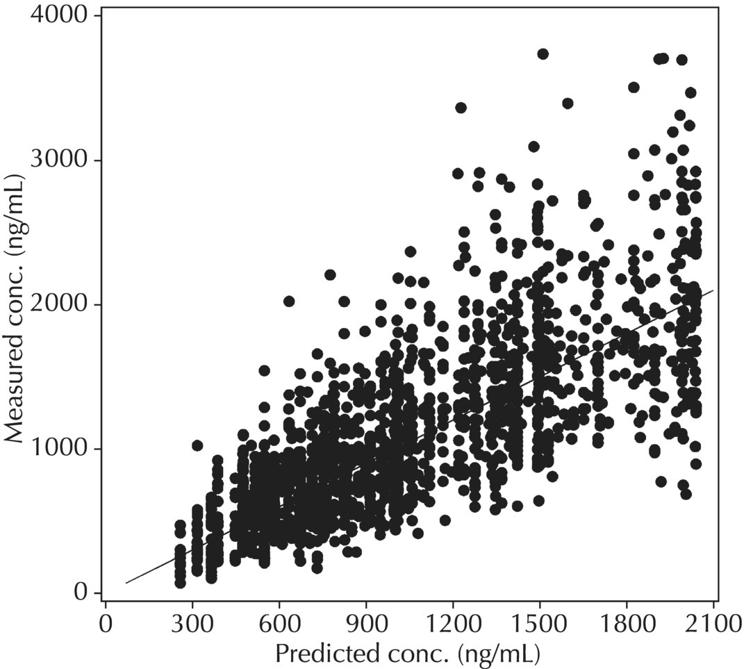
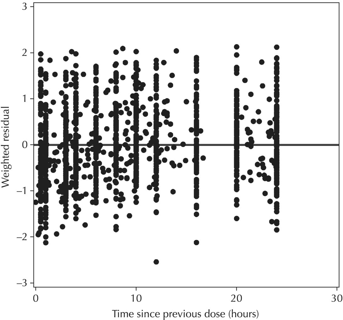
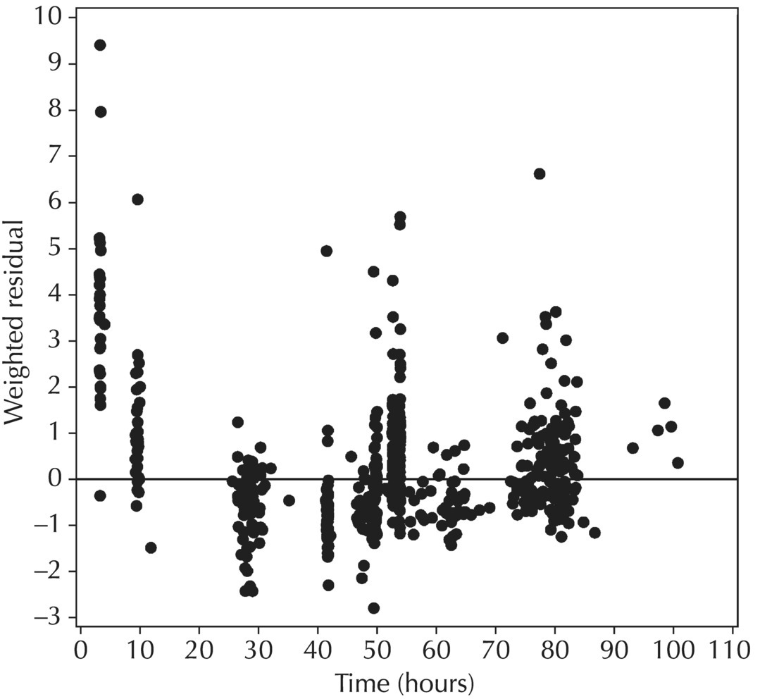
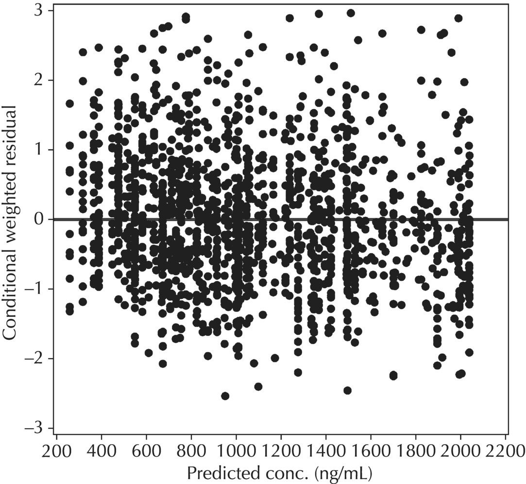
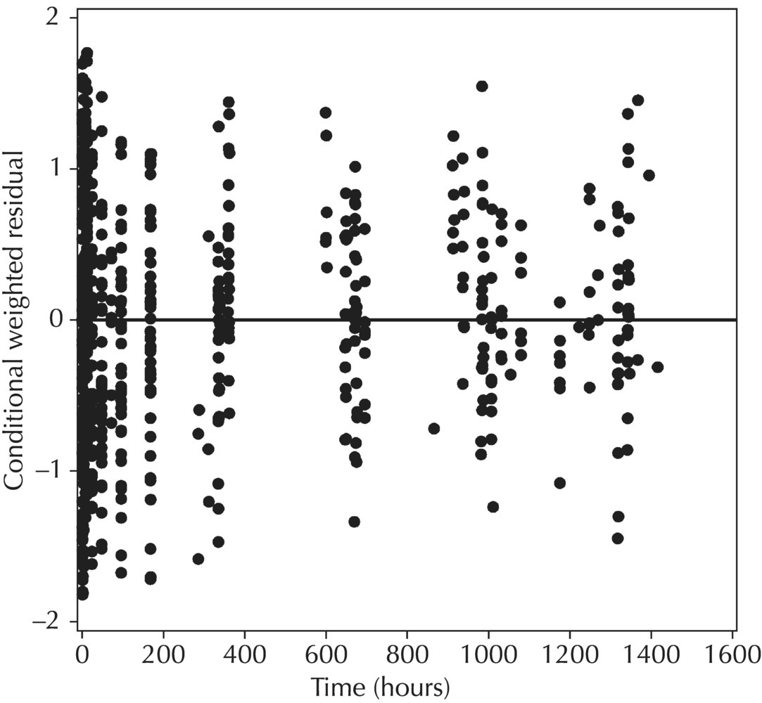
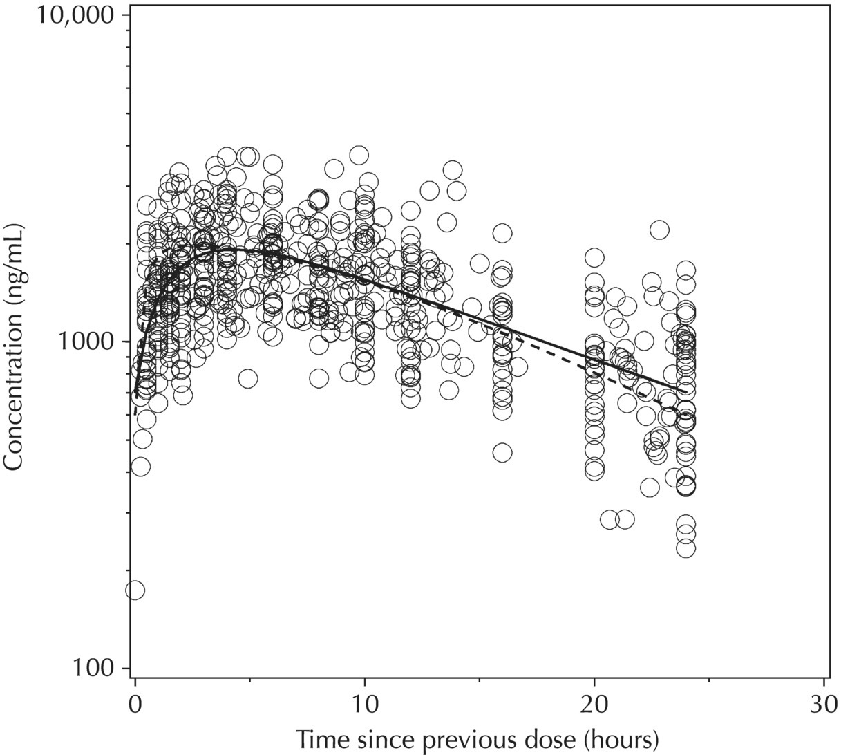
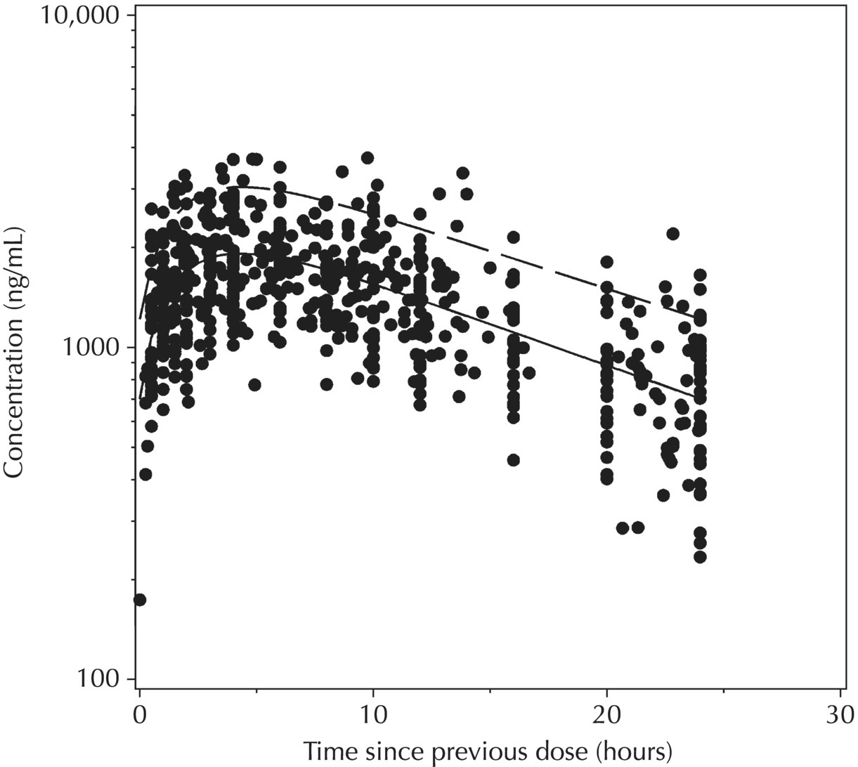
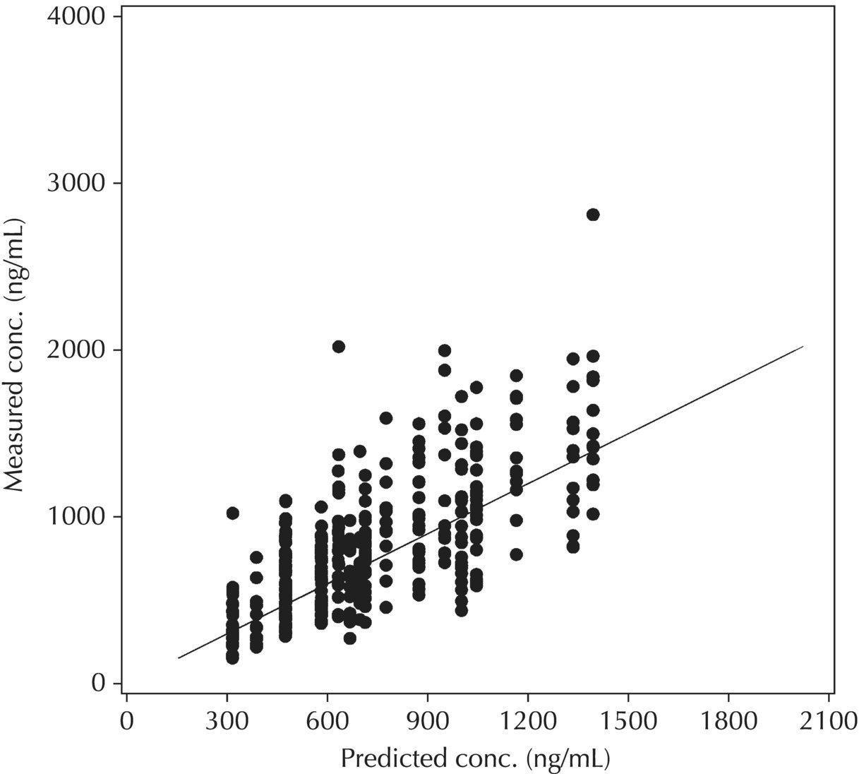
Chapter 5 Owing to the hierarchical nature of population pharmacokinetic/pharmacodynamic (PK/PD) nonlinear mixed effect models as well as the typical complexity of such model development efforts, a general framework is proposed. This framework consists of the basic steps of the process for the development of such models (in the context of their application in a drug development endeavor). A high-level description of the proposed process is illustrated in Figure 5.1; each of the steps outlined in the figure will be discussed in this or subsequent chapters of this text. Figure 5.1 Typical pharmacometric model building process. A framework consisting of the modeling-related steps (i.e., basic model, addition of structural features, addition of statistical features, model refinement, and model testing) was first proposed by Sheiner and Beal in the Introductory Workshops they offered in the early nineties, and became fairly standard practice amongst many pharmacometricians (Beal and Sheiner 1992). Ette and colleagues extended this process beyond modeling to address steps that should be taken in advance of modeling and steps that may be taken after a final model is selected to address the application of the model to the problem at hand (Ette et al. 2004). Today, however, many modelers have adopted their own unique variations on this framework in terms of the extent to which process steps are completed and the order in which some steps are undertaken. Analysis planning is perhaps the most important step in any data analysis and modeling effort but particularly so in pharmacometric model development and analysis. Whether the analysis planning process entails the development of a formal, controlled, and approved document or simply a bullet-point list describing the main components of the plan, it is critical to take the time to complete this step prior to initiating data analysis. Statistical analysis plans (SAPs) have long been used by statisticians in various fields of study to promote the ethical treatment of data and to ensure the consistency and repeatability of analyses. Development of an analysis plan prior to locking the study databases, unblinding the treatment codes, and/or analysis commencement is perceived to be good statistical practice to minimize potential bias and lend credibility to analysis findings. A well-written SAP should contain enough detail to enable two independent analysts following the plan to come to essentially the same conclusions. International Conference on Harmonization (ICH) guidelines on Statistical Principles for Clinical Trials (European Medicines Agency (EMA) 1998) recommend finalization of the SAP before the study blind is broken, in addition to documentation of such activities. The two most relevant regulatory guidance documents for population PK/PD modelers (FDA Guidance for Industry, Population Pharmacokinetics (Food and Drug Administration 1999) and EMEA CHMP Guideline on Reporting the Results of Population Pharmacokinetic Analyses (EMA 2007)) both refer to the importance of analysis planning by stressing the need to specify analysis assumptions and decision-making rules, as well as deviations from the planned analyses. The mere act of prespecifying, in detail, the major analysis steps and contingencies often results in a discovery of some sort: a feature of the data requiring further processing for analysis, an exploratory plot that might provide additional insight prior to modeling, a modeling assumption not likely to be met, a data editing rule requiring refinement, or an additional model worthy of consideration. Besides the improvement in analysis quality that derives from such careful a priori planning, obtaining input and/or approval of a pharmacometric analysis plan from team members representing other disciplines will likely result in greater buy-in and support for analysis results. The benefit of project team alignment prior to analysis and agreement with the planned approach to support eventual claims based on modeling efforts will only serve to further ingrain and instantiate the use of modeling and simulation techniques as an essential critical path activity. Team members representing various functional areas can provide differing types of input and derive different kinds of benefits from involvement in the analysis planning process. Data management personnel responsible for preparing the data for analysis will derive insight from an understanding of the objectives for modeling and simulation efforts, appreciation for the types of data that are most critical to meeting analysis assumptions, and in addition, can provide insight and refinement of data editing rules. Consistent involvement of data management personnel in analysis planning and dataset creation can also provide an opportunity for standardization of code and processes. Involvement of clinicians in the selection and specification of covariates to be considered may prevent wasted time and effort in evaluating factors not likely to be clinically relevant or physiologically plausible even with statistically significant results. The input of a clinician or clinical disease specialist is perhaps most important in the planning of clinical trial simulation efforts where knowledge of factors that might influence response and an understanding of patient population characteristics, especially those that might impact expectations about compliance or drop-out behavior, is essential to the eventual usefulness and applicability of the results. Other benefits of careful analysis planning performed with team input include greater transparency for life cycle and resource management, the ability to include modeling results and milestones in development program timelines, and the ability to devote time and resources to the consideration of explanations for possible findings prior to the availability of final results, when the timelines for delivery of knowledge are compressed. The proposed team-oriented analysis planning process can result in immediate reductions in time to complete modeling and simulation efforts and prepare the subsequent summary reports if the analysis planning effort is directly translated into the development of code (and even report text) based on the plan. Critical stopping and decision points, when a team-based review of results may be helpful for further planning, may also be elucidated based on the plan. Appendix 5.1 contains recommendations for pharmacometric analysis plan content. As discussed in Chapter 4, while NONMEM requires a specific structure and format for the dataset in order for it to be properly understood and interpreted by the software, one of its greatest strengths is its tremendous flexibility in accommodating different types of dosing regimens and patterns as well as variations in particular individual dosing histories. This capability, in conjunction with the statistical advantages of mixed effect modeling with sparse data, makes the NONMEM system an ideal platform for model development efforts utilizing the often-messy real-world (Phase 2/3) clinical trial data where protocol violations, data coding errors, dosing and sampling anomalies, and missing data abound. In addition, datasets consisting of pooled data from various trials or phases of development often require significant standardization efforts to normalize the data fields and values for appropriate model interpretation. As the complexity of the trial design(s) and the messiness of the constituent datasets increase, so does the complexity of the analysis dataset creation task. While an analysis dataset for a standard Phase 1 single ascending dose or age-gender effect crossover study may be achievable using data import and manipulation techniques in a spreadsheet program such as Microsoft Excel®, a dataset for even a single Phase 3 trial or a pooled dataset consisting of several trials requires many complex data merging and manipulation tasks to create the appropriate dosing and sampling event records for the variety of scenarios that are frequently encountered. Such tasks therefore require the use of a programmatic approach and a fair amount of programming expertise, as it would otherwise be almost completely untenable using a more manual approach. The creation of an analysis-ready dataset involves processing and cleaning the source data based on requirements developed to support the analysis plan. Anomalies in dosing history or sampling frequency will need to be coded so as to be understood accurately by the program, inconsistencies in units or coding of variables must be standardized, and new variables, required by NONMEM or the objectives of the analysis, may need to be created based on the data fields collected during the trial(s). Codification of the steps involved in creating accurate dosing and sampling records for each individual, while required, comes with its own numerous opportunities for the introduction of errors into the dataset. As such, a detailed plan for dataset review and checking should be implemented with each major dataset version or modification. Especially important when analysis datasets are created by someone other than the modeler, quality control review of an analysis dataset should consist of at least two major steps: (i) data checking of individual fields and relational data checking and (ii) dataset structure checking. When different individuals are responsible for the tasks of dataset creation and model development, written documentation of the analysis dataset requirements is generally prepared. The quality control process is then utilized as an opportunity to check not only the data and the dataset but importantly the understanding and interpretation of the requirements. Two different interpretations of the same written requirements may result in two different datasets—one, both, or neither of which may be correct (meaning as intended by the individual generating the requirements). Quality checking of individual data fields may consist of a review of frequency tables for categorical or discrete variables and summary statistics (minimum, maximum, mean, standard deviation (SD), median, etc.) of continuous variables based on expectations of the values. Relational data checks may consist of programmatic calculations, such as the amount of time between a given PK sample and the previous dose or a count of the number of samples of various types collected from each subject. These relational checks depend, in part, upon a comparison of the information collected in more than one field of the source datasets. Knowledge of the protocol(s) and/or trial design(s) is typically required to adequately interpret such edit checks. For NONMEM analysis datasets, quality checking of the dataset structure requires an understanding of both the analysis plan and the intended modeling approach (if not detailed in the plan) as well as the rules and requirements for NONMEM datasets as described in Chapter 4. Quality control review of the NONMEM dataset structure may involve individual field and relational edit checks of NONMEM-required variables in addition to a pass through NM-TRAN and a careful check of NONMEM’s FDATA file. The topic of quality control will be discussed in more detail in Chapter 12. Beyond these quality checks, a thorough exploratory review of the data performed by creating graphical and tabular summaries should be conducted prior to running the first model (Tukey 1977). The overarching goal of a careful and deliberate exploratory data analysis (EDA), conducted prior to modeling, is to explore the informational content of the analysis dataset relative to the models to be evaluated. In essence, EDA is a structured assessment of whether the data collected will support the intended analysis plan. A simple and common example illustrating the benefit of EDA lies in the value of the simple concentration versus time (since previous dose) scatterplot. When the protocol allows for subjects to come to the clinic on PK sampling visits at any time following the previous dose in an effort to obtain a random distribution of sampling times relative to dosing, it is critical to understand the reality of this distribution prior to model fitting. If the actual distribution of sampling times relative to dosing is essentially bimodal with the vast majority of sample times clumped at either 1–2 hours postdosing or 10–12 hours postdosing, the PK structural models that may be considered are therefore limited. In this case, attempting to fit two-compartment distribution models to such a dataset may well prove fruitless without consideration of fixing key parameters of the model. If the informational content of the dataset relative to the intended or expected model is significantly lacking, the model development strategy to be employed may require modification. When the sampling strategy and resulting data are more informative, EDA can serve to set up some expectations for models that are likely to be worthy of testing or not testing. Importantly, if informative plots are constructed, EDA can also serve to highlight important trends in the data, which may warrant consideration of other specific plots that can be constructed to further investigate trends or provide some insight into likely covariate effects. Graphical and tabular summaries of the data created during EDA may also help to identify outliers requiring exclusion and extreme data values worthy of further investigation. The typical objectives of EDA are therefore, at least threefold: (i) to understand the realities of the opportunities for variability based on study design or execution (i.e., explore the study execution and compliance issues present in the dataset, understand the analysis population, and explore the characteristics of any missing data), (ii) to search for large, obvious trends in the data that will facilitate modeling efforts, and (iii) to identify potential outliers or high-influence points that may be important to understand for the modeling. One important component of a thorough EDA entails a description of the population to be analyzed. Summary statistics should be computed describing the number of subjects to be modeled and patient characteristics in the overall dataset as well as separately by study, if data from various studies are to be pooled for analysis. If different dose levels will be evaluated, such summary statistics may also be computed by dose or treatment group in order to evaluate the distribution of subjects and patient features across the anticipated distribution of drug exposure. Table 5.1 and Table 5.2 provide examples of such summary tables generated to describe the population. Frequency distributions of patient characteristics (age, weight, race, gender, etc.) as illustrated in Figure 5.2, boxplots of continuous characteristics plotted versus categorical characteristics (e.g., age or weight versus ethnicity or gender) as in Figure 5.3, and scatterplots of the relationships between continuous patient characteristics should be generated, as in Figure 5.4, and evaluated for a thorough understanding of the patient population to be modeled. Table 5.1 Summary statistics of patient characteristics by study Table 5.2 Summary statistics of patient characteristics by dose group Figure 5.2 Frequency distributions of patient characteristics. Panel (a) illustrates the distribution of weight and Panel (b) provides the distribution of age in the population; the number below each bar represents the midpoint of the values in that bar. Figure 5.3 Boxplots of continuous patient characteristics versus categorical characteristics. Panel (a) illustrates the distribution of weight by gender. Panel (b) provides the distribution of weight by race group. Panel (c) illustrates the distribution of age by gender. Panel (d) provides the distribution of age by race group in the population; the box spans the interquartile range for the values in the subpopulation, the whiskers extend to the 5th and 95th percentiles of the distributions, with the asterisks representing values outside this range, and the boxes are joined at the median values. Figure 5.4 Scatterplot of the relationship between patient age and weight. In all population datasets, but in particular, those that include subjects studied at a variety of different dose levels, it is important to understand various aspects of the dose distribution to appropriately interpret and understand the resulting exposure distribution. Variables to be explored include the dose amount, the frequency of dosing, the length of drug infusions, the number of infusions received if this could vary between subjects, and if relevant, the overall length of drug treatment. Figure 5.5 illustrates an example frequency distribution of dose amount. In addition, derived dose-related data items required by NONMEM to describe dosing histories should also be described and explored (e.g., ADDL, II, and SS) via graphical or tabular frequency distributions. Table 5.3 illustrates a summary of dose-related data items; variables such as SS can be checked for the presence of only allowable values, and other variables, such as II, can be checked for unusual values, which may indicate an outlier or data error. Review of the distribution of such variables may help to identify possible anomalies in data collection or dosing histories as well as debug potential coding errors and/or improve code development to adequately capture the various typical as well as unusual patient behaviors with respect to dosing. Figure 5.5 Frequency distribution of dose amount. Table 5.3 Summary of select NONMEM dose-related data items For population PK modeling efforts, a thorough understanding of the concentration and sample collection related data is critical as the drug concentration is the dependent variable (DV) to be modeled. As previously discussed, frequency distributions of the times of sample collection relative to dosing and of the number of samples collected per subject enable a thorough understanding of the informational content of the PK samples in the dataset. Figure 5.6 illustrates an example frequency distribution of the time of sampling relative to the previous dose administration. With respect to the drug and/or metabolite concentrations, summary statistics characterizing the concentrations and the number of samples measured to be below the limit of quantification (BLQ) of the assay, overall and stratified by the applicable dose level, in addition to the timing of such samples relative to dosing, may be informative in selecting an appropriate method of handling such samples in the modeling. Table 5.4 provides an example summary table illustrating the extent of samples determined to be BLQ of the assay. A variety of methods to treat such samples have been proposed (Beal 2001; Ahn et al. 2008; Byon et al. 2008), and the intended method or the means to determine the handling of such samples should be described in the analysis plan. Figure 5.6 Frequency distribution of TSLD (time of sampling relative to the most recent previous dose administered). Summary statistics are also provided to quantify the frequency of sampling in various time bins or ranges of TSLD. Table 5.4 Summary of BLQ data by dose and sampling timepoint Perhaps the single most important and informative plot of PK data is the scatterplot of drug concentration level plotted against time of sampling. Because the Phase 2 and 3 data typically collected for population analysis are generated from sparse sampling strategies, where interpretation of the appropriateness and assessment of a given level are difficult at best, this simple scatterplot of concentration versus time since last dose (TSLD) for the population as a whole provides, in one picture, the basis for the population model to be developed. Figure 5.7 illustrates an example of a concentration versus TSLD scatterplot, using a semi-log scale for the y axis. Figure 5.7 Scatterplot of drug concentration versus TSLD. A semi-log scale is used for the y axis and time of sampling is normalized to time relative to the most recent dose administration. Even for this simple plot, however, a variety of plotting techniques can be employed to make the interpretation more useful. First, the sample time plotted on the x axis may be the time of the sample either relative to the last dose of study medication or relative to the first dose. Normalizing all of the samples relative to the last dose allows for a gross assessment of the shape of the PK profile, while consideration of the samples relative to the first dose may allow for an assessment as to whether the subjects are at steady state or when they come to steady-state conditions, as well as whether the PK of the study drug is stationary over time during the course of treatment. If a sufficient subset of the data consists of trough levels, this subset may be plotted against time since first dose (TSFD) for a more refined evaluation of stationarity over the treatment and collection period. Figure 5.8 and Figure 5.9 illustrate trough concentrations plotted against the time since the start of treatment. In Figure 5.9, a smooth line is added to highlight the mean tendency of the data over time. Figure 5.8 Scatterplot of trough concentrations versus time since the start of treatment. Figure 5.9 Scatterplot of trough concentrations versus time since the start of treatment with a smoothing spline through the data. A smoothing spline is added to the scatterplot to illustrate the central tendency of the trough concentrations over time. Perhaps the more important consideration in the interpretation of this plot is the treatment of the dose level. When dose is properly accounted for, an assessment may be made as to whether a given level may be considered unusual relative to others or within the typical range of variability observed for the particular compound. Without accounting for dose, overinterpretation of a particularly high or low concentration level is possible. For example, if the most extreme (highest) concentration level observed was known to be from a subject receiving the highest dose, it would not be considered as likely to be an outlier as if it were known to be from a subject receiving the lowest dose level. Importantly, any assessment of potential outliers from this plot is minimally a three-pronged evaluation with consideration given to whether the given concentration level is: (i) unusually high or low in the overall sample of concentrations or within the profile of concentration values from the individual (if available), (ii) unusually high or low in comparison to other samples collected following the same or similar dose levels, and (iii) unusually high or low in comparison to other samples collected at a similar time relative to dosing. Concentrations that test positive for each of these considerations may warrant further investigation as potential outliers. Appropriate consideration of factors such as the dose level and the timing of the sample relative to dosing (as in the model), may allow the analyst to hone in on the legitimately unusual samples and avoid spending unnecessary time investigating concentrations that are simply near the tails of the distribution and not necessarily unusual. The treatment of dose level in the scatterplot of concentration versus time can be handled in several different ways, each of which may provide a slightly different picture of the informational content of the dataset. The single scatterplot of concentration versus time in the entire population of interest can be drawn using different symbols and/or symbol colors for the concentrations measured following different dose levels; this technique is illustrated in Figure 5.10. Alternatively, separate scatterplots can be generated for the data following different dose levels. If this technique is used, it may be useful to maintain similar axis ranges across all plots in order to subsequently compare the plots across the range of doses studied; this is illustrated in Figure 5.11. Either of these options for the treatment of dose level allows for a simplistic evaluation regarding dose proportionality across the studied dose range. Yet another option for this type of assessment is to dose-normalize the concentration values by dividing each concentration by the relevant dose amount prior to plotting versus time. If differing symbols or colors are used for the various dose groups in a dose-normalized plot, confirmation that the different dose groups cannot be easily differentiated because of substantial overlap may provide adequate confirmation of dose proportionality in a given dataset. Figure 5.12 and Figure 5.13 illustrate dose-normalized concentrations plotted versus time since the previous dose, with different symbols used to represent the different dose groups; in Figure 5.13, a smoothing spline is added for each dose group. The addition of the smoothing splines to the dose-normalized plot in Figure 5.13 serves to further illustrate (in this case) the similarity between the disposition following each of the dose levels. Figure 5.10 Scatterplot of drug concentrations versus TSLD with different symbols used to represent the different dose groups. Figure 5.11 Scatterplot of drug concentrations versus TSLD with different panels used to compare the data following different dose levels. Solid triangles represent data following the administration of the 50-mg dose, asterisks represent data following the administration of the 75-mg dose, and solid dots represent data following the administration of the 100-mg dose. Figure 5.12 Scatterplot of dose-normalized drug concentrations versus TSLD with different symbols used to represent the different dose groups. Figure 5.13 Scatterplot of dose-normalized drug concentrations versus TSLD with different symbols used to represent the different dose groups and smoothing splines added for each dose group. If full- or relatively full-profile sampling strategies (four to six or more samples following a given dose) were implemented in the various studies to be analyzed, plotting this subset of the analysis dataset, joining the points collected from a given individual may be illustrative in understanding the shape of the PK profile and highlighting potential differences across patients. If sampling strategies are sparse (three or fewer samples following a given dose), joining such points within an individual’s data can be a misleading illustration of the PK profile when considered on a patient-by-patient basis. Figure 5.14 illustrates this type of plot for a sample of patients with full-profile sampling. When multiple troughs are collected from each individual, joining such levels across time in the study or time since first dose can provide an assessment of PK stationarity as discussed earlier. Figure 5.15 illustrates such a plot for a small number of subjects with two trough samples collected, and with a larger sample and/or more samples per subject, the overall trends across the data would be clear from a plot of this type. Figure 5.14 Concentration versus time profiles for a sample of patients with full-profile sampling. A semi-log scale is used for the y axis. Figure 5.15 Scatterplot of trough concentrations versus time since the start of treatment, joined by subject. The concentration or y axis may be plotted on either a semi-logarithmic or a linear scale, and probably should be plotted on each, since different information in the data is emphasized by the different plot formats. The linear scale for concentration allows for a straightforward means to interpret the exact value of a given concentration level, which may be useful in facilitating comparisons to known levels or summary statistics such as the mean or median concentration value. On a linear scale, the higher end of the concentration profile is emphasized in comparison to the log-scale version of the same plot, allowing for a perhaps closer examination of the peak, the absorption profile, and early distributional portion of the PK profile. When plotted on a semi-logarithmic scale, the lower end of the concentration profile is stretched in comparison to the linear scale version, thereby allowing for a closer examination of the later (elimination) phase of the PK profile. Figure 5.16 and Figure 5.17 illustrate linear scale y-axis versions of Figure 5.11 and Figure 5.14 for comparison. Furthermore, when plotted on a semi-log scale, the concentration versus time profile can be assessed for concordance with first-order (FO) processes, and the appropriate compartmental PK model for the data can be considered. If the concentration data following the peak exhibit a single linear slope, a one-compartment disposition model may be a reasonable characterization of the data. However, if the concentration data following the peak exhibit bi- or triphasic elimination, characterized by multiple linear segments, each with different and progressively shallower slopes over time, then a two- or three-compartment disposition model may be an appropriate characterization of the data. Furthermore, a distinctly concave shape to the concentration data following the peak level may indicate the presence of Michaelis–Menten (nonlinear) elimination. These types of assessments of the shape of the PK profile are not possible when concentration versus time data are plotted on a linear y-axis scale for concentration. Figure 5.18 illustrates the shape of some of these profiles for comparison. Figure 5.16 Scatterplot of drug concentrations (on a linear scale) versus TSLD with different panels used to compare the data following different dose levels. Solid triangles represent data following the administration of the 50-mg dose, asterisks represent data following the administration of the 75-mg dose, and solid dots represent data following the administration of the 100-mg dose. Figure 5.17 Concentration (on a linear scale) versus time profiles for a sample of patients with full-profile sampling. Figure 5.18 Representative concentration versus time profiles for various disposition patterns. A final plotting technique, which may be considered with concentration versus time data, is the use of a third stratification variable (other than or in addition to dose). For example, if the drug under study is known to be renally cleared, an interesting plot to consider for confirmation of this effect in a particular dataset is concentration versus time for a given dose, with different symbols and/or colors used for different categories of renal function. Obvious separation of the renal impairment groups in a concentration versus time scatterplot would provide empiric evidence to support the influence of renal function on the PK of the compound. Figure 5.19 and Figure 5.20 illustrate this plot, before and after smooth lines are added to further illustrate the differences between the renal function groups. Trellis-style graphics, as implemented in R, offer an alternative method for illustrating the potential effect of a third variable (R Core Team 2013). Such graphs provide a matrix of plots, each representing a different subset of the population based on the distribution of the third variable. Stratification of the concentration versus time scatterplot with different covariates under consideration allows for a quick and simple assessment of the likelihood of influence of such potential factors. Highly statistically significant covariate effects are often easily detected from such plots. Figure 5.21 illustrates the concentration versus time data, plotted in a trellis style with different panels for the different renal function categories. Figure 5.19 Scatterplot of drug concentrations versus TSLD with different symbols used to represent the different renal function categories. Figure 5.20 Scatterplot of drug concentrations versus TSLD with different symbols used to represent the different renal function categories and smoothing splines added for each renal function category. Figure 5.21 Scatterplot of drug concentrations versus TSLD with different panels used to compare the data from the different renal function categories. Solid triangles represent data from subjects with moderate renal impairment, asterisks represent data from subjects with mild renal impairment, and solid dots represent data from subjects with normal renal function. Special consideration of alternative plotting techniques may be warranted when datasets for analysis are extremely large. In this situation, scatterplots of the sort discussed in Section 5.5.3, especially those utilizing the entire dataset, may be largely uninterpretable as many points will plot very near each other resulting in a large inkblot from which no apparent trend can be deciphered. In this situation, the choice of plotting symbol can make a large difference and an open symbol (which uses less ink) may be preferable to a filled symbol. Figure 5.22 illustrates a scatterplot of a very large dataset using open symbols. The overlay of a smoothing line (spline) on such dense data is one technique that may help the analyst detect a trend or pattern where one cannot be easily seen by eye; Figure 5.23 shows the same data with a smoothing spline added. Stratification and subsetting techniques as described in the previous section also offer a method of breaking down a large dataset into more manageable subsets from which patterns may be observable. Figure 5.24 illustrates the large dataset plotted in different panels, stratified by study, revealing different underlying patterns in the different studies. A final technique, which may be considered when even the subsets of data are quite dense, is random thinning. With a random thinning procedure, points to be plotted are randomly selected for display in a given subset plot. For EDA purposes, it may be appropriate to apply this technique to the entire dataset, generating numerous subset plots such that each point is plotted exactly once, and ensuring that no point goes unobserved or unplotted. For illustration of very large datasets as in a publication, a single random subset plot that preserves at least most of the features of the overall dataset may be more appropriate. Software tools with interactive plotting features may also be useful in evaluating large datasets by implementing graph building or stripping features. Figure 5.22 Scatterplot of an endpoint versus a predictor variable for a large dataset using open symbols. Figure 5.23 Scatterplot of an endpoint versus a predictor variable for a large dataset using open symbols and a smoothing spline added. Figure 5.24 Scatterplot of an endpoint versus a predictor variable, plotted separately by study with smoothing splines. Panel (a) represents the endpoint versus predictor data for the subjects from Study A. Panel (b) is for Study B. Panel (c) is the data from Study C. Panel (d) is the data from Study D. Exploratory data analysis is a critical, though sometimes overlooked, step in a comprehensive and deliberate model building strategy. Analysts with the discipline to thoroughly explore and understand the nuances of a dataset prior to attempting model fitting will reap the rewards of efficiency in subsequent steps. A sure strategy for repeating analysis steps, starting and restarting model development efforts, and spending more time and effort than necessary includes initiating model fitting without fully appreciating the intricacies of the analysis dataset through EDA. With an understanding of the studies to be included, the population to be studied, and some expectations regarding the PK characteristics of the drug, EDA can be effectively planned and scripted at the time of drafting the analysis plan (i.e., well before trial databases are locked and data are even available for processing). Importantly, EDA plots and tables should be recreated following any significant change to the analysis population, such as the exclusion of a particular study from the analysis dataset. Neglecting to do so may result in the same potential misunderstandings and inefficiencies that result from not performing EDA in the first place. Data summaries, EDA plots, and tables should be included in presentations, reports, and publications of population modeling efforts. Such displays are the most effective way to demonstrate the features of a large complicated dataset, especially one consisting of several studies pooled together, and to facilitate understanding of the informational content of the data to be modeled. With a solid understanding of the informational content of the analysis dataset relative to the models to be considered for evaluation, initial model fitting may be attempted. The approach proposed herein (and adopted by the authors) involves starting with a parsimonious simplistic model sufficient only to characterize the overall nature of the data and subsequently building in layers of complexity as more knowledge is gained and more variability is explained with model additions and improvements. Thus, the base structural model initially attempted may be defined as a model that may be considered to be appropriate to describe the general and typical PK characteristics of the drug (i.e., one-compartment model with first-order absorption and linear elimination), including the estimation of interindividual variability (IIV) on only a limited number of PK parameters and including the estimation of residual variability using a simplistic error model. During the process of establishing an adequate base structural model, additional PK parameters may be estimated (e.g., absorption lag time and relative bioavailability fraction) as needed, and based on the model fit and diagnostics, IIV may be estimated on additional (or all) parameters, and the residual variability model (i.e., weighting scheme for the model fit) may be further refined. Considering these features part of a sufficient base structural model, when an adequate fit is obtained (see Section 5.6.1) following the evaluation of such model components, the model may be designated as the base structural model. Generally, a base structural population PK model will not include the effect of any individual-specific patient factors or covariates on the parameters of the model. However, in some circumstances, the inclusion of a patient covariate effect, especially one with a large and highly statistically significant effect on drug PK, is a necessary component to obtaining an adequate base structural model. Other possible exceptions to this precept might include estimating the effect of weight or body size in a pediatric population as an allometric scaling factor on relevant PK parameters. (See Section 5.7.4.3.2 for a description of the functional model form typically used for allometric scaling of PK parameters.) The table file output from NONMEM contains several statistics useful in interpreting the results of a given model fit. In addition to the requested values (i.e., those specified in the $TABLE record), NONMEM appends the following values at the end of each record of the table file: DV, PRED, RES, and WRES. The first value, DV, is the value of the dependent variable column of the dataset. The second value, PRED, is the population-level model-predicted value corresponding to the measured value in DV. The final two values, RES and WRES, are the residual and weighted residual corresponding to the given measured value and its prediction. The residual, RES, is simply the difference between the measured and predicted values, or DV-PRED. Positive values of RES indicate points where the population model-predicted value is lower than the measured value (underpredicted), and negative values for RES indicate an overprediction of the point (PRED > DV). The units for RES are the units of the DV, for instance, ng/mL, if the DV is a drug concentration. The weighted residual, WRES, is calculated by taking into account the weighting scheme, or residual variability model, in effect for this particular model fit. Because the weighting scheme effectively normalizes the residuals, the units for WRES can be thought of as an indication of SDs around an accurate prediction with WRES = 0. In fact, the WRES should be normally distributed about a mean of 0 with a variance of 1. Therefore, WRES values between –3 and +3 (i.e., within 3 SDs of the measurement or true value) are to be expected, and WRES values greater in absolute value than 3 are an indication of values that are relatively less well-fit, with a larger WRES indicating a worse fitting point. Perhaps the most common model diagnostic plot used today is a scatterplot of the measured values versus the corresponding predicted values. This plot portrays the overall goodness-of-fit of the model in an easily interpretable display. In the perfect model fit, predictions are identical to measured values and all points would fall on a line with unit slope indicating this perfect correspondence. For this reason, scatterplots of predicted versus observed are typically plotted with such a unit slope or identity line overlaid on the points themselves. For the nonperfect model (i.e., all models), this plot is viewed with an eye toward symmetry in the density of points on either side of such a unit slope line across the entire range of measured values and the relative tightness with which points cluster around the line of identity across the range of measured values. Figure 5.25 illustrates a representative measured versus population-predicted scatterplot with a unit slope line. With regard to symmetry about the unit slope line, the fit of this particular model seems reasonably good; there are no obvious biases with a heavier distribution of points on one or the other side of the line. However, when the axes are changed to be identical (i.e., the plot is made square with respect to the axes) as in Figure 5.26, a slightly different perspective on the fit is obtained. It becomes much more clear that the predicted range falls far short of the observed data range. Figure 5.25 Scatterplot of observed concentrations versus population predicted values illustrating a reasonably good fit. Note that the axes are scaled to the range of the data. Figure 5.26 Scatterplot of observed concentrations versus population predicted values with equal axes. Another plot illustrative of the overall goodness-of-fit of the model is a scatterplot of the weighted residuals versus the predicted values. The magnitude of the weighted residuals (in absolute value) is an indication of which points are relatively well-fit and which are less well-fit by the model. A handful of points with weighted residuals greater than |10| (absolute value of 10) in the context of the remainder of the population with values less than |4| indicate the strangeness of these points relative to the others in the dataset and the difficulty with which they were fit with the given model. Closer investigation may reveal a coding error of some sort, perhaps even related to the dose apparently administered prior to such sampling, rather than an error in the concentrations themselves. In addition to the identification of poorly fit values, the plot of WRES versus PRED also illustrates potential patterns of misfit across the range of predicted values. A good model fit will be indicated in this plot by a symmetric distribution of points around WRES = 0 across the entire range of predicted values. Figure 5.27 illustrates a good-fitting model in panel (a) and a similarly good-fitting model in panel (b) with two outlier points associated with large weighted residuals. Obvious trends or patterns in this type of plot, such as a majority of points being associated with exclusively positive or negative WRES (thus indicating systematic under- or overprediction, respectively) in a certain range of predicted values may indicate a particular bias or misfit of the model. The plot in Figure 5.28 illustrates clear trends, associated with certain misfit. A classic pattern in this plot with a specific interpretation is the so-called U-shaped trend shown in Figure 5.29, whereby a majority of WRES are positive for low values of the predicted values, become negative for intermediate values of PRED, and finally, are mostly positive again for the highest predicted values. Generally speaking, for PK models, this pattern is an indication that an additional compartment should be added to the model. For other models, it would be an indication that the shape of the model requires more curvature across the range of predictions. Figure 5.27 Scatterplot of weighted residuals versus population predicted illustrating a good fit. Panel (a) includes no apparent outlier points, while Panel (b) includes two apparent outliers associated with high weighted residuals. Figure 5.28 Scatterplot of weighted residuals versus population predicted values illustrating a poorly fitting model. Figure 5.29 Scatterplot of weighted residuals versus population predictions illustrating a U-shaped pattern, indicative of the need for an additional compartment in the model. Another pattern sometimes observed in WRES versus PRED plots is an apparent bias in the distribution of WRES values, evident as a lack of symmetry about WRES = 0, often with a higher density of points slightly less than 0 and individual values extending to higher positive values than negative ones. Figure 5.30 illustrates this pattern, which may or may not be consistent across the entire range of PRED values. This pattern is often an indication that a log-transformation of the DV values in the dataset and the use of a log-transformed additive residual variability model may be appropriate. The log-transformation of the data will often result in a more balanced and less biased display of WRES versus PRED. When the log-transformed additive error model is used, both the DV and PRED values displayed in diagnostic plots may be either plotted as is (in the transformed realm) or back-transformed (via exp(DV) and exp(PRED)) to be presented in the untransformed realm. Figure 5.30 Scatterplot of weighted residuals versus population predictions illustrating the need for log-transformation. In contrast to the WRES versus PRED plot, where a consistent spread in WRES is desired across the PRED range, the RES versus PRED plot may indicate vast disparity in the dispersion about RES = 0 and still portray a good fit. While symmetry about RES = 0 is still considered ideal, a narrower spread at the lower predictions which gradually increases to a much wider dispersion at the higher end of the predicted range is a reflection of the weighting scheme selected via the residual variability model. The commonly used proportional residual variability model which weights predictions proportionally to the square of the predicted value, thereby allows for greater variability (i.e., more spread) in the higher concentrations as compared to the lower concentrations. Figure 5.31 is a scatterplot of residuals versus population predictions illustrating this pattern. Since RES are simply the nonweighted difference between the measured value and the corresponding prediction, these values can be interpreted directly as the amount of misfit in a given prediction in the units of the DV. Figure 5.32 illustrates a representative residuals versus population predictions plot indicative of a good fit when an additive error model is used. Figure 5.31 Scatterplot of residuals versus population predictions illustrating the fan-shaped pattern indicative of the proportional residual variability model. Figure 5.32 Scatterplot of residuals versus population predictions illustrating a constant spread across the range of predictions indicative of an additive error model. Since PK models rely heavily on time, another illustrative plot of model goodness-of-fit is WRES versus TIME. This plot may sometimes be an easier-to-interpret version of the WRES versus PRED plot described above. Initially considering time as the TSLD of study drug, the plot of WRES versus TSLD allows one to see where model misfit may be present relative to an expectation of where the peak concentration may be occurring (usually smaller values of TSLD) or where troughs are most certainly observed (the highest TSLD values). Figure 5.33 provides an example of such a plot for a model that is fit well, where there are no obvious patterns of misfit over the time range. Considering time as the TSFD of study drug, again this plot allows one to consider misfit relative to time in the study and perhaps more easily identify possible problems with nonstationarity of PK or differences in the time required to achieve steady-state conditions. Figure 5.34 demonstrates some obvious patterns of bias in the plot of weighted residuals versus TSFD, indicating that the model is not predicting well over the entire time course. Figure 5.33 Scatterplot of weighted residuals versus time since the previous dose illustrating a good fit. Figure 5.34 Scatterplot of weighted residuals versus TSFD illustrating patterns indicative of a biased fit over the time course of treatment. Andrew Hooker and colleagues illustrated in their 2007 publication that the WRES values obtained from NONMEM and commonly examined to illustrate model fit are calculated in NONMEM using the FO approximation, regardless of the estimation method used for fitting the model (Hooker et al. 2007). In other words, even when the FOCE or FOCEI methods are used for estimation purposes, the WRES values produced by the same NONMEM fit are calculated based on the FO approximation. Hooker et al. derived the more appropriate conditional weighted residual (CWRES) calculation (based on the FOCE objective function) and demonstrated that the expected properties of standard WRES (i.e., normal distribution with mean 0 and variance 1) quickly deteriorate, especially with highly nonlinear models and are a poor and sometimes misleading indicator of the model fit. The CWRES, however, obtained using the alternative calculation, maintain the appropriate distributional characteristics even with highly nonlinear models and are therefore, a more appropriate indicator of model performance. The authors conclude that the use of the standard WRES from NONMEM should be reserved for use with only the FO method. Hooker et al. (2007) also showed that CWRES, calculated based on the FOCE approximation, can be computed using the FO method in combination with a POSTHOC step. Thus, in those rare cases where conditional estimation is not possible due to model instability or excessively long run times, this feature allows one to understand the possible improvement in model fit that may be obtained with a conditional estimation method by comparing the WRES obtained to the CWRES. An important caveat to the use of CWRES, however, is that with NONMEM versions 6 or lower, the calculation of the CWRES is not trivial. To facilitate the use of this diagnostic, Hooker et al. (2007) have implemented the CWRES calculation in the software program, Perl Speaks NONMEM, along with the generation of appropriate diagnostic plots in the Xpose software (Jonsson and Karlsson 1999; Lindbom et al. 2005). NONMEM versions 7 and above include the functionality to calculate CWRES directly from NONMEM and request the output of these diagnostics in tables and scatterplots. Based on Hooker et al.’s (2007) important work, and in order to avoid the selection of inappropriate models during the model development process based on potentially misleading indicators from WRES, the previously described goodness-of-fit plots utilizing weighted residuals should always be produced using CWRES in place of WRES when conditional estimation methods are employed. These plots include WRES versus PRED and WRES versus TIME, as well as examination of the distribution of WRES. Figure 5.35 and Figure 5.36 provide plots of conditional weighted residuals versus population predictions and time since first dose, in both cases indicating a good-fitting model. Figure 5.35 Scatterplot of conditional weighted residuals versus population predictions illustrating a good fit. Figure 5.36 Scatterplot of conditional weighted residuals versus TSFD illustrating a good fit. Another diagnostic plot supportive of the appropriateness of the selected structural model is a representation of the predicted concentration versus time profile for a typical individual overlaid on the (relevant) raw data points, as in Figure 5.37. Such a plot illustrates whether the so-called typical model fit captures the most basic characteristics of the dataset. To obtain the typical predictions for such a plot, a dummy dataset is first prepared containing hypothetical records for one or more typical subjects. For example, if the analysis dataset contains data collected following three different dose levels, the dummy dataset may be prepared with three hypothetical subjects, one receiving each of the three possible doses. The analyst will need to consider whether a predicted profile following a single dose (say, the first dose) is of interest or if a more relevant characterization of the fit would be for a predicted profile at steady state (say, following multiple doses) and create the appropriate dosing history for each subject in the dummy dataset. In order to obtain a very smooth profile of predicted values for each hypothetical subject, multiple sample records are included for each of the three subjects, at very frequent intervals following dosing for one complete interval. Sample records are created with AMT=“.”, MDV = 0, and DV=“.” in order to obtain a prediction at the time of each dummy sample collection. If the fit of a base model is to be illustrated with this method, the dataset need contain only those columns (variables) essential to describe dosing and sampling to NONMEM (i.e., the required data elements only). Figure 5.37 Typical value concentration versus time profile overlaid on the raw concentration versus time since previous dose data. A control stream is then crafted for prediction purposes which reads in the dummy dataset, adjusting the $DATA and $INPUT records as needed to correspond to the dummy dataset. If an MSF file was output from the model run of interest, it may be read in using a $MSFI record and the $THETA, $OMEGA, and $SIGMA records eliminated. However, if an MSF file does not exist, the final parameter estimates from the fit of the model to be used may be copied into the $THETA, $OMEGA, and $SIGMA records as fixed values. For the purposes of this deterministic simulation, the values in $OMEGA and $SIGMA are, in fact, not used and so these values may also be input with 0s. The $ESTIMATION record may either be eliminated or be specified with the MAXEVAL option set equal to 0 function evaluations. Either method prevents the minimization search from proceeding and essentially uses the estimates specified in $THETA, without a minimization search, to generate predictions for the hypothetical subjects in the dummy dataset. In the absence of the estimation step, the $COV record should either be commented out or not be included. The resulting table file may then be used to plot the predicted profile for each hypothetical subject in one or multiple displays in order to compare the predictions resulting from various doses, dosing regimens, or over a time scale of interest. This technique can also be applied to plot predicted profiles for specified values of a relevant covariate, as described below, in detail. Based upon the intended purpose of the display, it may be of interest to overlay such predicted profiles on the original raw data or an appropriate subset of the raw data (say, the data following a particular dose). This technique can be particularly useful in illustrating the differences between the profiles resulting from two different nonhierarchical models. For instance, if one wishes to compare the predicted profiles resulting from a particular one- and a two-compartment model in relation to the population data, two such control streams would be created and run, as described above, and the table files set together with each other and the raw data in order to overlay the two predicted profiles on the raw dataset. Figure 5.38 illustrates the typical value profiles for two competing models overlaid on the raw data; in this case, it is apparent that there is not much difference between the predicted typical profiles for these otherwise very different structural models (except at the earliest times). Figure 5.38 Typical value concentration versus time profiles for a one- and two-compartment model fit overlaid on the raw concentration versus time since previous dose data. The solid line indicates the typical profile associated with the one-compartment model and the dashed line indicates the typical profile associated with the two-compartment model. If the influence of significant covariate effects on the predicted concentration versus time profile is to be illustrated with this technique, consideration should also be given to the specified characteristics of the subjects to be included in the dummy dataset. For example, if the model includes the effects of two demographic covariates, such as weight and race with three levels each, nine subjects might be included in the dummy dataset, for all combinations of the different levels of the weight distribution and the different race groups (3 × 3 = 9). For a continuous covariate like weight, an arbitrary weight value from the lower end of the weight distribution, the population median weight, and an arbitrary weight value from the upper end of the weight distribution might be selected (e.g., the 5th percentile, 50th percentile, and 95th percentile, so as not to select values at the very extremes of the studied population, assuming the interest is in a typical subject’s profile). The control stream would be created and run as described above for the standard typical value overlay plot description, using the model that includes the covariate effects of interest to illustrate. The resulting table file may then be used to plot the predicted profile for each hypothetical subject in one or multiple displays in order to compare the predictions resulting from the covariates of interest in the model or from particular values of a continuous covariate. For example, if creatinine clearance is a statistically significant and clinically relevant factor in explaining intersubject variability in drug clearance, and predictions were generated for subjects with five different levels of creatinine clearance using the method described above, a single plot may be created with the five predicted profiles overlaid on the original raw dataset, where the symbols for the data points differ for various ranges of creatinine clearance, to roughly correspond with the five selected levels of interest. Figure 5.39 illustrates the overlay of the predicted profiles associated with two different patient types on the raw data; if desired, different symbols could also be used for the raw data to correspond with these patient types and further illustrate the correspondence of the model fits with the observed data. If the dataset is sufficiently large and/or fewer levels of the covariate of interest are to be displayed, such a plot might be stratified by each range of the covariate. For example, this could result in three separate plots, each illustrating a subset of the original dataset that corresponds to the subjects with creatinine clearance values in the lowest third of the distribution, the middle third, and the upper third, each with the relevant predicted profile overlaid. When separate plots like these are presented side-by-side, care should be taken to maintain the same axis ranges across each plot in order to best illustrate differences across the subsets; if the axis ranges are allowed to adjust to the data represented in each plot, it becomes more difficult to illustrate differences and the reader has to work a bit harder to draw the appropriate conclusions. Most software packages will, by default, allow the axis ranges to adjust to the data to be presented in the plot, and the resulting plots may be inappropriately interpreted if not carefully examined. Figure 5.39 Typical value concentration versus time profiles for hypothetical subjects representing two different patient types overlaid on the raw concentration versus time since previous dose data. With respect to the estimation of parameters describing IIV in PK parameters (i.e., ETAs), one should carefully consider the informational content of the dataset when postulating how many interindividual random-effect terms to include in a given model in addition to which ones (on which parameters) to estimate. If the informational content of a dataset is richer around the trough than it is around the peak or during absorption, it may be possible to obtain a good (precise) estimate of IIV on drug clearance only. However, if most subjects also had at least one blood sample drawn within the early time period after dosing, with some subjects having more than one sample in this time window, the estimation of IIV on either central volume, absorption rate, or both, in addition to clearance, may well be possible. A recommendation for strategy with respect to the estimation of IIV terms is to begin with the smallest number of IIV terms the dataset would be expected to support based on the EDA. Then, with successful estimation of this subset of possible ETAs, a systematic evaluation of the estimation of additional ETAs, one at a time, can be considered until the maximum number supported by the data is determined. In the early stages of model development, when much variability remains to be characterized or explained, it is not uncommon to encounter difficulty in obtaining successful minimization for a particular model due to one or more ETA terms being inestimable. In addition to the minimization errors or warnings, an inestimable ETA will often be returned with an estimate close to 0. One should be careful not to interpret this as an indication of the lack of IIV in a particular parameter, or even the extent of such IIV being small. On the contrary, this is more often an indication of the particular dataset’s inability to support the estimation of independent variability terms (random effects) given the rest of the terms of the model. However, the inability to estimate a particular IIV term at an early stage of model development is not necessarily an indication that this characterization will forevermore be impossible with this dataset. Sometimes, an inappropriate characterization of the residual variability model, resulting in interplay between the interindividual random-effect terms and the residual error random-effect terms can result in an inestimable ETA. Once the residual variability model is more appropriately characterized, however, a particular ETA term may become estimable. The standard diagnostic plots discussed in Section 5.6.1 describe various ways to view the typical value or population-level predictions (i.e., PRED) and residuals based on these (i.e., RES, WRES, and CWRES) from the model. These predictions for the concentration at a given time following a given dose can be obtained by plugging in the typical values of the PK parameters (THETA terms), along with the dose and time, into the equation for the PK model. Therefore, these predictions represent the expected value for a typical subject. It is also important to understand that these predictions, by definition, often give rise to a limited number of unique predicted values, especially when the study to be analyzed includes a limited number of doses and a fixed sampling strategy. A striped pattern evident in a plot of DV versus PRED is often observed in this situation and is merely an indication of the underlying design, the stage of model development, and the type of typical value predictions that are being plotted. Figure 5.40 provides an example of this type of pattern in a plot of the observed value versus the population predictions. As model development continues, and subject-specific covariate values are included in the model, the striped pattern will tend to fall away, as predictions become more subject specific. However, the fact remains that the population predictions (PRED) for a given concentration measured at a particular time after a particular dose for a subject with the same covariate values relevant to the model (say, the same weight and CrCL) would be identical. Figure 5.40 Scatterplot of observed concentrations versus population predicted values illustrating a limited number of predicted values based on the design and the model. However, with only a few lines of code, one can also obtain individual-specific predictions and residuals to plot and consider in evaluating the model fit and appropriateness. NONMEM’s F used in coding the residual variability model is, by definition, the individual predicted concentration value. It is individual-specific in that it includes all of the subject-specific ETA terms included in the model, thus giving rise to different predictions for each individual in the dataset. Since this F value may not be output directly from NONMEM (in the table file output from $TABLE or in a scatterplot from $SCAT), it must be renamed in order to be output (Beal et al. 1989–2011). One typical method to generate these individual predictions along with individual residuals and individual weighted residuals is shown below in code that can be used in NM-TRAN. The code above culminates with the expression of residual variability using a constant coefficient of variation error model. With the typical code specified above, one can easily change to an additive, log-transformed, or additive plus constant coefficient of variation model by changing the definition of W (the weighting term). For additive error, use W = 1; for log-transformed additive error (exponential error in the un-transformed domain), use IPRED = LOG(F) and W = 1 (but note other caveats about the use of the LOG() function in Section 3.5.3.1); for proportional or constant coefficient of variation (CCV) error, use W = F as shown above in the example; and for additive plus CCV, use either (i) An alternative framework for coding the residual variability structure is provided below. Similar to the previous structure, to use this alternative method only the definition of W would change with the implementation of differing models. This structure fixes the value of EPSILON(1) on $SIGMA to a variance of 1 for σ2. In contrast to the previous coding method, one advantage to this coding is that the IWRES values are scaled by this weighting and, therefore, are provided on an appropriate and similar scale to the population WRES, which facilitates interpretation. By fixing the estimate of EPS(1) to 1, the theta parameters estimated above represent the SDs of the corresponding variability components. As the reader will certainly appreciate by now, there are often several ways to accomplish similar tasks in NONMEM. Yet, another alternative to the residual variability coding provided above is the following:
Model Building: Typical Process
5.1 Introduction
5.2 Analysis Planning
5.3 Analysis Dataset Creation
5.4 Dataset Quality Control
5.5 Exploratory Data Analysis
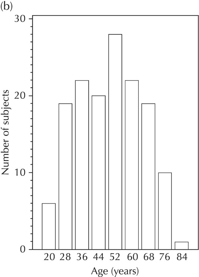
5.5.1 EDA: Population Description
Study 1
Study 2
Study 3
Pooled dataset
Weight (kg)
Mean (SD)
74.0 (13.1)
76.3 (15.1)
81.7 (16.8)
79.2 (17.3)
Median
70.1
75.4
79.9
78.5
Min, max
44.3, 109.1
51.9, 107.9
48.3, 131.4
44.3, 131.4
n
50
50
200
300
Age (years)
Mean (SD)
24.6 (4.7)
27.2 (6.8)
44.7 (11.2)
41.9 (12.1)
Median
23.0
25.6
45.2
40.7
Min, max
18. 39
19, 45
26, 61
18.61
n
50
50
200
300
Gender
Female n (%)
28 (56.0)
26 (52.0)
113 (56.5)
167 (55.7)
Male n (%)
22 (44.0)
24 (48.0)
87 (43.5)
133 (44.3)
Race
Caucasian n (%)
24 (48.0)
19 (38)
123 (61.5)
166 (55.3)
Black n (%)
12 (24.0)
11 (22.0)
29 (14.5)
52 (17.3)
Other n (%)
14 (28.0)
11 (22.0)
31 (15.5)
56 (18.7)
Asian n (%)
0 (0.0)
9 (18.0)
17 (8.5)
26 (8.7)
Renal function
Normal n (%)
39 (78.0)
37 (74.0)
133 (66.5)
209 (69.7)
Mild impairment n (%)
10 (20.0)
9 (18.0)
45 (22.5)
64 (21.3)
Moderate impairment n (%)
1 (2.0)
4 (8.0)
19 (9.5)
24 (8.0)
Severe impairment n (%)
0 (0.0)
0 (0.0)
3 (1.5)
3 (1.0)
100-mg dose
200-mg dose
Weight (kg)
Mean (SD)
78.7 (16.1)
79.9 (17.1)
Median
76.5
79.5
Min, max
44.3, 120.6
52.7, 131.4
n
120
180
Age (years)
Mean (SD)
36.9 (9.6)
42.5 (11.6)
Median
34.7
42.7
Min, max
18, 39
28, 61
n
120
180
Gender
Female n (%)
77 (64.2)
90 (50.0)
Male n (%)
43 (35.8)
90 (50.0)
Race
Caucasian n (%)
24 (48.0)
19 (38)
Black n (%)
12 (24.0)
11 (22.0)
Other n (%)
14 (28.0)
11 (22.0)
Asian n (%)
0 (0.0)
9 (18.0)
Renal function
Normal n (%)
39 (78.0)
37 (74.0)
Mild impairment n (%)
10 (20.0)
9 (18.0)
Moderate impairment n (%)
1 (2.0)
4 (8.0)
Severe impairment n (%)
0 (0.0)
0 (0.0) 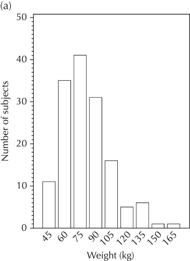
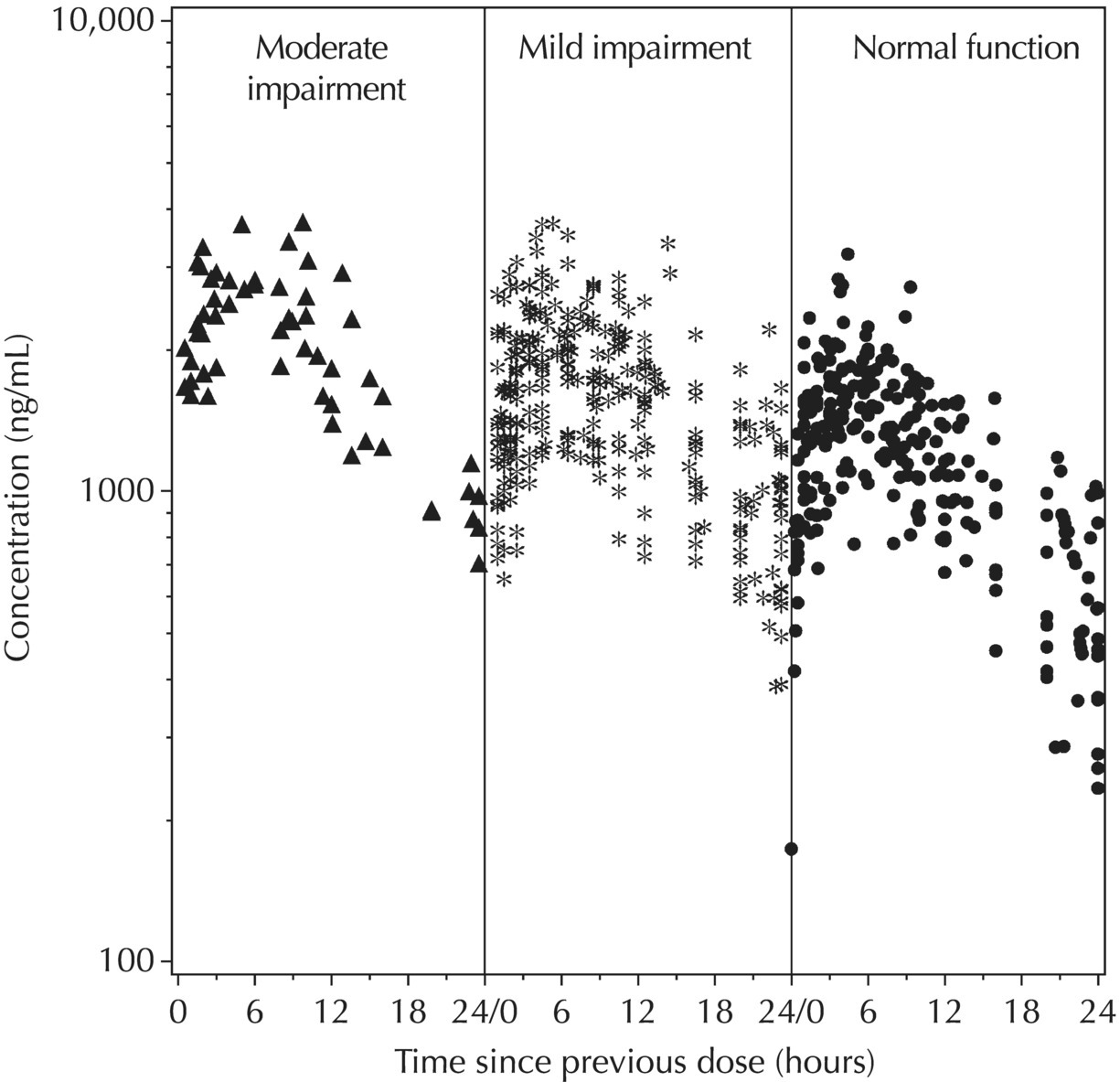
5.5.2 EDA: Dose-Related Data
ADDL
n,%
0
100, 33.3%
41
7, 2.3%
42
192, 64.0%
43
1, 0.3%
SS
n,%
0
100, 33.3%
1
199, 66.3%
2
1, 0.3%
II
n,%
0
100, 33.3%
24
200, 66.7%
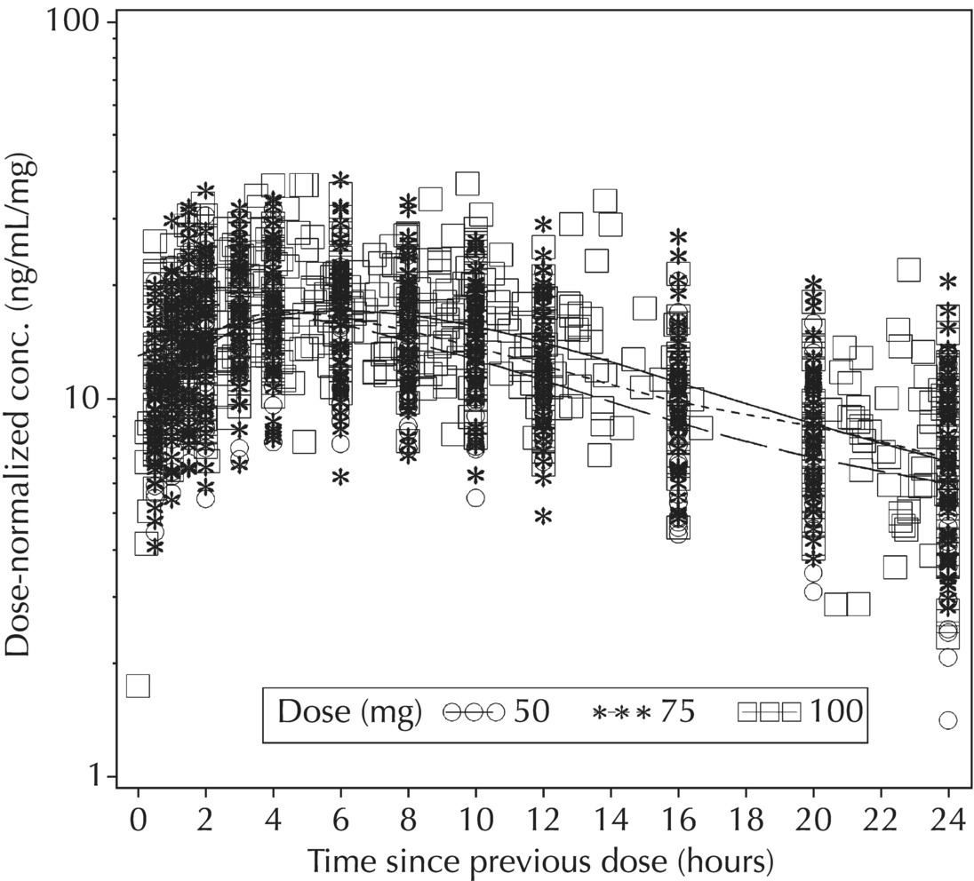
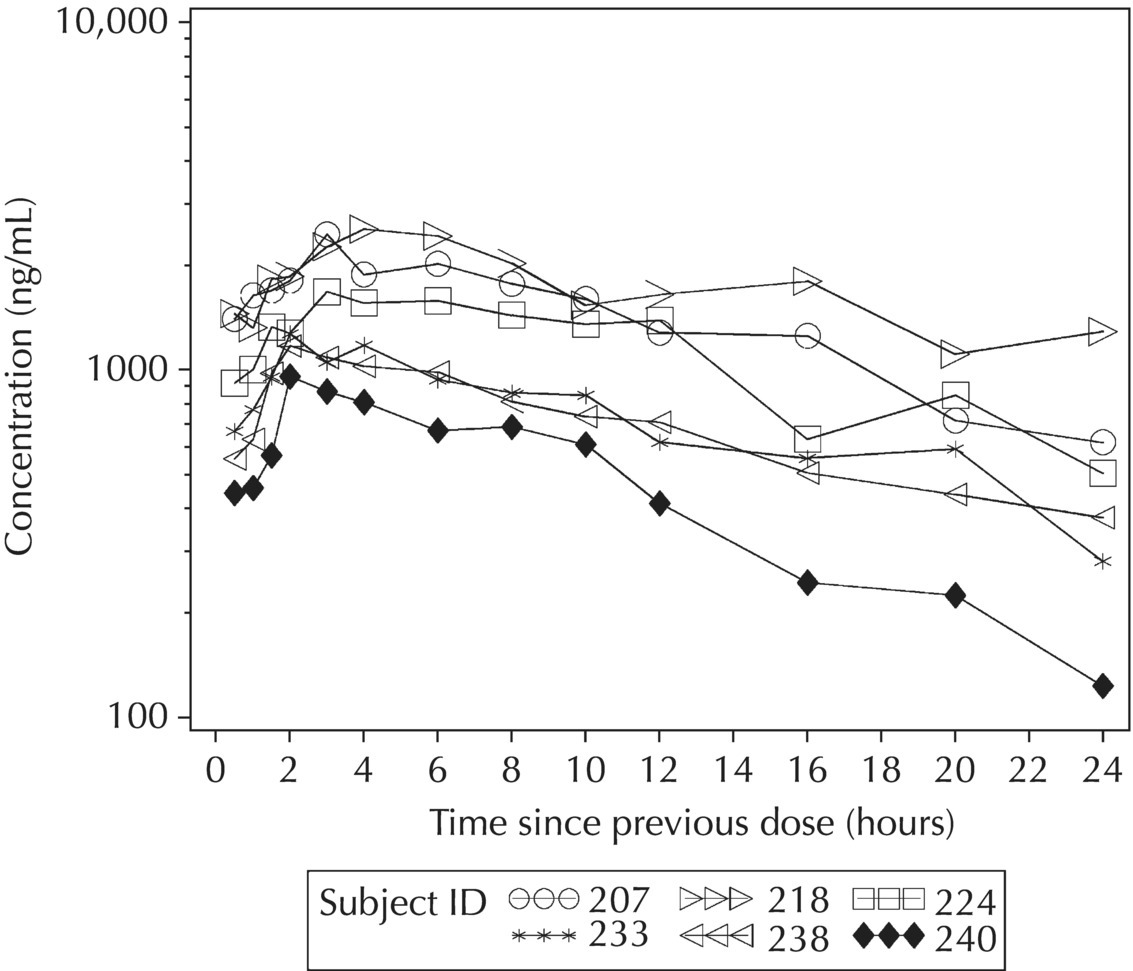
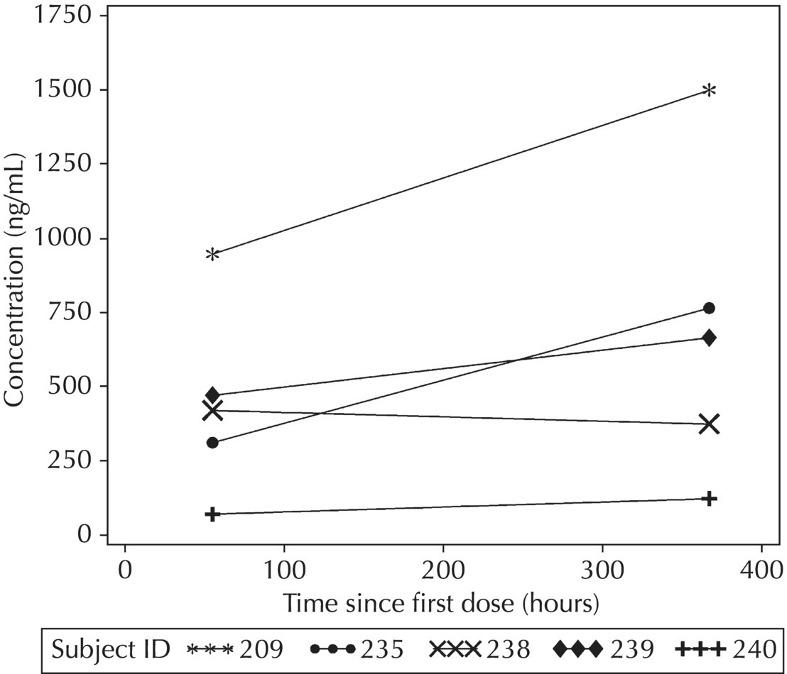
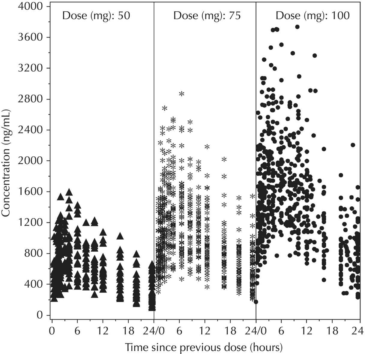
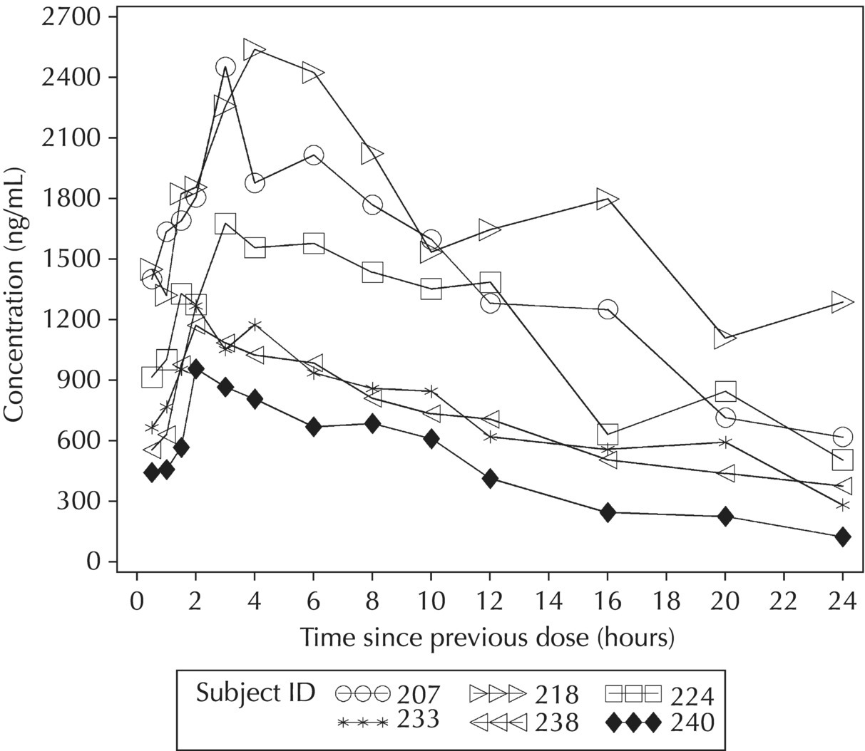
5.5.3 EDA: Concentration-Related Data
Sampling timepoint (hours since last dose)
100-mg dose group (n = 120)
200-mg dose group (n = 180)
0.5
0.5% BLQ
0.1% BLQ
99.5% > BLQ
99.9% > BLQ
1.0
0% BLQ
0% BLQ
100% > BLQ
100% > BLQ
2.0
0% BLQ
0% BLQ
100% > BLQ
100% > BLQ
4.0
0% BLQ
0% BLQ
100% > BLQ
100% > BLQ
8.0
1.5% BLQ
0% BLQ
98.5% > BLQ
100% > BLQ
12.0
4.7% BLQ
0.6% BLQ
95.3% > BLQ
99.4% > BLQ
24.0
11.2% BLQ
3.7% BLQ
88.8% > BLQ
96.3% > BLQ

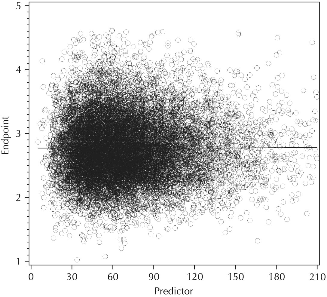
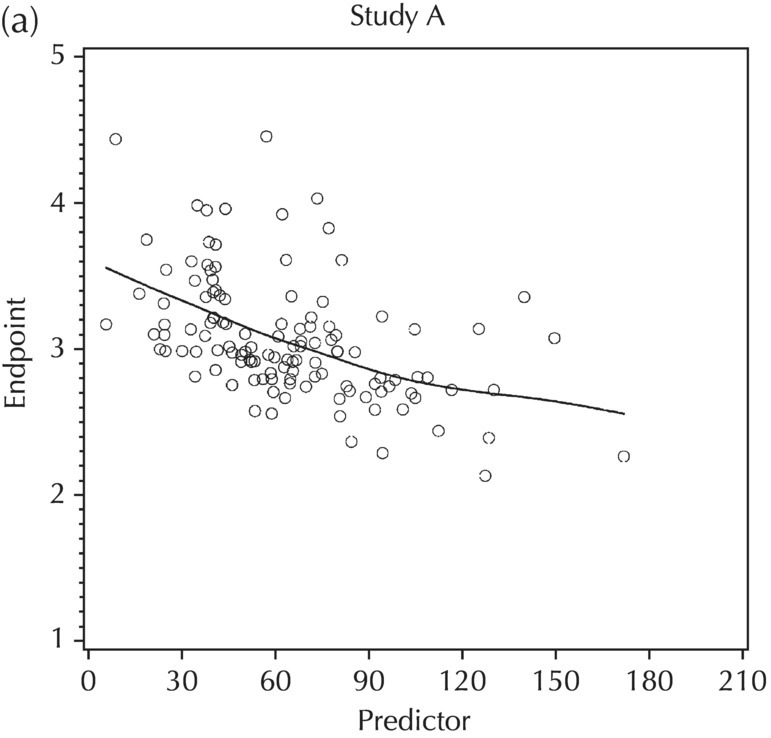
5.5.4 EDA: Considerations with Large Datasets
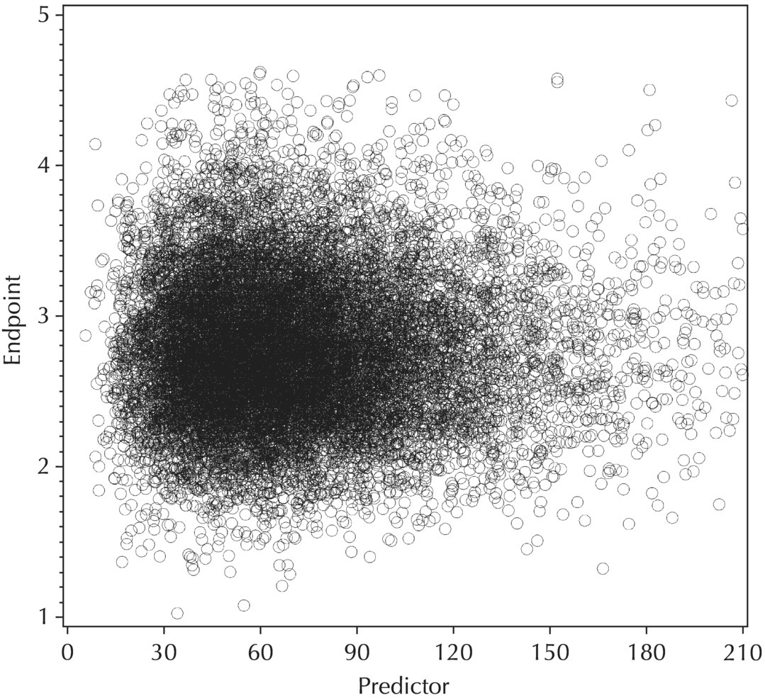
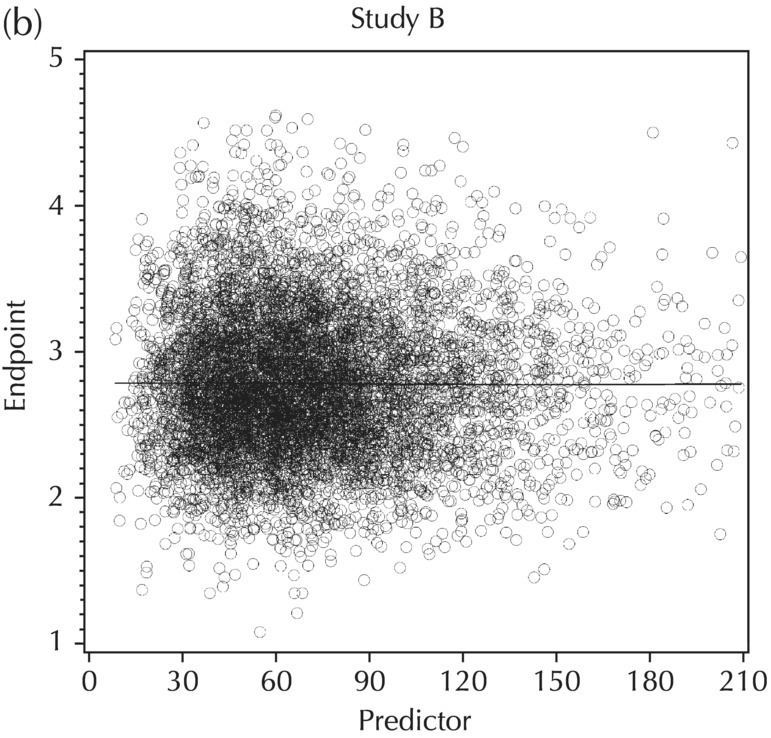
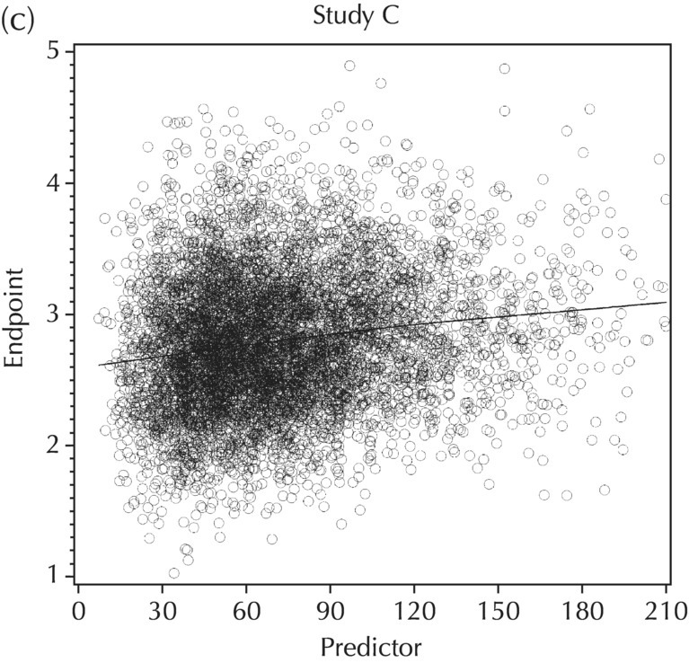
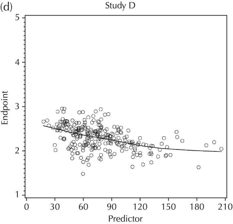
5.5.5 EDA: Summary
5.6 Base Model Development
5.6.1 Standard Model Diagnostic Plots and Interpretation
5.6.1.1 PRED versus DV
5.6.1.2 WRES versus PRED
5.6.1.3 RES versus PRED
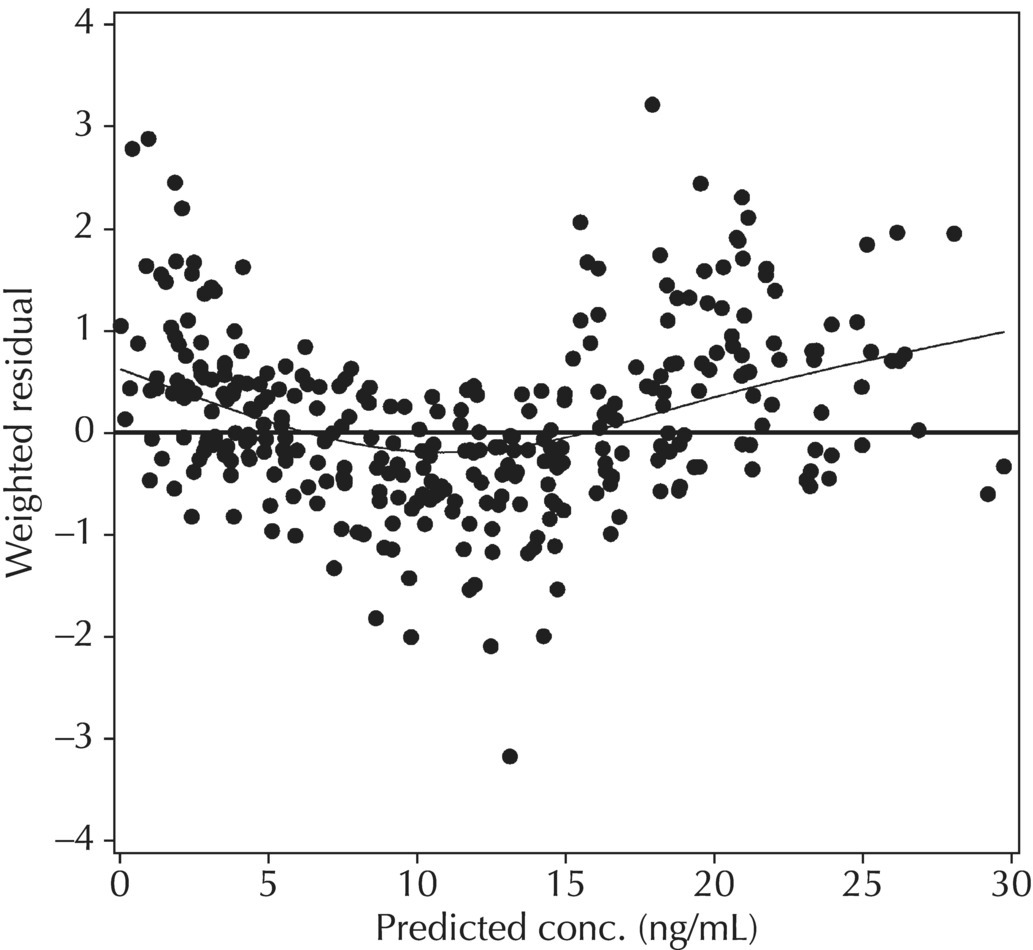
5.6.1.4 WRES versus TIME
5.6.1.5 Conditional Weighted Residuals (CWRES)
5.6.1.6 Typical Value Overlay Plot

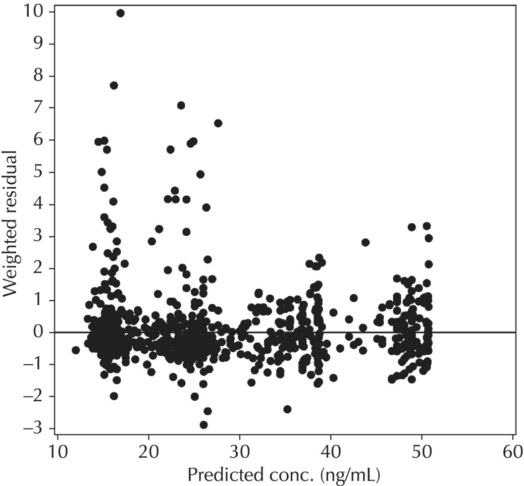
5.6.1.7 Typical Value Overlay Plot for Models with Covariate Effects
5.6.2 Estimation of Random Effects
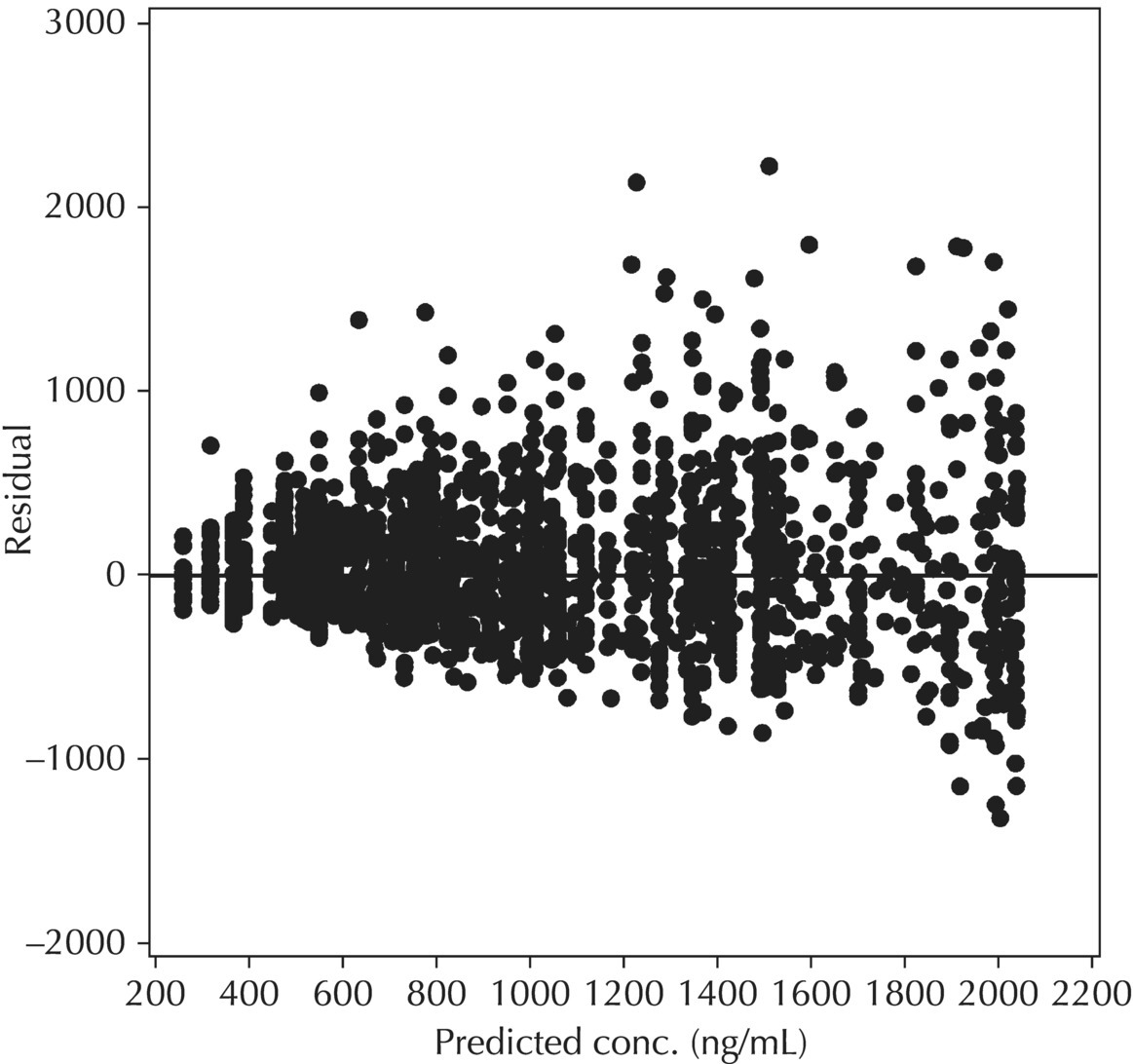
5.6.2.1 Diagnostic Plots for Random-Effect Models
 $ERROR

 IPRED = F

 W=F

 IRES = DV-IPRED

 IWRES = IRES/W

 Y = IPRED + W*EPS(1)
W = SQRT(1 + THETA(n)**2*F**2) or (ii) W = SQRT(F**2 + THETA(n)**2), where THETA(n) is defined as the ratio of the additive to proportional components of residual variability (RV) in (i) or the proportional to the additive components of RV in (ii). THETA(n) should be initialized in $THETA with a lower bound of 0 for either parameterization. Note also that for each of these residual variability models implemented with this coding structure, the IWRES value calculated as shown above (i.e., IRES/W) needs to be divided by the estimate of EPS(1)  in order to maintain the appropriate scaling.
$ERROR
IPRED = F
W = THETA(X)
; for additive RV
W = THETA(Y)*IPRED
; for proportional or CCV RV
W = SQRT(THETA(X)**2 + (THETA(Y)*IPRED)**2)
; for additive plus CCV RV
W = SQRT(THETA(Y)**2 + (THETA(X)/IPRED)**2)
; for additive plus CCV RV on a log-scale (to use this model and coding, the data must be log-transformed and IPRED must be defined as LOG(F))
IWRES = (DV – IPRED) / W
Y = IPRED + W*EPS(1)
$SIGMA 1 FIX
 $ERROR

 IPRED = F

 W = SQRT(IPRED**2*SIGMA(1,1) + SIGMA(2,2))   ; for additive plus CCV RV

 IWRES = (DV – IPRED) / W

 Y = IPRED + IPRED*EPS(1) + EPS(2)
$SIGMA 0.04 10
With this variation, the IWRES does not need to be scaled and no thetas are required to code the residual variability elements. In addition, the interpretation of the two epsilon terms is facilitated and alternative structures can easily be evaluated by simply fixing one or the other epsilon term to 0.
With any of the variations for residual variability coding described earlier, in addition to the IPRED value that can be output to a table file or included in diagnostic plots, the IRES and IWRES values are also calculated and defined as expected based on the IPRED definition. The IRES values are the individual-specific residuals or the difference between the measured value and the individual-specific prediction based on the model (including ETA terms). IRES values (similar to RES) are, therefore, calculated in units of the measured dependent value. The individual weighted residual (IWRES) is the individual-specific weighted residual based on the model (THETAs and ETAs) and considering the weighting scheme implemented in the residual variability model; it is the individual residual scaled by the defined weighting factor, W.
5.6.2.2 IPRED versus DV
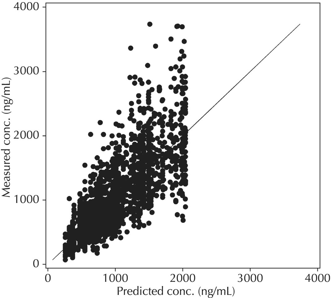
Although PRED versus DV is the most common model diagnostic plot used today, the IPRED versus DV plot is likely the most commonly reported and published model diagnostic plot. A scatterplot of IPRED versus DV compares the measured values with the corresponding individual-specific predicted values. This plot portrays the goodness-of-fit of the model after accounting for the influence of the subject-specific random-effect terms. Because much of the unexplained variability in PK models lies in the between-subject realm, once these differences are accounted for, the DV versus IPRED plot often demonstrates a large improvement over the similar DV versus PRED version. In the perfect model fit, individual predictions are identical to measured values and all points would fall on a line with unit slope indicating this perfect correspondence. Scatterplots of individual predicted versus observed values are typically plotted with such a unit slope or identity line overlaid on the points themselves. For the nonperfect model (i.e., all models), this plot is viewed with an eye toward symmetry in the density of points on either side of such a unit slope line across the entire range of measured values and the relative tightness with which points cluster around the line of identity across the range of values. Systematic under- or overprediction of points in this plot indicate an issue with the model fit that cannot be corrected with the flexibility introduced through interindividual random-effect terms. Figure 5.41 illustrates a representative scatterplot of observed concentrations versus individual predicted values.
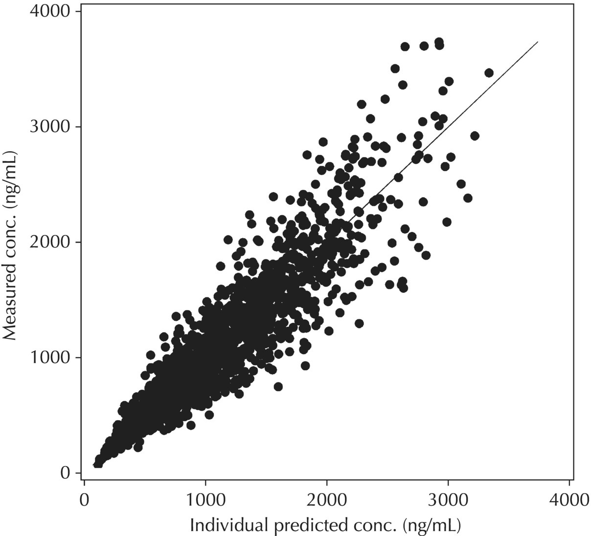
Figure 5.41 Scatterplot of observed concentrations versus individual predicted values illustrating a good fit.
5.6.2.3 IWRES versus IPRED and |IWRES| versus IPRED
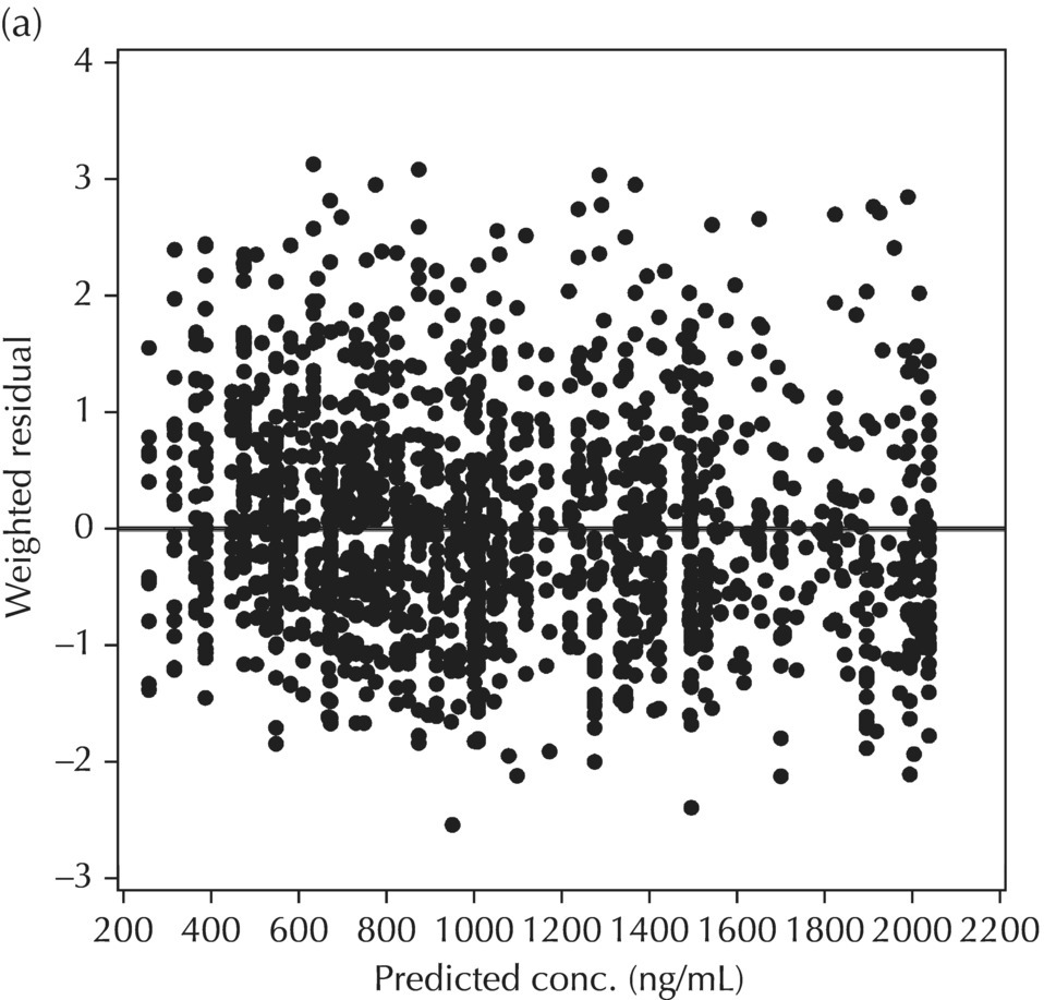
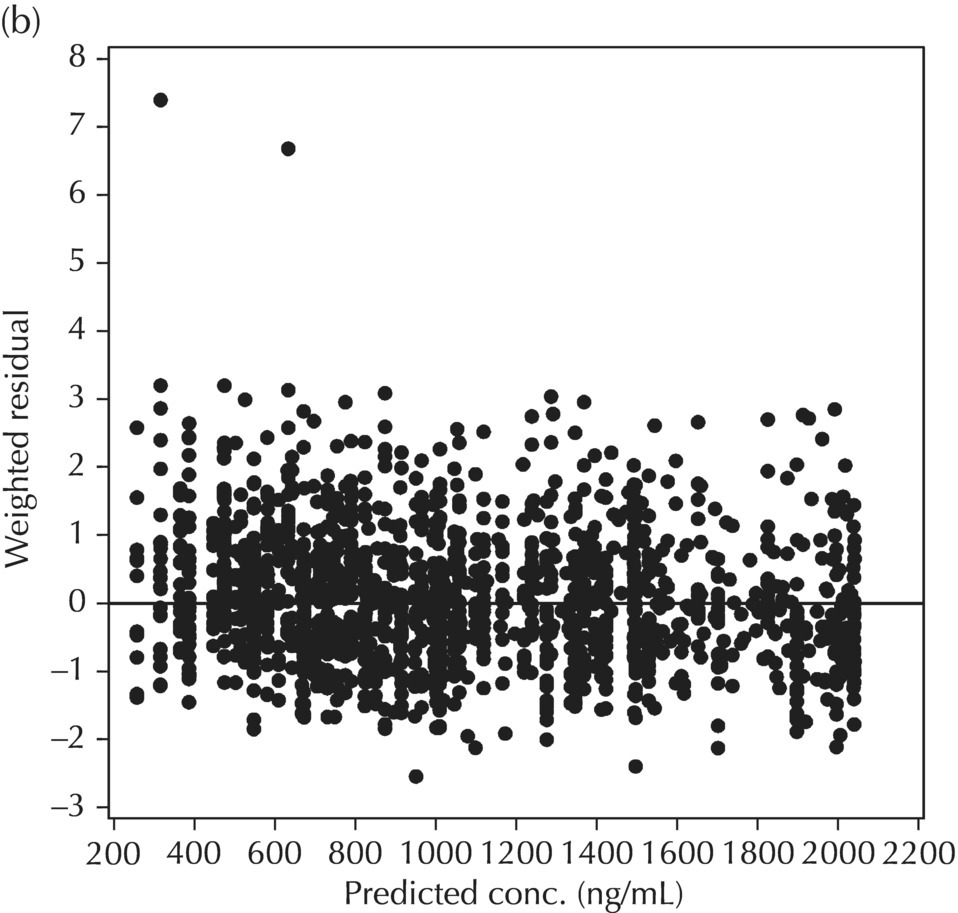
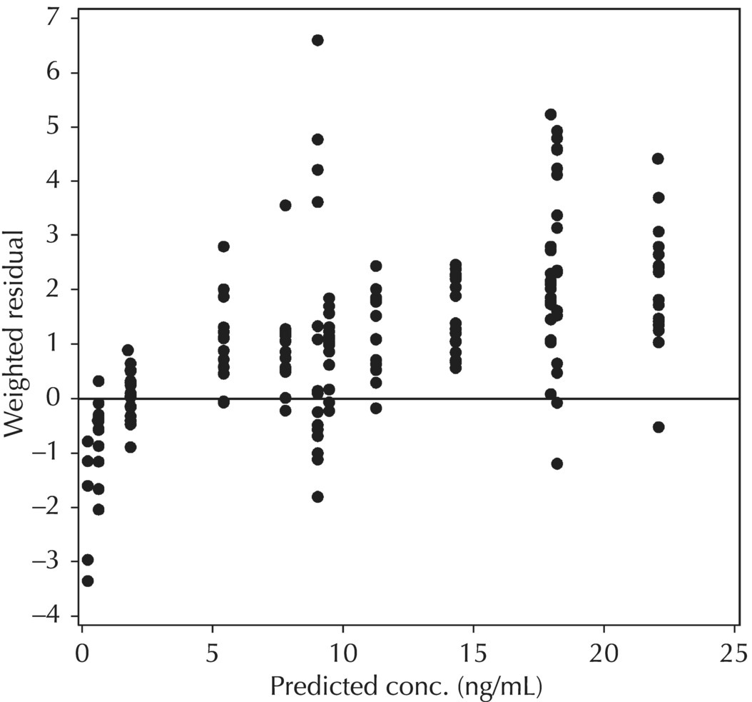
Two plots illustrative of the appropriateness of the selected residual variability model are variations of the scatterplot of the individual weighted residuals versus the individual predicted values. As with the population weighted residuals (WRES), the magnitude of the IWRES (in absolute value) is an indication of which points are relatively well fit and which are less well fit by the model. A model fit with appropriately characterized residual variability will be indicated in these plots by a symmetric distribution of points around IWRES = 0 across the entire range of individual predicted values and a flat and level smooth line in the |IWRES| versus IPRED version. Figure 5.42 illustrates a model with no apparent misfit in the specification of residual variability. Obvious trends or patterns in either of these plots, such as a gradually increasing spread of IWRES with increasing IPRED values, indicate greater variability in higher predictions as compared to lower ones and the possible inappropriate use of an additive RV model when a CCV model may be warranted; this is illustrated in Figure 5.43. Conversely, decreasing spread in IWRES with increasing IPRED may indicate that an additive model would be a more appropriate characterization of the data than a CCV model; this pattern is illustrated in Figure 5.44.
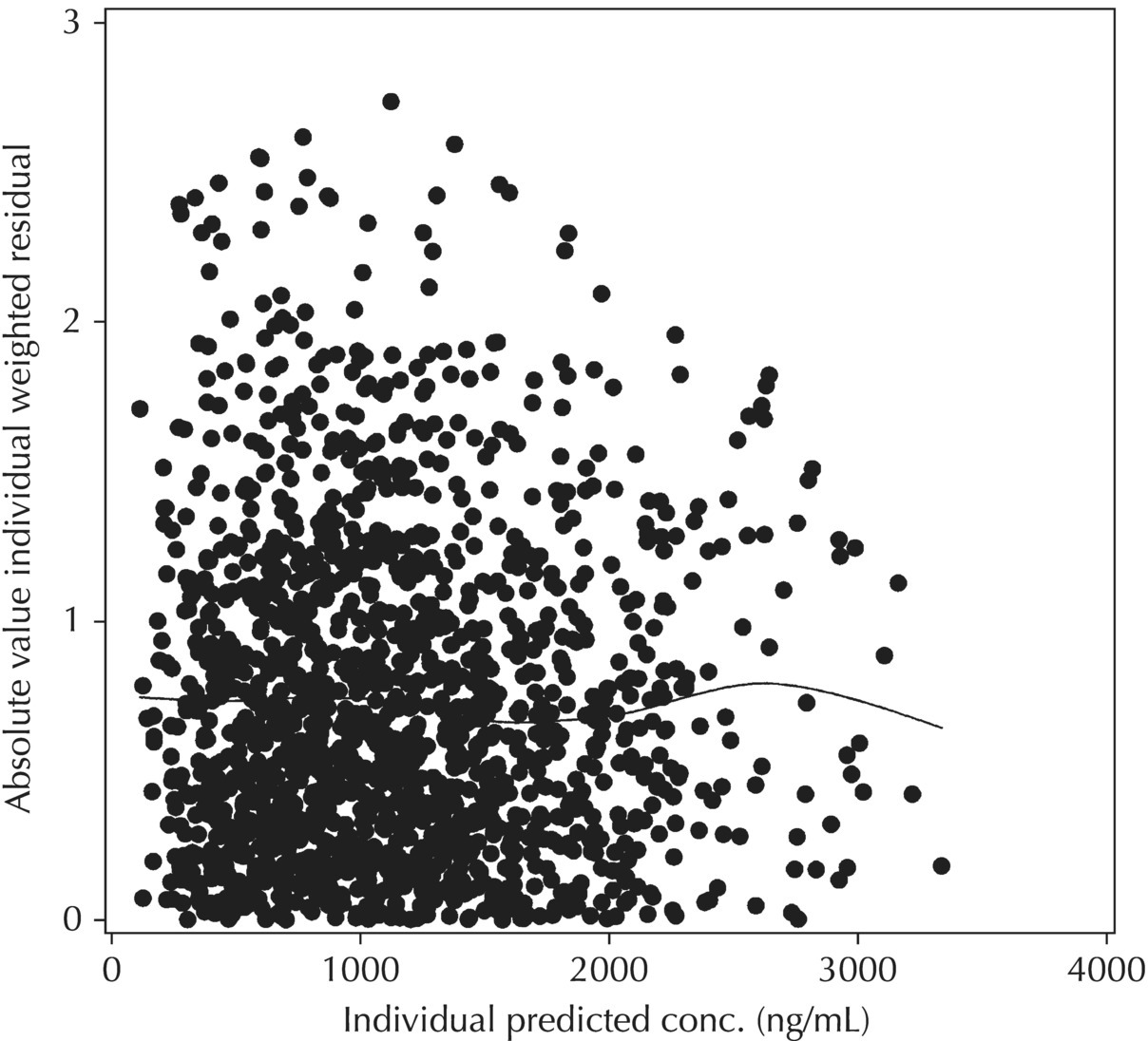
Figure 5.42 Scatterplot of the absolute value of the individual weighted residuals versus the individual predictions, indicating no lack of fit.
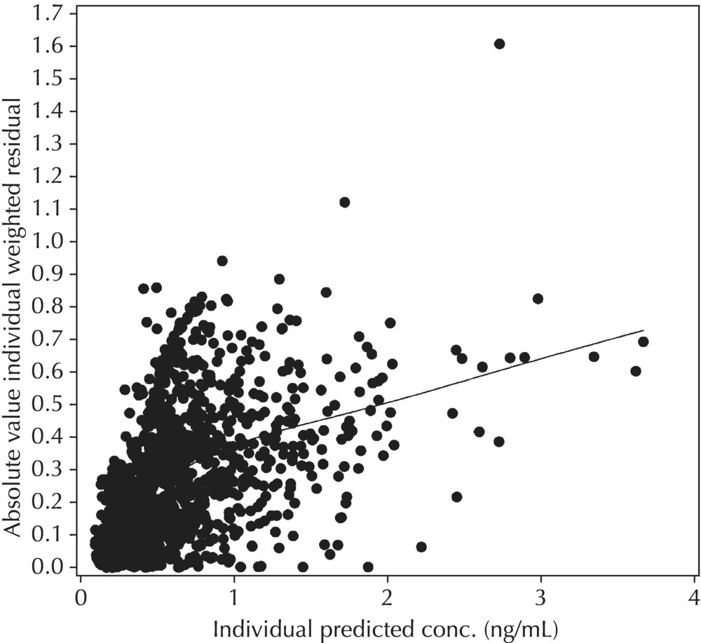
Figure 5.43 Scatterplot of the absolute value of the individual weighted residuals versus the individual predictions, indicating an increasing spread with increasing individual predictions. This pattern may result from the inappropriate use of an additive RV model when a CCV model may be warranted.
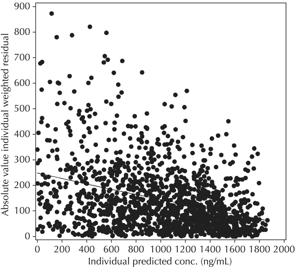
Figure 5.44 Scatterplot of the absolute value of the individual weighted residuals versus the individual predictions, indicating a decreasing spread with increasing individual predictions. This pattern may result from the use of a proportional or CCV RV model when an additive model would be more appropriate.
Note that a number of different variations on the predictions, residuals, and weighted residuals may now be requested directly from NONMEM, with version 7. In addition to the (standard) conditional weighted residuals, conditional predictions (CPRED) and conditional residuals (CRES) may be requested. In addition, conditional weighted residuals with interaction (assuming that the INTERACTION option was specified on $EST) named CWRESI, along with the corresponding CPREDI and CRESI, the conditional predictions and residuals accounting for eta–epsilon interaction, may be requested for output in $TABLE or for use in plotting with $SCAT (Beal et al. 1989–2011). Refer to Chapter 3 for additional detail on the $TABLE and $SCATTERPLOT records.
5.6.3 Precision of Parameter Estimates (Based on $COV Step)
While the significance of a successful $COVARIANCE step has been a point of contention and disagreement among pharmacometricians, when successfully completed, the output from this step can be used as an indication of the precision of the NONMEM parameter estimates. When the $COV step has been requested along with a particular model estimation and it completes successfully, standard errors are obtained for each element of THETA, OMEGA, and SIGMA which was estimated. Considering each of these standard errors in relation to the corresponding parameter estimate (i.e., as a percentage: standard error of the estimate divided by the final parameter estimate times 100 or SE(θn)/FPE(θn) × 100) allows one to compare the relative precision by which each of the fixed- and random-effect parameter estimates were obtained; for random-effect terms, we can similarly calculate the %RSE (or percent relative standard error) as  for the parameter, ETA(n). This statistic is sometimes referred to as a percent standard error of the mean (%SEM) and sometimes as a percent relative standard error (%RSE). Generally speaking, fixed-effect estimates with relative precisions below 30% are regarded as precisely estimated. Random-effect estimates are often obtained with less precision and values below 40–50% are generally regarded as reasonably precisely estimated.
An alternative calculation for the precision of random-effect terms is sometimes used. The calculation above for the %RSE of an element of OMEGA was performed on the variance (squared) scale. If one wishes to calculate the relative standard error of the random-effect terms on the SD scale (since we often think of these estimates in %CV terms anyway), one could take advantage of the delta method that uses the FO approximation of the variance, and the corresponding estimate of %RSE for an element of OMEGA or SIGMA would be calculated as follows: