FIGURE 4-1 Theoretical distribution from rolling a die 600 times.
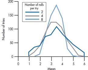
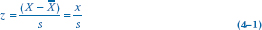
FIGURE 4-2 Computer simulation of averaging the sum of rolling the die 2, 4, and 8 times, each done 600 times.
We can illustrate this with another gedanken experiment. Imagine that we had a die that we rolled 600 times, and we recorded the number of times each face appeared. If the die wasn’t loaded (and neither were we), no face would be expected to appear more often than any other. Consequently, we would expect that each number would appear one-sixth of the time, and we would get a graph that looks like Figure 4-1. This obviously is not a normal distribution; because of its shape, it’s referred to as a rectangular distribution.
Now, let’s roll the die twice and add up the two numbers. The sums could range from a minimum of 2 to a maximum of 12. But this time, we wouldn’t expect each number to show up with the same frequency. There’s only one way to get a 2 (roll a 1 on each throw) or a 12 (roll a 6 each time), but two ways to roll a 3 (roll a 1 followed by a 2, or a 2 followed by a 1), and five ways to roll a 6. So, because there are more ways to get the numbers in the middle of the range, we expect that they will show up more often than those at the extremes. This t endency becomes more and more pronounced as we roll the die more and more times.
We did a computer simulation of this; the results are shown in Figure 4-2. The computer “rolled” the die twice, added the numbers, and divided by 2 (i.e., took the mean for a sample size of 2) 600 times; then it “rolled” the die four times, added the numbers, and divided by 4 (the mean for a sample size of 4) for 600 trials; and again rolled the die 8 times and divided by 8. Notice that rolling the die even twice, the distribution of means has lost its rectangular shape and has begun to look more normal. By the time we’ve rolled it 8 times, the resemblance is quite marked. This works with any underlying distribution, no matter how much it deviates from normal. So, the Central Limit Theorem guarantees that, if we take enough even moderately sized samples (“enough” is usually over 30), the means will approximate a normal distribution.
STANDARD SCORES
Before we get into the intricacies of the normal distribution, we have to make a minor detour. If hundreds of variables were normally distributed, each with its own mean and SD, we’d need hundreds of tables to give us the necessary specifications of the distributions. This would make publishers of these tables ecstatic, but everyone else mildly perturbed. So statisticians have found a way to transform all normal distributions so that they (the distributions, not the statisticians) use the same scale. The idea is to specify how far away an individual value is from the mean by describing its location in standard deviation (SD) units. When we transform a raw score in this manner, we call the results a standard score.
A standard score, abbreviated as z or Z, is a way of expressing any raw score in terms of SD units.
TABLE 4–1 Data in Table 3–2 transformed into standard scores
| X | z |
| 1 | −1.53 |
| 3 | −1.15 |
| 4 | −0.96 |
| 7 | −0.38 |
| 9 | 0 |
| 9 | 0 |
| 11 | 0.38 |
| 12 | 0.57 |
| 16 | 1.34 |
| 18 | 1.72 |
The standard score
Adding a bit to the confusion, Americans pronounce this as “zee scores,” whereas Brits and Canadians say “zed score.“5 A standard score is calculated by subtracting the mean of the distribution from the raw score and dividing by the SD. Just to try this out, let’s go back to the data in Table 3-2; we found that civil servants took an average of 9.0 coffee breaks per day, with a SD of 5.22. A raw score of 1 coffee break a day corresponds to:
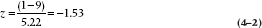
that is, -1.53 SD units, or 1.53 SD units below the mean. We can do the same thing with all of the other numbers, and these are presented in Table 4-1.
In addition to allowing us to compare against just one table of the normal distribution instead of having to cope with a few hundred tables, z-scores also have other uses. They allow us to compare scores derived from various tests or measures. For example, several different scales measure the degree of depression, such as the Beck Depression Inventory (BDI; Beck et al, 1961) and the Self-Rating Depression Scale (SDS; Zung, 1965). The only problem is that the BDI is a 21-item scale, with scores varying from a minimum of 0 to a maximum of 63; whereas the SDS is a 20-item scale with a possible total score between 25 and 100. How can we compare a score of, say, 23 on the BDI with a score of 68 on the SDS? It’s a piece of cake, if we know the mean and SD of both scales. To save you the trouble of looking these up, we’ve graciously provided you with the information in Table 4-2.
What we can now do is to transform each of these raw scores into a z-score. For the BDI score of 23:
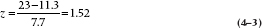
Similarly, for the SDS score of 68:
TABLE 4–2 Mean and standard deviations of two depression scales
| Beck Depression Inventory | Self-Rating Depression Scale | |
| Mean | ||
| 11.3 | 52.1 | |
| SD | ||
| 7.7 | 10.5 |
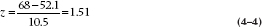
So, these transformations tell us that the scores are equivalent. They each correspond to z-scores of about 1.5; that is, ½ SD units above the mean. Let’s just check these calculations. In the case of the BDI, the SD is 7.7, so ½ SD units is (1.5 × 7.7) = 11.6. When we add this to the mean of 11.3, we get 22.9, which is (within rounding error) what we started off with, a raw score of 23. This also shows that if we know the mean and SD, we can go from raw scores to z-scores, and from z-scores back to raw scores. Isn’t science wonderful?
There are a few points to note about standard scores that we can illustrate using the data in Table 4-1. First, the raw score of 9, which corresponds to the mean, has a z-score of 0.0; this is reassuring, because it indicates that it doesn’t deviate from the mean. Of course, not every set of data contains a score exactly equal to the mean; however, to check your calculations, any score that is close to the mean should have a z-score close to 0.0. Second, if we add up the z-scores, their sum is 0 (plus or minus a bit of rounding error). This will always be the case if we use the mean and SD from the sample to transform the raw scores into z-scores. It is the same reason that the mean deviation is always 0; the average deviation of scores about their mean is 0, even if we transform the raw scores into SD units (or any other units). A third point about standard scores is that if you take all the numbers in the column marked z in Table 4-1 and figured out their SDs, the result will be 1.0. By definition, when you convert any group of numbers into z-scores, they will always have a mean of 0.0 and a standard deviation of 1.0 (plus or minus a fudge factor, for rounding error).
However, we don’t have to use the mean and SD of the sample from which we got the data; we can take them from another sample, or from the population. We do this when we compare laboratory test results of patients against the general (presumably healthy) population. For instance, if we took serum rhubarb levels from 100 patients suffering from hyperrhubarbemia6 and transformed their raw scores into z-scores using the mean and SD of those 100 scores, we would expect the sum of the z-scores to be 0. But if we used the mean and SD derived from a group of normal7 subjects, then it’s possible that all of the patients’ z-scores would be positive.
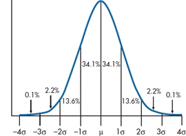
FIGURE 4-3 The normal curve.
TABLE 4–3 A portion of the table of the normal curve
| z | Area below |
| 0.00 | .0000 |
| 0.10 | .0398 |
| 0.20 | .0793 |
| 0.30 | .1179 |
| 0.40 | .1554 |
| 0.50 | .1915 |
| 0.60 | .2257 |
| 0.70 | .2580 |
| 0.80 | .2881 |
| 0.90 | .3159 |
| 1.00 | .3413 |
| 1.00 | .3413 |
| 1.10 | .3643 |
| 1.20 | .3849 |
| 1.30 | .4032 |
| 1.40 | .4192 |
| 1.50 | .4332 |
| 1.60 | .4452 |
| 1.70 | .4554 |
| 1.80 | .4641 |
| 1.90 | .4713 |
| 2.00 | .4772 |
THE NORMAL CURVE
Now armed with all this knowledge, we’re ready to look at the normal curve itself, which is shown in Figure 4-3. Notice a few properties:
- The mean, median, and mode all have the same value.
- The curve is symmetric around the mean; the skew is 0.
- The kurtosis is also 0, although you’ll have to take our word for this.
- The tails of the curve get closer and closer to the X-axis as you move away from the mean, but they never quite reach it, no matter how far out you go. In mathematical jargon, the curve approaches the X-axis asymptotically.
- For reasons we’ll discuss in Chapter 6, we’ve used μ (the Greek mu) for the mean and σ (lower-case sigma) for the SD.
Stay updated, free articles. Join our Telegram channel

Full access? Get Clinical Tree


