FIGURE 2-1 Bar chart of the five least popular courses
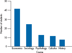
FIGURE 2-2 Figure 2-1 redrawn so that the categories are in order of preference and the tick marks are outside the axes.
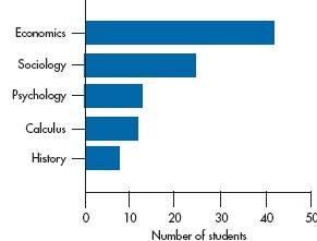
FIGURE 2-3 Figure 2-2 redrawn so that the bars are horizontal.
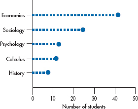
FIGURE 2-4 Figure 2-3 redrawn as a point graph.
At first glance, this doesn’t look too bad! However, we can make it look even better. It’s obvious that the data are nominal; the order is arbitrary, so we can change the categories around without losing anything. In fact, we gain something if we rank the courses so that the highest count is first and the lowest one is last. Now the relative standing of the courses is more readily apparent. (As a minor point, it’s often better to put the tick marks outside the axes rather than in. When the data fall near the F-axis, a tick mark inside the axis may obscure the data point, or vice versa.) Making these two changes gives us Figure 2-2.
This is the way most bar charts of nominal data looked until recently. Within recent years, though, things have been turned on their ear—literally. If the names of the categories are long, things can look pretty cluttered down there on the bottom. Also, some research (Cleveland, 1984) has shown that people get a more accurate grasp of the relative sizes of the bars if they are placed horizontally. Adding this twist (pun intended), we’ll end up with Figure 2-3.
Variation 1: Dot Plots
Another variant of the bar chart that is particularly useful when there are many categories is the dot plot, as shown in Figure 2-4. Instead of a bar, just a heavy dot is placed where the end of the bar would be. When there are many labels, smaller dots that extend back to the labeled axis are often used to make the chart easier to read.
Graphing Ordinal Data
The use of bar charts isn’t limited to nominal data; it can be used with all four types. However, a few other considerations should be kept in mind when using them with ordinal, interval, and ratio data. The first, which would seem obvious, is that because the values are ordered, you can’t blithely move the categories around simply to make the graph look prettier. If you were graphing the number of students who received Excellent/Satisfactory/Unsatisfactory ratings, it would confuse more than help if you put them in the order: Satisfactory/Excellent/Unsatisfactory just because most students were in the first category.
Graphing Interval and Ratio Data
A few other factors have to be considered in graphing interval and ratio data. Let’s say we have some data on the number of tissues dispensed each day by a group of 75 social workers. We look at our data, and we find that the lowest number is 10 and the highest is 117. The difference between the highest and lowest value is 107. (This difference is called the range. We’ll define it a bit more formally later in the next chapter.) If we have one bar for each value, we’ll run into a few problems. First, we have more possible values than data points, so some bars will have a “height” of zero units, and many others will be only one or two units high. This leads to the second prob-lem, in that it will be hard to discern any pattern by eyeballing the data. Third, the X-axis is going to get awfully cluttered. For these reasons, we try to end up with between 10 and 20 bars on the axis.3
To do this, we make each bar represent a range of numbers; what we refer to as the interval width. If possible, use a width that most people are comfortable with: 2, 5, 10, or 20 points. Even though a width of 6 or 7 may give you an esthetically beautiful picture, these don’t yield multiples that are easily comprehended. Let’s use an example.
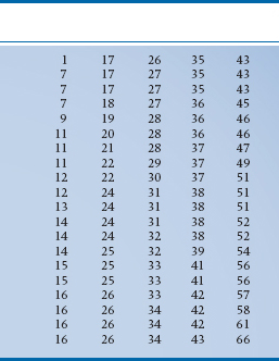
If we took 100 fourth-year nursing students and asked them how many bedpans they emptied in the last month, we’d get 100 answers, as in Table 2-2. The main thing a table like this tells us is that it’s next to impossible to make sense of a table like this. We’re overwhelmed by the sheer mass of numbers, and no pattern emerges. In fact, it’s very hard even to figure out what the highest and lowest numbers are; who’s been working like a Trojan and who’s been goofing off. To make our lives (and all of the next steps) easier, the first thing we should do is to put the data in rank order,4 starting with the smallest number and ending with the highest. Two notes are in order. First, you can go from highest to lowest if you wish, it makes no difference. Second, most computers have a simple routine, usually called SORT, to do the job for you. Once we do this, we’ll end up with Table 2-3.
With this table we can immediately see the highest and lowest values and get at least a rough feel for how the numbers are distributed; not too many between 1 and 10 or between 60 and 70, and many in the 20s and 30s. We also see that the range (66 – 1) = 65; far too large to graph when letting each bar stand for a unique number. An interval width of 10 would give us 7 boxes (not quite enough for our esthetic sense), whereas a width of 2 would result in 33 boxes (which is still too many). A width interval of 5 yields 14 boxes (which is just right). To help us in drawing the graph, we could make up a summary table, such as Table 2-4, which gives the interval and the number of subjects in that interval.
There are a few things to notice about this table. First, there are two extra columns, one labeled Midpoint and the other labeled Cumulative Total. The first is just what the name implies: It is the middle of the interval. Because the first interval consists of the numbers 0, 1, 2, 3, and 4, the midpoint is 2. If there were an even number of numbers, say 0, 1, 2, and 3, then the midpoint would again be in the middle. This time, though, it would fall halfway between the 1 and 2, and we would label it 1.5. The other added column, the Cumulative Total, is simply a running sum of the number of cases; the first interval had 1 case, and the second 4, so the cumulative total at the second interval is (1 + 4) = 5. The 9 cases in the third interval then produce a cumulative total of (5 + 9) = 14. This is very handy because, if we didn’t end up with 100 at the bottom, we would know that we messed up the addition somewhere along the line. The other point to notice is the interval. The first one goes from 0 to 4, the second from 5 to 9, and so on. Don’t fall into the trap of saying an interval width of 5 covers the numbers 0 to 5; that’s actually 6 digits.
TABLE 2–2 Number of bedpans emptied by 100 fourth-year nursing students in the past month
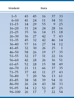
TABLE 2–3 Data from Table 2–2 put in rank Order
Another point to notice is that we’ve paid a price r grouping the data to make it more readable, and that price is the loss of some information. We can tell from Table 2-4 that 1 person emptied between 0 and 4 bedpans, but we don’t know exactly how many. In the next interval, we see that 4 people emptied between 5 and 9 pans, but again we’re not sure precisely how many future nurses dumped what number of bedpans. The wider the interval, the more information is lost.
TABLE 2–4 A summary of Table 2–3, showing the intervals, midpoints, counts, and cumulative total
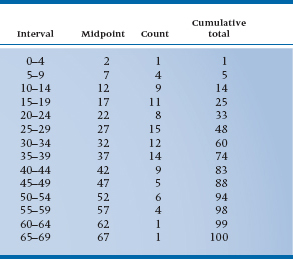
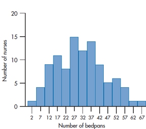
FIGURE 2-5 Histogram showing the number of bedpans emptied during the past month by each of 100 nursing students.
So, with these points in mind, we’re almost ready to start drawing the graph. There’s one last consideration, though: how to label the two axes. Looking at the count column in Table 2-4, we can see that the maximum number of cases in any one interval is 15. We would therefore want the F-axis to extend from 0 to some number over 15. A good choice would be 20, because this would allow us to label every fifth tick mark. Notice that on the X-axis, we’ve labeled the middle of the interval. If we labeled every possible number, the axis would look too cluttered; the midpoint cuts down on the clutter and (for reasons we’ll explore further in the next chapter) is the best single summary of the interval. Our end product would look like Figure 2-5
This figure differs from Figure 2-2 in a subtle way. In the earlier figure, because each category was different from every other one, we left a bit of a gap between bars. In Figure 2-5, the data are interval, so it makes both statistical as well as esthetic sense5 to have each bar abutting its neighbors. Now we can finally tell you the difference between bar charts and histograms:
Bar charts: There are spaces between the bars.
Histograms: The bars touch each other.
STEM-LEAF PLOTS AND RELATED FLORA
All these variants of histograms and bar charts are the traditional ways of taking a mess of data such as we found in Table 2-2 and transforming them into a graph such as Figure 2-5. The steps were as follows:
- Rank order the data.
- Find the range (the highest value minus the lowest).
- Choose and appropriate width to yield about 10 to 20 intervals.
- Make a new table consisting of the intervals, their midpoints, the count, and a cumulative total.
- Turn this into a histogram.
- Lose some information along the way, consisting of the exact values.
Tukey (1977) devised a way to eliminate steps 1 and 6 and to combine 4 and 5 into one step. The resulting diagram, called a Stem-and-Leaf Plot, thus consists of only three steps:
- Find the range.
- Choose an appropriate width to yield about 10 to 20 intervals.
- Make a new table that looks like a histogram and preserves the original data.
Let’s take a look and see how this is done, at the same time explaining these somewhat odd-sounding terms. The “leaf” consists of the least significant digit of the number, and the “stem” is the most significant. So, for the number 94, the leaf is “4” and the stem is “9.” If our data included numbers such as 167, we would make the “16” the stem. Using the data from Table 2-3 and the same reasoning we did for the histogram, we would again opt for an interval width of 5. We then write the stems we need, vertically, as in Table 2-5 (it’s best to do this on graph paper, for reasons that will be readily apparent if you’ll just be patient).
No, you are not seeing double. Table 2-5 really does have two 0s, two 1s, and so on. The reason is that, because we’ve chosen an interval width of 5, the first 0 will contain the numbers 0 to 4. Strictly speaking, the 0 is the stem of the numbers 00 (zero) to 04 (four). The second interval covers the numbers 5 (05) to 9 (09); the first 1 is the stem for the numbers 10 to 14, the second for the numbers 15 to 19, and so on. Now, we go back to our original data and write the leaf of each number next to the appropriate stem. For example, the first number in Table 2-2 is 43, so we put a 3 (the leaf) next to the first 4. The second number, reading across, is 45 so we put a 5 next to the second 4, because this stem contains the intervals 45 to 49. If you did what we told you to earlier, and used graph paper, each leaf would be put in a separate and adjacent horizontal box. Table 2-6 shows a plot of the first 10 numbers, and Table 2-7 is the stem-and-leaf plot of all 100 numbers.
If you turn Table 2-7 sideways, you’ll see it has exactly the same shape as Figure 2-5. Moreover, the original data are preserved. Let’s take the third line down, the first stem with a 1. Reading across, we can see that the actual numbers were 11, 14, 14, 14, 12, 11, 11, 13, and 12. If we want to be a bit fancier, we can actually rank order the numbers within each stem. Computer programs that produce stem-leaf plots (see the end of this chapter) do this for you automatically. Most journals still prefer histograms or bar charts rather than stem-leaf plots, but this is slowly changing. In any case, it’s simple to go from the plot to the more traditional forms.
FREQUENCY POLYGONS
Another way of representing interval or ratio types of data is called a frequency polygon. Let’s start off by looking at one, and then we’ll describe it. Now, look at Figure 2-6. This shows the same data as Figure 2-5. However, instead of a bar that spans each interval, we’ve put a dot at the midpoint of the interval and then connected the dots with straight lines. There are a few other differences between histograms and frequency polygons.
First, as we’ve said, polygons should not be used with nominal or ordinal data because joining the dots makes the assumption that there is a smooth transition from one datum point to another. For example, imagine that we have a polygon with just two points, as in Figure 2-7. The first point, at a midpoint of 20, shows 100 units on the F-axis, and the second point, which falls at a midpoint of 30, shows 110 units. Even though we may not have gathered any data that correspond to an X-axis value of 25, we assume they fall on the line, halfway between 20 and 30. In this case, they would correspond to 105 units (where the dot is). We can make this assumption only because we’re using an interval or ratio level of data; if the distances between intervals are variable or unknown, as they are with ordinal data, we couldn’t make this assumption.
TABLE 2–5 First step in constructing a Stem-and-Leaf Plot: Writing the stems
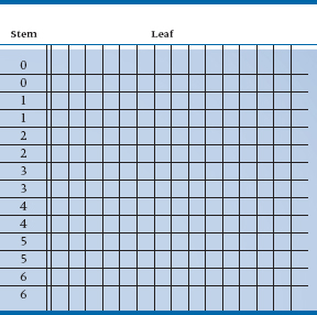
TABLE 2–6 Stem-and-Leaf Plot of the first 10 items of Table 2–2
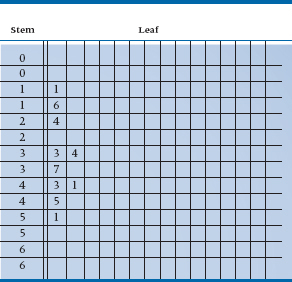
TABLE 2–7 Stem-and-Leaf Plot of all the data in Table 2–2
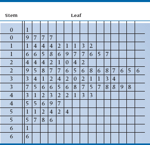
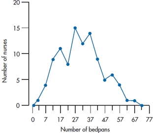
FIGURE 2-6 Frequency polygon showing the same data as in Figure 2-5.
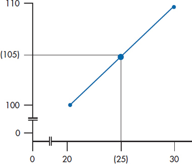
FIGURE 2-7 The assumption of a smooth transition from point to point in frequency polygons.
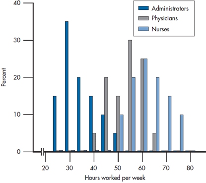
FIGURE 2-8 Data for three groups displayed as bar graphs.
A second difference is that bar charts seem to imply that the data are spread equally over the interval. For instance, if we had an interval width of 5 units spanning the numbers 20 through 24, and 10 cases were in that interval, it would appear (and we would assume) that 2 cases fell at 20, 2 at 21, 2 at 22, and so on. With a frequency polygon, we assume all the cases had the value of the midpoint. This is a closer representation of what we actually do in statistics; if we don’t know the exact value of some variable, we usually use some midpoint as an approximation.
A third difference is that, by convention, frequency polygons begin and end with the line touching the X-axis. To accomplish this, we’ve added an extra interval at the upper end, which had a frequency count of zero. At the low end, it doesn’t make sense in this case to add another interval because it would cover the numbers -1 to -5, so we just continue the line to the origin. If we were plotting data that did not include a value of zero, such as blood pressure, IQ, or height, we would have added an extra “empty” interval at the lower end.
So, when do we use a histogram and when a polygon? For nominal and ordinal data, you don’t have a choice; you’re limited to a bar chart. If you’re dealing with interval or ratio data and are showing the data for only one or two groups, it really doesn’t matter; it’s more a matter of personal preference, esthetics, and whatever your plotting package can manage. However, if you have more than two groups, then it’s often better to use frequency polygons, with each group represented by a different line. The advantage is that all the data for any one group are joined; with a histogram, the values for one group are often broken up by the bars for the other groups. We’ve shown an example of this in Figure 2-8. Figure 2-9 then shows the same data with a polygon, which we feel is easier to follow.
When you’re plotting two or more lines, they should be noticeably distinct from one another— different symbols representing the data points and different types of lines joining the points. If you’re showing the graph at a meeting, you can also use different colors; however, most publications are in black and white, so this isn’t an option.6
CUMULATIVE FREQUENCY POLYGONS
Before leaving the topic of graphing for a while, we’ll mention one more variant, a cumulative frequency polygon. Cast your mind back, if you will, to our discussion of the emptying of bedpans. When we drew up Table 2-4, we added another column, labeled the Cumulative Total, and mentioned that one reason for using it was as a check on our addition. Now we’ll mention another purpose; it helps us draw cumulative frequency polygons. With them, we plot not the raw count within each interval, but the cumulative count. You can also convert the cumulative total at each interval into a percentage of the total count and plot the cumulative percents, as we’ve done in Figure 2-10. In our example, because the total number of data points was 100, each cumulative total is also the percent, but you’ll rarely be in the fortunate position of having exactly 100 subjects. Figure 2-10 again shows the data in Table 2-4, but this time as a cumulative polygon. The only difference in drawing a regular frequency polygon and a cumulative one is where we put the point: in the former case, it was at the midpoint; with cumulative polygons, we put the mark at the upper end of the interval, for reasons that will soon be apparent.
In Figure 2-10 we’ve drawn a horizontal line at 50%, starting at the F-axis and extending to the curve, then dropped a vertical line to the X-axis. This shows us that 50% corresponds to 31 bedpans; that is, half of the people emptied fewer than 31 and half emptied more. We can also draw lines at other percentages, or even work backward; (e.g., draw a vertical line up from, say 40 bedpans, and see what percent of people dumped more or fewer).
This is the reason the data are plotted at the end of the interval, rather than at the midpoint. As we’ve mentioned, we have lost some information by grouping the data, so we don’t know exactly where within the interval the raw data actually occurred. We do know, though, how many cases there were, up to and including everyone within the interval. The difference may be small, but statisticians pride themselves on being accurate.7
Graphs of this sort are very common in plotting all sorts of anthropometric features, especially for kids— height, weight, head circumference, and other vital statistics. Then, after the doc takes the kid off the scale, she can look at a graph appropriate for age and sex and determine in what percentile this particular kid is.
HOW NOT TO GRAPH
As the old joke goes, “We have some good news and some bad news.” The good news is that every spreadsheet program, slide presentation program, and statistics program now can make graphs for you at the press of a button; you simply have to enter the data. The bad news is that, almost without exception, they do it extremely badly. Many of the choices are worse than useless, and most default options are just plain wrong. In this section, we’ll discuss some very useless and misleading (albeit very pretty) ways of presenting data.
Do You Really Need a Graph?
Before we begin to discuss bad graphs, let’s decide whether a graph is even needed. Take a look at Figure 2-11. It shows the number of males and females in some study. In other words, it conveys one bit of information—the proportion of males is 54%. (Even though you haven’t gotten too far into this book yet, we bet you can figure out that the proportion of females is 46%.) Do you need a graph, something that takes up about X of a page, to tell you that? We can convey the same information in one sentence, which takes about 15 seconds to write and 2 seconds to read; we don’t have to waste 30 minutes drawing a figure. Use graphs to show relationships, not to report numbers.
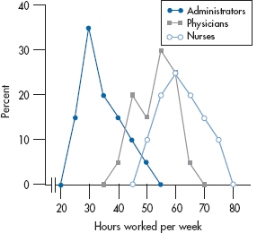
FIGURE 2-9 The same data as in Figure 2-8, but displayed as frequency polygons. The lines are differentiated by color and symbol type.
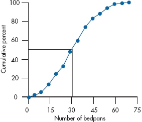
FIGURE 2-10 Cumulative frequency polygon of data in Figure 2-6.
The Case of the Missing Zero
Dr. X8 wants to be considered for early promotion. To support his petition, he submits a graph, shown in Figure 2-12, to show that the amount of grant money he has received has risen dramatically in the past year. So, should he be promoted? The proportion of males and females in a study.
Not if this graph is any indication of the quality of his work. From the picture, it looks as though there has been almost a threefold increase in his funding (the actual value is about 275%). The reality is that it went from a measly $11,000 to a paltry $15,000, an increase of only 37%. The problem is with the F-axis. Instead of starting at zero, it begins at $10,000, so that small differences are magnified. We see examples of this every day on TV or in the newspapers; it looks as though the temperature or the stock market is fluctuating wildly, because the axis doesn’t start at zero.
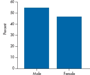
FIGURE 2-11 The proportion of males and females in a study.
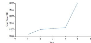
FIGURE 2-12 Grant money per year for Dr. X.
One way to check on this distortion is to use the Graph Discrepancy Index (GDI), which is simply:
In this case, it’s (275/37) – 1 = 6.43. That’s a tad higher than the recommended value of the GDI, which is 0.05 (Beattie and Jones, 1992). Gotcha, Dr. X!
3-D or Not 3-D, That is the Question
The bar charts and histograms that we’ve shown you so far look pretty drab and ordinary. Wouldn’t it be nice if we jazzed them up a bit by making them look three dimensional, or used fancier objects instead of just rectangles, or if we added shading, or converted them to pie charts? No, it would not be nice; it will just be confusing.
Let’s take Figure 2-2 and make it look sexy by adding some of the features we’ve just mentioned. Golly gee, Figure 2-13 looks hot! But quickly now, how many students said Economics? You’re excused if you said 39. You’d be wrong—the real answer is 42—but we’ll excuse you, because we’re nice guys. The problem is that the leading edge of the bar, which is where your eye is drawn, is just below the 40. The true value is actually indicated by the back edge of the bar, which confuses both the eye and its owner. For bars farther from the left side of the graph, we have to follow an imaginary line to the F-axis, make a turn, and then follow another imaginary line to where the legend is—a process that’s prone to error at every step. Compounding the problem, the back of the bar is not flush with the back wall, so the top of the bar is not at 40—you have to continue an invisible line until it hits the wall, two units above the top. As if that isn’t enough, the major purveyor of soft-ware (which will remain unnamed, but they make PowerPoint, Word, and other products) is inconsistent in this regard. Graph exactly the same data with PowerPoint and with Excel and you’ll get different results—one puts the bars against the back wall, one doesn’t. The greater the 3-D effect, the greater the confusion. So, the bottom line is, lose the 3-D.
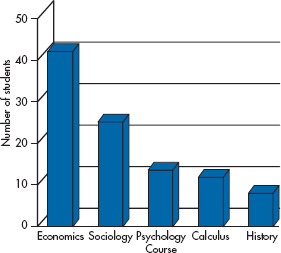
FIGURE 2-13 A 3-D version of Figure 2-2.
Pie in the Sky, Not in a Graph
Now let’s take the same data to make a pie chart and use it to compare two groups, as in Figure 2-14. Are the numbers of people saying Sociology the same in both groups? Yet again we’ll excuse you if you answer, “That’s hard to say.” You can relatively easily compare the first segment of the two pies, because they both start at 12 o’clock. But if the sizes of those segments are different, you now have to look at a segment of pie two, keep the angle constant as you rotate it until it’s at the same starting place as the corresponding segment of pie one, and judge the relative angles. Sounds like an impossible task, and it is. A pie chart may be good for showing data for one group, but is useless for comparing groups. Remember, the only place for a pie chart is at a baker’s convention.
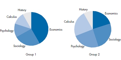
FIGURE 2-14 Comparing two groups using pie charts.
“But,” we hear you say, “you can simply put numbers inside or next to the wedges, and that will remove any ambiguity.” Let’s keep in mind the difference between a table and a graph. A graph is ideal for giving the reader a very quick grasp of relationships that exist in the data; is there a trend over time, or does one group differ from another? If the precise numbers are important, use a table. Don’t mix up these two functions: communicating a picture, or reporting data.
The Worst of Both Worlds
Take a look at Figure 2-15. Quickly now, answer two questions: (a) put the segments in rank order; and (b) tell us how much bigger is segment D than segment C. If you struggled to put A through C in order, and couldn’t easily say how much bigger D is, then we would say, “Gotcha!” The answers are: (a) segments A, B, and C are all equal, and (b) D is twice as big as each of them. Had the data been presented as a bar chart, the answers would have been obvious. The reason you had difficulty is that not only is this a pie chart, but it’s a 3-D pie chart, thus incorporating the worst features of each. Tilting the graph distorts the angles of the wedges, and the greater the 3-D effect, the worse the distortion.
STACKED GRAPHS
For a change, we’re not making some sort of sexist joke.9 Rather, we’re talking about graphs, much beloved by newspapers and magazines, where different values of a variable are placed on top of one another. Figure 2-16 is a stacked bar graph showing the marital status in three groups. As with a pie chart, we have no trouble comparing the groups with respect to the proportion married or single, because they have a common axis (the top or bottom of the graph). But, what about those who are widowed? To compare the groups, we have to try to keep the height of the segment in our mind while shifting the bases until they all line up, and then see if the heights are comparable; not an easy task by any means. These data would either be better presented in a table, or using separate bars for each category of marital status.
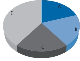
FIGURE 2-15 A 3-D pie chart.
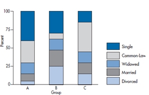
FIGURE 2-16 A stacked bar chart.
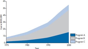
FIGURE 2-17 A stacked line graph.
In Figure 2-17, we show the annual cost of three programs over time in a stacked line chart. This type of graph is fine if we want to see what’s happening to the total cost of the three, but it’s terrible for looking at the contributions of each. Which program is growing the fastest? The reality is that Programs A and B are increasing geometrically each decade (e.g., 2, 4, 8, 16), whereas C is only increasing arithmetically (2, 4, 6, 8). Hard to tell, isn’t it? The bottom line—don’t use it.
Conclusion
We’ll close with a beautiful quote from Howard Wainer (1990): “Although I shudder to consider it, perhaps there is something to be learned from the success enjoyed by the multi-colored, three-dimensional pie charts that clutter the pages of USA Today, Time, and Newsweek. I sure hope not much.”
MAKING BETTER TABLES
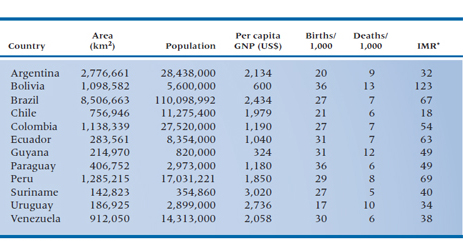
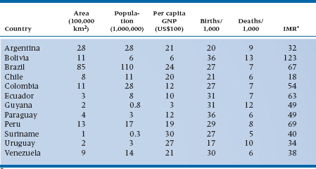
So far, we’ve been showing you different ways of presenting data in graphs, as if this were the only way that data can be portrayed. Indeed, graphs are excellent for displaying one or two variables at a time. There are times, though, when only a table of numbers will do—when we have many variables to show at the same time, or when we want the reader to see the actual numbers. It may seem at first glance as if tables were the simplest thing in the world to construct: just write the names of the variables as the headings of the columns, the subjects along the left to indicate the rows, and fill in the blanks. Table 2-8 is such a table, and it is typical of many you’ll see. The countries are listed alphabetically, and the numbers are given with as much accuracy as possible.
Now, quickly—which is the largest country? The smallest? The one with the highest GNP? The lowest infant mortality rate (IMR)? If you think that was hard, imagine how hard it would be if we had listed all of the countries in Africa.10
Why was such a seemingly easy task so hard? The main reason is that there are too many numbers; not that there are too many columns but that we have “unnecessary” accuracy. Don’t get us wrong; accuracy is good but, like a child, only in its place. If the exact numbers are important for archival purposes then, fine, maintain as many significant digits as you can come up with, but stick the table in an appendix. For most purposes, however, so many digits give an illusion of accuracy that is often misleading. For example, the population of Brazil is given as 110,098,992.11 By the time you finish reading that number, it’s already wrong. Even assuming that the census was correct when it was taken (a dubious assumption at best in developed countries, and most likely a myth in developing ones), it was out of date almost as soon as it was recorded. If the population increases by 3% a year, then there are nearly seven additional people every minute, or almost 10,000 a day. Between the time the census was taken (and don’t forget it was probably taken over a period of weeks or months), recorded by the central government, reported in an official document, reproduced in the atlas, and read by you, years may have elapsed. That number is no longer correct—if it ever was to begin with—but the last three digits give the illusion of precision.
“Inaccurate precision” can be found all over the place. If we report that the average age of one group is 43.02 years, and for another group is 44.76 years, is that last decimal place really meaningful? Bear in mind that .01 years represents less than four days. Making the problem worse, we probably asked people their age to the nearest year, so they were introducing a loss of accuracy from the very outset (assuming that they didn’t lie about their age12). Finally, without glancing up the page or at the table, do you remember the exact population of Brazil? Probably not; if you’re like most people, you’ll remember that it was somewhat over 110 million, but that final “90,992” has gone by the board. The moral of this story is to round, and then round again—keep enough digits to highlight important differences, and no more.
In Table 2-9, we’ve done some rounding. Now let’s try the same exercise again: Which is the largest country? The smallest? The one with the highest GNP? The lowest IMR? That was much easier, wasn’t it? Getting rid of unnecessary digits made the table much easier to comprehend. However, we can go even further. Keeping the countries in alphabetical order makes sense if this table is referred to often, or for a number of different purposes. But if there is one major point you want to make, such as focusing on the IMR, it would be even better to list the countries in order, ranging from the one with the highest IMR to the lowest (or vice versa). Then, ask yourself, Are the other columns really necessary? If you want to relate the IMR to the size of the country or to other indices of health such as the birth and death rates, then keep them; otherwise, out they go (or into an appendix). This also means that it may be worthwhile to reorder the columns; if IMR is the most important point of the table, list it first. If you want to relate it primarily to other health indices, then the birth and death rates are next, followed by the country’s per capita income and size.
Finally, use spaces to highlight clusters, as in Table 2-10 in which information is arranged logically for you. For example, Bolivia seems to be in its own class, with an IMR that is quite a bit higher than that of the next country. Then, there appears to be a group of countries with a gradation of similar IMRs, and Chile is by itself, with the lowest IMR.13 Those divisions are totally arbitrary; if you feel that there should be a break between Paraguay and Suriname, for instance, you can put one in; we’re flexible.
TABLE 2–8 Demographic characteristics of the countries in South America
*IMR = infant mortality rate/1,000 live births.
TABLE 2–9 Demographic characteristics of the countries in South America
*IMR = infant mortality rate/1,000 live births.
TABLE 2–10 Data from Table 2–8, with rounding introduced
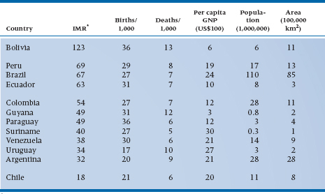
*IMR = infant mortality rate/1,000 live births.
EXERCISES
Let’s take another look at some of the variables we used in the exercises for Chapter 1, as well as a few others to minimize boredom. This time, though, indicate what type of graph you’d use to present the data (bar chart, histogram, frequency polygon, or something else). Just to keep you on your toes, there is sometimes more than one correct answer.
If you really want to learn how to make good tables, look at the article and book by Wainer listed in the “To Read Further” section; that’s where we got all these good ideas.
1. Number of hair transplant sessions per person.
2. Time since the last patient indicated his/her gratitude.
3. The number of patients with 0, 1, or 2+ vessels with 75% stenosis.
4. Before-taxes income.
5. Income for the different specialties in your profession.
6. Range of wrist motion for 100 patients.
7. Schmedlap Anxiety Inventory scores for 128 people.
How to Get the Computer to Do the Work for You
Note: Many chapters have a section on the end showing how to use SPSS to run the analyses mentioned in the chapter. If you’ve never used SPSS before, you may want to look at Chapter 29, “Getting Started with SPSS,” before you begin. It’s a basic tutorial on getting started
Stay updated, free articles. Join our Telegram channel

Full access? Get Clinical Tree


