Chapter Eight
The Application of Statistical Analysis in the Biomedical Sciences
Learning Objectives
After completing this chapter, the reader will be able to
• Define the population being studied and describe the method most appropriate to sample a given population.
• Identify and describe the dependent and independent variables and indicate whether any covariates were included in analysis.
• Identify and define the four scales of variable measurement.
• Describe the difference between descriptive and inferential statistics.
• Describe the mean, median, variance, and standard deviation and why they are important to statistical analysis.
• Describe the properties of the normal distribution and when an alternative distribution should be, or should have been, used.
• Describe several common epidemiological statistics.
• Identify and describe the difference between parametric and nonparametric statistical tests and when their use is most appropriate.
• Determine whether the appropriate statistical test has been performed when evaluating a study.
![]()
Key Concepts
![]() There are four scales of variable measurement consisting of nominal, ordinal, interval, and ratio scales that are critically important to consider when determining the appropriateness of a statistical test.
There are four scales of variable measurement consisting of nominal, ordinal, interval, and ratio scales that are critically important to consider when determining the appropriateness of a statistical test.
![]() Measures of central tendency are useful to quantify the distribution of a variable’s data numerically. The most common measures of central tendency are the mean, median, and mode, with the most appropriate measure of central tendency dictated by the variable’s scale of measurement.
Measures of central tendency are useful to quantify the distribution of a variable’s data numerically. The most common measures of central tendency are the mean, median, and mode, with the most appropriate measure of central tendency dictated by the variable’s scale of measurement.
![]() Variance is a key element inherent in all statistical analyses, but standard deviation is presented more often. Variance and standard deviation are related mathematically.
Variance is a key element inherent in all statistical analyses, but standard deviation is presented more often. Variance and standard deviation are related mathematically.
![]() The key benefit to using the standard normal distribution is that converting the original data to z-scores allows researchers to compare different variables regardless of the original scale.
The key benefit to using the standard normal distribution is that converting the original data to z-scores allows researchers to compare different variables regardless of the original scale.
![]() The last observation carried forward (LOCF) technique used often with the data from clinical trials introduces significant bias into the results of statistical tests.
The last observation carried forward (LOCF) technique used often with the data from clinical trials introduces significant bias into the results of statistical tests.
![]() The central limit theorem states when equally sized samples are drawn from a non-normal distribution, the plotted mean values from each sample will approximate a normal distribution as long as the non-normality was not due to outliers.
The central limit theorem states when equally sized samples are drawn from a non-normal distribution, the plotted mean values from each sample will approximate a normal distribution as long as the non-normality was not due to outliers.
![]() There are numerous misconceptions about p values and it is important to know how to interpret them correctly.
There are numerous misconceptions about p values and it is important to know how to interpret them correctly.
![]() Clinical significance is far more important than statistical significance. Clinical significance can be quantified by using various measures of effect size.
Clinical significance is far more important than statistical significance. Clinical significance can be quantified by using various measures of effect size.
![]() The selection of the appropriate statistical test is based on several factors including the specific research question, the measurement scale of the dependent variable (DV), distributional assumptions, the number of DV measurements as well as the number and measurement scale of independent variables (IVs) and covariates, among others.
The selection of the appropriate statistical test is based on several factors including the specific research question, the measurement scale of the dependent variable (DV), distributional assumptions, the number of DV measurements as well as the number and measurement scale of independent variables (IVs) and covariates, among others.
Introduction
Knowledge of statistics and statistical analyses is essential to constructively evaluate literature in the biomedical sciences. This chapter provides a general overview of both descriptive and inferential statistics that will enhance the ability of the student or evidence-based practitioner to interpret results of empirical literature within the biomedical sciences by evaluating the appropriateness of statistical tests employed, the conclusions drawn by the authors, and the overall quality of the study.
Alongside Chapters 4 and 5, diligent study of the material presented in this chapter is an important first step to critically analyze the often avoided methods or results sections of published biomedical literature. Be aware, however, that this chapter cannot substitute for more formal didactic training in statistics, as the material presented here is not exhaustive with regards to either statistical concepts or available statistical tests. Thus, when reading a journal article, if doubt emerges about whether a method or statistical test was used and interpreted appropriately, do not hesitate to consult appropriate references or an individual who has more formal statistical training. This is especially true if the empirical evidence is being considered for implementation in practice. Asking questions is the key to obtaining knowledge!
For didactic purposes, this chapter can be divided into two sections. The first section presents a general overview of the processes underlying most statistical tests used in the biomedical sciences. It is recommended that all readers take the time required to thoroughly study these concepts. The second section, beginning with the Statistical Tests section, presents descriptions, assumptions, examples, and results of numerous statistical tests commonly used in the biomedical sciences. This section does not present the mathematical underpinnings, calculation, or programming of any specific statistical test. It is recommended that this section serve as a reference to be used concurrently alongside a given journal article to determine the appropriateness of a statistical test or to gain further insight into why a specific statistical test was employed.
Populations and Sampling
When investigating a particular research question or hypothesis, researchers must first define the population to be studied. A population refers to any set of objects in the universe, while a sample is a fraction of the population chosen to be representative of the specific population of interest. Thus, samples are chosen to make specific generalizations about the population of interest. Researchers typically do not attempt to study the entire population because data cannot be collected for everyone within a population. This is why a sample should ideally be chosen at random. That is, each member of the population must have an equal probability of being included in the sample.
For example, consider a study to evaluate the effect a calcium channel blocker (CCB) has on blood glucose levels in Type 1 diabetes mellitus (DM) patients. In this case, all Type 1 DM patients would constitute the study population; however, because data could never be collected from all Type 1 DM patients, a sample that is representative of the Type 1 DM population would be selected. There are numerous sampling strategies, many beyond the scope of this text. Although only a few are discussed here, interested readers are urged to consult the list of suggested readings at the end of this chapter for further information.
A random sample does not imply that the sample is drawn haphazardly or in an unplanned fashion, and there are several approaches to selecting a random sample. The most common method employs a random number table. A random number table theoretically contains all integers between one and infinity that have been selected without any trends or patterns. For example, consider the hypothetical process of selecting a random sample of Type 1 DM patients from the population. First, each patient in the population is assigned a number, say 1 to N, where N is the total number of Type 1 DM patients in the population. From this population, a sample of 200 patients is requested. The random number table would randomly select 200 patients from the population of size N. There are numerous free random number tables and generators available online; simply search for random number table or random number generator in any search engine.
Depending on the study design, a random sample may not be most appropriate when selecting a representative sample. On occasion, it may be necessary to separate the population into mutually exclusive groups called strata, where a specific factor (e.g., race, gender) will create separate strata to aid in analysis. In this case, the random sample is drawn within each stratum individually. This process is termed stratified random sampling. For example, consider a situation where the race of the patient was an important variable in the Type 1 DM study. To ensure the proportion of each race in the population is represented accurately, the researcher stratifies by race and randomly selects patients within each stratum to achieve a representative study sample.
Another method of randomly sampling a population is known as cluster sampling. Cluster sampling is appropriate when there are natural groupings within the population of interest. For example, consider a researcher interested in the patient counseling practices of pharmacists across the United States. It would be impossible to collect data from all pharmacists across the United States. However, the researcher has read literature suggesting regional differences within various pharmacy practices, not necessarily including counseling practices. Thus, he or she may decide to randomly sample within the four regions of the United States (U.S.) defined by the U.S. Census Bureau (i.e., West, Midwest, South, and Northeast) to assess for differences in patient counseling practices across regions.1
Another sampling method is known as systematic sampling. This method is used when information about the population is provided in list format, such as in the telephone book, election records, class lists, or licensure records, among others. Systematic sampling uses an equal-probability method where one individual is selected initially at random and every nth individual is then selected thereafter. For example, the researchers may decide to take every 10th individual listed after the first individual is chosen.
Finally, researchers often use convenience sampling to select participants based on the convenience of the researcher. That is, no attempt is made to ensure the sample is representative of the population. However, within the convenience sample, participants may be selected randomly. This type of sampling is often used in educational research. For example, consider a researcher evaluating a new classroom instructional method to increase exam scores. This type of study will use the convenience sample of the students in their own class or university. Obviously, significant weaknesses are apparent when using this type of sampling, most notably, limited generalization.
Variables and the Measurement of Data
A variable is the characteristic that is being observed or measured. Data are the measured values assigned to the variable for each individual member of the population. For example, a variable would be the participant’s biological sex, while the data is whether the participant is male or female.
In statistics, there are three types of variables: dependent (DV), independent (IV), and confounding. The DV is the response or outcome variable for a study, while an IV is a variable that is manipulated. A confounding variable (often referred to as covariate) is any variable that has an effect on the DV over and above the effect of the IV, but is not of specific research interest. Putting these definitions together, consider a study to evaluate the effect a new oral hypoglycemic medication has on glycosylated hemoglobin (HbA1c) compared to placebo. Here, the DV consists of the HbA1c data for each participant, and the IV is treatment group with two levels (i.e., treatment versus placebo). Initially, results may suggest the medication is very effective across the entire sample; however, previous literature has suggested participant race may affect the effectiveness of this type of medication. Thus, participant race is a confounding variable and would need to be included in the statistical analysis. After statistically controlling for participant race, the results may indicate the medication was significantly more effective in the treatment group.
SCALES OF MEASUREMENT
![]() There are four scales of variable measurement consisting of nominal, ordinal, interval, and ratio scales that are critically important to consider when determining the appropriateness of a statistical test.2 Think of these four scales as relatively fluid; that is, as the data progress from nominal to ratio, the information about each variable being measured is increased. The scale of measurement of DVs, IVs, and confounding variables is an important consideration when determining whether the appropriate statistical test was used to answer the research question and hypothesis.
There are four scales of variable measurement consisting of nominal, ordinal, interval, and ratio scales that are critically important to consider when determining the appropriateness of a statistical test.2 Think of these four scales as relatively fluid; that is, as the data progress from nominal to ratio, the information about each variable being measured is increased. The scale of measurement of DVs, IVs, and confounding variables is an important consideration when determining whether the appropriate statistical test was used to answer the research question and hypothesis.
A nominal scale consists of categories that have no implied rank or order. Examples of nominal variables include gender (e.g., male versus female), race (e.g., Caucasian versus African American versus Hispanic), or disease state (e.g., absence versus presence). It is important to note that with nominal data, the participant is categorized into one, and only one, category. That is, the categories are mutually exclusive.
An ordinal scale has all of the characteristics of a nominal variable with the addition of rank ordering. It is important to note the distance between rank ordered categories cannot be considered equal; that is, the data points can be ranked but the distance between them may differ greatly. For example, in medicine a commonly used pain scale is the Wong-Baker Faces Pain Rating Scale.3 Here, the participant ranks pain on a 0 to 10 scale; however, while it is known that a rating of eight indicates the participant is in more pain than rating four, there is no indication a rating of eight hurts twice as much as a rating of four.
An interval scale has all of the characteristics of an ordinal scale with the addition that the distance between two values is now constant and meaningful. However, it is important to note that interval scales do not have an absolute zero point. For example, temperature on a Celsius scale is measured on an interval scale (i.e., the difference between 10®C and 5®C is equivalent to the difference between 20®C and 15®C). However, 20®C/10®C cannot be quantified as twice as hot because there is no absolute zero (i.e., the selection of 0®C was arbitrary).
Finally, a ratio scale has all of the characteristics of an interval scale, but ratio scales have an absolute zero point. The classic example of a ratio scale is temperature measured on the Kelvin scale, where zero Kelvin represents the absence of molecular motion. Theoretically, researchers should not confuse absolute and arbitrary zero points. However, the difference between interval and ratio scales is generally trivial as these data are analyzed by identical statistical procedures.
CONTINUOUS VERSUS CATEGORICAL VARIABLES
Continuous variables generally consist of data measured on interval or ratio scales. However, if the number of ordinal categories is large (e.g., seven or more) they may be considered continuous.4 Be aware that continuous variables may also be referred to as quantitative in the literature. Examples of continuous variables include age, body mass index (BMI), or uncategorized systolic or diastolic blood pressure values.
Categorical variables consist of data measured on nominal or ordinal scales because these scales of measurement have naturally distinct categories. Examples of categorical variables include gender, race, or blood pressure status (e.g., hypotensive, normotensive, prehypertensive, hypertensive). In the literature, categorical variables are often termed discrete or if a variable is measured on a nominal scale with only two distinct categories it may be termed binary or dichotomous.
Note that it is common in the biomedical literature for researchers to categorize continuous variables. While not wholly incorrect, categorizing a continuous variable will always result in loss of information about the variable. For example, consider the role participant age has on the probability of experiencing a cardiac event. Although age is a continuous variable, younger individuals typically have much a lower probability compared to older individuals. Thus, the research may divide age into four discrete categories: <30, 31–50, 51–70, and 70+. Note that assigning category cutoffs is generally an arbitrary process. In this example, information is lost by categorizing age because after categorization the exact age of the participant is unknown. That is, an individual’s age is defined only by their age category. For example, a 50-year-old individual is considered identical to a 31-year-old individual because they are in the same age category.
Descriptive Statistics
There are two types of statistics—descriptive and inferential. Descriptive statistics present, organize, and summarize a variable’s data by providing information regarding the appearance of the data and distributional characteristics. Examples of descriptive statistics include measures of central tendency, variability, shape, histograms, boxplots, and scatterplots. These descriptive measures are the focus of this section.
Inferential statistics indicate whether a difference exists between groups of participants or whether an association exists between variables. Inferential statistics are used to determine whether the difference or association is real or whether it is due to some random process. Examples of inferential statistics are the statistics produced by each statistical test described later in the chapter. For example, the t statistic produced by a t-test.
MEASURES OF CENTRAL TENDENCY
![]() Measures of central tendency are useful to quantify the distribution of a variable’s data numerically. The most common measures of central tendency are the mean, median, and mode, with the most appropriate measure of central tendency dictated by the variable’s scale of measurement.
Measures of central tendency are useful to quantify the distribution of a variable’s data numerically. The most common measures of central tendency are the mean, median, and mode, with the most appropriate measure of central tendency dictated by the variable’s scale of measurement.
The mean (indicated as M in the literature) is the most common and appropriate measure of central tendency for normally distributed data (see the Common Probability Distributions section later in chapter) measured on an interval or ratio scale. The mean is the arithmetic average of a variable’s data. Thus, the mean is calculated by summing a variable’s data and dividing by the total number of participants with data for the specific variable. It is important to note that data points that are severely disconnected from the other data points can significantly influence the mean. These extreme data points are termed outliers.
The median (indicated as Mdn in the literature) is most appropriate measure of central tendency for data measured on an ordinal scale. The median is the absolute middle value in the data; therefore, exactly half of the data is above the median and exactly half of the data is below the median. The median is also known as the 50th percentile. Note that the median can also be presented for continuous variables with skewed distributions (see the Measures of Distribution Shape section later in chapter) and for continuous variables with outliers. A direct comparison of a variable’s mean and median can give insight into how much influence outliers had on the mean.
Finally, the mode is the most appropriate measure of central tendency for nominal data. The mode is a variable’s most frequently occurring data point or category. Note that it is possible for a variable to have multiple modes; a variable with two or three modes is referred to as bimodal and trimodal, respectively.
MEASURES OF VARIABILITY
Measures of variability are useful in indicating the spread of a variable’s data. The most common measures of variability are the range, interquartile range, variance, and standard deviation. These measures are also useful when considered with appropriate measures of central tendency to assess how the data are scattered around the mean or median. For example, consider the two histograms in Figure 8–1. Both histograms present data for 100 participants that have identical mean body weight of 185 pounds. However, notice the variability (or dispersion) of the data is much greater for Group 2. If the means for both groups were simply taken at face value, the participants in these two groups would be considered similar; however, assessing the variability or spread of data within each group illustrates an entirely different picture. This concept is critically important to the application of any inferential statistical test because the test results are heavily influenced by the amount of variability.
The simplest measure of variability is the range, which can be used to describe data measured on an ordinal, interval, or ratio scale. The range is a crude measure of variability calculated by subtracting a variable’s minimum data point from its maximum data point. For example, in Figure 8–1 the range for Group 1 is 30 (i.e., 200–170), whereas the range from Group 2 is 95 (i.e., 235–140).
The interquartile range (indicated as IQR in the literature) is another measure of dispersion used to describe data measured on ordinal scale; as such, the IQR is usually presented alongside the median. The IQR is the difference between the 75th and 25th percentile. Therefore, because the median represents the 50th percentile, the IQR presents the middle 50% of the data and always includes the median.
The final two measures of variability described are the variance and standard deviation. These measures are appropriate for normally distributed continuous variables measured on interval or ratio scales. ![]() Variance is a key element inherent in all statistical analyses, but standard deviation is presented more often. Variance and standard deviation are related mathematically. Variance is the average squared deviation from the mean for all data points within a specific variable. For example, consider Figure 8–1, where the mean for both Group 1 and 2 was 185 pounds. Say a specific participant in Group 1 had a body weight of 190 pounds. The squared deviation from the mean for this participant would be equal to 25 pounds. That is, 190 –185 = 5 and 52 = 25. To calculate variance, the squared deviations are calculated for all data points. These square deviations are then summed across participants and then divided by the total number of data points (i.e., N) to obtain the average squared deviation. Some readers may be asking why the deviations from the mean are squared. This is a great question! The reason is that summing unsquared deviations across participants would equal zero. That is, deviations resulting from values above and below the mean would cancel each other out. While the calculation of variance may seem esoteric, conceptually all that is required to understand variance is that larger variance values indicate greater variability. For example, the variances of Group 1 and 2 in Figure 8–1 were 25 and 225, respectively. While the histograms did not present these numbers explicitly, the greater variability in Group 2 can be observed clearly. The importance of variance cannot be overstated. It is the primary parameter used in all parametric statistical analyses, and this is why it was presented in such detail here. With that said, variance is rarely presented as a descriptive statistic in the literature. Instead, variance is converted into a standard deviation as described in the next paragraph.
Variance is a key element inherent in all statistical analyses, but standard deviation is presented more often. Variance and standard deviation are related mathematically. Variance is the average squared deviation from the mean for all data points within a specific variable. For example, consider Figure 8–1, where the mean for both Group 1 and 2 was 185 pounds. Say a specific participant in Group 1 had a body weight of 190 pounds. The squared deviation from the mean for this participant would be equal to 25 pounds. That is, 190 –185 = 5 and 52 = 25. To calculate variance, the squared deviations are calculated for all data points. These square deviations are then summed across participants and then divided by the total number of data points (i.e., N) to obtain the average squared deviation. Some readers may be asking why the deviations from the mean are squared. This is a great question! The reason is that summing unsquared deviations across participants would equal zero. That is, deviations resulting from values above and below the mean would cancel each other out. While the calculation of variance may seem esoteric, conceptually all that is required to understand variance is that larger variance values indicate greater variability. For example, the variances of Group 1 and 2 in Figure 8–1 were 25 and 225, respectively. While the histograms did not present these numbers explicitly, the greater variability in Group 2 can be observed clearly. The importance of variance cannot be overstated. It is the primary parameter used in all parametric statistical analyses, and this is why it was presented in such detail here. With that said, variance is rarely presented as a descriptive statistic in the literature. Instead, variance is converted into a standard deviation as described in the next paragraph.
As a descriptive statistic, the standard deviation (indicated as SD in the literature) is often preferred over variance because it indicates the average deviation from the mean presented on the same scale as the original variable. Variance presented the average deviation in squared units. It is important to note that the standard deviation and variance are directly related mathematically, with standard deviation equal to the square root of the variance ![]() Thus, if the standard deviation is known, the variance can be calculated directly, and vice versa. When comparing variability between groups of participants, the standard deviation can provide insight into the dispersion of scores around the mean, and, similar to variance, larger standard deviations indicate greater variability in the data. For example, from Figure 8–1, Group 1 had a standard deviation of 5
Thus, if the standard deviation is known, the variance can be calculated directly, and vice versa. When comparing variability between groups of participants, the standard deviation can provide insight into the dispersion of scores around the mean, and, similar to variance, larger standard deviations indicate greater variability in the data. For example, from Figure 8–1, Group 1 had a standard deviation of 5 ![]() and Group 2 had a standard deviation of 15
and Group 2 had a standard deviation of 15 ![]() Again, the greater variability within Group 2 is evident.
Again, the greater variability within Group 2 is evident.
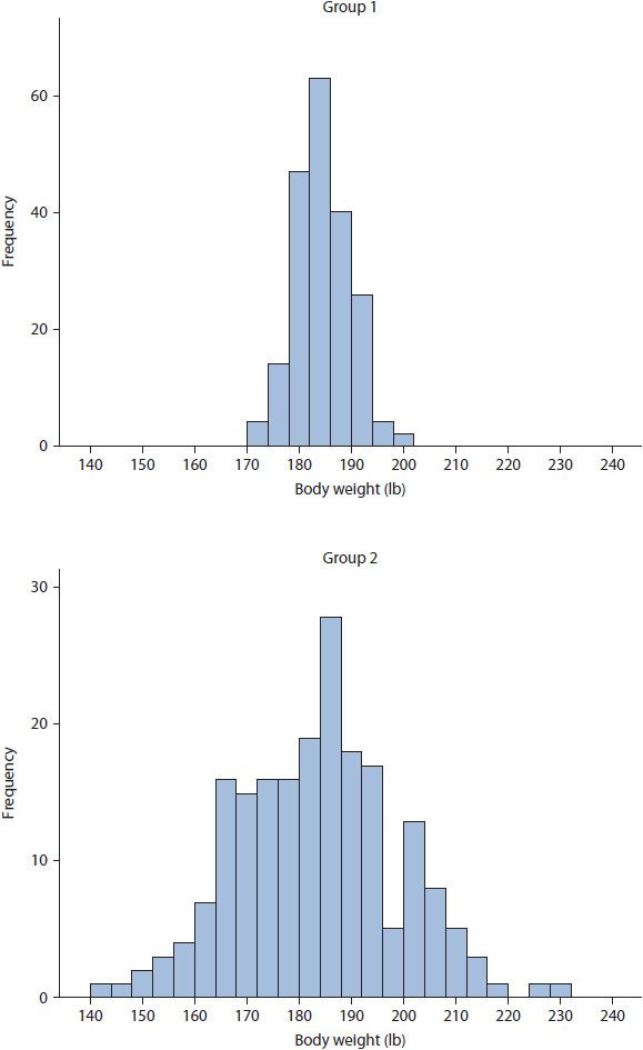
Figure 8–1. Differences in variability between two groups with identical means.
MEASURES OF DISTRIBUTION SHAPE
Skewness and kurtosis are appropriate measures of shape for variables measured on interval or ratio scales, and indicate asymmetry and peakedness of a distribution, respectively. They are typically used by researchers to evaluate the distributional assumptions of a parametric statistical analysis.
Skewness indicates the asymmetry of distribution of data points and can be either positive or negative. Positive (or right) skewness occurs when the mode and median are less than the mean, whereas negative (or left) skewness occurs when mode and median are greater than the mean. As stated previously, the mean is sensitive to extremely disconnected data points termed outliers; thus, it is important to know the difference between true skewness and skewness due to outliers. True skewness is indicated by a steady decrease in data points toward the tails (i.e., ends) of the distribution. Skewness due to outliers is indicated when the mean is heavily influenced by data points that are extremely disconnected from the rest of the distribution. For example, consider the histogram in Figure 8–2. The data for Group 1 provides an example of true positive skewness, whereas the data for Group 2 provides an example of negative skewness due to outliers.
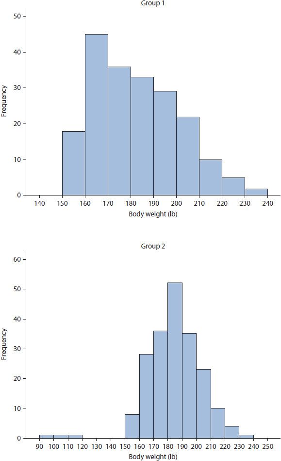
Figure 8–2. True positive skewness and negative skewness due to outliers.
Kurtosis indicates the peakedness of the distribution of data points and can be either positive or negative. Plotted data with a narrow, peaked distribution and a positive kurtosis value is termed leptokurtic. A leptokurtic distribution has small range, variance, and standard deviation with the majority of data points near the mean. In contrast, plotted data with a wide, flat distribution and a negative kurtosis value is referred to as platykurtic. A platykurtic distribution is an indicator of great variability, with large range, variance, and standard deviation. Examples of leptokurtic and platykurtic data distributions are presented for Group 1 and 2, respectively, in Figure 8–2.
GRAPHICAL REPRESENTATIONS OF DATA
Graphical representations of data are incredibly useful, especially when sample sizes are large, as they allow researchers to inspect the distribution of individual variables. There are typically three graphical representations presented in the literature—histograms, boxplots, and scatterplots. Note that graphical representations are typically used for continuous variables measured on ordinal, interval, or ratio scales. By contrast, nominal, dichotomous, or categorical variables are best presented as count data, which are typically reported in the literature as frequency and percentage.
A histogram presents data as frequency counts over some interval; that is, the x-axis presents the values of the data points, whether individual data points or intervals, while the y-axis presents the number of times the data point or interval occurs in the variable (i.e., frequency). Figures 8–1 and 8–2 provide examples of histograms. When data are plotted, it is easy to observe skewness, kurtosis, or outlier issues. For example, reconsider the distribution of body weight for Group 2 in Figure 8–2, where each vertical bar represents the number of participants having body weight within 10-unit intervals. The distribution of data has negative skewness due to outliers, with outliers being participants weighing between 90 and 120 pounds.
A boxplot, also known as a box-and-whisker plot, provides the reader with five descriptive statistics.5 Consider the boxplot in Figure 8–3, which presents the same data as the Group 2 histogram in Figure 8–2. The thin-lined box in a boxplot indicates the IQR, which contains the 25th to 75th percentiles of the data. Within this thin-lined box is a thick, bold line depicting the median, or 50th percentile. From both ends of the thin-lined box extends a tail, or whisker, depicting the minimum and maximum data points up to 1.5 IQRs beyond the median. Beyond the whiskers, outliers and extreme outliers are identified with circles and asterisks, respectively. Note that other symbols may be used to identify outliers depending on the statistical software used. Outliers are defined as data points 1.5 to 3.0 IQRs beyond the median, whereas extreme outliers are defined as data points greater than 3.0 IQRs beyond the median. The boxplot corroborates the information provided by the histogram in Figure 8–2 as participants weighing between 90 and 120 pounds are defined as outliers.
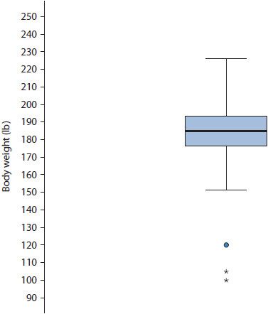
Figure 8–3. Boxplot of body weight with outliers. (Circle represent values 1.5 to 3.0 IQRs, asterisks represent values >3.0 IQRs.)
Finally, a scatterplot presents data for two variables both measured on a continuous scale. That is, the x-axis contains the range of data for one variable, whereas the y-axis contains the range of data for a second variable. In general, the axis choice for a given variable is arbitrary. Data are plotted in a similar fashion to plotting data on a coordinate plane during an introductory geometry class. Figure 8–4 presents a scatterplot of height in inches and body weight in pounds. The individual circles in the scatterplot are a participant’s height in relation to their weight. Because the plot is bivariate (i.e., there are two variables), participants must have data for both variables in order to be plotted. Scatter-plots are useful in visually assessing the association between two variables as well as assessing assumptions of various statistical tests such as linearity and absence of outliers.
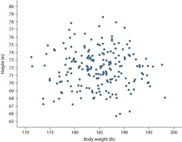
Figure 8–4. Scatterplot of height by weight.
Common Probability Distributions
Up to this point, data distributions have been discussed using very general terminology. There are numerous distributions available to researchers; far too many to provide a complete listing, but all that needs to be known about these available distributions is that each has different characteristics to fit the unique requirements of the data. Globally, these distributions are termed probability distributions, and they are incredibly important to every statistical analysis conducted. Thus, the choice of distribution used in a given statistical analysis is nontrivial as the use of an improper distribution can lead to incorrect statistical inference. Of the distributions available, the normal and binomial distributions are used most frequently in the biomedical literature; therefore, these are discussed in detail. To provide the reader with a broader listing of available distributions, this section also presents brief information about other common distributions used in the biomedical literature and when they are appropriately used in statistical analyses.
THE NORMAL DISTRIBUTION
The normal distribution, also called Gaussian distribution, is the most commonly used distribution in statistics and one that occurs frequently in nature. It is used only for continuous variables measured on interval or ratio scales. The normal distribution has several easily identifiable properties based on the numerical measures of central tendency, variability, and shape. Specifically, this includes the following characteristics:
1. The primary shape is bell-shaped.
2. The mean, median, and mode are equal.
3. The distribution has one mode, is symmetric, and reflects itself perfectly when folded at the mean.
4. The skewness and kurtosis are zero.
5. The area under a normal distribution is, by definition, equal to one.
It should be noted that the five properties above are considered the gold standard. In practice, however, each of these properties will be approximated; namely, the curve will be roughly bell-shaped, the mean, median, and mode will be roughly equal, and skewness and kurtosis may be evident but not greatly exaggerated. For example, the distribution of data for Group 2 in Figure 8–1 is approximately normal.
Several additional properties of the normal distribution are important; consider Figure 8–5. First, the distribution is completely defined by the mean and standard deviation. Consequently, there are an infinite number of possible normal distributions because there are an infinite number of mean and standard deviation combinations. In the literature, this property is often stated as the mean and standard deviation being sufficient statistics for describing the normal distribution. Second, the mean can always be identified as the peak (or mode) of the distribution. Third, the standard deviation will always dictate the spread of the distribution. That is, as the standard deviation increases, the distribution becomes wider. Finally, roughly 68% of the data will occur within one standard deviation above and below the mean, roughly 95% within two standard deviations, and roughly 99% within three standard deviations.
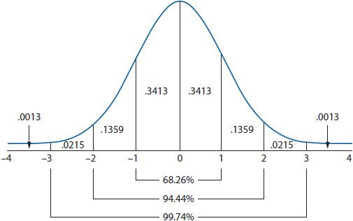
Figure 8–5. The normal distribution.
THE STANDARD NORMAL DISTRIBUTION
Among the infinite number of potential normal distributions, only the standard normal distribution can be used to compare all normal distributions. Although this may seem confusing on the surface, a clearer understanding of the standard normal distribution is made possible by considering the standard deviation. Initially, when converting a normal distribution to a standard normal distribution, the data must be converted into standardized scores referred to as z-scores. A z-score converts the units of the original data into standard deviation units. That is, a z-score indicates how many standard deviations a data point is from the mean. When converted to z-scores, the new standard normal distribution will always have a mean of zero and a standard deviation of one. The standard normal distribution is presented in Figure 8–5.
It is a common misconception that converting data into z-scores creates a standard normal distribution from data that was not normally distributed. This is never true. A standardized distribution will always have the same characteristics of distribution from which it originated. That is, if the original distribution was skewed, the standardized distribution will also be skewed.
![]() The key benefit to using the standard normal distribution is that converting the original data to z-scores allows researchers to compare different variables regardless of the original scale. Remember, a standardized variable will always be expressed in standard deviation units with a mean of zero and standard deviation of one. Therefore, differences between variables may be more easily detected and understood. For example, it is possible to compare standardized variables across studies. It should go without stating that the only requirement is that that both variables measure the same construct. After z-score standardization, the age of two groups of participants from two different studies can be compared directly.
The key benefit to using the standard normal distribution is that converting the original data to z-scores allows researchers to compare different variables regardless of the original scale. Remember, a standardized variable will always be expressed in standard deviation units with a mean of zero and standard deviation of one. Therefore, differences between variables may be more easily detected and understood. For example, it is possible to compare standardized variables across studies. It should go without stating that the only requirement is that that both variables measure the same construct. After z-score standardization, the age of two groups of participants from two different studies can be compared directly.
THE BINOMIAL DISTRIBUTION
Many discrete variables can be dichotomized into one of two mutually exclusive groups, outcomes, or events (e.g., dead versus alive). Using the binomial distribution, a researcher can calculate the exact probability of experiencing either binary outcome. The binomial distribution can only be used when an experiment assumes the four characteristics listed below:
1. The trial occurs a specified number of times (analogous to sample size, n).
2. Each trial has only two mutually exclusive outcomes (success versus failure in a generic sense, x). Also, be aware that a single trial with only two outcomes is known as a Bernoulli trial, a term that may be encountered in the literature.
3. Each trial is independent, meaning that one outcome has no effect on the other.
4. The probability of success remains constant throughout the trial.
An example may assist with the understanding of these characteristics. The binomial distribution consists of the number of successes and failures during a given study period. When all trials have been run, the probability of achieving exactly x successes (or failures) in n trials can be calculated. Consider flipping a fair coin. The coin is flipped for a set number of trials (i.e., n), there are only two possible outcomes (i.e., heads or tails), each trial is not affected by the outcome of the last, and the probability of flipping heads or tails remains constant throughout the trial (i.e., 0.50).
By definition, the mean for the binomial distribution is equal to the number of successes in a given trial. That is, if a fair coin is flipped 10 times and heads turns up on six flips, the mean is 0.60 (i.e., 6/10). Further, the variance of the binomial distribution is fixed by the mean. While the equation for the variance is not presented, know that the variance is largest at a mean of 0.50, decreases as the mean diverges from 0.50, and is symmetric (e.g., the variance for a mean of 0.10 is equal to the variance for a mean of 0.90). Therefore, because variance is fixed by the mean, the mean is the sufficient statistic for the binomial distribution.
In reality, the probability of experiencing an outcome is rarely 0.50. For example, biomedical studies often use all-cause mortality as an outcome variable, and the probability of dying during the study period is generally lower than staying alive. At the end of the trial, participants can experience only one of the outcomes—dead or alive. Say a study sample consists of 1000 participants, of which 150 die. The binomial distribution allows for the calculation of the exact probability of having 150 participants die in a sample of 1000 participants.
OTHER COMMON PROBABILITY DISTRIBUTIONS
As mentioned in the introduction to this section, there are numerous probability distributions available to researchers, with their use determined by the scale of measurement of the DV as well as the shape (e.g., skewness) of the distribution. When reading journal articles, it is important to know whether the appropriate distribution has been used for statistical analysis as inappropriate use of any distribution can lead to inaccurate statistical inference.
Table 8–1 provides a short list of the several commonly used distributions in the biomedical literature. Of note here is that alternative distributions are available when statistically analyzing non-normally distributed continuous data or data that cannot be normalized such as categorical data. The take away message here is that non-normal continuous data does not need to be forced to conform to a normal distribution.
TABLE 8–1. COMMON PROBABILITY DISTRIBUTIONS AND WHEN THEY ARE APPROPRIATE TO USE
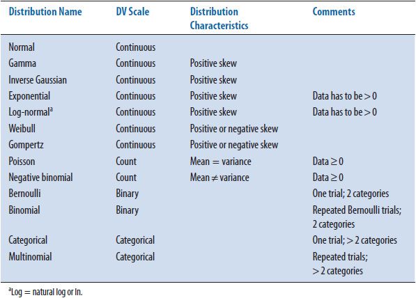
The only DV scale presented in Table 8–1 that has not been discussed thus far is count data. An example of count data would be a count of the number of hospitalizations during a 5-year study period. It is clear from the example that count data cannot take on negative values. That is, a participant cannot have a negative number of hospitalizations. Both the Poisson and negative binomial distributions are used when analyzing count data. The Poisson distribution assumes the mean and the variance of the data are identical. However, in situations where the mean and variance are not equal, the negative binomial distribution allows the variance of the distribution to increase or decrease as needed. As a point of possible confusion, the negative binomial distribution does not allow negative values. The negative in negative binomial is a result of using a negative exponent in its mathematical formula.
TRANSFORMING NON-NORMAL DISTRIBUTIONS
Transformations are usually employed by researchers to transform a non-normal distribution into a distribution that is approximately normal. Although on the surface this may appear reasonable, data transformation is an archaic technique. As such, transformation is not recommended for the three reasons provided below.
First, although parametric statistical analyses assume normality, the distribution of the actual DV data is not required to be normally distributed. As stated in the previous section, and highlighted in Table 8–1, if non-normality is observed, alternative distributions exist allowing proper statistical analysis of non-normal data without transformation. For this reason alone, transformation is rarely necessary.
Second, transforming the DV data potentially prevents effects of an IV from being observed. As an overly simplistic example, consider the bimodal distribution of body weight data presented in Figure 8–6. Say the body weight data were collected from a sample of men and women. Obviously, the data in Figure 8–6 is bimodal and not normally distributed. In this situation, a researcher may attempt to transform the data, but transformation would obscure the effects of an obvious IV—gender. That is, women tend to be lighter compared to men, and this is observed in these data, with women being grouped in the left distribution and men grouped in the right distribution. If transformation were performed successfully, inherent differences between men and women would be erased.
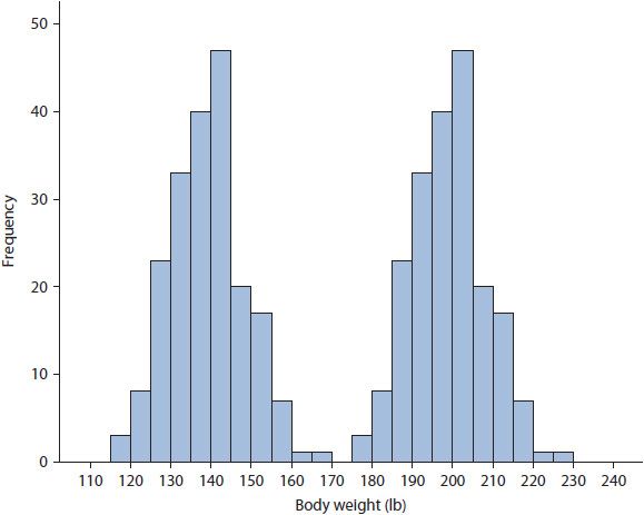
Figure 8–6. Body weight data for a group of men and women.
Third, while data transformation will not affect the rank order of the data, it will significantly cloud interpretation of statistical analyses. That is, after transformation all results must be interpreted in the transformed metric, which can become convoluted quickly making it difficult to apply results to the untransformed data used in the real world. Thus, when reading a journal article where the authors employed any transformation, be aware the results are in the transformed metric and ensure the authors’ interpretations remain consistent with this metric.
Although transformation is not recommended, it can be correct, and it will inevitably be encountered when reading the literature, especially for skewed data or data with outliers. Therefore, it is useful to become familiar with several of the techniques used to transform data. Transformations for positive skewness differ from those suggested for negative skewness. Mild positive skewness is typically remedied by a square root transformation. Here, the square root of all data is calculated and this square root data is used in analysis. When positive skewness is severe, a natural log transformation is used. When data are skewed negatively, researchers may choose to reflect their data to make it positively skewed and apply the transformations for positive skewness described above. To reflect data, a 1 is added to the absolute value of the highest data point and all data points are subtracted from this new value. For example, if the highest value in the data is 10, a 1 is added to create 11, and then all data points are subtracted from 11 (e.g., 11 –10 = 1, 11 –1 = 10, etc.). In this manner, the highest values become the lowest and the lowest become the highest. It should be clear that this process considerably convolutes data interpretation!
Epidemiological Statistics
The field of epidemiology investigates how diseases are distributed in the population and the various factors (or exposures) influencing this distribution.6 Epidemiological statistics are not unique to the field of epidemiology, as much of the literature in the biomedical sciences incorporates some form of these statistics such as odds ratios. Thus, it is important to have at least a basic level of understanding of these statistics. In this section, the most commonly used epidemiological statistics are discussed briefly including ratios, proportions, and rates, incidence and prevalence, relative risk and odds ratios as well as sensitivity, specificity, and predictive values.
RATIO, PROPORTIONS, AND RATES
Ratios, proportions, and rates are terms used interchangeably in the medical literature without regard for the actual mathematical definitions. Further, there are a considerable number of proportions and rates available to researchers, each providing unique information. Thus, it is important to be aware of how each of these measures are defined and calculated.7
A ratio expresses the relationship between two numbers. For example, consider the ratio of men to women diagnosed with multiple sclerosis (MS). If, in a sample consisting of only MS patients, 100 men and 50 women are diagnosed, the ratio of men to women is 100 to 50, or 100:50, or 2:1. Remember, that the order in which the ratio is presented is vitally important; that is, 100:50 is not the same as 50:100.
A proportion is a specific type of ratio indicating the probability or percentage of the total sample that experienced an outcome or event without respect to time. Here, the numerator of the proportion, representing patients with the disease, is included in the denominator, representing all individuals at risk. For example, say 850 non-MS patients are added to the sample of 150 MS patients from the example above to create a total sample of 1000 patients. Thus, the proportion of patients with MS is 0.15 or 15% (i.e., 150/1000).
A rate is a special form of a proportion that includes a specific study period, typically used to assess the speed at which the event or outcome is developing.8 A rate is equal to the number of events in a specified time period divided by the length of the time period. For example, say over a 1-year study period, 50 new cases of MS were diagnosed out of the 850 previously undiagnosed individuals. Thus, the rate of new cases of MS within this sample is 50 per year.
INCIDENCE AND PREVALENCE
Incidence quantifies the occurrence of an event or outcome over a specific study period within a specific population of individuals. The incidence rate is calculated by dividing the number of new events by the population at risk, with the population at risk defined as the total number of people who have not experienced the outcome. For example, consider the 50 new cases of MS that developed from the example above from the 850 originally undiagnosed individuals. The incidence rate is approximately 0.06 (i.e., 50/850). Note the denominator did not include the 150 patients already diagnosed with MS because these individuals could longer be in the population at risk.
Prevalence quantifies the number of people who have already experienced the event or outcome at a specific time point. Prevalence is calculated by dividing the total number of people experiencing the event by the total number of individuals in the population. Note that the denominator is everyone in the population, not just individuals in the population at risk. For example, the diagnosed MS cases (i.e., 50 + 150 = 200) would be divided by the population that includes them. That is, the prevalence of MS in this sample is 0.20 (i.e., 200/1000).
Stay updated, free articles. Join our Telegram channel

Full access? Get Clinical Tree


