CHAPTER THE TWENTY-EIGHT
Screwups, Oddballs, and Other Vagaries of Science
Locating Outliers, Handling Missing Data, and Transformations
In this chapter, we discuss ways of locating anomalous data values, how to handle missing data, and what to do if the data don’t follow a normal distribution.
SETTING THE SCENE
You’ve carefully planned your study and have estimated that you need 100 subjects in each of the two groups, with each subject tested before and after the intervention. With much effort, you’re able to locate these 200 patients. But, at the end of the trial, you find that 8 subjects didn’t show up for the second assessment; 2 subjects forgot to bring in urine samples; and you lost the sheet with all the demographic data on 1 subject. Your printout also tells you that your sample includes 2 pregnant men, a mother of 23 kids, and a 187-year-old woman. To add insult to injury, some of the data distributions look about as normal as the Three Stooges.
The situation we just described is, sad to say, all too common in research. Despite our best efforts, some data always end up missing, entered into the computer erroneously; or are accurate but reflect someone who is completely different from the madding crowd. Sometimes the fault is ours; we lose data sheets, punch the wrong numbers into the computer, or just plain screw up in some other way. Other times, the fault lies with the subjects;1 they “forget” to show up for retesting, put down today’s date instead of their year of birth, omit items on questionnaires, or are so inconsiderate that they up and die on us before filling out all the necessary paperwork. Last, what we’ve learned about the normal curve tells us that, although most of the people will cluster near the mean on most variables, we’re bound to find someone whose score places him or her somewhere out in left field.
Irrespective of the cause, though, the results are the same. We might have a few anomalous data points that can screw up our analyses, we have fewer valid numbers and less power for our statistical tests than we had initially planned on, and some continuous variables look like they cannot be analyzed with parametric tests. Is there something we can do with sets of data that contain missing, extreme, and obviously wrong values?
Of course there is, otherwise we wouldn’t have a chapter devoted to the issue. We have two broad options; grit our teeth, stiffen our upper lip, gird our loins, take a deep breath, and simply accept the fact that some of the data are fairly anomalous, wrong, or missing, and throw them out (and likely all of the other data from that case). Or, we can grab the bull by the horns and “fake it”—that is, try to come up with some reasonable estimates for the missing values. Let’s start off by trying to locate extreme data points and obviously (and sometimes not so obviously) wrong data. This is the logical first step because we would usually want to throw out these data, and we then end up treating them as if they were missing.
FINDING ANOMALOUS VALUES
Ideally, this section would be labeled “Finding Wrong Values,” because this is what we really want to do—find the data that eluded our best efforts to detect errors before they became part of the permanent record.2 For instance, if you washed your fingers this morning and can’t do a thing with them, and entered a person’s age as 42 rather than 24, you may never find this error. Both numbers are probably within the range of legitimate values for your study, and there would be nothing to tell us that you (or your research assistant) goofed. The best we can do is to look for data that are outside the range of expected values or where there are inconsistencies within a given case.
The easiest type of anomaly to spot is where a number falls either into a category that shouldn’t exist or above or below an expected range. For example, we can make a histogram of the subjects’ gender, using one of the computer packages we mentioned in Section 1. If we got the result shown in Figure 28–1, we’d know we’ve got problems.3
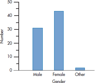
FIGURE 28-1 An obvious coding error.
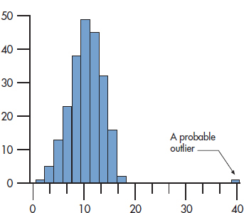
FIGURE 28-2 Histogram showing an outlier.
With continuous data, the two primary of ways of spotting whether any data points are out of line are (1) visually and (2) statistically. The visual way involves plotting each variable and seeing if any oddballs are way out on one of the tails of the distribution. You can use a histogram, a frequency polygon, or a box-plot; with each of them, the eyeball is a good measurement tool. Figure 28–2 shows what an outlier looks like on a histogram, and Figure 28–3 shows the same data displayed in a box plot. The solid circle on the right of Figure 28–3 is a far outlier, corresponding to the blip on the right of the histogram in Figure 28–2; and the asterisk is a run-of-the-mill outlier.
Notice that the histogram did not identify this low value as an outlier. The difference is that, with a histogram, we rely on our eyeballs only to detect outliers. With box plots, outliers are defined statistically, and this may pick up some of the buggers we would otherwise have overlooked. So, box plots combine visual detection of outliers with a bit of statistics.
You get a purely “statistical” look when you ask most computer packages to summarize a variable (show the mean, SD, and the like); they will also give the smallest and largest value for each variable. So if you’re studying the fertility patterns of business women, a minimum value of 2 or a maximum of 99 for age should alert you to the fact that something is awry, and you should check your data for outliers. Quite often, values such as 9 or 99 are used to indicate missing data. Again, check to see if this is the case.
A more sophisticated approach looks at how much each score deviates from the mean. You no doubt remember that the easiest way of doing this is to transform the values into z scores. Each number now represents how far it is from the mean, in SD units. The cutoff point between what’s expected and what’s an outlier is somewhat arbitrary, but usually anything over +3.00 or under −3.00 is viewed with suspicion. Doing this, we find that the highest value is 7.33—definitely an outlier that should be eliminated from further analysis. The lowest value has a z score of −2.54, so even though one program4 flagged it as suspicious, we’d probably keep it.
By eliminating the outlier(s), we’ve changed the distribution a bit. In this case, the mean dropped from 10.28 to 10.15, and the SD naturally got smaller (going from 4.06 to 3.54). Consequently, values that weren’t extreme previously may now have z scores beyond ± 3.00.5 So it makes sense to go through the data a few times, eliminating the outliers on each pass, until no more come to light.
More difficult to spot are “multivariate” errors. These occur when you’ve got two or more variables, each of which looks fine by itself, but some combinations are a bit bizarre. Imagine that we surveyed the incoming class of the Mesmer School of Health Care and Tonsorial Trades and got some basic demographic information. Take a look at the data in Table 28–1, which summarizes what we found for the first six students. If we used all of the tricks we just outlined, none of the variables would look too much out of line: the ages go from 18 to 32, which is reasonable; the only genders listed are male (M) and female (F); and once we realize that 99 means “Not Applicable,” the number of pregnancies looks okay. But wait a minute—we’ve got an 18-year-old female who had 5 pregnancies, and a 23-year-old man who had 2! Even in these days of more liberal attitudes toward sex, and a blurring of the distinctions between the genders, we would hazard a guess that these are, to use the statistical jargon, boo-boos.
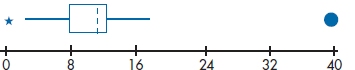
FIGURE 28-3 Box plot with one, possibly two, outliers.
TABLE 28–1 Data with some problems
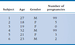
The important point is that neither of these errors would have been detected if we restricted our attention to looking at the variables one at a time; they were spotted only because we took two into consideration at the same time—age and number of pregnancies, and gender and number of pregnancies. One problem, though, is that if we have N variables, we have N × (N − 1) ÷ 2 ways of looking at them two at a time. For these 3 variables, there are 3 combinations; 10 variables would have 45, and so on. Although it may not make sense to look at all of these pairs, you should still examine those where being in a certain category on one of the variables limits the range of possible categories on the other. For example, age imposes limits on marital status (few people under the age of 17 have entered into the state of matrimonial bliss), number of children, income (not too many teenagers gross over $1,000,000 a year, although they all spend money as if their parents do), and a host of other factors.
Checking the data for integrity6 is a boring job that is best compared to being forced to listen to politicians. But it has to be done. The only saving grace is that we can hire research assistants to do the work for us; you can’t find anybody who’ll listen to politicians, for love or money.
TYPES OF MISSING DATA
You would think that data that are missing are just plain missing. But life is never that simple in statistics. Data can be missing in a number of ways. The situations we just outlined, for the most part, describe data that are missing completely at random (MCAR), in that there’s no pattern in the missingness (now isn’t that one ugly statistical term). This can happen if some values are entered incorrectly and later eliminated, if some data sheets are misplaced, if the machine that gathers the data acts up in unpredictable ways, or if the research assistant acts out in unpredictable ways. And for once, a statistical term means exactly what it says; the data are truly missing completely at random.
A term that doesn’t mean what it says is missing at random (MAR), which is different from MCAR, and doesn’t exactly mean that the data are missing randomly.7 MAR means that the probability of a score being missing for some variable is not related to the value of that variable, after controlling for other variables. For example, people with less education may be more likely to skip difficult items on a questionnaire. So, there is a definite pattern to the missingness, but it can be explained by some other variable in the data set; in this case, education level.
Finally, the data can be not missing at random (NMAR) or are non-ignorable (NI). This is the bane of existence of all researchers and, unfortunately, the most common situation. It means that the reason for missingness is directly related to the variable of interest. For example, in a study of analgesia, those in most pain may be the ones who are most unlikely to fill out the questionnaire. Similarly, patients in intervention trials who derive the least benefit or who experience the most side-effects would be those most likely to drop out early.
So why are we bothering you with these distinctions? It’s because the reason for data being missing affects how we deal with them. Some of the techniques we’ll describe in the next section don’t really work unless the assumptions of missingness at random or completely at random are met.
FILLING IN THE BLANKS
Just Forget about It
Once data are missing or have been eliminated as wrong or too anomalous, they are gone for good. Some statistical purists may say that any attempt to estimate the missing values either introduces a new source of error or results in biased estimations. Their solution would be to acknowledge the fact that some data are missing and then do the best with what is at hand. In fact, this is likely the most prudent path to take, especially when only a small amount of data are missing. As in other areas of statistics, the definition of “small” is subjective and arbitrary, but it probably hovers around 5% of the values for any one variable.
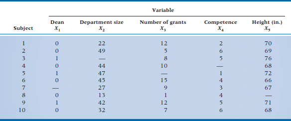
Even so, we still have a choice to make; to use all the available data left, or to eliminate all the data associated with a subject who is missing at least one data point. To illustrate the difference, let’s do a study testing a hypothesis based on our years of clinical observation working in a faculty of health sciences: the major criterion used to select deans (at least for males) is height. You can be the head of the largest clinical department, pull in the most grant money, and be responsible for a scientific advance that reduced the suffering among thousands of patients, but if you ain’t over 6’ tall, you won’t become a dean.8 To test this hypothesis, we’ll collect five pieces of data on former chairmen from several schools: whether or not they became a dean (coded 0 = No, 1 = Yes); the number of people in their department; the number of grants received during the last 5 years of their chairmanships; a peer rating of their clinical competence, on a 7-point scale (1 = Responsible for More Deaths than Attila the Hun, 7 = Almost as Good as I Am), and of course, their height. The data for the first 10 people are shown in Table 28–2.
Each of these 10 people was supposed to have 5 scores. As you can see, though, 5 subjects have some missing data: variable X1 (whether or not the person became a dean) for Subject 7; variable X2 for Subject 3; variable X3 for Subject 5, variable X4 for Subject 4, and Subject 8 has variable X5 missing. Assuming we want to correlate each variable with the others, how much data do we have to work with?
If we use as much data as possible, then the correlation between variables X2 and X3 is based on 8 subjects who have complete data for both variables (Subjects 1, 2, 4, 6, 7, 8, 9, and 10), as is the correlation between variables X2 and X4 (Subjects 1, 2, and 5 through 10) and similarly for all other pairs of variables. Intuitively, this approach is the ideal one to take because it makes maximum use of the existing data and makes no assumptions regarding what is missing. This way of analyzing missing data is sometimes referred to as pairwise deletion of data.
In pairwise deletion of data, a subject is eliminated from the analysis only for those variables where no data are available.
Needless to say, if anything seems logical, easy, and sensible in statistics, there must be something dreadfully wrong, and there is. Note that each of the 10 possible correlations is based on a different subset of subjects. This makes it difficult to compare the correlations, especially when a larger proportion of cases have missing data. Moreover, techniques that begin with correlation matrices (and this would include all the multivariate procedures, along with ordinary and logistic regression) may occasionally yield extremely bizarre results, such as F-ratios of less than 0 or correlations greater than 1.0. An additional problem is that it becomes nearly impossible to figure out degrees of freedom for many tests, because different parts of the model have differing numbers of subjects.
The other way of forgetting about missing data is to eliminate any case that has any data missing; this is referred to as casewise or listwise deletion of data. All of the statistics are then based on the same set of subjects.
In casewise or listwise data deletion, cases are eliminated if they are missing data on any of the variables.
The trade-off is the potential loss of a large number of subjects. It may seem that our example, where 50% of the subjects would be dropped from the study, is extreme. Unfortunately, it’s not. One simulation found that, when only 2% of the data were missing at random, over 18% of the subjects were eliminated using listwise deletion; and with 10% of the data missing, nearly 60% of the cases were dropped (Kim and Curry, 1977). So let this serve as a warning; if values are missing throughout the data set, listwise deletion can result in the elimination of a large number of subjects. If the data are MCAR, then listwise deletion results “only” in a loss of power because of the reduced sample size. In all other cases, it may lead to biased results, depending on which subjects are eliminated from the analyses.
When in Doubt, Guess
The second way of handling missing data is by imputing what they should be. This is simply a fancy way of saying “taking an educated guess.” Several techniques have been developed over the years, which in itself is an indication of the ubiquity of the problem and the lack of a totally satisfactory solution.9
TABLE 28–2 Data set with missing values
Deduction (the Sherlock Holmes technique). Sometimes it is possible to deduce a logical value for a missing data point. For instance, if a person’s race was missing, but we had data on the person’s parents, it’s a safe bet that the data would be the same. This approach is not always possible but is actually quite useful in cases where it can be used. It does work well in one common situation, where one too many (or too few) spaces were added during data entry. If an adult has an age of 5.2 years or 520 years, it’s pretty safe to assume that the correct age is 52, but the number got moved in one direction or the other. An “age” of 502 is a bit more tricky; should it have been 50 or 52?
Replace with the mean. The most straightforward method is to replace the missing data point with the mean of the known values for that particular variable. For example, the mean of the nine known values for variable X2 is 35.7, so we could assume that the value for Subject 3 is 36. Note that this hasn’t changed the value of the mean at all; it still remains 35.7 (plus or minus a tiny bit of error introduced by rounding). However, we reduced the variance somewhat; in this case, from 12.71 for the 9 values to 11.98 when we impute a value of 36. The reason is that it would be highly unusual for the missing value to have actually been the same as the mean value, so we’ve replaced the “real” (but lost) value with one that is closer to the mean—in fact, it is the mean. If only a small number of items are missing, the effect is negligible; once we get past 5% to 10%, however, we start to dramatically underestimate the actual variance. A good approximation of how much the variance will be reduced is n/N, where n is the number of non-missing values, and N is the total number of subjects.
Replacing the missing value with the mean would still result in an unbiased estimate of the numerator in statistics methods such as the t-test. However, the denominator may be a bit smaller, leading to a slightly optimistic test. On the other hand, correlations tend to be more conservative, by the amount:
where nx is the number of non-missing values for variable X, and ny is the number of non-missing values for variable Y. The distribution of scores is also affected by mean replacement, tending to become more leptokurtic.
Sometimes we can be even more precise. For example, departments of medicine are usually much larger than departments of radiology. So if we were missing the number of faculty members for a chairman of medicine, we’d get a better estimate by using the mean of only departments of medicine, rather than a mean based on all departments. However, because replacing the missing values with the mean lowers the SD, changes the distribution, and distorts correlations with other variables, this type of imputation should be avoided.
It’s important to note that mean substitution gives an unbiased estimate of the mean only if the data are MCAR (which, as we said, is rarely the case). When the data aren’t missing at random, it’s quite possible that those in the middle of the distribution are the people most likely to respond to a question; it’s those at the extremes who are more likely to skip items about income, for example (would you admit that your income is under $10,000 or over $500,00 a year?).
Use multiple regression. The next step up the ladder of sophistication is to estimate the missing value using the other variables as predictors. For example, if we were trying to estimate the missing value for the number of grants, we would run a multiple regression, with X3 as the dependent variable and variables X1, X2, X4, and X5 as the predictors. Once we’ve derived the equation, we can plug in the values for subjects for whom we don’t know X3 and get a good approximation (we hope).
A few problems are associated with this technique. First, it depends on the assumption that we can predict the variable we’re interested in from the others. If there isn’t much predictive ability from the equation (i.e., if the R2 is low), then our estimate could be way off, and we’d do better to simply use the mean value. The opposite side of the coin is that we may predict too well; that is, the predicted value will tend to increase the correlation between that variable and all the others, for the same reason that substituting the mean decreases the variance of the variable. The usual effect is to bias correlations toward +1 or −1. A better tactic is to add some random error to the imputed value (a method called stochastic regression). That is, instead of replacing the missing value with ˆy, it’s replaced by ˆy + N (0, s2),10 where s2 is the Mean Square (Residual) of the multiple regression. This substitution preserves the mean, the variable’s distribution, and its correlations with other variables. Last, multiple regressions are usually calculated using casewise deletion. Because several variables may be used in the regression equation, we may end up throwing out a lot of data and basing the regression on a small number of cases (i.e., we’re shafted by the very problem we’re trying to fix)! We should also note that although this technique is used widely, it should only be used when the data are MCAR or MAR (which they rarely are).
Use multiple imputation. The top step of the sophistication ladder is a technique called multiple imputation. What it does, in essence, is to impute the missing values a number of times (hence “multiple”) by using somewhat different initial guesses of what’s missing. Because these estimates are based on the data themselves, the final imputed values recreate the variance that was in the data. Rubin and Little (the guys who created this technique) say it can accurately impute values if up to 40% of the data are missing; and that as few as five imputations are required (Little and Rubin, 1987). That’s the good news. The bad news is that multiple imputation can be difficult to carry out. It means that there are five sets of data that are analyzed, their results stored, and then all the parameters averaged across these multiple data sets. As of this writing, very few statistical packages have implemented it. If you search the web, you’ll find some stand-alone packages; some are quite expensive, but others, like Amelia II (named after the aviator who went missing) and NORM,11 are free. Yet again, this technique works only for data that are MAR or MCAR, even though it’s commonly used for all types of missing data.
Last observation carried forward. If the previous techniques were on a ladder of increasing sophistication, last observation carried forward (LOCF) is, in our opinion, a broken rung. It is used with longitudinal data to cover circumstances where a subject drops out before the end. As the name implies, it consists simply of using that person’s last valid response to replace all the missing values. LOCF has two things going for it: it’s easy to implement, and it has the imprimatur of federal drug regulatory agencies.12 The underlying assumptions are that patients will improve while they’re receiving treatment, and won’t improve without therapy. If these assumptions are true, then carrying an intermediate value forward to the end is a conservative estimate of improvement that works against the study, which is good for intellectual honesty, if not for your curriculum vitae. So, what’s the problem? It’s with the assumptions. For example, studies of antidepressants often show that up to 40% of patients in the placebo condition improve, so assuming that they wouldn’t change without therapy is unwarranted. Also, improvement is rarely linear. More often, it is more rapid in the beginning and then starts to level out (asymptotes, if you want to use the technical jargon), so that LOCF may not be as conservative as you might think.
Another nail in the coffin of LOCF is the fact that the last value carried forward is always the same number. That is, if the final value were 7, then all of the imputed values will also be 7. But we know from psychometric theory that there will always be error associated with any measurement, so even if the person’s score actually remained 7, the measured value will vary around this number. This means that the constant value underestimates the error variance, which then leads to inflation of the statistical test; again, a bias operating in the wrong direction.
In some situations, LOCF actually overestimates the actual effectiveness of an intervention. This can occur if the outcome is the slowing of a decline. For example, the “memory drugs” used with patients with Alzheimer’s disease don’t improve memory; they simply slow its loss over time. If people drop out of the treatment condition more than the comparison because of adverse events, then LOCF would result in an overly optimistic picture of its effectiveness, by assuming that there won’t be any further decline. Similarly, you shouldn’t use this technique for adverse events, because LOCF will underestimate them for the same reason it underestimates improvement.
The bottom line is that, if you have longitudinal data with at least three data points for a person, use hierarchical linear modeling, as we discussed in Chapter 18, not LOCF. If you have even more data points, you could even model non-linear change.
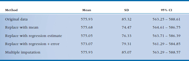
Comparing techniques. We did a simulation by using real data consisting of 10 variables from 174 people, and randomly deleting 20% of the values for one variable (Streiner, 2002b). These values were imputed using replacement with the mean, a regression based on the other nine variables, regression with error built in, and multiple imputation; the results are in Table 28–3. As you can see, all did a credible job of recapturing the actual mean of the variable. But, true to what we’ve said, replacement with the mean and with a value predicted by multiple regression underestimated the SD, and, as a result, the 95% CIs were overly optimistic. Adding in a fudge factor with multiple regression helped a bit, but multiple imputation stole the show; the confidence interval (CI) was almost identical to the original.
TABLE 28–3 Imputing means, SDs and CIs using four different methods
Over the past decade a number of other techniques have been introduced for dealing with missing data, such as expectation maximization and full information maximum likelihood (FIML). These are beyond the scope of this book,13 except to say that FIML is slowly becoming the default standard. It can be used with sample sizes as small as 100 and doesn’t require combining data sets as does multiple imputation. However, as of the writing of this edition, it hasn’t been implemented in many statistical programs.
TRANSFORMING DATA
To Transform or Not to Transform
In previous chapters, we learned that parametric tests are based on the assumption that the data are normally distributed.14 Some tests make other demands on the data; those based on multiple linear regression (MLR), for example, MLR itself, ANOVA, and ANCOVA, as the name implies, assume a straight-line relationship between the dependent and independent variables. However, if we actually plot the data from a study, we rarely see perfectly normal distributions or straight lines. Most often, the data will be skewed to some degree or show some deviation from mesokurtosis, or the “straight line” will more closely resemble a snake with scoliosis. Two questions immediately arise: (1) can we analyze these data with parametric tests and, if not, (2) is there something we can do to the data to make them more normal? The answers are: (1) it all depends, and (2) it all depends.15
Let’s first clarify what effect (if any) non-normality has on parametric tests. The concern is not so much that deviations from normality will affect the final value of t, F, or any other parameter testing the difference between means (except to the degree that extreme outliers affect the mean or SD); it is that they may influence the p-value associated with that parameter. For example, if we take two sets of 100 numbers at random from normal distributions and run a t-test on them using an α level of .05, we should find statistical significance about 5% of the time. The concern is that, if the numbers came from a distribution that wasn’t normal, we’d find significance by chance more often than 1 time in 20. Several studies, however, have simulated non-normal distributions on a computer, sampled from these distributions, and tested to see how often the tests were significant. With a few exceptions that we discuss below, the tests yielded significance by chance about 5% of the time (i.e., just what they should have done). In statistical parlance, most parametric tests (at least the univariate ones) are fairly robust to even fairly extreme deviations from normality. This would indicate that, in most situations, it’s not necessary to transform data to make them more normal.
There’s a second argument against transforming data, and that has to do with the interpretability of the results. For example, one transformation, called the “arc sine” and sometimes used with binomial data, is:

A colleague of ours once told us that his master’s thesis involved looking at the constipative effects of medications used by geriatric patients. He reasoned (quite correctly) that because his dependent variable—the number of times the patients had a bowel movement on a given day—was binomially distributed, he should use this transformation. Proud of his deduction and statistical skills, he brought his transformed data to his supervisor, who said, “If a clinician were to ask you what the number means, are you going to tell him, ‘It is two times the angle whose sine is the square root of the number of times (plus 1⁄2) that each patient shat that day’?” Needless to say, our friend used the untransformed data.16 The moral of the story is that, even when it is statistically correct to transform the data, we pay a price in that lay people (and we!) have a harder time making sense of the results.
As the name implies, J-shaped data are highly skewed, either to the right or to the left, as in Figure 28–4. Data such as these occur when there’s a limit at one end of the values that can be obtained, but not at the other end. For example, several studies have tried to puzzle out what is disturbed in the thought processes of people with schizophrenia by seeing how quickly they react to stimuli under various conditions. The lower limit of reaction time is about 200 ms, reflecting the time it takes for the brain to register that a stimulus has occurred, deciding whether or not it is appropriate to respond, and for the action potential to travel down the nerves to the finger. However, no upper limit exists; the person could be having a schizophrenic episode or be sound asleep at the key when he or she should be responding. We often run into the same problem with variables such as the number of days in hospital, or when we’re counting events, such as the number of hospitalizations, times in jail, and the like. The majority of numbers are bunched up at the lower end, and then taper off quickly at the upper end. When data like these are analyzed with parametric tests, the p-values could be way off, so it makes sense to transform them.
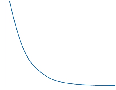
FIGURE 28-4 A J-shaped distribution.
A second situation in which transforming data is helpful is when we’re calculating Pearson correlations or linear regressions. Recall that these tests tell us the degree of linear relationship between two or more variables. It’s quite possible that two variables are strongly associated with one another, but the shape of the relationship is not linear. Around the turn of the last century, Yerkes and Dodson postulated that anxiety and performance are related to each other in an inverted U (∩)-shaped fashion: not enough anxiety, and there is no motivation to do well; too much, and it interferes with the ability to perform. Who studies 10 weeks before a big exam, and who can study the night before? As Figure 28–5 shows, a linear regression attempts to do just what its name implies: draw a straight line through the points.
As you can see, the attempt fails miserably. The resulting correlation is 0. Although this is an extreme example, it illustrates the fact that doing correlations where the relationship is nonlinear underestimates the degree of association; in this case, fairly severely. It would definitely help in this situation to transform one or both of the variables so that a straight line runs through most of the data points.
The third situation where transformations help is similar to the previous one; when, because of the nature of the data, they are expected to follow a nonlinear pattern, such as logarithmic or exponential. This assumption can be tested by doing the correct transformation and seeing if the result is a straight line. For example, if the relationship between the variables is exponential, a logarithmic transformation should make the line appear straight, and vice versa.17 This happens often when we’re looking at biological variables, such as blood levels. Here, the level of serum rhubarb, for instance, may depend on a previous enzymatic reaction, which in turn is dependent on a prior one. The central limit theorem tells us that the sum of a number of factors is normally distributed. In this situation, though, this causal chain is a result of the product of many influences, so the distribution is normal only if we take its log (Bland and Altman, 1996b). Even if it isn’t necessary to transform the variable for statistical reasons, simply seeing that the line is straight confirms the nature of the underlying relationship (Figure 28–6).
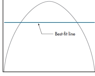
FIGURE 28-5 A straight-line fit through an inverted U (∩)shaped distribution.
The last situation where transformations may be warranted is when the SD is correlated with the mean across groups. Way back in Chapter 4, we mentioned that one of the desirable properties of the normal distribution is that the variance stays the same when the mean is increased. In fact, that’s one of the underlying assumptions of the ANOVA; we change the means of some groups with our interventions, but homogeneity of variance is (in theory, at least) maintained. This independence of the SD from the mean sometimes breaks down when we’re looking at frequency data: counts of blood cells, positive responses, and the like. If the correlation between the mean and the variance is pronounced,18 a transformation is the way to go. A good way to check this out is visually; plot the mean along the X-axis and the variance along the Y-axis; if the line of dots is heading toward the upper right corner, as in Figure 28–7A, you’ve got heteroscedasticity. If the line is relatively flat, as in Figure 28–7B, there’s no relationship between the two parameters.
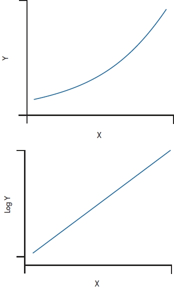
FIGURE 28-6 An exponential curve straightens out with a logarithmic transformation.
So let’s get down to the bottom line: should we transform data or shouldn’t we? We would propose the following guidelines19:
Don’t transform the data if:
The deviation from normality or linearity is not too extreme.
The data are in meaningful units (e.g., kilos, mm of mercury, or widely known scales, such as IQ points).
The sample size is over 30.
You’re using univariate statistics, especially ones whose robustness is known.
The groups are similar to each other in terms of sample size and distribution.
Transform the data if:
The data are highly skewed.
The measurements are in arbitrary units (e.g., a scale developed for the specific study or one that isn’t widely known).
The sample size is small (usually under 30).
You’ll be using multivariate procedures because we don’t really know how they do when the assumptions of normality and linearity are violated.
A large difference exists between the groups in terms of sample size or the distribution of the scores.
A moderate-to-strong correlation exists between the means and the SDs across groups or conditions.
So You Want to Transform
You’ve made the momentous decision that you want to transform some variables. Now for the hard question: which transformation to use? We can think of distributions as ranging from extremely skewed to the right (sort of a backward J), through normal, to extremely leftward skewed, as in Figure 28–8. In the same way, a range of transformations can be matched to the shapes almost one-to-one:
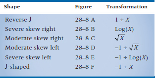
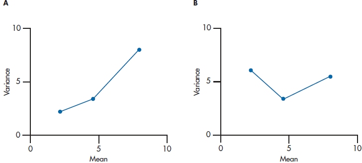
FIGURE 28-7 A situation where the means and SDs are A, correlated and B, independent.
The first transformation we’ll do is on these terms, by turning them into English. In fact, we can make this task even easier for ourselves; although it looks like we have six transformations here, we really have only three.20 The −1 term in the last three rows serves to “flip” the curve over, so the skew left curves become skewed right, allowing us to use the top three transformations. Let’s finish talking about this flip21 before explaining the transformations themselves. It’s obvious that, if we started with all positive numbers (such as scores on some test), we’ll end up with all negative ones.
Although the statistical tests don’t really mind, some people have trouble coping with this. We can get around the “problem” in a couple of ways. First, before the data are transformed, we can find the maximum value, add 1 to it (to avoid too many zeros when we’re done), and subtract each raw value from this number. For example, if we started out with the numbers:
1 1 2 4 8 9
then we would subtract each number from 10 (the maximum, 9, plus 1), yielding:
9 9 8 6 2 1
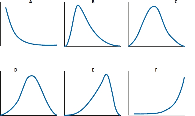
FIGURE 28-8 The “family” of distributions.
We would then use the transformations for right-skewed data, rather than left-skewed; that is, this reflection takes the place of dividing into −1.
The other method of eliminating the negative numbers is fairly similar22 but takes place after we divide the appropriate denominator into the −1 term. First, find the smallest number (i.e., the biggest number if we ignore the sign); subtract 1 from it (again to avoid too many zeros); and then add the absolute value of the number to all the data points. So, if our transformed data were:
−.1 −2 −3.7 −5 −6 −11
we would subtract 1 from −11, giving us −12; the absolute value is +12; and the result of the additions would be:
11.9 10 8.3 7 6 1
Now to explain the transformations. The first one, 1 ÷ X, is simply the reciprocal of X; if X is 10, the transformed value is (1 ÷ 10 = 0.1).23 The last transformation, −1 ÷ X, is exactly the same, except that 10 now becomes −0.1 (i.e., −1 ÷ 10).
The square root transformation is similar to the log transformation in that zeros and negative numbers are taboo.24 But, there’s an additional consideration in deciding how to eliminate these unwanted numbers: we also want to get rid of all numbers between zero and one. In other words, before we transform, we want the minimum number to be 1.0. The reason is that numbers between 0 and 1 react differently to a square root transformation than numbers greater than 1: the square root of numbers over 1 are smaller than the original numbers (e.g., the square root of 4 is 2), but the square roots of numbers less than 1 get larger with a square root transformation (the square root of 0.5 is 0.71). We often use square root transformations with data that have a Poisson distribution (discussed in Chapter 21), which are counts of things, such as the number of people dying in a given time period.
The second (and fifth) transformation involves taking the logarithm of the raw data. To refresh your memory, a logarithm (often called just a “log”) is the power to which a base number must be raised to equal the original number. So, if the base number is 10, 1 = 100 (any base to the power 0 is, by definition, 1), 10 = 101, 100 = 102, and 21 = 101.32. So, the log of 21, to the base 10, is 1.32 (written as log10(21) = 1.32). But, we don’t have to use a base of 10. For arcane reasons, we sometimes use a base of 2.71828…, which is abbreviated as e, and we write the log to base e as ln. Needless to say, the exponent is different: loge(21) = ln(21) = 3.04. In fact, we can use any number as a base, but in practice, we usually stick to bases of 2, 10, and e. Most computers can automatically figure out logs to bases of 10 and e and, with some manipulation, can handle base 2. When doing log transformations, it’s often a good idea to try a few bases because, depending on the nature of the data, some will work better than others. In general, the more extreme the spread of scores (“extreme” being yet another undefined term), the larger the base you should use. The same considerations apply to logs as to the square root transformation: the computer will have a minor infarct with zeros and negative numbers, and you should avoid numbers between zero and one. Log transforms come in handy with many physiological variables, where there are many factors that act together to affect an outcome.
These rules may seem to imply that you look at your data, pick the right transformation, and you’re off and running. Unfortunately, reality isn’t quite like that. The curves we get in real life don’t look like these idealized shapes; they always fall somewhere in between two of the models. What you have to do is try out a transformation and actually see what it does to the data (perhaps by looking at the figures for skewness and kurtosis, or at a box plot). It’s possible that you chose a transformation that overcorrected and turned a moderate left skew into a moderate right one. This gains you nothing except heartache. So, if this has happened, go back and try a less “powerful” transformation; perhaps square root rather than log, or log rather than reciprocal.
After the Transformation
Once we’ve transformed the data, our work isn’t quite done. We still have to interpret the results, and that often involves undoing what we’ve just done. In Figure 28–9, we’ve plotted the serum rhubarb levels of 366 patients with hyperrhubarbemia.25 As expected, it’s highly skewed to the right, with a mean of 4.645, and an SD of 2.083. If we use a log10 transformation, as in Figure 28–10, the distribution isn’t great, but it’s a lot more normal. Its mean is 0.622, with an SD of 0.206. You may think that if you “untransform” the log mean by 100.622, you’ll be back to where you started. But if you do that, you’ll get 4.190, not 4.645. The reason is that the antilog of the mean of transformed numbers is not the original arithmetic mean, but rather the geometric mean (Bland and Altman, 1996a). As we pointed out in Chapter 3, the geometric mean is always smaller than the arithmetic mean. It’s not that the geometric mean is wrong, but just realize what the number represents. The same argument applies to all other transformations, such as the reciprocal and square root.
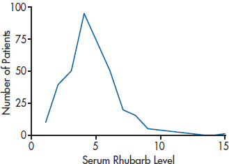
FIGURE 28-9 Graph of the distribution of hyperrhubarbemia.
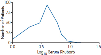
FIGURE 28-10 The distribution after a log10 transformation.
If you want to figure out confidence intervals, continue working with the transformed data: calculate the standard deviation and the standard error, multiply by the correct value for the 95% or 99% interval, and then transform back to the original units at the very end (Bland and Altman, 1996a). This is all very well and good for a single group. The fly in the ointment is that it breaks down when we are looking at the CI of the difference between groups (Bland and Altman, 1996c); the results are either meaningless (with square root or reciprocal transformations) or very difficult to interpret (with log transforms). As much as possible, try to work in the original units when you’re comparing groups.
How to Get the Computer to Do the Work for You
Finding Cases That Are Outliers
From Analyze, choose Descriptive Statistics → Explore
Select the variables in the left column, and move them into the Dependent List
Click

Imputing Missing Values
From Transform, choose Replace Missing Values
Select the Method [try Linear Trend at Point or Series Mean]
Select the variable from the left column and click the arrow key
Repeat this for all the variables [you can use different transformations for each variable]
Click

[New variables are created with the imputed values replacing the missing data.]
Transforming Data
From Transform, choose Compute
Type in a new variable name in the Target Variable box
Select or type in what you want to do in the Numeric Expression box; for example, to take the natural logarithm of variable
VAR1:
Type VAR2 in Target Variable
Choose LN(numexpr) from the Functions: box and click the up arrow
Select the variable to be transformed from the list, and click the arrow
1 At least that’s what we tell the granting agency.
2 We know of several ways to do this, such as entering the data twice and looking for discrepancies. But if you’re reading this book to find out other ways, you’ve picked up the wrong volume, so go look somewhere else.
3 Actually, our problems are not as serious as those of the two people labeled “Other,” if the data aren’t wrong.
4 We used Minitab in this case.
5 We can actually figure out which, if any, values would be “revealed.” Using all the original data, a z-score of 3 corresponds to a raw score of 22.46 (i.e., 10.28 + 3 × 4.06); after we eliminated the outlier, a z of 3 corresponds to a score of 20.77. So any score between these two values would not be detected the first time but would be extreme on the second pass through the data.
6 Its, not yours.
7 You just gotta love statistical terminology.
8 That’s one of the saving graces about being short.
9 Where do all the data go when they go missing? Is there some place, equivalent to the elephants’ burial ground, filled with misplaced 1s, 32s, and 999s?
10 The term N(0, s2) is statistical shorthand for a normally distributed variable with a mean of 0 and a variance of s2. Most statistical packages allow you to do this quite easily.
11 It’s called that because it assumes the data are normally distributed; it’s not in honor of one of the authors, despite what he’d like to believe.
12 That alone should be a warning that something is amiss; it’s probably simple-minded and wrong.
13 Meaning that we don’t understand them either.
14 Some tests assume other distributions, such as the Poisson or exponential. However, because we’ve been successful so far in ignoring them, we’ll continue to pay them short shrift.
15 It’s been rumored that graduate students receive their PhDs in statistics when they reflexively answer, “It all depends” to any and all questions.
16 And later went on to become the head of Statistics Canada.
17 AHA! Finally, an explanation of the phrase, log linear. It appears linear when we take the log of one variable.
18 Yet another precise term to which we can’t assign a number.
19 Bear in mind that these are just guidelines. Any statistician worth his or her salt can think of a dozen exceptions, even before the first cup of coffee.
20 There are actually many more possible transformations, including the arc sine one, but they’re rarely used, so we’ll ignore them.
21 The correct word would be “reflect,” as in a mirror—not meaning to ponder (we never do that in statistics).
22 For once, we don’t get rid of the minus sign by squaring!
23 Don’t get too worried that you’ll have to do all these transformations by hand; at the end of the chapter, we’ll show you how to get the computer to do the work for you.
24 This is beginning to sound like a commercial for unmentionables.
25 You’ll remember that it’s a disorder marked by extreme redness of the torso and green hair.
Stay updated, free articles. Join our Telegram channel

Full access? Get Clinical Tree


