Putting It All Together
In this chapter, we provide some final signposts: (1) flow charts to help you select the right test, (2) simplified tample-size calculations, and (3) names of some software available for doing sample-size calculations.
SETTING THE SCENE
As a result of reading this book to the end, you are fired up with enthusiasm for the arcane delights of doing statistics. You rush out to the local software house, drop piles of your hard-earned shekels on the table, and buy the latest version of BMDP or SPSS. You cram it into your PC, sacrificing some neat computer games along the way. And there you sit, like the highwayman of yore, ready to pounce on the next unsuspecting data set that passes your way. In due course it arrives, and suddenly you are faced with the toughest decision of your brief career as a statistician, “What test do I use???”
Every professional has his or her top problems on the hit parade. For family docs, it’s snottynosed kids and high blood pressure; for neurologists, it’s migraines and seizure disorders; for respirologists, it’s asthma and chronic obstructive pulmonary disease; and for psychiatrists, it’s depression and schizophrenia. Routine is a depressing fact of the human condition. As one psychologist put it, “An expert doesn’t have to solve problems any more.”
And so it is for statisticians. Ninety percent of the lost souls who enter our offices come with one of two questions. If they have bits of ragged paper covered in little numbers, it’s, “What test do I use?” And if they come with a wheelbarrow full of grant proposals,1 it’s “How big a sample do I need?”
In this chapter, we hope to help you answer these questions all by yourself. The chapter is admittedly self-serving because, unlike some health professionals, we rarely charge for our advice. If we do this right, some of you may learn enough that you need not bother us or other members of our clan with one of these questions, so we can stay home, write books, and make royalties.
DESCRIPTIVE STATISTICS
The flow chart for descriptive stats is shown in Table 29–1. The first decision point is between one variable and two (whether you are looking at distributions or associations). The next step, in either case, is to dredge out some definitions. Decide if the variable is nominal (a frequency count in one of several named categories), ordinal (ranked categories or actual ranking), or interval or ratio—the distinction is unimportant)—(a measured quantity on each subject). Some judgment calls must be made along the way, of course. Will you treat the responses on the seven-point scales as ordinal or interval data? The answer depends, at least in part, on the journal you are sending your results to. Of course, as you move to extremes, it becomes clearer. A two- or three-point scale really should be treated as frequencies in categories; conversely, a sum of 10 or 20 ratings, regardless of whether they comprise two-point scales (e.g., “Can you climb the stairs?”) or seven-point Likert scales, can justifiably be treated as interval data.
From here on in, it’s easy. Let’s deal with the description of single variables first. If the variable is interval or ratio, the appropriate statistics are the mean and SD, plus additional measures of skewness and kurtosis, if it suits your fancy. Several graphing methods are suitable: stem-leaf plots for information from the raw data, histograms or frequency polygons to show the data graphically, and box plots to summarize the various statistics.
TABLE 29–1 Descriptive statistics and graphs
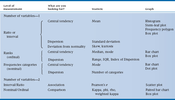
For ordinal data, means and SDs are replaced with medians, modes, and ranges or inter-quartile ranges. In displaying the data, connecting the dots is out of order, so we use bar charts and box plots only.
Finally, for nominal data, about all we can use to summarize the data is the mode (most commonly occurring category) to indicate central tendency and the index of dispersion to show dispersion. The data are displayed as a bar chart or dot plot (point graph).
What about showing the association between variables? For interval and ratio variables, the Pearson correlation is the only accepted measure. For categorical nominal variables, there are several contenders, but leading the pack are phi and Cohen’s kappa. For ordinal data in categories, weighted kappa would be used; if the data are ranked, then Spearman’s rho is the most useful measure.
The association between interval/ratio variables is illustrated with a scatter plot. With nominal variables, we can use a paired bar chart to display frequencies or a box plot when one variable is nominal and the other is interval/ratio (i.e., two groups).
UNIVARIATE STATISTICS
Now we get on to the bread and butter of stats—inferential statistics. The tables are organized more or less as was Table 29–1 on descriptive stats.
Once again, we begin by deciding whether the dependent variable is a measured quantity—an interval or ratio variable, a rank or ordinal variable, or a frequency or nominal variable. Interval and ratio variables are analyzed with parametric statistics, as in Chapters 7 through 19, and illustrated in Tables 29–2 and 29–3. Ranks and frequencies are analyzed with nonparametric statistics in Chapters 20 to 25 and covered in Table 29–4. Once this separation is made, we spell out the specifics for the two forms of statistics.
Parametric Statistics
The next major concern is with the independent variable(s), as shown in Table 29–2. If it is (or they are) also measured (interval or ratio) variables, then you are getting into examining the association among the variables with some form of regression analysis. If you have one variable, it’s simple regression, and the measure of association is the Pearson correlation, r. If you have more than one independent variable, then the game is multiple correlation, with all its complexities, and the overall measure of association is the multiple correlation, R.
By contrast, independent variables that are categorical lead to tests of differences among means, t-tests, and ANOVA methods. To sort out all these complexities, look at Table 29–3.
The first issue in arriving at the right test of differences among means is to examine the design. The two classes of simple designs are (1) those which involve independent samples, where subjects are in different groups, and (2) those which involve related samples, where one measure is dependent on another. That is, studies that involve matched controls, pretest and post-test measurements, or other situations with more than one measurement on each case, are called related samples.
TABLE 29–2 Parametric statistics (ratio or interval data)
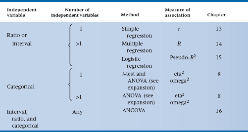
TABLE 29–3 Analysis of variance
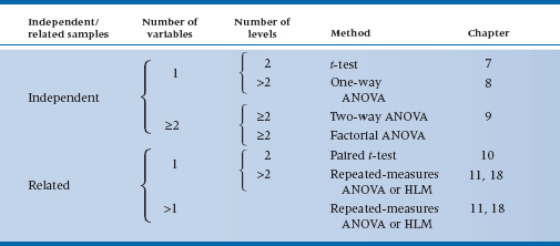
The simplest of the independent sample tests is the t-test, which involves only one grouping variable with only two levels (in simple language, two groups). If you have one independent variable but more than two groups, then you use one-way ANOVA.
Next in complexity is the consideration of more than one independent grouping factor. If you have just two factors (regardless of how many levels of each), it’s two-way factorial ANOVA. If you have more than two factors, then you are doing (generic) factorial ANOVA, which is a label attached to any number of wild and woolly2 designs (and also includes the two-way case).
Finally, the most general methods, which apply to all mixtures of interval/ratio and categorical independent variables, use analysis of covariance (ANCOVA; back to Table 29–2).
Having spelled out all these intricacies, keep in mind that most of these methods are rapidly becoming historical oddities. Any of the simpler tests are also special cases of the more complicated ones. Factorial ANOVA programs can do two-way ANOVA, one-way ANOVA, and t-tests. So bigger fishes continue to eat littler fishes all the way down the line.
Why bother with all this, “What test do I use” nonsense when actually one test will do? Several reasons are listed below:
- It shows that you are well grounded in the folklore of statistics.
- It helps you understand what less-erudite people did when they analyzed their data.
- The general programs, because they are more general, often require many more set-up specifications.
- Last, you may just find yourself somewhere in the middle of a campground with no electricity and only a solar calculator. It’s really handy to remember some of the simple strategies in this situation.
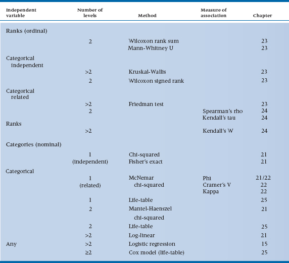
TABLE 29–4 Nonparametric statistics
Physician: “In my experience, all sheep in Scotland are black.”
Statistician: “You know, on statistical grounds, you can’t really conclude that. All you can really say is that some sheep in Scotland are black.”
Philosopher: “No, dear boy, that is incorrect. Logically all you can conclude is that one side of some sheep in Scotland is black.”
Nonparametric statistics
On to nonparametric statistics. The major division facing you is between ranked data, which are ordinal, and categorical data, which are usually nominal but may be ordinal, such as Stages I, II, and III (see Table 29–4). If it’s ranked data, then the next distinction is between independent and related samples, as in the parametric tests. For independent samples and ranked data, we are looking at the ordinal equivalent of the t-test (two groups) and one-way ANOVA (more than two groups), which are the Wilcoxon rank sum test (Mann-Whitney U) for two samples and the Kruskal-Wallis one-way ANOVA by ranks for more than two groups. If the samples are related (matched pairs of repeated observations), then the equivalent of the paired t-test is the Wilcoxon signed rank test. And for more than two groups or observations, we use the Friedman test for significance testing. Finally, if we are examining the relationship between two ranked variables, we can use Spearman’s rho or Kendall’s W (the former is preferred). If we want an overall measure of association among three or more rankings, analogous to an intraclass correlation coefficient, Kendall’s tau does the trick.
For categorical variables (see Table 29–4), the non-parametric tests concentrate on cross-classification and contingency tables (i.e., both independent and dependent variables are categorical). Note that, on several occasions (such as the dis-cussion of log-linear models), we have collapsed this distinction. In fact, the distinction between independent and dependent variables is more of a design consideration than an analysis decision. For example, what nonparametric test do we use when we are exploring the relationship between height of professors and tenure status (knowing the bias of at least one of the authors)? The dependent variable is tenure status (yes/no), and the independent variable is height. The appropriate test is a t-test, contrasting the mean heights in the tenured and untenured groups. In short (for a change, no pun intended), statistics is indifferent to the causal direction of the variables; only interpretation cares.
Now let’s run through the cookbook. If you have two categorical variables, the standard line of defense
is the chi-squared test. If the expected frequency in any cell of the contingency tables is less than five, then the Fisher exact test should be used. However, it may be hard to find software that can do this for tables that are larger than 2 × 2. If you have a larger table and a low expected frequency, it may be possible to collapse some cells to get the counts up without losing the meaning of the analysis. If you have three categorical variables, use the Mantel-Haenszel test. And if you have more than three, then the log-linear heavy artillery emerges. Finally, logistic regression, treated in Chapter 15, is a general strategy when the dependent variable is dichotomous and the independent variables are mixed.
Two quick detours: (1) if the samples are related or matched, with two variables, then a McNemar chi-squared is used. With more than two variables, no approach is available; (2) with survival data, you first construct a life table, then do a Mantel-Haenszel chi-squared. Then, to examine predictors of survival, the Cox proportional hazards model is appropriate.
MULTIVARIATE STATISTICS
Insofar as multivariate ANOVAs are concerned, we’d prefer not to repeat ourselves. So, just reread the section on ANOVAs, and stick an M in front of every mention of the term ANOVA; it’s that simple. For every ANOVA design (one-way, factorial, repeated-measures, factorial with repeated measures, fixed factors, random factors, ad infinitum), there’s an equivalent MANOVA for those situations when you have more than one dependent variable. And now, the fish gets even bigger—a two-way MANOVA can do a oneway MANOVA, which can do a Hotelling’s T2, which can do a t-test.
If you just have independent variables with no dependent variable and want to see what’s going on, use exploratory factor analysis. If you already have some idea of what’s happening and want to check out your hypotheses, a more powerful test (in terms of the theory, not necessarily in terms of statistical power) would be confirmatory factor analysis (CFA). Structural equation modeling allows you to simultaneously do a number of CFAs to define latent vari-ables and then look at the partial regressions among (or amongst, for our British readers—both of them) the latent variables.
QUICK AND DIRTY SAMPLE SIZES
We have spent an inordinate amount of time describing one approach after another to get a sample size, all the while emphasizing that nearly all the time the calculated sample size, despite its aura of mathematical precision, was a rough and ready approximation—nothing more. Well, someone has called our bluff and, along the way, made the whole game a lot easier. Lehr (1992) invented the “Sixteen s-squared over d-squared” rule, which should never be forgotten.
It goes like this. Recall that the sample size for a t-test is as follows3
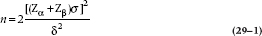
where σ is the joint SD and δ is the difference between the two means. Now if we select α = .05 (as usual), Zα = 1.96. If we pair this up with β = .20 (a power of .80) then Zβ = .84. And 2 (1.96 + .84)2 = 15.68, which is near enough to 16. So the whole messy equation reduces to something awfully close to:
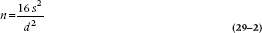
if we just abandon the Greek script and call δ “d” and σ “s.” Say it together now, class: “Sample size equals 16 ess squared over dee squared.”
“Ah, yes,” sez you, “but what about all the other esoteric stuff in the other chapters?” Well, continuing in the rough and ready (R and R) spirit, let’s deal with them in turn. Here we go.
Difference Between Proportions
The SD of a proportion is related to the formula 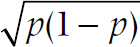 , where p is the proportion. If you want to be sticky about it, there are different SDs for the two groups, but they usually come out very close. So the R and R formula is:
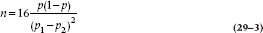
where p1 and p2 are the two proportions and p is the average of the two.
Difference Among Many Means
One-way ANOVA. Pick the two means you really care about then apply the formula, and this tells you how many you need for each group. If you have a previous estimate of the mean square (error), use this for s2.
Factorial ANOVA. Same strategy. Pick the difference that matters the most, and work it out accordingly. If you are nit-picky, add “1” per group for each other factor in the design, but this is not in the spirit of R and R calculations.
Correlations. We told you the fancy formula already, in Chapter 13. But to test whether a correlation is significantly different from zero, you can use this formula with the knowledge that the standard error of the correlation is about equal to 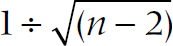 . The formula then becomes:
So perhaps you (and we) can relegate the high-powered formulae to the back burner. Certainly one
WRITING IT UP
Now that you’ve run all of your analyses, it’s time to write up what you found (or didn’t find). This section isn’t as much a how-to guide as random thoughts that occurred to us over the years, stimulated primarily by sloppy writing we’ve seen in journals, student papers, and manuscripts we’ve reviewed for various journals. Some of these suggestions reflect what journals now require,4 based on the report of a task force of the American Psychological Association (APA; Wilkinson et al. 1999). Others address points that would immediately label you to a reviewer as someone who doesn’t know what the @#$# he or she is doing.
Confidence Intervals. According to the APA task force, any point estimate (e.g., a mean, a correlation, a proportion, or whatever) should be accompanied by a confidence interval (CI). This reflects a growing trend that downplays the simple (and simple-minded) “significant/not significant” dichotomy. Earlier, we cited the delightful quote by Rosnow and Rosenthal (1989): “Surely, God loves the .06 nearly as much as the .05.” Probabilities exist along a continuum; an effect doesn’t mysteriously pop out of the blue as soon as the p-level drops below some arbitrary figure; there’s simply increasing confidence that there’s something going on. The CI is a good way of representing that confidence—is it tight enough that we can trust the findings; or is it so broad (despite a significant p-level) that the “real” result could be anywhere? Whenever possible, we’ve provided a formula for calculating the CI; use it!
Reporting p-Levels. In the same vein, report exact p-levels rather than p < .05, or < .01, or whatever. These cruder values are a holdover from the days when we had to look up p-levels in tables in appendices of books. Now that computers can report exact p-levels, use them (Wright, 2003). BUT, there are two caveats. First, don’t go overboard with the number of significant decimal places. A p-level of .014325 may look impressive, but it’s highly doubtful you will ever have enough data points to support such “precision.” Two numbers after the zero should be more than enough. Second, although computers used to be called “giant brains,” the truth is that they are incredibly stupid. In most statistical programs, highly significant results are often reported as p = .0000.5 Remember that the only things that have a probability of zero are those that violate one of the laws of nature, such as perpetual motion machines, traveling faster than the speed of light, or politicians who tell the truth. When you get a highly significant result, ignore what the computer spits out and report it as p < .001.
Significance. A few points about the term “significant.” One is that it’s often mistaken for “important.” A correlation of 0.14, based on 200 subjects, is statistically significant, but hardly one that will make other researchers envious of your insights. You should always preface the term “significant” with the word “statistically,” to indicate that you’re referring to a probability level and not to clinical or practical importance (Wright, 2003). Turning this around, the opposite of “significant,” in a statistical sense, is “nonsignificant;” it isn’t “insignificant.” The latter term is a value judgment (usually one we make about a rival’s statistically significant findings); non-significant is a statistical fact. Further, despite the fact that God is at least friendly with .06, results are either statistically significant or they’re not. A “trend that is not quite statistically significant” is a trend that might as well be zero. If you’ve got the confidence intervals and the exact p-value in there, the informed reader6 will understand. If you start to wax ecstatic about differences that aren’t significant, the informed reader (which includes many, but certainly not all, reviewers) will just be offended.
Effect Size. Reporting the ES is yet another variation on the theme that p-, t-, and F-levels tell only part of the story, and it’s another recommendation of the APA task force. Whenever possible, report the effect size in addition to the statistic. This is easy for correlational statistics, because r2 and R2 are themselves ESs. But for ANOVAs, for example, you should report one of the indices that we’ve discussed for each significant main effect and interaction.
Testing for baseline differences. Reading the results of any randomized controlled trial (RCT), the first table always reports the baseline characteristics of the groups, with a bunch of statistical tests showing whether any differences are significant or not. Although these tests are likely required by the editor, they are ridiculous for two reasons. First, let’s go back to the logic of significance testing. It answers the question, “If the null hypothesis is true, how probable is it that this difference could have arisen by chance?” But if we started off with one pool of subjects and randomly divided the people into two (or more) groups, then this probability is 100%. Any significant difference is a Type I error because what else but chance could have led to the difference if randomization worked (Altman, 1985, 1991)?
The second reason that significance testing is meaningless relates to the excuse that people use for doing the testing in the first place: “Well, if there are any differences, even due to chance, I want to correct for them using ANCOVA.” If you believe this, go back and read the section on ANCOVA. We should adjust for baseline characteristics (in randomized experiments and only in randomized experiments) even if the groups don’t differ significantly on the prognostic variables because ANCOVA will reduce the within-group variance, and this will result in a smaller value of p and tighter confidence intervals. So testing for baseline differences in RCTs is (a) logically meaningless, and (b) unnecessary. Unfortunately, having said that, go ahead and do it, because the benighted reviewers and editors who haven’t read this book will insist on it.
MEANWHILE, BACK AT THE RANCH
We’re now pretty well at the end of the story. But to close, we want to take a moment to re-re-reiterate something we’ve been saying all along. All of those arcane bits of algebra (well, most of them) have been directed simply at determining whether a result was or was not different from zero. A p-value of .036 says, “It’s likely different from zero”; a p-value of .00004 says, “It’s very likely different from zero”. That’s all.
Sadly, too many journal articles in health science begin and end with the p-value. Recently one of us was approached by a radiologist, whom we had never met before, who came into the office, dumped a file on the table, and said, “I’ve got some data here. Can you give me some p-values, please?” Even though he said “please,” the answer was an emphatic “No.” If you, the reader, are trying to understand what Ma Nature is all about, a p-value is uniquely unhelpful. The actual value of the t-test, F ratio, or Chi-squared helps a little bit, but not enough. Effect sizes may give some indication of how useful an effect is. Even the magnitude of a difference isn’t all that much use; a difference of 5% on a final exam has more value if it moves folks from 60% to 65% than from 93% to 98% or 21% to 26% (although paradoxically, the effect size would likely be smaller because the SD is larger due to floor or ceiling effects near the extremes).
But none of these are any substitute for displaying means, standard deviations, histograms, bar graphs, or scatter plots. You should always always ALWAYS let the reader know what the data look like by showing means, SDs, frequencies, odds ratios, or whatever in a figure or table, so we can get a real sense of what the data are telling us.
1 Why is it that it takes more text to describe the study you’re going to do than to describe the one you did? Typically, granting agencies allow 20 pages, or 5,000 words, for the proposal, but journals allow only 2,500 to 3,500 words for the finished product.
2 Time for one last joke before we leave you.A train was crossing the Scottish border on its way from London to Edinburgh. In the compartment were three professors—a physician, a statistician, and a philosopher. They spied a herd of black sheep, whereupon the conversation went as follows:
3 Actually don’t bother recalling; we’re giving it to you anyway.
4 If we were being trendy, we’d call these “best practices.”
5 This probably reflects the intellectual ability of the programmers, not the computer.
6 A reader informed by Bare Essentials, of course.
Stay updated, free articles. Join our Telegram channel

Full access? Get Clinical Tree


