In psychological jargon, we call these attributes hypothetical constructs; in statistics, they are called factors or latent variables. One purpose of FA is to determine if numerous measures (these could be paper-and-pencil tests, individual items on the tests themselves, physical characteristics, or whatever) can be explained on the basis of a smaller number of these factors. In this example, the Dean wants to know if applicants’ performances on these 15 tests can be explained by the 3 underlying factors; he will use these techniques to confirm his hypothesis (although, as we said, it’s better to use confirmatory factor analysis to do this, which we’ll explain in Chapter 20). In other situations, we may not know beforehand how many factors (if any) there are, and the object in doing the statistics is to determine this number. This is referred to as the exploratory use of FA.
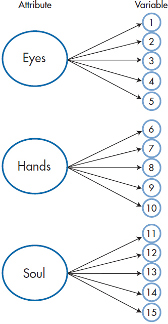
FIGURE 19-1 Three attributes (Eyes, Hands, and Soul), each measured by five tests.
Actually, Figure 19–1 oversimplifies the relationship between factors and variables quite a bit. If variables 1 through 5 were determined solely by the Eye of an Eagle factor, they would all yield identical results. The correlations among them would all be 1.00, and only one would need to be measured. In fact, the value of each variable is determined by two points (ignoring any measurement error): (1) the degree to which it is correlated with the factor (represented by the arrow coming from the large circles); and (2) its unique contribution—what variable 1 measures that variables 2 through 5 do not, and so on (shown by the arrow from the boxes labeled U in Figure 19–2). We can show this somewhat more complicated, but accurate, picture in Figure 19–2.
What exactly is meant by “uniqueness”?5 We can best define it in terms of its converse, communality. The communality of a variable can be approximated by its multiple correlation, R2, with all of the other variables; that is, how much it has in common with them and can be predicted by them. The uniqueness for variable 1 is then simply (1−R12); that portion of variable 1 that cannot be predicted by (i.e., is unrelated to) the remaining variables.
Before we go on, let’s complicate the picture just a bit more. Figure 19–2 assumes that Factor 1 plays a role only for variables 1 through 5; Factor 2, for 6 through 10; and Factor 3, for 11 through 15. In reality, each of the factors influences all of the variables to some degree, as in Figure 19–3. We’ve added lines showing these influences only for the contribution of the first factor on the other 10 variables. Factors 2 and 3 exert a similar influence on the variables, but putting in the lines would have complicated the picture too much. What we hope to find is that the influence of the factors represented by the dashed lines is small when compared with that of the solid lines.
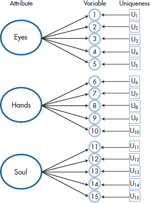
FIGURE 19-2 Adding the unique component of each variable to Figure 19-1.
HOW IT IS DONE
The Correlation Matrix
FA usually begins with a correlation matrix. On a technical note, we start with a correlation matrix mainly because, in our fields, the variables are each measured with very different units, so we convert all of them to standard scores. If the variables all used a similar metric (such as when we factor analyze items on a test, each using a 0-to-7 scale), it would be better to begin with a variance-covariance matrix.
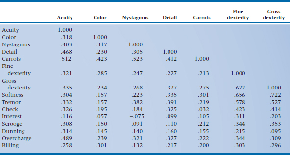
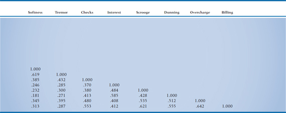
If life were good to us, we’d probably not need to go any further than a correlation matrix; we’d find that all of the variables that measure one factor correlate very strongly with each other and do not correlate with the measures of the other attributes (i.e., the picture in Figure 19–2). However, this is almost never the case. The correlations within a factor are rarely much above .85, and the measures are almost always correlated with “unrelated” ones to some degree (more like Figure 19–3). Thus we are left looking for patterns in a matrix of [n × (n − 1) ÷ 2] unique correlations; in our case, (15 × 14) ÷ 2, or 105 (not counting the 1.000s along the main diagonal), as shown in Table 19–1. Needless to say, trying to make sense of this just by eye is close to impossible.
TABLE 19–1 Correlation matrix of the 15 tests
Before going on to the next step, it’s worthwhile to do a few “diagnostic checks” on this correlation matrix. The reason is that computers are incredibly dumb animals. If no underlying factorial structure existed, resulting in the correlation matrix consisting of purely random numbers between −.30 and +.30 (i.e., pretty close to 0), with 1.000s on the main diagonal (because a variable is always perfectly correlated with itself), the computer would still grind away merrily, churning out reams of paper, full of numbers and graphs, signifying nothing. The extreme example of this is an identity matrix, which has 1.000s along the main diagonal and zeros for all the off-diagonal terms. So several tests, formal and otherwise, have been developed to ensure that something is around to factor analyze.
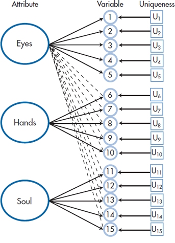
FIGURE 19-3 A more accurate picture, with each factor contributing to each variable.
Some of the most useful “tests” do not involve any statistics at all, other than counting. Tabachnick and Fidell (2013)6 recommend nothing more sophisticated than an eyeball check of the correlation matrix; if you have only a few correlations higher than .30, save your paper and stop right there.
A slightly more stringent test is to look at a matrix of the partial correlations. This “test” is based on the fact that, if the variables do indeed correlate with each other because of an underlying factor structure, then the correlation between any two variables should be small after partialing out the effects of the other variables. Some computer programs print out the partial correlation matrix. Others, such as SPSS/PC, give you its first cousin (on its mother’s side), an anti-image correlation matrix. This is nothing more than a partial correlation matrix with the signs of the off-diagonal elements reversed—for some reason that surpasseth human understanding. In either case, they’re interpreted in the opposite way as is the correlation matrix; a large number of high partial correlations indicates you shouldn’t proceed.
A related diagnostic test involves looking at the communalities. Because they are the squared multiple correlations, as opposed to partial correlations, they should be above .60 or so, reflecting the fact that the variables are related to each other to some degree. You have to be careful interpreting the communalities in SPSS/PC. The first time it prints them out, they may (depending on other options we’ll discuss later) all be 1.00. Later in the output, there will be another column of them, with values ranging from 0.0 to 1.0; this is the column to look at.
Among the formal statistical tests, one of the oldest is the Bartlett Test of Sphericity. Without going into the details of how it’s calculated, it yields a chisquare statistic. If its value is small, and the associated p level is over .05, then the correlation matrix doesn’t differ significantly from an identity matrix, and you should stop right there. However, Tabachnick and Fidell (2007) state that the Bartlett test is “notoriously sensitive,” especially with large sample sizes, so even if it is statistically significant, it doesn’t mean that you can safely proceed. Consequently, Barlett’s test is a one-sided test: if it says you shouldn’t go on to the Principal Components stage, don’t; but if it says you can go on, it ain’t necessarily so.
Another test is the Kaiser-Meyer-Olkin Measure of Sampling Adequacy (usually referred to by its nickname, MSA), which is based on the squared partial correlations. In the SPSS/PC computer package, the MSA value for each variable is printed along the main diagonal of the antiimage correlation matrix, and a summary value is also given. This allows you to check the overall adequacy of the matrix and also see which individual variables may not be pulling their full statistical weight. MSA is affected by four factors. It increases with (1) the number of variables, (2) the number of subjects, (3) the overall level of the correlation, and (4) a decrease in the number of factors (Dziuban and Shirkey, 1974). Kaiser (1970) gives the following definitions for values of the MSA:
Below 0.50 – Unacceptable
0.50 to 0.59 – Miserable
0.60 to 0.69 – Mediocre
0.70 to 0.79 – Middling
0.80 to 0.89 – Meritorious
Over 0.90 – Marvelous7
You should consider eliminating variables with MSAs under 0.70. If, after doing this and rerunning the analysis, you find that the summary value is still low, that data set is destined for the garbage heap.
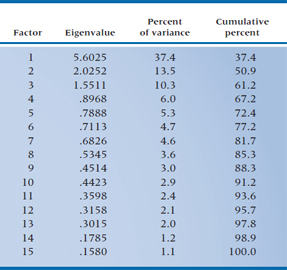
TABLE 19–2 The 15 factors
While we’re on the topic of diagnostic checks of your data set, let’s add one more. Take a look at the communalities for each variable; they should be above 0.50. If any variable has a value less than this, you should consider dropping it from the analysis and starting afresh.
Extracting the Factors
Assuming that all has gone well in the previous steps, we now go on to extracting the factors, a procedure only slightly less painful than extracting teeth. The purpose of this is to come up with a series of linear combinations of the variables to define each factor. For Factor 1, this would look something like:

where the X terms are the k (in this case, 15) variables and the w‘s are weights. These w terms have two subscripts; the first shows that they go with Factor 1, and the second indicates with which variable they’re associated. The reason is, if we have 15 variables, we will end up with 15 factors and, therefore, 15 equations in the form of the one above. For example, the second factor would look like:

Now, this may seem like a tremendous amount of effort was expended to get absolutely nowhere. If we began with 15 variables and ended up with 15 factors, what have we gained? Actually, quite a bit. The w‘s for the first factor are chosen so that they express the largest amount of variance in the sample. The w‘s in the second factor are derived to meet two criteria: (1) the second factor is uncorrelated with the first, and (2) it expresses the largest amount of variance left over after the first factor is considered. The w‘s in all the remaining factors are calculated in the same way, with each factor uncorrelated with and explaining less variance than the previous ones. So, if a factorial structure is present in the data, most of the variance may be explained on the basis of only the first few factors.
Again, returning to our example, the Dean hopes that the first 3 factors are responsible for most of the variance among the variables and that the remaining 12 factors will be relatively “weak” (i.e., he won’t lose too much information if he ignores them). The actual results are given in Table 19–2. For the moment, ignore the column headed “Eigenvalue” (we get back to this cryptic word a bit later) and look at the last one, “Cumulative percent.” Notice that the first factor accounts for 37.4% of the variance, the first two for over 50%, and the first five for almost 75% of the variance of the original data. So he actually may end up with what he’s looking for.
What we’ve just described is the essence of FA. What it tries to do, then, is explain the variance among a bunch of variables in terms of uncorrelated (the statistical term is orthogonal) underlying factors or latent variables. The way it’s used now is to try to reduce the number of factors as much as possible so as to get a more parsimonious explanation of what’s going on. In fact, though, FA is only one way of determining the factors. SPSS has seven different methods.
As with most options in factor analysis, which of these methods to use has been the subject of much debate, marked by strong feelings and little evidence. If the data are relatively normally distributed, the best choice is probably maximum likelihood and, if the assumption of multivariate normality is severely violated, use principal axis (Fabrigar et al., 1999), which we discuss in the next section; you can forget about all the others. Yet again, we’ve simplified your life.
Principal Components Analysis and Principal Axis Factoring
To understand the differences among this plethora of techniques, we’ll have to take a bit8 of a sidestep and expand on what we’ve been doing. In Equations 19–1 and 19–2, we showed how we can define the factors in terms of weighted combinations of the variables. In a similar manner, we can do it the other way, and define each variable as a weighted combination of the factors. For variable X1, this would look like:
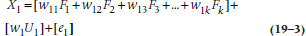
where the first subscript of the w‘s means variable 1, and the second refers to the factor, for the k factors we’re working with. Like Gaul, then, the variance of each variable is divided into three parts, which we’ve highlighted by putting them in separate sets of brackets: the first reflects the influence of the factors (i.e., the variable’s communality); the second is the variable’s unique contribution (U); and the third is random error (e) that exists every time we measure something. Ignoring the error term for a moment, we can summarize Equation 19–3 as:

The issue is what part of the variance we’re interested in.
In principal components analysis (PCA), we’re interested in all of the variance (that is, the communality plus the uniqueness); whereas in principal axis (PA) factoring, our interest is in only the variance due to the influence of the factors. That’s the reason that PA is also referred to as common factor analysis; it uses only the variance that is in common with all of the variables.9 This has a number of implications regarding how the analyses are done, how the results are interpreted, and when each is used.
In PCA, we begin with a correlation matrix that has 1.0s along the main diagonal. This may not seem too unusual, as all correlation matrices have 1.0s there, reflecting the fact that variables correlate perfectly with themselves. As a part of factor analysis, though, those 1.0s mean that we are concerned about all of the variance, from whatever source.10 It also means that, once we have defined the variables in terms of a weighted sum of the factors (as in Equation 19–3), we can use those equations and perfectly recapture the original data. We haven’t lost any information by deriving the factors. In terms of the computer output, it means that the table listing the initial communalities will show a 1.0 for every variable.
In PA, on the other hand, we’re concerned only with the variance that each variable has in common with the other variables, not the unique variance. Consequently, the initial estimate of the communality for each variable (which is what’s captured by the values along the main diagonal) will be less than 1.0. But, now we’re in a Catch-22 situation; we use FA to determine what those communalities are, but we need some value in order to get started. So, what we do is figure out the communalities in stages. As a first step, the best estimate of a variable’s communality is its squared multiple correlation (SMC) with all of the other variables. That is, to determine the SMC for variable X1, we do a multiple regression with X1 as the DV, and all of the other variables as predictors. This makes a lot of sense, since after all, R2(which is the usual symbol for the SMC) is the amount of variance that the predictor variables have in common with the DV, as we discussed in the chapters on correlation and regression. This estimate is later revised once we’ve determined how many factors we ultimately keep.
Because we have, in essence, discarded the unique variance, this means that we can’t go back and forth between the raw data and the results coming out of Equation 19–3 and expect to have exactly the same values; we’ve lost some information. However, from the perspective of PA, the information that was lost is information we don’t care about.11
So, when do we use what? If we’re trying to find the optimal weights for the variables to combine them into a single measure, then PCA is the way to go. We would do this, for example, if we were concerned that we had too many variables to analyze and wanted to combine some of them into a single index. Instead of five scales tapping different aspects of adjustment, for instance, we would use the weights to come up with one number, thus reducing the number of variables by 80%. We would also use PCA if we wanted to account for the maximum amount of variance in the data with the smallest number of mutually independent underlying factors. On the other hand, if we’re trying to create a new scale by eliminating variables (or items) that aren’t associated with other ones or don’t load on any factor, then PA (i.e., “common” FA) is the method of choice. This is the procedure that test developers would use.
After we’ve gone to great lengths to explain the difference between PCA and PA, the reality is that it may be much ado about nothing. Because PCA uses a higher value for the communalities than FA, its estimates of something called factor loadings (which we’ll explain more fully later on) are a tad higher than those produced by PA. But, the differences tend to be minor, and the correlations between factor loadings coming from the two methods are pretty close to 1.0 (Russell, 2002). The reality is that FA is highly robust to the way factors are extracted and that “many of these decisions have little effect on the obtained solutions” (Watson et al. 1994, p. 20). In fact, as the number of variables increases, the differences between FA and PCA virtually disappear, since the proportion of correlations on the main diagonal decreases, and those are the only ones that differ with the two techniques. When there are 10 variables, there are 45 unique off-diagonal correlations and 10 on the main diagonal, so they constitute about 18% of the entries. Once we’re up to 20 variables, they make up only 20/210 entries, or just under 10%.
Some people differentiate between the results of PCA and PA by calling the first components and the second factors. We’re not going to clutter this chapter (and your mind) by constantly saying “factors or components”; we’ll use the term factors for both, and trust you can keep the difference in mind.
On Keeping and Discarding Factors
A few paragraphs back, we mentioned that one of the purposes of the factor extraction phase was to reduce the number of factors, so that only a few “strong” ones remain. But first, we have to resolve what we mean by “strong,” and what criteria we apply. As with the previous phase (factor extraction) and the next one (factor rotation), the problem isn’t a lack of answers, but rather a surfeit of them.
At the same time, the number of factors to retain is one the most important decisions a factor analyst12 must make. Factor analysis is fairly robust with regard to the type of analysis (PCA versus PA), the type of rotation (stay tuned), and other details but, as we’ll discuss in a bit, keeping too many or too few factors may distort the final results. With too few factors, we may lose important information; with too many factors, we may focus on unimportant ones at the expense of major ones.
The criterion that is still the most commonly used is called the eigenvalue one test, or the Kaiser criterion, after the person who popularized it.13 It is the default (although, as we’ll see, not necessarily the best) option in most computer packages. We should, in all fairness, describe what is meant by an eigenvalue. Without going into the intricacies of matrix algebra, an eigenvalue can be thought of as an index of variance. In FA, each factor yields an eigenvalue, which is the amount of the total variance explained by that factor. We said previously that the w‘s are chosen so that the first factor expresses the largest amount of variance. It was another way of saying that the first factor has the largest eigenvalue, the second factor has the second largest eigenvalue, and so on. So why use the criterion of 1.0 for the eigenvalue?
The reason is that the first step in FA is to transform all of the variables to z-scores so that each has a mean of 0 and a variance of 1. This means that, with PCA, the total amount of variance is equal to the number of variables; if you have 15 variables, then the total variance within the (z-transformed) data matrix is 15. (With PA, this doesn’t quite hold, since we’ve thrown away the variance due to the uniqueness of each variable, but it should be fairly close.) If we add up the squared eigenvalues of the 15 factors that come out of the PCA, they will sum to—that’s right, class, 15.14 so you can think of a factor with an eigenvalue of less than 1.0 as accounting for less variance than is generated by one variable. Obviously then, dear reader,15 we gain nothing by keeping factors with eigenvalues under 1.0 and are further ahead (in terms of explaining the variance with fewer latent variables) if we keep only those with eigenvalues over 1.0; hence, the eigenvalue one criterion.
What most people (and all computer programs) tend to forget is that this criterion was proposed as a lower bound for the eigenvalues of the retained factors and therefore an upper bound for the number of factors to retain; that is, you should never keep more factors than it suggests, but you can keep fewer. In fact, this test has three problems. The first is that it’s somewhat arbitrary: a factor with an eigenvalue of 1.01 is retained, whereas one with a value of 0.99 is rejected. This ignores the fact that eigenvalues, like any other parameter in statistics, are measured with some degree of error. On replication, these numbers will likely change to some degree, leading to a different solution. The second problem is that the Kaiser criterion often results in too many factors (factors that may not appear if we were to replicate the study) when more than about 50 variables exist and in too few factors when fewer than 20 variables are considered (Horn and Engstrom, 1979). This is only logical because, with 20 variables, a factor with an eigenvalue of 1.0 accounts for 5% of the variance; with 50 variables, the same eigenvalue means that a factor is accounting for only 2% of the variance. The third problem is that, while this criterion may be logical in PCA, when the communalities are set equal to 1.0, it doesn’t make sense in PA, since the communalities are reduced. Unfortunately, programs such as SPSS use the same criterion for both methods (Russell, 2002).
The Lawley test tries to get around the first problem by looking at the significance of the factors. Unfortunately, it’s quite sensitive to the sample size and usually results in too many factors being kept when the sample size is large enough to meet the minimal criteria (about which, more later). Consequently, we don’t see it around much any more.
A somewhat better test is Cattell’s Scree Test. This is another one of those very powerful statistical tests that rely on nothing more than your eyeball.16 We start off by plotting the eigenvalues for each of the 15 factors, as in Figure 19–4 (actually, we don’t have to do it; most computer packages do it for us at no extra charge). In many cases (but by no means all), there’s a sharp break in the curve between the point where it’s descending and where it levels off; that is, where the slope of the curve changes from negative to close to zero.17 The last “real” factor is the one before the scree (the relatively flat portion of the curve) begins. If several breaks are in the descending line, usually the first one is chosen, but this can be modified by two considerations. First, we usually want to have at least three factors. Second, the scree may start after the second or third break. We see this in Figure 19–4; there is a break after the second factor, but it looks like the scree starts after the third factor, so we’ll keep the first three. In this example, the number of factors retained with the Kaiser criterion and with the scree test is the same.
The fact that no statistical test exists for the scree test poses a bit of a problem for computer programs, which love to deal with numbers. Almost all programs use the eigenvalue one criterion as a default when they go on to the next steps of factor analysis. If you do a scree plot and decide you won’t keep all the factors that have eigenvalues over 1.0, you have to run the FA in two steps: once to produce the scree plot, and again for you to override the eigenvalue criterion. You can usually do this by specifying either the minimum eigenvalue (equal to the value of the smallest one you want to retain) or the actual number of factors to keep. It’s a pain in the royal derrière to have to do it in two steps, but it can be done.
Be aware, however, that the simplicity of the scree plot can be deceiving. When Cattell drew up his rules for interpreting them, he was very explicit about the scales on the axes. When computer programs draw scree plots, however, the ratio of the scale of the X-axis to that of the Y-axis varies from one output to the next, depending on how many factors there are. Therefore, what looks like a clean break using Cattell’s criteria may seem smooth on the computer output, and vice versa. Sharp breaks are usually seen only when the sample size and the subject-to-variable ratio are large; when either is small, the scree plot tends to look smoother. In fact, we found that even experienced factor analysts couldn’t agree among themselves about how many factors were present (Streiner, 1998).
A third method, which is becoming increasingly more popular, is called parallel analysis (Horn, 1965), and is more accurate than interpreting the scree plot by eye (Russell, 2000). You create a number of data sets of random numbers – usually about 50 – with the same number of variables and subjects. The random variables have the same mean and range as the corresponding variable in the real data. All of these data sets are factor analyzed, and then the means and 95% CIs of each eigenvalue are calculated (that is, the mean of the first eigenvalue over the 50 data sets and its CI, the mean and CI of the second eigenvalue, and so on). Because using the mean eigenvalue is equivalent to setting the Type I error at 50% rather than 5%, it’s customary to use the value of 95th percentile rather than the mean in the next step. Finally, you superimpose these 95th percentile values from the random data on the scree plot of the real data (see Figure 19-5), and keep only those factors whose eigenvalues exceed those from the random data. In this example, that would lead to retaining three factors. Parallel analysis hasn’t been used much until recently because it isn’t implemented in most statistical packages. However, there are now a number of standalone programs and sets of code for SPSS and other packages (see Hayton et al., 2004; Ledesma and Valero-Mora, 2007; O’Connor, 2000; Reise et al., 2000; Thompson and Daniel, 1996).
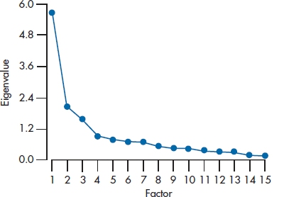
FIGURE 19-4 A scree plot for the 15 factors.
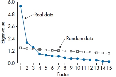
FIGURE 19-5 Results from a parallel analysis superimposed on the scree plot from Figure 19-4.
Bear in mind that, no matter which criterion you use for determining the number of factors, the results should be interpreted as a suggestion, not as truth. What your beloved authors do is use a couple of them (as long as one includes parallel analysis), and then run the FA a number of times; once with the recommended number, and then with one or two more and one or two fewer factors, and select the one that makes the most sense clinically. This use of clinical or research judgment drives some statisticians up the wall, because they like procedures that give the same result no matter who is using them. To them, we counter with the mature and sophisticated reply, “Tough, baby; live with it.” If, after using all these guidelines you still can’t decide whether to keep, say, five versus six factors, go with the higher number. It’s usually better (or at least less bad) to over-extract than to under-extract (Wood et al., 1996). When too few factors are extracted, the estimated factors “are likely to contain considerable error. Variables that should load on unextracted factors may incorrectly show loadings on the extracted factors. Furthermore, loadings for variables that genuinely load on the extracted factors may be distorted” (p. 359). The greater the degree of under-extraction, the worse the problem. Over-extraction leads to “factor splitting,” and the loadings on the surplus factors have more error than on the true factors, but often, clinical judgment can alert you to the fact that the variables on these surplus factors really belong with other factors. The bottom line is that you should be guided by the solutions, not ruled by them.
The Matrix of Factor Loadings
After we’ve extracted the factors and decided on how many to retain, the computer gives us a table (like Table 19–3) that is variously called the Factor Matrix, the Factor Loading Matrix, or the Factor Structure Matrix. Just to confuse things even more, it can also be called the Factor Pattern Matrix. As long as we keep the factors orthogonal to each other, the factor structure matrix and the factor pattern matrix are identical. When we relax this restriction (a topic we’ll discuss a bit later), the two matrices become different.
Table 19–3 tells us the correlation between each variable and the various factors. In statistical jargon, we speak of the variables loading on the factors. So “Visual Acuity” loads .627 on Factor 1 (i.e., correlates .627 with the first factor), .285 on Factor 2, and .347 on Factor 3. As with other correlations, a higher (absolute) value means a closer relationship between the factor and the variable. In this case, then, “Visual Acuity” is most closely associated with the first factor.
TABLE 19–3 Unrotated factor loading matrix
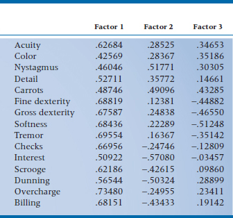
A couple of interesting and informative points about factor loadings. First, they are standardized regression coefficients (β weights), which we first ran across in multiple regression. In factor analysis, the DV is the original variable itself, and the factors are the IVs. As long as the factors are orthogonal, these regression coefficients are identical to correlation coefficients. (The reason is that, if the factors are uncorrelated, i.e., orthogonal, then the β weights are not dependent on one another.) This becomes important later, when we see what happens when we relax the requirement of orthogonality.
Second, the communality of a variable, which we approximated with R2 previously, can now be derived exactly. For each variable, it is the sum of the squared factor loadings across the factors that we’ve kept. Looking at Table 19–3, it would be (.62684)2 + (.28525)2 + (.34653)2 = .594 for ACUITY. We usually use the abbreviation h2 for the communality, and therefore, the uniqueness is written as (1 − h2).
At this point, we still don’t know what the factors mean. The first factor is simply the one that accounts for most of the variance; it does not necessarily reflect the first factor we want to find (such as the Eyes of an Eagle), or the variables higher up on the list. However, we’ll postpone our discussion of interpretation until after we’ve discussed factor rotation below.
Rotating the Factors Why rotate at all?
Up to now, what we’ve done wouldn’t arouse strong emotions among most statisticians.18 We’ve simply transformed a number of variables into factors. The only subjective element was in selecting the number of factors to retain. However, if we asked for the factor matrix to include all of the factors, rather than just those over some criterion, we could go back and forth between factors and variables without losing any information at all.19 It is the next step, factor rotation, that really gets the dander up among some (unenlightened) statistical folks. The reason is that we have, literally, an infinite number of ways we can rotate the factors. Which rotation we decide to use (assuming we don’t merely accept the program’s default options without question) is totally a matter of choice on the analyst’s part.
So, if factor rotation is still somewhat controversial, why do we do it? Unlike other acts that arouse strong passions, we can’t explain it simply on the basis of the fact that it’s fun. To us true believers, factor rotation serves some useful functions. The primary one is to help us understand what (if anything) is going on with the factors.
To simplify interpretation of the factors, the factor loading matrix should satisfy four conditions:
- The variance should be fairly evenly distributed across the retained factors.
- Each variable should load on only one factor.
- The factor loadings should be close to 1.0 or 0.0.
- The factors should be unipolar (all the strong variables have the same sign).
Stay updated, free articles. Join our Telegram channel

Full access? Get Clinical Tree


