A diagram of what this equation does is shown in Figure 20–1. For reasons that will become clear soon, we’ve drawn a box around each of the variables and a straight arrow3 leading from each of the predictor variables to the dependent variable (DV). This implies that we are assuming that each of the variables acts directly on the DV. But a little reflection may lead us to feel that the story is a bit more complicated than this. A person’s height may act directly on the coach’s evaluation, but it may also influence jumping ability. So a more accurate picture may be the one shown in Figure 20–2. One question we may want to ask is, which model is a more accurate reflection of reality?
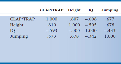
We’ll begin by just looking at how the variables are correlated with each other, to get a feel for what’s going on; the correlation matrix is shown in Table 20–1. As we would suspect, CLAP/TRAP has a strong positive relationship to Height and Jumping Ability, and is strongly and negatively related to IQ4; Height and Jumping are positively correlated with each other and negatively related to IQ.5
Interpreting the Numbers
If we now ran a multiple regression based on the model in Figure 20–1, we would get (among many other things) three standardized regression weights (betas, or βs), one for each of the predictors. In this case, βHeight is 0.548, βJumping is 0.199, and βIQ is −0.245. While the relative magnitudes of the β weights and their signs parallel those of the correlations, the relationship between these two sets of parameters isn’t immediately obvious. The problem is that the model in Figure 20–1 shows only part of the picture; it doesn’t take into account the correlations among the predictor variables themselves. To introduce a notation we’ll use a lot in this chapter, we can show that the variables are correlated with each other by joining the boxes with curved, double-headed arrows.6 In Figure 20–3, we’ve added the arrows and some numbers. The numbers near the curved arrows are the zero-order correlations between the predictor variables, and those above the single-headed arrows are the correlations between the predictors and the DV. Below the arrows, and in parentheses, are the β weights. Now, believe it or not, we can see the relationship between the correlations and the β weights.
Let’s start by looking at the effect of IQ on CLAP/TRAP. Its β weight is −0.245. Also, IQ exerts an indirect effect on CLAP/TRAP through its correlations with Jumping Ability and Height. Through Jumping Ability, the magnitude of the effect of IQ is the correlation between the two predictors (r = −0.433) times the effect of Jumping on CLAP/TRAP, which is its β weight of 0.199; and so −0.433 × 0.199 = −0.086. Similarly, the indirect effect of IQ through Height is −0.505 × 0.548, or −0.277. Adding up these three terms gives us:

which is the correlation between IQ and CLAP/TRAP. Doing the same thing for Jumping Ability shows a direct effect of 0.199; an indirect effect through IQ of −0.433 × −0.245 (which is 0.106), and an indirect effect through Height of 0.678 × 0.548, or 0.372. The sum of these three terms is 0.677, which, in this case,7 is the zero-order correlation between Jumping and CLAP/TRAP.8 Conceptually, then, r is the sum of both the direct and indirect effects between the two variables.
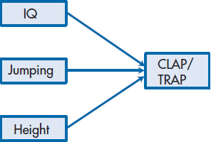
FIGURE 20-1 Model of linear regression predicting CLAP/TRAP scores from Height, Jumping Ability, and IQ.
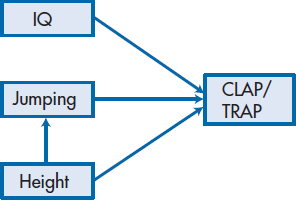
FIGURE 20-2 Modification of Figure 20-1 to show that Jumping Ability is affected by Height.
TABLE 20–1 Correlations among the variables in predicting CLAP/TRAP scores
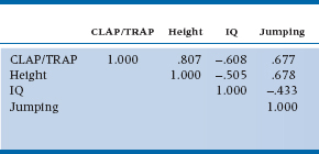
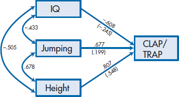
FIGURE 20-3 Figure 20-1 with the correlations among the variables and the β weights in parentheses added.
More formally, we can denote the correlation between pairs of predictors with the usual symbol for a correlation, r. Then, the correlation between IQ and Jumping is rIQ-Jump, between Height and Jumping is rHeight-Jump, and between IQ and Height is rIQ-Height. The path between each of the predictors and the dependent variable is a β weight, so that between Jumping and CLAP/TRAP is βJump, between IQ and CLAP/TRAP is βIQ, and between Height and CLAP/TRAP is βHeight. Therefore:
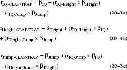
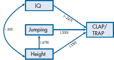
FIGURE 20-4 Figure 20-2 with path coefficients added.
TABLE 20–2 Original correlations in the upper triangle and reproduced correlations in the lower triangle
What we have just done is to decompose the correlations for the predictor variables into their direct and indirect effects on the DV. Now we are in a better position to see what adding the arrow in Figure 20–2 does to our model. The main effect is that it imposes directionality on the indirect effects; we are saying that Height can affect Jumping Ability (which makes sense), but that Jumping Ability doesn’t affect Height (which wouldn’t make sense9). In other words, we’ve delineated the paths through which the variables exert their effects; not surprisingly, Figure 20–2 is called a path diagram, and you have just been introduced to the basic elements of path analysis.
In Figure 20–4, we’ve added the “path coefficients” to the second model (the one in Figure 20–2). The direct effects are changed only slightly (although they are changed), but now the indirect effects are quite different. If we follow the arrows leading out of each predictor variable, we see that Jumping has a direct effect of 0.200 and, strange as it may seem, an indirect effect through Height of 0.678 × 0.550 ( = 0.373), for a total of 0.573.10 For Height, the direct effect of 0.550 is augmented by its indirect effect through Jumping Ability of 0.678 × 0.200, or 0.136, and its indirect effect through IQ of −0.505 × −0.247 ( = 0.125), so that its total effect is 0.810. IQ is even less straightforward; it has a direct effect (−0.247), an indirect effect through Height to CLAP/TRAP (−0.505 × 0.550 = −0.278), and a very indirect effect through Height to Jumping to CLAP/TRAP (−0.505 × 0.678 × 0.200 = −0.068), for an overall effect of −0.593. If you were paying attention, you will have noticed that, in this example, these numbers do not add up to equal the correlations in Table 20–2. We’ll show you why they don’t when we discuss how we can tell which models are better than others.
Finding Your Way through the Paths
When we decomposed the correlations in Figures 20–3 and 20–4, there were some paths we did not travel down, and others that we took seemed somewhat bizarre. For example, in Figure 20–3, we traced the indirect contribution of IQ → Jumping → CLAP/TRAP and IQ → Height → CLAP/TRAP; we did not have a path IQ → Jumping → Height → CLAP/TRAP. Similarly, in Figure 20–4, we had Height → Jumping → CLAP/TRAP, and, strangely enough, Jumping → Height → CLAP/TRAP, even though the arrow itself actually points from Height to Jumping. Back in 1934, Sewall Wright (the granddaddy of path analysis) laid out the rules of the road:
- For any single path, you can go through a given variable only once.
- Once you’ve gone forward along a path using one arrow, you can’t go back on the path using a different arrow.
- You can’t go through a double-headed curved arrow more than one time.
Kenny (1979) added a fourth rule:
- You can’t enter a variable on one arrowhead and leave it on another arrowhead.
Kenny’s rule is the reason why, in Figure 20–3, we did not trace out the path IQ → Jumping → Height → CLAP/TRAP or IQ → Height → Jumping → CLAP/TRAP. These paths enter one variable on an arrowhead from IQ, and would then leave on an arrowhead to get to the other variable—maybe not a felony offense but definitely a misdemeanor with respect to the rules.
Bizarre as it may seem, the path in Figure 20–4 starting at Jumping and then going through Height to CLAP/TRAP doesn’t violate any of these rules. The rule prohibits only paths that go forward and then backward;, this path goes backward and then forward. This path is meaningless in terms of our knowledge of biology (the technical term for this is a spurious effect), but it is legitimate insofar as decomposition of the correlation is concerned. It exists because Jumping and CLAP/TRAP have a common cause—Height.
Path Analysis and Causality
Until recently, path analysis was called “causal modeling.”11 Because we can specify paths by which we think one variable affects another, the hope was that we could make statements about causality, even if the data were actually correlational. In fact, if we specified a model that didn’t make much sense, such as having the path go from IQ to Jumping Ability, we would know from the statistics that something was amiss; there shouldn’t be a path between IQ and Jumping Ability. Does this mean that we actually can take correlational data and have them tell us about causation? Despite the hopes of the early developers of this technique, the answer is “No.” If we had altered the model by having the path go from Jumping Ability to Height, rather than from Height to Jumping Ability, as in Figure 20–5, all of the statistics would be the same. That is, this technique can tell us whether or not there should be a path between two variables, but it cannot tell us which way the arrow should point; this can only be supplied by our theory, the study design, or knowledge of the literature. For example, if we find a relationship between gender and spatial or verbal ability, it’s fairly safe to assume that gender (or factors correlated with gender, such as educational experiences or brain structure) leads to differences in ability. No matter how much we change people’s abilities, their gender will remain the same.12 Similarly, if we modify an educational program at time 1, and find that the experimental, but not the control, group improved their skills at time 2, the causality is apparent from the design of the study.
Path analysis can also disprove a “causal” model we may postulate—or fail to disprove it. However, just as failing to disprove the null hypothesis does not mean that we have proven it, failing to reject a causal model isn’t the same as showing that it’s correct. The bottom line is that determining true causation from correlations is still akin to getting gold from lead.
Endogenous and Exogenous Variables
The models we’ve discussed so far are relatively simple ones. To show what more path analysis can do, let’s look at some models it can handle and, at the same time, introduce you to some of the arcane vocabulary. When we looked at Figure 20–1, we referred to the variables on the left as the predictors and CLAP/TRAP as the dependent variable. Now that we have a new statistical technique, we have new terms for these variables.13 In path analysis (and, as we’ll see, in SEM in general), the variables on the left are referred to as exogenous variables.
Exogenous variables have arrows emerging from them and none pointing to them.
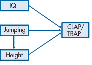
FIGURE 20-5 Figure 20-2 with Jumping Ability affecting Height.
This means that exogenous variables influence or affect other variables, but whatever influences them is not included in the model. For example, a person’s height may be influenced by genetics and diet, but our model will ignore these factors.
What we had called the dependent variable, CLAP/TRAP, is an endogenous variable in SEM terms, in that it has arrows pointing toward it. What about Jumping Ability in Figure 20–2? It has an arrow pointing toward it as well as one emerging from it. As long as there is at least one arrow (a path) pointing toward a variable, it is called endogenous.
Any variable that has at least one arrow pointing toward it is an endogenous variable.
This illustrates why the terms “independent,” “predictor,” and “dependent” variable can be confusing in path analysis. In Figure 20–4, Jumping is a dependent variable in relation to Height but a predictor in terms of its relationship to CLAP/TRAP. This further shows one of the major strengths of path analysis as compared to multiple regression; regression cannot easily deal with the situation in which a variable is both an independent variable (IV) and a DV.
Types of Path Models
Figure 20–6 shows a number of different path models, some of which we have already encountered. Those on the left are direct models, in that the exogenous variables influence the endogenous ones without any intermediary steps; in other words, the endogenous variables have arrows pointing toward them and none pointing away from them. In Part A of the figure (called an independent path model), the two exogenous variables affect an endogenous one, and the exogenous variables are not correlated with each other; hence the name “independent.” This situation isn’t too common in research with humans, since, as Meehl said in his famous sixth law (1990), “everything correlates to some extent with everything else” (p. 204).14 Part B of the figure, a correlated path model, is more common; it’s equivalent to a multiple regression, although we often have more than two predictors, and drawing in all those arcs between pairs of variables can really make the picture look messy. The picture it portrays is what we usually deal with, in that we assume the predictors are correlated with one another to various degrees. In Part C, there are two exogenous and two endogenous variables. The interesting thing about this model is that X1 and X2 can be different variables, or they can be the same variable measured at two different times; the same applies to Y1 and Y2. For example, in one study we did (McFarlane et al. 1983), we wanted to see if stressful events in a person’s life led to more illness. X1 and X2 were the amount of stress at time 1 and 6 months later at time 2, and Y1 and Y2 the number of illnesses at these two times. This model allowed us to take into account the fact that the best predictor of future behavior is past behavior (the path between Y1 and Y2), and then look at the added effect of stress at time 1 on illness at time 2.15 The two endogenous variables don’t have to be the same ones as the exogenous, nor do the two sets of variables have to be measured at different times, but they can be. Such is the beauty of path analysis.
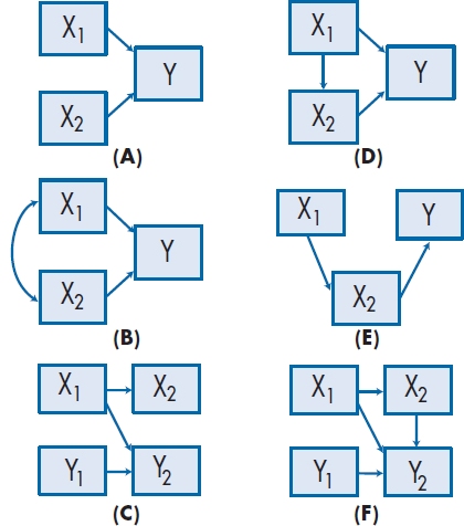
FIGURE 20-6 Different path models.
The major difference between the diagrams on the left of Figure 20–6 and those on the right are that the latter have endogenous variables with arrows pointing both toward them as well as away from them. These are referred to as indirect or mediated models, because the variables with both types of arrows mediate the effect of the variable pointing to them on the variables to which they point. In Part D of Figure 20–6, variables X1 and X2 both influence Y. However, X2 also mediates the effect of X1 on Y. In our example, Jumping (X2) affects CLAP/TRAP directly and also mediates the effects of Height (X1). That is, we would expect that, if two people can jump equally high, but one person is 6′3″ and the other “only” 5′8″,16 we would expect the second person to get more “credit,” since he’s exerting himself more. In Part E of the figure, variable X1 does not affect the endogenous variable directly, but only through its influence on X2. For example, the height of one’s father (X1) affects a person’s CLAP/TRAP score (Y) only by its effects on the cheerleader’s height (X2), which in turn affects Y.
The final model we’ll show (there are infinitely many others), part F of Figure 20–6, is the same as part C, except that we’ve added a path between X2 and Y2. What this does is to turn X2 (stress at time 2) into a mediated variable. Now we are saying that the number of illnesses measured at time 2 is affected by three things: illness at time 1, stress at time 1, and stress at time 2. Furthermore, we are saying that stress at time 1 works in two ways on illness behavior at time 2: directly (sort of a delayed reaction to stress), and by affecting stress at time 2, which, in turn, affects illness behavior immediately. The magnitude of the path coefficients tells us how strong each effect is.
Getting Disturbed
The models in Figure 20–6 look fairly complete and, in Part F, relatively complex. But, in fact, something is missing. We’re going to add some more terms, not to disturb you, but to disturb the endogenous variables. A more accurate picture (and a necessary one, from the standpoint of the statistical programs that analyze path models) is to attach disturbance terms to each endogenous variable. These are usually denoted by the letter D (for Disturbance), E for (Error), a small circle with an arrow pointing toward the variable, or a circle with one of the letters inside, as in Figure 20–7. This is similar to what we have in multiple regression, where every equation has an error term tacked on the end that captures the measurement error associated with each of the predictor variables. In path analysis (and in SEM in general), the disturbance term has a broader meaning; in addition to measurement error, it also reflects all of the other factors that affect the endogenous variable and which aren’t in our model, either because we couldn’t measure them (e.g., genetic factors) or we were too dumb to think of them at the time (e.g., how much the cheerleader’s parents bribed the coach for their kid to get a good performance score).
If we were to draw complete diagrams for the examples we’ve discussed, then Figure 20–3 would have a disturbance term attached to CLAP/TRAP. In Figure 20–4, there would be two disturbance terms: one associated with CLAP/TRAP and one for Jumping, since it has become an endogenous variable with the addition of the path from Height. So why didn’t we draw them? Since every endogenous variable must have a disturbance term, they are superfluous to those of us who are “au courant” with path analysis. We have to draw them in when we use the computer programs, and we may put them in diagrams for the sake of completeness, but they’re optional at other times.
Recursive and Nonrecursive Models
Although it may not be apparent at first, all of the models in Figure 20–6 are similar in two important ways. First, all the paths are unidirectional17; that is, they go from “cause” to “effect” (using those terms very loosely, without really meaning causation). Second, if we had drawn the disturbance terms in the models, they would all be assumed to be independent from one another; that is, we wouldn’t draw curved arrows between the disturbances. For reasons that surpass human understanding, these models are referred to as recursive models.
Let’s return to the example we used in Figure 20–6F and modify it a bit more. In Figure 20–8, we have added a path between X1 and Y1 and between X2 and Y2 to indicate that stress could affect illness concurrently. It could be just as logical that the relationship goes the other way and even more logical that the relationship was reciprocal: that stress at a given time affects illness and also that illness affects stress, so that Figure 20–8 may be a more accurate portrayal of what is actually occurring. A path diagram with this feedback loop is called a nonrecursive model.18
Note that there is a difference between connecting two variables with a curved, double-headed arrow, and joining them with two straight arrows going in opposite directions. The former means that we “merely” expect the two variables to covary, such as when we use two similar measures of the same thing. Covariance may be the result of one variable affecting the other, but it may also be due to the effect of some underlying factor affecting both of them. A feedback loop, on the other hand, explicitly states that each variable directly affects the other—stress leads to illness, and illness leads to stress.
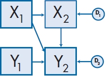
FIGURE 20-7 Addition of disturbance terms to Figure 20–6F.
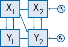
FIGURE 20-8 A nonrecursive path model.
Analysis and interpretation of nonrecursive models is much more difficult than with recursive ones, and far beyond the scope of one chapter in a book. If you ever do need to analyze a nonrecursive model, we suggest two things: (1) pour yourself a stiff drink and think again, and (2) if you still want to do it, read one of the books listed under “To Read Further.”
K.I.S.S.19
At first glance, it may seem as if the safest strategy to use is to draw paths connecting everything with everything else, and to let the path coefficients tell you what’s going on. This would be a bad idea for two reasons. First, as we will emphasize over and over again in this chapter (and indeed in much of the book), model building should be based on theory and knowledge. One disadvantage of the more sophisticated statistical techniques is that they are too powerful in some regard; they capitalize on chance variance and, if you blithely and blindly use a computer program to replace your brain cells, you can be led wondrously astray, albeit with low p levels. The second reason is that there are mathematical limits to how many paths you can have in any one diagram.
The number of parameters (i.e., statistical effects, such as path coefficients, variances, covariances, and disturbances) you can analyze is determined by the number of observations. “Observations” here is a function of the number of variables and is not related to the number of subjects. That is, a given path model has the same number of observations, whether the study used 10 subjects or 10,000 subjects. If there are k variables, then:
because there are [k × (k − 1)/2] covariances among the variables, plus k variances. In Figure 20–3, we have four observed variables, so we have 10 observations. This means that we can examine at most 10 parameters. Now the problem is, How many parameters do we actually have in this model? Another way of asking this question is, What don’t we know that we should know?
To answer this, we have to elaborate a bit more on the purpose of path analysis and, more generally, of structural equation modeling. We are trying to find out what affects the endogenous variables; that is, how the exogenous variables work together (the curved paths, which represent correlations or covariances), and which of those paths (the straight arrows) are important. This is determined by the variances of the variables. If we had a perfect model, then knowing these variances would allow us to predict the person-to-person variation in the endogenous variables. Because the endogenous variables are, by definition, “caused” or influenced by the other variables, they are not free to vary or covary on their own but only in response to exogenous variables. Consequently, we are not interested in estimating the variances of endogenous variables but only those variances for variables that can vary. Note that the disturbance term attached to an endogenous variable is, in SEM thinking, free to vary and thus influence the endogenous variable—so it’s one of those things we have to estimate.
Where does this leave us with respect to Figure 20–3? It’s obvious we want to estimate the 3 path coefficients, so they’re on the list of parameters to estimate. Also, we don’t know the variances of the exogenous variables or the covariances among them, so that adds another 6 parameters (3 variances + 3 covariances). Finally, we have the variance of the disturbance term itself (which isn’t in the figure, but is implied), meaning that there are 10 parameters to be estimated.
Now let’s do the same for Figure 20–4. There are still 4 observed variables, so the limit of 10 parameters remains, but there are a different number of arrows. We have 4 path coefficients (the 3 from the variables to CLAP/TRAP, and 1 from Height to Jumping); the covariance between IQ and Height; the variances of 2 exogenous variables (IQ and Height); and 2 disturbance terms (those for Jumping and CLAP/TRAP), resulting in 9 parameters to be estimated.
If you’ve followed this so far, a number of questions should arise: Why didn’t we count the variance of CLAP/TRAP in Figure 20–3 as one of the parameters to be estimated? Why did we count the variance of Jumping among the parameters in Figure 20–3, but not in Figure 20–4? Why can’t we have more than 10 parameters? Does it make any difference that we had 10 parameters to estimate in Figure 20–3 and 9 in Figure 20–4? Is there intelligent life on Earth? If you’ve really been paying attention, you will have noticed that we already answered the first two questions (but we’ll repeat it for your sake). Stay tuned, and the remaining questions will be answered (except perhaps the last question, which has baffled scientists and philosophers for centuries).
To reiterate what we’ve said, we didn’t count the variance of CLAP/TRAP in either model, or that of Jumping in Figure 20–4, for the same reason: they’re endogenous variables and thus not free to vary and covary on their own. Since the goal of SEM is to explain the variances of variables and the covariances between pairs of variables that can vary, we aren’t interested in the parameters of variables that are determined by outside influences. Hence, endogenous variables don’t enter into the count.
Why can’t we examine more parameters than observations? The analogy is having an equation with more unknown terms than data. For example, if we had a simple equation:

and we know that a = 5, then what are the values of b and c? The problem is that there are an infinite number of possible answers: b= 0 and c= 5; b= 1 and c = 4; b= −19.32 and c = 24.32; and so forth. We say that the model is undefined (or under-identified) in that there isn’t a unique solution. If we had another observation (e.g., b = −3), then we can determine that c has to be 8; the model is now defined (the technical term is just-identified). If there were as many observations as parameters (i.e., we knew ahead of time that a = 5, b= −3 and c = 8), then the model would be correct, but there would be nothing left to estimate (this is referred to as being over-identified). This is the situation in Figure 20–3, where there are 10 observations and 10 parameters. In the next section, we’ll see the implication of this.
As Good as It Gets: Goodness-of-Fit Indicators
How do we know if the model we’ve postulated is a good one? In path analysis, there are three things we look for: the significance of the individual paths; the reproduced (or implied) correlations; and the model as a whole. Of the three, the significance of the paths is the easiest to evaluate. The path coefficients are parameters and, as is the case with all parameters, they are estimated with some degree of error. Again like other parameters, the significance is dependent on the ratio of the parameter to its standard error of estimate. In this case, we end up with a z-statistic:
and (yet again like other z tests), if it is 1.96 or greater, it is significant at the .05 level, using a two-tailed test.20
A second criterion concerns the reproduced (or implied) correlation matrix. You’ll remember that, when we reproduced the correlations from the path coefficients in Figure 20–3, we were able to perfectly duplicate the correlations by tracing all the paths. However, when we tried to reproduce the correlations in Figure 20–4, we found differences between the actual and implied correlations. In fact, if we look at the reproduced correlations in the lower half of Table 20–2, some of them differ quite a bit from the original correlations, which are in the upper half of the matrix. This tell us two things: (1) the model in Figure 20–3 fits the data better than the model in Figure 20–4; and (2) the model in Figure 20–3 fits the data too well, in that there is no discrepancy at all between the original and the reproduced correlations. The reason is apparent if we compare the number of observations in Figure 20–3 with the number of parameters; there are 10 of each. Like the case in which we are told ahead of time that a = b + c and that a= 5, b = −3, and c= 8, there’s nothing left to estimate, and there is a perfect fit between the model and the data. Life is usually much more interesting when we have fewer parameters than observations; we can then compare how close different models come to estimating the data.
When we look at the model as a whole, the major statistic we use is called the goodness-of-fit χ2 (χ2GoF), which we’ll meet later in different contexts. In most statistical tests, bigger is better21—the larger the value of a t-test, F-test, r, or whatever, the happier we are. This situation is reversed in the case of the χ2GoF, where we want the result to be as small as possible. Why this sudden change of heart?
Let’s go over the logic of χ2 tests. Basically, they all reduce to the difference between what we observe and what would be expected, with “expected” meaning the values we would find if the null hypothesis were true. Thus, the larger the discrepancy between the two sets of numbers—observed and expected—the larger the χ2. Because we usually want our results (the observed values) to be different from the null, we want the value of χ2 to be large. However, when we use χ2 to test for goodness-of-fit, we are not testing our observed findings against the null hypothesis, but rather against some hypothesized model, and we want our results to be congruent with it. So, the less the results deviate from the model, the better. In the case of χ2GoF, we hope to find a nonsignificant result, indicating that our results match the model.
The degrees of freedom (df) associated with the χ2GoF is the difference between the number of observations and the number of parameters. In the case of the model in Figure 20–4, we have 10 observations and 9 parameters to estimate; hence, df = 1. In this example, χ2GoF is 2.044, which has a p level of .153. Because the χ2GoF is not statistically significant, we have no reason to reject the model. Just to reinforce what we said earlier, the χ2GoF for the model in Figure 20–5, where the arrow between Jumping and Height went the “wrong” way, is also 2.044; so this statistic doesn’t tell us about the “causality” of the relationship between the variables. For the sake of completeness, we also discussed a different model, one that was so ridiculous that we were ashamed even to draw it. This was a model where there was a path between IQ and Jumping Ability. The χ2GoF for this model (which also has df = 1) is 42.525, which is highly significant, and means that there is a very large discrepancy between the model and the data.
In Figure 20–3, we cannot calculate a χ2GoF, because the number of parameters is equal to the number of observations, meaning that df = 0. This further illustrates that, when a model is fully determined (a fancy way of saying that the number of parameters and observations is the same), the data fit the model perfectly.
So, if we find that χ2GoF is not significant, does this prove that our model is the correct one? Unfortunately, the answer is a resounding “No.” As we just showed, the χ2 statistics associated with Figure 20–2 and Figure 20–5 are identical, even though one model makes sense and the other is patently ridiculous.22 Also, the χ2GoF is dependent on the sample size, since this influences the standard errors of the estimates. If the sample size is low (say, under 100), even models that deviate quite a bit from the data may not result in statistically significant χ2s. Conversely, if the sample size is very large (over 200 or so), it is almost impossible to find a model that doesn’t deviate from the data to some degree. Furthermore, there is no guarantee that there is yet another, untested, model that may fit the data even better. Thus, χ2GoF can tell us if we’re on the right track, but it cannot provide definite proof that we’ve arrived.
What We Assume
Path analysis makes certain assumptions, as do all statistical tests. Many of the assumptions are the same as for multiple regression, which isn’t surprising, given that the two techniques are closely related. The first assumption is that the variables are measured without error. This is patently impossible in most (if not all) research, but it serves to remind us that we should try to use instruments that are as reliable as possible. When this rule is violated (as it always is), it results in underestimates of the effects of mediator variables (that is, the indirect paths) and overestimates of the effects of the direct paths (Baron and Kenny, 1986). The second assumption, which is much harder to detect, is that all important variables are included in the model. It’s not a good idea to include variables that aren’t important, but these usually become obvious from their weak path coefficients. When crucial variables are left out, though, the model fit may be poor or yield spurious results. No statistical test can tell us which variables have been omitted; only our theory can guide us in this regard. Third, multiple regression and path analysis assume that the variables are additive. If there are interactions among the variables, an appropriate interaction term should be built into the model (Klem, 1995). Finally, both techniques can handle a moderate degree of correlation among the predictor variables (multicollinearity), but the parameter estimates become unreliable if the correlations are high (Klem, 1995; Streiner, 1994).
A Word about Sample Size
The df associated with the χ2GoF test is the difference between the number of observations and the number of parameters. So where does the sample size come into play? The sample size affects the significance of the parameter estimates—the path coefficients, the variances, and the covariances. In all cases, the significance is the ratio of the parameter to the standard error (SE), and the standard error, as we all know, is dependent on the square root of N. Having said that, how many subjects do we need? Unfortunately, there is no simple relationship between the number of parameters to be estimated and the sample size. A very rough rule of thumb is that there should be at least 10 subjects per parameter (some authors argue for 20), as long as there are at least 200 subjects. Yes, Virginia, path analysis (and SEM in general) is extremely greedy when it comes to sample sizes.
STRUCTURAL EQUATION MODELING
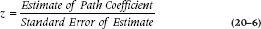
The major limitation with path analysis is that our drawings are restricted to circles and boxes, which become extremely monotonous. Wouldn’t it be nice if we could add some variety, such as ovals? Of course the answer is “Yes”; why else would we even ask the question? This isn’t as ludicrous as it first appears. In the drawing conventions of SEM, circles represent error or disturbance terms, and boxes are drawn to show measured variables—that is, ones we observe directly on a physical scale (e.g., Height) or a paper-and-pencil scale (e.g., CLAP/TRAP). In the chapter on factor analysis, however, we were introduced to another type of variable: latent variables (which we referred to in that chapter as factors). Very briefly, latent variables aren’t measured directly; rather, they are inferred as the “glue” that ties together two or more observed (i.e., directly measured) variables. For example, if a person gets a high score on some paper-and-pencil test of anxiety (a measured variable), shows an increased heart rate in enclosed spaces (another measured variable), and uses anxiolytic medications (yet a third observed variable), we would say that these are all manifestations of the unseen factor (or latent variable) of “-anxiety.”
FIGURE 20-9 Relationship between three measured variables and a latent variable.
The primary difference between path analysis and SEM is that the former can look at relationships only among measured variables, whereas SEM can examine both measured and latent variables. Because we represent latent variables with ovals, there is the added advantage that our diagrams can now become more varied and sexy. Figure 20–9 illustrates the example we just used in SEM terms. Notice the direction of the arrows: they point from the latent variable to the measured ones, which may at first glance seem backwards. In fact, this reflects our conceptualization of latent variables—that they are the underlying causes of what we are measuring directly. Thus, the latent variable (or trait or factor) of anxiety is what accounts for the person’s score on the test, his or her tachycardia, and is what leads to the use of pills. Also, since the three measured variables are endogenous, they have error or disturbance terms associated with them.
If Figure 20–9 looks suspiciously like the pictures we drew when we were discussing factor analysis, it’s not a coincidence. Exploratory factor analysis (EFA—the kind we discussed in Chapter 19) is now seen as a subset of SEM. We don’t gain very much, however, if we were to use the programs and techniques of SEM to do EFA. In fact, because SEM is a model testing or confirmatory technique, rather than an exploratory one, the computer output is less helpful than from programs specifically designed to do EFA (if that’s what we want to do). Despite this, we’ll start off with EFA to show you how the concepts we covered in path analysis apply in this relatively simple case. This will put us in a better position to understand how SEM works in more general cases.23
SEM and Factor Analysis
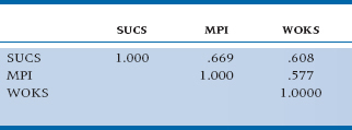
In addition to the variables of Height, Jumping Ability, and IQ, Dr. Teeme also hypothesized that, since the first part of the word “cheerleading” is “cheer,” success in this endeavor also depends on the candidate’s personality. However, unable to find a questionnaire that measures Cheer directly, he had to resort to using three other tests that he felt collectively measured the same thing: one tapping extroversion (the Seller of Used Cars Scale, or SUCS); another measuring positive outlook on life (the Mary Poppins Inventory, or MPI); and a third focusing on denial of negative feelings (the We’re OK Scale, or WOKS). The correlations among these scales are shown in Table 20–3. As he suspected, the correlations were moderate, but positive.
If we now did an EFA, using a least-squares method of extracting the factor, we would find that the factor loadings were 0.840 for SUCS, 0.797 for MPI, and 0.724 for WOKS. A drawing of this using the SEM conventions is shown as Figure 20–10. There are a few points to note. First, the disturbance or error term in EFA is usually labeled with the letter U (which stands for “uniqueness”); the terminology is different, but the concept is the same.24 Second, for each variable, the square of the factor loading (which is equivalent to a path coefficient) plus the square of the uniqueness equals 1.00 (e.g., 0.8402 + 0.5432 = 1.00). In English, we’ve divided up the variance of the variable into two components: that explained by the factor (or latent variable); and that which is not explained by it (the uniqueness, error, or disturbance). Finally, the product of any two factor loadings is equal to the correlation between the variables. For example, the factor loadings for MPI and WOKS are 0.797 and 0.724, respectively; their product (i.e., 0.797 × 0.724) is 0.577, or their correlation.
Now, if we ran this as if it were a structural equation model, we would find exactly the same thing! So, why make such a big deal about the difference between EFA and confirmatory factor analysis (CFA—the SEM approach to factor analysis)? Leaving the math aside for the moment,25 the major difference is a conceptual one. In traditional, run-of-the-mill EFA, we are in essence saying, “I don’t know how these variables are related to one another. Let me just throw them into the pot and see what comes out.” That’s why it’s called “exploratory,” folks. In fact, when we don’t know what’s going on, it can be a very powerful tool that can help us understand the interrelationships in our data. The downside is that we can end up with a set of factors that look good statistically but don’t make a whole lot of sense from a clinical or scientific perspective; that is, it may not be at all obvious why the variables group together the way they do.
Confirmatory factor analysis, as is the case with all variants of SEM, is a model testing technique, rather than a model building one.26 So, while we still get pages and pages of output (reams, if we’re not careful what we ask for), the action is really at the end, where we see how well the model actually fits the data. This is a point that we’ve already mentioned and, as promised, we’ll keep emphasizing: changes to the model to make it fit the data better should be predicated on our theoretical understanding of the phenomenon we’re studying, and not based on moving arrows around to get the best goodness-of-fit index. We’ll say a bit more about CFA later in the chapter.
Before we move on to discuss the steps in SEM, some other points about the advantages of using latent variables (in addition to the esthetic one of having ovals in our drawings) need to be discussed. In our example of the three scales to measure “Cheer,” we said that none measures it exactly but that the three together more or less capture what we want; in other words, we’re making a “super-scale” out of three scales. We can accomplish the same goal using other techniques, but the route would be more roundabout. We would have to run an EFA on these variables (and any other sets of variables we wanted to combine); use the output from this analysis to calculate a factor score for each person; and then use that factor score in the next stage of the analysis. With SEM, all of this can be accomplished in one step.
TABLE 20–3 Correlations among three tests to measure “Cheer”
A second advantage arises from the use of measurement theory. Any time we measure something, for example, whether it’s blood pressure or pain, some error is involved. The error can arise from a variety of sources: the person’s blood pressure may change from one moment to the next; the manometer may not be perfectly calibrated; and the observer may round up or down to the nearest 5 mm or make a mistake recording the number. When paper-and-pencil or observer-completed tests are involved, even more sources of error exist, such as biases in responding or lapses in concentration. These errors result in a measure that is less than reliable. A problem then arises when we correlate two or more variables: the observed correlation is lower than what we would find if the tests had a reliability of 1.0. Thus, we will almost always underestimate the relationships among the variables and, if the reliabilities are “attenuated” very much, we may erroneously conclude that there is no association when, in fact, one exists (i.e., we would be committing a Type II error). The solution is to disattenuate the reliabilities, and figure out what the correlation would be if both tests were totally reliable.27 One major advantage of SEM is that this is done as part of the process.
If we had only one scale to tap some construct (that is, we would be dealing with a measured variable rather than a latent variable defined by two or more measured ones), we are sometimes further ahead if we randomly split the scale in half and then construct a latent variable defined by these two “sub-scales.” We can then calculate the reliability28 and, based on this, the disattenuated reliability.29
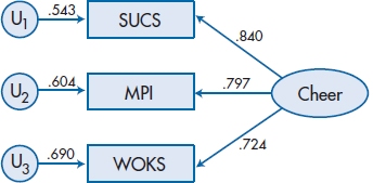
FIGURE 20-10 Factor loadings and uniqueness for the factor “Cheer” and its three measured variables.
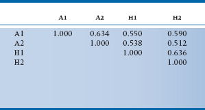
Let’s see just how powerful disattenuation can be when we’re testing a theory. Say we’re interested in the relationship between anxiety and the compulsion to read every e-mail message as soon as it pops up on the computer screen. The usual way to test this theory is to give one anxiety inventory and one test of e-mail reading compulsion to a group of people, and see what the correlation is. But, because the researcher has diligently digested what we’ve just said, she decides to give her 200 subjects two scales to tap anxiety (A1 and A2), and two of e-mail habits (H1 and H2). What she finds is shown in Table 20–4. The two anxiety scales are moderately correlated at 0.63, as are the two habit scales (0.64). To her sorrow, though, the correlations between anxiety and e-mail habits correlate only between 0.51 and 0.59; not bad, but not the stuff of which grand theories are made. However, after she creates a latent variable of anxiety, measured by the two A scales, and correlates this with the latent variable of habits, tapped by its two H scales, she finds the correlation between the traits is 0.86, and tenure (as well as glossy hair, finding her true love, and perpetual happiness) are guaranteed. In this case, the technique has calculated the parallel forms reliability, used this to disattenuate the reliabilities, and found what the correlation would be in the absence of measurement error.
TABLE 20–4 Correlations among two anxiety scales (A1 and A2) and two ccales of e-mail reading habits (H1 and H2)
Now that we have a bit of background, let’s turn to the steps involved in developing structural equation models. We’ll follow the lead of Schumacker and Lomax (1996) and break the process down into five steps30:
- Model specification
- Identification
- Estimation
- Testing fit
- Respecification
Model Specification
To a dress designer, model specification may mean, “I want a woman who’s 5′8″ tall, weighs 123 pounds, and has a perfect 36-24-36 figure.” To many men, it means stating which supercharged engine to put into a sports car, and whether to get a hard or a rag top (to attract the model of the first definition). Here, however, we are referring to something far more mundane: explicitly stating the theoretical model that you want to test. We have already discussed much of this when we were looking at path analysis. The same concepts apply, but now we will broaden them to include both measured variables (which can be analyzed with path analysis) and latent variables (which cannot be). For example, all of the diagrams in Figure 20–6 can be drawn replacing the measured variables with latent ones. In addition, we can “mix and match,” using both latent and measured variables in the same diagram, as long as we don’t do obviously ridiculous things, such as having two latent variables define a measured one.
Let’s use these concepts to fully develop a model of success in cheerleading, which is shown in Figure 20–11. We have a latent variable, Athletic Ability, which is measured by the three observed variables IQ, Height, and Jumping; and a second latent variable, Cheer, which is measured by our scales WOKS, SUCS, and MPI. Based on what we said earlier,31 it would make sense to randomly split CLAP/TRAP into two parallel forms (CLAP and TRAP) and have these define the latent variable, CT. Because CT is now an endogenous variable (it has arrows coming toward it from Cheer and Athletic Ability), we have to give it a disturbance term, which we’ve called d1.
This step of model building is called the measurement model, because we are specifying how the latent variables are measured. Some of the questions we could ask at this stage are as follows: (1) How well do the observed variables really measure the latent variable? (2) Are some observed variables better indices of the latent variable than are other variables? and (3) How reliable is each observed variable? (We will look at these issues in more depth and actually analyze this model when we discuss some worked-out examples of SEM and CFA.)
Identification
When we were discussing path analysis, we said that the number of parameters can never be larger than the number of observations, and, ideally, they should be less. However, it is often the case that, once we start adding up all the variances and covariances in our pretty picture, their number exceeds the limit of [k × (k + 1)]/2. The solution is to put constraints on some of the parameters. In the example we used previously, we were able to solve the equation, 5= b + c, by specifying beforehand that b= −3; that is, we made b a fixed parameter. We could also have solved the equation if we had said that b = c, in which case both b and c would have to be 2½. In this case, b and c are referred to as constrained parameters. So, we have three types of parameters in structural models: (1) free parameters, which can assume any value and are estimated by the structural equation model; (2) fixed parameters, which are assigned a specific value ahead of time; and (3) constrained parameters, which are unknown (as are free ones) but are limited to be the same as the value(s) of one or more other parameters. The joy32 of SEM is figuring out how many parameters to leave as free and whether the remaining ones should be fixed or constrained.
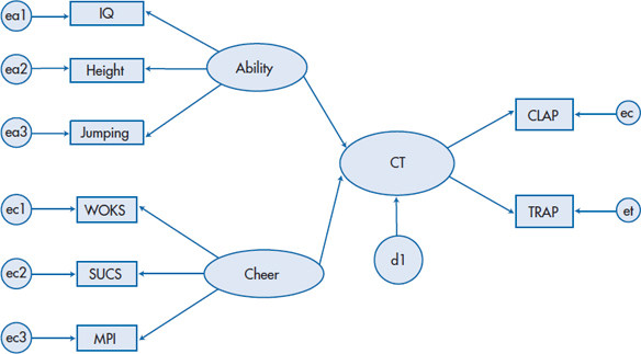
FIGURE 20-11 The full model for success in cheerleading.
Perhaps the easiest way of constraining parameters33 is simply not to draw a path. We said that MPI loaded on Cheer and (implicitly, by not having a path) did not load on Athletic Ability. That’s another way of saying that the parameter for the path from MPI to Athletic Ability is fixed to have a value of 0. Making the model as simple as possible is often the best way of avoiding “identification problems.” A second method involves the latent variables. For each unobserved variable with one single-headed arrow emerging from it (such as the error terms), we must fix either the path coefficient or the variance of the error itself to some arbitrary, non-zero value; otherwise, we’d be trying to estimate b and c at the same time. But, because we don’t actually measure (or observe) the error term, it doesn’t make sense to assign a value to it, which leaves us fixing the path coefficient. The easiest thing to do is to give it the value 1, and this is what’s usually done. In any case, assigning a different value won’t affect the overall fit of the model, just the estimate of the error variance.34
When a latent variable has two or more single-headed arrows coming from it (as is the case with CLAP/TRAP, Cheer, and Athletic Ability), one of them must be set to be equal to 1 (i.e., be a fixed parameter). It doesn’t really matter at all which one is chosen, but it’s best to use the variable with the highest reliability, if this is known. Changing which measured variable has a coefficient of 1 will alter the unstandardized regressions of all the variables related to that latent variable (because the unstandardized regressions are relative to the fixed variable), but it does not affect the standardized regression weights. Notice that we didn’t draw curved arrows between the exogenous variables. This is because we assume that the exogenous variables are correlated with themselves, and most programs, such as AMOS (Arbuckle, 1997), build this in automatically.
Finally, as we mentioned previously, there may be times when we believe that the error terms of two or more variables are identical (plus or minus some variation), and these become constrained parameters. This situation arises, for example, if we’re giving the same test at two different times; or we give it to mothers and fathers; or, as in the case of CLAP and TRAP, split a single test in half. In programs like AMOS, we indicate this by assigning the same name to the errors.
You might think that, if you’ve gone to the trouble of counting up the number of observations, simplifying the model, and constraining some of the parameters, you will avoid identification problems. Such thinking is naive, and reflects a trust in the inherent fairness of the world that is rarely, if ever, justified. The steps we’ve just discussed are necessary but not sufficient. Identification problems will almost surely arise if you have a nonrecursive model (i.e., one that has reciprocal relationships), which is yet another reason to avoid them whenever possible. You can also run into difficulty if the rank of the matrix35 you’re analyzing is less than the number of variables. This can occur if one variable can be predicted from one or more other variables, meaning that the row and column in a correlation matrix representing that variable is not unique. For instance, the Verbal IQ score of some intelligence tests is derived by adding up the scores of a number of subscales (six on the Wechsler family of tests). If you include the six subscale scores as well as the Verbal IQ score in your data matrix, then you will have problems, since one variable can be predicted by the sum of the others; that is, you have seven variables (the six subscales plus the Verbal IQ) but only six unique ones, resulting in a matrix whose rank is less than the number of variables. Even high correlations among variables (e.g., between height and weight) may produce problems.
Often, there’s no easy way to tell ahead of time if you’re going to have problems with under-identification of the model. You just do the best you can in setting up the model, pray hard, and hope the program runs. If the output says that the model needs more constraints, then you have to go back to your theory and determine if there is any justification in, for example, constraining two variables to have equal variances. You may suspect they may if they are the same scale measured at two different times, or two different scales tapping the same construct. If this doesn’t help, you may want to consider a different career.
Estimation
Now that you’ve specified the model, the time has come to estimate all of those parameters. The easy work is all of that matrix algebra—inverting matrices, transforming matrices, pre- and post-multiplying matrices, and so forth. Because it’s easy, the computer does it for us. What’s left for us is the hard stuff—deciding the best method to use. This requires brain cells; a commodity that is in short supply inside the computer.36 The fact that a number of different techniques exists should act as a warning, one that we’ve encountered in other contexts. If there were one approach that was clearly superior, then the law of the statistical jungle37 would dictate that it would survive, and all of the other techniques would exist only as historical footnotes. The continued survival of all of them, and the constant introduction of new ones, indicates that no clearly superior solution exists; hence, the unfortunate need to think about what we’re doing.
The unweighted least squares (ULS) method of estimating the parameters has the distinct advantage that it does not make any assumptions about the underlying distribution of the variables. However, it is scale-dependent; that is, if one or more of the indices is transformed to a different scale, the estimates of the parameters will change. In most of the work we do, the scales are totally arbitrary; even height can be measured either in inches or centimeters (or centimetres, if you live in the United Kingdom or one of the colonial backwaters.38 This means that the same study done in Canada and the United States may come up with different results, simply because of different measurement scales used. This becomes more of a problem when we use paper-and-pencil tests that don’t have meaningful scales. This is an unfortunate property, which is one of the reasons ULS is rarely used. Weighted least squares (WLS) is also distribution-free and does not require multivariate normality, but it requires a very large sample size (usually three times the number of subjects whom you can enroll) to work well.
Many programs default to the maximum likelihood (ML) method of estimating the parameters. This works well as long as the variables are multivariate, normal, and consist of interval or ratio data. But, if the data are extremely skewed or ordinally scaled, then the results of the ML solution are suspect.
So which one do you use? If you have access to the SEM program called LISREL8, and its “front-end” program, PRELIS2, then use those. They will calculate the correct matrix, based on the types of variables you have. If you use one of the other programs (e.g., EQS, PROC CALIS Stata, or AMOS), then it may be worthwhile to run the model with a few different types of estimators. If all of the results are consistent, then you can be relatively confident about what you’ve found; if they differ, you’ll have to go back and take a much closer look at the data to see if you have non-normality, skewness, or some other problem. Then, either try to fix it (e.g., with transformations) or choose a method that best meets the type of data you have.
Testing the Fit
In the previous section, on estimation procedures, we lamented the fact that there were so many different approaches. While that is undoubtedly true, the problem pales into insignificance in comparison to the plethora of statistics used to estimate goodness-of-fit. We already mentioned the χ2GoF in the context of path analysis, and that test is also used in SEM. It has a distinct advantage in that, unlike all of the other GoF indices, it has a test of significance associated with it. One rule of thumb for a good fit is that χ2GoF is not significant and that χ2GoF/df should be less than two. Unfortunately, as we mentioned when we were discussing path analysis, it is very sensitive to sample size and departures from multivariate normality.
Most of the other indices we will discuss39 are scaled to take values between 0 (no fit) and 1 (perfect fit), although what is deemed a “good fit” is often arbitrary. Usually, a value of .90 is the minimum accepted value, but as we just mentioned, there are no probabilities associated with these tests. Let’s go over some of the more common and useful ones to show the types of indices available, without trying to be exhaustive (and exhausting).
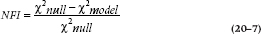
One class of statistics is called comparative fit indices, because they test the model against some other model. The most widely used index (although not necessarily the best) is the Normed Fit Index (NFI; Bentler and Bonett, 1980), which tests, if the model is different from the null hypothesis, that all of the variables are independent from one another (in statistical jargon, that the covariances are all zero).40 It takes the form of:
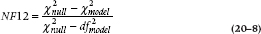
When we discussed multiple regression, we said that the value of R2 increases with each predictor variable we add. A similar problem exists for the NFI; it improves as we add parameters. Just as the adjusted R2 penalizes us for adding variables, the Normed Fit Index 2 (NFI2, also called the Incremental Fit Index, or IFI) penalizes us for adding parameters:
Another such parsimony statistic (you’re rewarded for being cheap when it comes to the number of parameters) is the Comparative Fit Index (CFI):
Nowadays, a more popular variant of this is the Non-Normed Fit Index (NNFI), which is commonly called the Tucker-Lewis Index (TLI):
For any given model, a lower χ2-to-df ratio implies a better fit. Both the CFI and TLI depend on the average correlation among the variables. Sometimes the CFI and TLI exceed 1, in which case they are set equal to 1. The CFI and TLI are highly correlated with one another, meaning that only one should be reported. When CFI is less than 1, it is always larger than TLI, which may tempt some to prefer it, but the move is toward using the TLI.
Other indices resemble R2 in that they attempt to determine the proportion of variance in the covariance matrix accounted for by the model. One such index is the Goodness-of-Fit Index (GFI); fortunately for you, its formula involves a lot of matrix algebra, so we won’t bother to show it.41 The Adjusted GFI (AGFI) is yet a different parsimony fit index you may run across. There are a number of variants of this, all of which decrease the value of AGI proportionally to the number of parameters you have. Another widely used index is Akaike’s Information Criterion (AIC) which is unusual in that smaller(closer to 0) is better42:

A slight variant of it is called the Consistent AIC, or CAIC:

Because nobody knows what a “good” value of AIC or CAIC should be, these indices are use most often to compare models—to choose between two different models of the same data. The one with the smaller AIC or CAIC is “better”; however, there isn’t any statistical test for either the indices or the difference between two AICs or two CAICs, so we can’t say if one model is statistically better or insignificantly better than the other.
A more recent index, used more and more often now, is the Root Mean Square Error of Approximation (RMSEA, often called “Ramsey” in casual conversation). Unlike the previous indices, it takes both the df and the sample size (N) into account:
Like the AIC and CAIC, it follows the criterion of anorectic fashion models that less is better. As with most of these indices, there’s no probability level associated with it. The guidelines are that a value of 0.01 is excellent fit, 0.05 is good, and 0.08 is mediocre. (Why these numbers? As the song in Fiddler on the Roof goes, “tradition” – nothing more.) The problem is that, as with all parameters, RMSEA is just an estimate and, when the sample size and df are low, the confidence interval can be quite wide.
Even more recent than RMSEA is the Standardized Root Mean Square Residual (SRMR; yes, every new dawn heralds a new index). It is the standardized difference between the observed correlations among the variables and the reproduced correlations (remember them from our discussion of path analysis?). The criteria for assessing it are generally similar to those for the RMSEA. It is not a parsimony index, so it gets better (smaller) as the sample size and the number of parameters in the model increase. Indeed, it’s not unusual to find values of zero.
Life is easy when all of the fit indices tell us the same thing. What do we do when they disagree? The most usual situation occurs when we get high values (i.e., over .90) for GFI or NFI2 and a low value for RMSEA (below .05), but the χ2GoF is significant. Unfortunately, here we have to use some judgment; can the significant χ2GoF be due to “too much” power?
If so, it’s probably better to trust one of the other indices. If there are roughly 10 subjects per parameter, then we should look at a number of indices. If they all indicate a “good fit,” then go with that. But, if the χ2GoF is significant, and the other indices disagree with one another, then we have a fit that’s marginal, at best, and whether or not to publish depends on your desperation level for another article.
Respecification
Respecification is a fancy term for playing with the model to achieve a better fit with the data. If you’ve been paying attention, you should realize that the statistical tests play a secondary role in this; the primary role should be your understanding of the area, based on theoretical and empirical considerations. Keep chanting this mantra to yourself as you read this section.
The major reason that a model doesn’t fit is that you haven’t included some key variables—the ones that are really important. Unfortunately, there are no statistical tests that can help us in this regard. There are no computer packages that will give you a Bronx cheer and say, “Fool,43 you forgot to include the person’s weight.” All of your purported colleagues will be only too happy to perform this function, but only when it’s too late, and you’re presenting the findings at an international conference.
The statistical tests that do exist are for the opposite type of mis-specification errors: those due to variables that don’t belong in the model or have paths leading to the “wrong” endogenous or exogenous variables. The easiest way to detect these is to look at the parameters. First, they should have the expected sign. If a parameter is positive and the theory states it should be negative, then something is dreadfully wrong with your model. The next step is to look at the significance of the parameters. As we’ve said, all parameters have standard errors associated with them, and the ratio of the parameter to its standard error forms a t-or z-test. If the test is not significant, then that parameter should likely be set equal to 0. Of course, this assumes that you have a sufficient sample size, so that you’re not committing a Type II error.
All of the major SEM programs, such as LISREL, CALIS (part of SAS), AMOS, Stata, and EQS, can examine the effects of freeing parameters that you’ve fixed (the Lagrange multiplier test) and dropping parameters from the model (the Wald statistic). These statistical tests should be used with the greatest caution. Whether to follow their advice must be based on theory and previous research; otherwise, you may end up with a model that fits the current data very well but makes little sense and may not be replicable.
Now that we’ve given you the basics, let’s run through a couple of examples.
A Confirmatory Factor Analysis
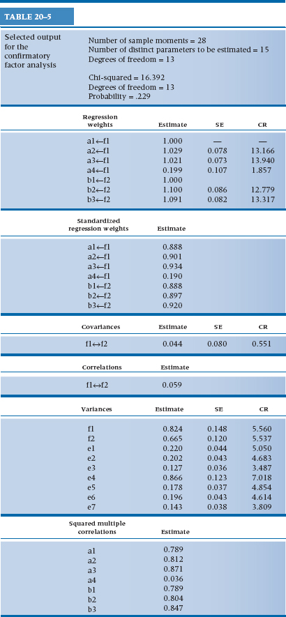
Let’s assume that we have seven measured variables that we postulate reflect two latent variables: a1 through a4 are associated with the latent variable f1, and b1 through b3 with latent variable f2. We also think that the two latent variables may be correlated with each other. We start by drawing a diagram of our model (if we’re using a program such as AMOS, Stata, or EQS), which is shown in Figure 20–12. The program is relatively smart,44 so it automatically fixed the parameters from all of the error terms to the measured variables to be 1. For each of the endogenous variables, it also set the path parameter for one measured variable to be 1. We didn’t like the choice the program made, so we overrode it and selected the variable in each set that, based on previous research, has the highest reliability. After we push the right button,45 we get the diagram shown in Figure 20–13 and reams of output, which we’ve summarized in Table 20–5.
First, what do all those little numbers in Figure 20–13 mean? The ones over the arrows should be familiar; they’re the path coefficients or standardized regression weights (either term will do), which are equivalent to the factor loadings in EFA. The numbers over the rectangles are the squared multiple correlations, which are equivalent to the communality estimates in EFA. There are two other things this figure tells us. First, we goofed when it comes to variable a4; it doesn’t really seem to be caused by the latent variable f1. Note that, in contrast to EFA, we aren’t told if it loads more on factor f2 or it doesn’t load on either factor; yet again, that’s because we’re testing a model, not trying to develop one. The second fact is that factors f1 and f2 probably aren’t correlated; the correlation coefficient is only 0.06.
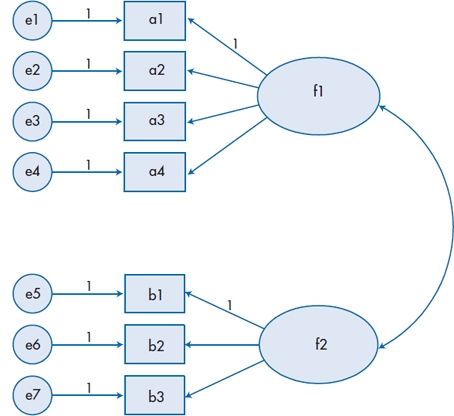
FIGURE 20-12 Input diagram for a confirmatory factor analysis.
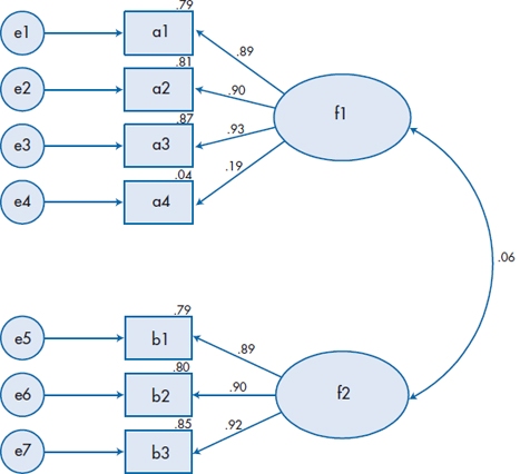
FIGURE 20-13 Output diagram based on Figure 20-12.
Now let’s turn to the printed output in Table 20–5 and see what else we learn. First, there are 28 “sample moments” in other words (i.e., English), 28 observations. This is based on the fact that there are seven measured variables, so there are (7 × 8) / 2 = 28 observations. Our model specifies 15 parameters to be estimated: five regression weights (two others aren’t estimated because we fixed them to be 1); the covariance between f1 and f2; and the variances of the seven error (or disturbance) terms and two latent variables.46 There are 13 degrees of freedom, which is the difference between the number of observations and the number of parameters. The next block of output tells us that the χ2GoF is 16.392, which, based on 13 degrees of freedom, has a p level of .229. So, despite the fact that variable a4 doesn’t work too well, the model as a whole fits the data quite well.
We then see the unstandardized and standardized regression weights. The unstandardized weights for a1 and b1 are 1.00, which is encouraging, because we set them to be equal to 1. The other five weights have standard errors associated with them, and the ratio of the weight to the SE is the Critical Ratio (CR) which is interpreted as a z-test. All of them are significant (at or over 1.96) except for a4, further confirming that it isn’t correctly specified. Similarly, the covariance (and hence the correlation) between f1 and f2 is low and has a CR of only 0.551; that is, the two latent variables or factors aren’t correlated. The next sets of numbers show the variances we’re estimating and the squared multiple correlations (which are also given in the figure).
Because we asked for them, we also get the Modification Indices (MI), which tell us how much the model could be improved if we specified additional paths. The largest one, which is listed under Regression Weights, is a3↔b2. That means that, if we drew a path from b2 to a3, our fit would improve. In fact, the path coefficient between the two is −0.123,47 and the χ2GoF (based now on df = 12, because we specified another path) drops to 10.028.48 But, because there is no theoretical rationale for this path (or for the other proposed modifications), we’ll just ignore them.
Finally, we’ve given just a few of the myriad other GoF indices. The saturated model represents perfection (as many parameters as observations, meaning there’s nothing more to estimate), and the independence model is the opposite (assuming nothing correlates with anything). Fortunately, our model is close to perfection; all of the indices are over 0.90. Our model would fit even better if we dropped variable a4. Yet again, this should be dictated by theory. If we believe that the variable is a substantive one, and that the nonsignificant path coefficient may be due to sampling error or a small sample size, we would keep it; otherwise, into the trash can it goes.
Comparing Two Factor Analyses
We’re sometimes in a position where we want to compare two factor structures; for example, are the results for patients and controls or for men and women alike49 and, if not, how do they differ? This can be done with EFA, but it is difficult, and the methods of comparing factor structures leave much to be desired. However, it’s relatively easy to do it with CFA.50 If we don’t have any hypotheses beforehand regarding the factor structure, we can start by running an EFA with one group and then use the results to fix the parameter estimates in a CFA for the second group. Conversely, if we do have some idea of what the structure should look like, we can specify it for both groups and see where it fits and doesn’t fit for each.
TABLE 20–5 Selected output for the confirmatory factor analysis
As an example, we’ll stay with the problem presented in Figure 20–13 and assume we drew another sample, one in which a4 actually does load on f1 but we don’t know this beforehand. Instead of fixing just one of the paths from the latent variables to the measured ones, we’ll put in the unstandardized regression weights from the first sample and again, based on our previous results, state that the covariance between f1 and f2 is 0. The output will be very similar to that in Table 20–5, with a few notable exceptions.
First, the number of parameters to be estimated drops from 15 to 9, because we’ve fixed an additional 6 parameters: 5 paths from the latent variables plus the covariance. Second, there will not be standard errors and critical ratios given for these 6 parameters, since we are not estimating them. The χ2GoF, now based on df = 19, is a whopping 144.47, indicating that the model doesn’t fit the data worth a plugged nickel. If we look at the modification indices, the largest ones involve a4 and e4 in various forms, such as suggesting that we include covariance terms between e4 and f1, or paths between a4 and the three other variables associated with f1. None of these make sense theoretically, but they all point to a misspecification involving a4. We would again return to our theory and hypothesize that the path coefficient, which we fixed at 0.20 to be congruent with the results from the first sample, is wrong and perhaps should be closer to 0.80. Alternatively, we can set it free and see what the program does with it. Note (yet again) that our use of the modification indices is tempered by our knowledge and theory.
If the model actually fits the data, then we can conclude that the factor loadings that we found for one group would fit the second group, too. In this case, we can up the ante and make the comparison more stringent: are the variances of the error terms similar across samples? This type of analysis is very useful for determining the equivalence of questionnaires in different groups of subjects.
A Full SEM Model
Now let’s return to the complete model of success in cheerleading, shown in Figure 20–11, and add what we’ve learned. First, we have to fix all of the paths leading to the various disturbance terms to 1, and fix one path from each latent variable to be 1. Second, because CLAP and TRAP are random halves of the same test, it is logical to assume that their variances are similar. We indicate the fact that we’ve constrained these terms by giving the variances the same name. The results of all of this fixing and constraining are shown in Figure 20–14; the terms vct over the disturbance terms for CLAP and TRAP tell the program that these variances should be the same. This diagram now forms the input to the program, which should run as long as the variable names in the rectangles correspond to the variable names in our data file.
The output from the program is shown in Figure 20–15. To begin, the χ2GoF is 38.225 which, based on 19 degrees of freedom, is highly significant (p= .006). The other GoF indices are equivocal: GFI and NFI are both just slightly above the cutoff point of 0.90, while AGFI is only 0.831. All of this leads us to believe that the model could stand quite a bit of improvement, but where? Let’s start with the measurement aspect of the model—how well are we measuring the latent variables of Athletic Ability, Cheer, and CLAP/TRAP?
AGFI = Adjusted GFI; CR = critical ratio; GFI = Goodness-of-Fit Index; MI = modification index; NFI = Normed Fit Index; SE = standard error.
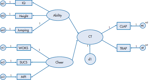
FIGURE 20-14 Figure 20-11 with the parameters constrained.
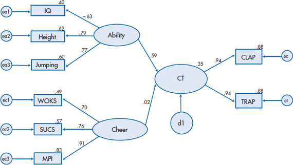
FIGURE 20-15 Output based on Figure 20-14.
The answer seems to be, not too badly, thank you, but perhaps we can do better with Ability and Cheer. If we look at the Modification Indices, most of them don’t make too much sense from the perspective of our theory, but one bears a closer look—the suggestion of adding a covariance between ea2 and ea3. Because Cheer as a whole seems to add little to the picture, let’s leave it aside for now and rerun the model adding e2 ↔ e3. Gratifyingly, the χ2GoF (df = 18) drops to 22.557, which has an associated p-value of .208. Because this model is a subset of the original one,51 the difference between their respective χ2s is itself distributed as a χ2. So, if we subtract the χ2s and the dfs, we get χ2 (1) = 15.668, meaning that there was a significant improvement in the goodness of fit. This is also reflected in an increase in the path coefficient from Ability to CLAP/TRAP, from 0.59 to 0.73; a drop in the coefficient from Cheer (from 0.02 to 0.01); and the fact that the other fit indices are in an acceptable range.
Finally, because Cheer doesn’t help,52 we can have a simpler model if we just drop it. Although the change in the χ2GoF isn’t significant this time around, all of the parsimony-adjusted GoF indices increase. Also, from a research perspective, it means that we don’t have to administer these three tests to all people, which at least makes us more cheerful.
REPORTING GUIDELINES
Programs for SEM and CFA produce reams and reams of output. This in turn has resulted in reams and reams of guidelines for reporting the results. We have labored mightily on your behalf, reducing them to manageable size. This cannot be considered to be plagiarism, because we followed the guideline for avoiding charges for it—we stole from many sources, including McDonald and Ho (2002), Raykov et al. (1991), and Schreiber et al. (2006).
- The most helpful thing to report is the diagram of the model, with the standardized regression weights and correlations near the arrows. You should also indicate which ones are statistically significant.
- In the text, there should be a theoretical or research-based rationale for every arrow in the diagram, both directional (one arrowhead) and nondirectional (the curved arrows with two heads).
- There are many programs for SEM and CFA, and they differ with regard to their methods. This means that, unlike with techniques such as ANOVA or EFA, different programs can produce different results. Consequently, you must say which program you used.
- You should indicate what kind of matrix was analyzed (covariances, covariance with means, correlation, etc.). If you don’t know, you shouldn’t be using these techniques.
- Never forget that CFA and SEM are large-sample techniques. You need to report not only the sample size but also the ratio of subjects to parameters (this implies that you know how many parameters you’re estimating).
- How did you treat outliers and missing data—did you drop those cases, impute values, or use some technique that can handle these anomalies?
- What method did you use for parameter estimation—maximum likelihood, generalized least squares, weighted least squares, etc.—and why?
- The model fit. As we said, there are many indices of this, but we would recommend as a minimum: (a) χ2GoF and its df; (b) the Tucker-Lewis Index (TLI, a.k.a. the NNFI); (c) the RMSEA; (d) SRMSR; and (e) the NFI.
- Indicate whether you’ve changed the model on the basis of the modification indices. If you have, state what was changed and the theoretical justification for it, as well as how much the modifications improved the fit.
Stay updated, free articles. Join our Telegram channel

Full access? Get Clinical Tree


