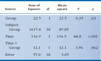
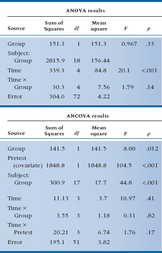
TABLE 17–2 ANOVA of pretest and post-test scores for the RCT of RRP
If that’s all we did, then the straightforward analysis is, as we already indicated, an unpaired t-test on the difference scores for each subject in the treatment and control groups. We did that for the data in Table 17–1, and it turns out to be 1.99, which, with df = 18, is not significant at the .05 level.
On the other hand, if you have been taking to heart all the more complicated stuff in the last few chapters, you might want to do a repeated-measures ANOVA, with one between-subjects factor (RRP group vs Placebo group) and one within-subjects repeated measure (Pretest/Post-test). Since we expect the treatment group to get better over the time from pretest to post-test and the control group to stay the same, this amounts to a Pre-/Post-test × Group interaction. All these calculations are shown in Table 17–2 if you’re interested.5
The mean scores for the RRP and control groups are about the same initially: 26.7 and 27.1. After a month, the JC of the RRP group has dropped some to 21.9, and the JC of the control group has also dropped a bit to 24.5. The Time × Group interaction resulted in an F-test of 3.96 with 1 and 18 degrees of freedom, which has an associated p-value of .062. This is equivalent to the t-test of the difference scores, which came out to 1.99 (the square root of 3.96) with the same probability (.062), just as we had hoped. So the interaction term is equivalent to the unpaired t-test of the difference scores, and the F-test of the interaction is just the square of the equivalent t-test. Once again, statistics reveals itself to be somewhat rational (at least some of the time).
PROBLEMS IN MEASURING CHANGE
If it’s this simple and straightforward, where’s the problem? There is none, actually, if you just want to plug the numbers into the computer and were interested only if the p level is significant or not; but there are many if you want to understand what the numbers mean. The two major issues affecting the interpretation of change6 scores are the reliability of difference scores and regression to the mean.
Reliability of Difference Scores
To understand whether there is a problem with difference scores being unreliable, we’ll have to make a brief detour into measurement theory.7 Any score that we observe, whether it’s from a paper-and-pencil test, a blood pressure cuff, or the most expensive chemical analyzer in the lab, has some degree of error associated with it. The error can arise from a number of sources, such as inattention on the part of the subject, mistakes reading a dial, transposition errors entering the data, fluctuations in a person’s state, and a multitude of others. Thus, the observed score (XO) consists of two parts: the true score (XT) and error (XE). We never observe the true score; it’s what would result if the person were tested an infinite number of times. The consequence is that, when we think about the total variation in a distribution of scores, it has two components, one due to real differences between people and the other due to measurement error. So the variance in a distribution of scores looks like:

If we imagine doing a trial where we assign folks at random to a treatment or a control group, doing something (or nothing) to them, and then computing an unpaired t-test on the final scores, the denominator of the test, which we learned in Equation 7–10, is actually based on this sum of variances.
One thing we can do to make this error term smaller is to measure everyone before the intervention and again afterward, then do an unpaired t-test on the difference scores, as in Equation 10–5. As we pointed out in Chapter 10, this is usually a good thing. But not always, and that’s where these variance components come in; let’s see why.
When we take differences, we do indeed get rid of all those systematic differences between subjects that go into σ2True. But, because we’ve measured everyone twice, the cost of all this is to introduce error twice. Now the error is:

What does this have to do with reliability? Well, if we compare Equation 17–1 with Equation 17–2, it’s pretty evident that we won’t always come out ahead with change scores. If the inequality:

holds, or simplifying a bit, if σ2True< σ2Error, then the test on postintervention scores will be larger than the test on difference scores. Now, back in Chapter 11 we defined reliability as:
so if σ2True < σ2Error, this amounts to saying that the reliability is less than 0.5. In short, measuring change is a good thing if the reliability is greater than 0.5, and a bad thing if it is less than 0.5.
Regression to the Mean
Now that we’ve put to rest the issue that measuring change is always a good thing, let’s confront the second issue, regression to the mean. If you think that term has a somewhat pejorative connotation, you should see what Galton (1877) originally called it—“reversion to mediocrity.” What he was referring to was that if your parents were above average in height, then most likely you will also be taller than average but not quite as tall as they are.8 Similarly, if their income was below average, yours will be, too, but closer to the mean. In other words, a second measure will revert (or regress) to the mean.9
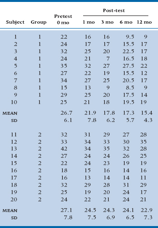
Let’s take a closer look a the data in Table 17–1. On the right side, we have displayed the difference in joint counts from pre- to post-treatment. A close inspection reveals that it seems that in both the treatment and control groups, the worse you are to begin with, the more you improve. Even in the placebo group, those with really bad joint counts initially seem to get quite a bit better after treatment. What an interesting situation. The drug and the placebo both do a world of good for severe arthritics, but don’t really help mild cases; in fact, they get worse.
This is a prime example of regression to the mean. There are a couple of reasons it rears its ugly head: sampling, and measurement theory (which rears its ugly head again). From the perspective of sampling, who gets into a study looking at the effects of treatment? Obviously, those who are suffering from some condition. You won’t end up as a subject in a study of RRP if you don’t have arthritis, or if you have it but aren’t bothered by it too much. You’re a participant because you went to your family physician and said, “Help me, Doc, the pain is killing me.” Now, as we said earlier, arthritis, like many other disorders, is a fluctuating condition, so the next time you’re seen, it’s likely the pain isn’t quite as bad. If that second evaluation of your pain occurs during the post-treatment assessment, then voilà, you’ve improved! So, one explanation of regression to the mean is that people enter studies when their condition meets all the inclusion and exclusion criteria (i.e., it’s fairly severe), and normal variation in the disorder will make the follow-up assessment look good. In fact, this is likely the reason “treatments” such as copper or “ionized” bracelets still continue to be bought by the truckload; people do get better after they’ve put them on. The only problem is that the improvement is due to regression effects, not the bangles.
The measurement perspective is fairly similar. Whose scores are above some cut-point (assuming that high scores are bad)? Those whose True and Observed scores are above the criterion; and those whose True scores are below the cut-point but, because of the error component, their Observed scores are above it. On retesting, even if nothing has intervened, a number of people in this latter group will have scores below the criterion, and yet again, voilà! Furthermore, these people won’t be balanced out by those whose True scores are above the mark but their Observed scores are below it; they wouldn’t have gotten into the study.
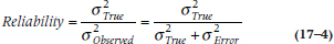
Measurement theory also provides another way of looking at the problem of regression toward the mean. Let’s assume that the test that we’re using has perfect reliability. That means that the correlation between the pretest and post-test scores is 1.0, shown in Figure 17–1, going up at a 45° angle.10 If a person has a pretest score of, say, 0.8 (don’t forget that we are dealing with standardized scores), then he or she will have the same post-test score. But, we know that no test on the face of the earth has a reliability of 1.0, so the actual regression line between pre- and post-test scores is at a shallower angle, like the broken line in the figure. In this case, the post-test score is less than 0.8, so the person has “improved” even in the absence of any intervention. Mathematically, the expected value at Time 2 (T2), given that the score at Time 1 (T1) was x is:

where the vertical line means “given that,” and ρ (the Greek letter rho) is the test’s reliability.
FIGURE 17-1 Relationship between pretest and post-test scores, showing regression to the mean.
This graph and equation tell us two other things. First, the less reliable the test, the greater the effect. Second, the more the score deviates from the mean, the more regression there will be. That’s why in Table 17–1, the more severely impaired patients “improved” more, whereas those who had less severe scores (those below the mean) actually appeared to get worse.11
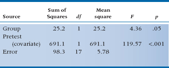
One solution, if people were randomly assigned to the groups, is to do an Analysis of Covariance (ANCOVA), with the final score as the dependent variable and the initial state as the covariate.12 The ANCOVA fits the optimal line to the scores, in the regression sense of minimizing error, and avoids overcorrection. We have done this in Table 17–3. Now we find that the effect of treatment results in an F-test of 4.36, which, with 1 and 17 df, is significant at the .05 level.
The use of ANCOVA in the design more appropriately corrected for baseline differences, leaving a smaller error term and a significant result. Under fairly normal circumstances, the gains from using ANCOVA instead of difference scores will be small, although, occasionally, there can be gains of a factor of two or more in power. Of course, if there is less measurement error, there is less possibility of regression to the mean, and less gain from the use of ANCOVA.
TABLE 17–3 Analysis of covariance of pretest and post-test scores for the RCT of RRP
Regression to the Mean and ANCOVA
As we’ve just said, adjusting for baseline differences among groups with ANCOVA is definitely the way to go if the people ended up in those groups by random assignment. Through randomization, we can assume that the differences are due to chance, and ANCOVA can do its magical stuff. In fact, the daddy of ANCOVA, Sir Ronald Fisher, took it for granted that there was random assignment. After all, he was working then at the Rothamsted Agricultural Experiment Station with plants and grains,13 and they don’t have the option of saying, “Sorry, I want to be in the other group.” However, when we’re dealing with cohort studies, where people end up in groups because of things they may have done (e.g., smoked or didn’t smoke, did or didn’t use some medication), background factors (male or female, socioeconomic status), or something else, we can’t assume that about baseline differences. In fact, it’s more likely that the group differences are related to those factors, and this may affect the outcome. In situations like these, the use of ANCOVA can lead to error.
The heart of the problem is something called Lord’s paradox.14 Let’s change the example we used in the previous chapter, looking at the relation between Pathos Quotient (PQ) and belt size; instead of randomly assigning men to the treatment and incidentally measuring their PQ, we’ll focus on seeing if fat and skinny men’s PQ scores change to the same degree when given testosterone. So, we form one group of broomsticks and another of gravity-challenged men, put them both on the hormone, and measure them before and after treatment.
Suppose, for the sake of this example, that there really is no difference on average; everyone changes by the same amount except for random error. Consequently, the two means—for the fatties and wisps—both lie on the same 45° line relating pretest to post-test, just as we see with the asterisks in Figure 17–2. However, the thing is, because of regression to the mean, the two ellipses don’t quite lie with their major axis on the 45° line. In each group, those who are below the mean the first time aren’t quite so low on the post-test, and vice versa. The net effect is that the footballs aren’t quite as tilted at the 45° line.
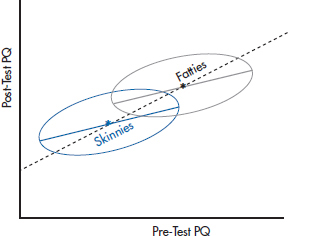
FIGURE 17-2 Analyzing the effect of testosterone in two groups using difference scores.
If we analyze the data by using a simple difference score (post-test minus pretest), and plot the findings, we’re effectively forcing the line of “best fit” to stay at 45°. We’ll get the results shown in Figure 17–2, where everyone, regardless of group, sits on the 45° line. From this, we’d conclude that there is no effect of weight, and that both groups changed to the same degree.
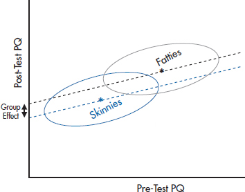
FIGURE 17-3 Analyzing the same data as in Figure 17-2, but using ANCOVA.
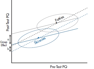
FIGURE 17-4 A similar graph, only this time showing a small treatment effect, with Fatties slightly higher than the slope = 1 line and the Skinnies lower.
Let’s analyze the data again, this time using ANCOVA to adjust for baseline differences in weight. What we’d find is shown in Figure 17–3. Now the picture is somewhat different. The ANCOVA line for each group goes right along the major axis of the ellipse, at a slope a bit less than 1. When we project these two lines to the Y-axis to see whether there is a differential effect of testosterone, we find to our amazement that there is, equal of course, to the distance between the two regression lines. But this is a consequence entirely of regression to the mean and the fact that the two groups started out differently.
So, which analysis is correct? Should we use a t-test on the difference scores, or an ANCOVA taking baseline differences into account? As is often the case, the answer is Yes, No, Maybe, or even Neither. The trouble is that the ANCOVA is pretty clearly overestimating the effect in this case. But under different circumstances, where there was a small “treatment effect” so the two means won’t lie on the 45° line, as shown in Figure 17–4, the ANCOVA, which, as we discussed, is more sensitive, will correctly say that there is a difference between groups. On the other hand, it may be that the difference score, which, as we discussed earlier, is a bit conservative, may well miss these effects. Of course, the closer the two groups are in starting values, the smaller the effect of the inequality in driving the two intercepts apart.
The paradox was raised by Lord, but he didn’t explain it. The explanation was given by Holland and Rubin (1983), and made comprehensible by Wainer (1991, 2004). Part of the problem is not just that one test is biased or the other is conservative. The reason for the equivocal answer is that the “real” answer depends on the assumptions we make, and those assumptions are untestable. What we really want to know is, if a person of a particular weight lost 5 Pathos Quotient points in the Skinny group, would he also lose 5 points if he were in the Fatties group? This is obviously an unanswerable question, because the same person can’t be in both groups. Moreover, even if we could find a person in the Fatties group who weighed the same and looked the same as someone in the Skinnies condition, these two people are not the same in one very important sense. The person in the Fatties group is below the mean of his group, whereas the equivalent person in the Skinnies group is above the mean of his mates. So, when the Fatty gets retested, he’s likely, because of measurement error, to move upward, whereas the Skinny of the same weight is more likely to move downward; what’s called differential regression toward the mean.
We can get a good approximation of the answer with random assignment to groups, because the people are more or less similar and interchangeable.15 This isn’t the case with cohort studies, for the reasons we outlined before. The assumption we make when we use difference scores, and analyze the data with t-tests or repeated-measures ANOVA, is that the amount of change is independent of the group (if one group is a placebo condition, that the dependent variable won’t change between pretesting and post-testing). The assumption with ANCOVA is that the amount of change is a linear function of the baseline, and that this relationship holds for all people in the group. In a cohort study, neither of these assumptions is testable. So, the choice of which strategy to use depends on which assumption you want to make, and then you pays your money and you takes your chances. Not very satisfying, but that’s the way the world is.16
MULTIPLE FOLLOW-UP OBSERVATIONS: ANCOVA WITH CONTRASTS
That’s fine as far as it goes. However, it is rarely the case that people with chronic diseases have only one follow-up visit. They come back again and again, seemingly forever and ever. It seems a shame to ignore all these observations just because you can’t do a t-test on them. Of course, one approach is to pick one time interval, either by design (e.g., specifying in advance that you’ll look at the 12-month follow-up) or by snooping (e.g., looking at all the differences and picking the one time period when the treatment seems to have had the biggest impact). The former is inefficient; the latter is fraudulent, although we’ve seen both done, with great regularity.
TABLE 17–4 Data from an RCT of RRP versus placebo with post-tests at 1, 3, 6, and 12 months
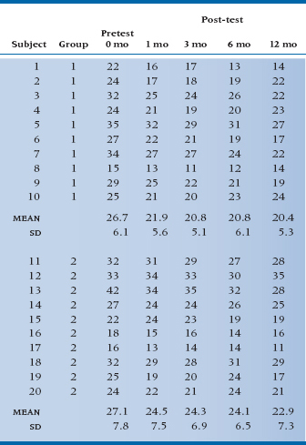
TABLE 17–5 ANOVA and ANCOVA of scores with multiple follow-ups at 1, 3, 6, and 12 months for the RCT of RRP
What’s so bad about the first strategy? Two things. First, it’s throwing away half the data you gathered, which is something that statisticians really don’t like to do. Second, and more fundamentally, it’s treating change in a very simplistic manner, kind of like a quantum change—first you’re in this state, later you’re in that state.17 There’s a ton of information about how patients are getting from one state to the other that is lost in the simple look at just the first and last measurements.
Let’s take a closer look. Examine Table 17–4, in which we’ve thrown in some more follow-up data. We’ve graphed the means in Figure 17–5. As you can see, the response to the drug is pretty immediate—people in the treated group have less pain after 1 month, and more or less stay at a decreased level of pain. Those in the control group get a little better, and again, stay a little better. Of course this is only one possibility (and perhaps an unlikely one); in a while we’ll examine some other possibilities. For the moment, let’s think about how we can analyze the data and be true to the pattern of change.
Two obvious approaches come to mind, namely the two we just did: an ANOVA with five repeated measures, and an ANCOVA, using the pretest as the covariate and post-tests at 1, 3, 6, and 12 months as the repeated observations. If we do an ANOVA, we might still look for a Time × Group interaction, since we are expecting that there will be no difference at Time 0, but significant differences at 1, 3, 6, and 12 months. On the other hand, the data from the follow-up times really look like a main effect of treatment, not an interaction.
If we do an ANCOVA, things are much clearer. The baseline data are handled differently as a covariate; we would expect that the effect of treatment will simply end up as a main effect. The results of both analyses are shown in Table 17–5.
Now that’s interesting! Despite the fact that we have four times as many observations of the treatment effect as before, the ANOVA now shows no overall significant effect in the main effect of Group or the Time × Group interaction, where we had an almost significant interaction before. By contrast, in the ANCOVA, the main effect of Group is now significant at the .012 level. What is going on here?
The explanation lies in a close second look at Figure 17–2. When we do the ANOVA, the overall main effect of the treatment is washed out by the pretest values, which, since they occurred before the treatment took effect, are close together. Conversely, the Time × Group interaction amounts to an expectation of different differences between Treatment and Control groups at different times, and this effect happens only when you contrast the pretest values with the post-test values (which was fine when there was only one post-test value). In effect, the differences between treatments are now smeared out over the main effect and the interaction, neither of which are appropriate tests of the observed data. By contrast, the ANCOVA gives the pretest means special status and does not try to incorporate them into an overall test of treatment. Instead, it simply focuses on the relatively constant difference between treatment and control groups over the four post-test times, and appropriately captures this in the main effect of treatment.
In the situation where there are multiple follow-up observations, the right analysis is therefore an ANCOVA, with pretest as the covariate and the later observations as repeated dependent measures. Is this only the case when the treatment effect is relatively constant over time? As it turns out, no. But to see this, we have to go one further step into the analysis and also generate some new data.
MULTIPLE, TIME-DEPENDENT OBSERVATIONS
As we indicated, the situation in which the treatment acts almost instantly and does not change over time is likely as rare as hen’s teeth. A more common scenario is one in which the treatment effect is slow to build and then has a gradually diminishing effect. One example of such a relationship is shown in the data of Table 17–6, where we have added some constants to the post-test observations to make the relationship over time somewhat more complex.
It is apparent that the treatment group shows continual improvement over time but with a law of diminishing returns, and the control group, as usual, just rumbles along. This might be more obvious in the graph of the data shown in Figure 17–6. Here we see clearly that the relation between Time and JC in the treatment group is kind of nonlinear—the sort of thing that might require a (Time)2 term as well as a linear term in Time. However, the control group data are still a straight horizontal line.
How do we put all this into the pot? First, we have to explicitly account for Time, since the straight ANOVA treats each X value as just nominal data—the results are the same regardless of the order in which we put the columns of data. We have somehow to tell the analysis that it’s dealing with data at 0, 1, 3, 6, and 12 months. Second, it is apparent that we have to build in some kind of power series (remember Chapter 16?) in order to capture the curvilinear change over time. Finally, we might even expect some interactions, indicating that the treated group has linear and quadratic terms but that the control group doesn’t.
Believe it or not, all this happens almost at the push of a button.18 It’s called orthogonal decomposition. When this button is pushed, the computer decomposes the Sum of Squares owing to Time and to the Time × Group interactions into linear, quadratic, and higher-order terms (one less term in the power series than the number of time points). The results are shown in Table 17–7.
FIGURE 17-5 Joint count for the study of RRP (from Table 17-4).
TABLE 17–6 Data from an RCT of RRP versus placebo with post-tests at 1, 3, 6, and 12 months, and linear and nonlinear changes over time
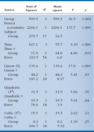
Now, the first six lines of this horrendous mess should look familiar. They’re completely analogous to the sources of variance we found before when we did an ANCOVA on the pretest and post-test scores. The numbers are different, of course, because we cooked the data some to yield a more complex relationship to time. In the next nine lines things get more interesting. By asking for an orthogonal decomposition, we told the computer to pay more attention to the time axis and fit the data over time to a power series regression, so we can test whether the relationship is linear, quadratic, or cubic, and so on. What emerges is an overall linear term (F = 17.0, df = 1/18, p < .001) showing that there is an overall trend downward, taking both lines into account. There is also an interaction with Group (F = 5.41, df = 1/18, p = .03), which signifies that the slopes of the two lines differ. Further down, there is a quadratic component interacting with Group (F = 5.01, df = 1/18, p = .04) showing that the line for the treated group has some curvature to it (this is not explicit in the interaction but, rather, an observation from the graph). Note that if we add up all these components, we get the three lines above that express the Time main effect and the Time × Group interaction. That is, the sum of the linear, quadratic, and cubic effects of Time (139.6 + 11.9 + 15.5) just equals 167.1, the main effect of Time. The interactions and error terms also sum to the Total Sums of Squares for the respective terms. We have decomposed the effects related to Time into linear, quadratic, and cubic terms that are orthogonal—they sum to the original. It’s the same idea that we encountered when we did orthogonal planned comparisons as an adjunct to the one-way ANOVA—decomposing the Total Sum of Squares into a series of contrasts that all sum back to the original.
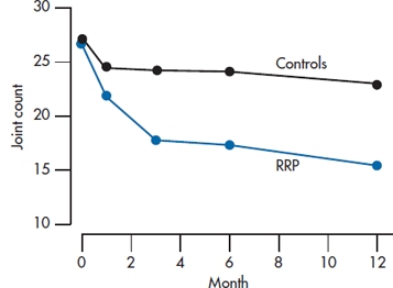
FIGURE 17-6 Joint count for the study of RRP (from Table 17-6).
TABLE 17–7 ANCOVA of follow-up scores with orthogonal decomposition for the RCT of RRP
All this is quite neat (at least we think so), and all it requires is multiple observations over time and no missing data. Regrettably, although the multiple observations over time is easy enough to come by, persuading a bunch of patients to come back faithfully at exactly the appointed intervals, thereby missing the loving grandchild’s birthday party or the free trip to Las Vegas, is as hard as Hades. This problem can be solved with another, almost magical technique, called hierarchical linear modeling, but for that you’ll have to wait until the next chapter.
WRAPPING UP
We have explored a number of approaches to analyzing change. The simplest and most commonly used methods—difference scores and repeated-measures ANOVA—are less than optimal, although they may yield results that are approximately correct. ANCOVA methods, using the pretest or baseline measure as a covariate, are preferred and yield optimal and unbiased results.
EXERCISES
1. The bane of all statistical tests is measurement error. Suppose you did a study looking at the ability of new Viagro to regenerate the hair on male scalps. You do a before/after study with a sample of 12 guys with thinning hair, before and after 2 weeks of using Viagro. Being the compulsive sort you are and desperate for something—anything—to prevent baldness, you count every single hair on their heads. Although they are thinning, the counts are still in the millions and, so, are highly reproducible from beginning to end. Regrettably, with a paired t-test, the difference is not quite significant, p = .063. If you proceeded to use more advanced tests, particularly repeated-measures ANOVA and ANCOVA, what might be the result?
a. p < .05 for both ANOVA and ANCOVA
b. p = .06 for ANOVA, p < .05 for ANCOVA
c. p = .06 for both ANOVA and ANCOVA
2. A common practice in analyzing clinical trials is to measure patients at baseline and at follow-up visits at regular intervals until the declared end of the trial. Frequently, the analysis is then conducted on the baseline and end-of-trial measures. Imagine a trial of a new antipsychotic drug, Loonix, involving measures of psychotic symptoms at baseline, 3, 6, 9, and 12 months (the declared end of the trial). The investigators report that there was a significant drop in psychotic symptoms in the treatment group (paired t = −2.51, p < .05), but the symptoms in the control group actually increased slightly (paired t = +0.46, n.s.)
a. Is this analysis right or wrong?
b. If the analysis was repeated, which of the following would be most appropriate? And what would be the likely result?
i. Unpaired t-test on the difference scores from 0 to 12 months
ii. Repeated-measures ANOVA on the scores at 0 and 12 months
iii. ANCOVA on the scores at 3, 6, 9, and 12 months with time 0 as covariate
How to Get the Computer to Do the Work for You
For most of this chapter, the statistical methods have been encountered before. We have shown you how to do paired t-tests, repeated-measures ANOVA, and ANCOVA. Refer to the relevant chapters for advice if you need a refresher.
1 And if you want to practice your statistical prowess, the right test is an unpaired t-test on the difference scores derived from the treatment and control groups.
2 The reason it is wrong or at least suboptimal to use difference scores has to do with a phenomenon called regression to the mean, which we’ll talk about in due course. If there is no measurement error, which excludes every study we’ve ever done or read about, then difference scores are perfectly OK.
3 Carter and Dodd beat us to the better organs.
4 If we really did measure a whole bunch of things, we should use Multivariate Analysis of Variance (MANOVA). See Chapter 12.
5 They’re shown in Table 17–2 even if you’re not interested.
6 The terms difference score, change score, and gain score are synonymous, and we’ll use them interchangeably. Also, it doesn’t matter if we subtract the pretest score from the post-test or vice versa. The statistics don’t care, and neither do we.
7 For a Cook’s Tour of measurement theory, see Streiner and Norman (2014).
8 This is somewhat different from the “proof” that sterility is inherited: if your grandparents couldn’t have children, then neither could your parents, nor will you have any.
9 This is also the bane of recruiting agents for sports teams. If a batter or pitcher has had an above-average year, we can guarantee that next year’s performance will be worse.
10 It’s at 45° only if we standardize the two scores, which we’ve done to make the example easier. However, the argument is the same even when the scores haven’t been standardized.
11 And why batters who hit exceptionally well one year will really take a tumble the next. The good news is that those who had a very bad year will likely improve (except if they’re with the Toronto Blue Jays). So, if you’re scouting for next year’s team, pick those in the cellar, not the stars.
12 If people weren’t randomly assigned (e.g., in a cohort study), you have to be aware of Lord’s paradox, which we will discuss shortly.
13 This legacy lives on in other ways. Another variant of ANOVA, not discussed in this book, is called a split plot design, because Fisher took a plot of land and split it, planting different grains in each section, thus controlling for soil and atmospheric conditions.
14 That refers to Frederick M. Lord (1967, 1969), not the one looking down from on high and keeping track of all of your statistical shenanigans.
15 And also in a design called a cross-over, where the person gets both the treatment and the control intervention at different times.
16 Philosophy 101 (no date).
17 As if there’s something simplistic about quantum mechanics.
18 In some software. The old standby, BMDP, does it in both the 2V and 5V subroutines. SPSS, as far as we can tell, will do an orthogonal decomposition, but demands equal spacing on the X-axis.
Stay updated, free articles. Join our Telegram channel

Full access? Get Clinical Tree


