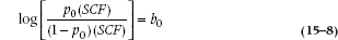
We can write a linear regression equation like this, but we shouldn’t. First, probabilities don’t go in a straight line forever; they are bounded by zero and one. Second, there’s a problem with that little e hiding at the end of the equation. In linear regression, the assumption is made that the distribution of that error term is normal. But, if the dependent variable is dichotomous, then the distribution of e is binomial rather than normal. That means that any significance tests we run or confidence intervals that we calculate won’t be accurate. Finally, we call it multiple linear regression because we assume that the relationship between the DV and all the predictor variables is (you guessed it) linear. For a dichotomous outcome, though, the relationship is more S-shaped; the technical term is a logistic function. So, to get around all these problems, we transform things so that there’s an S-shaped outcome that ranges between zero and one; Not too surprisingly, this is called a logistic (sometimes referred to as a logit) transformation:4
(where you’ll remember that the “hat” over the y means the estimated value).
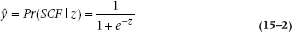
FIGURE 15-1 The logistic function.
A complicated little ditty. What it is saying in the first instance is that y is the probability of getting SCF for a given value of z, that is, for a given value of the regression equation. This function does some nice things. When z = 0, y is 1/(1 + e0) = 1/(1 + 1) = 0.5. When z goes to infinity (∞), it becomes 1/(1 + e−∞) = 1. And when z goes to −∞, it becomes 1/(1 + e∞) = 0. So, it describes a smooth curve that approaches zero for large negative values of z, and goes to 1 when z is large and positive. A graph illustrating this is shown in Figure 15–1.
There are a couple of other things to note about Figure 15–1. The shape implies that there are two threshold values. There’s almost no relationship between the predictor variables and the probability of the outcome for low values of z; in this figure, z can increase from −10 to about −3 without changing the probability. But, once the predictors pass a certain lower threshold, there’s a linear relationship between them and the probability of an outcome. Then, beyond an upper threshold, the relationship disappears again, so that further increases in the predictors don’t increase the probability any more.
Until now, the shape of the curve is not self-evidently a good thing; now, we remind ourselves about the situation we’re trying to model. The goal is to estimate something about the various possible risk factors for dreaded SCF. All the predictors are set up in an ascending way, so that if z is low, you don’t have any risk factors, and the probability of contracting SCF should be low, which it is—that’s the left-hand side of the curve. Conversely, if you have a lot of risk factors, you’re off on the right-hand side, where the probability of getting SCF should approach one, which it does. If we had tried this estimate with multiple regression, it would have ended up as a straight-line relationship, so probabilities would be negative on the left side, and go to infinity on the right side—definitely not a good thing.
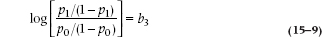
This ability to capture a plausible relationship between risk and probability is not the only nice feature of the logistic function, but we’ll save some of the other surprises until later. For the moment, it’s best to realize that the job is far from done, since we have this linear sum of our original values (which is the good news) hopelessly entangled in the middle of a complicated expression (which is the very bad news). Time to mess around a bit more. First, we’ll rearrange things to get the linear expression all by itself:
Now, the next bit of sleight of hand. The way to get rid of an exponent is to take the logarithm, so we now get:
and −log (c/d) = log (d/c), so the negative sign goes away:
Son of a gun! We have managed to recapture a linear equation, so we can go ahead and analyze it as yet another regression problem. Here’s another definition to add to the long list, by the way. The expression we just derived,  , is called the logit function of y. As you see, a logit is the natural logarithm (that is, a log with the base e) of an odds ratio. We’ll talk later about the interpretation of this function, but first we have to figure out how the computer computes all this stuff.
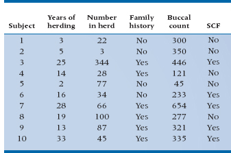
To put some meat on the bones, let’s conjure up some real data (real being a relative term, of course). We fly off to the Sahara,5 rent the Land Rover, and wander from wadi to wadi and oasis to oasis, recruiting camel herders wherever we can find them, buying off each with a few handfuls of beads and bullets, administering a questionnaire, and swabbing their camels’ mouths. After months of scouring the desert, we have found 30 herders. The pathologist does her bit and we have found that 18 herders had SCF and 12 didn’t. The data for the first few are shown in Table 15–1.
Before we get to the output of the analysis, we should invest some time describing how the computer does its thing. One might think that, having converted the whole thing to a linear equation, we could just stuff the data into the regression program and let the beast go on its merry way, estimating the parameters and adjusting things so that the Sum of Squares (Residual) is at a minimum (see Chapter 14).
Unfortunately, things aren’t quite that simple. The standard method of computing regression by minimizing the residual Sum of Squares, called the method of least squares for (one hopes) fairly obvious reasons, can be used only when the underlying model is linear, and the dependent variable is approximately normally distributed. Although we have done our best to convert the present problem to a linear equation, this was at the cost of creating a dependent variable that is anything but linear. So, statisticians tell us that we cannot just crash ahead minimizing the error Sum of Squares. Instead we must use an alternative, computationally intensive,6 method called Maximum Likelihood Estimation, or MLE.
MAXIMUM LIKELIHOOD ESTIMATION PROCEDURES
To understand what MLE procedures are all about, it’s necessary to first go back to basics. The whole point of logistic regression is to compute the estimated probability for each person, based on Equation 15–2. That estimate of the probability that the poor soul will have SCF is then compared with the actual probability, which is of a particularly simple form: 0 (the person don’t got it) or 1 (the person does got it). Now, if the logistic regression is doing a good job, and the universe is being predictable, the estimated probabilities for those poor souls who actually have SCF will be high, and the probabilities for those who don’t will be low. The Likelihood Function considers the fit between the estimated probabilities and the true state, computed as an overall probability across all cases.
Looking at things one case at a time, if pi is the computed likelihood of disease given the set of predictor variables for person i who has the disease, then the probability of the overall function being correct associated with this person is just pi. If person j doesn’t have the disease, then the appropriate probability of a correct call on the part of the computer program is (1 − pj). So the overall probability of correct calls (i.e., the probability of observing the data set, given a particular value for each of the coefficients in the model) is just the product of all these ps and (1 − p)s:

where the is include all the cases, and the js include all the non-cases, and π (Greek letter pi) is a symbol meaning “product.”7 This is the Likelihood Function, obtained by simply multiplying all the ps for the cases and (1 − p)s for the non-cases together to determine the probability that things could have turned out the way they did for a particular set of coefficients multiplying the predictors. It’s actually conceptually similar to the standard approach of minimizing the residual sum of squares in ordinary regression. The residual sum of squares in this case is the difference between the observed data and the fitted values estimated from the regression equation, except that we do the whole thing in terms of estimated probabilities and observed probabilities (which are either 0 or 1). And since the numbers of interest are probabilities, we multiply them together instead of adding them.
TABLE 15–1 Data from the first 10 of 30 camel herders
The rest of the calculation is the essence of simplicity (yeah, sure!). All the computer now has to do is try a bunch of numbers, compute the probability, fiddle them a bit to see if the probability increases, and keep going until the probability is maximum (the Maximum Likelihood Estimation). That’s what happens conceptually, but not actually. Just as in ordinary regression, calculus comes to the rescue to find the maximum value of the function.8 However, this analysis is so hairy that even after using calculus, it’s still necessary for the computer to use iteration to get the solution, rather than calculate it from the equation.
Unconditional versus Conditional Maximum Likelihood Estimation
Unfortunately, that’s still not the whole story. What we computed above is one kind of MLE, called Unconditional MLE. There’s still another kind, called, not surprisingly, Conditional MLE. Basically, they differ in that unconditional MLE takes the computed probability at face value, and goes ahead and maximizes it. The conditional MLE compares the particular likelihood with all other possible configurations of the data. What actually gets maximized is the ratio of the likelihood function for the particular set of observations conditional on all other likelihood functions for all other possible configurations of the data.
What in the name of heaven do we mean by “all other configurations”? Assume we reorder the data so the first 13 are cases and the next 17 are controls. That’s only one possibility; others include the first 12 are cases, the next one isn’t, the one after that is, and the remaining 16 are not. That is, the other configurations are computed by keeping the predictors in a fixed order and reordering the 1s and 0s in the last column to consider all possible combinations, always keeping the totals at 13 and 17. For each one of these configurations the MLE probability is computed, and then they’re all summed up.9 Needless to say, the computation is very intensive.
TABLE 15–2 B coefficients from logistic regression analysis of SCF data
All this would be of academic interest only, except that sometimes it really matters which one you pick. When the number of variables is large compared with the number of cases, then the conditional approach is preferred, and the unconditional MLE can give answers that are quite far off the mark. How large is large? How high is up? It seems that no one knows, but perhaps the “rule of 5”—5 cases per variable—is a safe bet.
SAMPLE CALCULATION
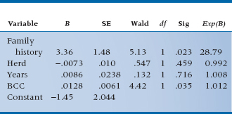
Now that we understand a bit about what the computer is doing, let’s stand back and let it do its thing. We press the button on the SCF data, sit back, and watch the electrons fly, and, in due course, a few pages come spinning out of the printer. Some of it looks familiar; some does not. Let’s deal with the familiar first. A recognizable table of b coefficients is one of the first things we see, and it looks like Table 15–2.
Just like ordinary multiple regression, this table shows the coefficients for all the independent variables and their associated standard errors (SEs). However, the column to the right of SE, which one might expect to be the t-test of significance for the parameter [t = b/SE(b); see Chapter 13] is now labelled the Wald test, and it doesn’t look a bit like the b/SE(b) we expected.
As it turns out, this is familiar territory. The Wald statistic has two forms: in the first form, it is just the coefficient divided by SE, and it is distributed approximately as a z test (so Table A in the Appendix is appropriate). In the second form, the whole thing is squared, so it equals [b/SE(b)]2. In the present printout, taken from SPSS, they chose to square it. So this part of the analysis, in which we have computed the individual coefficients, their SEs, and the appropriate tests of significance, is familiar territory indeed. As it turns out, Family History and BCC are significant at the .05 level; Herd and Years are not.
This is almost straightforward, except for the last column. What on earth is Exp(B)? So glad you asked. The short answer is that is stands for “exponential of B,” which leaves most folks no further ahead. Remember, however, that we began with something that had all the b coefficients in a linear equation inside an exponential. Now we’re working backward to that original equation.
Suppose the only variable that was predictive was Family History (Fam), which has only two values: 1 (present) or 0 (absent). We have already pointed out that the logistic function expresses the probability of getting SCF given certain values of the predictor variables. Focusing only on Fam now, the probability of SCF given a family history looks like:
If there is no family history then Fam = 0, and the formula is:
Now the ratio of p/(1 − p) is the odds10 of SCF with Fam present or absent. The odds ratio (OR; also called the relative odds) is the ratio of the odds, naturally, and if you are good at diddling logs you can show that the log odds ratio is:
In words: for discrete predictor variables, the regression coefficient is equal to the log odds ratio of the event for the predictor present and absent. If we take the exponential of the b coefficient, we can get to the interpretation of the last column:
So, in the present example, the b coefficient for Fam is 3.36, and e3.36 is 28.79; therefore, the relative odds of getting SCF with a positive family history is 28.79. That is, in this equation, a family history is a bad risk factor; the odds of getting SCF when you have a positive history is about 29 times what it would be otherwise. Perhaps you should stay away from your parents.
For continuous variables we can do the same calculation, but it requires a somewhat different interpretation. Now the eb corresponds to the change in odds associated with a one-unit change in the variable of interest. So looking at BCC, the other significant predictor, the relative odds is 1.013, meaning that a one-unit change in BCC increases the odds of contracting SCF by about 1%.
Interpreting Relative Risks and Odds Ratios
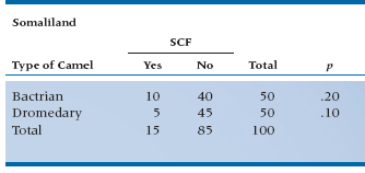
The major problem with logistic regression is the interpretation (or rather, the misinterpretation) of the OR. Many people interpret them as if they were relative risks, which they ain’t. Let’s go through some examples to see the difference. In our example, we haven’t differentiated between Bactrian camels (two humps) and Dromedaries (one hump).11 Is it possible that two humps doubles the chances of SCF? In Table 15–3, we present the results from two different regions—Somaliland itself, and that ancient emirate, Kushmir en Tuchas.12
In Somaliland, the risk of SCF from Bactrian camels is 10/50 = 0.20; and the risk from Dromedaries is 5/50 = 0.10. Hence, the relative risk (RR) of SCF from Bactrians is 0.20/0.10 = 2; that is, you’re twice as likely to get this debilitating disorder from the two humper as compared with the unihumper. But the OR, which is calculated as:

where a, b, c, and d refer to the four cells, is:
In Kushmir en Tuchas, the comparable numbers are again an RR of 2.0, but with an OR of 6.0. Clearly, the two are not the same. In Kushmir, you’re twice as likely to get SCF from Bactrians as Dromedaries (that’s from the RR); but the odds are 6:1 that if you got SCF, it was from a B-type beast. The important point is that the OR does not describe changes in probabilities, but rather in odds. With a probability, the numerator is the number of times an event happened, and the denominator is the number of times it could have happened. The numerator is the same in an OR, but the denominator is the number of times the event didn’t occur.
When the numbers in cells a and c are small, the RR and OR are almost identical, as in Somaliland. As the proportion of cases in those cells increases, the OR exceeds the value of the RR. To see why, let’s spell out the equation for a relative risk. It’s:
Now, when the prevalence of a disorder is very low (say, under 10%), c + d isn’t much different from d; and a + b is just about equal to b. So, the equation simplifies to ad/bc, which is the formula for the OR we saw in Equation 15–11.
TABLE 15–3 The relationship between type of camel and SCF in two regions

So, to summarize:
- An RR and an OR of 1 means that nothing is going on; the outcome is equally probable in both groups.
- When the prevalence of a disorder is low (under about 10%), the RR and OR are nearly the same.
- As the prevalence increases, the OR becomes larger than the RR. In fact, the OR sets an upper bound for the RR. We’ll discuss ORs and RRs in greater depth in Chapter 26.
GOODNESS OF FIT AND OVERALL TESTS OF SIGNIFICANCE
That was the easy part; however, missing from the discussion so far is any overall test of fit—the equivalent of the ANOVA of regression and the R2 we encountered in multiple regression. Since this is a categorical outcome variable, we won’t be doing any ANOVAs on these data.
At one level, goodness of fit is just as easy to come by with logistic regression as with continuous data. After all, we began with a bunch of cases of SCF and non-cases. We could do the standard epidemiologic “shtick” and create a 2 × 2 table of observed versus predicted classifications. To do this, since the predicted value is a probability, not 0 or 1, we must establish some cutoff above which we’ll call it a case—50% or .50 seems like a reasonable starting point.
If we do that for the present data set, the contingency table would look like Table 15–4.
The overall agreement is 26/30 or 86.67%. We could of course do kappas or phis on the thing (see Chapter 23)—but we won’t. However, there are a couple of useful statistics that come out of tables like this. The Gamma statistic tells us how many fewer errors would be made in predicting the outcome using the equation rather than just chance. If the value were 0.532, for example, we’d make 53.2% fewer errors in predicting who’ll get SCF. But, it tends to overestimate the strength of the relationship. Another useful bit of information is the c statistic. If we take two camel herders, one of whom has SCF and the other not, how good is our equation in predicting who’s the unlucky one? If c were 0.750, it would mean that our equation gave a higher probability of SCF to the sick herder 75% of the time. A useless equation has a c value of 0.50 (that is, it’s operating at chance level), and a perfect one has a value of 1.00. This statistic is particularly useful when we’re comparing a number of regression equations with the same data, or the same equation to different data sets—go with the one with the highest value of c.
TABLE 15–4 Observed and predicted classification
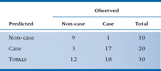
While this table is a useful way to see how we’re doing overall, it is not easily turned into a test of significance. We could just do the standard chi-squared on the 2 × 2 table, but this isn’t really a measure of how well we’re doing, because to create the table, every computed probability from 0 to .49999 was set equal to 0, and everything from .50000 to 1 was set equal to 1. So, the actual fit may well be somewhat better than it looks from the table.
In fact, the likelihood function, which we have already encountered, provides a direct test of the goodness of fit of the particular model, since it is a direct estimate of the likelihood that the particular set of 1s and 0s could have arisen from the computed probabilities derived from the logistic function. That is, the MLE is a probability—the probability that we could have obtained the particular set of observed data given the estimated probabilities computed from putting the optimal set of parameters into the equation for the logistic function (optimal in terms of maximizing the likelihood, that is). Now, the better the fit, the higher the probability that the particular pattern could have occurred, so we can then turn it around and use the MLE as a measure of goodness of fit.
It turns out that, although the programs could report this estimate, they don’t—that would be too sensible. Instead, they do a transformation on the likelihood:

The only reason to do this transformation is that some very clever statistician worked out that this value is approximately distributed as a chi-squared with degrees of freedom equal to the number of variables in the model.
In the present example, the value of the goodness of fit is 18.10. With 4 variables, there are 4 df, so the critical chi-squared, derived from Table F in the Appendix, is 14.86 for p < .005; so, it’s highly significant.
There are a couple of tricks in the interpretation of this value. First, you have to recall some arcane high school math. For any number x less than one, the logarithm of x (log x) is negative. Since the MLE is a probability (and, therefore, can never exceed 1.0), its log will always carry a negative sign, and further, the bigger the quantity (bigger negative that is), the smaller the probability, the worse the apparent fit. So, when we multiply the whole thing by “−2,” it all stands on its head. Now, the bigger the quantity (this time in the usual positive sense), the lower probability, and the worse the fit. That is, just as you’ve gotten used to the idea that the bigger the test, the better, statisticians turn things “bass-ackwards” on you.
A consequence of this inversion is that, like all multiple regression stuff, the more variables in the model, the smaller the goodness-of-fit measure. Tracing down this logic, as we introduce more variables, we expect that the fit will improve, so the ML probability will be higher (closer to 1), the log will be smaller (negative but closer to zero), and (−2 log L) will be smaller. Of course, also like multiple regression, this is achieved at the cost of an increase in the degrees of freedom, so it’s entirely possible that additional predictor variables will improve the goodness of fit (make it smaller), but it will be less significant, since the degrees of freedom for the chi-squared is going up faster than is the chi-squared.
Faking R2
So, with all this talk about how well the equation does or doesn’t work, why haven’t we mentioned R2? For one simple reason: it doesn’t exist for logistic regression. Just as the Crusaders searched high and low for the Holy Grail, statisticians have looked just as diligently, and just as fruitlessly, for an R2-like statistic for logistic regression. The problem is that logistic regression uses MLE, rather than trying to minimize variance, so the R2 approach doesn’t work. The good news is that there are a number of other indices proposed to replace it—what are called pseudo-R2 statistics. The bad news is that they all differ, and nobody knows which one is best. There are three major contenders.
McFadden’s R2 tells you how much better the model is compared to one that includes only the intercept (the “null” model). Like R2, it ranges from 0 to 1, and can be interpreted as (a) the proportion of total variance explained by the model and (b) the degree to which the model is better than the null model; it cannot be interpreted as the square of the correlation between the DV and IVs. There’s also a variant called McFadden’s adjusted R2, which is similar to the adjusted R2 in least-squares regression: you’re penalized for adding variables to the equation, especially variables that don’t contribute much. In fact, add too many of these, and the adjusted R2 can actually be negative.
The second contender is Cox and Snell’s R2. It gives you the degree to which the model is better than the null, but doesn’t tell you the proportion of variance explained by the model nor is it the square of the multiple correlation. Moreover, its maximum value is less than 1. In our opinion, it doesn’t have much going for it. Nagelkerke’s R2, the third contender, overcomes the last problem with Cox and Snell’s R2 by rescaling it so that its maximum value is 1. Rest assured that there are many other indices, and rest doubly assured that we won’t bother to mention them.
STEPWISE LOGISTIC REGRESSION AND THE PARTIAL TEST
All of the above suggests a logical extension along the lines of the partial F-test in multiple regression. We could fit a partial model, compute the goodness of fit, then add in another variable, recompute the goodness of fit, and subtract the two, creating a test of the last variable which is a chi-squared with one degree of freedom. In the present example, if we just include Fam, Herd, and Years on the principle that it’s awfully difficult to persuade camels to “open wide” as we ram a swab down their throats, we find the goodness of fit is 25.88. So, the partial test of BCC is:
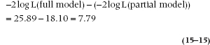
With df = 1, the critical chi-squared is 3.84, so there’s a significant change by adding BCC.
One final wrinkle, then we’ll stop. The p-value resulting from this stepwise analysis should be the same level of significance as that for the B coefficient of BCC in the full model. Regrettably, it isn’t quite. Looking again at Table 15–2, the computed Wald statistic yields a p of .03, which is larger but still significant.
Why the discrepancy? As near as we can figure, it’s because of the magical word “approximately,” which has featured prominently in the discussion. For the discrepancy to disappear, we need a larger sample size, but we have it on good authority13 that no one seems to know how much larger it needs to be. Again, upon appealing to higher authorities than ourselves, we are led to believe that, when in doubt, we should proceed with the formal likelihood ratio test.
MORE COMPLEX DESIGNS
Now that we have this basic approach under our belts, we can extend the method just as we did with multiple regression. Want to include interactions? Fine. Just multiply Herd × Years to get an overall measure of exposure14 and stuff it into the equation. Want to do a matched analysis, in which each person in the treatment group is matched to another individual in the control group? Now we have a situation like a paired t-test, in which we are effectively computing a difference within pairs. No big deal. Create a dummy variable for each of the pairs (so that, for example, pair 1 has a dummy variable associated with it, pair 2 has another, and so on). Of course, in this situation, where the number of variables is going up by leaps and bounds, the use of an unconditional ML estimator is a really bad idea, and you’ll have to shell out for a new software package. And on and on—ad infinitum, ad nauseam.
POISSON REGRESSION
If your spelling isn’t too good, you may wonder why we have a section on deadly agents favored by female English crime writers of a certain age; and if you remember your high school French, you may wonder why there’s a disquisition on fish in a statistics book. In fact, this section is about neither. A Poisson distribution is named after a famous granddaddy of statistics, Siméon Denis Poisson (1781–1840), and describes what you’d find if you plotted the number of discrete events that occur within a given time. It languished, unnoticed and unloved, until a Russian-Polish statistician living in Germany15 named Ladislaus Josephovich von Bortkiewicz was given the task of predicting the probability of a Prussian cavalry soldier being killed in any given year by being kicked by a horse. He went back and gathered data from 14 cavalry corps over 20 years. The findings, which are given in Table 15–5 and graphed in Figure 15–2, meet all of the criteria of a Poisson distribution—the data are discrete counts of events within a time period; the time between events is not dependent on the previous ones (that is, they’re independent); and the number of events is small relative to the entire population. We encounter this type of data all the time: the number of hospital admissions per day, the number of medications taken per person, the number of missing teeth,16 the number of minutes between admissions to an ER, the number of unwanted people who walk through your door each day, and so on. What all of these variables have in common is that the distributions are highly skewed to the right; there’s a “wall” at the lower end, because you can’t have fewer than zero admissions or unwanted visiting nudniks, and most observations are clustered around the lower values, with some relatively large numbers.
TABLE 15–5 Number of deaths from horse kicks per corps-year.
| Number | Corps-Years |
| 0 | 109 |
| 1 | 65 |
| 2 | 22 |
| 3 | 3 |
| 4 | 1 |
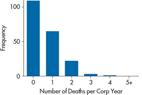
FIGURE 15-2 The number of officers killed by a kicking horse over 200 corps-years.
When the count variable is the DV and its mean is above 10 or so, you can probably use ordinary multiple regression and get away with it (Coxe et al., 2009). But, when the mean is less than that, the standard errors tend to be biased, and this naturally affects the tests of significance. Also, the data violate the assumption of homoscedasticity, because the variances around the smaller values are smaller than those around the larger counts. To the rescue comes the Poisson distribution.17
When we introduced the normal distribution, we said that it was defined by two parameters—the mean (μ) and the standard deviation (σ). Life is even simpler with a Poisson distribution, because μ = σ that is, whatever the mean is, that’s the value for the standard deviation. To compensate for this greater simplicity, we complicate your life by designating the mean of a Poisson distribution by λ rather than μ. Why? Just because. The probability of a certain number of events, k, is determined from the equation:
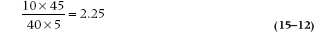
where e = 2.7183, and x! (pronounced “x factorial”) is x × (x − 1) × (x − 2) × … × 1. Let’s see how that works, using von Bortkiewicz’s data. There were a total of 200 corps-years, because not all of the 14 corps were in existence for the 20 years over which data were collected. There were 65 corps-years that had one death, 22 that had two, and so on. Therefore, the total number of deaths was (65 × 1) + (22 × 2) + (3 × 3) + (4 × 1) = 122. So λ = 122/200 = 0.61. The probability of two deaths in a corps-year predicted by the Poisson distribution is then:
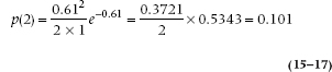
(Don’t worry that you’d be dividing by 0 or raising λ to the power of 0 for p(0); by definition, 0! = 1 and any number to the 0 power = 1.) Given that there were 200 corps-years of observation, then 200 × 0.101 = 20.2 corps-years with exactly two deaths, versus an observed 22; not a bad fit.
Using Equation 15–16, we can draw Poisson curves for any value of λ, and a few are shown in Figure 15–3. As we can see, as λ increases, the curves become more and more symmetrical. That’s why we said earlier than when λ is greater than 10 or so, we can use multiple regression with count data; by the time λ is 20, the distribution is indistinguishable from a normal one.1818
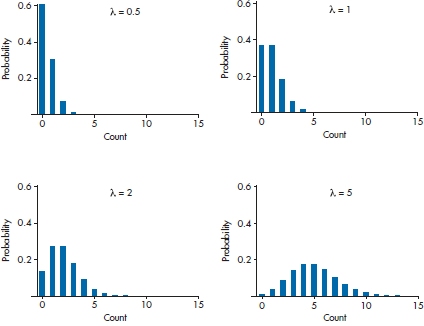
FIGURE 15-3 The Poisson distributions for various values of λ.
Having gotten those preliminaries out of the way, now we’re in familiar territory. When we discussed logistic regression, we said we’d get a linear equation if we defined the dependent variable in natural log terms (the logit transformation) as:
Well, Poisson regression follows the same logic, but is even simpler:

so that:

and since eln(x) = x, this simplifies even further to:

So there we have it. The right side of the equation looks exactly the same as a logistic regression; only the left side (what’s called the link function) is different. The coefficients in a Poisson regression are interpreted in (almost) exactly the same way as in a logistic regression. For each predictor variable, Xi, a one-unit increase results in a change in the predicted value of λ of  . Let’s play with some data, and see what we get.
A Sample Problem
As anyone who has been to the Mideast and done the touristy things can attest to, camels can be nasty S.O.B.s. Not only is the ride uncomfortable,19 but they have a habit of spitting and biting. Needless to say, this is an occupational hazard among camel drivers. Can we predict how many bites a driver receives in a year, based on the type of camel (Camel_Type) and the size of the herd (Herd_Size)? As a variable, Bites meets the criteria for a Poisson regression—it’s a count variable, relatively rare, and one bite is independent of the time since the previous one.
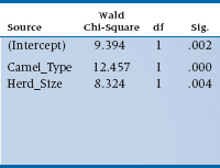
The first thing the computer spits out (so to speak) is a table with a whole mess of goodness of fit indices which, as we explained when we talked about logistic regression, pretty much boil down to Pearson χ2-like statistics. These test whether the data deviate from a Poisson distribution, so we do not want them to be significant; the usual rule of thumb is that the value divided by df should be equal to 1. If the data pass this test (and we’ll explain in a bit what to do if they don’t), we move on to the next table which, in SPSS, is labeled Omnibus Test. No, this is not a driving exam for London double-decker drivers; it indicates whether all of the parameters in the model are equal to zero. If the test is not significant, then we can pack up our camels and ride into the sunset; nothing’s going on. Because it was significant with our data,20 we can move on to the next table which is called Test of Model Effects, and shown in Table 15–6.
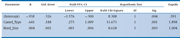
Don’t worry about the term for the intercept. It tells us whether the number of bites is significant when all of the predicted variables have a value of zero (e.g., no type of camel and no camels in the herd). So, it’s an accurate answer to a meaningless question.21 If we had centered the variables, as we described in the chapter on multiple regression, this parameter would tell us something useful, but we didn’t so it doesn’t. The Wald statistics for the two predictors are significant, meaning that both the size of the herd and the type of camel contribute to predicting the number of bites.22 Finally, we get to heart of the matter, a table called Parameter Estimates, which is shown in Table 15–7.
What do those numbers tell us? Let’s start off with Herd_Size, since it’s a (relatively) continuous variable and somewhat easier to interpret. The value of B in the table (which most statisticians would write as b) means that for every additional camel, the expected increase in the log number of bites is .004; not very informative. So let’s go to the right-most column, labeled Exp(B), which is eB (or more accurately, eb), and has a value of 1.004. This means that the penalty for having one additional camel is an increased risk of 0.004 bites in a year, or about one for every 250 of those burdensome beasts. The value for Camel_Type is 1.898. This is a nominal variable, so we have to remember which type is coded as 1 (Bactrian) and which as 2 (Dromedary). So Dromedaries bite almost twice as often as Bactrians, probably due to their resentment over having only one hump.
TABLE 15–6 Tests of model effects for the Poisson regression of number of camel bites.
Deviant Statistics
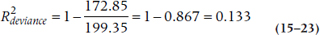
If you felt bad about not having a true R2 statistic with logistic regression, you’re going to feel even worse about Poisson regression—it doesn’t even have a pseudo-R2 statistic. The closest is something called reduction in deviance, and you’ll have to work hard to get that. Deviance is one of the goodness of fit statistics that we mentioned earlier, and it tells us how well or how badly the data fit a perfect model. As we said, we want deviance/df to be about 1, but the value of the deviance (172.85 in our case) doesn’t tell us any useful information. What we have to do is rerun the regression, leaving out all of the predictor variables, so we have a model that includes only the intercept. When we did that, we got a value of 199.35. We can now create a statistic called  , which tells us how much the deviance has been reduced when we add our predictors (Coxe et al., 2009):
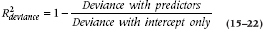
With the numbers we have, that would be:
We can also use the deviance statistic to see if adding another variable reduces the deviance. Again, we’ll have to do the work ourselves. The trick is to run the model with a set of variables, jot down the deviance, run it again with an additional variable, and write down the new value. The difference between the deviances is distributed as χ2 with df = 1 (assuming you’ve added only one variable). If this number is greater than 3.84 (the critical value of χ2 at p = .05), then the new variable has made a significant contribution.
Dealing with Fishy Data
Poisson regression has a fairly strict requirement that the standard deviation equals the mean. Unfortunately, not all data sets have read the textbook, so they can deviate from this assumption in three ways: the standard deviation is larger than the mean; there are too many zeros; or there are no zeros. Let’s deal with each of these in turn.
TABLE 15–7 Parameter estimates for the Poisson regression of number of camel bites.
The first situation, σ > λ, is called overdispersion. To be a bit more technical about it, this arises when the variance of the residuals (that is, the difference between the actual and predicted values of the DV) is larger than the predicted mean. The main reason this may occur is if an important predictor has been left out of the model. For example, if the probability of getting bitten by a camel depends on years of experience (of the herder, not the camel)—a factor we did not include in our example—then the variance it would have explained ends up in the error variance term, leading to the unexplained heterogeneity. Another possible reason is that there may have been a violation of the assumption of independence of the events. That is, if a camel develops a taste for biting and, having bitten a herder once, bites him a second or third time, then the counts are not independent from one another.
We know whether overdispersion is present if the value of the Pearson χ2/df (which is usually denoted by Φ) is greater than 1. How much greater than 1? We don’t know either, but anything over 1.5 is usually a red flag.23 The best cure for overdispersion is to add meaningful predictor variables and improve the model. That sounds good in theory, but it implies that (a) we know what those variables are and, more importantly, (b) we actually measured them and they’re in our data set. If the model is specified to the best of our ability, then there are two possible solutions. The first is to include a new parameter, Φ, into the works so that instead of λ = σ, it now equals Φ × σ. This doesn’t change any of the parameter estimates, but it makes the standard errors somewhat larger, leading to more conservative tests. Believe it or not, this is easy to do in SPSS; see the end of the chapter.
The second solution is to use a variant of the Poisson distribution called the negative binomial distribution. The major problem with Poisson regression is that it has no error term, as exists in multiple regression. That is, it does not allow for heterogeneity among individuals—all people (or camels) with the value x on some predictor variable are assumed to have the same value of the DV. The negative binomial adds an error term; this doesn’t change the estimates of the parameters, but results in more accurate estimates of the standard errors, and hence the significance tests. If there’s no overdispersion, then the negative binomial model reduces to a Poisson model, which is why some people prefer to use it; it’s a more flexible tool.
The second problem is called zero inflated models, which means that there are more zeros in the data than would be expected with a Poisson model. The primary cause—and fortunately the easiest situation to correct—is due to structural zeros. These are zeros due to the fact that the respondent can never have a positive value. For example, if we were doing a study of the number of driver-caused car accidents, then people who don’t have driver’s licenses will always (we hope) report that they never caused a fender-bender. In essence, we’re dealing with two populations: one made up of drivers whose numbers of accidents will form a Poisson distribution, and one of non-drivers, who will never have an accident and thus inflate the number of zeros. The solution is to simply restrict the sample to those for whom a positive response is possible. Yet again, this implies that we know of some factor that can differentiate between these two groups and have it in our data base. If we don’t, then we can use a zero-inflated negative binomial model, but not if we’re using SPSS; as of now, it exists only in programs like Stata or MPlus.
The opposite situation is called truncated zeros—we have no people with values of zero on the DV. If our sample of herders consists solely of those who have shown up in the emergency tent because of camel bites, then by definition the smallest value will be 1. It’s possible to adjust the Poisson model to account for this, but how to do this is well beyond the scope of this book.
SUMMARY
Logistic regression analysis is a powerful extension of multiple regression for use when the dependent variable is categorical (0 and 1). It works by fitting a logistic function to the 1s and 0s, estimating the fitted probability associated with each observed value. The test of significance of the model is based on adjusting the parameters of the model to maximize the likelihood of the observed arising from the linear sum of the variables, the so-called MLE procedure. Tests of the individual parameters in the logistic equation proceed much like the tests for ordinary multiple regression.
In a similar manner, Poisson regression handles DVs that are counts, because such data are usually skewed heavily to the right. Variations of Poisson regression deal with distributions that are more dispersed, with the SD exceeding the mean; data where there are more zeros than would be expected with a Poisson distribution; and situations where the zeros are absent for structural reasons.
SAMPLE SIZE
Regarding the question of how many subjects are necessary to run a logistic regression, there’s a short answer and a long one. The short answer is, “Dunno”; the long answer is, “Neither does anyone else.” We looked in many textbooks about multivariate statistics and logistic regression, and only one (Tabachnick and Fidell, 2001) even mentions the issue of sample size. Tabachnick and Fidell state that there are problems when there are too few cases relative to the number of variables, and spend the next three paragraphs discussing the problems and possible solutions (such as collapsing categories). Unfortunately, they don’t say what’s meant by “too few cases.” But, we do know this: logistic and Poisson regression are large-sample techniques, so the old familiar standby of 10 subjects per variable probably doesn’t work, and you’d do better thinking of at least 20 per variable.
REPORTING GUIDELINES
There are no generally accepted ways of reporting the results of logistic and Poisson regressions. Some people use a table similar to the one for ordinary least squares regression, except for replacing the t-test with the Wald statistic and its df and adding an extra column called either Odds Ratio (OR) or Exp(b), which is the same thing. As an added fillip, you can add the confidence interval around Exp(b). Other journals are content for you to report the ORs and CIs. Whichever format you use, be sure to report one or more of the pseudo-R2 statistics for logistic regression; we’d recommend McFadden’s adjusted R2 and Nagelkerke’s R2. As we said, we don’t see much use for the Cox and Snell statistic. For Poisson regression, report the  .
.
EXERCISES
1. For the following designs, indicate the appropriate statistical test.
a. A researcher wants to examine factors relating to divorce. She identifies a cohort of couples who were married in 1990 through marriage records at the vital statistics office. She tracks them down and determines who is still married and who is not. She also inquires about other variables—income, number of children, husbands’ parents married, wife’s parents married.
b. A surgeon wants to determine whether laparoscopic surgery results in improvements in quality of life. He administers a quality-of-life questionnaire to a group of patients who have had a cholecystectomy by (i) laparoscopic surgery or (ii) conventional surgery. The questionnaire is administered (i) before surgery, (ii) 3 days postoperatively, and (iii) 2 weeks postoperatively.
c. What is the role of lifestyle and physiologic factors in heart disease? A researcher studies a group of post-myocardial infarction patients and a group of “normal” patients of similar age and sex. She measures cholesterol and blood pressure, activity level (in hours/week), and alcohol consumption in mL/week.
d. At the time of writing, the latest cancer scare is that antiperspirants “cause” breast cancer. To test this, a researcher assembles a cohort of women with breast cancer and a control group without breast cancer and asks about the total use of antiperspirant deodorants (in stick-years).
e. To determine correlates of clinical competence, an educator assembles a group of practicing internists, and gives them a series of 10 written clinical scenarios. The independent variables are (i) Year of graduation, (ii) Gender, and (iii) Academic standing (pass, honors, distinction). The dependent variable is the proportion of the cases diagnosed correctly.
2. A randomized trial of a new anticholesterol drug was analyzed with logistic regression (using cardiac death as an endpoint), including drug/placebo as a dummy variable, and a number of additional covariates. The output from a logistic regression reported that Exp(b1) = 0.5. Given that the cardiac death rate in the control group was 10%, what is the relative risk of death from the treatment?
How to Get the Computer to Do the Work for You
Logistic Regression
- From Analyze, choose Regression → Binary Logistic…
- Click on the dependent variable from the list on the left, and click the arrow to move it into the box marked Covariates:
- Click on the predictor variables from the list on the left, and click the arrow to move them into the box marked Independent:
- For Method, choose Enter
- Under
 … check CI for exp(B)
- Click

Poisson Regression
This is done through a module called Generalized Linear Models, which is different from General Linear Model (go figure). The format of the screen is different from other modules.
- From Analyze, choose Generalized Linear Models → Generalized Linear Models …
- Under the Type of Model tab, click the button under Counts for Poisson loglinear
- Under the Response tab, move your dependent variable into Dependent Variable:
- Under the Predictors tab, move your continuous and dichotomous predictors into Covariates: and your categorical ones into Factors:
- Under the Model tab, move the predictors into Model:
- Under the Estimation tab, we prefer to use Robust estimator in the Covariance matrix section
- The only thing to add under the Statistics tab is to click on Include exponential parameter estimates
- If you had any categorical predictors, then under the EM Means tab, move them into the Display means for: box. Then click Contrast and select Pairwise. In the lower left-hand corner, under Adjustment for Multiple Comparisons, choose Bonferroni.
- Then click on
 and go.
Overdispersed Model
Basically, the same as a Poisson model with the following change:
- In the Estimation tab, in the Scale Parameter Method: box, choose Pearson chi-squared.
This doesn’t change the parameter estimates, but increases the estimates of the standard errors.
Negative Binomial Model
Again, much the same as the Poisson with these changes:
- In the Type of Model tab, under Counts, choose Negative binomial with log link.
- In the Estimation tab, under Scale Parameter Method, select Fixed value.
1 So if you’re rusty on multiple regression, you might want to have a fresh look at Chapter 14 before you proceed.
2 First brought to the attention of modern medicine in PDQ Statistics.
3 Two humps in Asia.
4 On a historical note, for those so inclined, its name comes from the fact that it was originally used to model the logistics of animal populations. As numbers increased, less food was available to each member of the herd, leading to increased starvation. As the population dropped, more food could be consumed, resulting in an increase in numbers, and so on.
5 Normally research assistants do the data gathering, but this rule is ignored when exotic travel and frequent flyer points are involved.
6 Which is why logistic regression was absent from many statistical packages until recently.
7 Note that we threw in a little hat over the ps; this is the mathematical way to say that these are estimates, not the truth.
8 What really happens is that the process begins by differentiating the whole thing with respect to each parameter (calculus again) resulting in a set of k equations in k unknowns, the set of coefficients for each of the predictor variables, and a constant. See note 6 in Chapter 13.
9 For your interest (who’s still interested?), the number of possible combinations for our 30 herders is 1.786 ×1035! If you want to see how we got there, look up the Fisher Exact Test.
10 Although some folks might like to convince you that this came from epidemiology, it didn’t—it came from horse racing. Imagine that the odds makers work out that the probability of Old Beetlebaum winning is 20%. The odds of him winning is 0.2/(1 −0.2) = 0.25, or turning it around, the odds against Beetlebaum are 0.8/(1 − 0.8) = 4. So they say it’s 4 to 1 against Beetlebaum in the 7th.
11 If you can’t remember the difference, rotate the first letters 90° to the left—a B has two bumps, and a D has one. Now tell us, in what other statistics book outside of Saudi Arabia can you learn about the finer points of camel herding?
12 For those of you not fluent in Yiddish, “Kush mir in tuchas” is a request to kiss my other beast of burden—a smaller one spelled with three letters, the first of which is a and the third of which is s.
13 Kleinbaum (1994), in the “To Read Further” section.
14 If these were wolves, not camels, we would obviously call it a “pack-year” of exposure.
15 And you thought you had an identity crisis?
16 Except for hockey players, where the number is 32 for everyone.
17 Hopefully not riding on one of those deadly horses.
18 An interesting, but totally useless, fact is that when λ is a whole number, the probability for λ is the same as for 1 − λ. You can drop that into the conversation at your next cocktail party.
19 For those of you old enough to remember ads for Camel cigarettes, we wouldn’t walk a mile for a camel.
20 Of course it was significant; we made up these data. You really didn’t think we’d waste our time in the Mideast counting camel bites, did you?
21 Sort of like the definition of statistics in general.
22 As you can see, SPSS, like other programs, prints out small p levels as .000. Don’t you do that—nothing has a probability of zero unless it violates a fundamental law of nature, like honest politicians. Write it as < 0.001.
23 Don’t get overly alarmed; red flags enrage only bulls, not camels.
Stay updated, free articles. Join our Telegram channel

Full access? Get Clinical Tree


