OF
VARIANCE
CHAPTER THE SEVENTH
Comparing Two Groups
The t-Test
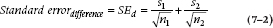
The t-test is used for comparing the means of two groups and is based on the ratio of the difference between groups to the standard error of the difference.
SETTING THE SCENE
To help young profs succeed in academia, you have devised an orientation course where they learn how to use big words when little ones would do. And, to help yourself survive in academia, you decide to do some research on it. So, you randomize half your willing profs to take the course and half to do without, then measure all the obscure words they mutter. How can you use these data to tell if the course worked? In short, how can you determine how much of the variation in the scores arose from differences between groups and how much came from variation within groups?
Perhaps the most common comparison in all of statistics is between two groups—cases vs. controls, drugs vs. placebos, boys vs. girls. Reasons why this comparison is ubiquitous are numerous. First, when you run an experiment in biomedicine, in contrast to doing an experiment in Grade 7 biology, you usually do something to some poor souls and leave some others alone so that you can figure out what effect your ministrations may have had. As a result, you end up looking at some variable that was measured in those lucky folks who benefited from your treatment and also in those who missed out.1
Note that we have implied that we measure something about each hapless subject. Perhaps the most common form of measurement is the FBI criterion—dead or alive. There are many variations on this theme: diseased or healthy; better, same, or worse; normal or abnormal x-ray; and so on. We do not consider this categorical type of measurement in this section. Instead, we demand that you measure something more precise, be it a lab test, a blood pressure, or a quality-of-life index, so that we can consider means, SDs, and the like. In the discussion below, we examine Interval or Ratio variables.
AN OVERVIEW
As we indicated in Chapter 6, all of statistics comes down to a signal-to-noise ratio. To show how this applies to the types of analyses discussed in this section, consider the following example.
A moment’s reflection on the academic game reveals certain distinct features of universities that set them apart from the rest of the world. First, there is the matter of the dress code. Profs pride themselves on their shabbiness. Old tweed jackets that the rest of the world gardens in are paraded regularly in front of lecture theaters. The more informal among us, usually draft dodgers with a remnant of the flower child ethos, tramp around in old denim stretched taut over ever-expanding derrieres.
But even without the dress code, you can tell a prof in a dark room just by the sound of his voice. We tend, as a group, to try to impress with obscure words in long, meandering sentences.2 It’s such a common affliction that one might be led to believe that we take a course in the subject, and foreigners on the campus might do well to acquire a Berlitz English-Academish dictionary.
Imagine if you will a course in Academish IA7 for young, contractually limited, tenureless, assistant profs. As one exercise, they are required to open a dictionary to a random page, pick the three longest words, and practice and rehearse them until they roll off their lips as if Mommy had put them there.
Of course, not wanting to pass up on a potential publication, the course planners design a randomized trial; graduate students are required to attend a lecture from one of the graduands and some other prof from the control group and count all the words that could not be understood. After the data are analyzed, the graduands (n1 = 10) used a mean of 35 obscure words. A comparable group (n2 = 10) who didn’t take the course used a mean 27 such words in their lectures. Did the course succeed? The data are tabulated in Table 7−1.
It is apparent that some overlap occurs between the two distributions, although a sizeable difference also exists between them. Now the challenge is to create some method to calculate a number corresponding to the signal—the difference between those who did and did not have the course, and to the noise—the variability in scores among individuals within each group.
The simplest method to make this comparison is called Student’s t-test. Why it is called Student’s is actually well known. It was invented by a statistician named William Gossett, who worked at the Guinness brewery in Dublin around the turn of the century. Perhaps because he recognized that no Irishman, let alone one who worked in a brewery, would be taken seriously by British academics, he wrote under the pseudonym “Student.” It is less clear why it is called the “t”-test. There is some speculation that he did most of his work during the afternoon breaks at the brewery. Student’s Stout test probably didn’t have the same ring about it, so “tea” or “t” it became.3
EQUAL SAMPLE SIZES
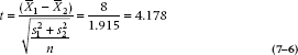
To illustrate the t-test, let’s continue to work through the example. From the table, the profs who made it through Academish IA7 had a mean of 35 incomprehensible words per lecture; the control group only 27. One obvious measure of the signal is simply the difference between the groups or (35 − 27) = 8.0. More formally:

where the vertical lines mean that we’re interested in the absolute value of the difference; because it’s totally arbitrary which group we call 1 and which is 2, the sign is meaningless. Under the null hypothesis (i.e., that the course made no difference), we are presuming that this difference arises from a distribution of differences with a mean of zero and a standard deviation (s) that is, in some way, related to the original distributions.
There are two differences between the t-test and the z-test. The first is that, although the t-test can be used with only one group, to see if its mean is different from some arbitrary or population value, its primary purpose is to compare two groups; whereas the z-test is used mainly with one group. The second, and more important, difference is that for the t-test, the standard deviation is unknown; whereas in the case of the z-test, discussed in Chapter 6, the SD of the population, σ, was furnished to us (remember, we had a survey of 3,000 or so penile lengths, so we were given the mean and SD of the population).
TABLE 7–1 Number of incomprehensible words in treatment and control groups
| Participants | Controls | ||
| 35 | 22 | ||
| 31 | 25 | ||
| 29 | 23 | ||
| 28 | 29 | ||
| 39 | 30 | ||
| 41 | 28 | ||
| 37 | 30 | ||
| 39 | 33 | ||
| 38 | 21 | ||
| 33 | 29 | ||
| Sum | 350 | 270 | |
| Mean | 35.0 | 27.0 | |
| Grand mean | 31.0 |
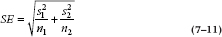
This is not the case here, so the next challenge is to determine the SD of this distribution of differences between the means: the amount of variability in this estimate that we would expect by chance alone. Because we are looking at a difference between two means, one strategy would be to simply assume that the error of the difference is the sum of the error of the two estimated means. The error in each mean is the standard error (SE),  , as we demonstrated in Chapter 6. So, a first guess at the error of the difference would be:
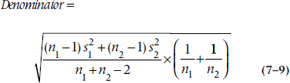
This is almost right, but for various arcane reasons we won’t bother to go into, we can’t add SDs; the sum doesn’t come out right. But, we can add variances, and then take the square root of the answer to get back to our original units of measurement. So, what we end up with is:
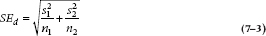
Because the sample sizes are equal (i.e., n1 = n2), this equation simplifies a bit further to:
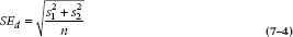
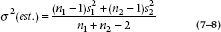
In the present example, then, we can calculate the variances of the two groups separately, and these are equal to:
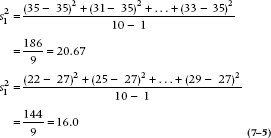
Then the denominator of the test is equal to 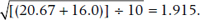 .
.
We can see what is happening by putting the whole thing on a graph, as shown in Figure 7–1. The distribution of differences is centered on zero, with an SE of 1.915. The probability of observing a sample difference large enough is the area in the right and left tails. If the difference is big enough (i.e., sufficiently different from zero), then we can see that it will achieve significance. The t-test is then obtained by simply taking the signal-to-noise ratio:
We can then look this up in Table C in the Appendix and find a whole slew of numbers we don’t know how to handle. The principal problem is that, unlike the situation with the z-test, there is a different t value for every degree of freedom, as well as for every α level. Instead of finding that, if α = .05, then t = 1.96, as we could expect if it behaved like a z-test, we find that now, t can range anywhere from 1.96 to 12.70. The problem is that, because we have estimated both the means and the SDs, we have introduced a dependency on the degrees of freedom. As it turns out, for large samples, t converges with z—they are both equal to 1.96 when α = 0.05. However, t is larger for small samples, so we require a larger relative difference to achieve significance.
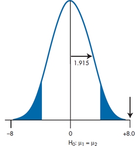
FIGURE 7-1 Testing if the mean difference is greater than zero.
Degrees of Freedom
We talked about that magical quantity, degrees of freedom (df), but haven’t yet told you what it is or how we figure it out. Degrees of freedom can be thought of as the number of unique pieces of information in a set of data, given that we know the sum. For example, if we have two numbers, A and B, and we know that they add up to 30, then only one of the numbers is unique and free to vary. If we know the value of A (say, 25), then B is fixed; it has to be (30 − 25) = 5. Similarly, if we know the value of B, then A has to be (30 − B). So, in general terms, if there are n numbers that are added up, such as the scores of n people in a group, then df = n − 1. In a t-test, we have two sets of numbers: n1 of them in group 1, and n2 of them in group 2. So, the total df for a t- test is [(n1 − 1) + (n2 − 1)], or (n1 + n2 − 2).
We can now look up the critical value of t for our situation (18 df) at the 0.05 level, which is 2.10. So our calculated value of t, which is equal to 4.178, is wildly significant.
The Formulae for the SD
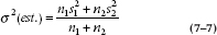
If you were paying attention, you would have noticed that the equation we just used to calculate the variance (Equation 7–5) differs slightly from the equation we used in Chapter 3, when we introduced the concept of variance and the SD; in particular, the denominator is N – 1, rather than just N. Equations 3–5 (for the variance) and 3–6 (for the SD) are used to calculate these values for the population; whereas the equivalent formulae with N – 1 in the denominator are used for samples (the usual situation). Why the difference? The answer is based on three factors, all of which we’ve already discussed. First, the purpose of inferential statistics is to estimate the value of the parameter in the population, based on the data we have from a sample. Second, we expect that the sample parameter (the mean, in this case) will differ from the population value to some degree, small as it may be. Finally, any set of numbers will deviate less from their own mean than from any other number. Putting this all together, the sample data will deviate less from the sample mean than they will from the population mean, so that the estimate of the variance and SD will be biased downward. Dividing the squared deviations by N − 1 rather than by N compensates for this, and leads to an unbiased estimate of the population parameter.
The question is why we divide by N − 1 as a fudge factor rather than, say, N − 2 or some other value. We’re not going to go into the messy details. Suffice it to say that if we took a very large number of independent samples from the population (about a billion or so), we’d find that the mean of those variances isn’t σ2 the population variance, but rather σ2 times (n − 1) / n. So, if we multiply each of the obtained values by n / (n − 1), we’ll end up with the unbiased estimate that we’re looking for. That’s why there’s a 1 in the denominator, rather than a different number.
TWO GROUPS AND UNEQUAL SAMPLE SIZES: EXTENDED t-TEST
If there are unequal sample sizes in the two groups, the formula becomes a little more complex. To understand why, we must again delve into the philosophy of statistics. In particular, when we used the two sample SDs to calculate the SE of the difference, we were actually implying that each was an equally good estimate of the population SD, σ.
Now, if the two samples are different sizes, we might reasonably presume that the SD from the larger group is a better estimate of the population value. Thus it would be appropriate, in combining the two values, to weight the sum by the sample sizes, like this:
This is close, but by now you have probably gotten into the habit of subtracting 1 every time you see an n. This is not the place to stop, so:
This is the best guess at the SD of the difference. But we actually want the SE, which introduces yet another 1 ÷ n term. In this case, there is no single n; there are two n terms. Instead of forcing a choice, we take them both and create a (1 ÷ n1 + 1 ÷ n2) term. So, the final denominator looks like:
And the more general form of the t-test is:
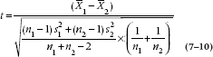
Although this looks formidable, the only conceptual change involves weighting each SD by the relevant sample size. And of course, the redeeming feature is that computer programs are around to deal with all these pesky specifics, leaving you free. From here we proceed as before by looking up a table in the Appendix, and the relevant df is now (n1 + n2 − 2).
Pooled versus Separate Variance Estimates
The whole idea of the t-test, as we have talked about it so far, is that the two samples are drawn from the same population, and hence have the same mean and SD. If this is so, then it makes good sense to pool everything together to get the best estimate of the SD. That’s why we did it; this approach is called a pooled estimate.
However, it might not work out this way. It could be that the two SDs are wildly different. At this point, one might rightly pause to question the whole basis of the analysis. If you are desperate and decide to plow ahead, some computer packages proceed to calculate a new t-test that doesn’t weight the two estimates together. The denominator now looks like:
This looks very much like our original form and has the advantage of simplicity. The trade-off is that the df are calculated differently and turn out to be much closer to the smaller sample of the two. The reason is not all that obscure. Because the samples are now receiving equal weight in terms of contributing to the overall SE, it makes sense that the df should reflect the relatively excess contribution of the smaller sample. This strategy is called the harmonic mean (abbreviated as  ), and comes about as:
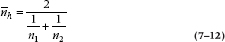
In short, if n1 was 4 and n2 was 20, the arithmetic mean would be 12; the harmonic mean would be 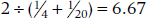 , which is closer to 4 than to 20. So the cost of the separate variance test is that the df are much lower, and it is appropriately a little harder to get statistical significance.
THE CALIBRATED EYEBALL
We promised you in the previous chapter that we would show you how to do statistical “tests” with your eyeball, so, honorable gentlemen that we are, here goes. What we do is plot the means of the groups with their respective 95% CIs; that’s done in the left side (Part A) of Figure 7–2 for the data in Table 7–1. Remember that the CI is:
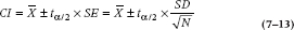
We’re using the t distribution rather than the normal curve because the sample size is relatively small. N is 10, so t with df = 9 is 2.26. For the Participants, Equation 7–5 tells us that s2 is 20.67, so the SD is  . Plugging those numbers into the formula gives us:
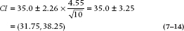
and (24.14, 29.86) for the Controls.
What we see in Figure 7–2 is that the confidence intervals don’t overlap; in this case, they don’t even come close. We conclude that the groups are significantly different from each other, which is reassuring, because that’s what the formal t-test told us. On the other hand, the error bars in the right side (Part B) of the figure show considerable overlap, so the difference is not statistically significant. From this, we can follow Cumming and Finch (2005) and establish a few rules:
- If the error bars don’t overlap, then the groups are significant at p ≤ .01.
- If the amount of overlap is less than half of the CI, the significance level is ≤ .05.
- If the overlap is more than about 50% of the CI, the difference is not statistically significant.4
Stay updated, free articles. Join our Telegram channel

Full access? Get Clinical Tree


