You may wonder why we need three data points, since we can fit a perfectly straight line with only two. There are three answers to this: one methodological, one statistical, and one based on measurement theory. The methodological answer is that with only two data points, we cannot determine the nature of the change. Figure 18–1 shows three of an infinite number of ways that people may change between two assessments. If the response were improvement in functioning, it makes a lot of difference whether a person improves quickly and then plateaus, starts off slowly but shows greater improvement over time, or simply maintains improvement as a linear change with time. The more data points we have, the more accurate a picture we can get.
The statistical reason is a consequence of what we said in the first sentence—you can fit a perfectly straight line. That is, there is no estimate of any error, and without any error estimates, you can’t run tests of significance. On the other hand, it is highly unlikely that three measures will all fall on a perfectly straight line, so there will be three estimates of how far the data points deviate from the least-squares estimate. Finally, from a measurement perspective, with only two points there is confounding between true change and measurement error. We don’t know whether there was true change or whether, because of possible error, the scores were spuriously low on the first occasion and spuriously high on the second. The more time periods we have, the less likely this becomes.
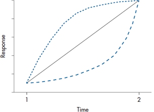
FIGURE 18-1 Three possible ways people can change between two assessments.
Another implication of this is that there must be enough time between measurements for something to have happened. If you’re measuring recovery in activities in daily living following a stroke, for instance, it doesn’t make sense to assess the person on days 1, 2, and 3; as we said in the previous paragraph, ain’t nothin’ there to model.
STEPPING THROUGH THE ANALYSIS
Step 1. Examine the Data
Although HLM is able to fit almost any shape of line to the data, the best place to start (and often to stop) is with a straight line. This is similar to multiple regression; we can throw in quadratic terms, cubic terms, and even try to fit the data with Shmedlap’s inverse hypergeonormal function,5 but for the vast majority of cases, a simple linear relationship will suffice. So, it’s a good idea to try fitting a straight line for each subject. In Figure 18–2, we’ve plotted the improvement score for the first six subjects in the RRP group, and we use that very powerful test for linearity, the eyeball check. Needless to say, not every person’s data will be well fitted, but we don’t want the majority of curves to look too deviant. However, if it seems as if most of the subjects’ data follow a different type of curve, we should think of either transforming the data so they become linear, or using a model with a higher order time effect, such as Time2. Note that Subject 5 missed the third follow-up visit, but we still have enough data to include her in the analysis.
The next thing to look at is the pattern of the correlations over time, because with the more powerful HLM programs, we’ll have to specify what that pattern is. There are many possibilities. But, as a starting point, there are three that are most common; ranging from the most to the least restrictive, they are compound symmetric, autoregressive, and unstructured. With compound symmetry, the variances are equal across time and all the covariances are equal;6 in simpler terms, the correlation between the data at Time 1 and Time 2 is the same as between Time 3 and Time 4. This isn’t too improbable, but compound symmetry also requires them to be equivalent to the correlation between Time 1 and Time 4.7A more realistic picture of what really happens over time is captured by the autoregressive model, in which the longer the interval, the lower the correlation. So, we would find that the correlation between Times 1 and 3 is lower than between Times 1 and 2, and that between Times 1 and 4 it is lower still. If there doesn’t seem to be any pattern present, we would use an unstructured correlation matrix. The advantage of more restrictive models is that they require fewer parameters, and this translates into more power. So, the unstructured pattern is the easiest to specify, but you pay a price for this.
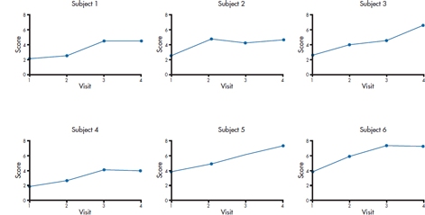
FIGURE 18-2 Checking that subjects’ data are more or less linear.
At this point, it’s a good idea to consider whether you should center the data, which we discussed in the chapter on multiple regression. As we’re sure you remember, one major advantage of centering is to make the intercept more interpretable. If the time variable, for example, is the person’s age or year in school, then without centering, the intercept tells you the value of the DV when the person is 0 years old, or in Grade 0; admittedly not overly useful information. In the example of the trial of the usefulness of RRP, the time variable is the number of the follow-up visit, so it may not be worthwhile to center, since the intercept would reflect the person’s status when the treatment ended.
Step 2. Fit Individual Regression Lines
The next step is up to the computer. A regression line is fitted to the data for each subject, so that we get two variables for each person, i: a slope (π0i) and an intercept (π1i).8An example for one subject is shown in Figure 18–3. It is because of this that the technique has two of its other names, random effects regression and mixed effects regression. In ordinary least squares regression (and all of its variants, such as logistic regression), we assume that the intercept and slopes that emerge from the equation apply to all individuals in the sample; that is, they’re fixed for all subjects. In HLM, though, each person has his or her unique intercept and slope, so that they’re random effects. The term mixed effects comes into play at the next stage, when these random effects are themselves entered into yet another regression equation, where the terms—the average slope and intercept for the group—are fixed.
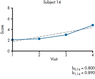
FIGURE 18-3 Fitting a straight line for each person.
Didn’t we just violate one of the assumptions of linear regression in this step? Having the predictor variables consist of the same measurement over time for an individual most definitely violates the requirement that the errors are independent from one another. So why did we do it? Because the bible tells us we can. In this case, the bible is an excellent book on HLM by Singer and Willett (2003). The rationale is that violating the assumption of independence of the predictors plays absolute havoc with the estimates of the standard errors, but it doesn’t affect the estimates of the parameters themselves. Because we’re interested only in getting the parameters—the slope and intercept—for each person, and we aren’t doing any significance testing, it doesn’t matter.
Before continuing further with the analyses, it’s a good idea to stop here and see how well the linear model fits the data for each person. With some programs, you can examine the residuals and perhaps even the value of R2 at an individual subject level. The residual is simply the difference between the actual and predicted values of the DV, and we’d like them to be relatively small. This would mean that the values for R2 should be moderate to large. Again, this won’t hold for every person, but it should be true for most.9
Step 3. Fit the Level 1 Model
At this point, we’re ready to derive the model at the lowest level of the hierarchy, the individual. The form of the model is:

This means that person i‘s score at time j is a function of his or her intercept (π0i), slope (π1i), the value of the variable that keeps track of time or occasion (Timeij), and the ubiquitous error (εij). We assume that everybody has the same form of the equation, but that the values of π0 and π1 vary from one person to the next; hence the term random effects regression. We can even get a little bit fancy here. If, when we were eyeballing the data, we thought that they would be better described by a quadratic equation (that is, increasing ever faster as time went on), we can throw in another term, such as:

but we’d need at least four data points per person. For now, though, we’ll omit the Time2 term.
We said that ε is the error term. Well, that’s not entirely true. Part of what contributes to ε is indeed error, owing to all the frailties that human flesh (and its measurement tools) is heir to (W. Shakespeare, personal communication). But, in other ways, it resembles the Error terms in ANOVA, in that a better description would be “unexplained variance.” With ANOVA, we try to reduce error by introducing other factors that can account for that variance. Similarly, in HLM, we may be able to reduce ε by including other factors that may account for variation between people or within people over time (Singer and Willett, 2003). Indeed, as we’ll see later, we actually hope that there is unexplained variance at this stage of the game that can be reduced when we include things like group membership into the mix.
There’s one very helpful implication of Equation 18–1. We’ve tossed all of the measurement error into the ε term, but we’re using the estimates of the π terms when we move up to the next highest level. That means that these estimates are measured separately from the measurement error and they’re not affected by attenuation caused by such errors (Llabre et al. 2004).
Step 4. Fit the Level 2 Model
Before we go any further, it’s worthwhile to see if there’s any variance to model in the next steps; that is, is anything going on? We do this by fitting the simplest of models:
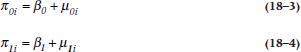
In Equation 18–3, β0 is the mean intercept for the group (the fixed effect), and μ0i is the difference for each person between his or her intercept and the mean for the group (the random effect). Equation 18–4 is the same thing for the slope (β1) and the residual difference between each person’s slope and the mean (μ1i). If the models fit, then we might as well pack up our bags and head for home, because there’s nothing going on—all of the subjects have the same slope and intercept, so it’s fruitless to try to determine why different people change at different rates.
If our prayers are answered and the models don’t fit the data well, we can take all those parameter estimates we calculated at the individual person level and figure out what’s going on at the group level. What we are interested in is whether the two groups differ over time: if their intercepts are the same (in this example, whether they are starting out at the same place after treatment), and if their slopes are the same (whether or not they’re changing at the same rate over time). That means that we have to calculate two regression lines, one for each group, with an intercept and a slope for each. The way it’s done is to determine the intercept for the control group, and how much the treatment group’s intercept differs from it, and then do the same for the slope. Hence, we have two equations to get those four parameters. For the intercept parameters, we have:

where γ00 is the average intercept for the control subjects (γ is the Greek letter “gamma”), γ01 is the difference in the intercept between the control and RRP groups, Groupi indicates group membership, and ζ0i is the residual (ζ is the Greek “zeta”).
For the slope parameters, the equation is:

where γ10 is the average slope for the control subjects, γ11 is the difference in the slope between the groups, and ζ1i is the residual.10
So, before going any further, let’s see what all those funny looking squiggles mean, by looking at a typical output, as in Table 18–1. The labels at first seem a bit off; the third line gives us the intercept for the slope. But realize that we’re going to end up with two regression lines, one for the RRP group and one for the control group. The first line tells us that the intercept for the control group is 0.732, and the second line says that the intercept for the RRP group is (0.732 + 1.208) = 1.940. The third line indicates that the slope for the control group is 0.481, and the fourth tells us that the slope for the RRP group is (0.481 + 0.421) = 0.902. So, to summarize, what we’ve done is derive one regression line for the control group, and one for the RRP group. For the control group, it’s:

and for the RRP group, it’s:

Let’s plot those and see what’s going on. The results are shown in Figure 18–4.
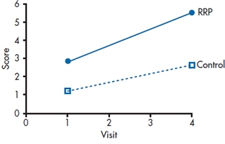
FIGURE 18-4 Plotting the fixed effects.
TABLE 18–1 Output of the fixed effects of HLM
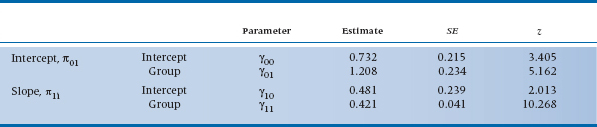
The z values in Table 18–1 are figured out the same way all z values are; they are the estimates divided by their standard errors. For reasons that we’ll explain at the end of this chapter, those SEs are asymptotic estimates (i.e., they get more accurate as the sample size increases), so some programs label them as ASE rather than SE. In this case, they’re all statistically significant, meaning that the control group began above 011(γ00); the RRP group began at a significantly higher level (γ01); there is a significant change for the control group over time (γ10); and that the RPP group changed at a significantly different rate (γ11).
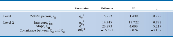
Those two residual terms, ζ0i and ζ1i, reflect the fact that the slopes and intercepts for individuals vary around these group estimates; again, they reflect error or unexplained variance. What we are interested in is not the actual values of those ζs but rather their variances. The amount of variance of ζ0i is denoted by σ02, and that for ζ1i as σ12. There’s also a third term, σ012, which is the covariance between ζ0i and ζ1i. (In this, we’re following the convention of Singer and Willett (2003), but to make your life more interesting, they state that other texts and computer programs use different Greek letters and other subscripts.) To be more exact, σ02 and σ12 are conditional residual variances, because they are conditional on the predictor(s) already in the equation; in this example, they tell how much variance is left over after accounting for the effect of Group. The covariance term, σ012, is there because it’s possible that the rate of change depends on the person’s starting level. We examined one aspect of this phenomenon in the previous chapter, because this covariance may be due to regression toward the mean—the greater the deviation from the mean, the more regression. Other possible reasons may be that people who start off with higher scores may be near the ceiling of the test or closer to a physiological limit, so they have less room to improve; or that those with higher scores have a head start on those with lower scores. Whatever the reason, σ012 lets us measure its effects.
So let’s take a look at those variance components and see what they tell us. In Table 18–2, we see that there’s still unexplained within-person variance at Level 1 (σe2). This means that we may want to go back and look for time varying predictors at the level of the individual. These are factors that could change from one follow-up visit to the next, such as the person’s compliance with taking the meds or whether the person is using other, over-the-counter drugs. At Level 2, there isn’t any residual variance for the intercept (σ02), but there is for the slope (σ12), even accounting for group membership. This tells us that we should look for other factors that may explain the variance, both time-varying ones as well as time-invariant ones, such as sex or age.12
TABLE 18–2 Output of variance components from HLM
Sidestep: Putting the Equations Together
So far, we’ve presented the two levels of the analysis—the individuals and the groups—as two sets of regression equations. That’s both an easy way to conceptualize what’s being done, and the method that was used in the far, distant past (say 10 years ago). But, let’s continue to follow Singer and Willett (2003) and see how we can combine the equations, which is actually the way most HLM programs like them to be specified.
In Equation 18–1, we defined Yij in terms of π0i and π1i. Then, in Equations 18–5 and 18–6, we defined these two values of π in terms of different values of γs. Putting it all together, what we get is:
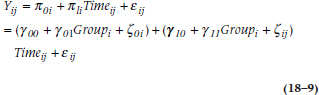
where the three terms inside the first set of brackets give us the Level 1 intercept based on the Level 2 parameters, and the terms in the second set of parentheses do the same for the slope. We can go one further step by multiplying out the terms in the second set and rearranging the results, giving us:
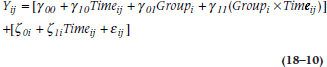
This looks much more formidable than Equation 18–9, but in one way, it’s actually more informative. The first part of the formula, with the γ symbols, shows the influence of the measured variables on a person’s score at a given time. It consists of where the person started out (γ00); the effects of Time and Group; and the interaction between the two, which allows the groups to diverge over time. It also consists of the slopes and intercepts of the RRP and control groups. The second part of the equation, with the ζs, reflects the various sources of error—around the intercept (ζ0i), at each measurement over time (ζ1i), and what’s still unexplained (εij).
Some Advantages of HLM
We already mentioned a few of the major advantages of analyzing change this way rather than with repeated-measures ANOVA or MANOVA—the ability to handle missing data points (as long as at least three times are left), the relaxation of the restriction about measuring at fixed times for all subjects, and the elimination of measurement error. After being so blessed, it’s hard to imagine that there’s even more, but there is. One of the major threats to the validity of a study is not so much people dropping out (although that can affect the sample size), but differential dropouts from the two groups, as we mentioned at the beginning of the chapter. That is, if more people drop out of the study from one group rather than the other, and if the reasons are related to the intervention (e.g., side effects or lack of effectiveness), then any estimate of the relative change between the groups would be biased by this confounding.
If we’re lucky, though, HLM can account for this. If, for example, people drop out because the placebo is not having an effect (duh!), then this should be reflected in a smaller slope for the dropouts than the remainers. HLM can (a) tell us if this is indeed happening, (b) retain the people in the analyses, and (c) model how much they would have changed had they remained in the study. This naturally assumes that they would have continued to change at the same rate, of course, but it’s a more conservative assumption (i.e., it works against rejecting the null hypothesis) than last observation carried forward (LOCF). As the name implies, LOCF is a way of trying to minimize the loss of data by taking the last valid data point from a subject before he or she dropped out, and using that value for all subsequent missing values.13 LOCF is conservative when it’s applied to the treatment group, in that it assumes that no further change occurs, but it may be too liberal when applied to the comparison group. Using HLM with both groups is probably a much better way to proceed.
Dealing with Clusters
Earlier in this chapter, we mentioned that some studies enroll participants in clusters. For example, in the Burlington Randomized Trial of the Nurse Practitioner (Spitzer et al. 1974), family physicians were randomized to have or not have a nurse practitioner (NP) assigned to their practices, and the outcome consisted of the prevalence of a number of “tracer conditions” among the patients. So, what’s the unit of analysis? We can look to see how many patients in each arm of the study had these different conditions. But, we expect that people within the same family share not only the same house, but also the same food, similar attitudes toward health, and that they inhale the same germ-laden air. So, it’s likely that people within a family are more similar to each other than they are to people in a different family, which means that mom, pop, and the two kids14 can’t be treated as four separate observations. Similarly, the “philosophy” of treatment of any doc or NP—that is, when to intervene for hypertension, or how to treat otitis media—would apply to all of his or her patients, so the patients or families within any one practice aren’t truly independent either. In summary, patients are clustered (or nested) within families, and families within practices.15
Now, HLM didn’t exist back then, but these days, this would be an ideal situation in which to use it. The stretch from the previous example to this one isn’t too far. With RRP, we can think of the various times as being nested within an individual; here, the clustering is within groups of people. Indeed, we can combine these by having time nested within the individual, and all of the measures for the individual nested within the groups. To keep us (and you) from going completely bonkers, though, let’s restrict ourselves to one measurement of blood pressure. Now, the Level 1 (individual) model, comparable to Equation 18–1, would be:

where Yij is the blood pressure of person i in family j, π0j is the average blood pressure from family j, π1i is the slope for family j, and Familyj should be self-explanatory.
The Level 2 (family) model for the intercept is:

and for the slope is:

where Groupj indicates whether the family is in the nurse practitioner or control group. If there were more than one family practice per condition, we would have a third level; the second level would substitute Practice for Group, and it would be this third level that would include the Group variable.
Whenever you’re dealing with clusters, you should calculate the intraclass correlation coefficient (ICC), which we discussed in Chapter 11. If you hunger for even more details about the ICC, see Streiner and Norman (2014).
SAMPLE SIZE
Although we’ve presented HLM as a series of multiple regressions, in fact we (or rather, the computer programs) don’t use least squares regression any more. For the most part, they’re calculated by a procedure called maximum likelihood estimation (MLE). MLE has many desirable properties, including the fact that the standard errors are smaller than those derived from other methods, it yields accurate estimates of the population parameters, and that they are normally distributed. But, these happen asymptotically; that is, as the sample size gets closer to infinity. So how many subjects do we need? Singer and Willet (2003) say that 10 is too few, and 100,000 may be too many. Does that give you enough guidance?
Long (1997) recommends a minimum of 100 subjects for cross-sectional studies, and says that 500 people are “adequate.” Those estimates are a bit narrower, but not by much. Returning to our bible, Singer and Willett (2003) say there are too many aspects of the data and the actual ML method used to be more precise, but that p levels and confidence intervals derived from “small” samples should be regarded with caution.16
REPORTING GUIDELINES
In many ways, reporting the results of HLM is very similar to reporting the results of multiple regression: you need the (1) standardized and (2) unstandardized regression weights, (3) their standard error, (4) the t-tests, and (5) their significance levels; and these are best given in a table. But, because HLM is an order of magnitude more complex than regression, more has to be reported. This would include:
- Unlike programs for ANOVA or regression, those for HLM each work somewhat differently, so you should state which program you used.
- What method of parameter estimation was used (e.g., maximum likelihood, restricted maximum likelihood, etc.).
- The sample size at each level of the analysis.
- How missing data and outliers were handled at each level. (Notice that we didn’t say “If there are missing data ….” We assume there will be.)
- Tests of the assumptions of the model, such as normality, homogeneity of variance, multicollinearity, and so on.
- What pattern of correlations over time were used: compound symmetry, autoregressive, unstructured, or whatever.
- Because the model is usually built up sequentially, from one with no predictors to the final one, each one should be described. The table should indicate how much better each more restrictive model is.
- The table of coefficients, which we described above, for the fixed and random effects.
- The intraclass correlation coefficients at the various levels.
Stay updated, free articles. Join our Telegram channel

Full access? Get Clinical Tree


