FIGURE 16-1 Individual relationship between Pathos Quotient (PQ) and Treatment (A), Belt size (B), and Age (C).
TABLE 16–1 Data for 16 PMS patients
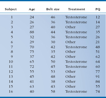
TABLE 16–2 ANOVA of regression for PMS against belt size
Having gotten this far, we might like to see the appearance of these elements on graphs. Figure 16–1 shows the PQ scores for 16 subjects in comparison to belt size, age, and treatment, based on the data of Table 16–1. It is evident from the graph that the data are pretty well linearly related to belt size. We could proceed to do a regression analysis on the data in the usual way. If we did, the ANOVA of the regression looks like Table 16–2, and the multiple R2 turns out to be .30, which is not all that great.
Looking at treatment, this is just a nominal variable with two levels, and the hormone group mean is a bit lower than the “Other” group. If we wanted to determine if there was any evidence of an effect of treatment, we could simply compare the two means with a t-test. For your convenience, we have done just that; the t-value is 1.33, which is not significant.
Finally, we do have this slightly bizarre relationship with age, indicating that the mid-life crisis is a phenomenon to be reckoned with, and moreover, its effects seem to dwindle on into the 60s. It is anything but obvious how this should be analyzed, so we won’t—yet. For the sake of learning, we’ll leave age out of the picture altogether for now and simply deal with the other two variables—Belt Size (a ratio variable) and Treatment with testosterone/other (a nominal variable).
ANALYSIS OF COVARIANCE
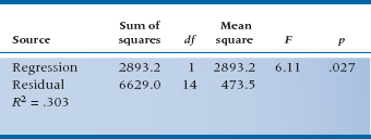
Again, if you’ve learned your lessons well, you know by now that a first approach is to graph the data, and at least this time it really isn’t too hard to put three variables on two dimensions. We simply use different points for the two groups, then plot the data against belt size again. Figure 16–2 shows the updated graph.
Now we have a slightly different picture than before. If we look back at the relationship to Belt Size, we can see that the data are actually pretty tightly clustered around two lines, one for Testosterone and one for Other. Some of the variability visible in the data in Figure 16–1B was a result of the treatment variable, as well as the belt size. Conversely, if we imagine projecting all the data onto the Y-axis, so that we have essentially two distributions of PQs, one for Testosterone and the other for Other, we recapture the picture of Figure 16–1A. And taking account of all of the variance from both sources, by determining two lines instead of one, we are able to reduce the scatter, or the error variance, around the fitted lines. This should result in a more powerful statistical test, both for analyzing the impact of belt size on PQ and also for determining if treatment has any effect.
Conceptually, we have the same situation as we had with multiple regression. We have two independent variables, Belt Size and Treatment, each of which is responsible for some of the variance in PQ. As a result, the residual variance, which results from other factors not in the study, is reduced. The effect of using both variables in the analysis is to reduce the error term in the corresponding test of significance, thereby increasing the sensitivity of the test.
The challenge is to figure out how to deal with both nominal and ratio independent variables. What we seem to need is a bit of ANOVA to handle the grouping factor and a dose of regression to deal with the continuous variable. Historically, the problem is dealt with by a method called ANCOVA, from ANalysis of COVAriance, once again using creative acronymizing to obscure what was going on. You may recall from Chapter 13, however, that the covariance was a product of X and Y differences that expressed the relationship between two interval-level variables, so this is a reasonable description of what might be the relationship to belt size. We then need some way to analyze the effect of the treatment variable, which amounts to looking at the difference between two groups, something we would naturally approach with an ANOVA, or a t-test, which is the same thing. Put it together and what have you got? Analysis of covariance.2
The time has now come to turn once again from words to pictures, employing what is now a familiar refrain—parceling out the total Sum of Squares in PQ into components resulting from Belt, Treatment, and error. To see how this comes about, refer to Figure 16–3, which is simply an enlargement of Figure 16–2 around the middle of the picture. We have also included the Grand Mean of all the PQs as a large black dot, and we have thrown in a bunch of arrows (we’ll get to those in a minute).
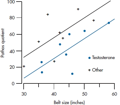
FIGURE 16-2 Relationship between PQ and Treatment and Belt size.
Three possible sources of variance are Treatment, Belt, and the ubiquitous error term. So far, so good, but how do they play out on the graph? Sum of Squares resulting from Treatment is related to the distance between the two parallel lines, so it expresses the treatment effect on PQ. The Sum of Squares resulting from Belt is the sum of all the squared vertical distances between the fitted points and their corresponding group mean, just as in a regression problem, except that the distances are measured to one or the other line. Sum of Squares (Error) is the distance between the original data points and the corresponding fitted data point. The better the fit between the two independent variables (Treatment and Belt), (1) the closer the data will fall to the fitted lines, and (2) the larger will be Sum of Squares (Belt) and Sum of Squares (Treatment) when compared with the Sum of Squares (Error).
Viewed this way, it’s not such a difficult problem, showing once again that a picture is worth a few words. But we haven’t actually started analyzing it numerically yet, so here we go. You will note that we have made a big deal of putting together both nominal and interval-level data, but in fact they both come down to sums of squared differences when we look at the variance components. In fact, we seem to be in the process of collapsing the distinction altogether between ANOVA and regression methods. After all, in the last chapter we got used to the idea of ANOVAing a regression problem. Perhaps we can be forgiven if we now stand things on their heads and do a regression to an ANCOVA problem.3
Suppose we forget for a moment that these are a mixture of variables and just plow ahead, stuffing them into a regression equation. It might look a bit like this:

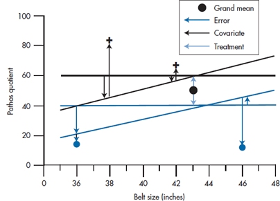
FIGURE 16-3 Relationship between PQ and Treatment and Belt size (expanded), indicating sums of squares.
That looks like a perfectly respectable regression equation. But we have only one little problem. When we put Belt into the equation it’s pretty clear what belt size to use—32, 34, 36 … 54 inches (or the metric equivalent). But what number do we use for Treatment? It’s a nominal variable, so there is no particular relationship between any category and a corresponding number. Well … suppose we try 0 for Other and 1 for Testosterone; what happens? Then the regression equation for the control group is:

and for the treatment group it is:
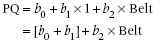
In other words, the choice of 0 and 1 for the Treatment variable creates two regression lines with the same slope, b2, which differ only in the intercept. In the Testosterone group, the intercept is (b0 + b1); in the Other group it is just b0. So b1 is just the vertical distance between the two lines in the graph (i.e., the effect of treatment). That is just what we want. All that remains is to plow ahead just as with any other regression analysis and determine the value and statistical significance of the bs. In the course of doing so we have actually done what we set out to do: determine the variance attributable to each independent variable.4
In this case, the Sum of Squares resulting from regression, for the full model, is equal to:

Lest the algebra escape you, this is just the difference between the fitted point at each value of PQi (the whole equation in the parentheses) and the overall mean of PQ, with all the individual differences squared and summed. So this is the sum of squares in PQ resulting from the combination of the independent variables.
The Sum of Squares (Residual) is equal to:

This takes the difference between the original data, PQi, and the fitted values (again, the stuff in the parentheses), all squared and added. So this represents the squared differences between the original data and the fitted points.
To test the significance of each independent variable, we must actually determine three regression equations: one with just Treatment in the equation, one with just Belt in the equation, and the last with both in the equation. This way we can determine the effect of each variable above and beyond the effect of the other variables. The ANOVAs for each of the models are in Table 16–3.
We then proceed to determine the individual contributions. For Belt, the additional Sum of Squares is (5274.5 − 1139.1) = 4135.4 with 1 df, and the residual term is 326.8. The F-test for this variable is therefore 4135.4 ÷ 326.8 = 12.65, equivalent to a t of 3.56. We’ll let you work out the equivalent test for Treatment. Suffice to say that it, too, is significant, with a t of 2.70, p < .05.
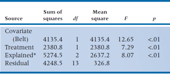
Actually, although we have structured the problem as a regression problem for continuity and simplicity, if the analysis were actually run as an ANCOVA program, the contributions of each variable would be separately identified in the ANCOVA table (Table 16–4).
Note that a funny thing happened when both variables went in together. Because each variable accounted for some of the variance, independent of the other, the residual variance shrank, so the test of significance of both variables became highly significant. When each was tested individually, however, Treatment was not significant, and Belt was only marginally so. For those of you with a visual bent, the situation is illustrated in Figure 16–4.
Figure 16–4 nicely illustrates one potential gain in using ANCOVA designs: the apportioning of variance resulting from covariates such as Belt can actually increase the power of the statistical test of the grouping factor(s). Of course, this is true only insofar as the covariates account for some of the variance in the dependent variable. As with regression, it can work the other way, where adding variables decreases the power of the tests.
ANCOVA for Adjusting for Baseline Differences
Actually, surprisingly few people are even aware of this potential gain in statistical power from using covariates. More frequently, ANCOVA is used in designs such as cohort studies where intact control groups are used and the two groups differ on one or more variables that are potentially related to the outcome or dependent variable.
As an example, consider the pitiless task of trying to drum some statistical concepts into the thick heads of a bunch of medical students.5 In an attempt to engage their humorous side, one prof decides to try a different text this year—Bare Essentials, naturally. He gives this class the same exam as he gave out last year and finds that the mean score on the exam is 66.1% this year, whereas it was 73.5% last year. That’s not funny for him or us.
FIGURE 16-4 Variance in PQ resulting from Belt size and Treatment.
TABLE 16–3 ANOVAs of regressions for Testosterone/other, Belt size, and Both
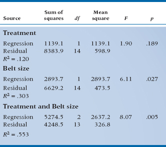
TABLE 16–4 Summary ANCOVA table for Treatment and Belt size
Do Norman and Streiner honor the money-back guarantee and forfeit their hard-earned cash? Not likely, for several reasons: (1) we’re tight-fisted, (2) we already spent it recklessly on women,6 and (3) we know the dangers of historical controls and other nonrandomized designs. A little detective work reveals the fact that the admissions committee has also been messing around and dropped the GPA standard, replacing it with interviews and other touchy-feely stuff. So one explanation is that this class has a slightly higher incidence of cerebromyopathy7 than had the last. But what can we do about it? Clearly we need some independent measure of quantitative skills. Let’s take the physics section of the Medical College Admissions Test (MCAT). If we plot MCAT physics scores and final grades for the two classes, we get Figure 16–5.
A different picture now emerges. It is clear that Bare Essentials delivered on the goods. The regression line for this year’s class is consistently higher than last year’s, by about 15%, as shown by the arrow. But what happened is that the admissions committee blew it (at least as far as stats mastery goes) by admitting a number of students with chronic cases of cerebromyopathy, so that they start off duller (i.e., to the left of the graph), and end up duller. But, relative to their starting point, they actually learn more from Bare Essentials, and we get to keep the dough.
TABLE 16–5 Mean scores (and SD) for the classes of 1990 and 1991 on MCAT physics and post-test
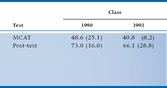
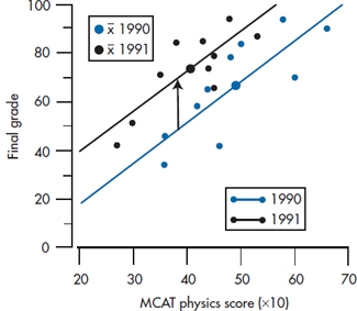
FIGURE 16-5 Relationship between MCAT physics and post-test statistics score for the classes of 1990 and 1991.
We’ll put some statistics into it (which is what we’re here for), and the data for the two cohorts on MCAT and post-test are shown in Table 16–5. If we do a t-test on the post scores, the result is t(18) = 0.82, p = 0.41, which is a long way from significance and in the wrong direction anyway. Note that graphically, this is equivalent to projecting all the data onto the Y-axis and looking at the overlap of the two resulting distributions. However, if we bring up the heavy artillery and ANCOVA the whole thing, with MCAT as the covariate and 90/91 as the grouping factor, a whole new picture emerges.
First, the estimated effect of 90/91 (i.e., the Bare Essentials treatment effect) is now a super 19.75—the difference between the two lines. Further, the effect is highly significant (t(18) = 3.60, p = .002). So not only did we improve the sensitivity of the test in this analysis, we also corrected for the bias resulting from baseline differences, to the extent that the estimate of the treatment effect changed direction.
This then summarizes the potential gains resulting from using ANCOVA to account for baseline differences:
- When randomization is not possible and differences between groups exist, ANCOVA can correct for the effect of these differences on the dependent variable. However, this correction for baseline differences is fraught with bias, as we’ll talk about in the next chapter, and really shouldn’t be done without a lot of thought.
- Even when you have no reason to expect baseline differences, ANCOVA can improve the sensitivity of the statistical test by removing variance attributable to baseline variables.
Stay updated, free articles. Join our Telegram channel

Full access? Get Clinical Tree


