Fig. 14.1
An example of how symbolic data in a spreadsheet (a) when converted into a visual representation (b) leverages the parallel processing abilities of the visual cortex which enables faster comprehension of patterns in the data. Because visual processing is parallel in nature, it scales to handle large amounts of data. When the same data is sorted by gender (c), the visual representation reveals yet another pattern demonstrating how interaction with the data is a critical aspect of visual analytics, and can guide the verification of the patterns using the appropriate quantitative measures
In contrast, as shown in Fig. 14.1b, if all cells in the spreadsheet with values >140 are colored red, the resulting visual representation enables processing of red cells in each column to be conducted in parallel, resulting in a more rapid determination that the left column has more red cells compared to the right column. Such parallel processing is independent of the number of cells, and therefore scales up well to large amounts of data. Data visualizations therefore help to shift processing from the slower symbolic processing areas of the human brain, to the faster graphical parallel processing of the visual cortex enabling detection of patterns in large and complex biomedical data sets. Furthermore, by externalizing key aspects of the task, the representation in Fig. 14.1b shifts information from an internal to an external representation, making other tasks such as counting the number of patients with systolic >140 in each column much easier (Zhang and Norman 1994).
Unfortunately, not all data visualizations are effective in augmenting cognition. For example, a road map pointing south is not effective for a driver who is facing north because it requires a mental rotation of the map before it can be useful for navigation. Similarly, an organizational chart of employee names and their locations laid out in a hierarchy based on seniority is not very useful if the task is to determine patterns related to the geographical distribution of the employees. Finally, if a chart has an incorrect or missing legend and axes labels, the visualization is difficult to comprehend because it cannot be mapped to concepts in the data. Therefore visualizations need to be aligned with mental representations of the user (Tversky et al. 2002), tasks (Norman 1993), and data, before those visualizations can be effective in augmenting cognition.
14.2.2 Why Does Interactivity Matter?
While static visualizations of data can be powerful if they are aligned with mental representations, tasks, and data, they are often insufficient for comprehending complex data. This is because data analysis typically requires many different tasks performed on the same data such as discovery, inspection, confirmation, and explanation (Bhavnani et al. 2012), each requiring different transformations of the data. For example, if the task in Fig. 14.1b is to understand the relationship of the drug to gender, then the data can be sorted based on gender. As shown, interaction with the data through such sorting reveals that the drug has no effect on females (low values remain low, and high values remain high), whereas it has a dramatic effect on lowering systolic values in males (all high values become low). Therefore, while it is well accepted that interactivity is crucial for the use of most computer systems, interaction with data visualizations can help to reveal relationships that are otherwise hidden when using a single representation of the data.
Interactivity is also critical when analysis is done in teams consisting of different disciplines, where each member often requires a different representation of the same data. For example, a molecular biologist might be interested in which genes are co-expressed across patients, whereas a clinician might be interested in the clinical characteristics of patients with similar gene profiles, and later how they integrate with the molecular information. To address these changes in task and mental representation, visualizations require interactivity or the ability to transform parts, or the entire visual representation.
14.2.3 Theories Related to Visual Analytics
Although the field of visual analytics has drawn on theories and heuristics from different disciplines such as cognitive psychology, computer science, and graphic design, the development of theories and taxonomies for visual analytics are still in early stages of development (Thomas and Cook 2005). For example, there are a number of attempts to classify visual analytical representations (Heer et al. 2010; Shneiderman 1996), and interaction intents at different levels of granularities (Yi et al. 2007; Amar et al. 2005).
One attempt to classify visual analytical representations groups them into (1) time series (e.g., line graphs showing how the expression of different genes change over time), (2) statistical distributions (e.g., box-and-whisker plots), (3) maps (e.g., pie charts showing percentages of different races at different city locations on the US map), (4) hierarchies (e.g., top-down tree showing the management structure of an organization), and networks (e.g., a social network of how friends connect to other friends such as on Facebook). Once these visualizations are generated, they are considered visual analytical if they enable interaction directly or indirectly with part, or all of the information being represented. Examples for such interactivity include transforming a top-down tree into a circular tree, coloring nodes in the tree based on specific properties such as gender, or dragging a node in the tree to swap its location with another sibling node.
Similarly, there have been several attempts to classify interactions with visualizations at different levels of granularity. For example, Amar et al. (2005) proposed 8 low-level interaction intents: retrieve value, filter, compute derived value, find extremum, sort, determine range, characterize distribution, find anomalies, and cluster and correlate. In contrast, Yi et al. (2007) proposed 6 higher level interaction intents typically used: select, explore, reconfigure, encode, abstract/elaborate, filter and connect.
While the above classifications of visual analytical representations and interaction with them are useful as check lists for building effective visual analytical systems, they do not provide an integrated understanding of how they work together to enable analytical reasoning, a primary goal of visual analytics. To address this gap, Liu and Stasko (2010) proposed a framework which integrates visual representation, interaction, and analytical reasoning. The framework specifies that central to reasoning with an external visual analytical representation (e.g., the table in Fig. 14.1b) is a mental model which is an analog of the external representation stored in working memory, and which is “runnable” to enable reasoning of the data and relationships. This is achieved by creating a mental model in working memory which is a “collage” of some or all of the structural, semantic, and elemental details present in the visual representation, in addition to other information from long term memory relevant to the task. For example as shown in Fig. 14.1b, an analyst conducting the task of determining which of the two columns have more patients with systolic >140 might construct a mental model in working memory consisting of two columns with cells colored red and white, but excluding elements such as the numbers in the cells. Similar to the speed of accessing information stored in the memory of a computer versus from disk, a mental model stored in the brain’s working memory can be used to rapidly achieve tasks such as determining which of the two columns have more red cells, or even determining that the first column has approximately three times more red cells compared to the second column.
The framework further specifies that because working memory has size constraints, a mental model can typically contain only some of the information present in the external visualization at any given time. Therefore, when the task changes, it motivates a tight interactive coupling between the internal mental model and the external visual representation, through which new information is extracted from the existing state of the visualization or from long term memory, irrelevant information in the mental model is discarded to make room for new information, the external visual representation itself is transformed to reveal new relationships, or the conceptual information is externalized onto the visual representation to enable future tasks. For example, when the task described in Fig. 14.1 involves exploring or determining the relationship of systolic blood pressure to gender, then a tight coupling between the internal and external representations is triggered enabling the extraction of gender-related information and its relationship to systolic blood pressure. This can be done either by extracting the information from the current representation (requiring often costly mental manipulations) to identify patterns, or by transforming the external representation through manipulations such as sorting (requiring relatively cheaper physical actions) to reveal new relationships, which are then immediately available for internal reasoning tasks such as determining inequalities between the columns. Furthermore, information about the current or previous task such as a discovered pattern can be externalized onto the visual representation through annotations, and therefore freeing up working memory for subsequent tasks.
The framework proposes that the coupling of internal and external representations can be characterized by three interacting goals: (1) External anchoring or the process of connecting conceptual structures (e.g., systolic blood pressure >140) to material elements of the visualization (red colored cells), (2) Information foraging or the process of exploring the external visual representation through extraction (e.g., counting the red cells related to female patients) or through transformation (e.g., sorting) of the representation, and (3) Cognitive offloading or the process of transferring a conceptual structure onto the visual representation to reduce working memory demands (e.g., encircling or annotating in Fig. 14.1c all female patients who have systolic >140 before and after taking the drug).
While the above integrated framework of visual representation, interaction, and analytical reasoning still needs to be elaborated into a theory and tested through predictive models, it provides a first step into how the critical concepts of visual analytics could be working together to enable analytical reasoning, leading to implications for the design and evaluation of effective visual analytical systems.
Finally, it is important to note that visual analytics has considerable overlap with the fields of scientific visualization (focused on modeling real-world geometric structures such as earthquakes), and information visualization (focused on modeling abstract data structures such as relationships). However, as described above, visual analytics places a large emphasis on approaches that facilitate reasoning and making sense of complex information individually and in groups (Thomas and Cook 2005).
14.3 Visual Analytics: Biomedical Applications
The use of visual analytical representations is increasingly becoming pervasive in the biomedical domain. The selection of visual analytical representations is highly dependent on the users of the information and their goals, which can be classified in the following two broad categories:
14.3.1 Information Consumers
The primary goal of information consumers is to make biomedical information actionable in terms of directly affecting change in health-related behaviors. An important class of information consumers is patients and care providers whose primary goal is to track and modify personal health and life style behaviors through the use of biomedical and social data. For example, the website PatientsLikeMe (2014) enables users to input health and lifestyle variables of specific individuals. As shown in Fig. 14.2, this information is displayed using visual analytical representations such as longitudinal charts and graphs which can be modified to display different granularities of data. Users can also find patients who are similar to their profile, and learn about their real-world experiences of dealing with their diseases, with the goal of improving the quality of life for themselves or for those they provide care. Similarly, personal and wearable activity monitors (e.g., fitbit) have been developed to motivate behavior change such as weight loss by monitoring how many steps a user has taken on a particular day, and displaying that information on a smart phone using visualizations such as a progress bar and the recommended target. Such information can be shared with other users in a social network to provide additional motivation through competition.
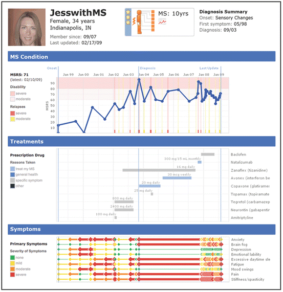
Fig. 14.2
A visual analytical display of patient information provided by PatientsLikeMe, a website that enables patients and caregivers to upload information about individuals, and search for other patients with a similar condition (Reprinted by permission from Macmillan Publishers Ltd: Nature Biotechnology (Brownstein et al. 2009), copyright 2009)
Another important class of information consumers consists of healthcare providers such as physicians and first-responders whose primary goal is to make healthcare decisions relevant to specific patients and situations by extracting relevant information from databases such as electronic health records. For example, the Twinlist system (Plaisant et al. 2013) was developed to reconcile multiple lists of drugs (e.g., from the hospital records versus what the patient reports taking) associated with a patient by graphically displaying what is similar and different among the different lists. The goal of this prototype was to enable caregivers to rapidly reconcile contradictory information with the goal of reducing errors in treatment.
A third class of information consumers consists of policy makers from federal and state agencies whose primary goal is to make policy decisions based on public health information. For example, the Centers of Disease Control provides interactive maps showing the incidence of different disease outbreaks across the US (CDC 2014), with the goal of enabling faster response.
Given that the primary goal of information consumers is to make specific forms of biomedical information actionable, an active area of research is to determine which visual analytical representations are appropriate for which classes of users and goals, and to design and evaluate systems which are easy to learn, and intuitive to use (Shneiderman et al. 2013). For example, while interactive time series, maps, and hierarchies when designed carefully are considered easy to comprehend and to interact with, other representations such as networks with more than a few dozen nodes are considered more difficult to comprehend and tend to be avoided as representations for information consumers.
14.3.2 Information Analysts
In contrast to information consumers, the primary goal of information analysts in academic and industrial settings is to make contributions to biomedical scientific knowledge. While the goal of all biomedical information users is to ultimately improve health outcomes, the process of reaching that long-term goal is achieved by information analysts through progressive contributions to scientific knowledge. An important class of information analysts consists of biologists and bioinformaticians whose primary goal is to decipher the biological mechanisms involved in different diseases. For example, biologists often use network visualization and analysis tools like Cytoscape (2014) to comprehend complex disease-protein associations (Ideker and Sharan 2008) with the goal of deciphering the functions and pathways related to proteins of interest.
A second class of information analysts consists of clinical researchers and medical informaticians whose primary goal is to develop new methods to improve patient treatment by analyzing the relationship between clinical variables and outcomes. For example, networks visualizations have been used to analyze Medicare claims from more than 30 million patients, which enabled researchers to infer patterns in the progression of different diseases (Hidalgo et al. 2009). One of the their observations was that that highly connected nodes in the network had high lethality implying that patients with such diseases are more likely to have an advanced stage of disease.
A third class of information analysis consists of epidemiologists whose primary goal is to analyze public health information. For example as shown in Fig. 14.3, Christakis and Fowler (2010) found that the flu infection in a social network consisting of Harvard students peaked two weeks earlier compared to a random set of students from the same population. Such advanced warning could be effective for planning immunizations during outbreaks of infectious diseases.
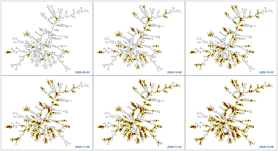
Fig. 14.3
Progression of the flu infection through a social network of students from Harvard University (Christakis and Fowler 2010). The red nodes represent infected students, the yellow nodes represent friends of infected students, and the edges connecting the nodes represent self-reported friendship links (Reprinted under the Creative Commons Attribution license)
An active area of visual analytics research is to develop new approaches that integrate molecular, clinical, and epidemiological information, in a single representation. For example, translational scientists working in teams have used network visualization and analyses to integrate molecular and clinical information with the goal of inferring heterogeneity in asthma, and the respective biological mechanisms (e.g., Bhavnani et al. 2014a, b).
Given the importance of networks for the analysis and presentation of complex relationships in a wide range of data types, and because it is one of the most advanced form of visual analytics, the rest of this chapter focuses on providing a concrete understanding of this approach as applied to the integrative analysis of molecular and clinical information.
14.4 Network Analysis: Making Discoveries in Complex Biomedical Data
Networks (Newman 2010) are an effective representation for analyzing biomedical data because they enable an interactive visualization of complex associations. Furthermore, because they are based on a graph representation, they also enable the quantitative analysis and validation of the patterns that become salient through the visualization. Networks are increasingly being used to analyze a wide range of molecular measurements related to gene regulation (Albert 2004), disease-gene associations (Goh et al. 2007), and disease-protein associations (Ideker and Sharan 2008). A network (also called a graph) consists of a set of nodes, connected in pairs by edges; nodes represent one or more types of entities (e.g., patients or genes). Edges between nodes represent a specific relationship between the entities (e.g., a patient has a particular gene expression1 value). Figure 14.4 shows a sample bipartite network where edges exist only between different types of entities (Newman 2010), in this case between patients and genes.2
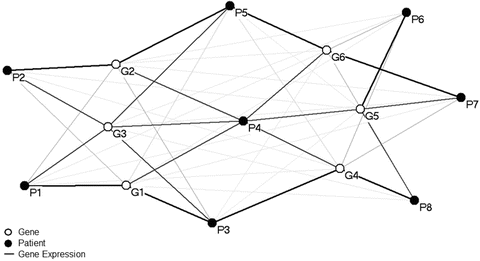
Fig. 14.4
A sample bipartite network where edges exist only between two different types of nodes. In this case, nodes represent either patients (black) or genes (white), and edges connecting the two represent gene expression
Network analysis of biomedical data typically consists of three steps: (1) exploratory visual analysis to identify emergent bipartite relationships such as between patients and genes; (2) quantitative analysis through the use of methods suggested by the emergent visual patterns; (3) inference of the biological mechanisms involved across different emergent phenotypes. This three-step method used across several studies (Bhavnani et al. 2010, 2011b, 2012) have revealed complex but comprehensible visual patterns, each prompting the use of quantitative methods that make the appropriate assumptions about the underlying data, which in turn led to inferences about the biomarkers and underlying mechanisms involved. Each of the three steps of this method is described below, followed by its application to analyze a data set of subjects and gene expressions.
14.4.1 Exploratory Visual Analysis
Network analysis typically begins by transforming symbolic data into graphical elements in a network. To achieve this, the analyst needs to decide which entities in the data represent the nodes in the network, in addition to how other useful information can be mapped onto the node’s shape, color, and size. Similarly, the analyst needs to decide which relationships between the entities in the data are represented by the edges in the network, in addition to how to map other useful information to the edge’s thickness, color, and style. These selections are made based on an understanding of the kinds of relationships that need to be explored, and is often an iterative process based on an understanding of the domain and the nature of the data being processed.
Once the symbolic data has been mapped to graphical elements, the resulting network is laid out so the nodes and edges can be visualized. The layout of nodes in a network can be done where either the distances between nodes has no meaning (e.g., nodes laid out randomly or along a geometric shape such as a line or circle), or where the distance between nodes represents a relationship such as similarity (e.g., similar cytokine expression profiles). Layouts where distance has meaning are typically generated through force-directed layout algorithms. For example, the application of the Kamada-Kawai (1989) layout algorithm to a network results in nodes with a similar pattern of connecting edge weights to be pulled together, and those with different patterns to be pushed apart.
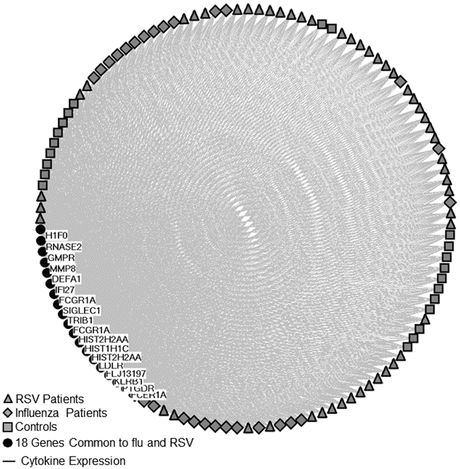
Figures 14.5, 14.6, 14.7 and 14.8 show the steps that were used to generate a bipartite network of 101 subjects and 18 genes, data which is described in more detail in the original study (Ioannidis et al. 2012). The 101 subjects consisted of 28 influenza (flu), and 51 respiratory syncytial virus (RSV) cases, and 22 age, gender, and race matched healthy controls. The 18 genes were highly significant, differentially-expressed genes that were common to both infections. The goal of this analysis was to identify subgroups of cases that had different molecular profiles and therefore could suggest sub-phenotypes that require different treatments. Figure 14.5 shows how the three types of subjects were represented as RSV (gray triangles), flu (gray diamonds), and controls (gray squares), and the genes were represented as circular black nodes. Furthermore, normalized gene expression values were represented as edges connecting each subject to each gene. These nodes were laid out equidistantly around a circle. Figure 14.6 shows the same network but where the edge thicknesses are proportional to the normalized gene expression values. Therefore, thicker edges represent higher gene expression values as compared to the thinner edges. Furthermore, the size of the node was made proportional to the total expression value of the connecting edges. Therefore, larger patient nodes have overall higher aggregate gene expression values compared to smaller patient nodes.