Figure 16-1. County-level risk-standardized 30-day heart failure readmission rates (%) in Medicare patients by performance quintile for July 2009 to June 2012. (Data from Centers for Medicare & Medicaid Services; available at https://data.medicare.gov/data/hospital-compare.)
HISTORY AND DEFINITIONS
Variation in clinical care, and what it reveals about that care, is a topic of great interest to researchers and clinicians. It can be divided broadly into outcome variation, which occurs when the same process produces different results in different patients, and process variation, which refers to different usage of a therapeutic or diagnostic procedure among organizations, geographic areas, or other groupings of health care providers. Studies of outcome variation can provide insight into patient characteristics and care delivery that predispose patients to either a successful or an adverse outcome and help identify patients for whom a particular treatment is likely to be effective (or ineffective). Process variation, in contrast, can provide insight into such things as the underuse of effective therapies or procedures and the overuse of ineffective therapies or procedures.
Study of the variation in clinical care dates back to 1938, when Dr. J. Allison Glover published a study revealing geographic variation in the incidence of tonsillectomy in school children in England and Wales that could not be explained by anything other than variation in medical opinion on the indications for surgery. Since then, research has revealed variation among countries and across a range of medical conditions and procedures, including prostatectomy, knee replacement, arteriovenous fistula dialysis, and invasive cardiac procedures. Actual rates of use of procedures, different variability in supply of health care services, and the system of health care organization and financing (health maintenance organizations [HMOs], fee-for-service [FFS], and national universal health care) do not necessarily determine or even greatly affect the degree of variation in a particular clinical practice. Rather, the degree of variation in use relates more to the characteristics of the procedure. Important characteristics include:
• The degree of professional uncertainty about the diagnosis and treatment of the condition the procedure addresses
• The availability of alternative treatments
• Controversy versus consensus regarding the appropriate use of the procedure
• Differences among physicians in diagnosis style and in belief in the efficacy of a treatment
When studying variation in medical practice—or interpreting the results of someone else’s study of variation—it is important to distinguish between warranted variation, which is based on differences in patient preference, disease prevalence, or other patient- or population-related factors; and unwarranted variation, which cannot be explained by patient preference or condition or the practice of evidence-based medicine. Whereas warranted variation is the product of providing appropriate and personalized evidence-based patient care, unwarranted variation typically indicates an opportunity to improve some aspect of the quality of care provided, including inefficiencies and disparities in care.
John E. Wennberg, MD, MPH, founding editor of the Dartmouth Atlas of Health Care and a leading scholar in clinical practice variation, defines three categories of care and the implications of unwarranted variation within each of them:
1. Effective care is that for which the evidence establishes that the benefits outweigh the risks and the “right rate” of use is 100% of the patients defined by evidence-based guidelines as needing such treatment. In this category, variation in the rate of use within that patient population indicates underuse.
2. Preference-sensitive care consists of those areas of care in which there is more than one generally accepted diagnostic or therapeutic option available, so the “right rate” of each depends on patient preference.
3. Supply-sensitive care is care for which the frequency of use relates to the capacity of the local health care system. Typically, this is viewed in the context of the delivery of care to patients who are unlikely to benefit from it or whose benefit is uncertain; in areas with high capacity for that care (e.g., high numbers of hospital beds per capita) more of these patients receive the care than in areas with low capacity, where the resources have to be reserved for (and are operating at full capacity with) patients whose benefits are more certain. Because studies have repeatedly shown that regions with high use of supply sensitive care do not perform better on mortality rates or quality of life indicators than regions with low use, variation in such care may indicate overuse. Local health care system capacity can influence frequency of use in other ways, too. For example, the county-level association between fewer primary care physicians and higher 30-day hospital readmission rates suggests that inadequate primary care capacity may result in preventable hospitalizations.
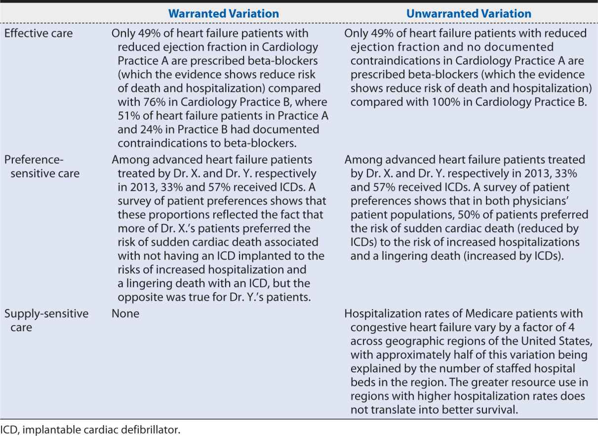
Table 16-1 provides examples of warranted and unwarranted variation in each of these categories of care.
Table 16-1. Examples of warranted and unwarranted variations in heart failure care.
A second important distinction that must be made when considering variation in care is between common cause and special cause variation. Common cause variation (also referred to as “expected” or “random” variation) cannot be traced to a root cause and as such may not be worth studying in detail. Special cause variation (or “assignable” variation) arises from a single or small set of causes that can be traced and identified and then implemented or eliminated through targeted quality improvement initiatives). Statisticians have a broad range of tests and criteria to determine whether variation is assignable or random and with the increasing sensitivity and power of numerical analysis can measure assignable variation relatively easily. The need for statistical expertise in such endeavors must be emphasized, however; the complexity of the study designs and interpretation of results (particularly in distinguishing true variation from artifact or statistical error) carries a high risk of misinterpretation in its absence.
LOCAL VARIATION
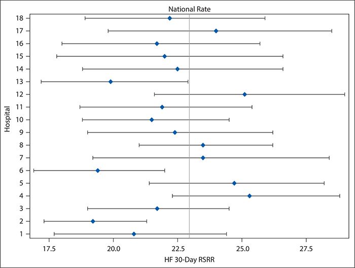
Although variation in care processes and outcomes frequently is examined and discussed in terms of large-scale geography (among countries, states, or hospital referral regions, as, for example, was shown in the heart failure readmissions national map in Figure 16-1), it can be examined and provide equally useful information on a much smaller scale. For example, Figure 16-2 shows variation in 30-day risk-adjusted heart failure readmission rates for hospitals within a single county (Dallas, Texas), ranging from 20% below to 25% above the national average and with three hospitals showing readmission rates that were statistically significantly lower than the national average. Although no hospitals had readmission rates that were statistically significantly higher than the national rate, the poorer performing hospitals might nevertheless be interested in improving. Cooperation among the quality and clinical leaders of the hospitals within Dallas County would enable investigation of differences in practices and resources among the hospitals, which might identify areas to be targeted for improvement for those hospitals with higher readmission rates.
Figure 16-2. Forest plot showing variation in heart failure 30-day risk-standardized readmission rates (HF 30-day RSRR, %) in Medicare patients for hospitals in Dallas County, Texas for July 2009 to June 2012. Hospitals were assigned random number identifiers in place of using names. (Data from Centers for Medicare & Medicaid Services; available at https://data.medicare.gov/data/hospital-compare.)
Local between-provider variation is often encountered in the form of quality reports or scorecards. Such tools seek to identify high versus low performers among hospitals, practices, or physicians to create incentives for high performance either by invoking providers’ competitive spirit or by placing a portion of their compensation at risk according to their performance through value-based purchasing or pay-for performance programs. In other words, they show unwarranted variation in the delivery of care. Care must be taken in presenting and interpreting such variation data, however. For example, league tables (or their graphical equivalent, caterpillar charts), which order providers from the lowest to highest performers on a chosen measure and use CIs to identify providers with performance that is statistically significantly different from the overall average, are both commonly used to compare provider performance on quality measures and easily misinterpreted. One’s instinct on encountering such tables or figures is to focus on the numeric ordering of the providers and assume, for example, that a provider ranked in the 75th percentile provides much higher quality care than one in the 25th percentile. This, however, is not necessarily the case: league tables do not capture the degree of uncertainty around each provider’s point estimate, so much of the ordering in the league table reflects random variation, and the order may vary substantially from one measurement period to another, without providers making any meaningful changes in the quality of care they provide. As such, there may not be any statistically significant or meaningful clinical difference among providers even widely separated in the ranking.
Forest plots, such as Figure 16-2, for hospitals in Dallas County are a better, although still imperfect, way of comparing provider performance. Forest plots show both the point estimate for the measure of interest (e.g., risk-adjusted heart failure 30-day readmission rates) and its CI (represented by a horizontal line) for each provider, as well as a preselected norm or standard (e.g., national average; represented by a vertical line). By looking for providers for whom not only the point estimate but the entire CI falls to either the left or right of the vertical line, readers can identify those whose performance was either significantly better or significantly worse than the preselected standard. Although Forest plots may be ordered so that hospitals are ranked according to the point estimates, that ranking is vulnerable to the same misinterpretation as in league tables. An easy way to avoid this problem is to order the providers according to something other than the point estimate—for example, alphabetically by name. Because Forest plots are easy to produce without extensive statistical knowledge or programming skills, such an approach can be very useful in situations in which experienced statisticians are not available to assist with the performance comparisons.
The funnel plot is probably the best approach for presenting comparative performance data, but it does require more sophisticated statistical knowledge to produce. In a funnel plot, the rate or measure of interest is plotted on the y axis against the number of patients treated on the x axis; close to the origin, the CI bands drawn on the plot are wide (where the numbers of patients are small) and narrow as the numbers of patients increase. The resulting funnel shape gives its name to the plot. Providers with performance falling outside the CI bands are outliers, with performance that may be statistically significantly better or worse than the overall average. Those that excel can be examined as role models to guide others’ improvement. Those that lag behind their peers can be considered as opportunities for improvement, which might benefit from targeted interventions. And because the funnel plot does not attempt to rank providers (beyond identifying the outliers), it is less open to misinterpretation by readers who fail to consider the influence of random variation.
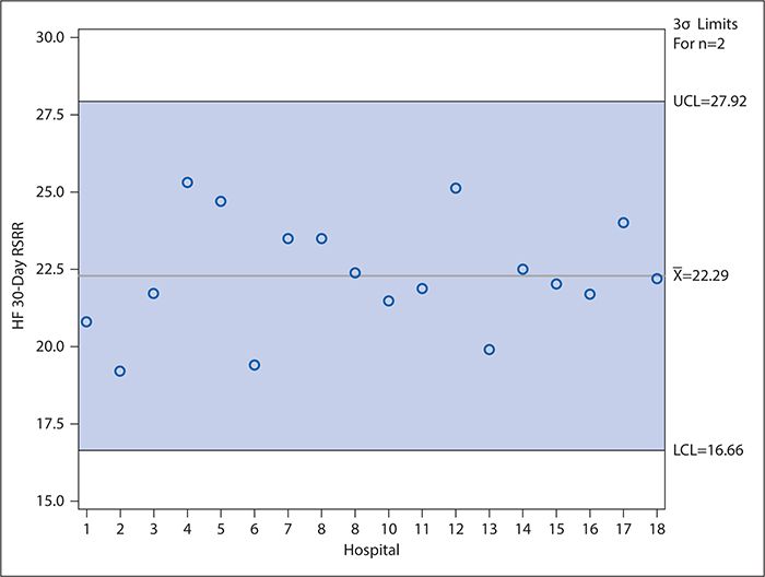
Control charts (discussed later in detail in the context of examining variation over time) can be used in a manner similar to funnel plots to compare provider performance. In such control charts, the CI bands of the funnel plot are replaced with upper and lower control limits (typically calculated as ±3 standard deviations [SDs] from the mean [or other measure of central tendency]), and providers need not be ordered according to decreasing number of patients in the denominator of the measure of interest. As in the funnel plot, however, the providers whose performance is statistically significantly higher (or lower) than the mean are identified as those for whom the point estimate falls above the upper (or below the lower) control limit. Figure 16-3 shows an example of such a control chart for the risk-adjusted 30-day heart failure readmission rates for the hospitals in Dallas County, Texas. Unlike the forest plot in Figure 16-2, which compares each hospital’s performance with the national average, Figure 16-3 considers only the variation among the hospitals located in Dallas County. As can be seen, no data points fall outside the control limits. Interpretation of control charts is discussed in greater detail later, but this suggests that all the variation in the readmission rates among these hospitals is explained by common cause variation (not attributable to any specific cause) rather than by any specific difference in the hospitals’ characteristics or practices. This is interesting in light of the Figure 16-2 results, which show that three hospitals’ readmission rates differed significantly from the national average. However, it should be kept in mind, first, that the CIs used to make this determination in Figure 16-2 are set at 95% compared with the control limits in Figure 16-3 which are set at 3 SDs (corresponding to 99.73%) for reasons explained in the following section. Second, Figure 16-3 draws only on the data for 18 hospitals, which is a much smaller sample than the national data, and the smaller number of observations results in relatively wide control limits.
Figure 16-3. Control chart showing variation in heart failure 30-day risk-standardized readmission rates (HF 30-day RSRR, %) in Medicare patients for hospitals in Dallas County for July 2009 to June 2012). Hospitals were assigned random number identifiers in place of using names. LCL, lower control limit; UCL, upper control limit. (Data from Centers for Medicare & Medicaid Services; available at https://data.medicare.gov/data/hospital-compare.)
Finally, variation can be studied at the most local level: within a provider—even within a single physician—over time. Such variation is best examined using control charts, discussed in detail in the next section.
QUANTITATIVE METHODS OF STUDYING VARIATION
Data-driven practice-variation research is an important diagnostic tool for health care policymakers and clinicians, revealing areas of care where best practices may need to be identified or—if already identified—implemented. It compares utilization rates in a given setting or by a given provider with an average utilization rate; in this it differs from appropriateness of use and patient safety studies, which compare utilization rates with an identified “right rate” and serve as ongoing performance management tools.
A good framework to investigate unwarranted variation should provide:
1. A scientific basis for including or excluding each influencing factor and to determine when the factor is applicable or not applicable
2. A clear definition and explanation of each factor suggested as a cause
3. An explanation of how the factor is operationalized, measured, and integrated with other factors
Statistical Process Control and Control Charts
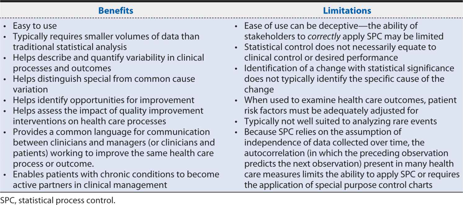
Statistical process control (SPC), similar to continuous quality improvement, is an approach originally developed in the context of industrial manufacturing for the improvement of systems processes and outcomes and was adopted into health care contexts only relatively recently. The basic principles of SPC are summarized in Table 16-2. Particularly in the United States, SPC has been enthusiastically embraced for quality improvement and applied in a wide range of health care settings and specialties and at all levels of health care delivery, from individual patients and providers to entire hospitals and health care systems. Its appeal and value lie in its integration of the power of statistical significance tests with chronological analyses of graphs of summary data as the data are produced. This enables similar insights into the data that classical tests of significance provide but with the time sensitivity so important to pragmatic improvement. Moreover, the relatively simple formulae and graphical displays used in SPC are generally easily understood and applied by nonstatistician decision makers, making this a powerful tool in communicating with patients, other clinicians, and administrative leaders and policymakers. Table 16-3 summarizes important benefits and limitations of SPC in health care contexts.
Table 16-2. Basic principles of statistical process control.
1. Individual measurements of any process or outcome will show variation.
2. If the process or outcome is stable (i.e., subject only to common cause variation), the variation is predictable and will be described by one of several statistical distributions (e.g., normal [or bell-shaped], exponential, or Poisson distribution).
3. Special cause variation will result in measured values that deviate from these models in some observable way (e.g., fall outside the predicted range of variation).
4. When the process or outcome is in control, statistical limits and tests for values that deviate from predictions can be established, providing statistical evidence of change.
Table 16-3. Benefits and limitations of statistical process control in health care.
Tools used in SPC include control charts, run charts, frequency plots, histograms, Pareto analysis, scatter diagrams, and flow diagrams, but control charts are the primary and dominant tools.
Control charts are time series plots that show not only the plotted values but also upper and lower reference thresholds (calculated using historical data) that define the range of the common cause variation for the process or outcome of interest. When all the data points fall between these thresholds (i.e., only common cause variation is present), the process is said to be “in control.” Points that fall outside the reference thresholds may indicate special cause variation due to events or changes in circumstances that were not typical before. Such events or changes may be positive or negative, making control charts useful both as a warning tool in a system that usually performs well and as a tool to test or verify the effectiveness of a quality improvement intervention deliberately introduced in a system with historically poor performance.
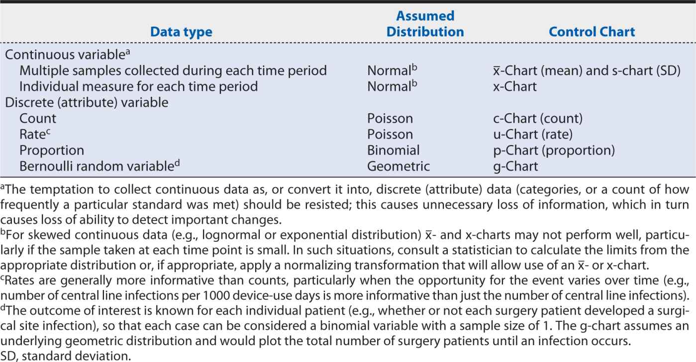
The specific type of control chart needed for a particular measure depends on the type of data being analyzed, as well as the behavior and assumed underlying statistical distribution. The choice of the correct control chart is essential to obtaining meaningful results. Table 16-4 matches the most common data types and characteristics for the appropriate control chart(s).
Table 16-4. Appropriate control charts according to data type and distribution.
After the appropriate control chart has been determined, further issues include (1) how the upper and lower control limit thresholds will be set, (2) what statistical rules will be applied to separate special cause variation from common cause variation, and (3) how many data points need to be plotted and at what time intervals.
Broadly speaking, the width of the control limit interval must balance the risk between falsely identifying special cause variation where it does not exist (type I statistical error) and missing it where it does (type II statistical error). Typically, the upper and lower control limits are set at ±3 SDs from the estimated mean of the measure of interest. This range is expected to capture 99.73% of all plotted data compared with the 95% captured by the 2 SDs criterion typically used in traditional hypothesis testing techniques. This difference is important because, unlike in the traditional hypothesis test in which the risk of type I error (false positive) applies only once, in a control chart, the risk applies to each plotted point. Thus, in a control chart with 25 plotted points, the cumulative risk of a false positive is 1 – (0.9973)25 = 6.5% when 3 SD control limits are used compared with 1 – (0.95)25 = 72.3% when 2 SD limits are used.
The primary test for special cause variation, then, is a data point that falls outside the upper or lower control limit. Other common tests are listed in Table 16-5. Although applying these additional tests does slightly increase the false-positive rate from that inherent in the control limit settings, they greatly increase the control chart’s sensitivity to improvements or deteriorations in the measure. The statistical “trick” here lies in observing special cause patterns and accumulating information while waiting for the total sample size to increase to the point where it has the power to detect a statistically significant difference. The volume of data needed for a control chart depends on:
Table 16-5. Common control chart tests for special cause variation.
