One of the advantages of working with samples is that the investigator does not have to observe each member of the population to get the answer to the question being asked. A sample, when taken at random, represents the population. The sample can be studied and conclusions drawn about the population from which it was taken.
Let us focus on the group that makes up the sample. We are not as interested in an individual’s response as we are in the group’s response. The individual values, of course, are accounted for in the group, but the way to compare outcomes is by looking at an overall response. The data from the groups are used to estimate a parameter. As you recall, these are values that represent an average of a collection of values, such as average age or standard (which is really “average”) deviation from the mean age.
To see how this is done, let us first look at a hypothetical situation. Consider what would happen if we were to study a population variable with a normal distribution. If we were to take multiple samples from this population, each sample theoretically would have a slightly different mean and standard deviation. When all sample means ( s) are plotted (if this could be done), they would tend to cluster around the true population mean, μ. Many would even be right on the mark.
The problem, of course, is that we don’t know with certainty how close we are by looking at just one sample. The mean of any given sample ( ) could be on either side of μ and at a different distance from μ.
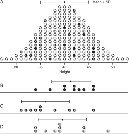
Figure 11-1 illustrates what could happen when we take a sample from the population. This is a very clever idea that was used to illustrate the concept of sampling distributions in the Primer of Biostatistics by Stanton Glantz.2 In this case, the population is Martians (as in those who are from Mars). Figure 11-1A shows the frequency distribution for the heights in every member of the population, assuming this could be measured. But since we really cannot actually measure this, notice the various samples that were taken in graphs B, C, and D. The dots are the sample means; they are close but not exact. The bars on either side of the mean dots represent the samples’ standard deviations.
Now cover up graph A. The laws of random sampling tell us that each of these samples was equally likely to be picked. They are pretty good estimators for the population parameter of mean height. It is highly unlikely to pick a sample comprised of only members at one end of the curve. In this case, the estimate would be way off the mark.
Inferential statistics does not focus on “What is the true parameter?” Instead, we ask “How likely is it that we are within a certain distance from the true parameter?” What we really need to know is the degree of variability among the samples that could happen by chance, and the possibility of obtaining an aberrant or unusual sample. The method we use depends on the sampling distribution of the test statistic. Every statistical test relies on this. It is the basis of the entire theory of inference.
The statistic in this case has a special meaning—it is the result of the data analysis that is used to estimate the population parameter. The sampling distribution is an abstract concept. The distribution of the sample statistic is the result of what would happen if every sample of a particular size were studied. Even though we study a single, random sample, it is only one of an incredibly large number of possible samples—each with its own statistic.
The rest of the chapter discusses how sampling distributions for different types of test statistics are generated. This is not an actual step in this process of inference testing. We do not create a distribution because we have only one sample to work with. The statisticians look at the sample size and the type and variability of the data to see which distribution to use.
In the above example, we talked about using a sample mean, designated as  , to estimate the population parameter, μ. Many statistical tests will use sample means in the data analysis. There are other ways of analyzing data that result in different types of test statistics. We will explore a few of these as we look at different types of data but, for now, let us focus on just sample means as a way of estimating population means.
For any sample of a given size, we can calculate the mean,  . If we were to plot the value of
  on a frequency distribution, for all the values of
  for samples of the same size, a pattern would emerge. The distribution of sample means has the same mean as the population but with a much smaller spread than the original sample. This makes sense because the means of each sample will not have the same degree of spread that the individual values do. The means plotted at the tails of the distribution will be less frequent, since a sample mean that deviates markedly from the population mean is very unlikely. Samples behave in a predictable fashion. They will have some variability but, if they come from the same population, the statistics will fall into a predictable collection of values. The sampling distribution is the illustration of this expected frequency and range.
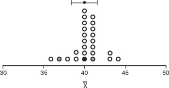
Figure 11-2 is a graph of the means of 25 samples of Martian heights. When these means are plotted, a normal distribution emerges and forms a predictable pattern. Note that the mean of all of these samples, designated as  , is the same as the population mean, μ, but the spread of standard deviation of the means is much narrower than the original data. The deviation of the sample means (in this case, of 25 means) is known as the standard error of the mean to distinguish it from the standard deviation of a single sample. The standard error of the mean is denoted as SE
 . As Glantz aptly states, “Unlike the standard deviation, which quantifies the variability in the population, the standard error of the mean quantifies uncertainty in the estimate of the mean.”3
Theoretically, if we took the means for a given variable from every possible sample of the same size, we could plot these in a frequency distribution. Computer simulation actually can demonstrate this process. What emerges is a pattern that falls into the normal distribution, even if the original distribution of the values was not normal. Surprised? So was I at first. But it makes sense that sample means would tend to approach the true parameter, with equal chances of under- or overestimating the true mean.
Only gold members can continue reading.
Log In or
Register to continue
Related