CHAPTER 9 The Normal Distribution
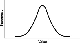
The normal distribution was originally presented by the French mathematician Abraham de Moivre (1667–1754). He realized that to use samples to represent much larger populations, as Jacob Bernoulli had suggested, a pattern must emerge from the data. He demonstrated that the values of a variable in a sample would be distributed around the average value. When he plotted the values in a frequency distribution, the result was a unimodal and symmetric curve. The data points were distributed equally on either side of the mean. The ends tailed off toward the abscissa because the values farthest from the mean value were less likely to occur. This is called a normal distribution, since de Moivre attributed this pattern to the orderliness of the natural world. The famous mathematician Carl Friedrich Gauss expounded on this distribution, so it also became known as the Gaussian distribution. Figure 9-1 shows that it has a graceful bell shape, and thus is sometimes referred to as the bell curve.
ATTRIBUTES OF THE NORMAL DISTRIBUTION
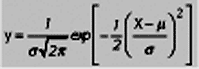
There is a mathematical equation for the normal distribution that describes the relationship between the points on the abscissa and the ordinate. A collection of values with a normal distribution will have a mean μ and standard deviation σ. These descriptors determine the peak of the curve and its spread. There are many different bell curves for different values of μ and σ. For a particular curve, however, the height of the curve y at any given point depends on the value of x. Box 9-1 shows the formula for normal distributions, but it is not necessary to memorize it.
In a normal distribution, the mode is the peak of the hill. It is the value that occurs most frequently. It is also the mean, or the average of all the values in the distribution that is represented by μ. And because the data points are evenly distributed on either side, the same point represents the median, which is the 50th percentile. When μ changes but σ remains the same, the curve will shift along the abscissa but the shape remains the same, as in Figure 9-2.
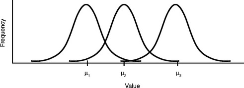
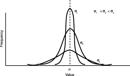
Figure 9-3 shows what happens to the overall shape of the curve for different values of σ. When the standard deviation is smaller, the average distance from the mean is less, so more data points will have a value closer to the mean. This results in a narrower curve with a higher peak. The mean stays the same, but the curve is drawn upward.
We see that the normal distribution is actually a collection of bell-shaped curves, depending on μ and σ. We will ultimately use the curve as a frequency distribution to plot outcomes on the abscissa, so we can see the probability of their occurrence on the ordinate. It is to our advantage to somehow standardize all of these curves so we only need to refer to one. We can do this by performing some simple mathematical alterations to each data point. It is possible because the family of normal distributions are related by the way the data points are arranged under portions of the curve.
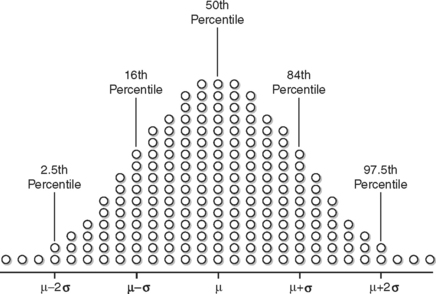
Figure 9-4 is an illustration of this principle. The population mean μ is also the median, and marks the 50th percentile. One half of the data points live on either side of μ. When going out one standard deviation (σ) on either side, the markers are at the 16th and 84th percentiles. This means 68% of the data points lie between these two markers (84 − 16 = 68). Likewise, the markers for 95% of the data points are 97.5 and 2.5. When the points in the two tails of the graph outside these markers are excluded, 95% of the original data points will be housed here.
Stay updated, free articles. Join our Telegram channel

Full access? Get Clinical Tree


