STATISTICS
CHAPTER THE TWENTY-FIRST
Tests of Significance for Categorical Frequency Data
Here we introduce statistical methods used to deal with categorical frequency data of the form, “The number of individuals who…” We begin with the simplest case, the chi-squared (χ2) test, and then consider some special cases: small numbers (the Fisher Exact Test), paired data (McNemar’s chi-squared), two factors (Mantel-Haenszel chi-squared), and finally the general case involving many factors (log-linear analysis).
SETTING THE SCENE
A few years ago, a report (Eidson et al. 1990) indicated that several people in New Mexico had succumbed to a rare but particularly nasty disease, eosinophilia-myalgia syndrome (EMS). 1 The only circumstance they appeared to have in common was that they were health food freaks and had all been imbibing large quantities of an amino acid health food called tryptophan, which is supposed to be good for everything from insomnia to impotence. You, Hercules Parrot, have been assigned to the case by your masters at CDC Atlantis. You scour the countryside far and wide and locate 17 other poor souls who have succumbed under mysterious circumstances. Did tryptophan do it, and how will you prove it? In particular, how do you perform statistics on counts of bodies?
We confess to a deviation from our tradition. In this case, the story (however unlikely) happens to be true (at least true enough to end up in a law court). It is now fairly well accepted by everyone except the manufacturers and distributors of tryptophan that this innocent-appearing stuff actually bumped off about 200 unfortunate folks in the United States.2 It did start with a few suspicious cases in New Mexico and grew rapidly from there.
This is the stuff of real epidemiology. None of this touchy-feely research based on “How do you feel on a seven-point scale?” questions. Here it is a matter of life and death, and our data are body counts.3 The question is, of course, how do you analyze bodies, because they don’t usually follow a normal distribution unless you pile them that way. But first a small diversion into research design.
You may have heard that the best of all research designs is a randomized controlled trial, whereby subjects are assigned at random to a treatment or control group and no one knows until it’s over who was in what group. What you heard is true, but it’s also impossible to apply in this situation. If we really thought people might die from tryptophan exposure, it’s unlikely (we hope) that any ethics committee would let us expose folks to the stuff just for the sake of science. The next best design is a cohort study. Here, you assemble cohorts of folks who, of their own volition (smoking), or from an accident of nature (radon) or their jobs (Agent Orange), have been exposed to a substance, match them up as best you can to another group of folks who are similar in every way you can think of but exposure, and then check the frequency of disease occurrence in both. That might work here, except that probably hundreds of thousands of health food freaks are gobbling up megavitamins and all sorts of other stuff, and (1) very few of them actually appear to have come down with eosinophilia-myalgia syndrome (EMS), and (2) it would be hard to trace all of them. So you end up at a third design, a case-control study, in which you take a bunch of folks with the disease (the cases) and without the disease (controls), and see how much of the exposure of interest each group has had. Although this approach has its problems, it is about the only practical approach to looking at risk when the prevalence is very low.
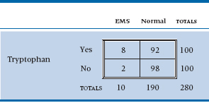
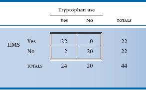
Off you go, Mr. Parrot, to find cases and controls. You scour hospital records and death certificates around the country, and you eventually locate 80 people with EMS. You also locate some controls, who were hospitalized for something else or died of something else. Because there are lots of the latter, you stop at 200. You then administer a detailed questionnaire to their next of kin or by way of seance, ascertaining exposure to all sorts of noxious substances—vitamins, honey, ginseng root, lecithin, and (of course) tryptophan. After the dust settles, 42 of the EMS group and 34 of the control group took tryptophan regularly.4 Is this a statistically significant difference? That, of course, is what this chapter is all about.
TABLE 21–1 Association between tryptophan exposure and eosinophilia-myalgia syndrome (EMS)
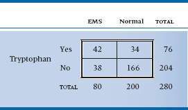
TABLE 21–2 Expected values of the table assuming no association
The dilemma is that, like our dummy variables in Chapter 14, this variable has only two values—0 or 1 (dead or alive)—so it is not normally distributed. (If it were, we would just do a t-test.) We might bring logistic regression to the rescue, but that would be overkill (no pun intended) and would ignore the large body of research called nonparametric statistics, which antedated logistic regression and big computers by many decades. To explain why this is nonparametric statistics, we have to explain why the other type isn’t. ANOVA, regression, and all those other techniques are based on calculated means and SDs, the parameters of the normal distribution. By contrast, nonparametric statistics makes no assumptions about the nature of the distribution, so it is free of assumed parameters.
Actually, in keeping with note 3, we just lied to you. As we’ll see in the next few paragraphs, some of the “nonparametric” tests actually do make some assumptions about the underlying distribution. The chi-squared (χ2) test is based on a distribution but one that isn’t normal. For some reason, it’s lumped together with other tests that actually don’t make any assumptions. This is probably due to the fact that many of the tests used with categorical data are truly nonparametric and, through laziness, or sloppiness (or more likely ignorance), all statistics designed for categorical data were called nonparametric. So, the next test we’ll talk about is a parametric, “nonparametric” statistic.
THE CHI-SQUARED TEST
To begin to tease out a strategy for approaching the data, we’ll put the data into a form dearly beloved by clinicians and statisticians alike: a 2 × 2 contingency table. It’s called “2 × 2” because it has two rows and two columns and “contingency” because the values in the cells are contingent on what is happening at the marginals (be patient; we’ll get to that in a minute) (Table 21–1).
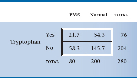
Now, what we are trying to get at is whether any association exists between tryptophan use and EMS. As usual, the starting point is to assume the null hypothesis (no association) and then try to reject it. The question is, “What would the 2 × 2 table look like if there were no association?” One quick—and wrong—response is that the 280 people are equally divided among the four cells; that is, there would be 280 ÷ 4 = 70 people in each one. Not at all. We began with 80 patients and 200 controls. Were there no association, we would expect that exactly the same proportion of patients as controls would have gobbled tryptophan. Our best guess at the proportion of tryptophan users is based on the marginal totals, and it equals 76 ÷ 280 = 0.271. So, the number of EMS patients who ate tryptophan, under the null hypothesis of no association, is 80 × (76 ÷ 280) = 21.7; and the number of controls is 200 × (76 ÷ 280) = 54.3. In a similar manner, the number of EMS folks who abstained is 80 × (204 ÷ 280) = 58.3, and the number of control abstainers is 145.7. If there were no association, then, Table 21–2 would result.
The extent to which the observed values differ from the expected values is a measure of the association, our signal again. But if you work it out, it equals zero, just as it did when we determined differences from the mean in the ANOVA case. So we do the standard statistical game and square everything. The signal now looks like:
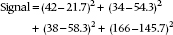
If we were to follow the now familiar routine, the next step would be to use the individual values within each cell to estimate the noise. Unfortunately, we have only one value per cell. Fortunately, Mother Nature comes to the rescue. It turns out that frequencies follow a particular distribution, called a Poisson distribution,5 which has a very unusual property: the variance is exactly equal to the mean.6 Thus, for each one of the squared differences in the equation above, we can guess that it would be expected to have a variance equal to the expected mean value. So, the ratio of the squared difference between the observed and expected frequency to the expected mean is a signal-to-noise ratio. It’s called chi-squared, for reasons now lost in antiquity.7 Formally, then:
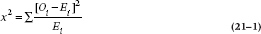
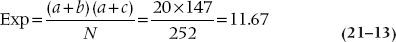
where Oi is the observed frequency and Ei is the expected frequency. And in this case, it equals:
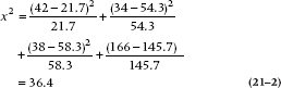
That looks like a big enough number, but it’s not clear where we should go looking to see whether it’s big enough to be statistically significant. As it turns out, chi-squared has a table all to itself (Table F in the Appendix). Once again, it’s complicated a bit by the df. For this table, df is 1. To demonstrate this, keep the marginal frequencies fixed and put the number in one cell. Now, for the cells to add up to the correct m-arginal totals, all other cells are predetermined: the marginal total minus the filled-in value. So you have only one cell free to vary; hence, one df. In the g-eneral case of a (r × c) contingency table (r rows and c columns), there are (r − 1) × (c − 1) df. This particular value is highly significant (the value of chi-squared needed for significance at p = .05 for one df is 3.84), proving conclusively that health food is bad for your health.8
A nice rule of thumb is that the value of χ2 needed for significance at the .05 level is about equal to the number of cells. In this case, we would have said 4, which differs a bit from the true value of 3.84. For a 5 × 2 table, our guess would be 10; the actual value is 9.49.
But that’s not the end of the story. Careful tracking of EMS cases showed that many were turning up all over the United States but virtually none in Canada or Europe. Although Americans were more likely to junk out on health foods and other “alternative” therapies than were the staid Brits, it was well known that Canadians were also popping the stuff with gay abandon. So perhaps the illness was caused by a contaminant that snuck into one batch from one manufacturer, not by the stuff itself. This cause was pinpointed in a study by Slutsker et al. (1990). They located 46 cases with EMS who also took tryptophan; 45 of the 46 ate stuff from one manufacturer in Japan (sold through 12 wholesalers and rebottled under 12 different brand names). There were 41 controls who took tryptophan but didn’t get EMS; 12 of them ate tryptophan from the Japanese manufacturer, the other controls from other manufacturers. This difference (45/46 to 12/41) is so significant that only a sadist or a software manufacturer would demand a statistical test.
TABLE 21–3 Source of tryptophan by group
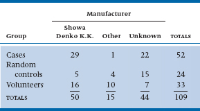
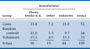
TABLE 21–4 Expected values for Table 21–3
Another study, this time in Minnesota (Belongia et al. 1990), managed to track the nasties down to a single contaminant. To do this, they first located 52 cases with a high eosinophil count and myalgia. They then formed two control groups: (1) a volunteer group of folks who had been taking tryptophan but weren’t sick, located by public announcements (n = 33), and (2) a control group of people who had also taken tryptophan and were located by a random telephone survey (n = 24). They then interviewed everybody to see what brand of tryptophan they were using. Only 30 cases, 26 volunteers, and 9 random controls could locate the bottle. They rapidly focused the problem down to a single manufacturer. The data are presented in Table 21–3.
And once again, M. Parrot, the time has come to crunch numbers. The approach is just the same as with the 2 × 2 table. This time, the analysis is analogous to a one-way ANOVA for parametric statistics. First, you estimate the expected value in each cell by multiplying the row and column marginal totals and dividing by the grand total. So for row 1 and column 1, this equals (50 × 52) ÷ 109 = 23.8. Working through the expected values results in Table 21–4.
From this, we can calculate a chi-squared as we did before, simply by taking the difference between observed and expected values, squaring it, dividing by the expected value, and adding up all nine terms. The answer is 22.40, and the df are (3 − 1) × (3 − 1) = 4; moreover, the result is highly significant, at p < .0001. To close the corporate noose around Showa Denko, the investigators then showed that (1) the manufacturer cut back on the amount of activated charcoal at one filtration stage, (2) bypassed some other filter, and (3) 17 of the 29 cases had consumed tryptophan out of one particular batch. The contaminant also showed up on liquid chromatography. In short, the goose was neatly fried.
Another way of looking at the chi-squared test of association is that it is a test of the null hypothesis that the proportion of EMS cases among tryptophan users (usually abbreviated as πt) was the same as the proportion among nonusers (πn); that is, it is a test of two or more proportions. There is, in fact, a z-test of the significance of two independent proportions. We haven’t bothered to include it for the simple reason that z2 is exactly the same as chi-squared. However, it’s easier to figure out sample size requirements based on proportions, so we’ll come back to this concept when we tell you how to figure them out.
That’s the story for chi-squared—almost. Things work out well as long as (1) you only have four cells, and (2) the frequencies are reasonably good. When you have more cells, as in the example of myalgia, or when the numbers are small, then some fancier stuff is required.
DECONSTRUCTING CHI-SQUARED
In the previous example, we showed that the overall chi-squared was significant, but we skipped over a problem9—what was significantly different from what? This is similar to the situation after finding a significant F-ratio in a one-way ANOVA: we still don’t know which groups differ from the others. In the case of ANOVA, we would use one of the post-hoc tests, such as Tukey’s or Scheffé’s, but we don’t have that option with χ2. What we have to do is decompose the χ2 table into a number of smaller subtables, and see which ones are significant.
TABLE 21–5 Decomposing the data from Table 21–3 into a series of 2 × 2 subtables
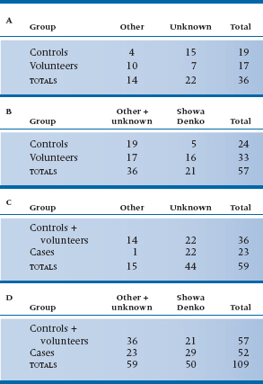
At first glance, it would seem as if we could have nine 2 × 2 subtables: Showa Denko versus Other for Cases versus Controls, Cases versus Volunteers, and Controls versus Volunteers; Showa Denko versus Unknown for the same three group comparisons; and the three group comparisons for Other versus Unknown. But the rules of the game say otherwise; the number of subtables we are allowed and how they are constructed must follow certain conventions. These were summarized by Iversen (1979)10—kind of like the Hoyle of χ2 decomposition. The rules are as follows:
- The degrees of freedom, summed over all of the subtables, must equal the degrees of freedom of the original table.
- Each frequency (i.e., cell count) in the original table must be a frequency in one and only one subtable.
- Each marginal total, including the grand total, must be a marginal total in one and only one subtable.
Are you sufficiently confused yet? Let’s work this out for the data in Table 21–3 and see what it looks like. This should either dispel the confusion or make you turn to hard liquor.11 According to the first rule, we can have subtables with a total of four degrees of freedom, since the original table had df = 4. This means we can have four 2 × 2 tables, or one 3 × 2 and two 2 × 2 tables. The easiest breakdown to interpret (although not necessarily the most informative) is a series of 2 × 2 tables. It’s easiest to start with the upper left corner, so that’s what we’ll do. For reasons that will become obvious as we go along, we’ll arrange the table so that the row and column we’re most interested in (Showa Denko and Cases) are the last ones, rather than the first. The first subtable, then, is shown in Table 21–5A. Now, according to the second rule, none of those four cell counts can appear in any other table, and the marginal totals must appear in some other table. We can satisfy these rules (in part, so far), by combining columns 1 (Other) and 2 (Unknown) and comparing this to column 3 (Showa-Denko) for the Controls and Volunteers; this is shown in Table 21–5B. Notice also that some of the row marginals from the original table are now frequencies in 21–5B, in accordance with rule 3. In Table 21–5C, we do the same thing, only this time we’re combining the first two rows (Controls and Volunteers) and comparing them with the Cases; in Table 21–5D, we combine both rows and columns. If you want to check, you will see that each of the 16 numbers in Table 21–3 (nine cell frequencies, three row totals, three column totals, and the grand total) appears once and only once in one of the subtables. Now, that wasn’t hard, was it?12
This is one of a number of possible sets of 2 × 2 tables. It may make more sense, for example, to combine Unknown with Showa-Denko than with Other, or to combine Controls with Cases rather than-Volunteers. Because you’re limited in the number of tables you can make, it’s important to think about which comparisons will provide you with the most useful information.
Strictly speaking, the subtables shouldn’t be analyzed with the usual method for χ2, because it doesn’t account for the frequencies in the cells that aren’t included. But, people do it anyway, and the results are relatively accurate, if the total N in the subtable is close to the N of the original table. If you want to be extremely precise, the equation you need is in Agresti (1990). But be forewarned—it’s formidable! We’ll take the easy route and just do χ2 on the four of them. It turns out that all four subtables are significant. This tells us that the Other and Unknown preparations produce different results for the Cases and Volunteers. The most important analysis, from our perspective, however, is of Table 21–5D—Showa-Denko versus everything else and Cases versus everyone else. The numbers in this table really clinch the case.
EFFECT SIZE
After devoting an entire heading to effect size for chi-squared, we’re actually not going to discuss it; at least not yet. Stay tuned until the next chapter, where we discuss measures of association for categorical data. There, you’ll find out about the phi coefficient (ϕ) and Cramer’s V, which are the indices of effect size for chi-squared.
SMALL NUMBERS, YATES’ CORRECTION, AND FISHER’S EXACT TEST
Yates’ Correction for Continuity
When the expected value for any particular cell is less than 5, then the usual chi-squared statistic runs into trouble. Part of this is simply instability. Because the denominator is the expected frequency, addition or subtraction of one body can make a big difference when the expected values are small. But the chi-squared tends towards liberalism because it approximates categories with a continuous distribution. However popular this is politically, it is anathema to statisticians. One quick and dirty solution is called Yates’ Correction. All you do is add or subtract 0.5 to each difference in the numerator to make it smaller before squaring and dividing by expected values. So the Yates’ corrected chi-squared is:
The vertical lines around the O and E are “absolute value” signs, so you make the quantity positive, then take away half and proceed as before.
Having said all this, it turns out that Yates’ correction is a bit too conservative. So half the world’s statisticians recommend using it all the time, and half recommend never using it. In any case, the impact is small unless frequencies are very low, in which case an exact alternative is available.
Fisher’s Exact Test
Imagine that we have proceeded with the original investigation of whether tryptophan causes the disease and we’re using a stronger design—a cohort study.13 You put more signs up in the health food stores, this time asking for people who are taking tryptophan, not people who are sick. You then locate a second group of folks who weren’t exposed to the noxious agent tryptophan, perhaps by hitting up the local greasy spoon.
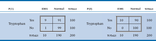
Now, fortunately for the populace (but unfortunately for you), tryptophan isn’t all that nasty, so very few people actually come down with EMS. If we had 100 of each group, the data might look like Table 21–6. The expected value for both cells in the first column is 5, so we can’t use chi-squared on this. The alternative is called Fisher’s exact test, which is as follows. Instead of calculating a signal-to-noise ratio and then looking it up in the back of the book, we dredge up some of the basic laws of probability to calculate the exact14 probability of the data under the hypothesis of no association.
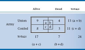
To understand how this one works, we’ll really stretch the analogy. Cast your mind back to the Civil War, when families were torn asunder, etc. You remember from your history books the famous Battle of Bull Roar, don’t you? Let’s just briefly remind you.
Bull Roar was a small town in West Virginia. One hot summer night, recruiters from both the Union and the Confederacy descended on the town, hit all the local pubs, stuffed the boys into uniforms, and handed them all muskets. The next day, they assembled in a field on the edge of town. Thirteen wore the blue of the North, and 11 wore the gray of the South. They opened fire, and when the smoke blew away, four Union men and three Confederates lay dead on the ground. At this point, the survivors all took off their uniforms, went into the pubs in their underwear, and got thoroughly sozzled.
The statistical question is, “Given only the information in the marginals—that is, there were 24 able-bodied males, of whom 13 were in blue uniforms and 11 in gray; and 7 ended up dead and 17 alive—what is the chance that things could have turned out the way they did?” We might, as we are wont to do in this chapter, put it all into a 2 × 2 table (Table 21–7).
TABLE 21–6 Association between tryptophan use and EMS
Data from Slutsker L et al (1990). Eosinophilia-myalgia syndrome associated with exposure to tryptophan from a single manufacturer. Journal of the American Medical Association, 264:213–217.
TABLE 21–7 Statistics from the Battle of Bull Roar
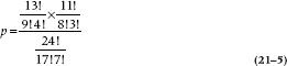
To make things easier, we’ll begin by illustrating the field of battle graphically (Figure 21–1). Now let’s look at the Union men first. What is the chance that 4 of the 13 should die? Think of it one shot at a time. The first fatal bullet might have taken out any 1 of 13 men, so there are 13 ways that the first bullet could have done its dirty work. Now one man is dead—what about the second bullet? There are 12 men to choose from, so 12 possibilities. Similarly, there are 11 possibilities for the third bullet, and 10 for the fourth. So in the end, there are 13 × 12 × 11 × 10 possible ways the bullets could have found their mark. However, once the lads are dead on the field, we no longer care in which order they were killed. Again, by the same logic, any one of the four could have been taken out by the first bullet, then three possibilities for the second bullet, and so on. So the overall number of ways that 4 of the 13 Union men could have been killed is (13 × 12 × 11 × 10) ÷ (4 × 3 × 2 × 1). A convenient way of writing this algebraically is through the use of factorials.15 So, the number of ways to bump off 4 men out of 13 is:
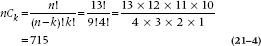
where k is the number of events (deaths) and n is the total number of individuals. Similarly, the number of ways losses on the Confederate side could have occurred are equal to 11! ÷ (8! 3!) = 165.
However, we are ultimately interested in the association between Union/Confederate and Alive/Dead. To get at this, we have to begin with the nonassociation and figure out how many ways a total of 7 men could have been shot out of the 24 who started. We put them all in one long row, regardless of the color of their uniform, and do the same exercise. The answer, using the same logic as before, is 24! ÷ (7! 17!) = 346,104.
That means that there were a total of 346,104 ways of ending up with 7 dead souls out of the 24 with we began. That is, if we were to line up all the soldiers in a row with the 13 Union guys on the left and the 11 Rebels on the right and fire 7 rounds at them, there are a total of 346,104 ways to take out 7 soldiers. Some of these possibilities are 6 dead Union soldiers and 1 dead Confederate soldier, 5 dead Confederate soldiers and 2 dead Union soldiers, and on and on.
Now, how many possibilities have the right combination of 4 and 3? Well, imagine the Confederates shoot first, so there are just 4 Unionists on the ground. We have already worked out that the number of ways you can kill 4 Union people of 13 is 715. Now, for each one of these possibilities, we can now let the Union guys open fire, and kill 3 Confederates—as before, 165 possible configurations. So the total number of patterns that correspond to 4 and 3 dead, after we have got everyone back in a single line, is just 715 × 165 = 117,975. This is out of the total number of possibilities of 346,104. So, the overall probability of getting the distribution of deaths that occurred at Bull Roar is 117,975/346,104 = 0.34. Now, if we put all the factorials together, we can see that the formula for the probability that things came out as they did is:
More generally, this can be expressed in terms of as and bs as:
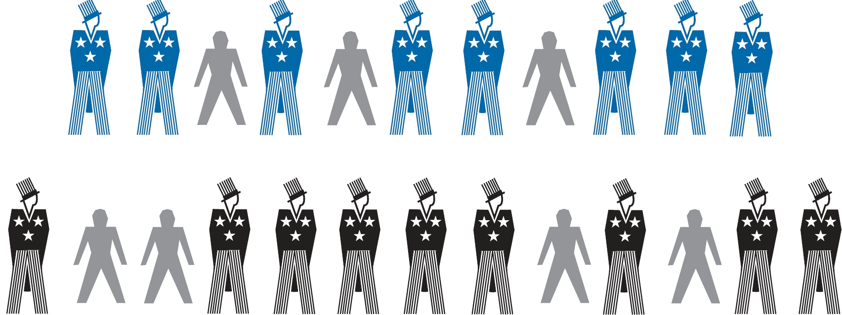
FIGURE 21-1 Aftermath of the Battle of Bull Roar.
This simplifies to:
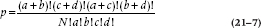
This then is the probability of a particular configuration in a 2 × 2 table. So going back to our original EMS example, the probability of occurrence of the events in Table 21–6 is:
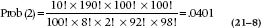
where the ‘(2)’ means that the count in the cell with the fewest number of subjects is two. We’ll see why that’s important in a moment.
TABLE 21–8 Most extreme associations between tryptophan use and EMS
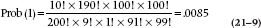
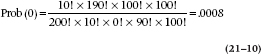
We’re not quite done. The probability used in the statistical test is the entire probability in the tail (i.e., the likelihood of observing a value as extreme or even more extreme than the one observed). In the discrete case we are considering, this corresponds to tables with stronger associations, which means more extreme values in the cells. There are only two possibilities with more extreme values; 1 case in the control group and 0 cases in the control group.16
The corresponding 2 × 2 tables are shown in Table 21–8. For one occurrence the formula is:
And for no occurrences this probability equals:
Putting it all together, the overall probability of observing this strong an association or stronger is .0410 + .0085 + .0008 = .0503. But, that’s only one tail of the distribution; the two-tailed probability is (about) double that, or about .10. When we’re doing the calculations by hand, we can stop at an earlier step if the sum of the probabilities (two-tailed) exceeds .05. So, this particular investigation doesn’t make it to the New England Journal of Medicine.
To summarize, Fisher’s exact test is used when the expected frequency of any cell in a 2 × 2 table is less than 5. You construct the 2 × 2 tables for the actual data and all more extreme cases, then work out the probability for each contingency table using the binomial theorem, shown above. The exact probabilities are then added together to give the probability of the observed association or any more extreme.
PAIRED AND MATCHED OBSERVATIONS: MCNEMAR CHI-SQUARED
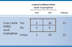
Perhaps you noticed that we began this chapter by telling you that we were going to use a real example, and we then went back to some imaginary data. There was a good reason for this peculiar action.17 The original study that implicated tryptophan (Eidson et al. 1990) used a slightly more complicated design—complicated in the sense of analysis at any rate. They located 11 individuals who had EMS based on objective criteria and then matched them with 22 controls on the basis of age and sex. The magical word “match” means that we have to try another approach to analysis, equivalent to a paired t-test. The approach is called the McNemar chi-squared; it is logically complex but computationally trivial. Because the logic is tough enough with simple designs, we will pretend that the investigators just did a one-on-one matching and actually located 22 cases. If we ignored the matching, the data could be displayed as usual (Table 21–9).
Matched or not, clearly this is one case where the p value is simply icing on the cake; however, we will proceed. The logic of the matching is that we frankly don’t care about those instances where both case and control took tryptophan, or about those instances where neither took it. All that interests us is the circumstances where either the case took it and the control didn’t, or vice versa. So we must construct a different 2 × 2 table reflecting this logic (Table 21–10). The first thing to note is that the total at the bottom right is only 22; the analysis is based on 22 pairs, not 44 people. Second, note that the four cells display the four possibilities of the pairs—both used it, both didn’t use it, cases did but controls didn’t, and controls did but cases didn’t.
TABLE 21–9 Study 3—matched design association between tryptophan use and EMS (shown unmatched)
Data from Eidson M et al (1990). L-tryptophan and eosinophilia-myalgia syndrome in New Mexico. Lancet, 335:645–648.
TABLE 21–10 Study 3—matched design association between tryptophan use and EMS (shown matched)
Data from Eidson M et al (1990). L-tryptophan and eosinophilia-myalgia syndrome in New Mexico. Lancet, 335:645–648.
Finally, as we said, we’re interested in only the two off-diagonal cells because those are where the action will be. The reason is that if no association existed between being a case or a control and tryptophan exposure, we would expect that there would be just as many instances where cases used tryptophan and controls didn’t as the opposite. We have 20 instances altogether, so we would expect 10 to go one way and 10 the other. In short, for the McNemar chi-squared, the expected value is obtained by totaling the off-diagonal pairs and dividing by two. It is now computationally straightforward to crank out a chi-squared based on these observed and expected values. There is one wrinkle—McNemar recognized that he would likely be dealing with small numbers most of the time, so he built a Yates’-type correction into the formula:
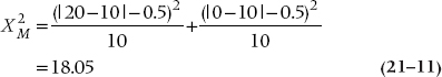
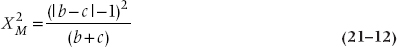
with one df. To no one’s surprise, this is significant at the .0001 level. Because of the particular form of the expected values, the McNemar chi-squared takes a simpler form for computation. If we label the top left cell a, the top right b, the bottom left c, and the bottom right d, as we did in Table 21–7, the McNemar chi-squared is just:
To summarize, then, the McNemar chi-squared is the approach when dealing with paired, matched, or pre-post designs. Unfortunately, despite its computational simplicity, it is limited to situations with only two response categories and simple one-on-one matching. That’s why we modified the example a bit. To consider the instance of two controls to each case, we must look at more possibilities (e.g., one exposed case and one control case, and both controls). It’s possible, but a bit hairier. You don’t get something for nothing.
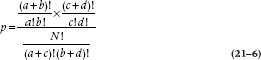
TWO FACTORS: MANTEL-HAENSZEL CHI-SQUARED
Well, we’re making some progress. We have dealt with all the possibilities where we have one independent categorical variable. Chi-squared, with a 2 × 2 table, is equivalent to a t-test, and with more than two categories is like one-way ANOVA. The McNemar chi-squared is the analogue of the paired t-test. The next extension is to consider the case of two independent variables, the parallel of two-way ANOVA. The strategy is called a Mantel-Haenszel chi-squared (hereafter referred to as M-H chi-squared. Guess why?)
Unfortunately, none of the real data from the EMS studies are up to it, so we’ll have to fabricate some. Stretch your biochemical imagination a bit and examine the possibility (admittedly remote) that some other factors interact with tryptophan exposure from the bad batch to result in illness. For example, suppose EMS is actually caused by a massive allergic response to mosquito bites that occurs only when excess serum levels of tryptophan are present. Well now, gin and tonic (G and T) was originally developed by the British Raj to protect the imperialist swine from another mosquito-borne contagion (malaria) while concurrently providing emotional support (in the form of inebriation). Maybe it would work here, as well.
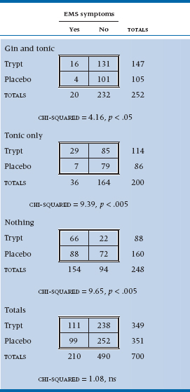
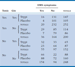
To test the theory (and to deal with the possible response bias resulting from folks in the G and T group saying they are feeling great when they are past feeling anything), we create six groups by combining the two independent variables: Gin and Tonic, Tonic Only, or No Drinks, with half of each group having taken tryptophan and the other half a placebo (in ANOVA terms, a 3 × 2 factorial design). We can’t afford any lab work, so we use symptoms as dependent variables: insomnia, fatigue, and sexual dysfunction. When we announced the study in the graduate student lounges, we had no trouble recruiting subjects and got up to 500 per group, despite the possible risk. However, the dropout rates were ferocious. The No Drink group subjects were mad that they didn’t get to drink; the G and T group got so blotto they forgot to show up; and the Tonic Only group presumed they were supposed to be blotto and didn’t come either. In the end, the data resulted in Table 21–11.
Before we plunge into the statistical esoterica, take really close look at the table. Within each 2 × 2 subtable there is a strong association between tryptophan use and symptoms, with about three times as many people with symptoms per 100 in each stratum. The risk of symptoms among tryptophan-exposed individuals in the Tonic Only group is 29 ÷ 114 = 25.4/100; in the Placebo and Tonic Only group, it’s 8.14/100. So the relative risk is 25.4 ÷ 8.14 = 3.12. But because of the peculiarities of the data—mainly the excess of symptoms in the “Nothing” group, and the factor of two between Tryptophan and Placebo in those who stayed in the trial (160 vs 88)—when they are combined (shown at the bottom of Table 21–11), the association disappears.
Clearly, one way not to examine the association between tryptophan and symptoms, when there are strata with unequal sample sizes, is to add it all together, which makes the effect completely disappear.18 Instead, we must use some strategy that will recognize the interaction between the two factors, and so must stay at the level of the individual 2 × 2 tables.
We can start as we have before, by considering the expected value of an individual frequency, contrasting this with the observed value, and squaring the lot up. For example, the expected frequency in the G and T, Tryptophan, YES cell is:
You probably thought that a reasonable way to proceed now is simply to calculate a chi-squared by doing as we have already done—summing up all the (O − E)2 ÷ E for all 12 cells. We thought so too, but Mantel and Haenszel didn’t.19 First, the variance in this situation is not just the expected value, as it was when we did the original chi-squared. Here, the variance of the expected value of each frequency is20:
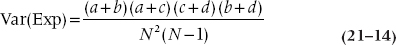
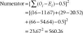
The next step is to add up the (O − E) differences for all the individual frequencies in the a (top left) cells across all subtables21 and square the resulting total. We then throw in a Yates’ correction, just for the heck of it. This is the numerator for the M-H chisquared and is an overall measure of the signal, the difference between observed and expected values, analogous to the mean square (between) in ANOVA.
TABLE 21–11 Association between tryptophan, gin and tonic, and EMS
Similarly, the variances of the values in each subtable are added together to give the noise term, analogous to the mean square (within) in ANOVA:
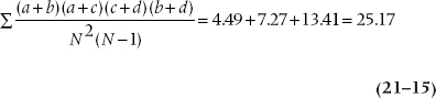
where N is the total sample size for each subtable (252, 200, and 248). Finally, the ratio of the two sums is the M-H chi-squared, with (k − 1) df, where k is the number of subtables in the analysis; in this case, three. This M-H chi-squared equals 560.26 ÷ 25.17 = 22.25, and it is significant at the .001 level.
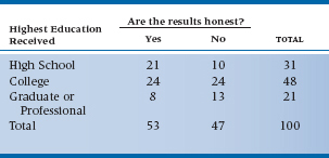
TABLE 21–12 Belief in the honesty of professional wrestling by educational level
Although useful for analyzing stratified data, the MH chi-squared also appears in the analysis of life tables because, at one level, a life table is nothing more than a series of 2 × 2 tables (e.g., treatment/control by alive/dead) on successive years over the course of the study. This is described in more detail in Chapter 25.
When we first introduced χ2, we said that both variables are measured at the nominal level, such as sex, group membership, or the presence or absence of some outcome. Well, that’s only partially true. The ordinary, run-of-the-mill Pearson’s χ2 is like this, so if a variable has more than two levels, such as tryptophan manufacturer, we’d get exactly the same answer if we changed the order of the rows or columns around in the table—the true property of a nominal level variable. So what do we do if both of the variables are ordinal, or if one is ordinal and the other is dichotomous? In this case, we’re looking for a linear trend, to see if a higher level of one variable is associated with a higher or lower level of the other, and we’d lose information if we ignore this.
Let’s get away from “healthy” additives for a while and turn our attention to more pressing issues—such as testing the hypothesis that believing professional wrestling is staged or not is related to your education level. So, we stop 100 people on the street, ask them about the highest grade they completed, and whether or not they think that the outcome of a pro wrestling matched is fixed ahead of time. The results of our scientific survey are presented in Table 21–12, with education classified as (1) attended or finished high school, (2) attended or finished college, or (3) attended or finished graduate or professional school.
Now, if we ignored the ordinal level of education, and ran an ordinary χ2, we’d get a value of 4.751 which, with df = 2, is not statistically significant. Let’s pull another test out of our bag of tricks, called the Mantel-Haenszel chi-squared (χ2MH),22 which is also known as the test for linear trend or the linear-by-linear test. We’d find its value, with df = 1, is 4.620, which is significant at p = .032. We would conclude that there’s a significant trend, with higher education being associated with a greater degree of skepticism, which we wouldn’t have seen with a Pearson’s χ2.
Calculating χ2MH is quite easy. We run a Pearson’s correlation (r) between the two variables, and then:

which we would then look up in a table of the critical values of the χ2 distribution (Table F in the Appendix) with df = 1. Pearson’s correlation between education and belief is 0.216, so

As you can see from the example, the increase in significance level isn’t due to a higher value of the χ2, but to fewer degrees of freedom: (r − 1) × (c − 1) for Pearson’s χ2, and 1 for χ2MH, irrespective of the number of levels of either variable. So the more levels there are, the greater the gain when you use χ2MH.
Did we just violate something or someone by figuring out Pearson’s r on ordinal data? Not really; Pearson is robust and can handle this easily. If you’re a purist and insist on using a non-parametric correlation, such as Spearman’s ρ instead,23 you’d get a value of 0.217 rather than 0.216. But, if it makes you feel better, go ahead and spear away. While you’re doing that, we’ll return to the tragedy of tryptophan.
MANY FACTORS: LOG-LINEAR ANALYSIS
We must still deal with the equivalent of factorial ANOVA—the situation where imaginations and budgets run rampant, and we end up swimming in variables. This frequently occurs on “fishing expeditions” but can also arise when folks do randomized trials, insist on gathering demographic data by the pile, and then make the fatal mistake of analyzing them to show the groups are equivalent. Occasionally, it even happens by design.
In particular, in the last example, we examined the combined effects of tryptophan and gin and tonic on EMS symptoms. But the astute ANOVA’er might have noticed that we could have, but didn’t, look at the effects of gin and tonic separately. As a result, we cannot separate out the main effect of gin from the interaction between gin and tonic.24 A better design would be to have four groups—Gin and Tonic, Gin only, Tonic only, and Nothing, with half of each group exposed to tryptophan and half to placebo.
We had a good reason for not doing it this way. This would have introduced three factors in the design (Tryptophan, Gin, Tonic) and the M-H chi-squared, like the parametric two-way ANOVA, is capable of dealing only with two independent variables. To deal with multiple factors, we must move up yet again in the analytical strategy: the approach to analysis called log-linear analysis. We work out a way to predict the expected frequency in each cell by a product of “effects”—main effects and i-nteractions—and then take the logarithm of the effects to create a linear equation (hence, log-linear). It ends up, yet again, as a regression problem using estimates of the regression parameters. Everything seems to be a linear model, or if it’s not, we poke it around until it becomes one!
For relative simplicity, we’ll add an extra group to Table 21–11 to separate out the two drinking factors (Table 21–13). In log-linear analysis, we first collapse the distinction between independent and dependent variables. You and I know that Symptoms of EMS is the dependent variable, but from the vantage point of the computer, it’s just one more factor leading to vertical or horizontal lines in the contingency table. Table 21–13 could be displayed with any combinations of factors on the vertical and horizontal axis, and it is only logic, not statistics, that distinguishes between independent and dependent variables. Ultimately we care about the association between EMS and Tryptophan, Gin, and Tonic, but this, like a correlation, has no statistical directionality.
We begin by determining what an effect is. Let’s start by assuming there was no effect of any of the variables at all. In this case, the expected value of each cell is just the total divided by the number of cells, 852 ÷ 16 = 53.25.
The next level of analysis presumes a main effect of each factor; this explains the different marginals. This is introduced by multiplying the expected value by a factor reflecting the difference in marginal totals. We would begin by determining the marginal proportion with Gin present, (252 + 152) ÷ 852 = 0.47, and the proportion with Gin absent (0.53). If Gin had no marginal effect, these proportions would be .50 and .50, so we multiply the Gin-present cells by .47 ÷ .50 = .94, and the Gin absent cells by .53 ÷ .50 = 1.06.
Working this through for the top left cell, where all effects are present, to account for all the marginal totals, the initial estimate must also be multiplied by the overall probability of Tonic (252 + 200) ÷ 852 = 0.53 ÷ .50 = 1.06; the overall probability of Tryptophan (147 + 114 + 65 + 88) ÷ 852 = 0.48 ÷ .50 = .96; and the overall probability of Symptom (20 + 36 + 55 + 154) ÷ 852 = 0.31 ÷ .50 = .62. so, the expected value in this cell is 53.25 × .94 × 1.06 × .95 × .62 = 31.58. If we call βG1 (there is no logical reason to call these things β’s—that’s just what everybody calls them) the main effect of the Gin factor, where the subscript (1) indicates the first level; βP1 the effect of the Pop (Tonic) factor; βS1 the main effect of EMS at the first level; and βT1 the main effect of tryptophan, then algebraically the expected value of cell (1,1,1,1) with no association is:
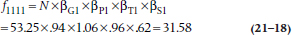
TABLE 21–13 Association between tryptophan, gin, tonic, and EMS
where N is the expected frequency in each cell assuming no main effects, just the total count divided by the number of cells (852 ÷ 16 = 53.25). Going the next step, if we assume that there is an association between Gin and Symptoms, but there is not an association between Pop and Tryptophan and Symptoms, then this would amount to introducing another multiplicative factor to reflect this interaction, a factor that we might call βGS11. We won’t try to estimate this value because there is a limit to our multiplication skills, but algebraically, the expected value in the top left cell of such a model would look like:

There is no reason to stop here. Several models could be tested, including No Effects (the expected value in each cell is 53.25), then one or more main effects only, then one or more two-way interactions, then the three-way interactions, and finally the four-way interaction.
However, as yet, we have not indicated how we test the models. Here is the chicanery. Recall once again your high school algebra, where you were told (and then forgot) that the logarithm of a product of terms is the sum of the logarithms of the terms. So if we take the log of the above equation, it becomes:
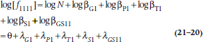
Again, unfortunately, there isn’t much rationale for the Greek symbols. The first thing looking like an “O” with a bird dropping in the center is called theta. The others are called lambda and are the Greek “L”— for log-linear, we suppose.
We have now reduced the beast to a regression problem. The usual analytical approach is to fit the models in hierarchical fashion, so that first the main effects model is fitted, then the two-way interactions model, then the three-way interactions model, and on to the full model. Of course, just as in regression, when new terms are introduced into the model, the magnitudes of all the estimated parameters change. One additional constraint is imposed on the analysis: all the λs for a particular effect must add to zero. Thus, when an effect has two levels, as is the case in our example, the λs will be something like +0.602 and –0.602. In turn, because each of the estimated parameters is the logarithm of a factor that multiplies the initial expected cell frequency, it is also possible to determine the expected cell frequencies at any stage by listing the parameter estimates, taking antilogs, and then multiplying the whole lot together. Computer packages that run log-linear analysis will do this for you, of course.
At each stage of the analysis, a chi-squared is calculated, based on the differences between the observed frequencies and the frequencies estimated from the model. If the model fits the data adequately, we get a nonsignificant chi-squared, indicating no significant differences between the predicted and the observed data. Where do the degrees of freedom come from? Two effects: first, note that, in this case, all variables are at two levels, so each effect is a 2 × 2 or a 2 × 2 × 2 table, and any combination of 2 × 2 tables has one df; second, there are 4 main effects, 6 two-way interactions, 4 three-way interactions, and 1 four-way interaction (see Table 21–14), so these are the total df: 15.
TABLE 21–14 Test of individual interactions in log-linear analysis
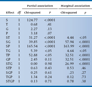
TABLE 21–15 Test of interactions in log-linear analysis
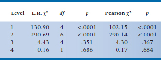
For the present data, the analysis of zero, first, and higher order interactions results in Table 21–15. It is clear that the test of first-order interactions (i.e., main effects) is significant (L.R. chi-squared = 130.90), simply implying that the marginals are not equal; the two-way interactions are also highly significant (L.R. chi-squared = 290.69). However, fortunately for us, no evidence of a significant three-way or four-way interaction is found (fortunate because we wouldn’t know how to interpret it if it was there). So we conclude that the model with two-way interactions fits the data (i.e., it is the model with the lowest order significant interactions, and no significant chi-squareds exist beyond it), so we stop.
So what is an “L.R. chi-squared”? The L.R. is shorthand for likelihood-ratio, which is defined as:
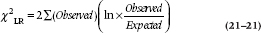
where ln means the natural logarithm (i.e., to base e). Actually, SPSS gives you both a run-of-the-mill Pearsonian χ2 as well as Fisher’s χ2LR, and they’re usually fairly similar. The advantage of χ2LR is that the difference between the ones at succeeding levels shows the contribution of the next level (with degrees of freedom equal to the difference in df).
The next step is to examine the individual terms to determine which of the main effects and interactions are significant. For the present data, these are shown in Table 21–14. Looking at the main effects, we see that only S is significant, which means that the frequencies in the Symptom and No Symptom summed cells are not equal. Who cares? More interesting is that all the two-way interactions with Symptoms are significant, so an association does exist between symptoms and tryptophan, gin, and tonic. Tryptophan makes you sicker, tonic makes you better, and gin makes you better. The remaining two-way interactions are not of any particular interest, indicating only that there happen to be interactions among the independent variables. Finally, none of the three-way or four-way interactions are significant.
Note that, in Table 21–14, we show both a marginal and a partial association. The marginal association is based on frequencies at the marginals and is analogous to a test of a simple correlation. Conversely, the partial association takes into account the effect of the other variables at this level, so it is analogous to the test of the partial correlation.
Not surprisingly, at a conceptual level, the analysis resembles multiple regression, in that it reduces to an estimation of a number of fit parameters based on an assumed linear model, with the exception that, in log-linear analysis, you generally proceed in hierarchical fashion, fitting all effects at a given level. For those with an epidemiological bent, there is one final wrinkle. The estimated effect is exactly equal to the log of the odds ratio. Thus an effect of −1.5 for G and T implies that the odds ratio (the odds of disease with G and T present to the odds of disease with G and T absent) is equal to exp(−1.5) = 0.22. Similarity to factorial ANOVA also exists in the unique ability of the log-linear analysis to handle multiple categorical variables.
DIFFERENCE BETWEEN INDEPENDENT PROPORTIONS
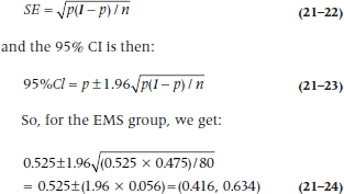
Let’s take another look at the data in Table 21–1. We analyzed them using χ2 and found a significant association between tryptophan exposure and EMS. One problem with χ2, though, is that all we get is a probability level; we can’t draw any confidence intervals (CIs) around the difference. A different approach is to look at the proportions in each group of people who developed EMS. We can derive CIs for the individual proportions, and also for the difference between them.
In the EMS group, 42 people had taken tryptophan and 38 had not, so p1, the proportion in Group 1 who took the stuff is 42 / (42 + 38) = 0.525. Similarly, the proportion in the second (Normal) group, p2, is 34 / (34 + 166) = 0.170. If we want to have CIs around the proportions, we begin with the standard error of a proportion, which is:
The standard error of the difference in proportions is:
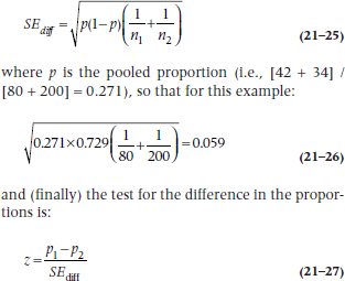
This turns out to be:
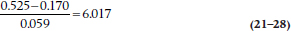
which is highly significant, as was the χ2. This isn’t surprising, since both tests are using the same data in the same way. Which one you use depends on whether you just want a significance level, or also want the CIs.
SIGN TEST
To be perfectly honest, the sign test doesn’t really belong in a chapter on tests for categorical frequency data. But then again, it doesn’t neatly fit into any of the other chapters, either. It’s sort of half-way between here and a non-parametric test for ranked data. The sign test is used when we would normally (no pun intended) use a one-sample t-test or a paired test, but the data deviate so far from normality that we would violate even our own very low standards by using them. What we do is convert the scores to either a “+” to indicate improvement or being above some criterion, or “−” to indicate worsening or the score being below some criterion, and then see if there are significantly more pluses or minuses. Hence the name, and why we decided to put the test in this chapter—it boils down to frequencies of the two categories of response.
Imagine, if you will,25 a study of cultural stereotyping—are the French really better lovers than wholesome, red-blooded North Americans? Because of the tremendous variability from one person to the next in rating satisfaction, you decide to do a cross-over trial.26 You take 20 (very willing) women, let each of them have an “encounter” with a French or North American lover (counterbalanced, of course), and rate the experience on a 1 to 3 scale, where 1 means as exciting as making love to your spouse, and 3 is that not only the earth, but also the moon and a couple of planets moved. The rating scale is anything but interval, and we can’t really trust that a difference score is really meaningful. About all we can do is record a + if the hamburger eater was better, and a − if the lover of frogs’ legs wa27.27 If both were equivalent, we’d just record a 0 and drop that observation from the analysis. The results are shown in Table 21–16.
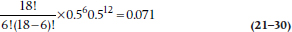
The next step is the essence of simplicity; we count the number of pluses and minuses. In fact, if you’re lazy, you can simply count whichever has fewer entries. But, for the sake of completeness and to make sure we’ve counted correctly, we’ll count all three. There are 12 pluses, so N+ = 12 and N− = 6. Because N0 = 2 (the ties for Subjects 12 and 19), we have only 18 valid numbers. If North Americans and Frenchmen are equal in their love-making prowess (the null hypothesis), we’d expect nine of each. So now the question is, what’s the probability that the smaller number is six? We go back to the binomial expansion we encountered in Equation 5-10, which is:
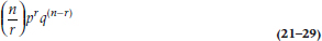
TABLE 21–16 Satisfaction ratings of 20 women with North American and French lovers
N.A. = North American.
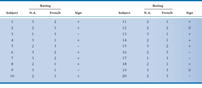
where n = 18, r is the smaller of N+ and N−, which is 6, and both p and q are 0.5. What we get, then, is:
meaning that North American women might as well stay at home; there’s no difference.
The problem with the sign test is that it has very little power. If we can use ranks, a much better alternative would be the Wilcoxon Signed-Ranks test, which we’ll discuss in Chapter 23.
SAMPLE SIZE ESTIMATION
As we found in earlier situations, sample size procedures are worked out for the simpler cases such as those with two proportions, but not for any of the more advanced situations. The method for two proportions is a direct extension of the basic strategy introduced in Chapter 6. Imagine a standard RCT where the proportion of deaths in the treatment group is πT and in the control group is πC. (With a few sad exceptions, πT is less than πC.)
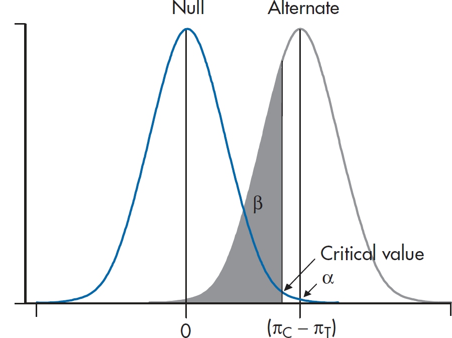
FIGURE 21-2 Visualizing the sample size calculation for two independent proportions.
We consider two normal curves, one corresponding to the null hypothesis that the two proportions are the same (πT− πC = 0), and the second corresponding to the alternative hypothesis that the proportions are different (πC− πT= δ). We’re almost set. However, we first have to figure out the SD of the two normal curves. You may recall that the SD of a proportion is related to the proportion itself. In this case, the SD of the proportion π is equal to:
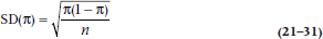
and the variance is just the square of this quantity. Now the two bell curves are actually derived from a difference between two proportions, so the variances of the two proportions are added. For the H1 curve on the right, then, the SD is:
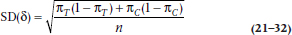
Finally, the H0 curve is a little simpler because the two proportions are the same, just equal to the average of πT and πC.
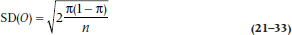
The whole lot looks like Figure 21–2, which, of course, bears an uncanny resemblance to the equivalent figure in Chapter 6 (Figure 6–7). We can then do as we did in Chapter 6, and solve for the critical value. The resulting sample size equation looks a little horrible:
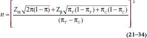
What a miserable mess this is! Now the good news. If you would like to forget the whole thing, that’s fine with us because we have furnished tables (Table K) that have performed all this awful calculation for you. These tables are based on a slightly different, and even more complicated, formula, so they will not yield exactly the same result.
For the situation where you wish to test the significance of a single proportion, the formula is a bit simpler. One good example of this is the paired design of the McNemar chi-squared, where the null hypothesis is that the proportion of pairs in each off-diagonal cell is .5. In this case, the SDs are a bit simpler, and the formula looks like:
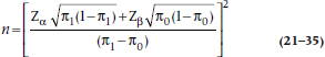
where π1 is the proportion under the alternative hypothesis, and π0 is the proportion under the null hypothesis (in this case, .5). Unfortunately, there is no table for this, so get out the old calculator.
To show you how it’s done, we refer to an ad we recently saw on TV where it was loudly proclaimed that, “In a recent survey, 57% of consumers preferred Brand X to the leading competitor.” Pause a moment, and warm up the old C.R.A.P. Detectors. This means that 43% preferred the competitor, and the split is not far from 50–50. They also don’t say how many times they did the “study” or how many people were involved. More particularly, we might ask the essential statistical question, “How large a sample would they need to ensure that the 57–43 split did not arise by chance alone?”
Looking at the formula above π1 is .57, and π0 is .50, so the equation looks like (assuming α = .05 and β = .10):
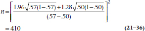
Any bets how many consumers they really used?
THE JACKKNIFE, BOOTSTRAPPING, AND RESAMPLING
Yet again we’ll start off with a disclaimer that this section really doesn’t belong here, but we couldn’t think of any better place to put it. In one sense, it does logically belong in a chapter on nonparametric tests, because the techniques we’ll describe don’t make any assumptions about the underlying distribution of the data. Also, they’re an extension of the Fisher exact test, which is a permutation test, and one variant of what we’ll talk about. On the other hand, these procedures can be used with parametric data, but since they are distribution-free, we’ll keep it here. Now that we’ve confused you sufficiently, let’s get down the heart of the matter.
Parametric tests are based on assuming some underlying distribution whose parameters we know, usually the mean and standard deviation. When the data meet the assumptions of the distribution, these tests are very powerful and allow us to make inferences about the population. There are times, though, when the assumptions aren’t met or when the formulae for calculating the standard errors are extremely complicated. The solution is to use the data themselves to figure out probabilities and SEs, rather than relying on values found in tables, such as the ubiquitous 1.96. These various techniques are called resampling methods, because, as the name implies, we draw many samples from our data.
The situation of the data not meeting the assumptions of the distribution was solved by Sir Ronnie Fisher with his exact test; when one cell of the χ2 table has an expected frequency of less than five, the χ2 distribution just doesn’t work. His solution was to work out every possible permutation of the data, and then determine the probability of the layout that was found. Fisher abandoned this approach soon afterwards; not because it doesn’t work—it works beautifully—but rather because he didn’t want to do the work that was involved. Living in the days before computers28 and powerful hand-held calculators that could do factorials at the push of a button, it was just too laborious to do all of the calculations.29 Were he alive today, stats books would most likely not have chapters on nonparametric tests of any sort, but would be filled with various permutation tests. Alas, such is not the case, and Fisher’s exact test is about the only permutation test in general use.
The next step in the evolution of resampling methods was the Jackknife, which was invented by Quenouille (1949). It was originally developed to see how much outliers affect the parameter estimates in multiple regression and other procedures. It was further developed by the ubiquitous John Tukey (1958), who gave it its name, because he saw it as an all-purpose statistical tool. Its other name, leave one out, explains how it works. The data are analyzed a number of times, each time leaving out one randomly selected subject. At each iteration of the analysis, the parameters are calculated based on N − 1 subjects; for multiple regression, for example, the parameters would be R2 and the β weights. We can then get the average value of the parameter and their SD. We can go a step further and determine if the parameters are stable. If we denote the parameter by ϕ, then:

where ϕ’ means the estimate from the reduced sample. Dividing the mean pseudo-value by its SE produces a t-test of the stability of the parameter estimates.
Much as we love our Swiss Army jackknives,30 they do have one limitation—there are a finite number of blades and gadgets that can be crammed into them. This Jackknife has a similar problem: there are a finite number of samples we can draw. If the sample size is 50, we’re limited to a maximum of 50 resamples, which may not be enough if we’re trying to get stable estimates of the parameters. We get around this problem with another resampling method, called Bootstrapping (Efron and Tibshirani, 1993), so called because we use the data to lift ourselves up by our bootstraps.31
With bootstrapping, we repeatedly draw random samples from our data with replacement. That means that if subject 13 is one of the people drawn, we in essence leave her data in the data set, so that it is possible that she could be drawn again in the same sample. As we said, we’re not limited regarding the number of samples we can draw by the sample size, and it’s not unusual to draw 1,000 or even 10,000 samples. Let’s give it a try using the data in Table 21–16, where, as we’re sure you’ll all remember, we compared Frenchmen and North Americans as lovers. We found that the home team won 12 of the 18 contests, or 66.7% of the time (we’ll forget about the two who couldn’t decide). Our conclusion was that, statistically speaking, there was no significant difference, but 18 is a pretty small sample on which to base such momentous findings. It would be tough to replicate this study—not that we wouldn’t find many willing women, but men shy away from contests like this where they may lose. So, let’s resample from this group 1,000 times and see in how many cases North Americans win. We find that the answer is, on average, 68.3%. If we do this four more times, the answers are 67.2%, 76.7%, 60.0%, and 64.4%, which nicely brackets what we found originally. Based on these replications, we can easily determine the SE and hence the confidence intervals around our original results.
Needless to say, we didn’t sit at our desks, drawing 5,000 samples by hand. Resampling had to wait for computers to come on the scene. We used a delightful (and free!) program called Statistics101, available at http://www.statistics101.net/, which is based on a book by Simon (1997), also available free at http://www.resample.com/content/text/. What more can one want out of life?
Bootstrapping is a useful technique when sample sizes are small or where the data don’t meet the assumptions of parametric tests. But, as General Alexander Haig famously (or infamously) said, “Let me caveat that.”32 Some people have argued that you can’t get something for nothing. If the sample is biased, then all we’ve done is draw on a biased sample many times, and we shouldn’t base statistical inferences on that. Then again, that’s true even if we don’t use bootstrapping; badly chosen samples will lead to results that aren’t generalizable. So, as with any technique, be aware of the limitations of the data.
REPORTING GUIDELINES
The reporting guidelines for χ2 are a bit confusing. Needless to say, two of the mandatory elements are (1) the value of χ2 itself, and (2) the p level. Beyond that, advice differs; some say to report the df, some say the sample size, some say both. Because both elements are really needed to properly make sense of χ2, we’d say report them both; for example:

or:

In fact, we’d go even further and suggest you add a measure of effect size; as we mentioned earlier, we’ll discuss the ϕ coefficient and Cramer’s V in the next chapter.
SUMMARY
We have considered several statistical tests to be used on frequencies in categories. The ubiquitous chi-squared deals with the case of two factors (one independent, one dependent) only, as long as no frequencies are too small. In the case of low fre-quencies, you use the Fisher exact test. For 2 × 2 tables with paired or matched designs, the McNemar chi-squared is appropriate. Finally, we considered the MH chi-squared for three factor designs, and log-linear analysis for still more complex designs.
EXERCISES
1. In a small randomized double-blind trial of attar of eggplant for acne, the ZR (medical talk for “zit rate”) in the treated group was half that of the control group. However, a chi-squared test of independent proportions showed that the difference was not significant. We can conclude that:
a. The treatment is useless
b. The reduction in ZR is so large that we should start using the treatment immediately
c. We should keep adding cases to the trial until the test becomes significant
d. We should do a new trial with more subjects
e. We should use a t-test instead of the chi-squared
2. The data below are from a study of previous failure in school, academic or behavioral problems, and dropout.
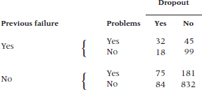
How would you analyze it?
3. A case-control study was performed to examine the potential effect of marijuana as a risk factor for brain cancer. A total of 75 patients with brain cancer were matched to 75 controls. All subjects were questioned about previous marijuana use.
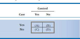
Of the cases, 50 said they had used marijuana, and 35 of their matched controls reported marijuana use. No use of marijuana was reported by 25 cases and 20 controls.
If the data were analyzed with a McNemar chi-squared, what would be the observed frequency in the upper right corner (cell B) in the table below?
4. Is it really true that “If you don’t wear your long underwear, you’ll catch your death of cold, dearie!”? We know colds are caused by viruses, but surely all those grannies all those years couldn’t have all been wrong.
5. Let’s put it to the test. One cold, wintry week in February, half the kids in the student residence have their longjohns confiscated for science. After a week, the number of colds looks like this: Analyze the data with:
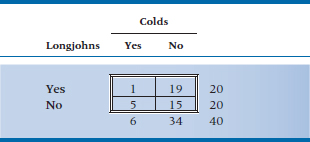
a. Chi-squared
b. Yates’ corrected chi-squared
c. Fisher exact test
How to Get the Computer to Do the Work for You
Chi-squared and Fisher’s Exact Test
It may look as if the appropriate place to find these tests would be in Analyze, Nonparametric Tests → Chi-Square. Well, resist the temptation to do what appears logical. The best way to get chi-squared and Fisher’s exact test is:
- From Analyze, choose Descriptive Statistics → Cross-Tabs
- Click on the variable you want for the rows and click the arrow to move it into the box labeled Row(s)
- Do the same for the second variable, moving it into the Column(s) box
- Click the
 button and choose Chi-square, then
- Click the
 button and click on Row, Column, and Total in the Percentages box, then
- Click

McNemar’s Chi-squared
- Simply select it after you click the
 button
Chi-Squared with Grouped Data
If the data are already grouped into a table, and you want to calculate a chi-squared on the results, you have to proceed in a somewhat different way:
- Create one variable for Row, and one for Column (you can call them anything you want)
- For a 2 × 2 table, then, you would have four rows of data: R1C1, R1C2, R2C1, and R2C2
- Create a third variable, containing the counts in each of the cells.
- Under Data, select Weight Cases…, and then click the Weight cases by button
- Click on the variable that has the counts and then

- Now do the analysis as outlined above
Log-Linear Analysis
- Go through the steps outlined in For Grouped Data. For the data in Table 21–12, there will be 16 lines. To make life easier, use 1 = Yes, 2 = No for all of the variables except the cell frequencies.
- From Analyze, choose Loglinear → Model Selection…
- Pull over the variables for the independent variables into Factor(s)
- Highlight all of the variables and click the button labeled

- Enter 1 for Minimum, 2 for Maximum, and click

- Pull over the variable representing the cell counts into Cell Weights
- If you want to see the table of partial associations, click
 and check the two boxes under Display for Saturated Models
- Click

Mantel-Haenszel Chi-Squared
- From Analyze, choose Descriptive Statistics → Crosstabs…
- Enter the row and column variables as you would do for a Pearson’s χ2
- Click the
 button and check Cochran’s and Mantel-Haenszel statistics
- Click
 and then
- Just to confuse you, the results will be labeled “Linear-by-Linear Association,” not Mantel-Haenszel Chi-Square
1 Eosinophilia-myalgia syndrome (EMS) is a very nasty multisystem disease. As well as causing c-rippling muscle pain and high eosinophil counts, it has many other manifestations (e.g., fever, weakness, nausea, dyspnea, t-achycardia), and it occasionally kills.
2 Actually it was a contaminant, but we don’t want to get ahead of ourselves.
3 Just like Vietnam, only we’ll tell you when we’re lying.
4 These data aren’t real. Later on, we’ll show you some data that are.
5 To which any regular stats book would devote about 20 pages, just so we could get to the next equation.
6 For more details about Poisson regression, go back to Chapter 15 for a second look.
7 Before we go any further, we should answer the question that has plagued statisticians since this test was introduced: “Is it chi-square or chi-squared?” Finally, we can give you a definitive answer: “Yes.” Last (2000) states that a “bare majority” of people he surveyed prefer the former term; we (in the minority but assured of our correctness) opt for the latter, because the letter chi is squared. We don’t refer to 32 as “three square,” do we?
8 As a brief aside, the astute reader might have noted that the value of chi-squared, 3.84, is just the square of the corresponding z-test (1.96). A general observation, offered without proof, is that chi-squared on 1 degree of freedom, is just z2 . Pay attention, it might be on the exam.
9 Our next book will consist simply of problems we have skipped over in this one.
10 And translated into English by Agresti (1990), from the original Statisticalese.
11 Or both, if we’re lucky.
12 The only acceptable answer is, “No sirs, that wasn’t hard at all. May I have more, please?”
13 If you expect us to define this further, forget it; this is a statistics book. Read PDQ Epidemiology.
14 That’s why it’s called the exact test.
15 Remember that n! = n × (n − 1) × (n − 2) × (n − 3) × … 3 × 2 × 1. If this doesn’t sound familiar, go back and re-read about permutations and combinations in Chapter 5.
16 What happened to the top row with 8 cases? It turns out that the binomial distribution, as shown in the formula, is symmetrical. So we could have worked out the probability of observing 8 and 9 and 10 and 11 … and 99 and 100 cases. But it would have taken a bit more time and resulted in the same answer anyway. The two probabilities are not added together because that would amount to counting everything twice.
17 In contrast to many of our peculiar actions.
18 The situation is completely analogous to the problems of estimating main effects for ANOVA when there are unequal samples and interactions.
19 Another one of those “It is just so” situations. We’re honestly not quite sure why you do all the steps that follow, but that’s the way it is.
20 Although this seems strange, it actually is related to more general equations. The general formula for the variance of a proportion is π (1 – π) ÷ n, where n is the total number of objects and π is the proportion. After a great deal of algebra, this is equal to the formula shown, except for an n ÷ (n – 1) “fiddle factor” favored by statisticians. See also the section on the phi coefficient in Chapter 22.
21 We just use the “a” cells because all the (O– E) differences in each subtable are the same, and all the variances in each subtable are the same, so this would amount to multiplying both numerator and denominator by four, which changes nothing.
22 No, you’re not becoming amnestic. We just described a Mantel-Haenszel chi-squared, but it was a different one. Confusing, ain’t it?
23 Which we discuss in Chapter 24.
24 Presumably there must be some positive interaction—that’s why bartenders put them together.
25 You’ll have to imagine this because there’s no way you could ever get money out of a reputable granting agency to do the study.
26 That’s a legitimate description of a type of experimental design; it does not describe one of the positions some couples may adopt.
27 The assignment of who’s + and who’s − isn’t meant to prejudice the results; we’d reach exactly the same conclusion if we were to interchange the signs.
28 Yes, dear younger readers. There was actually a time when computers and hand calculators did not exist. If you know what the term “slip stick” means, we’ll buy you a coffee the next time you visit us.
29 No, he wasn’t lazy. One of the authors did the calculations in Equation 21-5. The other author checked the calculations and got a different answer. We both did it again and got two more answers. After three tries, we finally got the right result, and this was with a calculator that did permutations.
30 This probably pertains mainly to those of the masculine persuasion.
31 We’d suggest you not try this at home.
32 Which is why generals, like children, should be seen but not heard.
Stay updated, free articles. Join our Telegram channel

Full access? Get Clinical Tree


