Survival Analysis
Survival analysis is a technique used when the outcome of interest is how long it takes until some outcome is reached, such as death, recurrence of a disease, or hospitalization. It can handle situations in which the people enter the trial at different times and are followed for varying durations; it also allows us to compare two or more groups, and to examine the influence of different covariates.
SETTING THE SCENE
In some parts of the developed world, such as southern California and Vancouver, it is commonly believed that, if you eat only “natural” foods, exercise (under the direction of a personal trainer, of course), live in a home built according to the principles of Feng Shui, have a bottle of designer water permanently attached to your hand, and follow other precepts of the Yuppie life, you need never die. To test this supposition, people were randomly assigned to one of two conditions: Life As Usual (LAU) or an intervention consisting of Diet, Exercise, Anti-oxidant supplements, Tai-Chi, and Hydration (the DEATH condition). Because of the difficulty finding Yuppies who didn’t follow this regimen to begin with, recruitment into the trial had to extend over a 3-year period. Participants were followed until the trial ended 10 years later. During this time, some of the participants died, others moved from La-La Land to rejoin the rest of humanity, and some were still alive when the study ended. How can the investigators maximize the use of the data they have collected?
WHEN WE USE SURVIVAL ANALYSIS
In most studies, people are recruited into the trial, where they either get or don’t get the intervention that is destined to change the world. They are then followed for a fixed period of time, which could be as short as a couple of seconds (e.g., if we want to know if a new anesthetic agent works faster than the old one) or a few decades (e.g., to see if reduced dietary fat decreases the incidence of breast cancer). At the end of that time, we measure the person’s status on whatever variable we’re interested in. Sometimes, though, we are less interested in how much of something a person has at the end, and more concerned with how long it takes to reach some outcome. In our example, the outcome we’re looking at is the length of time a person survives (hence the name of the statistical test), although the end point can be any binary state (whether a disease recurs or not, if a person is readmitted to hospital, and so on). Complicating the picture even more, many of these trials enroll participants over an extended period of time in order to get a sufficient sample size. The Multiple Risk Factor Intervention Trial (MRFIT), for instance, involved nearly 13,000 men recruited over a 27-month period (MRFIT, 1977). Because of this staggered entry,1 when the study finally ends (as all trials must, at some time), the subjects will have been followed for varying lengths of time, during which several outcomes could have occurred:
Some subjects will have reached the designated end point. In this example, it means that the person dies, much to his or her surprise. In other types of trials, such as chemotherapy for cancer, the end point may the reappearance of a malignancy.
Some subjects will have dropped out of sight: they moved without leaving a forwarding address; refused to participate in any more follow-up visits; or died of some cause unrelated to the study, such as being struck by lightning or a car.2
The study will have ended before all the subjects reach the end point. When the trial ends 10 years after its inception, some participants are still alive. They may die the next day or live for another 50 years, but we won’t know, because the data collection period has ended.
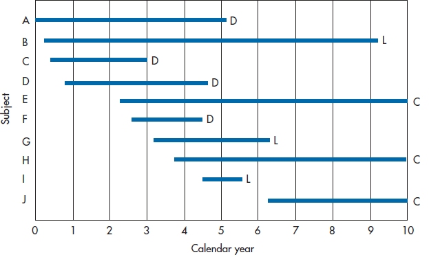
FIGURE 25-1 Entry and withdrawal of subjects in a 10-year study.
Figure 25–1 shows how we can illustrate these different outcomes, indicating what happened to the first 10 subjects in the DEATH group. Subjects A, C, D, and F died at various times during the course of the trial; they’re labeled D for Dead. Subjects B, G, and I were lost to follow-up, and therefore have the label L. The other subjects, E, H, and J (labeled C) were still alive at the time the trial ended. These last three data points are called “right censored.”3 Note that Figure 25–1 shows two different types of time: the X-axis shows calendar time, and each line shows survival time (Newman, 2001). To be more quantitative about the data, Table 25–1 shows how long each person was in the study and what the outcome was.
When we get around to finally analyzing the data, people who were lost and those who were censored will be lumped together into one category because, from the perspective of the statistician, they are the same. In both cases, we know they survived for some length of time and, after that, we have no idea. It doesn’t matter what name we call them, but to be consistent with most other books, we’ll refer to them as lost.
SUMMARIZING THE DATA
So, how can we draw conclusions from these data regarding the survival time of people in the DEATH condition? What we need is a method of summarizing the results that uses most, if not all, of the data and isn’t overly biased by the fact that some of the data are censored. Rather than giving you the right answer immediately, we’ll approach it in stages. The first two ways of summarizing the data (Mean Survival and Survival Rate) are intuitively appealing but have some problems associated with them, which the third method (using Person-Years) neatly sidesteps.
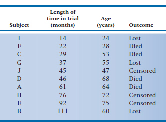
TABLE 25–1 Outcomes of the first 10 subjects
Subject | Length of time in trial (months) | Outcome |
A | 61 | Died |
B | 111 | Lost |
C | 29 | Died |
D | 46 | Died |
E | 92 | Censored |
F | 22 | Died |
G | 37 | Lost |
H | 76 | Censored |
I | 14 | Lost |
J | 45 | Censored |
Mean Survival
One tactic would be to look at only those subjects for whom we have complete data, in that we know exactly what happened to them. These subjects would be only those who died: subjects A, C, D, and F.
Their mean survival was (61 + 29 + 46 + 22) ∴ 4 = 39.5 months after entering the trial.4 The major problem with this approach is that we’ve thrown out 60% of the subjects. Even more seriously, we have no guarantee that the six people we eliminated are similar to the four whose data we analyzed; indeed, it is most likely they are not the same. Those who were lost to follow-up may be more transient, for either good or bad (they may be more upwardly mobile and were promoted to jobs in other parts of the country; or lazy bums who moved to avoid paying the rent), less compliant; or whatever. Those who were right censored were still alive, although we don’t know for how much longer. Ignoring the data from these subjects would be akin to studying the survival rates following radiation therapy but not including those who benefited and were still alive when the study ended; any conclusion we drew would be biased by not including these people. The extent of the bias is unknown, but it would definitely operate in the direction of underestimating the effect of radiation therapy on the survival rate.5 We could include the censored subjects by using the length of time they were in the study. The effect of this, though, would again be to underestimate the survival rate because at least some of these people are likely to live for varying lengths of time beyond the study period.
Survival Rate
Another way to summarize the data is to see what proportion of people are still alive. The major problem is “survived” as of when? The survival rate after one month would be pretty close to 100%; after 60 years, it would probably be 0%.6 One way around this is to use a commonly designated follow-up time. Many cancer trials, for instance, look at survival after five years. Any subjects who are still around at five years would be called “survivors” for the 5-year survival rate, no matter what subsequently happened to them.
This strategy reduces the impact of “the censored ones,” although it doesn’t eliminate it. Those subjects who were censored after five years don’t bother us any more because their data have already been used to figure out the 5-year survival rate. Now the only people who give us any trouble are those who have been followed for less than 5 years when the study ended. However, the major disadvantage is still that a lot of data aren’t being used, and what happens between 0 and 5 years can be very different for the two groups. For example, in Group A, everyone can live for the entire five years and then 90% die simultaneously on the last day of the trial; while in Group B, 90% die in Year 1 of the study, and the other 10% linger on until the end. The 5-year survival rate for both groups is 10%, but would you rather be in Group A or B? We rest our case.
Using Person-Years
In (unsuccessfully) trying to use the mean duration of survival or the survival rate to summarize the data, it was necessary to count people. This led us to the problem of choosing which people to count or not count when the data were censored. Because we divide the length of survival or the number of survivors by whichever number we finally decide to include, this has been referred to as the “denominator problem.”
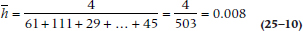
A different approach is to use the length of time each person was in the study as the denominator, rather than to use individual people; that is, the total number of person-years of follow-up in the study. Actually, it doesn’t have to be measured in years; we can use any time interval that best fits our data. If we were looking at how quickly a new serotonin reuptake inhibitor reduced depressive symptoms, for example, we could even talk in terms of person-days. The major advantage of this approach is that it uses data even from people who were lost for one reason or another. If we add up all the numbers in the middle column of Table 25–1, we would find a total of 503 person-months, during which time 4 people died. This means that the mortality in the DEATH group is (4 ÷ 503) = 0.0080 deaths per person-month. The major problem with this approach is the assumption that the risk of death is constant from one year to the next. We know that, in this case at least, it isn’t. The risk of dying increases as we get older; in the LAU group, due to the aging of the body, and in the DEATH group, probably from drinking all that bottled water.7
SURVIVAL ANALYSIS TECHNIQUES
What we can do is figure out how many people survive for at least one year, for at least two years, and so on. We’re not limited to having equal intervals; they can be days for the first week, then weeks for the next month, and then months thereafter. This approach, called either the survival-table or, more commonly, the life-table technique, has all the advantages of the person-years method (i.e., making maximum use of the data from all of the subjects), without its disadvantage of assuming a constant risk over time. There are two ways to go about calculating a life table: the actuarial approach and the Kaplan-Meier approach. They’re fairly similar in most details, so we’ll begin with the older (although now less frequently used) actuarial approach.
THE ACTUARIAL APPROACH
The first step in both approaches involves redrawing the graph so that all of the people appear to start at the same time. Figure 25–2 shows the same data as Figure 25–1; however, instead of the X-axis being Calendar Year, it becomes Number of Years in the Study. Now, both the X-axis and the lines represent survival time. The lines are all the same length as in Figure 25–1; they’ve just been shifted to the left so that they all begin at Time 0.
From this figure, we can start working out a table showing the number of people at risk of death each year, and the probability of them still being around at the end of the year. To begin with, let’s summarize the data in Figure 25–2, listing for each year of the study (1) the number of subjects who are still up and kicking (those at risk),8 (2) the number who died, and (3) the number lost to follow-up. We’ve done this in Table 25–2.
Getting from the graph to the table is quite simple. There were 10 lines at the left side of the interval 0 to 1 year, so 10 people were at risk of dying. No lines terminate during this interval, so we know that no one died and no one was lost. Between years 1 and 2, one line ends with a D and one with an L, so we enter one Death and one Loss in the table. This means that two fewer subjects begin the next time interval, so we subtract 2 from 10, leaving 8 at risk. As a check, we can count the number of lines at the left side of the Year 2–3 interval, and see that there are 8 of them. We continue this until either the study ends or we run out of subjects. As we said previously, we’re treating those who were censored and those who were lost identically; both are placed in the Lost column.
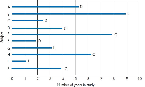
FIGURE 25-2 Figure 25-1 redrawn so all subjects have a common starting date.
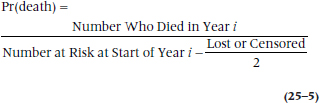
The next step is to figure out the probability of dying each year. This would be relatively simple to do if all we had to deal with were subjects who were alive at the start of each study year and the number who died. In that case, the probability of death would simply be:
To simplify writing our equation, let’s use the symbols:
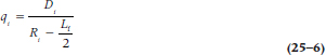
qi = Probability of death in Year i
pi = 1 − qi (i.e., the probability of survival in Year i)
Di = Number of persons who died in Year i
Ri = Number of subjects at risk starting Year i
So, we can rewrite Equation 25–3 as:
But, back to our machinations. What do we do with the people who were lost during the year? If we gather follow-up data only at discrete intervals, we wouldn’t know exactly when they were lost and thus aren’t sure for what length of time they were at risk. Do we say that they were at risk for the whole year, or should we drop them entirely at the beginning of the year? For example, Subject G in Figure 25–2 dropped out of sight some time between the start of Year 3 and the start of Year 4. We can either attribute a full year of risk to this subject (Year 3 to Year 4), or limit his time at risk to the end of Year 3. To say he was at risk for the entire year assumes he lived all 12 months. In reality, he may have died one minute after New Year’s Eve.9 In this case, we have “credited” him with 12 extra months of life, which would then underestimate the death rate. On the other hand, to drop him entirely from that year throws away valid data; we know that he at least made it to the beginning of Year 3, if not to the end.
What we do is make a compromise. If we don’t know exactly when a subject was lost or censored, but we know it was sometime within the interval, we count him as half a person-year (or whatever interval we’re using). That is, we say that half a person got through the interval, or putting it slightly differently and more logically, the person got through half the interval. In a large study, this compromise is based on a fairly safe assumption. If deaths occur randomly throughout the year, then someone who died during the first month would be balanced by another who died during the last, and the mean duration of surviving for these people is six months. On average, then, giving each person credit for half the year balances out. So, if we abbreviate the number of people lost (i.e., truly lost or censored) each year as Li, we can rewrite Equation 25–3 as:
TABLE 25–2 Number of subjects at risk, who died, and were lost each year
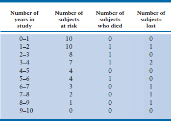
TABLE 25–3 Data for all subjects in the DEATH trial
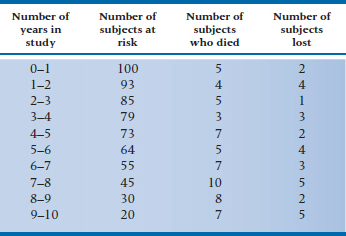
TABLE 25–4 Life-table based on data in Table 25–3
or, in statistical shorthand:
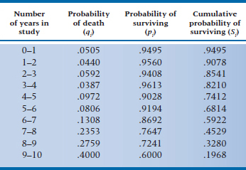
To give ourselves more data to play with, let’s assume that these 10 people were drawn from a larger study, with 100 people in each group. The (fictitious) data for subjects in the DEATH condition are in Table 25–3. Now, using Equation 25–6 with the data in Table 25–3, we can make a new table (Table 25–4), giving (1) qi, the probability of death occurring during each interval, (2) the converse of this, pi, which is the probability of surviving the interval, and (3) Si, the cumulative probability of survival (which is also referred to as the survival function).10 Let’s walk through a few lines of Table 25–4 and see how it’s done.
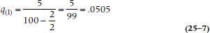
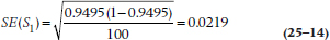
The first line of Table 25–3 (0–1 years in the study) tells us that there were 5 deaths and 2 losses. Using Equation 25–6, then, we have:
so the probability of death during Year 1 is slightly over 5%. Therefore, the probability of surviving that year, p1, which is (1 − q1), is 0.9495.11 The second year began with 93 subjects at risk (100 minus the 5 who died and 2 who were lost); 4 died during that year, and 4 were either truly lost or censored. Again, we use Equation 25–6, and get:
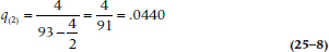
The probability of surviving Year 2 is (1 − 0.0440) = 0.9560. The cumulative probability of surviving Year 2 (S2) is the probability of surviving Year 1 (S1, which in this case is 0.9560) times the probability of surviving Year 2 (p2, which is 0.9560), or 0.9078.
What is the difference between p2 and S2? The first term (which is 1 minus the probability of dying in Year 2) is a conditional probability12; that is, it tells us that the probability of making it through Year 2 is 95.60%, conditional upon having survived up to the beginning of Year 2. However, not all the people made it to the start of the year; five died during the previous interval and two were lost. Hence the cumulative probability, S2, gives us the probability of surviving the second year for all subjects who started the study, whereas p2 is the probability of surviving the second year only for those subjects who started Year 2.
Now we continue to fill in the table for the rest of the intervals. If some of the intervals have no deaths, it’s not necessary to calculate qi, pi, or Si. By definition, qi will be 0, pi will be 1, and Si will be unchanged from the previous interval. Once we’ve completed the table, we can plot the data in the Si column (the survival function), which we have done in Figure 25–3. This is called, for obvious reasons, a survival curve.
THE KAPLAN-MEIER APPROACH TO SURVIVAL ANALYSIS
The Kaplan-Meier approach (KM; Kaplan and Meier, 1958), which is also called the product-limit method for reasons that will be spelled out later, is similar to the actuarial one, with four exceptions. First, rather than placing death within some arbitrary interval, the exact time of death is used in the calculations. Needless to say, this presupposes that we know the exact time.13 If all we know is that the patient died after the 2-year follow-up visit but before the 3-year visit, we’re limited to the actuarial approach.14 Second, instead of calculating the survival function at fixed times (e.g., every month or year of the study), it’s done only when an outcome occurs. This means that some of the data points may be close together in time, whereas others can be spread far apart. This then leads to the third difference; the survival curve derived from the actuarial method changes only at the end of an interval, whereas that derived from the KM way changes whenever an outcome has occurred. What this means is that, with the actuarial approach, equal steps occur along the time axis (X); but with the KM method, the steps are equal along the probability (Y) axis. You can usually tell what type of graph you’re looking at—if the steps along the X-axis are equal, it’s from an actuarial analysis; if the steps aren’t of equal length but most are of equal height, it’s from a KM analysis.
Last, subjects who are lost to follow-up because they are truly lost or due to censoring are considered to be at risk up to the time they drop out. This means that, if they withdraw at a time between two events (i.e., deaths of other subjects), their data are used in the calculation of the survival rate for the first event but not for the second. If we go back to Figure 25–2, one event occurred when Subject C died; the next when Subject D left us to sing with the choir invisible. Between these two times, Subject G dropped out of sight. So, Subject G’s data will be used when we figure out the survival rate at the time of C’s death, but not D’s.
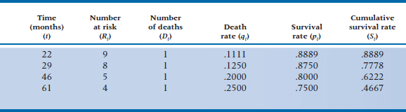
To show how this is done, let’s go back and use the data for the 10 subjects in Table 25–1. The first step is to rank order the length of time in the trial, flagging the numbers that reflect the outcome of interest (death, in this case), and indicate which ones are from people who were lost or censored. We’ve done this by putting an asterisk after the value for people who were lost or censored because of the termination of the study.
14* 22 29 37* 45* 46 61 76* 92* 111*
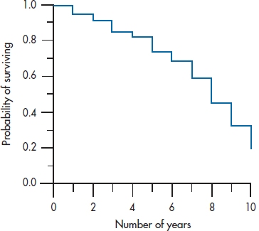
FIGURE 25-3 Survival curve for the data in Table 25-4.
Our life table (Table 25–5) would thus have only four rows; one for each of the four people who shucked their mortal coils. As a small point, notice that we used the subscript i in each column of Table 25–4. In Table 25–5 we’ve used t to indicate that we’re measuring an exact time, rather than an interval.
One person was lost before the first person died, so the number at risk at 22 months (the time of the first death) is only 9. At 46 months, 2 people had died and 3 were lost, so the number at risk is 5, and so on. Because we know the exact time when people were lost to the trial, we don’t have to use the fancy-shmancy correction in Equation 25–6 to approximate when they dropped out of sight. We can use Equation 25–4 to figure out the death rate, qt, as we did in Table 25–5.15
So, which technique do we use, the actuarial or the KM? When you have fewer than about 50 subjects in each group, the KM approach is likely somewhat more efficient, from a statistical perspective, because you’re using exact times rather than approximations for the outcomes. The downside of KM is that withdrawals occurring between outcomes are ignored; this is more of a problem when N > 50. However, in most cases the two approaches lead to fairly similar results, so go with whichever one is on your computer.16
The Hazard Function
Closely related to the term qi, the probability of dying in interval i, is something called the hazard
TABLE 25–5 Kaplan-Meier life-table analysis of the data in Table 25–1
The hazard function is the potential of occurrence of the outcome at a specific time, t, for those people who were alive up until that point.
Those in the area of demographics refer to this as the force of mortality. Whatever it’s called, the hazard is a conditional value; that is, it is conditional on the supposition that the person has arrived at time t alive. So, the hazard at the end of Year 4 doesn’t apply to all people in the group; only those who began Year 4. It isn’t appropriate to use for those who died before Year 4 began. When we plot the hazard for each interval of the study, we would call this graph the hazard function, which is usually abbreviated h(t).
There are a couple of things to note about the hazard function. First, we’ve used terms like “potential of occurrence” and “conditional value” and studiously avoided the term probability. The reason is that the hazard is a rate (more specifically, a conditional failure rate) and not a proportion. A proportion can have values only between 0 and 1, while the hazard function has no upper limit. Confusing the picture a bit, the hazard can be interpreted as a proportion with the actuarial method; but not with the KM approach. Second, the cumulative probability of surviving (Si), and hence the survival curve, can only stay the same or decrease over time. On the other hand, the hazard and the hazard function can fluctuate from one interval to the next. The hazard function for people from the age of 5 or so until the end of middle age17 is a flat line; that is, it’s relatively constant over the interval. On the other hand, the hazard function over the entire life span of a large group of people is a U-shaped function: high in infancy and old age, and low in the intermediate years. There are other possible hazard functions. For example, for leukemic patients who aren’t responsive to treatment, the potential for dying increases over time; this is called an increasing Weibull function. Conversely, recovery from major surgery shows a high perioperative risk that decreases over time; this is described as a negative Weibull function (Kleinbaum, 1996). However, the risk of giving you more information than you really want increases rapidly the more we talk about different hazard functions, so we’ll stop at this point.
SUMMARY MEASURES
There are a few measures we can calculate at this point to summarize what’s happening in each of the groups. Once we’ve plotted the survival curve, it is a simple matter to determine the median survival time. In fact, no calculation is necessary. Simply draw a horizontal line from the Y-axis where the probability of surviving is 50% until it intersects the curve, and then drop a line down to the X-axis. In this case, it is 8 years, meaning that subjects in the DEATH group live on average 8 years after entering the trial. The median survival time is also the time up to which 50% of the sample survives only if there were no censored data. Needless to say, we can complement the median survival time (which is a measure of central tendency, like the median itself) with an index of dispersion. As you well remember, the measure of dispersion that accompanies the median is the inter-quartile range, and we do that here by drawing two additional lines; one where the probability of surviving is 25% and the other where it is 75%.
Another summary measure involves the hazard, which, as we’ve described, can change over time. The average hazard rate  is the number of outcomes divided by the survival times summed over all the people in the group:
Average Hazard Rate
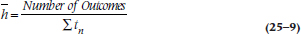
where tn means the survival time for each of the n people. Using the data in Table 25–1, where there were four deaths,  would be:
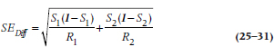
The Standard Error
It’s possible to calculate an SE for the survival function, just as we can for any other parameter. (Just to remind you, the survival function consists of the data in the Si column of Figure 25–3; or the St column of Table 25–5.) However, we’re limited to estimating it at a specific time, rather than for the function as a whole; that is, there are as many SEs as there are intervals (with the actuarial method) or times (with the KM approach). There are also several formulae, all of which are approximations of the SE and some of which are quite complicated. The formula most widely used in computer programs is the one by Greenwood, because it is the most accurate:
The SE of the Survival Function
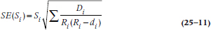
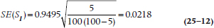
The equation is exactly the same for the KM approach; just use the terms with the subscript t rather than i. Let’s go back to Tables 25–3 and 25–4 to figure out the numbers. For Year 0–1, Si = 0.9495, and Ri = 100, and there were 5 deaths, so:
That was easy. Unfortunately, once we get beyond the first interval, the math gets a bit hairy, which is fine for computers but not for humans. For this reason, Peto and colleagues (1977) introduced an approximation that isn’t too far off and is much more tractable if we ever want to second-guess the computer:
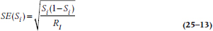
Plugging in the same numbers we get:
which, as you can see, isn’t very far off the mark. For Year 9–10, S10 = 0.1968 and R10 = 20:
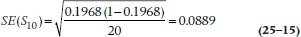
SE(S10) is larger than SE(S1) because the sample size is smaller. In general, then, as the intervals or times increase, so do the SEs, because the estimates of the survival function are based on fewer and fewer subjects.
Assumptions of Survival Analysis
During our discussion so far, we’ve made several assumptions; now let’s make them explicit.
An identifiable starting point. In this example, the starting point was easily identifiable, at least for those in the DEATH group: when subjects were enrolled in the study and began their five-part regimen. When the study looks at survival following some intervention under the experimenter’s control, there’s usually no problem in identifying the start for each subject. However, if we want to use this technique to look at the natural history of some disorder, such as how long a person is laid up with low-back pain, we may have a problem specifying when the problem actually began. Is baseline when the person first came to the attention of the physician; when he or she first felt any pain; or when he or she did something presumably injurious to the back? There are difficulties with each of these. For instance, some people run to their docs at the first twinge of pain, whereas others avoid using them at all costs. The other proposed starting points rely on the patients’ recall of events, which we know is notoriously inaccurate.18
Having a person enter a trial in the midst of an episode is referred to as left censoring,19 because now it is the left-hand part of the lines that have been cut off. Survival analysis has no problem dealing with right censoring, but left censoring is much more difficult to deal with, and so should be avoided if it’s at all possible. This injunction is similar to the recommendations for evaluating the natural history of a disorder—the participants should form an inception cohort (Guyatt et al. 1993, 1994). The important point is that, whatever starting point is chosen, it must be applied uniformly and reproducibly for all subjects.
A binary end point. Survival analysis requires an end-point that is well-defined and consists of two states that are mutually exclusive and collectively exhaustive (Wright, 2000). This isn’t a problem when the end point is death.20 However, we have problems similar to those in identifying a starting point if the outcome isn’t as “hard” as death (e.g., the reemergence of symptoms or the reappearance of a tumor). If we rely on a physician’s report or the patient’s recall, we face the prospect that a multitude of other factors affect these, many of which have nothing to do with the disorder. The more we have to rely on recall or reporting, the more error we introduce into our identification of the end point and hence into our measurement of survival time.
A second problem occurs if the end point can occur numerous times in the same person. Examples would include hospitalization, recurrence of symptoms, admission to jail, falling off the wagon following a drinking abstinence program, binge eating after a weight-loss program, and a multitude of others. The usual rule is to take the first occurrence of the outcome event, and then unceremoniously toss the subject out of the study. If the person is readmitted to the study and is thus represented in the data set more than once, this would violate the assumption that the events are statistically independent and would play havoc with any hypothesis testing (Wright, 2000).21
Loss to follow-up should not be related to the outcome. We’ve been assuming that the reason people were lost to follow-up is that they dropped out of the study for reasons that had nothing to do with the outcome (the assumption of independent censoring). They may have moved, lost interest in the study, or died for reasons that are unrelated to the intervention. If the reasons are related, then our estimation of the survival rate will be seriously biased, in that we’d underestimate the death rate and overestimate survival.
Determining if the loss is or isn’t related to the outcome is a thorny issue that isn’t always as easy to resolve as it first appears. If we’re studying the effectiveness of a combination of chemotherapy and radiation therapy for cancer, with the end point being a reappearance of a tumor, what do we do with a person who dies because of a heart attack, or who commits suicide, or even dies in an automobile accident?
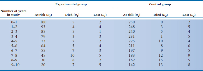
TABLE 25–6 Data for both groups in the DEATH trial
At first glance, these have nothing to do with the treatment. But, could the myocardial infarction have been due to the cardiotoxic effects of radiation? Could the person have committed suicide because she believed she was becoming symptomatic again and didn’t want to face the prospect of a lingering death? Was the accident due to decreased concentration secondary to the effects of the treatment? It’s not as easy to determine this as it first appeared. You may want to look at Sackett and Gent (1979) for an extended discussion on this point.
Note that this isn’t an issue for people who are lost because of right censoring; only for those who drop out or who are lost to follow-up for other reasons.
There is no secular trend. When we construct the life table, we start everyone at a common time. In studies that recruit and follow patients for extended periods, there could be up to a five-year span between the time the first subject actually enters and leaves the trial and when the last one does. We assume that nothing has happened over this interval that would affect who gets into the trial, what is done to them, and what factors influence the outcome. If changes have occurred over this time (referred to as secular changes22 or trends), then the subjects recruited at the end may differ systematically, as may their outcomes, from those who got in early. This could have resulted from changes in diagnostic practices (e.g., the introduction of a more sensitive test or a change in the diagnostic criteria), different treatment regimens, or even a new research assistant who codes things differently.
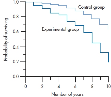
FIGURE 25-4 Survival curves for both groups in the DEATH study, from Table 25-6.
COMPARING TWO (OR MORE) GROUPS
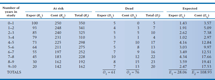
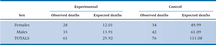
The survival curve in Figure 25–3 shows us what happened to people in the DEATH group. But, we began with the question of comparing the DEATH regimen with life as usual. Does adhering to all those precepts of Yuppiedom actually prolong life, or does it just make it feel that way? Because we anticipate that many people in the LAU group may become subverted by the blandishments of the promise of eternal life and drop out of the study, we oversampled and got 250 subjects to enroll in the LAU group. The data for both groups are presented in Table 25–6. The first four columns are the same as in Table 25–3, and the last three columns give the data for the subjects in the LAU condition.
The first thing we should do is draw the survival curves for the two groups on the same graph so we can get a picture of what (if anything) is going on (Figure 25–4). This shows us that DEATH may be living up to its name; rather than making people immortal, diet, exercise, bottled water, and the like may actually be hastening their demise.23 The survival curve for the DEATH group seems to be dropping at a faster rate than that for the LAU group. But is the difference statistically significant?
THE z-TEST
One approach to answering the question would be to compare the two curves at a specific point. To do this, using our old standby of the z-test, we have to assume that the cumulative survival rates of the two groups are normally distributed. So:
The z-test
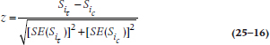
where  and
and  are the values of S (the cumulative probability of surviving) at some arbitrarily chosen interval i (or time, t, if we used the KM approach) for the Treatment (T) and Control (c) groups; and the SEs are the standard errors at that time for the two groups, calculated using Equations 25–11 or 25–13.
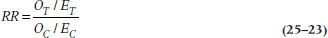
This method is quite easy to calculate and is very useful if we are interested in the difference in survival rates at one specific time, such as 5-year survival in cancer. An added advantage is that it is simple to determine the Relative Risk (RR) at this point. The RR is the ratio of the probability of having the outcome occur among subjects in one group versus the other. In this example, it would be the risk of expiring for people in the DEATH group relative to the LAU group. The formula for determining the RR is:
The Relative Risk at Interval i:
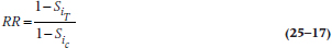
The z-test can also be applied to evaluate the significance of the RR.
The RR compares the survival functions of the two groups. We can similarly compare the hazard functions at a specific time. As the name implies, the hazard ratio (HR) is simply the ratio of the hazards at time i for the Treatment and Control groups:
The Hazard Ratio
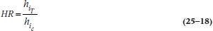
Although the HR isn’t an odds ratio, it’s interpreted in much the same way (Kleinbaum, 1996). An HR of 1 means the hazards are identical in both groups; an HR of 3 means the hazard in the Experimental group is 3 times that of the Control; and an HR of 0.5 means the hazard for the Experimental group is half that of the Control group. Because the RR deals with the survival function and the HR with the hazard function, as one goes up, the other goes down.
THE MANTEL-COX LOG-RANK TEST AND OTHERS
This approach, however,24 has two problems. The first involves intellectual honesty; you should pick your comparison time before you look at the data, ideally, before you even start the trial. Otherwise, there is a great temptation to choose the time that maximizes the difference between the groups. The second problem is more substantive, and involves the issues we discussed early in the chapter when we introduced the Survival Rate—we’ve ignored most of the data by focusing on one time point and, more specifically, we don’t take into account that the groups can reach the same survival rate in very different ways. A better approach would be to use all of the data. This is done by using the Mantel-Cox log-rank (or logrank) test, which is a modification of the Mantel-Haenszel chi-squared we ran into earlier (Cox, 1972; Mantel, 1966).25 Although it is a nonparametric test, it is more powerful than the parametric z-test because it is a whole-pattern test that uses all of the data. Indeed, one of the strengths of the log-rank test is that it makes no assumptions about the shape of the survival curves, and doesn’t require us to know what the shapes are (Bland and Altman, 2004).
As with most chi-squared tests, the log-rank test compares the observed number of events with the number expected, under the assumption that the null hypothesis of no group difference is true. That is, if no differences existed between the groups, then at any interval (or time), the total number of events should be divided between the groups roughly in proportion to the number at risk. For example, if Group A and Group B have the same number of subjects, and there were 12 deaths in a specific interval, then each group should have about 6 deaths. On the other hand, if Group A is twice as large as B, then the deaths should be split 8:4.
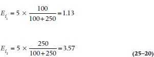
If we go back to Table 25–6, we see that there are 350 people at risk during the first interval: 100 in the DEATH group, and 250 in the LAU group. Because 28.6% of the subjects are in the DEATH regimen, and there were a total of 5 deaths during this interval, we would expect that 5 × 0.286 = 1.43 deaths would have occurred in this group, and 3.57 among the controls.26 The shortcut formula for calculating the expected frequency for Group k (where k = 1 or 2) at interval i is:
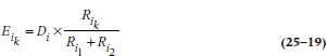
where Di is the total number of deaths.
Using this in the example we just worked out:
Doing this for each interval, we get a new table listing the observed and expected frequencies, as in Table 25–7.27 As a check on our (or the computer’s) math, the total of the observed deaths (61 + 76) should equal the sum of the expected ones (28.06 + 108.93), within rounding error. The last step, then, is to figure out how much our observed event rate differs from the expected rate. To do this, we use (finally!) the Mantel-Cox chi-squared:
TABLE 25–7 Calculating a log-rank test on the data in Table 25–6
The Mantel-Cox Chi-Squared
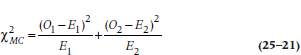
with 1 df. (Some texts subtract ½ from the value |(O − E)| before squaring. As we discussed, though, we question the usefulness of this correction for continuity.) If we had more than two groups, we would simply extend Equation 25–21 by tacking more terms on the end and using k − 1 df, where k is the number of groups.28 Let’s apply this to our data in Table 25–7:
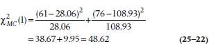
which is highly significant.
The RR can be figured out with the formula:
The Overall Relative Risk
For our data, this works out to be:
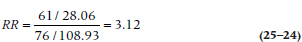
Because the chi-squared value was significant, we can go ahead and look at the RR. By convention, we disregard any RR under 2 as not being anything to write home about. This RR of 3.12 tells us that sticking to a strict healthy regimen is bad for your health—let’s go out and eat ourselves silly to celebrate!
The Mantel-Cox chi-squared is probably the best test of significance when one group is consistently higher than the other across time. If the survival curves cross at any point, even at the very beginning before going their separate ways, it’s unlikely to be significant (Bland and Altman, 2004). When the group differences are larger at the beginning of the study than later on, the Breslow test (which is a generalized Wilcoxon test) is more sensitive; and the Tarone-Ware test (Tarrone and Ware, 1977) is best if the differences aren’t constant over time or if the curves intersect (Wright, 2000).
ADJUSTING FOR COVARIATES
After having gone to all this trouble to demonstrate the log-rank test, it would be a pity if we could use it only to compare two or more groups. In fact, it does have more uses, mainly in testing for the possible effects of covariates. If we thought, for example, that men and women may react to the regimen differently, then we could divide the two groups by sex and do a survival analysis (either actuarial or KM) for these two (or more29) strata. If the covariate were continuous, such as age, we could split it at the median or some other logical place (despite our constant injunctions to not turn continuous variables into categorical or ordinal ones). Taking the covariate into consideration involves an “adjustment” that takes place at the level of the final chi-squared, where we use the strata-adjusted expected frequencies. Let’s assume that we divided each group by sex and had the computer redo the calculations for Table 25–7 two times: once for females divided by experimental condition (DEATH vs LAU), and again for males split the same way. Table 25–8 shows what we found. Using these new figures in Equation 25–21 gives us:
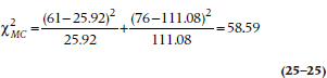
TABLE 25–8 Survival time of the two groups stratified by sex
which is larger than the unadjusted log-rank test, telling us that the DEATH way of life did indeed affect the two sexes differently.
There are a few problems with this way of going about things, though. First, each time we split the groups into two or more strata, our sample size in each subgroup drops. Unless we have an extremely large study, then, we’re limited as to the number of covariates we can examine at any one time. The second problem, which we mentioned in the previous paragraph, is that we may be taking perfectly good interval or ratio data and turning them into nominal or ordinal categories (e.g., converting age into <40 and ≥ 40 years). This is a good way to lose power and sensitivity. Last, although we can calculate the statistical significance of adjusting for the prognostic factor(s) (that is, the covariates), we don’t get an estimate for the magnitude of the effect.
What we need, then, is a technique that can (1) handle any number of covariates, (2) treat continuous data as continuous, and (3) give us an estimate of the magnitude of the effect; in other words, an equivalent to an analysis of covariance for survival data. With this build-up, it’s obvious that such a statistic is around and is the next topic we tackle. This technique is called the Cox proportional hazards model (Cox, 1972).
Let’s go back to the definition of the hazard:
The hazard at time t, ht, is the potential of an event at time t, given survival (no event) up to time t.
The proportional hazards model extends this to read:
The proportional hazard is the potential of an event at time t, given survival up to time t, and for specific values of prognostic variables, X1, X2, etc.
In the example we did illustrating the Mantel-Cox chi-squared, it would be the probability of death at time t (or interval i), given that the person was male or female. With our new, enhanced technique, the prognostic variable can be either discrete (e.g., sex) or continuous (such as age), and we can have several of them (age and sex).30 So, to be more precise, instead of having just one X, we can have several, X1, X2, and so on, with each X representing a different prognostic variable. However, let’s stick to just one variable now to simplify our discussion.
The major assumption we make is that the effects of the prognostic variables depend on the values of the variables and that these values do not vary over time; in other words, that the prognostic variables are time-independent. That is, we assume that the values of the Xs for a specific person don’t change over the course of the study. Gender (for the vast majority of people, at least) remains constant, as does the presence of most chronic comorbid disorders. Age is a bit tricky; it naturally increases as the trial goes on, but it does so at a constant rate for all participants; and its effect on survival depends primarily on its value at baseline. So, it’s usually considered to be a time-independent variable (Kleinbaum, 1996). On the other hand, if people’s weights fluctuate considerably, and this fluctuation differs among people and affects the outcome, then weight is time-dependent, and the proportional hazards assumption wouldn’t be met. Later, we’ll discuss how to assess this assumption.
The proportional hazard consists of two parts: a constant, c, which depends on t and tells us how fast the curve is dropping; and a function, f, that is dependent on the covariate, X. Needless to say, f gets more complex as we add more covariates to the mix. Putting this into the form of an equation, we can say:
The proportional hazard at time t for some specific value of X = (some constant that depends on t) times (some function dependent on X)
and writing it in mathematical shorthand, we get:
The Proportional Hazard

where the symbol (t | X) means a value of t given (or at some value of) X.
Now let’s start using it with some data. To keep the number of subjects manageable, we’ll use the 10 subjects in the DEATH group we first met in Table 25–1. In Table 25–9, we’ve added one covariate, Age, and ranked the subjects by their time in the study, because we’ll use the KM method.
The first death occurred at 22 months and was Subject F (let’s call her the index case for this calculation). All of the other people were in the study at least 22 months, with the exception of Subject I, who was lost to follow-up after 14 months. The next step is to figure out the probability of Subject F dying at 22 months, versus the probabilities for the other people at risk. She was a tender 28 years of age, so her probability of death at 22 months after starting the regimen is c (22) × f (28).
TABLE 25–9 Outcomes of the first 10 subjects
We31 now repeat this procedure in turn for all of the other people who died, each of them in turn becoming the index case. In each calculation, we include in the denominator only those people who were still in the study at the time the index case went to his or her eternal reward; that is, those still at risk. We don’t include those who were already singing with the angels or those whose data were censored before the time the index case died.
When we’re finally done with these mind-numbing calculations, what we’ve got32 for each person is some expression, or function, involving the term f. Multiplying all of the expressions together gives us the overall probability of the observed deaths. Now the fun begins.
Those of you who are still awake at this juncture may have noticed that we’ve been talking about the term f without ever really defining it. Based on both fairly arcane statistical theory as well as real data,33 the distribution of deaths over time can best be described by a type of curve called exponential, and is shown in Figure 25–5. This occurs when the hazard function is a flat line; more events occur early on when there are more people at risk, and then the number tapers off as time goes on because there are fewer people left in the study. In mathematical shorthand, we write the equation for an exponential curve as:
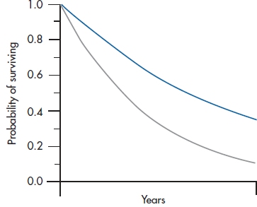
FIGURE 25-5 Two examples of exponential curves.

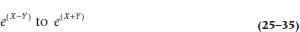
where e is an irrational number34 which is the base of the natural logarithm and is roughly equal to 2.71828. Another way of writing this to avoid superscripts is: y = exp(−kt). What this equation means is that some variable y (in this case, the number of deaths) gets smaller over time (that’s why the minus sign is there). The k is a constant; it’s what makes the two curves in Figure 25–5 differ from one another. All of this is an introduction for saying that the f in our equation is really exp(−kX); X is the specific value of the covariate we’re interested in (age, in this case), and we’ve gone through all these calculations simply to determine the value of k.
The computer now goes through its gyrations and comes up with an answer. Let’s say it tells us that k is −0.02, with an associated p level of .03. First, the p tells us that the effect of age is significant: older people have a different rate of dying than those who are less chronologically challenged.35 Knowing the exact value of k, we can compare the RRs at any two times. For example, to compare those who are 40 years old with those who are 60, we simply calculate:
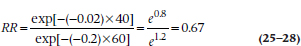
This gives us the press-stopping news that people who are 40 years of age had only two-thirds the risk of dying as those who are 60 years old.
When we have more than one covariate, we have a number of k terms, one for each. If we were to write out the exponent for, say, three predictors, it would look like:
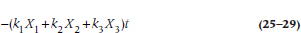
which should look familiar; it’s basically a multiple regression, where the ks are equivalent to the βs, and with a time factor, t, thrown in.
So, to reiterate, the proportional hazards model allows us to adjust for any number of covariates, whether they are discrete (e.g., sex or use of Feng Shui) or continuous (e.g., age or amount of red wine consumed every day). Another reason for the popularity of the Cox model is that it is robust. Even if we don’t know what the shape is of the hazard function (e.g., exponential, Weibull), the Cox model will give us a good approximation; that is, it’s a “safe” choice (Kleinbaum, 1996). The only drawback is that, to get relatively accurate estimates of the standard errors associated with the coefficients, larger sample sizes are needed than for the actuarial or KM methods (Blossfeld et al, 1989; Cox, 1972).
TESTING FOR PROPORTIONALITY
So, how do we know if our data meet the assumption of proportional hazards? There are a couple of ways; visual and mathematical. One visual method consists of plotting the hazard functions for the groups over time. If the lines are parallel, the assumption is met; if they diverge or cross, as in Figure 25–6, we don’t have proportionality.
Another visual technique is a log-log (or log-minus-log) plot. For mathematical reasons we won’t bother to go into here,36 we take the logarithm of the survival function (S), change the sign of the result (because it will be negative, and you can’t take the log of a negative number), and then take the log of that again (hence the name “log-log” and the reason for the “minus” in the alias) for two or three values of the covariate and plot the results. If the log-log plot of the data is close to the log-log plot of the expected line of the survival curve for each group, we’re fine; otherwise, we have problems.
Appealing and simple as these techniques are (at least if you’re a computer), there are a couple of problems. First, how parallel is parallel; or how close is close enough? If the lines are perfectly parallel or if they cross, the answer is fairly obvious. For anything in between, though, we have to make a judgment call, and one person’s “close enough” may be another person’s “that ain’t gonna cut it.” Fortunately, Kleinbaum (1996) says the assumption of proportional hazards is “not satisfied only when plots are strongly discrepant” (p. 146). A second problem is that these approaches are fine if the covariate has only two or three values. When we’re dealing with a continuous covariate, such as age, we have to divide it into a few categories, with all the problems that entails.
The mathematical approach uses a goodness-of-fit chi-squared (χ2GOF) test, with df = 1. As with all χ2 tests, it evaluates how closely the data conform to expected values. With the traditional χ2, the expected values are those that arise under the null hypothesis that there’s no association between two variables, so we naturally want χ2 to be large, and p to be less than .05. With χ2GOF, though, we’re seeing how far the data deviate from some theoretical model that we’ve proposed, so we don’t want it to be significant; in fact, the less significant, the better.
So, which do we use? Actually, it’s a good idea to use all. If the graphs look sort of parallel and close, and χ2GOF is not significant, we’re in good shape. If they disagree, use your judgment.
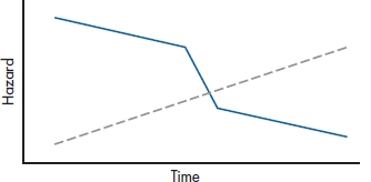
FIGURE 25-6 Because the hazard functions cross, the assumption of proportional hazards is not met.
CONFIDENCE INTERVALS
We’ve calculated a lot of different parameters in this section: differences in proportions surviving, hazard ratios, and the like. Jealous creatures that they are, each of them demands its own CI, so we’ll dip into Gardner and Altman’s (1989) book again and dig out a few of them.
In Equation 25–11, we calculated the SE for the survival function at time i. The 95% CI around it is the old standby:

For the difference between survival proportions at any time, we naturally have to start with the SE for the difference between two proportions, P1 and P2, each with a given number of people at risk, R1 and R2:
and the 95% CI is:

For the hazard ratio (h), it’s a bit messier. First, we have to calculate two new values, X and Y:
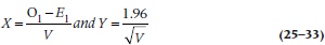
where V is:
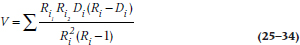
and finally (Yes!), the CI is:
SAMPLE SIZE AND POWER
As is usual in determining the required sample size for a study, we have to make some estimate of the magnitude of the effect size that we wish to detect. For the t-test, the effect size is the ratio of the difference between the groups divided by the SD. In survival analysis, the effect size is the ratio of the hazards, q, at a given time, such as five or 10 years. If we call this ratio δ (delta), then the number of events (deaths, recurrences, readmissions, or whatever) we need in each group can be figured out with an equation proposed by George and Desu (1974):
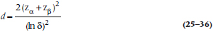
where the term “ln δ” means the natural logarithm of δ. To save you the hassle of having to work through the formula, we’ve provided sample sizes for various values of δ in Table L in the book’s appendix.
Remember that these aren’t the sample sizes at the start of the study; they’re how many people have to have outcomes. To figure out how many people have to enter the trial, you’ll have to divide these numbers by the proportion in each group you expect will have the outcome. So, if you’re planning on a two-tailed α of .05, a β of .20, and δ of 2, Table L says you’ll need 33 events per group. If you expect that 25% of the subjects in the control group will experience the outcome by the time the study ends, then you have to start with (33 ÷ 0.25) = 132 subjects. A different approach to calculating sample sizes, based on the difference in survival rates, is given by Freedman (1982), who also provides tables.
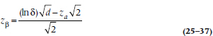
To determine the power of a trial after the fact, we take Equation 25–36 and solve for zβ. For those who care, this gives us:
A minor problem arises if the number of outcomes (d) is different in the two groups. If this happens, the best estimate of the average number of events in the two groups can be derived using the formula for the harmonic mean:
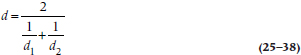
For example, if Group 1 had 13 events at the end, and Group 2 had 20, we would have:
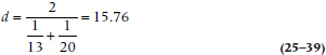
so we would use 15.76 (or 16) for d.
REPORTING GUIDELINES
The most crucial information you want to report is the survival curve. If there are two or more groups, be sure that the lines for them are clearly distinguishable (don’t use different colors for a journal article; journals don’t do color). When you’re comparing groups, you should report (1) the hazard ratio; (2) its confidence interval; (3) the statistical test between the groups (e.g., the log-rank test); (4) its exact p level; and (5) some indication of the survival in each group, such as the median survival time or the survival probabilities at a particular time.
EXERCISES
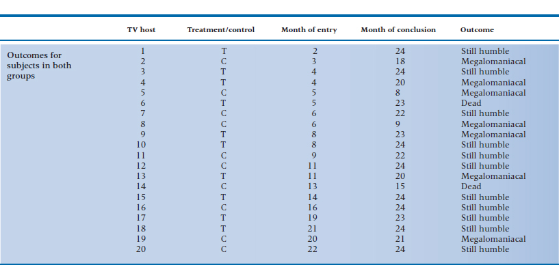
Television executives are becoming worried that, at one point or another, all TV talk-show hosts become afflicted with a case of terminal megalomania and think they are as powerful as the Assistant Junior Vice President in Charge of Washroom Keys. To slow the onset of this insidious condition, the executives try an experiment. They hire a group of television psychologists37 to give half of the 20 hosts a course in Humbleness 10138 and have the other half serve as the controls. The outcome is any 5-minute interval where the host says “I,” “me,” or “my” more than 15 times; a sure sign that the course did not work or that its effects are wearing off.
Because the course is a grueling one, the company can take in only one or two people each month over the 2 years of the study. Also, some of the hosts are killed off by irate viewers, crashes in their Lamborghinis, or enraged Assistant Junior Vice Presidents in Charge of Washroom Keys. The data for the experiment are shown in the accompanying table.
1. Draw an actuarial curve for these data.
2. What test would you use to determine whether your treatment works?
3. What would your data look like if you simply approached it with a contingency table chi-squared?
4. What is the SE at 6 to 7 months for the control group?
5. What is the relative risk at 18 months? (If you cheated on your homework and didn’t work out the table for the experimental group, pE = .567.)
How to Get the Computer to Do the Work for You
Actuarial Method
From Analyze, choose Survival → Life Tables
Click on the variable in the left column that indicates the time since entry into the study, and click the arrow to move it into the Time box
Fill in the boxes in the Display Time Intervals area. In the first box (0 through ❏), fill in the last interval you want analyzed. In the second box (by ❏), enter 1 if you want to analyze every interval, 2 for every other interval, and so on
Click on the variable in the left column that indicates the outcome for that case, and move it into the Status area with the arrow button
Click the
 button
The default is Single Value. Enter the number that indicates that an outcome has occurred (all other values will be treated as censored data)
If you have two or more groups, you can analyze each group separately by moving the variable that defines group membership into the Factor box
By clicking the
 button, you can elect to display the survival function or the hazard function, or both.
Click
 and then
Kaplan-Meier Method
From Analyze, choose Survival → Kaplan-Meier
The rest is identical to the Actuarial Method
Cox Proportional Hazards Method
From Analyze, choose Survival → Cox Regression
Then follow the instructions for the Actuarial Method, except now you can enter the name of the covariate(s) into the Covariates box or analyze categorical data by strata by entering the name of the variable into the Strata box
1 This means that subjects are enrolled over a period of time. In a study of alcohol abuse, the phrase may have a secondary (and perhaps more accurate) definition.
2 If they are killed by an enraged spouse after the discovery of an affair with the personal trainer, this criterion may not hold.
3 That means that the data toward the right of the graph were cut off because the study ended before the subjects reached the designated end point; it doesn’t mean they were silenced by conservative moralists.
4 Obviously, life is a high-risk proposition.
5 We recently uncovered a Web page that contained this egregious error. They looked at 391 dead rock musicians, and discovered that they lived an average of only 39.6 years. Their conclusion was that the Lord was punishing them for messing around with drugs and loose women. They forgot to count the many thousands of rock stars who were still alive (including Keith Richards, who only looks dead).
6 Despite the underlying assumption in the DEATH condition, the mortality rate is 100% if we wait long enough.
7 In fact, the risk of contracting Salmonella or E. coli 0157:H7 is much higher among people using unpasteurized juices or honey; eating “natural” foods may lead to unnatural deaths..
8 It is indeed a sobering thought that being alive merely means you are at risk of death
9 Obviously, because he was overdosing on bottled water, when he should have been drinking red wine and benefiting from its cardioprotective effects.
10 In some texts (and in the previous editions of this one), this was abbreviated as Pi. Some people (including us), however, had problems differentiating pi from Pi, so we’ve adopted the other commonly used symbol, Si, where S stands for Survival.
11 Although having only 100 subjects would not normally support accuracy to four decimal places, we use four because these quantities will be multiplied with others many times. Fewer decimal places will lead to rounding errors which would be compounded as we march along.
12 If you feel a bit shakey about conditional probabilities go back and read Chapter 5.
13 Note that “exact” is an inexact term. It may mean knowing the time of death within hours, if we are dealing with an outcome that may occur soon after enrollment (e.g., a trial of a treatment for hemorrhagic fever), or within weeks for diseases such as cancer or cystic fibrosis.
14 Patients are notorious for not letting investigators know when they die. This is one of the hazards of clinical research and explains why investigators such as B. F. Skinner preferred using pigeons. Other reasons include the fact that, if you don’t like the results, you can have squab for dinner and start again the next day with a new batch of subjects.
15 The calculations for the KM method involve multiplying (i.e., getting the product) of the terms up to the limit of the last outcome; hence its alias, the product-limit method.
16 And how’s that for statistical pragmatism?
17 A term defined as five years older than us.
18 For some examples of just how bad recall of health events can be, see the extremely good and highly recommended book, Health Measurement Scales (2014). Oh, by the way, did we mention that it’s by Streiner and Norman?
19 By analogy to right censoring, left censoring would also mean making all those rabid ultra-conservative radio talk show hosts finally shut up and get a real job.
20 This state, however, may be hard to recognize in some tenured professors and long-serving politicians, when signs of life may appear only when the bar opens in the afternoon.
21 There are programs that can handle this, but they’re highly specialized and not found in the major commercial packages.
22 We presume as opposed to “ecclesiastical changes,” which affect only members of the clergy.
23 If the acronym DEATH didn’t alert you to our views about a “lifestyle” based on the precepts of the Age of Aquarius, suely these fictitious results will.
24 Why does there always seem to be a “however” whenever something appears simple?
25 We can’t use the Mantel-Haenszel chi-squared because it assumes that the chi-squared tables we’re summing across are independent. They aren’t truly independent in survival analysis because the number of people at risk at any interval is dependent on the number of people at risk during the previous intervals. That’s a long answer for a question you didn’t ask.
26 We’ll not deal with the existential question of how there can be a fraction of a death.
27 In reality, we let the computer do this for us. After all, that’s why they were placed on this earth.
28 Don’t even think of asking why this is also called the log-rank test, as no logs or ranks appear in it. But since you did ask, there is a version that does use logs and ranks, but the results are equivalent.
29 We know; we know. To do this, we’d have to differentiate between “sexual orientation” and “gender.” However, we’re not going there.
30 No, the two are not mutually incompatible.
31 Or, more accurately, the computer, as no rational being would ever want to do this by hand, except to atone for some otherwise unpardonable sin, such as reading another stats book.
32 Aside from a headache.
33 For a change, both theory and facts give the same results.
34 An irrational number is simply one that cannot be created by the ratio of two numbers. No aspersions are being cast on its mental stability.
35 For such findings, Nobel prizes are rarely awarded
36 If you want the messy details, see the excellent book by Kleinbaum (1996).
37 They used to be pet psychologists until the market went to the dogs.
38 The motto of this company is, “The most important thing is sincerity. Once you learn to fake that, the rest is easy.”
Stay updated, free articles. Join our Telegram channel

Full access? Get Clinical Tree


