AND
CORRELATION
CHAPTER THE THIRTEENTH
Simple Regression and Correlation
The previous section dealt with ANOVA methods, which are suitable when the independent variable is nominal categories and the dependent variable approximates an interval variable. However, there are many problems in which both independent and dependent variables are interval-level measurements. In these circumstances (with 1 independent variable) the appropriate method is called simple regression and is analogous to one-way ANOVA.
SETTING THE SCENE
You notice that many of the Yuppie patients in your physiotherapy clinic appear to suffer from a peculiar form of costochondrotendonomalaciomyalagia patella (screwed-up knee), apparently brought on by the peculiar shift patterns of the BMW Series 17. You investigate this new syndrome further by developing an index of Yuppiness, the CHICC score, and attempting to relate it to range-of-motion (ROM) of the knee. But CHICC score and ROM are both continuous variables. You could categorize one or the other into High, Medium, and Low and do an ANOVA, but this would lose information. Are there better ways?
BASIC CONCEPTS OF REGRESSION ANALYSIS
The latest affliction keeping Beverly Hills and Palm Springs physiotherapists employed is a new disease of Yuppies. The accelerator and brake of the BMW Series 17 are placed in such a way that, if you try any fancy downshifting or upshifting, you are at risk of throwing your knee out—a condition that physiotherapists refer to as costochondrotendonomalaciomyalagia patella (Beemer Knee for short). The cause of the disease wasn’t always that well known until an observant therapist in Sausalito noticed this new affliction among her better-heeled clients and decided to do a scientific investigation. She examined the relationship between the severity of the disease and some measure of the degree of Yuppiness of her clients. She could have simply considered whether they owned a series 17 BMW, but she decided to also pursue other sources of affluence. Measuring the extent of disease was simple—just get out the old protractor and measure ROM.
But what about Yuppiness? After studying the literature on this phenomenon of the 1980s, she decided that Yuppiness could be captured by a CHICC score, defined as follows:
CARS—Number of European cars + number of off-road vehicles − number of Hyundai Elantras, Toyota Corollas, or Chrysler Caravans.
HEALTH—Number of memberships in tennis clubs, ski clubs, and fitness clubs.
INCOME—Total income in $10,000 units.
CUISINE—Total consumption of balsamic vinegar (liters) + number of types of mustard in refrigerator.
CLOTHES—Total of all Gucci, Lacoste, and Saint Laurent labels in closets.
CHICC and ROM are very nice variables; both have interval properties (actually, ROM is a true ratio variable). Thus we can go ahead and add or subtract, take means and SDs, and engage in all those arcane games that delight only statisticians. But the issue is, How do we test for a relationship between CHICC and ROM?
Let’s begin with a graph. Suppose we enlisted all the suffering Yuppies in Palm Springs.1 We find 20 of them, all claiming some degree of Beemer Knee, and measure CHICC score and ROM. The data might look like Figure 13–1. At first glance, it certainly seems that some relationship exists between CHICCC and ROM—the higher the CHICC, the less the ROM.2 It also seems to follow a straight-line relationship—we can apparently capture all the relationship by drawing a straight line through the points.
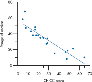
FIGURE 13-1 Relation between range of motion (ROM) and CHICC score in 20 Yuppies.
Before we vault into the calculations, it might be worthwhile to speculate on the reasons why we all agree3 on the existence of some relationship between the two variables. After all, the statistics, if done right, should concur with some of our intuitions. One way to consider the question is to go to extremes and see what conditions would lead us to the conclusion that (1) no relationship or (2) a perfect relationship exists.
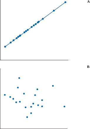
FIGURE 13-2 Graphs indicating A, a perfect relationship and B, no relationship between two variables.
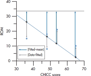
FIGURE 13-3 Relation between ROM and CHICC score (enlarged).
Examine, if you will, Figure 13–2. Seemingly, the relationship depicted in the upper graph is as perfect as it gets. To the untrained eye (yours, not ours), Y is perfectly predictable from X—if you know one, you know the other. By contrast, even a sociologist would likely give up on the lower graph because of the lack of an apparent association between the two variables.4
Two reasons why we might infer a relationship between two variables are (1) the line relating the two is not horizontal (i.e., the slope is not zero). In fact, one might be driven to conclude that the stronger the relationship, the more the line differs from the horizontal. Unfortunately, although this captures the spirit of the game, it is not quite accurate. After all, we need only create a new ROM, measured in tenths of degrees rather than degrees, to make the slope go up by a factor of 10. (2) Perhaps less obviously, the closer the points fall to the fitted line, the stronger the relationship. That’s why we concluded there was a perfect linear relationship on the top left of Figure 13–2. The straight-line relationship between CHICC and ROM explained all the variability in ROM.
Actually, both observations contain some of the essence of the relationship question. If we contrast the amount of variability captured in the departures of individual points from the fitted line with the amount of variability contained in the fitted function, then this is a relative measure of the strength of association of the two variables.
To elaborate a little more, consider Figure 13–3, where we have chosen to focus on the narrow window of CHICC scores between 30 and 70, which were extracted from the original data of Figure 13–1. Now the signal (there’s that ugly word again!) is contained in the departure of the fitted data from the grand mean of 33.5. The noise is contained in the variability of the individual data about the corresponding fitted points.
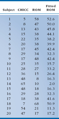
TABLE 13–1 CHICC scores and range of motion for 20 Palm Springs Yuppies
If this is not starting to look familiar, then you must have slept through Section II.5 We could apply the same, now almost reflex, approach of calculating a Sum of Squares (Signal) based on deviations of the fitted points from the grand mean and a Sum of Squares (Noise) based on deviations of individual data from the corresponding fitted points.
One mystery remains, however, before we launch into the arcane delights of sum-of-squaring everything in sight. In several locations we have referred to the fitted line rather glibly, with no indication of how one fits such a line. Well, the moment of reckoning has arrived. For openers, you must search through the dark recesses of your mind to retrieve the formula for a straight line, namely:

where a is the intercept, the value of Y when X is equal to zero, and b is the slope, or the amount of change in Y for one unit of change in X.
Let’s rewrite the equation to incorporate the variables of interest in the example and also change “a” and “b” to “b0” and “b1”:

That funny-looking thing over ROM goes by the technical name of “hat,” so we would say, “ROM hat equals …” It means that for any given value of CHICC, the equation yields an estimate of the ROM score, rather than the original value. So, a ^ over any variable signifies an estimate of it.
Still, the issue remains of how one goes about selecting the value of b0 and b1 to best fit the line to the data. The strategy used in this analysis is to adjust the values in such a way as to maximize the variance resulting from the fitted line, or, equivalently, to minimize the variance resulting from deviations from the fitted line. Now although it sounds as if we are faced with the monumental task of trying some values, calculating the variances, diddling the values a bit and recalculating the values, and carrying on until an optimal solution comes about, it isn’t at all that bad. The right answer can be determined analytically (in other words, as a solvable equation) with calculus.
Unfortunately, no one who has completed the second year of college ever uses calculus, including ourselves, so you will have to accept that the computer knows the way to beauty and wisdom, even if you don’t.6 For reasons that bear no allegiance to Freud, the method is called regression analysis7 and the line of best fit is the regression line. A more descriptive and less obscure term is least-squares analysis because the goal is to create a line that results in the least square sum between fitted and actual data. Because the term doesn’t sound obscure and scientific enough, no one uses it.
The regression line is the straight line passing through the data that minimizes the sum of the squared differences between the original data and the fitted points.
Now that that is out of the way, let’s go back to the old routine and start to do some sums of squares. The first sum of squares results from the signal, or the difference between the fitted points and the horizontal line through the mean of X and Y.8 In creating this equation, we call Ŷ the fitted point on the line that corresponds to each of the original data; in other words, Ŷ is the number that results from plugging the X value of each individual into the regression equation.

This tells us how far the predicted values differ from the overall mean, analogous to the Sum of Squares (Between) in ANOVA.
The second sum of squares reflects the difference between the original data and the fitted line. This looks like:

This is capturing the error between the estimate and the actual data, analogous to the Sum of Squares (Within) in ANOVA. It should be called the error sum of squares, or the within sum of squares, but it isn’t—it’s called the Sum of Squares (Residual), expressing the variance that remains, or residual variance, after the regression is all over.
To make this just a little less abstract, we have actually listed the data used in making Figure 13–1 in Table 13–1. On the left side is the calculated CHICC score for each of the afflicted, in the middle is the corresponding ROM, and on the right is the fitted value of the ROM based on the analytic approach described above (i.e., plugging the CHICC score in the equation and estimating ROM).
As an example of the looks of these sums of squares, the Sum of Squares (Regression) has terms such as:
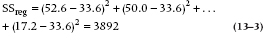
and the Sum of Squares (Residual) has terms such as:
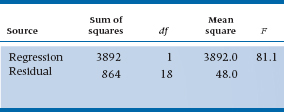
To save you the anguish, we have worked out the Sum of Squares (Regression) and Sum of Squares (Residual) and have (inevitably) created an ANOVA table, or at least the first two columns of it (Table 13–2).
However, the remaining terms are a bit problematic. We can’t count groups, so it is a little unclear how many df to put on each line. It’s time for a little logic. The idea of df is the difference between the number of data values and the number of estimated parameters. The parameters were means up until now, but the same idea applies. We have two parameters in the problem, the slope and the intercept, so it would seem that the regression line should have 2 df. The residual should have (n − 2 − 1) or 17, to give the usual total of (n − 1), losing 1 for the grand mean. Almost, but not quite. One of the parameters is the intercept term, and this is completely equivalent to the grand mean, so only 1 df is associated with this regression, and (n − 1 − 1) with the error term.
Now that we have this in hand, we can also go on to the calculation of the Mean Squares and, for that matter, can create an F-test. So the table now looks like Table 13–3. The p-value associated with the F-test, in a completely analogous manner, tells us whether the regression line is significantly different from the horizontal (i.e., whether a significant relationship exists between the CHICC score and ROM). In this case, yes.
B’S, BETAS AND TESTS OF SIGNIFICANCE
While the ANOVA of regression in Table 13–3 gives an overall measure of whether or not the regression line is significant, it doesn’t actually say anything about what the line actually is—what the computed value of b0 and b1 are. Typically, these values are presented in a separate table, like Table 13–4.
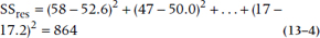
The first column of numbers is just the estimates of the coefficients that resulted from the minimization procedure described in the last section. The second, labeled Standard Error (or SE), requires some further discussion. For the slope, which is what we usually are most worried about, it turns out that the SE is related to the Mean Square (Residual), MSRes. The square root of MSRes, called S(Y|X) (the standard error of Y given X), is just the standard deviation of the deviations between the original data and the fitted values; the bigger this is, the more error there is going to be in the estimate of the slope. But there are a couple of other things coming into play. First, as usual, the larger the sample size, the smaller the SE, with the usual  relation. And the more dispersion there is in the X-values, the better we can anchor the line, so this error term in inversely related to the standard deviation of the X-values. The actual formula is:
TABLE 13–2 ANOVA table for CHICC against ROM (step 1)
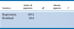
TABLE 13–3 ANOVA table for CHICC against ROM (step 2)
where Sx is the standard deviation of the X-values. The SE associated with the intercept is similar, but a bit more complicated. Since we rarely care about it, we’ll not go into any more detail.
The column labelled β (beta) is called a Standard Regression Coefficient; like a z-score, this expresses the coefficient in standard deviation units. We’ll talk more about it in the next chapter. Finally, the table contains a t-test, which actually has the same form as all the other t-tests we’ve encountered; it’s just the ratio of the coefficient to its SE.
TABLE 13–4 Regression Coefficient and Standard Errors for CHICC against ROM
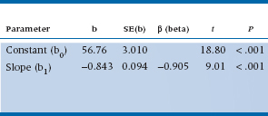
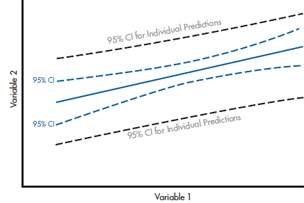
FIGURE 13-4 The 95% CI around the regression line (blue) and the 95% CI for predicting the score of a single individual (grey).
There’s another consistency lurking in the table as well. After all, the test of the significance of the regression line is the test of the significance of the slope. Fortunately, it works out this way. The F-test from Table 13–3 is just the square of the t-test, and the p-values are exactly the same.
THE REGRESSION LINE: ERRORS AND CONFIDENCE INTERVALS
While we’re pursuing the idea of errors in slopes and intercepts, there are a couple of other ways to think about it. If we think about the graph of the data in Figure 13–1, we can imagine that the fitted line, with its associated errors, actually looks more like a fitted band, where the true value of the line could be anywhere within the band around our computed best fit. Further, while it’s tempting to think that this band might just be like a ribbon around the fitted line, with limits as two other parallel lines above and below the fitted line, this isn’t quite the case. There is error in both the slope and intercept; this means that as the slope varies, it’s going to sweep out something like a Japanese fan around the point on the graph corresponding to the mean of X and Y. In other words, we have the best fix on the line where most of the points are, at the center, and as we move toward the extremes we have more and more error.
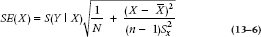
Putting the two ideas together, then, the confidence interval around the fitted line is going to be at a minimum at the mean and spread out as we get to high and low values (where there are fewer subjects), as shown by the dotted blue lines in Figure 13–4. The actual equation is a pretty complicated combination of things we’ve seen before: the SE of the residuals, S(Y|X), the sample size, and an expression involving the standard deviation of the Xs. The standard error of the line at any point X, is
where  is the variance of the X-values. So, the SE is at a minimum when X is at the mean, equal to
  , and it gets bigger proportional to the square of the distance from X to the mean.
The confidence interval is just this quantity multiplied by the t-value, on either side of the fitted line:

So this fancy formula ends up describing a kind of double-trumpet-shaped zone around the fitted line, which is the (1 − α)% confidence interval around the line.
If you go back to Figure 13–4, you’ll see another CI, much broader, around the regression line. This is the CI for predicting the DV for a single individual. It’s wider than the CI for the line for the same reason that the CIs are wider at the ends—sample size. There’s more error associated with the prediction of the score for one person with a given set of values of the predictor variable(s) than for a group of people with the same values.
THE COEFFICIENT OF DETERMINATION AND THE CORRELATION COEFFICIENT
All is well, and our Palm Springs physiotherapist now has a glimmer of hope concerning tenure. However, we have been insistent to the point of nagging that statistical significance says nothing about the magnitude of the effect. For some obscure reason, people who do regression analysis are more aware of this issue and spend more time and paper examining the size of effects than does the ANOVA crowd. One explanation may lie in the nature of the studies. Regression, particularly multiple regression, is often applied to existing data bases containing zillions of variables. Under these circumstances, significant associations are a dime a dozen, and their size matters a lot. By contrast, ANOVA is usually applied to experiments in which only a few variables are manipulated, the data were gathered prospectively at high cost, and the researchers are grateful for any significant result, no matter how small.
We have a simple way to determine the magnitude of the effect—simply look at the proportion of the variance explained by the regression. This number is called the coefficient of determination and usually written as R2 for the case of simple regression. The formula is:
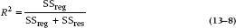
This expression is just the ratio of the signal (the sum of the squares of Y accounted for by X) to the signal plus noise, or the total sum of squares. Put another way, this is the proportion of variance in Y explained by X. For our example, this equals 3892 ÷ (3892 + 864), or 0.818. (If you examine the formula for eta2 in Chapter 8, this is completely analogous.)
R2, the coefficient of determination, expresses the proportion of variance in the dependent variable explained by the independent variable.
The square root of this quantity is a term familiar to all, long before you had any statistics course—it’s the correlation coefficient:
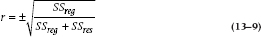
Note the little ± sign. Because the square of any number, positive or negative, is always positive, the converse also holds: the square root of a positive number9 can be positive or negative. This is of some value; we call the correlation positive if the slope of the line is positive (more of X gives more of Y) and negative if, such as in the present situation, the slope is negative. So the correlation is 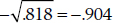 . One other fact, which may be helpful at times (e.g., looking up the significance of the correlation in Table G in the Appendix), is that the df of the correlation is the number of pairs −2.
The correlation coefficient is a number between −1 and +1 whose sign is the same as the slope of the line and whose magnitude is related to the degree of linear association between two variables.
We choose to remain consistent with the idea of expressing the correlation coefficient in terms of sums of squares to show how it relates to the familiar concepts of signal and noise. However, this is not the usual expression encountered in more hidebound stats texts. For completeness, we feel duty-bound to enlighten you with the full messy formula:
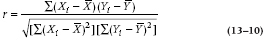
Because we can write  as xi, and
  , this can also be written as:
However messy this looks, some components are recognizable. The denominator is simply made up of two sums of squares, one for X and one for Y. If we divide out by an N here and there, we would have a product of the variance of X and the variance of Y, all square-rooted.
The numerator is a bit different—it is a cross-product of X deviations and Y deviations from their respective means. Some clarification may come from taking two extreme cases. First, imagine that X and Y are really closely related, so that when X is large (or small) Y is large (or small)—they are highly correlated. In this case, every time you have a positive deviation of X from its mean, Y also deviates in a positive direction from its mean, so the term is (+) × (+) = +. Conversely, small values of X and Y correspond to negative deviations from the mean, so this term ends up as (−) × (−) = +. So if X and Y are highly correlated (positively), each pair contributes a positive quantity to this sum. Of course, if X and Y are negatively correlated, large values of X are associated with small values of Y, and vice versa. Each term therefore contributes a negative quantity to the sum.
Now imagine there is no relationship between X and Y. Now, each positive deviation of X from its mean would be equally likely to be paired with a positive and a negative deviation of Y. So the sum of the cross-products would likely end up close to zero, as the positive and negative terms cancel each other out. Thus, this term expresses the extent that X and Y vary together, so it is called the covariance of X and Y, or cov (X, Y).
The covariance of X and Y is the product of the deviations of X and Y from their respective means.
The correlation coefficient, then, is the covariance of X and Y, standardized by dividing out by the respective SDs. So, yet another way of representing it is:
Incidentally, of historical importance, this version was derived by another one of the field’s granddaddies, Karl Pearson. Hence it is often called the Pearson Correlation Coefficient. This name is used to distinguish it from several alternative forms, in particular the Intraclass Correlation. Its full name, used only at black-tie affairs, is the Pearson Product Moment Correlation Coefficient. Whatever it’s called, it is always abbreviated r.
INTERPRETATION OF THE CORRELATION COEFFICIENT
Because the correlation coefficient is so ubiquitous in biomedical research, people have developed some cultural norms about what constitutes a reasonable value for the correlation. One starting point that is often forgotten is the relationship between the correlation coefficient and the proportion of variance we showed above—the square of the correlation coefficient gives the proportion of the variance in Y explained by X. So a correlation of .7, which is viewed favorably by most researchers, explains slightly less than half the variance; and a correlation of .3, which is statistically significant with a sample size of 40 or 20 (see Table G in the Appendix), accounts for about 10% of the variance.
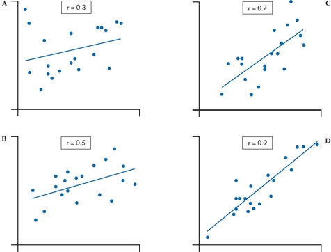
FIGURE 13-5 Scatter plots of with correlations A, .3; B, .5; C, .7; and D, .9.
Having said all that, the cultural norms now reestablish themselves. In some quarters, such as physiology and some epidemiology, any correlation of .15, which is statistically significant with a sample size of about 400, is viewed with delight. To maintain some sanity, we have demonstrated for you how correlations of different sizes actually appear.10 In Figure 13–5, we have generated data sets corresponding to correlations of .3, .5, .7, and .9. Our calibrated eyeball says that, even at .9, a lot of scatter occurs about the line; conversely, .3 hardly merits any consideration.11
Another way to put a meaningful interpretation on the correlation is to recognize that the coefficient is derived from the idea that X is partially explaining the variance in Y. Variances aren’t too easy to think about, but SDs are—they simply represent the unexplained scatter. So a correlation of 0 means that the SD of Y about the line is just as big as it was when you started; a correlation of 1 reduces the scatter about the line to zero. What about the values in the middle—how much is the SD of Y reduced by a given correlation? We’ll tell you in Table 13–5.
TABLE 13–5 Proportional reduction in standard deviation of Y for various values of the correlation
| Correlation | SD (Y | X) ÷ SD (Y)* |
| .1 | .995 |
| .3 | .95 |
| .5 | .87 |
| .7 | .71 |
| .9 | .43 |
*The expression (Y | X) is read as “Y given X,” and means the new value of the standard deviation of Y after the X has been fitted.
What Table 13–5 demonstrates is that a correlation of .5 reduces the scatter in the Ys by about only 13%, and even a correlation of .9 still has an SD of the Ys that is 43% of the initial value! It should be evident that waxing ecstatic and closing the lab down for celebration because you found a significant correlation of .3 is really going from the sublime to the ridiculous.
There’s a third way to get some feel for the magnitude of a correlation. If we take only those people who score above the median on X, where do they fall on Y? If the correlation between X and Y is 0, then the score on one variable doesn’t affect the score on the other, so we’d expect that half of these people would be above the median on Y, and half would be below. Similarly, if the correlation were 1.0, then all of the people who are above the median on X would also be above the median on Y. Unfortunately, the relationship isn’t linear between r = 0 and r = 1; the actual relationship is shown in Figure 13–6.
Bear in mind when you’re trying to make sense of the relative magnitudes of two correlations that r is not scaled at an interval level. A correlation of 0.6 is larger than one of 0.3, but it is not twice as large. However, the coefficient of determination (r2 for a simple correlation, R2 for simple and multiple regression) is on ratio scale, so that an r2 of 0.50 is twice as large as an r2 of 0.25. In the next section, we’ll discuss a transformation that puts r on a ratio scale.
One last point about the interpretation of the correlation coefficient. If there is one guiding motto in statistics, it is this: CORRELATION DOES NOT EQUAL CAUSATION! Just because X and Y are correlated, and just because you can predict Y from X, and just because this correlation is significant at the .0001 level, does not mean that X causes Y. It is equally plausible that Y causes X or that both result from some other things, such as Z. If you compare country statistics, you find a correlation of about −.9 between the number of telephones per capita and the infant mortality rate. However much fun it is to speculate that the reason is because moms with phones can call their husbands or the taxis and get to the hospital faster, most people would recognize that the underlying cause of both is degree of development.
Simple as the idea is, it continues to amaze us how often it has been ignored, to the later embarrassment (we hope) of the investigators involved. For example, amidst all the hoopla about the dangers of hypercholesterolemia, one researcher found that hypocholesterolemia was associated with a higher incidence of stomach cancer and warned about lowering your triglyceride levels too much. It turned out that he got it bass-ackwards—the cancer can produce hypocholesterolema. Closer to home, several studies showed an association between an “ear crease” in the earlobe and heart disease. Lovely physiologic explanations have been made of the association—extra vascularization, an excess of androgens, etc. However, in the end, it turned out that both ear creases and coronary artery disease are strongly associated with obesity, and the latter is a known and much more plausible risk factor.
CONFIDENCE INTERVALS, SIGNIFICANCE TESTS, AND EFFECT SIZE
Making r Normal
With other parameters we’ve calculated, such as the mean, it’s fairly straightforward to figure out the SE and then the 95% CI. Would that life were that simple here. Unfortunately, as we’ve said, Pearson’s r is not measured on an interval scale and therefore is not normally distributed, which can lead to two problems: the CIs won’t be accurate; and for large correlations, the upper bound of the CI may exceed 1.0. We have to proceed in three steps: (1) transform the r so that its distribution is normal; (2) figure out the SE and CI on the transformed value; and (3) “untransform”12 the answers so that they’re comparable with the original correlation. Fisher worked out the equation for the transformation, so not too surprisingly, it’s called Fisher’s z′. We can either use Equation 13–13 and do the calculations (it’s not really that hard with a calculator), or use Table P in the Appendix:
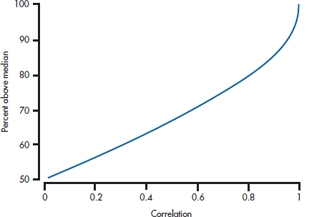
FIGURE 13-6 Percentage of people above the median on one variable who are above the median on the second variable, for various magnitudes of the correlation.
and the SE of z′ is simply:
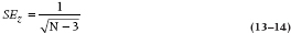
where N is the number of pairs of scores. Note that the SE is independent of anything happening in the data—the means, SDs, or the correlation itself.
Confidence Intervals
Now the 95% CI is in the same form that we’ve seen before:
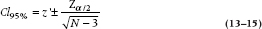
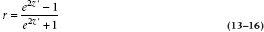
where zα/2 = 1.96 for the 95% CI if N is over 30; if it isn’t, use the table for the t-tests, with N − 3 df. Now we have to take those two z′-values and turn them back into rs, for which we use Equation 13–16 or Table Q in the Appendix:
So for our example, where r = .904,
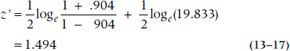
which means that the two ends of the interval are:
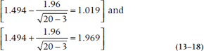
Getting those back into rs gives us:
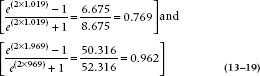
so the 95% CI for the correlation is [0.769, 0.962]. Note the CI is symmetric around the z′-score, but isn’t around the value of r. It’s symmetrical when r is 0.50, but for all other values, it’s shorter at the end nearer to 0 or 1.
To see if the correlation is significantly different from 0, we first need the SE of r, which is:
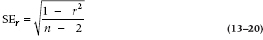
which in our case is:
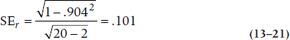
As with the SE for z′, it doesn’t depend on means or SDs, only the correlation and the sample size. The test for statistical significance is a run-of-the-mill t-test; the parameter divided by the SE, with df = N − 2:
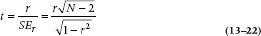
which is equal to .904 + .101 = 8.95.
For completeness, you may recall an earlier situation where we indicated that an F-value with 1 and N df was equal to the squared t-value. This case is no exception; the equivalent F-value is 8.952, which is just about the value (within rounding error) that emerged from our original ANOVA (Table 13–3).
Effect Size
Having just gone through all these calculations to test the significance of r, we should mention two things. First, you can save yourself a lot of work by simply referring to Table G in the Appendix. Second, testing whether an r is statistically different from 0.00 is, in some ways, a Type III error—getting the correct answer to a question nobody is asking. We have to do it to keep journal editors happy and off our backs, but the important question is rarely if r differs from zero; with a large enough sample size, almost any correlation will differ from zero. The issue is if it’s large enough to take note of. Here we fall back on the coefficient of determination we discussed earlier; simply square the value of r. As a rough rule of thumb, if r2 doesn’t even reach 0.10 (that is, an r of 0.30 or so), don’t bother to call us with your results.
In fact, r is itself a measure of effect size. The problem is that it’s on a different scale from d, the ES for t-tests. r is constrained between −1 and +1 (although as an index of ES we can ignore the sign), whereas d has no upper limit. So, how can we compare them? Actually, it’s quite simple; we use the formulae that Cohen (1988) kindly gave us:
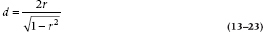
to get from r to d, and
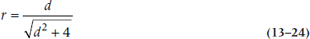
to get from d to r.
SAMPLE SIZE ESTIMATION
Hypothesis Testing
In the previous chapters on ANOVA and the t-test, we determined the sample size required to determine if one mean was different from another. The situation is a little different for a correlation; we rarely test to see if two correlations are different. However, a more common situation, particularly among those of us prone to data-dredging, is to take a data base, correlate everything with everything, and then see what is significant to build a quick post-hoc ad-hoc theory. Of course, these situations are built on existing data bases, so sample size calculations are not an issue—you use what you got. However, the situation does arise when a theory predicts a correlation and we need to know whether the data support the prediction (i.e., the correlation is significant). When designing such a study, it is reasonable to ask what sample size is necessary to detect a correlation of a particular magnitude.
The sample size calculation proceeds using the basic logic of Chapter 6—as do virtually all sample size calculations involving statistical inference. We construct the normal curve for the null hypothesis, the second normal curve for the alternative hypothesis, and then solve the two z equations for the critical value. However, one small wrinkle makes the sample size formula a little hairier, and it revealed itself in Equation 13–20 earlier. The good news is that the SEs of the distribution are dependent only on the magnitude of the correlation and the sample size, so we don’t have to estimate (read “guess”) the SE.13 The bad news is that the dependence of the SE on the correlation itself means that the widths of the curves for the null and alternative hypotheses are different. The net result of some creative algebra is:
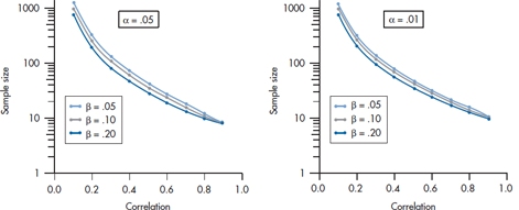
FIGURE 13-7 Sample size for correlation coefficients related to magnitude of the correlation and ɑ and β level.
To avoid any anguish putting numbers into this equation, and also to reinforce the message that such calculations are approximate, we have put it all onto a graph (actually the two graphs in Figure 13–7).
To read these families of curves, first decide what the α level is going to be: .05 or .01; α = .05 puts you on the left graph; α = .01 puts you on the right. Next, pick a β level from .05 to .20, which orients you on one of the three curves on each graph. The next guess is related to how big a correlation you want to declare as significant, which puts you somewhere on the X-axis. Finally, read off the approximate sample size on the Y-axis.
REPORTING GUIDELINES
Reporting the results of a correlation follows the model we used for the t-test or ANOVA in that you must give: (1) the value of r, (2) the df, and (3) the value of p. It’s not necessary to report a separate effect size, though, since r or r2 are ES measures. So, it’s very simple:

If the correlation is negative, be sure to include the minus sign; the direction of the correlation is as important as its magnitude. Also, if you’re submitting to a journal that follows American Psychological Association format, omit the zero to the left of the decimal point; numbers that cannot exceed 1 do not have leading decimals.
SUMMARY
Simple regression is a method devised to assess the relationship between a single interval level independent variable and an interval level dependent variable. The method involves fitting an optimal straight line based on minimizing the sum of squares of deviations from the line. The adequacy of fit can be expressed by partitioning the total variance into variance resulting from regression and residual variance. The proportion of variance resulting from the independent variable is expressed as a correlation coefficient, and significance tests are derived from these components of variance.
EXERCISES
1. Two studies are conducted to see if a relation exists between mathematics ability and income. Study 1 uses 100 males, ages 21 to 65, drawn from the local telephone book. Study 2 uses the same sample strategy but has a sample size of 800. What will be the difference between the studies in the following quantities?
2. Study 3 uses the sample size as 2, but the men are sampled from subscribers to Financial Times. Now what will happen to these estimates?
3. An analysis of the relationship between income and SNOB (Streiner-Norman Obnoxious Behavior) scores among 50 randomly selected men found a Pearson correlation coefficient of 0.45. Would the following design changes result in an INCREASE, DECREASE, or NO CHANGE to the correlation coefficient:
a. Increase the sample size to 200
b. Select only upper-echelon executives
c. Select only those whose SNOB scores are more than +2 SD above or less than −2 SD below the mean
How to Get the Computer to Do the Work for You
- From Analyze, choose Correlate → Bivariate
- Click the variables you want from the list on the left, and click the arrow to move them into the box labeled Variables
- Click

If you want to see a scatterplot, then:
- From Graphs, choose Scatter
- If it isn’t already chosen, click on the box marked Simple, then select the
 button
- Select the variable you want on the X-axis from the list on the left, and click the X Axis arrow
- Do the same for the Y-axis
- Click

1 We would likely have to go outside Palm Springs. The “Y” in Yuppie stands for young, and everybody in Palm Springs is over 80, or looks it because of the desert sun. It’s the only place on earth where they memorialize you in asphalt (Fred Waring Drive, Bob Hope Drive, Frank Sinatra Drive) before you are dead.
2 Once again, we have broken with tradition. Most relationships are depicted so that more of one gives more of the other. We could have achieved this, of course, with some algebra, but we decided to make you do the work. Now the bad news—no wall mirror will save you; you have to stand on your head.
3 One good reason is that the teacher says so. When we were students, this never held much appeal; strangely, now it does.
4 Graphs such as the one on top are as rare as hen’s teeth in biomedical research; the graph on the bottom is depressingly common.
5 A not uncommon experience among readers of statistics books; however, we had hoped the dirty jokes would reduce the soporific effect of this one.
6 The key to the solution resides in the magical words maximum and minimum. In calculus, to find a maximum or minimum of an equation, you take the derivative and set it equal to zero, then solve the equation, equivalent to setting the slope equal to zero. The quantity we want to maximize is the squared difference between the individual data and the corresponding fitted line. To get the best fit line, this sum is differentiated with respect to both b0 and b1, and the resulting expression is set equal to zero. This results in two equations in two unknowns, so we can solve the equations for the optimal values of the b.
7 The real reason it’s called “regression” is that the technique is based on a study by Francis Galton called “Regression Toward Mediocrity in Hereditary Stature.” In today’s language, tall people’s children “regress” to the mean height of the population. (And one of the authors is delighted Galton discovered that persons of average height are mediocre; he always suspected it).
8 The reason for examining differences from the horizontal line is clear if we project the data onto the Y-axis. The horizontal through the mean of the Ys is just the Grand Mean, in our old ANOVA notation, and we are calculating the analogue of the Sum of Squares (Between). Another way to think of it is—if no relationship between X and Y existed, then the best estimate of Y at each value of X is the mean value of Y. If we plotted this, we’d get a horizontal line, just as we’ve shown.
9 Note that the coefficient of determination should not be less than zero because it is the ratio of two sums of squares. It can happen, when no relationship exists, to have an estimated sum of squares below zero; this is due simply to rounding error. Usually, it is then set equal to zero.
10 If people took Section I seriously, this demonstration would not be necessary. However they don’t, so it is.
11 We ‘fess up. You don’t have to track our own CVs very far back to find instances where we were waxing ecstatic in print about pretty low correlations. Those are the circles we move in.
12 No, there isn’t such a word, but there should be.
13 Those of us who have developed sample size fabrication (oops, estimation) to an art form regard this as a disadvantage because it reduces the researcher’s df.
Stay updated, free articles. Join our Telegram channel

Full access? Get Clinical Tree


