CHAPTER THE TWENTY-SIXTH
Measures of Impact
This chapter introduces you to measures of “how much” of something—how many people have a disorder at any given time, how much greater a risk some people have than others, and how many people have to be treated to benefit just one.
SETTING THE SCENE
Although your beloved authors are known as statisticians (or at least as writers of statistics books, which isn’t necessarily the same thing), we take pride in the fact that we have introduced a number of hitherto unknown disorders to an unsuspecting world, including Somaliland Camelbite Fever, Beemer Knee, and the Pathetic Male Syndrome. To this, we can now add MHE – Malignant Hypertrophy of the Ego. This dread disease, which is highly prevalent among film stars, politicians, hospital administrators, deans, and neurosurgeons, is marked by an enhanced feeling of entitlement, with starting all sentences with “I” (or, even worse, the imperial “We”), and the demand for outrageous salaries. Because these people often suffer egregious injury at the hands of the great unwashed (i.e., the rest of us), their rates of injury and death are higher than average. How can we quantify this, and measure the effects of any treatments meant to alleviate MHE?
In the classic Marx Brothers movie, A Day at the Races, Dr. Hugo Z. Hackenbush (played by Groucho) wants to bet on a horse race. He buys a tip sheet from Tony, the “Tutsi Fruitsi Ice Cream Man” (played by Chico), but discovers that it’s in code, so he has to buy a code book to decipher it. However, in order to understand the code book, he now has to buy a master code book. But, that’s of no use until he buys the breeder’s guide (two volumes) which, needless to say, is useless without the 10-volume jockeys’ guide. By the time he’s done, the race is over, and the horse he initially wanted to bet on had won.1 Why do we mention this? Because before you can learn about measures of impact, you’ll have to learn a bit about epidemiology, and before you can learn about that, you’ll need to know something about surveys. So, we’re in the same boat as Dr. Hackenbush—one thing just leads to another.
COUNTING THE LIVE BODIES: INCIDENCE AND PREVALENCE
The first thing we have to do is figure out how widespread this scourge is; how many people have MHE? We can answer this in a number of ways—how many people develop it within a given time (incidence), and how many people have it now (prevalence). Well, actually, we have to do something even before this (remember Dr. Hackenbush?) and that’s to do a study to get these numbers. So, let’s do one. We’ll randomly sample 1,000 people, determining whether they meet or have ever met the criteria for MHE. If the answer is Yes, we’ll also try to find out when the disorder started and when, if ever, it was cured. The results of our research are shown in Figure 26–1.
Incidence
As you can see, there are 15 people who met the criteria. Of these, four (C, G, I, and N) developed the disorder during the window. So, we say that the incidence, or the number of new cases within a given time period, is:
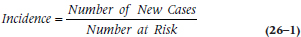
which in our case is:
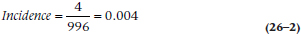
and which we can write as either 0.004 or 4 per 1,000. If the incidence is even lower than this, we can say it’s x per 10,000 or even x per 100,000 people per year.
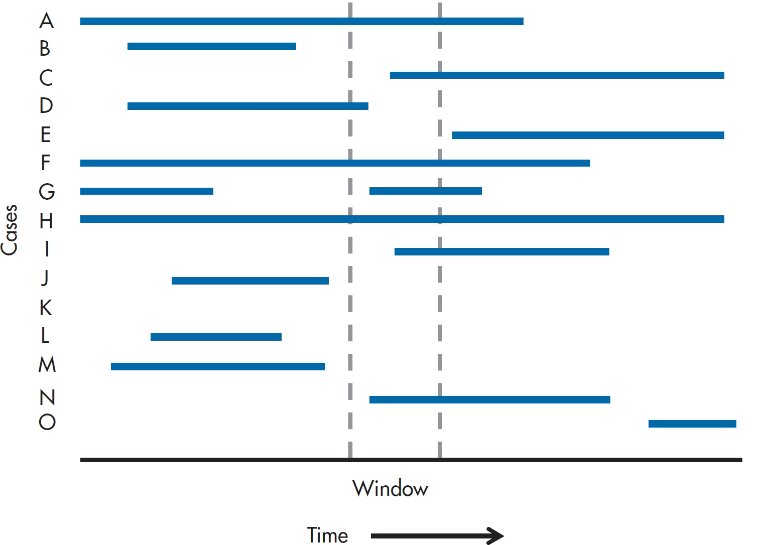
FIGURE 26-1 Cases of Malignant Hypertrophy of the Ego in a sample of 1,000 people.
You may wonder why we’re dividing by 996 rather than 1,000. The reason is that four people (A, D, F, and H) already had the disorder at the opening of the window, so they’re not at risk for developing it.
Does this seem simple and straightforward? Well, let’s complicate things a bit and ask the question, Who’s at risk? There’s no doubt about egotists C, I, and N—they never had MHE before, and developed it during the sampling window, so they are definitely incident cases. But what about G? He had it previously, so should he be considered at risk, or is this just a reemergence of an existing problem (and he therefore should be eliminated from both the numerator and the denominator)? The answer is Yes. The problem is that when people first started looking at incidence and prevalence, this issue didn’t exist. They were studying diseases that either killed you outright (like cholera or the plague), granted you life-long immunity against getting it again (measles), or lasted until you died of it or something else (syphilis). But there are many disorders that don’t show these patterns; you can get them many times, like the common cold, or the symptoms wax and wane over time, such as multiple sclerosis (MS). If you had a cold last year2 and got one again this year, it’s fairly safe to assume it’s a brand new episode. On the other hand, even if the overt symptoms of MS disappear for a while, the underlying disease hasn’t gone away, and we wouldn’t say that the reemergence of symptoms means that you got the disorder for a second time. So, it comes down to our understanding3 of the condition: is it permanent or temporary? Often we don’t know, and have to adopt arbitrary rules, such as, “It’s the same episode if the last one ended less than x months ago; and a new one if it has been more than x months.” For the sake of our calculations, we’ll assume that for person G, it’s a new episode.
Prevalence
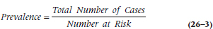
With that out of the way, let’s turn to prevalence of a disorder, which is the total number of cases—new and pre-existing—within a given time frame:
which is:
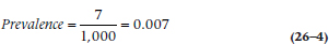
since there are seven people who had the disorder in the window.
Unfortunately, this raises another issue: how wide is the window? In keeping with the precision of our previous answers, we’ll respond: “As wide or as narrow as we want it to be.” We’d like it to be as narrow as possible, so that we can say, “On this specific day, the prevalence was….” This is known as point prevalence, since it’s the prevalence at one point in time. Most often, though, that’s impractical for a number of reasons. First, a respondent may be able to say that she came down with something within the last month or so, but doesn’t remember exactly when; or that it was over at some time within a time frame. Also, it may be difficult to survey all of the sample in a short period. So, we usually use period prevalence, with a window of one month (often used for short-lived disorders like the flu), or six months or a year for longer-lasting or chronic conditions.
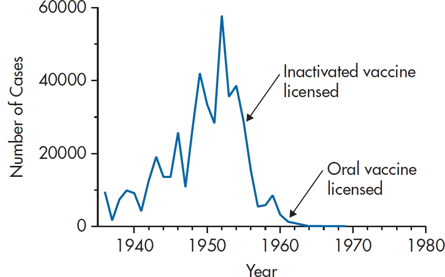
FIGURE 26-2 Number of incident cases of polio in the United States between 1935 and 1980.
When to Use Each
Incidence and prevalence data give us different information. For example, Figure 26–2 shows the number of incident cases of polio in the U.S. between 1935 and 1980. A couple of things jump out. First, it virtually disappeared from the scene by 1962. Second, the incidence was already decreasing by the time the inactivated vaccine was introduced, and the oral vaccine came on the scene during the final act. So, incidence data are extremely useful for indicating the time course of outbreaks, and can lead to hypotheses about cause.
But, these data are of little use if you’re in charge of a rehabilitation hospital.4 What you want to know is how many cases are going to show up on your doorstep, irrespective of when the problem began, and according to the Centers for Disease Control and Prevention, there are still about 640,000 paralytic polio survivors. So, if you’re interested in need for service, it’s prevalence that you want, not incidence.
INDICES OF RISK—THE RELATIVE RISK, ODDS RATIO, AND OTHERS
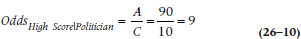
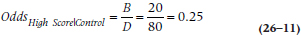
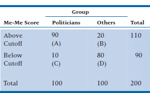
Now that we have a bit of a handle on how widespread the problem of MHE actually is, let’s see if we can figure out what leads to it and what, if anything, can make it go away. We discussed two of these measures—the odds ratio and the relative risk—in Chapter 15, but now we’ll go into them in greater depth. Yet again, we’ll do a study. We suspect that those who suffer from MHE will be more likely to run for office than those who don’t go into politics, so we’ll gather two cohorts5—100 people who scored above the cut-off on the Modified Extended Measure of Egotism (the Me-Me) scale while they were in university, and 100 who scored below it. Then we’ll wait a couple of years and see how many people in each group have been elected to office6 and how many went into honest professions; the results are shown in Table 26–1.
TABLE 26–1 Number of people above and below the cutoff on the Me-Me Scale who ended up in politics.
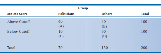
Relative Risk
What is the “risk” of the adverse outcome (becoming an elected politician) if your score is above the cutoff? It would be the number of people elected (cell A) divided by the total number of people who scored high (cells A + B). This is the absolute risk (AR) of the exposed group. More formally:
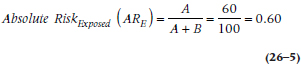
(We presume that the number in cell A isn’t higher because the other high-scorers became deans, neurosurgeons, or actors.) Similarly, the risk if you have a low score would be cell C divided by cells C + D, or:
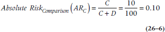
That means that the relative risk (RR) is the ratio of the risks:
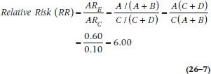
Put into English, that means that if you have a high score on the Me-Me scale, your risk of being elected is six times higher than if you scored in the normal range. More generally, it’s the increased (if the RR > 1) or decreased (an RR < 1) risk of some outcome, given the presence of some risk factor.
A note about terminology. If we were to do a study looking at the effect of some intervention in reducing MHE in a group of egotists, and the outcomes were either “cured” or “not cured,” we could analyze the data in terms of either outcome. It would make sense to talk about a relative risk when we focus on the “not cured” outcome, but it seems strange to talk about the “risk” of a good outcome (“cured”)—we usually associate the term “risk” with some adverse event. In that case, we can simply use the term “benefit” and go ahead and calculate all the statistics in the same way.
Absolute and Relative Risk Reduction
There are times, admittedly rare, when the names of indices tell you exactly what they are. Two of those blessed indices are the absolute risk reduction (ARR) and relative risk reduction (RRR).
The ARR is simply the difference in the absolute risks for the two groups:
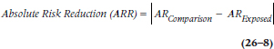
Those vertical lines mean that we use the absolute value—we ignore the minus sign if ARExposed is larger than ARComparison. The real beauty of this simple index will become apparent when we discuss another, more useful, index, the number needed to treat (stay tuned).
The relative risk reduction is:
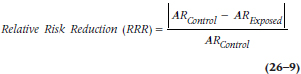
People find the RRR easier to interpret than the ARR; RRR of 50%, for example, means that the risk of a bad outcome has been cut in half in the treatment group compared to the comparison group. The problem, though, is that the RRR may be misleading because it depends on the level of risk in the comparison group. If the control group has a low rate of bad events to begin with (e.g., the risk of death in mildly hypertensive or hypercholesterolemic people), then the RRR may look impressive even when the treatment doesn’t do very much.
Odds Ratio
A slight detour into epidemiology. What we described was a cohort study,7 in which people were selected on the basis of a putative cause or exposure and then followed over time to determine how many in each group had the outcome of interest. Sometimes, though, we have to work in the opposite direction—sample people who do and do not have the outcome, and see how many in each group have the risk factor of interest. This is called a case-control study, and is usually done when the outcome is rare.8 So, let’s find a group of 100 politicians (the cases) and 100 non-politicians (the controls), administer the Me-Me scale to them, and see how many in each group score above and below the cut-off; these results are in Table 26–2.
We could charge ahead and calculate a relative risk, but that would be a mistake. The reason is that in a cohort study (and in a randomized, controlled trial), the ratios of cell A to cell B, and of cell C to cell D, are a function of the strength of the exposure variable (or of the intervention in an RCT). If the effect of the exposure is strong, then there will be more people in A relative to B. But in a case-control study, the ratios of A to B and C to D are determined by the researcher. We decided that we’d have the same number of people in each outcome group. But we could have said that we’d have two controls for every case, or five, or even 10, in order to boost the power of the study. Some epidemiological studies include everyone in their data base with the outcome and everyone without the outcome, so that the ratios aren’t nice round numbers. So, the relative risk is out and we have to use another statistic, called the odds ratio (OR) or relative odds (also called OR).
Among politicians, 90 had scores above the cutoff and 10 below, so the odds of a high score are:
where the subscript means “A high score, given that you’re a politician.” That is, the odds are 9 to 1 (which can be written as 9:1) that, if you’re politically inclined, you score in the high range. For the control group (also called “honest folk”), the odds are:
or 1:4. Not surprisingly, the OR is the ratio of the two:
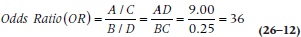
TABLE 26–2 Number of politicians and others who score above and below the cutoff on the Me-Me Scale.
so the relative odds are 36 to 1 that if you have a high score, you’re a politician. We can interpret this number the other way, too: if you’re a politician, the odds are 36:1 that you score in the high range of the Me-Me scale.
Note that this is not a relative risk. It doesn’t mean that politicians are 36 times more likely to score in the high range, or that high scorers are 36 times more likely to become politicians. It means that 36 people will have the outcome for every one who doesn’t. ORs less than 1 are even more difficult to interpret. An OR of 0.1 means that one-tenth of a person9 will have the outcome for every one who does. It’s easier if we multiply by 10 and say that one person will have it for every 10 who don’t. Another way of thinking about it is that there is one event for every 10 non-events, or that the risk is 1/11 = 0.09. More generally,
We can also change the OR into an RR using the formula:
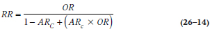
where ARC is the absolute risk in the comparison group, as we defined in Equation 26–6. [If you’re too lazy to flip back, it’s C/(C+D).] Applying that, we find that an OR of 36, given an ARC of 0.10, is:
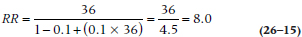
If we actually calculated an RR for Table 26–2 (even though we know we shouldn’t), we’d find it is 6.0. This illustrates a couple of points. First, the OR is always larger than the RR. The degree to which it is larger depends on how rare or common the outcome is. As we showed in Chapter 15, when the outcome is extremely rare (say, under 10%), the OR and the RR yield virtually identical numbers. The greater the prevalence of the outcome, the more the OR exceeds the RR. Finally, the conversion of an OR into an RR depends on the absolute risk in the comparison group (ARC).
OR versus RR
So, which one is better, the OR or the RR? We often don’t have a choice regarding which to use; if the study was a case-control, or if we used a logistic regression (Chapter 15), we have to use the OR. Some people have argued, however, that it’s the poor relation of the family, only an approximation of what we really want to know, which is the RR. One of the reasons given is that many people interpret an OR as if it were an RR, and that only horse racing aficionados can really make sense of ORs. Is this really the case, though?
Let’s go back to the data in Table 26–1, where we figured out that the RR of becoming a politician given that you have a high score on the Me-Me scale is 6.0. If we had looked at the data in the opposite way, and calculated the risk of a good outcome (i.e., becoming a normal person) given that you have a high score, we’d get [(40/100)/(90/100)] = 0.44. What is the relationship between 6.0 and 0.44? The answer is, “Absolutely nothing.” Using some mathematical jargon, the RR is non-invertible; that is, we get different answers depending on whether we’re looking at the positive or the negative outcome.
Now let’s do the same thing with the data in Table 26–2, where we get an OR of [(20/80)/(90/10)] = 0.278. And what’s the relationship between that and the OR of 36 we got originally? One is the reciprocal of the other: 1/36 = 0.278, and 1/0.278 = 36. This becomes even more apparent if we take the logarithm of the OR: ln (36) = 3.584, and ln (1/36) = −3.584—exactly the same number, but with the sign reversed. (This works no matter what base we use for the logs; the actual value will change, but the relationship holds.) Not surprisingly, we say that the OR is invertible, in that we get the same answer if we interchange the good and bad outcomes. Another way to say the same thing is that the OR is invariant to the outcome, and the RR is not.
So, while people can be led astray if they interpret the OR as an RR (score one point for the RR), they can also be led astray if they think they’ll get the same answer with the RR if they look at an outcome or its converse (one point for the OR). As dey sez in Brooklyn, “You pays yer money and you takes yer chances.”
Problems with Ratios
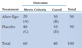
The results of almost all studies of the new block-buster drug of the week are reported as RRs or RRRs. That should be a dead giveaway10 that there are serious problems with these indices. To illustrate them, we’ll test our new drug, Alter-Ego, designed to combat Malignant Hypertrophy of the Ego. True to the tradition of the randomized controlled trial, 50 egotists afflicted with this disorder are assigned to the treatment group and 50 to the placebo control group. The outcome is the number of people still meeting the criteria for MHE one year after treatment, and the results are shown in Table 26–3.
Let’s see how we did. Using Equations 26–6 and 26–7, the ARs for the two groups are: ARTreatment = 0.40 and ARPlacebo = 0.80, and Equation 26–8 tells us that the RR is 0.50. Wow! We’ve cut the risk of meeting criteria in half by using this new wonder drug.11 Needless to say, we smother the airwaves and medical journals with our findings, highlighting this very impressive RR.
But let’s say we replicate the study, only instead of 50 per group, we now have 5,000 per group. However, let’s assume that the number who meet criteria stays the same—20 in the treatment group and 40 in the placebo group. Now, ARTreatment = 0.004, and ARPlacebo = 0.008. And what’s the RR? That’s right, folks; it’s 0.50, so we again buy up all the advertising space we can afford, touting yet a second study with this number.
Does something seem wrong with this? As they used to say on Laugh-In, “You bet your sweet bippy.” In the first study, 60% of patients actually got better, compared with only 20% in the placebo group; while in the second study, it was 0.6% versus 0.2%. The RR (and the RRR) are blind to this to difference in the absolute rates of improvement. With apologies to Herr Doktor Professor Einstein, not everything is relative. So, how can we take the absolute rates into account? The answer is the number needed to treat (NNT).
Number Needed to Treat
Remember when we were discussing the absolute risk reduction (ARR) we said that it would come in handy later, when we discuss the NNT? Well, it’s now later. The NNT is an amazingly simple and useful index, introduced by Laupacis, Sackett, and Roberts (1988). It is simply the reciprocal of the absolute risk reduction:
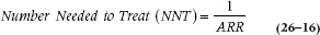
For the first study, the NNT is 1/0.4 = 2.5, and for the second, it is 1/0.004 = 250. So what do those numbers mean? In the first instance, we’d have to treat three people (whenever there’s a fraction, we round up to be a bit conservative) in order to cure one additional person; whereas in the second example, we’d have to treat 250 people to save one additional soul. Very different pictures from the same RR or RRR.
Ideally, we’d like the NNT to be 1—every person treated is one additional success. But that won’t happen for two reasons. First, despite what the ads tell us, not everyone who is treated will improve. Even in our first example, our success rate was only 60%. The second reason usually plays an even larger role: not everyone in the comparison group meets a dire fate; 20% of the placebo group improved, which is actually a small number compared to improvement rates in control groups in studies of pain or depression. We see this in the preventative treatments for many chronic conditions. The NNTs for the statins that change cholesterol levels, for example, are in the 100s to prevent one heart attack over a three- or four-year period. That means that the vast majority of people who take the drug will never have an MI even if they spent their hard-earned cash on wine (or scotch), women (or men), and song (or dance).
We can use the same formula when looking at adverse events due to the new intervention. Here, the risks are those of the bad outcomes, and we call the reciprocal of the ARR the number needed to harm (NNH)—how many people must receive the intervention to cause on additional adverse outcome in the treatment group.
TABLE 26–3 Number of egotists meeting criteria for MHE one year after treatment with Alter-Ego.
Confidence Intervals for the RR, OR, and NNT
As the old joke goes, we have some good news and some bad news. First the bad news: in order to figure out the CIs, we have to use logs and exponents. Now the good news: the procedure is just about the same for the RR and the OR. The first thing we have to do is to determine the standard error (SE) of the ratios; actually, the SE of the natural logarithm (ln) of the ratios. For the RR, the formula is:
and for the OR, it’s:
From here, we use the same formulae to work out the lower limit (LL) and upper limit (UL):
where (Ratio) is either the OR or the RR. Let’s work those through. For the data in Table 26–1, the SE is:
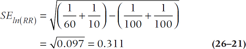
so the upper and lower limits of the 95% CI are:
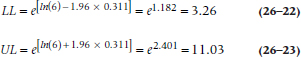
For your homework assignment, you can work out the CI for the OR in Table 26–2. (To check your results, the answer is 15.91 to 81.47. If you got the right answer, take the rest of the evening off.)
Figuring out the exact CI for the NNT requires a special computer program. Fortunately, Daly (1998) has ridden to the rescue with a simplification. The first step, as always, is to estimate the SE; it’s:
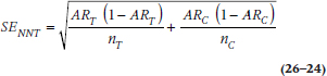
and then multiply that by 1.96 to get the 95% CI for the ARR:

Take the reciprocals of those numbers, and voila! Let’s work through the first Alter-Ego study, where ART = 0.40, ARC = 0.80, and nT = nC = 50.
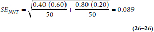
so that the 95% CI for the ARR is:
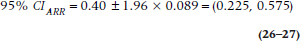
and the 95% CI for the NNT is (1/0.575, 1/0.225) = (1.74, 4.44), or (2, 5), in keeping with our injunction to always round up.
A warning, though. As Altman (1998) points out, if the results of a study aren’t significant, then the lower bound of the NNT is zero or negative. The reciprocal of zero is infinity, which is good news for the drug manufacturers, but doesn’t make clinical sense (you have to treat everyone in order to save nobody). So, don’t bother to figure out the limits; just admit defeat.
COUNTING THE DEAD BODIES: INDICES OF NEGATIVE OUTCOMES
We started off this chapter by counting the live bodies, using indices of incidence and prevalence. But, as we said, MHE can sometimes be a life-threatening condition, as the constant preening and self-regard of these people may generate violent reactions in those of us who must work them. So, let’s follow the advice of Monty Python and “bring out the dead.”
Fatality and Mortality Rates
The mortality rate (MR), which is also called the crude death rate, is the number of deaths in the population within a given time frame, usually one year:
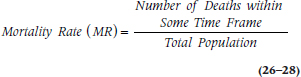
It is usually expressed as the number of deaths per 100,000 or per 1,000,000 people per year. In 2009, for example, the MR in the United States was 803.6 per 100,000 people. This is an amazingly unhelpful statistic for a number of reasons. First, it tells us nothing about the cause of death, since all deaths go into the numerator. Second, it isn’t very helpful comparing different regions or countries, because it’s greatly affected by the demography of the country. Figure 26–3 is an age pyramid, showing the age distribution of Liberia and Russia. Liberia is a typical developing world country,12 with many young people and few old ones; whereas Russia is an example of a developed, European country with an aging population. It’s no great surprise that the MR in Russia is 16.04/1000 and that in Liberia is only 10.62/1000; old people have a tendency to die. So let’s see how we can improve on this index.
But first, a note about terminology. Because the name of the index includes the term “rate,” it must have a time component. This injunction is sometimes violated; the “literacy rate” or “exchange rate,” for example, do not include an element of time. But when used technically, “rate” should specify “per unit of …,” such as “every six months” or, more commonly, “per year.” We’ll get tired if we have to say “per year” over and over, so we’ll assume all mortality rates are yearly ones unless we tell you otherwise.
The disease-specific mortality rate is somewhat more helpful because, as the name implies, it doesn’t count all deaths within the population, only those due to a specific cause:
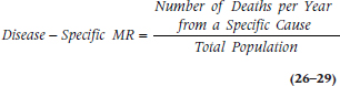
That’s a bit better. Now we can at least compare different diseases within the same region or country. A few disease-specific MRs don’t use the total population in the denominator, but restrict it to people at risk. For example, the perinatal mortality rate is the number of neonatal and fetal deaths per 1,000 births per year; the maternal mortality rate is the number of maternal deaths per 100,000 women of child-bearing age; and the infant mortality rate is restricted to children under one year. The problem, though, is that if we knew that the disease-specific MR for MHE is 40 per 100,000 people, and that for breast cancer is 30 per 100,000 women, the higher number can be due to a couple of different things: MHE is more lethal than breast cancer; there are more people who suffer from MHE than from breast cancer;13 or both.
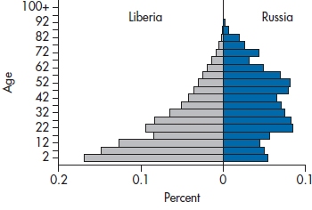
FIGURE 26-3 An age-pyramid for Liberia and Russia.
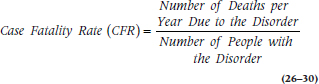
So, one answer is to focus on the number of deaths only within the group of people with the disorder. The case fatality rate (CFR) tells us the proportion of people with MHE who die because of it within a given time period:
Well, that takes care of most of the problems. Now at least we’re not comparing apples with oranges, but we’re still comparing MacIntoshes with Old Grannies.14 The remaining problem is that it’s still hard to look across different regions because, as we’ve said before, they may differ in terms of age. If the birthrate is high, the population is younger on average, and the mortality rate may be lower. So paradoxically, developing countries with high birthrates may actually have lower mortality rates than developed countries. The solution is to use age-standardized mortality rates. This resolves the difficulty by adjusting for age differences in various populations, and it can be done in one of two ways. In the first, we use the age distribution of some reference population, such as the entire world or some large geographic region. This is the way to go if we want to compare a number of regions. The other method, useful if we have just two areas, is to adjust the age distribution of one to be the same as the age distribution of the other. Because it’s more general, we’ll go through the first procedure.15
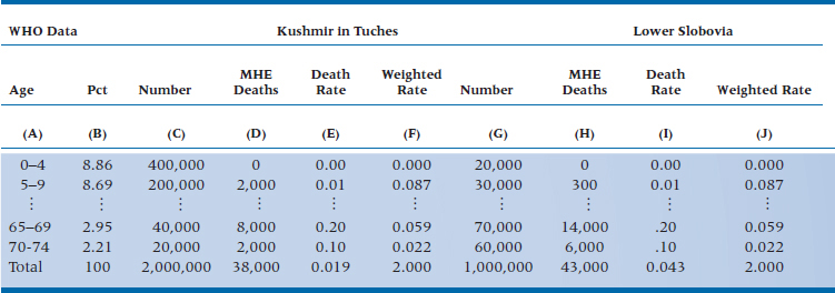
So, let’s compare the mortality rate in two countries; the developing one of Kushmir in Tuches (KIT), which we encountered in Chapter 15, and the former European grand dukedom of Lower Slobovia (LS). The reference population, shown in Column B of Table 26–4, is taken from the World Health Organization’s website and shows the percent of people in different age groups for the entire world. If we compare the number of deaths from MHE in these two countries (the last line in columns D and H), it looks like there are somewhat fewer in KIT than LS. But, this doesn’t mean much because the size of the populations differs, as well as the age structure. So, let’s look at the death rate (columns E and I), which compensates for the number of people in each country. Now it looks like there’s a striking difference—the rate in KIT (0.019) is much lower than that in LS (0.043). But, once we take the age structure into account, the age-adjusted mortality rates are identical (2.000).
So, how did we come up with these numbers? We’ll work it through just for KIT; you can do the heavy lifting for LS. Columns C and D come from tables of vital statistics for the country; we didn’t have to do anything (except to make up the numbers). Column E (the Death Rate) is simply the ratio of the previous two columns. To get the Weighted Rate (column F), we multiplied the Death Rate by the number in column B, which standardizes the rates to the world population. Add up those numbers, and there we are!
We’re not limited to standardizing mortality rates by age. If we think that the rates may differ by gender, and if the regions differ in terms of age and gender, we can build even more complicated tables taking both of these factors into account.
SUMMARY
Once we venture into the realm of epidemiology, there are a number of other indices and statistics. These include various ways of counting the quick (incidence and prevalence) and the dead (mortality rates), and looking at relative frequencies of events (relative risk and the odds ratio).
TABLE 26–4 Mortality rates from MHE in Kushmir in Tuches and Lower Slobovia.
1 Let this be an object lesson about experts, especially those trying to sell books to you. (Oops, that’s us. Forget that we said anything.)
2 Writing this in Canada, the real issue is not if you got a cold, but when and how many.
3 Actually, for most of medicine and psychology, it’s our lack of understanding.
4 But then again, when have you ever found any administrator basing decisions on real data?
5 A cohort used to refer to one-tenth of a Roman legion and consisted of six centuria of 80 men each. Now it simply means a group of people who share some trait. In all modesty, in what other book can you learn about military history, etymology, and statistics all in the same place?
6 We’re not interested in the fairness of the election, only in the outcome, so we can also include those elected in Chicago and presidents who were put into office by the U.S. Supreme Court.
7 Your first clue should have been the fact that we said we gathered two cohorts and then went on to tell you more about the origin of the term than you really wanted to know.
8 Unfortunately, that’s not the case here, because it seems as if we’re overrun by politicians. But, we’ll keep the same example.
9 That’s someone on a very strict diet.
10 No pun intended, but maybe there should be.
11 Available by prescription only from your local pharmacist, at a cost of merely $5,000 a year for the rest of your life. Buy now! Better yet, buy stock in our company.
12 That may not be the politically correct term. But, we can’t keep track of what the right term is from day to day—underdeveloped, third world, economically challenged. Use whichever one you want.
13 Only women over the age of menarche have breasts, but everyone has an opening in the rectum and can act like one.
14 Does that simile tell you anything about our computer preferences? That’s right; we’re writing this on Old Grannies.
15 If you want to see how to use the second, easier one, see that superb book, PDQ Epidemiology. Guess who the authors are.
SECTION THE FOURTH
C.R.A.P. DETECTORS
Stay updated, free articles. Join our Telegram channel

Full access? Get Clinical Tree


