Mathematical Principles

CHAPTER 2 Mathematical Principles


A common application of inferential biostatistics uses comparisons to see whether one pathway is better than another. A sample is selected and divided into groups. The groups are exposed to different interventions and the end results for each group are observed and compared. The result, such as mortality rate, is expressed as a numerical value. So, by definition, some math is involved. The math you need to know, however, is basic and involves comparisons in the form of ratios or simple algebraic formulas. A review of these concepts and a discussion of the various types of graphs you are likely to encounter are presented in this chapter.


RATIOS


When comparisons are made between the proportion of an attribute in two or more groups, the proportions are often expressed as ratios, such as the mortality ratio of persons treated with medical therapy versus those with surgical therapy. Ratios result from the comparison of fractions. Every fraction has a numerator, N, and a denominator, D.


image


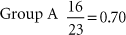
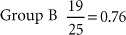
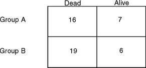
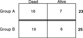
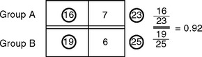
D reflects the number of subjects in the group, such as the number of subjects getting standard medical treatment. N is the number of subjects with the characteristic being measured in the group, such as mortality. Figure 2-1 illustrates the results of a study where subjects with lung cancer received either medical or surgical treatment and mortality rates were compared.


It is easier to compare fractions when the denominator of each fraction is the same. This is done by converting the fractions so the denominators are expressed as equal values. Multiplying the numerator and the denominator by the same number does not change the value of the fraction (this is because you are essentially multiplying the fraction by 1). The ratios can be compared by the value of the numerators.


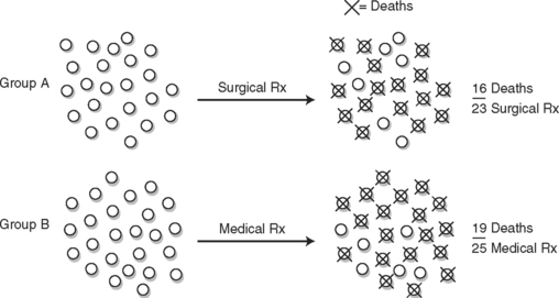
For example, group A had 16 deaths out of 23 individuals in 5 years. Group B had 19 deaths out of 25 individuals in the same time period. Which group fared worse?


image


This problem is easier to solve if there are equal denominators. We multiply the first fraction by 25/25 and the second fraction by 23/23 to convert to equal denominators, without changing the value of the individual fractions.


image


image


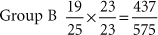
Group B did worse; they had a higher death rate.


Another way to compare ratios is to reduce each fraction so that the denominator is equal to 1. Any numerator over a denominator of 1 equals itself. (It follows that any number is actually itself divided by 1.) Do this by dividing the numerator by the denominator. When all fractions in a group are reduced so that their denominators are equal (such as 1 or 100), it is legitimate to compare numerators.


image


image


Again, we see that group B had a higher mortality rate.


Fractions can also be expressed as percentages. This implies that the denominators have all been converted to 100. It is easy to compare relative values using the percentage scale, since our currency is based on 100 and all of us know how to compare prices!


image


image


image


image


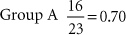
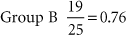
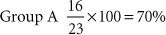
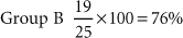
Group A had a 70% mortality rate, whereas Group B had a 76% mortality rate.


We can combine the mortality rates for two groups into one number known as a ratio. The mortality rate of one group becomes the numerator, N, and the mortality rate of the other group becomes the denominator, D. Both the numerator and denominator are fractions in themselves. For our purposes, when one fraction is divided by another, this will be designated by a double line. Dividing the two mortality rates results in a single number, the mortality ratio.


It is not always apparent which group was designated to be in the numerator and which was designated as the denominator. If the result is less than 1, we know that the mortality rate of the group represented in the numerator was less than the other group, but we often need to rely on an explanation in the text to identify exactly which group fared better.


LOGIC AND VENN DIAGRAMS


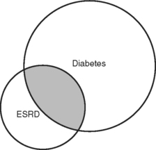
Certain groups of individuals tend to have associated characteristics. For instance, people with diabetes tend to have end-stage renal disease (ESRD) requiring dialysis. But not all people on dialysis have diabetes, and not all diabetics have renal failure. These relationships can be expressed graphically as Venn diagrams, where one circle represents condition 1 and another circle represents condition 2. An example of a Venn diagram is shown in Figure 2-2. These are rough diagrams that do not have numerical meaning, but the relative sizes of the circles are often a crude estimate of the relative prevalence of the conditions. The overlap represents those subjects with both conditions.


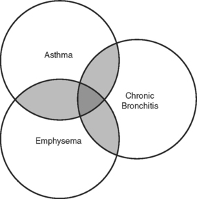
Venn diagrams do not need to be limited to two conditions. For example, Figure 2-3 illustrates the relationship between asthma, chronic bronchitis, and emphysema. Some people have just one of these conditions, others have two, and the ones represented in the middle of the diagram have been diagnosed with all three. This Venn diagram also illustrates that none of these conditions is exclusive. The presence of one condition does not exclude the possibility of having another.


Venn diagrams are used to illustrate an early awareness between connected conditions. As one circle encroaches upon another or the overlap increases, we may be prompted to perform further observational tests to try to quantify that relationship. In fact, as we continue to learn more about diseases and their epidemiology, such Venn diagrams are revised.


When one circle is completely within another bigger circle, as in Figure 2-4

Only gold members can continue reading. Log In or Register to continue

Stay updated, free articles. Join our Telegram channel

Jun 18, 2016 | Posted by in BIOCHEMISTRY | Comments Off on Mathematical Principles

Full access? Get Clinical Tree

Get Clinical Tree app for offline access