Fig. 8.1
A 4-key number entry design. The left/right “arrows” move the cursor left and right, and the up/down arrows increase or decrease the digit the cursor is over. The cursor is shown here as a gray box, but on many designs it will flash, and perhaps invert video as well. Some defective designs allow left/right arrows to wraparound the cursor position: e.g., pressing too many rights will bring the cursor round to the far left, so a user trying to enter a fractional digit could accidentally enter a 1000s digit. Some designs adjust digits independently, and others have “carry” so incrementing a digit goes −8–9–10, rather than −8–9–0. The four-key design has a low user error rate but it is complex to ensure it handles boundary cases correctly and in the best way for the user. For example, an easy way of changing 10–100 goes via 0, which may be a prohibited value and automatically set a minimum value like 1, which the user will find counter-productive!
Caregivers must often make calculations while using medical devices, such as to convert between different units. However, calculators vary greatly in how they detect and flag use errors. The Apple iPhone calculator detects some use errors. For example, keying 1/0. = instead of 1/0.7 = will give Error rather than 2.04. Unfortunately, continuing the calculation after an error, for instance 1/0. + 2 × 3 will give the wrong answer—here 6 rather than Error. The calculator spots an error and reports it, but the Error message is not persistent; in fact, the user is allowed to enter an erroneous calculation, and the iPhone defectively just does the last part of the calculation. The user may take 6 as the answer, and if so it would be tempting to say they would be wrong—in fact, the calculator is wrong, and its design induced the user to make this error.
Many devices keep a log, and the log may be used as legal evidence after an incident. If the log says the infusion pump delivered 15 mL, then it is tempting to think the user told it to deliver 15 mL, and if this is the cause of the incident, then it would seem the user is to blame. But it is not so simple. On some devices, the delete key does not work as expected. For example, keying 1. [DEL] 5 may result in 5 rather than the intended 1.5, an error that is 3.33 times out yet the log will say the user keyed 5, not 1.5 (or even 1. [DEL] 5). Thus the log in this case probably correctly describes what the infusion pump did, but not what the user asked it to do. Logs are also susceptible to key bounce errors, where the user presses a key once but the device treats it as two or more presses; again the log will say what the device does, but is a misleading account of what the user did.
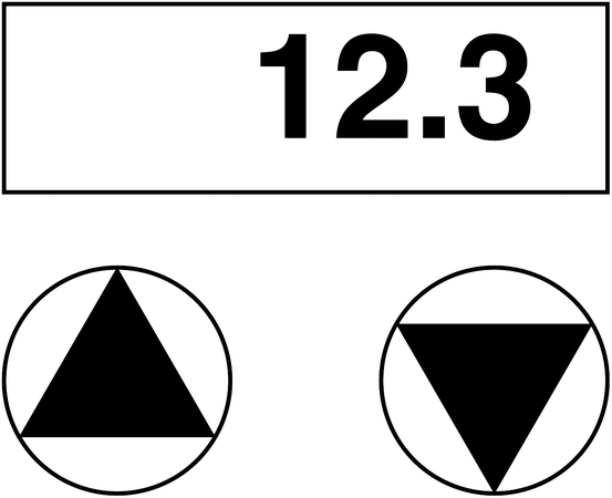
Reducing the number of keys to enter numbers makes using a device easier, and also reduces the amount of time a user needs to look at the keyboard. Some devices use up/down arrows to increase and decrease numbers (see Fig. 8.2). Not only are there fewer keys, but the user model is that the displayed number has to be changed to be correct; like the 4-key style mentioned above, therefore, 2-key number entry has lower error rates. Instead of the design being “the user keys a number” the design is “the number displayed is wrong; the user corrects it” and therefore they are forced to look at the display and to expect errors they will correct. Such interfaces are much more reliable, yet they are slower and therefore some might claim they are “less usable.” However, to say they are less usable is to confuse speed with ease of use; but in a healthcare environment, ease of use is not as important as whether a device can be used reliably. Obviously it is an advantage that people like a design, but it should not be the top criterion. A better way to understand the trade-off is that cars with brakes are slower (in fact, that is the point of brakes) but they are much safer and arguably also much easier to drive than cars without brakes. Likewise, slowing down a user may improve their performance overall.


Fig. 8.2
2-key number entry. Pressing the “up” triangle (on the left) increases the number and pressing the “down” triangle decreases the number. Typically, holding a button down repeatedly increments or decrements the number, and holding it down for several seconds speeds up the rate of change. Some devices swap the up/down keys, and some additionally have “fast” keys (e.g., which increment and decrement in 10s or 100 s rather than 1 s)
Feedback is important—users cannot always pay full attention to a device (they have distracting jobs) so devices must make clear whether user actions “work” or not. In all the designs discussed, keys normally change the display, but in boundary cases (e.g., when too many digits have been pressed) the display cannot change or possibly changes in a non-standard way (e.g., not going above a preset maximum value). Hence buttons should make two sorts of noise: that they have been pressed successfully, and possibly that they have been pressed but nothing can happen. Many designs beep once for success and twice for failure, as of course a double beep for a single key press is an error in any case. Some buttons (such as [cancel] or buttons that cause confirmatory displays to appear) should make distinctive sounds.
8.11 Conclusions
The HCI of medical devices is an important but complex topic due to their safety-critical nature, regulatory requirements, and the complexity and heterogeneity of their users and use environments. This chapter provided only a brief overview of these issues. The key messages are:
1.
Humans make errors sooner or later and designers should design for error. The key point in medical device design is that use error should be managed and so far as possible not lead to patient harm. For example, correctly implemented UNDO or DELETE keys allows users to make errors and to correct them.
2.
Designers, too, are human and can never know enough about the context of use of a device. Medical devices help highly trained professionals in complex, stressful environments, and they do not understand complex issues of engineering design. It is inevitable that design requirements are going to have oversights. Devices have to be user-tested in realistic environments and improved in light of experimental results, in a repeating process called iterative design.
3.
To fully assess device usability, designers should augment user tests with simulation and formal software engineering approaches. Simulated users that make keystroke errors can exercise the full range of device operations. Formal methods, such as model checking, can prove that the device works as intended.
4.
There are numerous relevant international standards, and these are both a regulatory framework of minimum standards as well as an excellent resource of authoritative literature.
There is considerable need for research that addresses common issues across medical devices; more so, there is considerable need for the research to be applied! Research on medical device alarms and data entry interfaces are good examples of such work, but additional work is needed in other areas, such as improving situational awareness when using one or more devices.
This chapter gives only a basic introduction to the challenges of designing interfaces for medical devices. A comprehensive review can be found in the Handbook of Human Factors in Medical Device Design (Weinger et al. 2011) and in the FDA guidance documents and regulatory standards.
Discussion Questions
1.
What are the similarities and differences between HCI for medical devices vs. non-medical devices?
2.
Pick a type of medical device, such as an insulin pump, and then search MAUDE for related reports. Can you separate use-related errors from other types of problems, such as malfunctions or unrelated issues? Are they consistent kinds of use errors? Do they vary based on the model? What kinds of data would you like to gather to further clarify possible use-related errors?
3.
Discuss the definition of a medical device with respect to sample mobile apps. Can you find examples of apps that meet and do not meet the definition?
4.
Pick a simple mobile device, such as a blood pressure monitor, and consider how well it meets the needs of a diverse set of users and use environments.
5.
Based on the definition of a medical device, do you think electronic health record systems (EHRs) are medical devices? If EHRs were regulated as medical devices, how might this affect the stakeholders, including EHR vendors, doctors, and patients?
Acknowledgments
This work was partly funded by EPSRC grant [EP/L019272/1].
Additional Readings
Kaye, R., & Crowley, J. (2000). Medical device use-safety: Incorporating human factors engineering into risk management. Silver Spring: U.S. Food and Drug Administration, Center for Devices and Radiological Health. Retrieved from http://www.fda.gov/downloads/MedicalDevices/DeviceRegulationandGuidance/GuidanceDocuments/UCM094461.pdf
Sawyer, D. (1996). Do it by design – An introduction to human factors in medical devices. Rockville: U.S. Food and Drug Administration, Center for Devices and Radiological Health. Retrieved from http://www.fda.gov/medicaldevices/deviceregulationandguidance/guidancedocuments/ucm094957.htm
Weinger, M. B., Wiklund, M. E., & Gardner-Bonneau, D. J. (2011). Handbook of human factors in medical device design. Boca Raton: CRC Press.
References
Association for the Advancement of Medical Instrumentation. (1996). Human factors in medical devices: Design, regulation, and patient safety (Conference report). Arlington: Author. Retrieved from http://www.fda.gov/MedicalDevices/DeviceRegulationandGuidance/HumanFactors/ucm126018.htm
Association for the Advancement of Medical Instrumentation. (2001). Human factors design process for medical devices. Arlington: Author.
Association for the Advancement of Medical Instrumentation. (2009). Human factors engineering – Design of medical devices. Arlington: Author.
Beecher, H. K., & Todd, D. P. (1954). A study of the deaths associated with anesthesia and surgery: Based on a study of 599, 548 anesthesias in ten institutions 1948–1952, inclusive. Annals of Surgery, 140(1), 2–35.PubMedCentralPubMedCrossRef
Stay updated, free articles. Join our Telegram channel

Full access? Get Clinical Tree


