So, the little squiggles aren’t all that mysterious; most stand for the same quantity in the sample and the population. Sample means begin with M, population means begin with Greek m, or mu (μ) . . . and so on.
As yet, we haven’t said anything about how one goes about calculating these mystical quantities. In fact, you don’t, because only God has access to the entire population.4 What one does is use the calculated sample statistic—the mean or standard deviation calculated from the sample to estimate the population parameter.
ELEMENTS OF STATISTICAL INFERENCE
Times are tough for male boomers. Those carefree sixties, the days of free love and free spirits (and other more leafy intoxicants), are long gone. And somehow, most of their libido went with it. To make matters worse, the issue is no longer restricted to inner thoughts; it has now become medicalized. Nightly television ads are a constant reminder that you have a disease—“erectile dysfunction syndrome”—that is cured by a little blue pill, if only you screw up your courage and ’fess up to your doctor. Added to that, the increasing barrage of explicit images of well-endowed males on late night TV, movies, and all, does nothing to reassure the aging male that he’s not merely on the small side of normal.
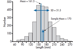
FIGURE 6-1 Distribution of erect penile length for 3,100 subjects.
However, just as Pfizer’s little blue pill solved the first problem, and shot it to the biggest drug company on the planet, pharmacologic help has come from an unlikely source. Researchers in a small company situated 234 km northwest of Port Moresby, New Guinea, many years ago noted that the local men were apparently remarkably well endowed, and on further inquiry found that they engaged in a nightly ritual of rubbing a potion derived from the boiled oil of bamboo stalks on the area. They managed to identify the ingredient in bamboo that causes it to be the fastest growing stalk in the vegetable kingdom, and have refined it into a small red pill, with the trade name of Mangro. Since it’s a naturally occurring compound, no research was required. The label says that it’s “Guaranteed to add half an inch after six weeks or your money refunded. Just call 1-800-123-4567 in Brandon, Manitoba, cough up three monthly payments of $19.95, and satisfaction is yours.”
While the temptation is powerful, you, as a budding clinical scientist, decide to put the claim to the test. You design a randomized trial of Mangro versus placebo, swing it with ease past the ethics committee composed of older male scientists,5 and put up signs by the elevators. You’re immediately inundated with calls, but after you explain the study, everyone drops out, since with the availability of an enhancer off the Web for a paltry $60, who would want to be in the control group? You recognize that you could possibly do the study by just administering the real drug to a group of subjects, if only you could find good comparison data on penile length of males who aren’t taking the drug. So you press on and enlist 100 anxious males in the study. Six weeks later, the results are in: an average erect length of 6.7 inches (170.0 mm).
In despair, you decide to take a break and go Web surfing. And there you find it—the definitive penis size survey results (www.sizesurvey.com/result.htm). Now in its sixth edition, the survey has gathered data on flaccid and erect lengths from over 3,100 subjects, and has carefully compiled the data. The report contains a wealth of interesting data that those who are interested can pursue at their leisure. But for the moment, the most useful data for our purposes is the distribution of erect penile length of the whole sample, shown in Figure 6–1. Overall, the mean of all 3,100 subjects is 161.5 mm (6.4 inches), with a standard deviation of 31.5 mm (1.25 inches). With 3100 subjects, that’s as close as we’re ever going to get to a population, so from here on in, we’ll assume the population mean is 161.5 mm. and SD is 31.5 mm. So our guys, with an average length of 170.0 mm, have gained a total of 8.5 mm, about a third of an inch. Not quite up to the claim, and not something you (or your significant other) would notice. But still, not so small that you would walk away from it altogether.
The distribution looks remarkably bell shaped. In Figure 6–2, we’ve replaced the original data with a normal curve with a mean of 161.5 and standard deviation of 31.5, and displayed our sample mean. Looking at the distribution, that puts the study participants up around the 60th percentile; 40% bigger, 60% smaller.
The obvious question is, “Is this a real difference, or did you just happen to locate 100 guys who were, on average, just a little bit bigger than normal?” In short, did the drug work, or could the difference you found be simply explained by chance; that is, by the sample you ended up with? Putting it slightly differently again, what’s the probability that you could get a difference between your sample of 100 people and the population in the definitive survey of a third of an inch, just by chance? That, dear reader, is what all of inferential statistics is about—figuring out the chances that a difference could come about by chance. All the stuff that fills the next 200 pages and all the other pages in all the other stats books, all the exams that have struck terror in the hearts of other stats students (but not you!), is all about working out the chances that a difference could come about by chance.
Of course, if ordinary people realized that was all there is, people like us couldn’t make all the big bucks, so we have to put a veneer of scientific credibility on it. We turn the whole thing into a scientific hypothesis. However, statisticians are a cynical lot, so we actually start with a hypothesis that the drug didn’t work, called a null hypothesis.6
H0: There is no difference between the penile length of males treated with Mangro and untreated males.
Of course, if this is true, then the chances of cashing in on the drug are non-existent and our chances of retiring early on the profits are equally small. So there is also a parallel hypothesis that the drug did work, called the alternative hypothesis, and labeled H1. It states that the penile length of treated males is bigger than untreated males.7
THE STANDARD ERROR AND THE STANDARD DEVIATION OF THE MEAN
If you look at Figure 6–1, you’re likely thinking to yourself that this is one study where the null hypothesis wins hands down. A third of an inch just doesn’t look very impressive, to either scientist or consumer. However, and it’s a very big however, the question we’re asking as scientists is not whether a particular penile length could be ⅓ of an inch bigger than the mean by chance, but whether the mean of a sample of 100 erect phalli could be bigger than the population by ⅓”.
Suppose the treatment doesn’t work; that the null hypothesis is true. That means that our study is simply repeating the original survey, only with 100 guys, not 3,000. It would be the same as if we went out on the street,8 sampled 100 guys, measured them up, computed their mean, and put it on a piece of graph paper. If we now do this a number of times, plotting the mean for each of our samples, we would start to build up a distribution like Figure 6–1. However, we’re now no longer displaying the original observations; we’re displaying means based on a sample size of 100 each. Every time we sample 100 guys, we get a few who are big, some who are small, and a bunch who are about average. The big ones cancel out the little ones, so the sample mean should fall much closer to 161.5 than any individual observation.
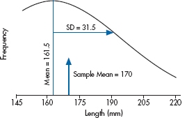
FIGURE 6-2 Normal distribution of the data in Figure 6-1.
Putting it another way, what we’re really worried about are the chances that a sample mean could be equal to or greater than 170.0 mm if the sample came from a distribution of means with mean 161.5. So, we have to work out how the means for sample size 100 would be distributed by chance if the true mean was 161.5.
One thing is clear. The sample means will fall symmetrically on either side of 161.5, so that the mean of the means will just be the overall mean, 161.5. And from our discussion above, another thing is clear—the distribution of the sample means will be much tighter around 161.5 than was the distribution of the individual lengths. That’s because, as we’ve said, when we’re plotting the individual measurements, we’ll find big guys and small ones. But, when we’re plotting the average of 100 folks, the big ones will average out with the little ones.
If this doesn’t seem obvious, think about the relation with sample size. If we did the study with a very small sample size, say by taking two guys at a time, sometimes they would both be on the big size of average, sometimes they would both be on the small side, but most of the time one small guy is going to be balanced by one large guy. So if we average their two observations, they’ll be a bit closer to 161.5 than each alone. If we increase the sample size to, say, five, then there’s a pretty good chance that the five guys will be spread out across the size range, the extremes will cancel out, and the mean will be closer still to 161.5. And as the sample size gets bigger and bigger, there’s an increasing chance that extreme values will cancel out, so the mean will get closer and closer to the population value of 161.5.
Of course, this whole exercise is a bit bizarre. We find ourselves in the unenviable position of having to do a study where we go and grab (not literally) 100 guys at a time, measure their members, and send them packing, and doing this again and again, all in the cause of finding out how the means for sample size 100 are distributed, in order to figure out how likely it is to find a mean of 170.0 or more on a single study.
But here’s where statistics students get their Ph.D.s. They work out for us just how those means will be distributed theoretically. For this case, it’s not really all that complicated. We’ve already figured out that the bigger the sample size, the tighter the distribution (the closer the individual means will be to the population mean of 161.5). It’s also not too great a leap of faith to figure out that the less dispersed the original observations (i.e., the smaller the standard deviation), the tighter the means will be to the population mean. In other words, we expect that under the null hypothesis, the distribution of means for a given sample size will be directly related to the original standard deviation, and inversely related to the sample size. And that’s just about the way it turns out. The width of the distribution of means, called the Standard Error of the Mean [which is abbreviated as SE(M) or SEM], is directly proportional to the standard deviation, and inversely proportional to the square root of the sample size:
Standard Error of the Mean
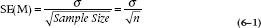
Of course, we usually don’t know σ, because we very rarely have access to the entire population, so in most cases, we estimate it with the sample SD. In this case, the SE(M) is 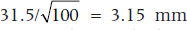 . This formula tells us, based on a single sample, how spread out the means will be for a given value of σ and n. Fortunately for us (and for the measurees), we don’t have to repeat the study hundreds of times to find out.
So, the SD reflects how close individual observations come to the sample mean, and the SE(M) reflects, for a given sample size, how close the means of repeated samples will come to the population mean. Of course, all this is assuming that the repeated samples are random samples of the population we began with, normal males; the null hypothesis still holds.
THE CRITICAL VALUE, DECISION REGIONS, ALPHA AND TYPE I ERRORS
All the preceding discussion suggests that Figure 6–2 is working from the wrong distribution. What we really need to know is the distribution of means for a sample size of 100 under the null hypothesis that they all come from the untreated population with a true mean of 161.5. We also know that the distribution will have a standard deviation (the standard error of the mean) of 3.15. This distribution is portrayed in Figure 6–3, where we have stretched the X axis. The solid line is the distribution of means and the dotted line above it the distribution of individual values.
We’re getting there. We now have an idea about how means for a sample size of 100 would be distributed, just by chance, if the null hypothesis were true. Of course we don’t know whether it’s true or false—that’s our goal. But if we think about our situation for a minute, it’s easy to see, at least in qualitative terms, how we can go from a computed sample mean to a probability that it could arise by chance. If the difference between the sample mean and 161.5 is very small compared to the width of the distribution, say 1.5 (so the sample mean is at 163.0), then it likely did arise by chance and we would be unlikely to conclude the treatment worked and reject the null hypothesis. Quantitatively, we would say that the probability that the difference arose by chance was large. Conversely, if the difference between sample and population means were large, say 15 (a sample mean of 176.5), then the sample mean is way out on the tail of the distribution so the probability of observing it by chance is very small, and we would likely conclude it was a real difference.
Taking this one step further, we can see that there is a relationship between the magnitude of the difference and the likelihood it arose by chance. The larger the difference, the lower the likelihood it could arise by chance. We could let it go at that, and just compute the actual probability; in fact, in a few pages we’ll do just that. But for the moment we want to push the logic just a bit further.
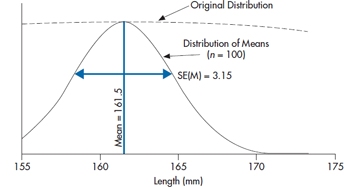
FIGURE 6-3 The distribution of means of n = 100 from the population in Figure 6-1.
Let’s acknowledge that, at the end of the day, we want a clear statement that either the drug worked or it didn’t. This must be related to the probability the difference arose by chance. To turn it into a decision situation, all we need do is to declare a priori that below a given probability of occurrence, we’ll assume that the difference is real, and reject the null hypothesis. And anyone who has ever read a journal article using stats knows what that number is: 0.05. We call this “alpha” or α. Of course, another way of saying it is that there is a probability of 0.05 (i.e., alpha) that we’ll mistakenly assume there is a difference when there isn’t:
Alpha (α) is the probability of concluding that there is a difference when there is not, and the sample actually came from the H0 distribution.
We’ll delve into the history of the magic 0.05 a bit later, but for the moment, continuing this line of reasoning, declaring this number as the critical value that decides between “real” differences and chance differences has some consequences. What it means, in effect, is shown in Figure 6–4. Below a certain critical value of the difference, which corresponds to a probability in the tail of the null hypothesis distribution of 0.05, we’ll accept that there is no difference; i.e., accept the null hypothesis (or, to be pedantic about it, fail to reject it, since we can never prove the nonexistence of something). Conversely, in another region corresponding to differences greater than the critical value, we’ll reject the null hypothesis and conclude that there is a difference. This then establishes an “Accept H0” region and a “Reject H0” region.
In the case of the present study, what we need to do is work out the location on the X axis that corresponds to the critical value, where there is 5% of the distribution to the right. That’s not hard, since others wiser than we have worked it all out in advance. A first step is to transform the raw data into standard error (SE) units, called a z transformation. We simply compute how many SEs away from the mean a particular value is. In the present example, the mean is 161.5 and the SE is 3.15. So a value of 164.65 is 1 SE above the mean; a value of 167.8 is 2 SEs above the mean. The actual formula is:
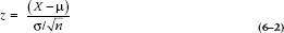
where μ (called mu, Greek for “m”) is the population mean and σ (sigma, Greek for s) is the population standard deviation. If we go to Table A in the Appendix, we see that it shows the relation between a particular value, expressed in standard error units, and the probability. Critical to use of the table is that it shows the relation between the value of X and the proportion of the probability curve to the right of the mean. So a tail probability of 0.05 is going to be found in the table at a value of [0.50 (the right half of the distribution) − 0.05] = 0.45. And that corresponds to a z value of 1.65. Now we just have to put all this into the equation:
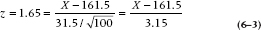
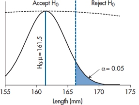
FIGURE 6-4 Testing if our result differs from a mean of 175.
and solving for X:

So if our experiment yields a sample mean larger than 166.70, the likelihood it could have arisen by chance is less than 0.05, 1 in 20, and it’s statistically significant. That is, any sample mean to the right of the critical value in Figure 6–4 is significant; anything to the left is not. In the present case, the observed mean of 170 is to the right of the critical value, so, despite our initial reservations, the result was unlikely to arise by chance. We therefore reject the null hypothesis and declare a significant difference. That’s what “significant” means—the chance that a difference this big or bigger could have arisen by chance if the null hypothesis were true is less than 1 in 20. No more and no less.
This is the approach that was advocated by Jerzy Neyman and Egon Pearson about a century ago. The critical idea is that you don’t associate a probability directly with the calculated sample mean. Instead, you use knowledge of the population mean, the SD, and the sample size to create an Accept and a Reject region, using a preordained value of the tail probability. You then do the study, compute the sample mean, and either it falls to the left or to the right of the critical value, so you accept or reject H0; you declare that the difference was or was not statistically significant. And you stop.
However, don’t lose sight of that 1 in 20 probability. The decision all hinged on a likelihood of 1 in 20 that the difference could arise by chance. This means, of course, that for every 20 studies that report a significant difference at the 0.05 level, one is wrong. In short, there is a 1 in 20 chance that we will reject the null hypothesis when it is true. This is called “making a Type I error.”
Why Type I? To distinguish it from Type II, of course. That’s next on the agenda.
THE ALTERNATIVE HYPOTHESIS AND β ERROR
Things might not have turned out the way they did. The sample mean, after the experiment was over, could have actually ended up to the left of the critical value, in the “Accept H0” region. There are two ways this could arise:
- The most obvious is simply that Mangro doesn’t work, so that any difference that arises is due to chance. The sample mean comes from the null hypothesis distribution, and so most (95%) of the time, it will lie in the Accept H0 region. If this is the case, then we conclude there is no difference and we’re right, there is none. All is well with the world.
- On the other hand, Mangro might well work. We might have done the experiment exactly the same way, but this time the sample mean was not so large, say 165.0. In this case, we would conclude there was no significant difference as well. But in fact it did work, so when we conclude that it didn’t we have made a mistake.
This can come about in many ways. It may be that the treatment effect is smaller than we thought, but still non-zero. Or the variability in individual observations (the SD) was larger. Or we did the study with a smaller sample size so that, although everything else was the same, the SE(M) is larger. Regardless of the cause of the problem, we would be making a mistake. As you might suspect, it’s called a Type II error: concluding there is no difference (accepting the null hypothesis) when there is one—the null hypothesis should be rejected.
It clearly matters, and not only because we don’t like making mistakes. It’s also harder to publish negative results, so pragmatically, accepting H0 is a hard way to get ahead. In any case, having put all that time and money into the study, it would be nice to know which alternative—the treatment doesn’t work, or it does work, but Ma Nature conspired against us—is the truth.
But how can we tell these two apart? After all, all we have is a sample mean and a hypothetical null distribution. Actually, no. We have a sample mean and two hypothetical distributions; one corresponding to the distribution of means under the null hypothesis that the treatment didn’t work and a second, sitting off to the right, under the alternative hypothesis, H1, that it did work. That is, if we are going to assume that there is a difference, this is tantamount to saying that the sample mean no longer comes from the H0 distribution—that’s the distribution of sample means if the treatment did not work. Instead, we’re saying that the sample mean actually comes from a distribution of sample means resulting from a non-zero treatment effect. That is, there is now a second distribution, the H1 distribution, centered around some treatment effect, which we’ll call Δ (delta). This is shown in Figure 6–5.
Now we cannot actually tell them apart. We can never really conclude whether the treatment didn’t work, or it did work but we missed it. But with this picture, showing the distribution of sample means under both assumptions, what we can do is compute the probability that the alternative hypothesis is true, for a particular configuration of treatment effect, standard deviation, and sample size. It’s just the area of the H1 distribution to the left of the critical value, as shown in Figure 6–5.
To do that, we need one more piece of information. We know where the H0 distribution is—-centered on 0.0 treatment effect, obviously. In this case, that’s at 161.5 cm. We know the width of the H0 distribution—it’s  . We can easily make a small additional assumption that, wherever the H1 distribution is, it has the same width. (This is called the assumption of homoscedasticity, don’t ask us why.) But we also have to make an assumption about where the H1 distribution is centered.
How in the world can we do that? After all, we did the experiment to find out what the treatment effect was. But on reflection, right now our best guess is that it’s zero, given the way the data turned out. So we have to make a blatant guess. The logic goes like this:
“Darn drat.9 The study didn’t work. I wonder if this is because we just didn’t have enough power to detect a difference.” (Power is a good word here. We’ll explain it in a minute.) By this we mean, to reiterate, maybe the SD is too large, the sample size too small, or the treatment effect too small, to get us a significant difference. OK. Suppose we assume a plausible value of the treatment effect. Does the configuration put the H1 distribution far enough to the right that there isn’t much tail of it to the left of the critical value? If we can locate the plausible value, the center of the H1 distribution, then it’s trivial to figure out how much of the tail might hang to the left of the critical value. Essentially, we have Figure 6–5, where we’ve planted the H1 distribution some distance to the right of the H0 distribution (but not necessarily to the right of the critical value).
How do we do that? Well, in the present case, it’s fairly straightforward. Mangro was guaranteed to add ½”—about 13 mm. So we should, to give the inventors credit, reassure ourselves that if, indeed, it delivered on the ½”, we could deliver on a 0.05 significant difference. All we have to do is create a figure like 6–5, with the H1 distribution at 161.5 + 13 = 174.5 mm. The standard error (standard deviation of the means) is still 3.15, and the critical value is at 166.70. We have all the pieces we need. The critical value is at:
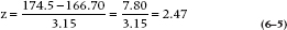
That then means that the probability of having a sample mean to the left of the critical value, if H1 is true, is the probability corresponding to a z of 2.47, which is, from Table A, 0.0068 (that is, 0.5 − 0.4932). This is the β error, the likelihood of saying there is no difference when, in fact, there is. Or more formally, the probability of accepting H0 when H1 is true. Since it’s kind of small, we’re happy to go with it.
Beta (β) is the probability of concluding that there is no difference when there is, and the sample actually came from the H1 distribution
On the other hand, we began this bit by asking whether we had enough power to detect a difference. That is formally defined as (1 − β), the probability of accepting the alternative hypothesis when it’s true. And in this case, it turns out to be (1.0 − 0.007) = 0.993.
Power (1 − β) is the probability of concluding that there is difference when there is.
So if you’re using this approach (and you may not, stay tuned), you write the paper with two critical elements. In the Methods section, at some point you say, “we used an alpha of 0.05.”10 And in the Results section, when you’re talking about what happened, you say that either “The difference was statistically significant” or “The difference was not statistically significant.” You do not say “The difference was highly significant.” That’s like saying “we really rejected the null hypothesis.”
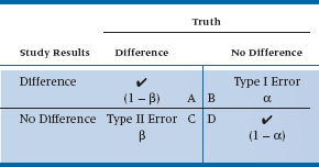
We’ve come to the end of the road. We’ve discussed all aspects of the Neyman-Pearson convention, based on the testing of hypotheses. Two in particular: H0: it didn’t work; and H1: it did work. This, in turn, leads to four different conclusions: (a) the stuff really works, and our study showed that it worked; (b) it works, but our study concluded that it didn’t; (c) it doesn’t do anything, and that’s what our study said; and (d) it doesn’t do anything, but we concluded that it did. The first part of each of the four phrases—it works or it doesn’t work—is, in fact, beyond our ken. This is something that only an omnipotent being would know; it is “truth” in the Platonic sense11 that we can get glimpses of through our studies, but never know definitely. We can show the four conclusions in a two-way table, as in Table 6–1. The columns show “reality,” while the rows show what we found in our study. Cell A describes the situation in which there really is a difference, and that’s also what our study showed. Congratulations are in order; we’ve come to the right conclusion. As you can see in the table, this box reflects the power of the study—the probability of finding a difference when it’s there, which is 1 − β. Similarly, Cell D shows another place where we’ve come to the correct answer—there really is no difference because of the intervention, and that’s also what our study said. Unfortunately, that leaves two boxes to be filled.
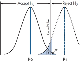
FIGURE 6-5 The null and alternate hypotheses.
In Cell B, there is no difference (i.e., the intervention doesn’t work), but our study rejected the null hypothesis. This is called a Type I error. How often does it occur? If we use the commonly accepted α level of .05, then by definition, it will happen 5% of the time. That is, if we took a totally useless preparation, gave it to half of the subjects, and gave the other half a different totally useless preparation, and repeated this 100 times, we’d find a statistically significant difference between the groups in five of the studies.
Cell C shows the opposite situation—the stuff really works, but our study failed to reject H0. With great originality, statisticians call this a Type II error,12 and its probability of occurring is denoted by β. By tradition, we’d like β to be .15 to .20 (meaning that the power of the study was between 80 and 85%). There are many factors that affect β—the magnitude of the difference between the groups, the variability within the groups, and α. But, the factor that we have the most control over is the sample size; the larger the study, the more power (and the smaller is β); the smaller the study the less power. So, if you did a study and the results look promising, but they didn’t reach statistical significance, the most likely culprit is that there were too few subjects.13
TABLE 6–1 The results of a study and the types of errors
On “Proving” the Null Hypothesis
One final bit of philosophical logic. All along, we’ve used the phrases “accept the null hypothesis” and “fail to reject the null hypothesis” more or less interchangeably, since to the average reader they differ only in pomposity. However, to serious statisticians and philosophers of science (both of which categories exclude present company), there is a world of difference, and by treating them as synonyms we have offended them terribly.
It really is illustrated with the example. When we did the study with a sample size of 100, we found that there was a significant difference, so we rejected H0 and concluded the treatment worked. Exactly the same data, only a smaller sample size, and we might come to the opposite conclusion. But the fact is, there really was a difference between the groups; it’s just that we couldn’t find it. Hence the logic that we “failed to reject the null hypothesis” acknowledges that there may well be a treatment effect, but we have insufficient evidence to prove it. It’s logically analogous to the old philosophical analysis of the statement, “All swans are white,” which can never be proven correct because you can never assemble all swans to be sure.14
To be a bit more formal about it, you can never prove the non-existence of something (although we’ll try to in Chapter 27). The lack of evidence is not the same as the evidence of a lack. Our study may not have found an effect because it was badly designed, we used the wrong measures, or, more likely, the sample size was too small (and hence the power was low). The next study, which is better executed, may very well show a difference. Hence, all we can do in the face of negative findings is to say that we haven’t disproven the null hypothesis, yet.
Where Did That 5% Come From?
We promised you we’d explain why the magic number for journal editors is a p level of .05 or less, so here we go. The historical reason is that the grand-daddy of statistics, Sir Ronald Fisher, sayeth unto the multitudes, “Let it be .05,” and it was .05. We’ll see in a bit that, as with most historical “truths,” this isn’t quite right. But at another level, 5% does seem to correspond to our gut-level feeling of the dividing between chance and something “real” going on!15
Try this out with some of your friends. Tell them you’ll play a game—you’ll flip a coin and if it comes up heads, each of them will pay you $1.00; whereas if it comes up tails, you’ll pay each of them $1.00. You keep tossing and, mirabile dictu, it keeps coming up heads. How many tosses before your friends think the game is rigged?
If we were doing it with our friends, they would say “One or fewer.” But, with a less cynical audience, many will start becoming suspicious after four heads in a row, and the remainder after five. Let’s work out the probabilities. For one head (and no cheating), the probability of a head is 1 in 2, or 50%. Two heads, it’s 1 in 22, or 25%; three heads is 1 in 23, or 12.5%; four heads is 1 in 24, or 6.25%; and the probability of five heads in a row is 1 in 25, which is just over 3%. So 5% falls nicely in between; Sir Ronnie was probably right.
Ritual and Myth of p < .05
Having just fed you the party line about the history and sanctity of p < .05, let’s take much of it back. First, Fisher did in fact talk about a null hypothesis (which, by the way, he said need not always be the “nil” hypothesis of nothing going on), but never talked about “accepting” or “rejecting” it; he simply said we should work out its exact probability. Second, he said that we should go through the rigamarole of running statistical tests and figuring out probabilities only if we know very little about the problem we’re dealing with (Gigerenzer, 2004); otherwise, just look at the data. Finally, he was actually the author of the heretical words:
no scientific worker has a fixed level of significance at which from year to year, and in all circumstances, he rejects hypotheses; he rather gives his mind to each particular case in the light of his evidence and his ideas (Fisher, 1956)
which mirrors what the famous philosopher and skeptic David Hume said way back in 1748: “A wise man proportions his belief to the evidence,” and Carl Sagan turned into his battle cry of “Extraordinary claims require extraordinary proof.”
That is, do we need the same level of evidence to believe that non-steroidal anti-inflammatory drugs help with arthritis as the claim that extract of shark cartilage cures cancer? There have been roughly 10 papers by every rheumatologist in the world demonstrating the first, and not a single randomized trial showing the second. Insisting that the same p level of .05 applies in both situations is somewhat ridiculous.
So where does that leave us? Should we test for p < .05 or not? We’d love to say that saner heads have now prevailed, and we consider the strength of the evidence, and speak of values as near significant or highly significant, not just whether the probability is less than or greater than 1 in 20. Unfortunately, if anything, things are more rigid. To quote a recent JAMA editorial review when we tried to get away with it:
JAMA reserves the term “trend” for results of statistical tests for trend, and does not use it to describe results that do not reach statistical significance. We also do not use similar terms such as “marginal significance” or “borderline significance.” Instead, such findings should just be described as “no statistically significant association” or the equivalent, with relevant confidence intervals and p-values provided.
In brief, if you want to pass Miss Manner’s rules of statistical etiquette, you can’t talk about “trends,” “near significant result,” “highly significant result,” and so on. It is or it ain’t.16
However, although the .05 rule remains inviolate, Fisher’s exact probability estimation has risen from the ashes over the past decade or so. Let us explain why.
Exact Probabilities: The Fisher Approach
Nowadays, while you may still see the quaint Victorian phrases like “We rejected the null hypothesis,” it is increasing rare to see it standing alone. Far more often, it goes like “we rejected the null hypothesis (p = 0.043)” or more commonly, “The results were highly significant (p = .00034).” When your august mentors, David and Geoff, were in stats class, such phrases were viewed with the same disdain as passing wind at the Dean’s tea party. But nowadays, they’re pretty well the norm.
What changed, and why? Well, first of all, it’s not a new idea. As we described in the previous section, the approach has been around almost since the dawn of statistics, and was championed by the person who has more right than anyone else to claim “father of statistics” status—Ronald Fisher. By all accounts, he was an ornery cuss and picked fights with nearly everyone.17 And one of those fights was with Egon Pearson (Karl’s son). As we saw, Pearson and Neyman set it up as a hypothesis testing exercise, and you either accepted the hypothesis or rejected it. As we discussed in the previous section, Fisher, on the other hand, recognized, correctly, that the world is rarely black and white. Results that have an associated p value of 0.0001 are more credible than results that have a p value of 0.049, and the Pearson-Neyman convention loses this information.
Fisher did the obvious (in hindsight, at least). He simply said, “Here’s the difference I observed. What’s the likelihood that this could have arisen by chance if there really was no difference?” If you impose the sample mean on Figure 6–3, it looks like Figure 6–6, and it’s pretty obvious where to go from here. Visually, the likelihood of observing a mean this big or bigger is a leetle teeny sliver to the right of the sample mean.
To work out how teeny leetle it is, is easy-peasy. The mean of the null hypothesis distribution is at 16.5, the standard deviation, SE(M), is 3.15, and the sample mean is 170. So the sample mean in SE(M) units is:
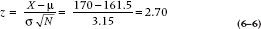
and the sample mean is 2.70 standard deviation units out. We go to Table A and work out that the probability is 0.5000 − 0.4965 = 0.0035. So the chance of finding a sample mean of 170 under the null hypothesis is 0.0035 or about 1 in 300, and we therefore reject H0, just as before. Only this time we’re considerably more confident that it really is a difference.
So why did us old guys learn the Neyman-Pearson approach? Simple. Back in the pre-computer days,18 all those p values had to be computed by hand by some poor stats Ph.D. student, and we users had to look them up in the back of the book (just like Tables B-H in this book). It took a lot fewer trees and a lot less graduate student time to calculate it once for p = 0.05 than for every value of the test. Nowadays, the exact p value is dumped out by a laptop computer in nanoseconds, and the tables are pretty well redundant.
On the other hand, the magic of 0.05 remains so, as we’ve seen. Things are or are not significant, and there’s no wiggle room. So the ghosts of Pearson and Neyman are also lurking in the wings. More important, and the reason why we led you through the arcane corridors of H0 and H1 first, is that if you don’t get a significant result, you still have to figure out why, and whether you have enough power. And to do so, you have to revert to the Neyman-Pearson convention entirely, setting up a critical value and computing beta and power.
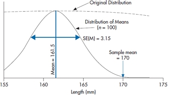
FIGURE 6-6 Figure 6-3 showing the observed sample mean of 170.
We now have the best (or worst) of both worlds.
A Little Bit More History and Philosophy
We’ve just gone through two approaches to the whole idea of statistical inference. Face it; they don’t seem all that different. Neyman and Pearson declare two hypotheses—it’s different and it’s not different—and then reject one or the other based on where the sample mean lies. Fisher, by contrast, determines the exact probability that a particular sample mean could arise by chance. But they’re all based on the same distributions and the same data. What’s the big deal? Beats us. Seems pretty mundane. But this was the stuff of one of the longest standing debates in science. Believe it or not, this particular battle between the two camps ranged from 1933 when Neyman and Pearson published their counterpoint to Fisher until at least 1968, six years after Fisher’s death, when Egon Pearson was still writing letters to Biometrica quoting an even earlier statistician, William Gossett (Student), in defense of his position.
If nothing else, the debate has great entertainment value. All parties were British, and like most Brits who rose through the public (i.e., private) school system to the hallowed halls of Oxbridge, they were trained in the art of rhetoric before they were potty trained. Here’s an exchange, minuted by the Royal Statistical Society in 1935:
Dr Pearson said while he knew that there was a widespread belief in Professor Fisher’s infallibility, he must, in the first place, beg leave to question the wisdom of accusing a fellow-worker of incompetence without, at the same time, showing that he had succeeded in mastering his argument [cited in Lenhard (2006)].
And just to show that the polemics were not one-sided, here is Fisher on Pearson:
[The unfounded presumptions] would scarcely have been possible without that insulation from all living contact with the natural sciences, which is a disconcerting feature of many mathematical departments (Fisher, 1955, p. 70).
Just what could have caused such longstanding vitriol? Well, in part, no doubt, it’s just British academe flexing its rhetorical muscle. But in fact there are some very subtle and profound differences between the two positions. We won’t begin to explore the subtleties, but if you want to read further, Lenhard (2006) has reviewed the longstanding feud in some detail. We will, however, highlight two critical differences.
The first, as Lenhard points out in his review of the Neyman-Pearson critique, is that Fisher’s position lacks some symmetry. A test can accept or reject the null hypothesis, but it puts nothing in its place. At best, that’s a risky strategy, a bit like turning down a job offer without having a better one. The Neyman–Pearson approach, instead, leads naturally to rejecting the null hypothesis and therefore to accepting the alternative hypothesis, or not rejecting the null hypothesis and looking carefully at power to do so.
That then leads to the second fundamental difference. In the Neyman- Pearson perspective, it’s all a case of model testing. You test two models—null hypothesis and alternative hypothesis—and determine, based on the experiment’s results, which model better fits the data. By contrast, the Fisher perspective begins, as we described at the beginning of the chapter, with a hypothetical infinite population of results consistent with the null hypothesis, and we draw a sample from the population, which becomes our study. We do something to the folks in the sample, and probably we don’t do something (or do something else) to another sample, then calculate the difference between the two. And if it is sufficiently unlikely to have arisen by chance, as determined by Fisher’s p value, we then conclude that the difference could not have arisen by chance, and we reject the null hypothesis.
You know all of this by now; we’ve drummed it in again and again. But we want to return to the idea of a hypothetical infinite population. As we said earlier in this chapter, “no one has ever made a truly random sample from a list of everyone of interest [the population].” We weren’t the first people to notice this small speed bump on the road to truth, beauty, and wisdom. But eventually, a better idea about the whole logic of inference came along.
It took about 50 years for that better idea, which emerged from the work of two American statisticians—Jerome Cornfield and John Tukey. Tukey was most famous for a book called Exploratory Data Analysis (1977), which proposed the radical concept of simply looking at the data—an idea which induces apoplexy in mainstream statisticians, and which we will return to in due course. He is less famous for a bit of philosophy he and Cornfield put together that directly confronts Fisher’s dilemma, called the “Cornfield Tukey Bridge Argument” (Cornfield and Tukey, 1956).
It’s likely easiest to explain it by taking an example from the laboratory. When the EPA (Environmental Protection Agency) wants to prove that such and such a noxious agent “causes” cancer, they first try to find a species of rat or mouse that has been bred to be highly susceptible to cancer. They then expose small groups of rats (typically around 40) to absurdly high levels of the agent, and hang around to see how many get cancer. With luck, about half will. With more luck, more will get cancer in the high exposure group than the low or no exposure groups. With even more luck, the difference will be statistically significant. And if it is, they approach the New York Times and ban the agent as a “probable human carcinogen.”
The bridge argument goes like this. Imagine a river with an island in the middle. One span of the bridge goes from the near bank to the island, and the next span goes to the far bank. The short span to the island is the statistical “p < .05” bit, where after comparing one group of mousies to another, you then generalize to all mousies in a famous hypothetical population just like yours.19 And we worry and fret endlessly about this short span. Did they really sample randomly? Did they follow up everyone? Did they blind the observers? Did they do the stats right? And on and on.
All this ignores the long span from the island to the far side of the river. This is the scientific inference that mice are enough like people (in terms of exposure to nasty things) to justify concluding an effect on humans even though you never studied them. And it rests on theoretical grounds—similar metabolism, similar anatomy, or whatever—not on statistical grounds. Another name for the short and long spans, seen in books on research design, are “internal validity’ (the short span) and “external validity” (the long span).
It’s almost axiomatic that increasing internal validity reduces external validity—the more inclusion and exclusion criteria, for example, the less the patients in the study resemble those in real life; the more control we exercise over how the treatment is delivered, the more it deviates from how it’s really given. The distance from one bank to the other is constant; all we can do is move the island closer to one bank or the other. Tukey had a last word on this:
Far better an approximate answer to the right question, which is often vague and imprecise, than an exact answer to the wrong question, which can always be made precise (Tukey, 1962, p. 13).
The same issue arises when a psychologist does a reaction time experiment on a bunch of first-year psychology students who don’t really want to be there, but have to, for course credit.20 If she’s done her stats really well, she’ll have no difficulty whatsoever convincing the peer reviewers that the effects apply to all human brains, not just 18-year-old, testosterone-soaked ones.21 But one might well ask what tapping a key when a light flashes on a computer screen has to do with hitting the brakes in time to avoid an accident on a highway. Maybe it is the same; maybe it’s not. But we need more knowledge, not more statistics, to find out.
It’s actually a huge issue in science. Just as the EPA concluded that formaldehyde was a “probable human carcinogen” at domestic exposure of about 50 parts per billion on the basis of seeing that susceptible rats exposed to 15 parts per million for their whole lives got nasal cancer, we routinely make inferences about how things work that go well beyond our experiments. Not just in terms of the study sample; also in choice of experimental conditions. Psychologists (OK, some psychologists) go out of their way to develop materials that are sensitive to the manipulations they want to investigate, but then extrapolate far beyond these materials.
And now doctors, let’s stop and wipe that smugness off your clinical faces, please. You too must plead guilty as charged. When you do a clinical trial, the standard routine is to develop a list of inclusion and exclusion criteria as long as your right arm so that you’ll end up with a sample of patients as close to genetically identical rats as you can. And as far from typical patients as imaginable. You want them to have squeaky clean arteries, no excess fat, no hypertension, no diabetes, no nuttin’ except a really high total cholesterol. Think I’m kidding? The LRC-CPPT trial (Lipids Research Clinics Program, 1984) screened 300,000 men just like that to find 4,000 who would take the crud (cholestyramine) morning noon and night for 7 to 10 years. And when the dust settled, they were looking at 38 heart attack deaths in one group and 30 in the other − p < .05 (just). Now do we wonder why clinicians constantly complain that “those patients aren’t like mine”?
That’s what Cornfield and Tukey are talking about. In the LRC trial, the first bridge, the really short one, was the statistical one from the 4000 guys they studied to other similar “guys” from some hypothetical population. The really long bridge was from those atypical guys to the more typical at-risk patient who walks into the family doc’s office, with his large gut, smoking two packs a day, a father who died young of an MI, and elevated blood sugar. And their point is that it’s really a case of “buyer beware.” You have to decide, based on your understanding of biology, physiology, pharmacology, as well as a bit of statistics, whether the results of that big multicenter trial are of use to you or not. That’s why proclamations of the death of basic science in medical school curricula are a bit premature. As more and more practice guidelines impose recommendations based on findings from atypical samples, it is more and more incumbent on the doc to decide about the applicability of those guidelines to her patients. In our view, reasoned departure from guidelines is a sign of a good, not a bad, doctor.
And all these examples do make the debate between Fisher and Pearson about sampling from an infinite hypothetical population a bit like ancient monks debating how many pins you can stick in the head of an angel.
WHEN CAN YOU PEEK? EXPLORATORY DATA ANALYSIS, STOPPING RULES, AND STATISTICAL ETIQUETTE
The Bridge argument was not Tukey’s only or largest contribution to the science of statistics.22 Indeed, most have forgotten the bridge argument or never came across it in their education. Tukey also invented a number of methods we’ve reviewed in this book: the Stem-and-Leaf Plot, the Box-and-Whisker Plot, jackknife estimation, and some post-hoc tests are all attributed to him. Some claim that he even invented two computer terms: bit—short for “binary digit”—and software, although the latter is disputed. But what he is best known for is exploratory data analysis (which the cognoscenti call EDA), which he described as:
If we need a short suggestion of what exploratory data analysis is, I would suggest that
- It is an attitude AND
- A flexibility AND
- Some graph paper (or transparencies, or both)
Tukey strongly felt that the statistician’s job was to really understand what his data were telling him before any p values were produced. In fact, another one of his (many) quotes is that “Exploratory data analysis … does not need probability, significance or confidence.” To that end, his book, EDA, introduced the community to all sorts of strategies to get to really know what Ma Nature was trying to tell the researcher (some of which we described in Chapter 3). Only after the data have been suitably explored are you justified in proceeding to the now appropriate statistical test. He believed that the community was far too preoccupied with the latter and far too unschooled in the former. To quote again:
Once upon a time statisticians only explored. Then they learned to confirm exactly—to confirm a few things exactly, each under very specific circumstances. As they emphasized exact confirmation, their techniques inevitably became less flexible. The connection of the most used techniques with past insights was weakened. Anything to which a confirmatory procedure [i.e., a statistical test] was not explicitly attached was decried as “mere descriptive statistics,” no matter how much we had learned from it.
This seems all eminently reasonable. So what led to communal apoplexy? Well, the statistician’s golden rule (one of many) is “In the final analysis, thou shalt not mess with thy data before the final analysis.” There are two issues underlying the commandment. The first relates to p values yet again. Strictly speaking, every time you do a statistical analysis, you have a .05 chance of rejecting H0 incorrectly. So if you sneak a peek at the data after half the subjects have been enrolled, there goes one .05. And if you take another look two weeks later, there’s another .05. And on it goes. You have committed a cardinal sin and “lost control of your alpha level,” and may end up in numerical purgatory for eternity.
Of course, one solution is to just look at the data, as Tukey would have us to. Graph it, scatter plot it, survival curve it, or whatever, but don’t compute a p value. That’s OK, isn’t it? Yeah, but….
So you’re in the middle of the NIH-funded trial of date pits and toenail cancer, and you look at the survival curves. Fifty percent of the placebo group are goners, but 75% of the pit group are alive and kicking. Trouble is, there are only 12 patients in each group so far. Now you have a problem. It’s unethical to keep the trial going and deny an effective therapy to the patients in the placebo group. It’s also unethical to do a p value early. So what can the poor ethical researcher do? One strategy is called “stopping rules,” where, if the risk reduction is greater than X, you’re entitled to declare a victor and call the whole thing off and save a few placebo group lives in the process. Trouble is, it’s hard to separate real benefit from chance; after all,
p < .001 does happen one time in a thousand, and there is good evidence that trials stopped early do overestimate the benefit. So a controversy continues to rage, with little sign of resolution. We will explore no further; suffice it to say that, while statistical methods have evolved to deal with these issues, they remain controversial.
But there’s another, even more catastrophic, danger lurking in them thar hills. Imagine a different trial now; one where we are looking at quality of life as a primary endpoint. We use a bunch of standard measures—the EQ5-D, the SF-36, the GHQ, or whatever—and we administer them every three months for two years of follow-up. Now suppose we sneak the peek at 18 months and discover that at 3, 6, 9, 12, and 15 months none of the measures showed a difference, but at 18 months there was a significant difference for the EQ5-D but none of the others. Care to guess how the journal article will be written?
Lest you think we’re making this up, sadly there’s much evidence that this kind of data culling is not a rare phenomenon. One review (Lexchin et al., 2003) found that studies funded by drug companies were four times as likely to show a significant difference favoring the drug as those not funded by companies. A follow-up study (Lexchin, 2012) showed a number of reasons for this: the studies may use an inappropriate dose of the comparator drug to reduce efficacy or increase side effects, selective nonreporting of negative studies, liberal statistical tests, reinterpreting the data, multiple publication of favorable trials, and, as we suggested above, only publishing the outcomes that favored the drug. This review found that, in 164 trials, there were 43 outcomes that did not favor the drug, and half (20) of them were unreported. In the remaining 23, five were reported as significant in the publication but not in the report.
Steps have been taken in the last decade or so to reduce the bias. Not surprisingly, the biggest concern is the clinical trial, where the most money can be made (or lost). Nowadays, if you want to publish your trial in BMJ or The Lancet, not only must you swear on a stack of Harrison’s that you have no (or some) financial interest in the outcome, but you must have registered your trial when you began, telling the world exactly what you would do to whom and how. But long before CONSORT statements, statistics courses cautioned students to specify the analysis in detail at the time of the proposal and never, Never, NEVER depart from the initial plan.
And that is why Tukey is both worshipped and reviled. Exploratory data analysis, with or without p values, where you conduct the first analysis to determine how to conduct the later analysis, breaks all the rules. Well, all those rules. Which brings us to another school of thought altogether that falls in line with Tukey’s approach. This second perspective is that the good scientist is sensitive to the story her data tells her. She pokes the data every way she can think of to understand the data better. Only when she is certain of the underlying trends does she punch the p value button. In short, selective use of some variables and transformations is not only condoned; it is viewed as essential. Moreover, early analysis, while the study is underway, is also encouraged, so that you don’t waste time and people pursuing hypotheses that ultimately turn out to be dumb ideas. Two quotes, both from Fred Mosteller, a famous statistician, say it all:
Although we often hear that data speak for themselves, their voices can be soft and sly (Mosteller et al., 1983, p. 234).
The main purpose of a significance test is to inhibit the natural enthusiasm of the investigator (Mosteller and Bush, 1954, pp. 331–332).
Who is right? Well this won’t be the last time we will answer with an unequivocal “It depends.” On the one hand, in a typical clinical trial, the goal is really not to advance understanding—it’s to find out whether the therapy works or not. And the stakes are high—millions of dollars may hang in the balance. So this is not the place for fudge factors. On the other hand, science is a detective story. As Mary Budd Rowe, professor of philosophy of science said: “Science is a special kind of story-telling with no right or wrong answers, just better and better stories.“
As anyone who has read The Double Helix (Watson, 1968) will attest, when it’s done right it’s a huge mystery story. But somehow, as we keep adding layers of bureaucracy to the research game, maybe, just maybe, we’re throwing out the baby with the bathwater. This week, we sent an article to BMJ, and it came back with the ominous note that it had been “desubmitted”23 for lack of dotted i’s and crossed t’s. Turns out that in BMJ guidelines, they now want you to submit the original grant proposal if at all possible, and if you have departed in any way from what you said you would do four years ago, you must explain why. Boy, isn’t that a cue to follow the leads! Tukey is turning over in his grave.
MULTIPLICITY AND TYPE I ERROR RATES
Until now, we have been discussing statistical tests as if they were hermits, living on their own in splendid isolation. In fact, they’re more like cockroaches—if you see one, you can bet there’ll be plenty of others. It’s extremely unusual for a paper to report only one test or p level, and that can be a problem. The problem has a name: multiplicity, which simply means multiple statistical tests within a single study. Actually, multiplicity situations are like cockroaches in many regards: they’re ubiquitous, pesky, and difficult to deal with. First, let’s outline what the problem is.
In Chapter 5, we showed that the probability of at least one test being significant is 1 minus the probability that none are significant. So, if we have six statistical tests in a study, and if we assume that absolutely nothing is going on (i.e., the null hypotheses are all true), then the probability of finding at least one test to be significant by chance is (1 − .956) = 26.49%, which is a lot higher than the 5% we assume is operative. By the time we get to 10 tests, the probability has shot up to nearly 60%. This was delightfully illustrated in two studies. In one, Bennett et al. (2010) showed a subject a series of photographs of people expressing specific emotions in social situations, and the subject had to identify the emotion. The approach was very technical, using “a 6-parameter rigid-body affine realignment of the fMRI timeseries, coregistration of the data to a T1-weighted anatomical image, and 8 mm full-width at half-maximum (FWHM) Gaussian smoothing” (we don’t know what they’re talking about either). After searching 8064 voxels produced by the fMRI, they found three with significant signal changes during the photo condition compared to rest. The only fly in the ointment was that the “subject” was a salmon, and a dead one at that. In the other study, Austin et al. (2006) searched through 223 of the most common diagnoses in a large database and found that people born under the astrological sign of Leo had a higher probability of gastrointestinal hemorrhage, and those born under Sagittarius had a higher probability of fractures of the humerus, compared to the other signs combined.
The problem, as you’ve probably guessed by now, is the large number of statistical tests that were run, compounded by the fact that none of the hypotheses were specified beforehand; they were fishing expeditions, pure and simple (and not just because the subject in one study was a salmon). Admittedly, these are extreme cases, with many variables, and were conducted to illustrate the difficulties that are encountered under such circumstances, but the question is still valid: Is it necessary to adopt a more stringent cutoff for p when a study involves more than one test of significance? The question is simple, but the answer is far from straightforward. One leading epidemiologist (Rothman, 1990) argues that you should never correct for multiple tests, because it will lead to too many Type II errors; while others, like Ottenbacher (1998) are just as vociferous that you always should because not correcting leads to too many Type I errors. Moyé (1998) puts it well: “Type I error accumulates with each executed hypothesis test and must be controlled by the investigators.” So what should we do?
Not surprisingly, your devoted authors have jumped head-first into this fray (Streiner and Norman, 2011). To begin with, let’s differentiate among various situations where multiplicity may rear its ugly head. The first is when we have done a study involving two or more groups, and we want to see if they differ at baseline. If it’s a randomized controlled study (RCT), don’t bother to test at all. As we explain in Chapter 29, the p level under such circumstances is meaningless, since the probability that any differences could have arisen by chance is 100%; after all, what else could account for any differences if the subjects are divided randomly? If it’s not an RCT, then the main purpose for testing baseline differences is to see if we should correct for them. (We’ll have more to say about dealing with baseline differences in Chapters 16 and 17). Here, it’s probably better to have Type I errors rather than Type II, because it doesn’t cost much to control for differences that may not actually exist. So, correcting for multiplicity isn’t necessary.
The second situation is when we may have a limited number of outcomes, and we have specified them beforehand. A good example of this is factorial ANOVA (see Chapter 9), which may routinely test five or 10 hypotheses. Typically, the researcher may be interested in only one or two, each relating to a different hypothesis, so it doesn’t make sense to correct for all of the tests that will be ignored. Here, we tend to side with Rothman and not correct. It may result in some false positive results, but that’s likely better than closing off potentially useful research areas with false negative conclusions.
The final area is when we haven’t specified hypotheses a priori (a fancy way of saying we’re on a fishing expedition). This often arises when people have measured a number of variables and then examine the table of correlations to find out which relationships are significant. Our advice here would be that you definitely have to correct for multiplicity; how to do so is discussed in Chapter 8, under Post-Hoc Comparisons.
STATISTICAL INFERENCE AND THE SIGNAL-TO-NOISE RATIO
The essence of the z-test (and as we will eventually see, the essence of all statistical tests), is the notion of a signal, based on some observed difference between groups, and a noise, which is the variability in the measure between individuals within the group. If the signal—the difference—is large enough as compared with the noise within the group, then it is reasonable to conclude that the signal has some effect. If the signal does not rise above the noise level, then it is reasonable to conclude that no association exists. The basis of all inferential statistics is to attach a probability to this ratio.
Nearly all statistical tests are based on a signal-to-noise ratio, where the signal is the important relationship and the noise is a measure of individual variation.
To bring home the concept of signal-to-noise ratio, we’ll make a brief diversion into home audio. As the local electronics shops and our resident adolescents continue to remind us, the stereo world has undergone yet another revolution. The last one in recent memory was the audio cassette, which had the advantage of portability so it would fit into the Walkmen (Walkpersons?) of us on-the-move yup-pies, and also would continue to blare music out of our BMWs without skipping a beat as we rounded corners at excessive speed. The cost of all this miniaturization was lots and lots of hiss that no amount of Dolbyizing would resolve. But now we have CDs—compact discs—which deliver all that rap noise at a zillion decibels, completely distortion-free.
All that hissing and wowing was noise, brought about by scratches and dents on the album or random magnetization on the little tape. This was magically removed by digitizing the signal and implanting it as a bit string on the CD, letting the signal—the original music (or rap noise or heavy metal noise)—come booming on through. In short, two decades of sound technology can be boiled down to a quest for higher and higher signal-to-noise ratios so worse and worse music can be played louder and louder without distortion.
Although we are referring to music, we are simply using this as one example of a small signal detected above a sea of noise. When it comes to receiving the radio signal from Voyager 2 as it rounds the bend at Uranus, signal-to-noise ratio of the radio receiver is not just an issue of entertainment value; it’s a measure of whether any information will be detected and whether all those NASA bucks are being well spent.
You might imagine the signals from Voyager 2 whistling through the ether as a “blip” from space. This is superimposed on the random noise of cosmic rays, magnetic fields, sunspots, or whatever. The end result looks like Figure 6–7. Now, if we project these waves onto the Y-axis, we get a distribution of signals and noises remarkably like what we have already been seeing. The signals come from a distribution with an average height about +1.1 microvolts (μV), and the noises around another distribution at +0.7 μV. If we now imagine detecting a blip in our receiver and trying to decide if it is a signal or just a random squeak, we can see that it may come from either distribution. Of course, if it is sufficiently high, we then conclude that it is definitely unlikely to have occurred by chance. Conversely, if it is very low, we do not hear it at all above the noise, and we falsely conclude that no signal was present. That is, there are always four possibilities: (1) concluding we heard a signal when there was none, (2) concluding there was a signal when there was, (3) concluding no signal when there was one, and (4) concluding there was no signal when there was none. Two of these are correct decisions (2 and 4), and two are wrong ones (1 and 3). Our problem is to determine which our decision is.
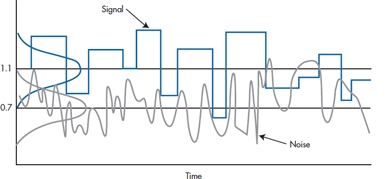
FIGURE 6-7 Spectra of radio signal and noise.
TWO TAILS VERSUS ONE TAIL
You might have noticed that, all through the phallus example, we were preoccupied with the right side of the H0 distribution. For obvious reasons, we were really not interested in a treatment that made things shorter. As a consequence, we worried only about committing a Type I error on the high side. This kind of test, focusing only on one side, is called, with astounding logic, a one-tailed test:
A one-tailed test specifies the direction of the difference of interest in advance.
On the other hand, given the dubious provenance of the therapy, there exists the possibility, ever so slight, that it might make them shrink, not grow. If so, we would surely be interested in such a consequence, if for no other reason than to fend off lawsuits. That is, we might reframe the alternative hypothesis, so that instead of asking whether the Mangro group is larger than the population, we might ask whether it is different from the population, in either direction. If we do this, then we are equally concerned about Type I errors in either direction, albeit for very different reasons. Consequently, we have to think about the H0 distribution with a critical value on both sides, which is called, as an obvious extension a two-tailed test.
A two-tailed test is a test of any difference between groups, regardless of the direction of the difference.
If we frame it formally, for a one-tailed test, the two hypotheses are:
or, if the direction is the other way around:
where A and B refer to the two groups.
For a two-tailed test, the null and alternate hypotheses are:
Aside from the philosophy, it is not immediately evident what difference all this makes. But remember that the significance or nonsignificance of the test is predicated on the probability of reaching some conventionally small criterion (usually 0.05). If this occurs only on one side of the distribution, then from Table A in the book Appendix, we see that this probability occurs at a z value of 1.645 (i.e., 1.645 SDs from the mean). By contrast, if we want the total probability on both sides to equal 0.05, then the probability one side is 0.025, which corresponds to a z value of 1.96. So, to achieve significance with a one-tailed test, we need only achieve a z of 1.645; if it is a two-tailed test, we must make it to 1.96. Clearly the two-tailed test is a bit more stringent.
You would think that one-tailed tests would be the order of the day. When we test a drug against a placebo, we don’t usually care to prove that the drug is worse than the placebo.24 If we want to investigate the effects of high versus low social support, we wouldn’t be thrilled to find that folks with high support are more depressed. In fact, except for the circumstance where you are testing two equivalent treatments against each other, it is difficult to find circumstances where a researcher isn’t cheering for one side over the other.
However, there is a strong argument against the use of one-tailed tests. We may well begin a study hoping to show that our drug is better than a placebo, and we expect, for the sake of argument, a 10% improvement. Taking the one-tail philosophy to heart, imagine our embarrassment when the drug turns out to have lethal, but unanticipated, side effects, so that it is 80% worse. Now we are in the awkward situation of concluding that an 80% difference in this direction is not significant, where a 10% difference in the other direction was. Strictly speaking, in fact, we don’t even have the right to analyze whether this difference was statistically significant; we would have to say it resulted from chance. Oops!25
So that is the basic idea. One-tailed tests are used to test a directional hypothesis, and two-tailed tests are used when you are indifferent as to the direction of the difference. Except that everybody uses two-tailed tests all the time.
CONFIDENCE INTERVALS
More and more, politicians are showing that they have no judgment of their own; whatever opinions they express are simply the results of the latest poll.26 Polling is now a regular feature of most daily newspapers. And every poll somewhere contains the cryptic phrase, “This poll is accurate to ± 2 percentage points 95% of the time.” Often we wonder what mere mortals make of that bit of convoluted prose. We know what they’re supposed to make of it; it’s what is called the 95% confidence interval (CI or CI95).
It is a different kind of logic from what we’ve seen until now. Instead of focusing on two hypothetical means and bobbing back and forth, we go from the opposite direction, and say, “Well, it’s all over. We did the study, and we got a treatment effect of 123.45. We know that this isn’t 100% correct, because we’re dealing with a sample, not the population. But, we’re pretty confident that the truth lies around there somewhere. In fact, we’re 95% confident that the mean lies between 121 and 125.” Or, putting it another way, if we did the study a thousand times, on 950 occasions the means would lie between 121 and 125.
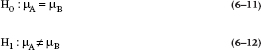
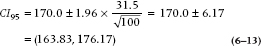
Now the question is how can we figure out what the bounds of 95% probability would be. Let’s go back to Mangro and work it out. Recall that the calculated mean of the study sample was 170 mm, and the standard error of the mean was 3.15 mm. What we now want to do is establish an upper and lower bound so that we’re 95% confident that the true mean of the treated population lies between these bounds.
Let’s look at the lower bound first. We want to find out where the population mean would have to be located in order that 2.5% [½ of (100 − 95)] of the sample means for n = 100 would be greater than 170. The SE for a sample size 100 is 3.15. From the normal distribution, a 2.5% probability corresponds to a z value of 1.96. Therefore, the lower bound must be (170 − 1.96 × 3.15) = 170 − 6.17 = 163.83. So, if the true population mean was 163.83, there is a 2.5% chance of observing a sample mean greater than 170.
Using a similar logic, we calculate the upper bound as (170 + 1.96 × 3.15) = 176.17, meaning that if the true population mean were 176.17, there is a 2.5% chance of seeing a sample mean of 170 or less.
All this is evident from Figure 6–8, which shows that the left-hand curve—the distribution of sample means for a population mean of 163.83—ends up with a tail probability of 2.5% above 170; and the right-hand curve—the distribution of sample means with a population mean of 176.17—has 2.5% below the sample mean of 170.0.
There is also a consistency between this and the results of our hypothesis-testing exercise. Since the lower bound is actually larger than the original untreated population mean (161.5), it must be the case that the probability of seeing a sample mean of 170 is lower than .025, so the result is significant (both two-tailed, as in this case, and one-tailed as we first calculated it). Conversely, the upper bound of 176.17 is actually greater than our alternative hypothesis of 175, so the probability of observing a sample mean of 170 with a population mean of 175 is greater than .025, and we do not reject the alternative hypothesis. All this is shown in Figure 6–9, where the lower bound of the CI is to the right of the null hypothesis line at 161.5, but the upper bound is beyond (to the right) of the alternative hypothesis line at 175.
FIGURE 6-8 A 95% CI about a sample mean of 170, showing the distributions corresponding to the upper and lower bounds.
Putting it all together, the actual confidence interval will be written as:
To formalize all this into an equation, the 95% confidence interval is:

From this equation, it is evident that a relationship exists between the CI and the sample size and SD. The smaller the sample size or the larger the SD, the larger the CI; the larger the sample size or the smaller the SD, the smaller the CI. And considering the relationship between the CI and the null hypothesis, if the population mean falls within the CI, the sample doesn’t differ significantly from it. In the next chapter, we’ll go into more detail on using the CIs from two groups to do “eyeball” tests of statistical significance.
STATISTICAL SIGNIFICANCE VERSUS CLINICAL IMPORTANCE
It may have dawned on you by now that statistical significance is all wrapped up in issues of probability and in tables at the ends of books. Whatever actual differences were observed were left far behind. Indeed, this is a very profound observation. Statistical significance, if you read the fine print once again, is simply an issue of the probability or likelihood that there was a difference—any difference of any size. If the sample size is small, even huge differences may remain non- (not in-) significant. By the same token, with a large sample size, even tiddly little differences may be statistically significant. As our wise old prof once said, “Too large a sample size and you are doomed to statistical significance.”
As one example, imagine a mail-order brochure offering to make your rotten little offspring smarter so they can go to Ivy League colleges, become stockbrokers or surgeons, and support you in a manner to which you would desperately like to become accustomed. This is what the insurance companies call “Future Planning.” Suppose the brochure even contains relatively legitimate research data to support its claims that the product was demonstrated to raise IQs by an amount significant “at the .05 level.”
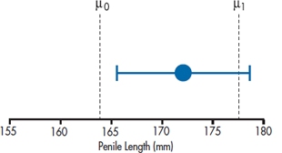
FIGURE 6-9 Another way of showing the 95% CI.
How big a difference is this? We begin by noting that IQ tests are designed to have a mean of 100 and SD of 15. Suppose we did a study with 100 RLKs (rotten little kids) who took the test. Just like the earlier example, we know the distribution of scores in the population if there is no effect. Under the null hypothesis, our sample of RLKs would be expected to have a mean of 100 and an SD and 15. How would the means of a sample size of 100 be distributed?
The SE is equal to:
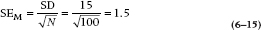
Now, the z value corresponding to a probability of 0.05 (two-tailed, of course) is 1.96. So, if the difference between the RLK mean and 100 is δ, then:
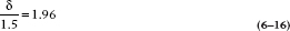
so δ = (1.96 × 1.5) = 2.94 IQ points. That is, for N = 100, a difference of only 3 points would produce a statistically significant difference.
This is not the thing of which carefree retirement, supported by rich and adoring offspring, is made! Working the formula out for a few more sample sizes, it looks like Table 6–2. It would seem important, before finding that little cottage in the Florida swampland, to investigate how large the sample was on which the study was performed.
TABLE 6–2 Relation between sample size and the size of a difference needed to reach statistical significance when SD = 15
| Sample size | Difference |
| 4 | 14.70 |
| 9 | 9.80 |
| 25 | 5.88 |
| 64 | 3.68 |
| 100 | 2.94 |
| 400 | 1.47 |
| 900 | 0.98 |
Of course, like everything else, “large” and “small” in terms of sample size are relative terms. By and large (and small), if the study deals with measured quantities such as blood sugar, clinical ratings, aptitude tests, or depression scores, any difference worth worrying about can be attained with about 30 to 50 subjects in each group. By contrast, with relatively rare events such as death,27 it may take depressingly large samples.28 For example, the first large-scale sample of cholesterol-lowering drugs screened 300,000 men to get 4,000 who fit the inclusion criteria. They were followed for 7 to 10 years, then analyzed. There were 38 heart-related deaths in the control group and 30 in the treatment group—just significant at the .05 level.
It would seem important to clearly outline the difference between statistical significance and clinical importance. As we have shown (we hope), statistical significance simply addresses the likelihood that the observed difference is, in truth, not actually zero. Statistical significance says nothing about the actual magnitude or the importance of the difference. The importance of the difference, often called clinical significance or clinical importance,29 is a separate issue, and it can be decided only by judgment, not by any whiz-bang mathematics. It’s a pity that statistical significance has assumed such magical properties, because it really is addressing a pretty mundane idea.
Note, however, that the two concepts are not unrelated. Although statistical significance makes no claims to the importance of a difference, it is a necessary precondition for clinical significance. If a difference is not statistically significant, it might as well be zero, or, for that matter, it might as well be in the opposite direction. Trying to argue that a difference that is not statistically significant (i.e., may be equal to zero) is still clinically important is illogical and, frankly, dumb.
Statistical significance is a necessary precondition for a consideration of clinical importance but says nothing about the actual magnitude of the effect.
EFFECT SIZES
Now that we’ve told you that there’s a difference between statistical significance and clinical importance, the question arises, how do you determine if a result is clinically important? One way is to simply turn to your colleague and ask, “OK, Charlie, do you think this is clinically important?” There are a couple of problems with this approach. First, it assumes that Charlie knows the answer, but he may be as much in the dark as you are. Second, there may not be much difficulty if the outcome is in units we can understand, such as the number of deaths in the treatment and control groups, or decreases in weight for people on a diet. But very often, we are dealing with scores on a scale. Is a three-point difference between groups on a pain scale clinically important? Without any other information, about all we can say is, “I dunno, whadda you think?” What we need is an index that can express differences between groups or relationships among variables using a common yardstick.30 That common index is called the effect size, or ES.
Borrowing a definition from Vacha-Haase and Thompson (2004), we can define an ES as:
A statistic that quantifies the degree to which results diverge from the expectations (e.g., no difference in group means, no relationship between two variables) specified in the null hypothesis.
Many physicians, physiotherapists, lab medicine types, and others go through their entire career without ever encountering an ES. This doesn’t (necessarily) make them benighted souls who have been deprived of a solid education. Rather, it reflects the type of measures they encounter in their work. Variables such as blood pressure, range of motion, or serum whatever are measured in commonly accepted units that all practitioners are familiar with (or at least should be). If PaCO2 changes from 50 mmHg to 40 mmHg, that’s all you really need to know—it moved from a level indicating acidosis into the normal range. The need to express change or differences between groups arises only when we’re dealing with measures that use arbitrary scales. This applies to almost all paper-and-pencil questionnaires, and since there are literally tens of thousands of these, ESs won’t be out of a job.
We’re not going to go into the messy details of how you calculate ESs just yet; whenever possible, we’ll spell it out when we discuss the different statistical tests. For now, suffice it to say that ESs come in two different flavors: those for tests that look at differences between groups, and those that evaluate the proportion of variance in one variable that is explained by another variable.31 For historical reasons, the first class is known as d type effect sizes, and the second as r type. There is no upper limit for d type ESs, although in practice, it’s unusual to find them greater than 1.0. For r type ESs, the upper limit is 1.0.
SAMPLE SIZE ESTIMATION
As we already indicated, a lot of clinical research is horrendously expensive. To keep the cost of doing the study down, it has become de rigueur to include a sample size calculation in the grant proposal. Essentially, this begins with the clinicians guessing the amount of the minimum clinically significant difference worth detecting. Then the statistics are messed around so that this minimum clinical difference corresponds to the statistical difference at p = .05.
Returning to the example of the RLKs, suppose we decide, about the time the encyclopedia salesman is shoving his foot further into the door, that the minimum difference in IQ we would shell out for is 5 points. How big a sample would Encyclopedia Newfoundlandia (E.N.) need to prove that its books will raise IQ levels by 5 points?
Now the picture is like Figure 6–10. We know where the mean of the null distribution is, at 100 points. We know where the mean of the population of RLKs who had the dubious benefit of E.N. is—a 5-point gain, at IQ 105. Finally, we must keep in mind that the normal curves we have drawn in the figure correspond to the distribution of means for repeated experiments, where the values are distributed about either 100 (if E.N. had no effect) or 105 (if E.N. had an effect). Of course, we don’t know what distribution our E.N.-exposed RLKs come from; that’s the point of the experiment. Either way, we know how wide the normal curves are—they correspond to an SD of  The challenge is to pull it all together and solve for n.
Imagine that the experiment was completed in such a way that it just achieved statistical significance at the .05 level, by the skin on its chin. Then the critical value (CV) corresponding to this state is 1.96 SEs to the right of the null mean. We will call this distance zα, the z value corresponding to the alpha error. Now we have to decide how much we want to risk a Type II error, the area of the H1 curve to the left of this point. Suppose we decide that we will risk a beta error rate of .10; this, then, puts the critical value at 1.28 SEs to the left of the alternative hypothesis mean. By analogy, this will be called zβ, the z value on the alternative curve corresponding to the beta error. IMPORTANT NOTE: The z-value for β is always based on a one-sided test. This doesn’t contradict what we said about two-tailed tests because that applies only to the α level. The reason can be seen in Figure 6–10, where the tail of the H1 distribution overlaps that of H0 on only one side.
We can formalize this with a couple of equations:
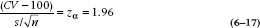
Similarly:
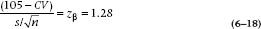
where CV is the critical value between the H0 and H1 curves. Adding the two equations together, we get rid of CV.
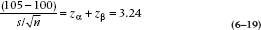
If, for the sake of generality, we call (105 − 100) the difference Δ, the algebra becomes:
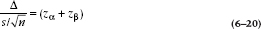
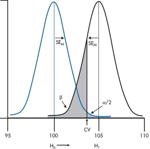
FIGURE 6-10 Mean IQ of sample of RLKs against the null and alternative hypotheses.
so that
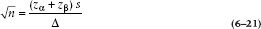
and squaring everything up:
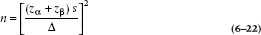
We should put this equation in big, bold type because it, and variations on it, are the things of which successful grant proposals are made. The same strategy will be used in subsequent chapters to derive sample size estimates for a variety of statistical tests. To save you the agony of having to work out this formula every time you want to see how many subjects you need to compare two means, we’ve given you these in Table B in the Appendix at the end of the book. Obviously, we couldn’t do this for every possible value of σ and Δ. What we’ve done is to present N for different ratios of σ ÷ Δ.
Note that the ratio of the difference between groups to the SD is called the effect size (ES). The effect size is like a z-score, and it tells you how big the difference is in SD units. If the difference you’re looking for is 5 points and the SD is 15 points, then the ES is 5 ÷ 15 = .33. So the ratio in the sample size equation, σ/Δ, is the inverse of the effect size.
For completeness, we’ll put the numbers of Figure 6–9 back in:

What is the distinction between the αs and βs in this calculation and the one before? Really only one of timing. In the previous example, the experiment was finished and did not show a difference. In this case, we are in the position of designing a trial, and so we based our calculations on a critical value for the sample mean that corresponded to the difference required to just reject the null hypothesis. If the experiment had turned out at that critical value, we then would have been able to determine exactly the probability of rejecting the null hypothesis when it was true (α, the Type I error) and the probability of rejecting the alternative hypothesis (accepting the null hypothesis) when it was true (β, the Type II error). It was these values that were used in the sample size calculation.
REPORTING
In Chapter 28, we give you some rules for how to report the results that you worked so hard to obtain. But here, we’ll give you a foretaste32 of what’s to come. We can lay blame for many of the problems at the feet of the ubiquitous computers; the people who program them may know a lot about how to make electrons fly around to give us the right answer (most of the time), but don’t know diddly-squat about logic. Other mistakes, though, are due to the people who (mis)interpret what the computer spit out. What’s wrong with these statements?
a) “The results were highly significant (p < 0.0000).”
b) “The results were of borderline significance (p = .058).”
c) “The effect was stronger in Study A (n = 273, p = .013) than in Study B (n = 14, p = .042).”
d) “The results, based on this study of 13 individuals, were highly significant (p = 0.00002357).”
Stay updated, free articles. Join our Telegram channel

Full access? Get Clinical Tree


