CHAPTER 8 Distributions
TYPES OF DISTRIBUTIONS
When we discussed the types of variables in Chapter 5, we stated that categorical variables may be assigned a number but the number represents a category rather than a true value. Table 8-1 is a data set that contains information on the marital status (a categorical variable) for all Americans age 18 or over. In this example the categories of marital status are listed instead of being assigned a number. The same data are displayed in a different format in Figure 8-1.
TABLE 8-1 Count and Percent of Marital Status of Americans Age 18 and Over
| Marital Status | Count (millions) | Percent |
|---|---|---|
| Never married | 43.9 | 22.9 |
| Married | 116.7 | 60.9 |
| Widowed | 13.4 | 7.0 |
| Divorced | 17.6 | 9.2 |
Data from Moore, D. S. and G. P. McCabe. 1999. Introduction to the practice of statistics, 3rd ed. New York: W. H. Freeman and Co., p. 6.
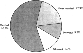
FIGURE 8-1 Pie chart of the same data as in Table 8-1. The human eye immediately compares the area contained within the different slices. The categories need to be mutually exclusive unless there is a slice devoted to a combination of the categories.
(From Moore, D. S. and G. P. McCabe. 1999. Introduction to the practice of statistics, 3rd ed. New York: W. H. Freeman and Co., p. 7, with permission.)
Another way to illustrate the distribution of these variables is with a bar graph, as in Figure 8-2. The height of the bar allows easy comparison among the different values of the characteristic. Keep in mind that the ordinate (y-axis) represents the frequency of the value. The higher the bar, the more variables in the data set that have that value. This format is known as a histogram.
• A histogram is a type of bar graph in which the height of the bar represents the relative frequency of the observed value in the data set.
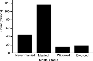
FIGURE 8-2 Bar graph of the marital status of U.S. adults.
(From Moore, D. S. and G. P. McCabe. 1999. Introduction to the practice of statistics, 3rd ed. New York: W. H. Freeman and Co., p. 6, with permission.)
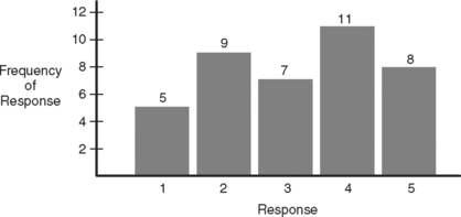
Variables that use an ordinate system can also be displayed in the bar graph, as in Figure 8-3. Recall that these variables have numerical values that indicate their relative place within the group and that the mathematical differences between the numerical values are not consistent. The observed value for the variable has been replaced by a numerical rank, from lowest to highest. It is easy to see if and where the values tend to cluster.
• A frequency distribution is a graph that plots the value of a variable against the frequency of occurrence.
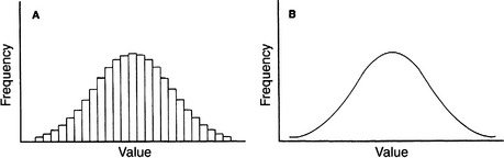
A histogram is a type of frequency distribution. The height of the individual bars represent the relative frequency at which each value occurs. When the bars are placed close together, a pattern emerges. We see in Figure 8-4 that as the values along the abscissa are divided into smaller units, the height of the bars can be connected to form a smooth line.
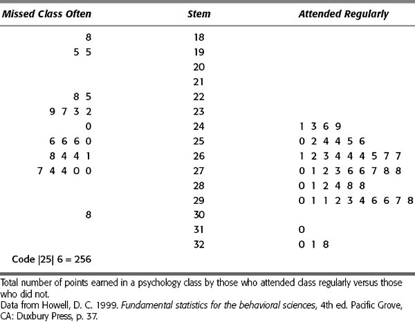
A stem and leaf plot (also called stemplot) is a creative way of displaying not only the relative frequency of a value, but the individual values as well. It allows a side-by-side comparison of the distributions of a variable in two groups. This type of plot takes raw data and arranges them into a continuum based on the relative value of each measurement (lowest to highest). The stem plots out what are called the leading digits—the higher numbers that encompass many of the values, such as the 100s or 10s. The 1s are plotted individually next to their stem to form the leaves. In Table 8-2, a comparison was made between students who attend class regularly versus those who do not. The total points for each individual in a psychology course are plotted on a stem and leaf diagram. On the right are the regular attendees and on the left are the truants.
Stay updated, free articles. Join our Telegram channel

Full access? Get Clinical Tree


