Fig. 13.1
As each of these form factors of devices became available, they were adopted for use in healthcare
13.2.1 Mobile Stand-Alone
Internet-connected mobile applications are becoming easier to develop thanks to readily available software libraries (e.g., touchdevelop.com) and the increasingly pervasiveness of wireless Internet access. Initial mobile prototypes however were typically stand-alone and not connected to the Internet. Internet connected applications required the following set of resources that (the designer, evaluator, and developer need to consider): (1) a mobile Internet accessible area (which is still challenging in some rural communities); (2) a server or trusted cloud service that hosts data; a mobile device that can easily access the Internet; (3) a data plan for each user to access the Internet; and – especially relevant in health applications, (4) a secure connection to share health information. If resources are restricted, then researchers may consider a mobile stand-alone application that hosts all of the data on the device. Researchers can download the data when they meet with the users, however they also need to inform users of contingency plans and design software that alerts participants if they are not receiving accurate information because they are not transferring data in real time.
An example of a stand-alone mobile application by Apple Research is a record keeping application to assist nurse midwives in rural India track the thousands of people that they must care for on a regular basis. The nurse midwives’ responsibilities went beyond the typical ante and postnatal care to include treating injuries, vaccinating people, administering health tests, and providing health education. The researchers set out to design a mobile application to help the nurse midwives accurately and easily record health information so that it could readily be shared with government policy decision makers. The researchers spent significant time understanding the needs, expectations, and cultural issues surrounding the care and documentation of rural populations and ultimately designed an application that was informed by information resources the nurse midwives made for low literacy birth attendants. The researchers learned about the resources that the nurse midwives created after interviewing and shadowing participants (Grisedale et al. 1997). Researchers at Indiana University experienced a similar design issue when designing a dietary intake monitoring application (DIMA) for a low literacy, chronically ill population – participants preferred dietary feedback icons that looked similar to a cup that was used during their initial disease education meetings. Despite interviewing dietitians and nurses before designing the interfaces, it was not until the researchers presented the results to the health professionals that the similarity to the cup was mentioned (Siek et al. 2006). Based on these experiences, we encourage researchers to consider contextual inquiry methods (Holtzblatt et al. 2004) to learn about current processes and information resources so that the researcher can integrate these processes and artifacts earlier into their design and analysis cycle. Contextual inquiry methods typically include researchers interviewing (the inquiry) target users where they conduct the targeted activity (the context) and asking users to walk through typical activities to gain a better understanding of what is done when and how the process works. Researchers can gain rich data on users processes – specifically an understanding if technology is appropriate and how technology could enhance these processes.
Similar to the Apple Research example, DIMA researchers spent 2 years meeting with health professionals and patients in an iterative user-centered design process to design the application. The mobile application used icons, barcode scanning, and voice recording to provide users with an easy way to input what they ate and receive real-time feedback. In a pilot study, participants were able to successfully use DIMA and some noted that it helped them change their diet by becoming more compliant with their dietary restrictions (Connelly et al. 2012). Since the application needed to provide real time feedback, the researchers had to ensure that the database was primed with everything users could possibly input into the system. In addition, the authors had to iteratively design the interface because they were working with a low literacy population – a population often overlooked in the human computer interaction community. The research team had to consider everything from how to present dietary limits, organize food items (Siek et al. 2006), and the application’s navigation structure (Chaudry et al. 2012).
13.2.2 Text Messaging
Text messaging – also known as Short Message Service (SMS) – uses standardized communication protocols to send short text messages via Web or mobile communication systems. In everyday conversation, we typically say we texted a picture, video, or other multimedia, however technically messages with multimedia are called Multimedia Messaging Service (MMS). In this chapter, we broadly define text messaging interventions that provide information – textual or multimedia – to individuals. Text messaging interventions provide health informatics researchers with a low cost, quick way to send and receive data to consumers and health professionals. Currently, there are two main text messaging programs – push programs that deliver information to people and two-way programs that can deliver and receive information from people users.
13.2.2.1 Push Text Messaging Programs
Current mass consumption text messaging programs are push systems in that they push information to the public to inform them about specific health related issues, but do not expect user responses. Push systems are fairly straightforward to implement – researchers could choose to manually send text messages from a phone or text message app (e.g., iMessage). Alternatively, researchers could create a more robust and automatic system by maintaining an SMS gateway or using an SMS gateway service (e.g., Twilio) to automatically send text message at specific times.
In the United States, the Department of Health and Human Services compiles a list of text messaging programs that aim to improve health (http://www.hhs.gov/open/initiatives/mhealth/projects.html). For example, text4baby (text4baby.org) provides thousands of moms with three free text messages per week about their baby’s development from pregnancy through their first year. Smokefreetxt (smokefree.gov) is a freely available text messaging program for young adults and adults to aid them in quitting smoking by sending 1–5 text messages per day for the 2 weeks leading up to their quit date and 6 weeks after their planned quit date. Smokefreetxt provides users with the ability to gain more information about specific points in the message by texting back specific words to get more information on how to deal with that point (e.g., texting “Cravings” to learn how to deal with cravings after quitting smoking). Push text message programs are beneficial because they provide an easy mechanism to send health messages to people and alert them about specific health considerations, however they are limited because they may not be customized enough to be relevant to some of the users or the message may not be delivered at the appropriate time to encourage a change in decision. For example, imagine designing relevant information about infant development that is understandable to someone with an elementary school reading level and yet still beneficial to the woman with an advanced degree in business.
13.2.2.2 Two-Way Communication Programs
Some health text messaging programs provide two-way communication so that users can communicate with other users or healthcare professionals. Two-way communication is slightly more complex to implement than push programs because the researcher needs to use a SMS gateway service and program some logic into the system to accommodate the various inputs a user may send to the system.
An example of a two-way communication program would be SMARTDIAB that provides type 1 diabetes patients with the ability to send and receive information to their doctor to receive personalized feedback. SMARTDIAB is also integrated with a web portal and mobile application for the users to transmit secure messages and reflect on aggregate data (Bin-Sabbar and Al-Rodhaan 2013). Since SMARTDIAB has multiple ways for people to access information – text message, mobile app, web portal – it provides users with a lot of flexibility. Researchers should also understand that the more flexibility users have to input and view data, the more time they must spend in designing, evaluating, and ensuring the users can efficiently interact with the system to promote ongoing use. For example, researchers have to consider the interactions users will have with each interface – text messaging, mobile app, and web portal – and between the interfaces. Do users interact with the application similarly independent of the platform or are they expected to remember different interactions for each platform? Can users easily transfer information between the interfaces and receive immediate feedback on their progress? We understand that each platform has different input and output mechanisms, however the overall user experience has to be similar enough so that users are not overburdened.
Sometimes researchers choose to use text messaging as an easy way to simulate real-time feedback without a database or Internet connection. For example, Chick Clique was a mobile phone application for teens to log their daily step counts, reflect on their progress, and check in on how their clique of friends were doing in their walking progress. The mobile phone application used text messages from a specific phone number to update the step counts that were shown on the phone application (Toscos et al. 2006). Although the application seemed to provide real-time data, the developer spent significant time ensuring that the most current data was updating the interface to avoid critical section issues that happen when multiple pieces of data (e.g., the sent text messages) want to access a shared resource (e.g., the individual step counts of each teen on the mobile phone). In addition, the users had to be warned not to edit any of the text messages received from a specific phone number otherwise the phone app would not be able to interpret the data properly.
An example that is closely related to a two-way text messaging solution is @BabySteps, a low-overhead system that uses twitter for parents to manage their child’s development. For example, BabySteps would tweet to a user, “Can your baby do a push-up when he’s on his tummy? #baby2325.” The user would respond with “#yes #Adam can do a push-up when he’s on his tummy! #baby2325.” In this example, the hashtag #baby2325 helps to identify which milestone is being tracked. The user’s response could add other free text or additional hashtags in addition to the necessary response of #yes, #sometimes, #no. In a feasibility study, the researchers found that parents could learn to use the hashtags, however they plan to iterate on how many messages parents should receive to keep them engage without overburdening them. The study shows that although the use of hashtags in text or twitter messages provides an easy mechanism for researchers to parse data and provide customized feedback, researchers have to carefully consider how often the intervention should require input from users and how users want to provide that input (e.g., using a service they already use in their everyday lives like twitter instead of a new off-the-app-store app) (Suh et al. 2014).
13.2.3 Feature Phones
Feature phones are mobile phones that contain features in addition to voice calling and text messaging included in basic mobile phones. Many of these phones included features such as cameras, mobile broadband access, WiFi, PDA functionality (e.g., address book, calendar, and email), and music and video playback. While there is no standardized way to distinguish feature phones from smartphones, a major distinguishing factor has been the ability of the phone to run third party applications. Feature phones typically do not have the ability to run third party applications or applications not officially certified by the mobile carrier. Many of the feature phones use a more traditional touchtone telephone-style keypad, though in recent times, this has begun shifting to include touchscreen displays as well.
The major benefits that feature phones provide over smartphones are that they are less expensive, have a longer battery life, and are usually more durable. Another benefit is that since they tend to utilize a keypad that is close to that of traditional touchtone phones and basic phones that most individuals are used to, people less familiar with technology may be able to easily use the basic functions on feature phones, while adding a few additional features.
However, this same advantage also creates some challenges for using the more advanced features in feature phones. For example, it can be extremely challenging to type URLs and browse the web using the basic keypad available on the majority of feature phones. In addition, building on the two-way text messaging example we discussed earlier, feature phones are difficult to text on because users have to touch the same button multiple times to get a specific character. For example, if someone tried to text “no” using the phone shown in Fig. 13.2, they would have to push the number 6 twice to get the letter “n” and then wait for the screen cursor to move over before pushing the number 6 three times to get the letter “o”.
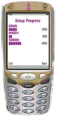

Fig. 13.2
Chick clique interface
Because feature phones tend to cost less and have longer battery life than smartphones, feature phones are still relatively popular in developing countries, such as China, India, and Africa, where cost and availability of power is a major consideration in comparison to more developed countries.
Attempts to use feature phones for clinical interpretation of ECGs has been tried. An emergency physician photographed ECGs using a mobile phone and sent to an interpreting cardiologist (Bilgi et al. 2012). The images were photographed using a Nokia N93 mobile phone and sent via multimedia messaging system (MMS) to an identical phone used by an interpreting cardiologist. A separate cardiologist and an emergency physician interpreted the paper print out versions of the ECGs. While the cardiologist reading the paper printouts were deemed to have made the significantly fewer mistakes in interpretation than the cardiologist who read via the mobile phone and the emergency physician, the results of the cardiologist interpreting the ECG on the mobile phone screen were slightly better than those of the emergency physician who interpreted the ECG paper printouts. This suggests that sending the ECG images via MMS may be a cost effective telecardiology procedure, particularly when a cardiologist is not available in the emergency department.
13.2.4 Smartphones
A smartphone is a mobile phone with advanced computing capabilities and Internet connectivity. Modern smartphones enable web-browsing, installation of 3rd-party applications (apps), and since the introduction of the iPhone in 2007, frequently include a relatively large (approx. 3.5″–5″ or 90–130 mm when measured diagonally) color touchscreen display. With their ever-increasing computational capabilities, memory capacity, and ability to install applications, they are increasingly being viewed more and more like a handheld computer rather than just a mobile phone. The relatively compact form factor of smartphones makes them easily portable and are frequently carried almost everywhere the user goes. In addition smartphones typically come with the latest networking technology – from short-range wireless connections, such as Bluetooth, to wireless Internet. It is for these reasons that there has been a significant push to try to leverage them to enhance participatory healthcare (Boulos et al. 2011).
While smartphones are incredibly powerful portable devices, there are some major challenges due to the small form factor. Although the screens on smartphones tend to be larger than those on basic and feature phones, there is limited screen real estate compared to that of a desktop computer. This can create significant challenges for user interface designers, who then have to enable navigation through nested menus to fit all of the functionality onto a screen. Also, buttons in these user interfaces cannot be too small or they can be difficult to use for those with limited vision or dexterity as may occur with older adults or with other patients with health concerns. While enabling users to zoom into the user interface can compensate for some of these issues, the gestures required to zoom in can be challenging for users who are inexperienced with smartphones. In addition, some companies have strict design guidelines that limit designers’ abilities to customize interface widgets and interactions.
Research regarding the performance of older adults when using touchscreen interfaces can provide some general guidance on the recommended button sizes for most effectively enabling older adults to use touchscreen enabled smartphones (Motti et al. 2013). In a number of studies, researchers observed and measured the actions of study subjects on a variety of touch screen devices and user interfaces. In these studies, task completion times with various size buttons and gestures such as taps, drags, and pinching motions were studied.
Kobayashi et al. (2011) suggested that buttons should be at least 8 mm in size on smaller screens and targets that are located close to each other need to be larger. However, research has also shown that bigger is not always better. Jin et al. (2007) suggested that targets with 16.5 mm width and spacing between targets of 3.17 and 6.35 mm are appropriate for older users with good dexterity. For users with poor dexterity, larger target sizes of 19 mm in width and 6.35–12.7 mm spaces between targets are preferred. However, while increasing the button sizes and the space between buttons can increase performance, they can lead to higher response times, perhaps due to Fitts’s Law. (Fitts’s Law is a model of human movement that predicts the time required to rapidly move from one target area to another. This amount of time is proportional to the distance to the target and the size of the target.) Nischelwitzer et al. (2007) found that older adults preferred to tap on buttons rather than to use sliders or cursors buttons to select values. Accommodating these size requirements in an app can be difficult on the screen sizes typically found in smartphones.
Many early uses of smartphones in health care were focused on bringing clinicians mobile access to patient and reference information. One such example was the development of a web-based portal to a clinical information system called PalmCIS (Chen et al. 2004). PalmCIS was designed to be a wireless handheld extension to NewYork-Presbyterian Hospital’s web-based clinical information system, WebCIS. PalmCIS was designed to be HIPAA compliant and to display as much clinical information as possible while still being easy to navigate and read. At the time, Palm OS devices were very popular and one of the earliest smartphones, the Kyocera QCP 6035 was chosen as hardware platform. One of the limitations of PalmCIS was due to the limited capabilities of mobile web browsers in the early 2000s. The web browser, EudoraWeb was limited to a subset of HTML and did not support images. Clinicians were able to view patient reports that summarized laboratory, cardiology, and radiology results for the current and previous days. Another interesting feature was that it also enabled clinician to query PubMed directly from the PalmCIS interface, allowing clinicians to quickly access relevant article abstracts and citations. A somewhat unique feature of the PalmCIS interface was how they chose to balance ensuring a high level of security while enabling ease of use (see Fig. 13.3). PalmCIS required two-factor authentication through the use of a user name, password, and SecurID token. The SecurID token was implemented using a series of checkboxes to help the user input the correct token. This authentication was only required once a week, enabling the provider to use PalmCIS throughout the week and not constantly interrupting the workflow of the clinician and making him or her log in at every use. This balance of ready access for the clinician while ensuring an appropriate level of security is an important factor to consider when designing clinical applications on mobile devices, as barriers to efficient clinical workflows will severely hamper adoption rates.


Fig. 13.3
Screenshots of PalmCIS Login Screens. Adapted by permission from BMJ Publishing Group Limited. PalmCIS: a wireless handheld application for satisfying clinician information needs, Chen, E. S., Mendonça, E. A., McKnight, L. K., Stetson, P. D., Lei, J., & Cimino, J. J. (2004). Journal of the American Medical Informatics Association, 11(1), 19–28
Another area of significant interest has been the use of smartphones for Personal Health Records (PHRs). There have been two main approaches to PHRs on smartphones—integrated and standalone. Within the category of integrated PHRs, they fall into two subcategories–those that integrate with EHRs and those that integrate with online PHR systems that contain data maintained by the patient. Integrated PHRs have been met with great interest and enable patients to access a subset of information that is stored in their health record that is maintained in their health care provider’s EHR. They also frequently enable the patient to securely communicate with their provider. One such app is that of the MyChart for the iPhone from Epic Systems Corporation (see Fig. 13.4). There are a few PHR apps for smartphones that access information that are maintained by the patient themselves, but they have largely been unsuccessful due to the lack of adoption of these platforms, even on desktop computers (Kharrazi et al. 2012).
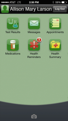

Fig. 13.4
Screenshot of Epic’s MyChart on iOS. © 2014 Epic Systems Corporation. Used with permission
Despite the fact that smartphones have amazing capabilities, effort needs to be spent on making sure that interventions are designed appropriately and that the new capabilities of smartphones adds any substantive improvement in health care interventions over what is available in phones of lesser capabilities. Buller et al. (2014) performed a randomized trial of comparing the effectiveness of a smartphone mobile application to text messaging to support smoking cessation (Buller et al. 2014). Their smartphone application, REQ-Mobile had the ability to receive and send short messages, enabled smokers to create lists on the reasons for and benefits of quitting, had interactive tools, had support documents for strategies and benefits of quitting, and had audio testimonials from former smokers. They compared REQ-Mobile with the onQ text messaging system, which sent tailored automated messages to the text inbox of the participants. Their comparison of these two approaches showed that users of REQ-Mobile took longer to quit and fewer study subjects were abstinent at 6 weeks than those who were enrolled in the onQ text messaging approach. They also found that the audio testimonials were rarely used. One of the resulting hypotheses for why onQ may have been more effective than REQ-Mobile was that it delivered messages to the normal text messaging inbox rather than an inbox in the REQ-Mobile app. These results suggest that using lesser technologies that are available in basic and feature phones, such as such text messaging, can be as effective if not more effective interventions than those that require smartphones, while enabling a wider audience to participate and lowering costs of the intervention.
Another major challenge can be deciding which platform or platforms to support. This used to be a much larger issue but as of early 2014, the leading two platforms are Google’s Android and Apple’s iOS, with a total of over 90 % of the worldwide market share. Researchers are also adopting platform independent solutions, such as PhoneGap (http://phonegap.com), that allow developers to create the app using web technologies and deploy the apps on multiple platforms. Most of the app functionality can be used offline, however researchers can benefit by being able to collect real time data when the smartphone can access the Internet.
13.2.5 Tablets
Modern tablet computers are typically similar to smartphones and are based on the same mobile operating systems as smartphones, but are larger with displays measured at 7″ (18 cm) or larger, diagonally. Another differentiation from smartphones is that while tablets may also have cellular connectivity, they usually do not have cellular calling as a feature and it can only be used as a data connection. The most typical form factors for tablets fall into two rough size categories: 7″ and 10″ (25 cm) displays. The 7″ size is obviously more portable and less costly, but the 10″ size offers more screen real estate, which can be highly desirable, particularly for individuals with lower levels of dexterity and vision. The larger form factor enables different user interface paradigms than are typically used on smartphones.
As discussed in the smartphone section, touch targets measuring between 16.5 and 19 mm in width and spacing between targets of 3.17 and 12.7 mm spaces between targets have been shown to be most appropriate in older adult populations. On screen buttons of these sizes in users interfaces are more easily accommodated on 7″ and 10″ tablets than on devices of smaller form factors. While the larger 10″ tablets can be very attractive from a user interface design and screen real estate perspective, a major downside is that because of their larger display size, they are less portable and are more costly. This has major implications for their use in healthcare interventions.
Stay updated, free articles. Join our Telegram channel

Full access? Get Clinical Tree


