. When speaking to another statistician, we can say either the “mean” or the “X bar.”2
In recent years, we’ve seen a new abbreviation for the mean: M. This is because most word processing packages can’t handle  . In other words, we have to adapt our practices to accommodate the needs of the computer; does that strike you as bizarre as it does us?
The number of subjects in the sample is represented by N. There is no convention on whether to use uppercase or lowercase, but most books use a lowercase n to indicate the sample size for a group when there are two or more and use the upper case N to show the entire sample, summed over all groups. If there is only one group, take your pick and you’ll find someone who’ll support your choice. If there are two or more groups, how do we tell which one the n refers to? Whenever we want to differentiate between numbers, be they sample sizes, data points, or whatever, we use subscript notation. That is, we put a subscript after the letter to let us know what it refers to—n1 would be the sample size for group 1, X3 the value of X for subject 3, and so on.
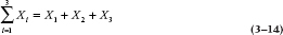
To indicate adding up a series of numbers, we use the symbol ∑, which is the uppercase Greek letter sigma. (The lowercase sigma, σ, has a completely different meaning, which we’ll discuss shortly.) If there is any possible ambiguity about the summation, we can show explicitly which numbers are being added, using the subscript notation:
We read this as, “Sum over X-sub-i, as i goes from 1 to N.” This is just a fancy way of saying “Add all the Xs, one for each of the N subjects.”
X refers to a single data point. Xi is the value of X for subject i. nj is the number of subjects (sample size) in group j. N is the total sample size.  is the arithmetic mean. ∑ means to sum.
Later in this book, we’ll get even fancier, and even show you some more Greek. But for now, that’s enough background and we’re ready to return to the main feature.
MEASURES OF CENTRAL TENDENCY
The Mean
Just to break the monotony, let’s begin by discussing interval and ratio data and work our way down through ordinal to nominal. Take a look at Figure 3–1, where we’ve added a second group to the bedpan data from the previous chapter. As you can see, the shape of its distribution is the same as the first group’s, but it’s been shifted over by 15 units. Is there any way to capture this fact with a number?3 One obvious way is to add up the total number of bedpans emptied by each group. For the first group, this comes to 3,083.4 Although we haven’t given you the data, the total for the second group is 4,583. This immediately tells us that the second group worked harder than the first (or had more patients who needed this necessary service).
However, we’re not always in the position where both groups have exactly the same number of subjects. If the students in the second group worked just as hard, but they numbered only 50, their total would be only 2,291 or so. It’s obvious that a better way would be to divide the total by the number of data points so that we can directly compare two or more groups, even when they comprise different numbers of subjects. So, dividing each total by 100, we get 30.83 for the first group and 45.83 for the second. What we’ve done is to calculate the average number of bedpans emptied by each person. In statistical parlance, this is called the arithmetic mean (AM), or the mean, for short.
The reason we distinguish it by calling it the arithmetic mean is because there are other means, such as the harmonic mean and the geometric mean, both of which we’ll touch on (very briefly) at the end of this chapter. However, when the term mean is used without an adjective, it refers to the AM. If there is any room for confusion (and there’s always room for confusion in this field), we’ll use the abbreviation. Using the notation we’ve just learned, the formula for the mean is:
We spelled out the equation using this formidable notation for didactic purposes. From now on, we’ll use conceptually more simple forms in the text unless there is any ambiguity. Because there is no ambiguity regarding what values of X we’re summing over, we can simplify this to:
The Arithmetic Mean
The mean is the measure of central tendency for interval and ratio data.
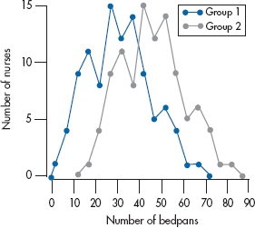
FIGURE 3-1 Graphs of two groups, with the second shifted to the right by 15 units.
A measure of central tendency is the “typical” value for the data.
One of the ironies of statistics is that the most “typical” value, 30.83 in the case of Group 1 and 45.83 for Group 2, never appears in the original data. That is, if you go back to Table 3–2, you won’t find anybody who dumped 30.83 bedpans, yet this value is the most representative of the groups as a whole.5
The Median
What can we do with ordinal data? It’s obvious (at least to us) that, because they consist of ordered categories, you can’t simply add them up and divide by the number of scores. Even if the categories are represented by numbers, such as Stage I through Stage IV of cancer, the “mean” is meaningless.6 In this case, we use a measure of central tendency called the median.
The median is that value such that half of the data points fall above it and half below it.
Let’s start off with a simple example: We have the following 9 numbers: 1, 3, 3, 4, 6, 13, 14, 14, and 18. Note that we have already done the first step, which is to put the values in rank order. It is immaterial whether they are in ascending or descending order. Because there is an odd number of values, the middle one, 6 in this case, is the median; four values are lower and four are higher.
If we added one more value, say 17, we’d have an even number of data points, and the median would be the AM of the two middle ones. Here, the middle values would be 6 and 13, whose mean is (6 + 13) ÷ 2 = 9.5; this would then be taken as the median. Again, half of the values are at or below 9.5 and half located at or above. (On a somewhat technical level, this approach is logically inconsistent. We’re calculating the median because we’re not supposed to use the mean with ordinal data. If that’s the case, how can we then turn around and calculate this mean of the middle values? Strictly speaking, we can’t, yet we do.)
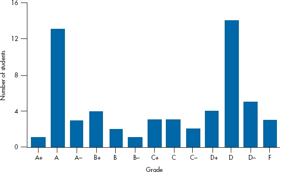
FIGURE 3-2 A bimodal distribution of course grades.
If the median number occurs more than once (as in the sequence 5 6 7 7 7 10 10 11), some purists calculate a median that is dependent on the number of values above and below the dividing line (e.g., there are two 7s below and one above). Not only is this a pain to figure out, but also the result rarely differs from our “impure” method by more than a few decimal places.
As we’ve said, the median is used primarily when we have ordinal data. But there are times when it’s used with interval and ratio data, too, in preference to the mean. If the data aren’t distributed symmetrically, then the median gives a more representative picture of what’s going on than the mean. We’ll discuss this in a bit more depth at the end of this chapter, after we introduce you to some more jargon; so be patient.
The Mode
Even the median can’t be used with nominal data. The data are usually named categories and, as we said earlier, we can mix up the order of the categories and not lose anything. So the concept of a “middle” value just doesn’t make sense. The measure of central tendency for nominal data is the mode.
The mode is the most frequently occurring category.
If we go back to Table 2–1, the subject that was endorsed most often was Economics, so it would be the mode. If two categories were endorsed with the same, or almost the same7 frequency, the data are called bimodal. This happened in one course I had in differential equations: If you understood what was being done, the course was a breeze; if you didn’t, no amount of studying helped. So, the final marks looked like those in Figure 3–2—mainly As and Ds, with a sprinkling of Bs, Cs, and Fs. If there were three humps in the data, we could use the term trimodal, but it’s unusual to see it in print because statisticians have trouble counting above two. However, you’ll sometimes see the term multimodal to refer to data with a lot of humps8 of almost equal height.
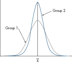
FIGURE 3-3 Two groups, differing in the degree of dispersion.
MEASURES OF DISPERSION
So far we’ve seen that distributions of data (i.e., their shape) can differ with regard to their central tendency, but there are other ways they can differ. For example, take a look at Figure 3–3. The two curves have the same means, marked  , yet they obviously do not have identical shapes; the data points in Group 2 cluster closer to the mean than those in Group 1. In other words, there is less dispersion in the second group.
A measure of dispersion refers to how closely the data cluster around the measure of central tendency.
This time, we’ll begin with nominal data and work through to interval and ratio data.
The Index of Dispersion
The simplest measure of dispersion for nominal data is to simply state how many categories were used. However, this is a fixed number in many situations; there are only two sexes, a few political parties,9 and so on, and in most cases, all of them are used. There is, though, a better index of dispersion for nominal and ordinal data, called, with an amazing degree of originality, the index of dispersion. It is defined as follows:
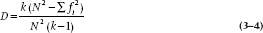
where k is the number of categories, fi the number of ratings in each category, and N the total number of ratings. If all of the ratings fall into one category, then D is zero; whereas, if the ratings were equally divided among the k categories, D would be equal to 1. If we go back to the data in Table 2–1, k = 5 (Sociology, Economics, History, Psychology, and Calculus); f1 = 25, f2 = 42, and so on; 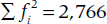 ; and N = 100. Therefore,
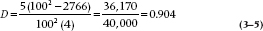
showing a nice spread of scores across the courses. However, if the eight people who rated History as their most boring course changed their responses to Calculus, meaning that only four of the five categories were used, then D would drop to 0.370.
The Range
Having dispensed with nominal data, let’s move on to ordinal data. When ordinal data comprise named, ordered categories, then they are treated like nominal data; you can say only how many categories were used. However, if the ordinal data are numeric, such as the rank order of students within a graduating class, we can use the range as a measure of dispersion.
The range is the difference between the highest and lowest values.
If we had the numbers 102, 109, 110, 117, and 120, then the range would be (120 − 102) = 18. Do not show your ignorance by saying, “the range is 102 to 120,” even though we’re sure you’ve seen it in even the best journals. The range is always one number. The main advantage of this measure is that it’s simple to calculate. Unfortunately, that’s about the only advantage it has, and it’s offset by several disadvantages. The first is that, especially with large sample sizes, the range is unstable, which means that its value can change drastically with more data or when a study is repeated. That means that if we add new subjects, the range will likely increase. The reason is that the range depends on those few poor souls who are out in the wings—the midgets and the basketball players. All it takes is one midget or one stilt in the sample, and the range can double. It follows that the more people there are in the sample, the better are the chances of finding one of these folks. So, the second problem is that the range is dependent on the sample size; the larger the number of observations, the larger the range. Last, once we’ve calculated the range, there’s precious little we can do with it.
However, the range isn’t a totally useless number. It comes in quite handy when we’re describing some data, especially when we want to alert the reader that our data have (or perhaps don’t have) some oddball values. For instance, if we say that the mean length of stay on a particular unit is 32 days, it makes a difference if the range is 10 as opposed to 100. In the latter case, we’d immediately know that there were some people with very long stays, and the mean may not be an appropriate measure of central tendency, for reasons we’ll go into shortly.
The Interquartile Range
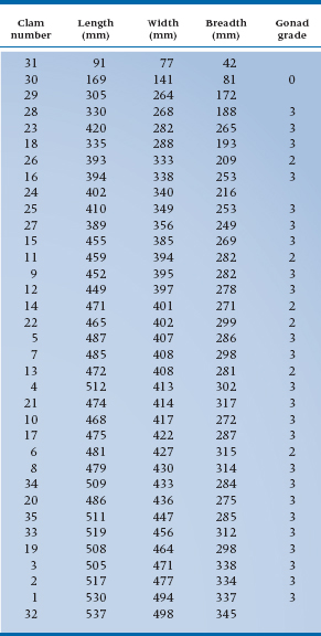
Because of these problems with the range, especially its instability from one sample to another or when new subjects are added, another index of dispersion is sometimes used with ordinal data, the interquartile range (sometimes referred to as the midspread). To illustrate how it’s calculated, we’ll use some real data for a change. Table 3–1 shows the length, width, breadth, and gonad grade for 35 littleneck clams, Protothaca staminea, harvested in Garrison Bay. These data were taken from a book by Andrews and Herzberg (1985), called, simply, Data. Although our book is intended as family reading, we had to include the data on the gonad grade of these clams because we will be using them later on in this section.10 If any reader is under 16 years of age, please read the remainder of this section with your eyes closed. And yes, we know the data are ratio, but you can use this technique with ordinal, interval, and ratio data.
For this part, we’ll focus on the data for the width; to save you the trouble, we’ve rank ordered the data on this variable and indicated the median and the upper and lower quartiles.11 Remember that the median divides the scores into two equal sections, an upper half and a lower half. There are 35 numbers in Table 3–1, so the median will be the eighteenth number, which is 407. Now let’s find the median of the lower half, using the same method. It’s the ninth number, 340, and this is the lower quartile, symbolized as QL. In the same way, the upper quartile is the median of the upper half of the data; in Table 3–1, QU is 433. So, what we’ve done is divide the data into four equal parts (hence the name quartile).
The interquartile range is the difference between QL and QU and comprises the middle 50% of the data.
Because the interquartile range deals with only the middle 50% of the data, it is much less affected by a few extreme scores than is the range, making it a more useful measure. We’ll meet up with this statistic later in this chapter, when we deal with another way of presenting data, called box plots.
Variations on a Range
The interquartile range, which divides the numbers into quarters, is perhaps the best known of the ranges, but there’s no law that states that we have to split the numbers into four parts. For example, we can use quintiles that divide the numbers into five equally sized groups, or deciles that break the data into 10 groups. Having done that, we can specify a range that includes, for example, the middle 30% (D6 − D4), 50% (D7 − D3), or 70% (D8 − D2) of the data. The choice depends on what information we want to have: narrower intervals (e.g., D6 − D4) contain less of the data but fall closer to the median; wider ranges (e.g., D7 − D3) encompass more of the data but are less accurate estimates of the median.
The Mean Deviation
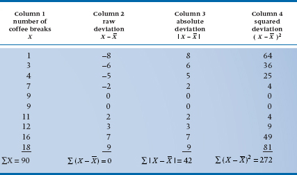
An approach that at first seems intuitively satisfying with interval and ratio data would be to calculate the mean value and then see how much each individual value varies from it. We can denote the difference between an individual value and the mean either by ( ) or by the lowercase letter, x. Column 1 of Table 3–2 shows the number of coffee breaks taken during 1 day by 10 people12: their sum, symbolized by ∑X, is 90. Dividing this by N, which is 10, yields a mean of 9. Column 2 shows the results of taking the difference between each individual value and 9. The symbols at the bottom of Column 2, ∑(
 ), signify the sum of the differences between each value and the mean. We could also have written this as ∑x. Adding up these 10 deviations results in—a big zero. This isn’t just a fluke of these particular numbers; by definition, the sum of the deviations of any set of numbers around its mean is zero. So, clearly, this approach isn’t going to tell us much. We can get around this problem by taking the absolute value of the deviation; that is, by ignoring the sign. This is done in Column 3, when taking the absolute value of a number is indicated by putting the number between the vertical bars: |+ 3| = 3, and |− 3| = 3. The sum of the absolute deviations is 42. Dividing this by the sample size, 10, we get a mean deviation of 4.2; that is, the average of the absolute deviations. To summarize the calculation:
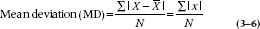
This looks so good, there must be something wrong, and in fact there is. Mathematicians view the use of absolute values with the same sense of horror and scorn with which politicians view making an unretractable statement. The problem is the same as with the mode, the median, and the range; absolute values, and therefore the mean deviation (MD), can’t be manipulated algebraically, for various arcane reasons that aren’t worth getting into here.
TABLE 3–1 Vital statistics on 35 littleneck clams
The Variance and Standard Deviation
But all is not lost. There is another way to get rid of negative values: by squaring each value.13 As you remember from high school, two negative numbers multiplied by each other yield a positive number: −4 × −3 = +12. Therefore, any number times itself must result in a positive value. So, rather than taking the absolute value, we take the square of the deviation and add these up, as in Column 4. If we left it at this, then the result would be larger as our sample size grows. What we want, then, is some measure of the average deviation of the individual values, so we divide by the number of differences, which is the sample size, N. This yields a number called the variance, which is denoted by the symbol s2.
TABLE 3–2 Calculation of the mean deviation
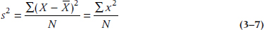
This is more like what we want, but there’s still one remaining difficulty. The mean of the 10 numbers in Column 1 is 9.0 coffee breaks per day, and the variance is 27.2 squared coffee breaks. But what the #&$! is a squared coffee break? The problem is that we squared each number to eliminate the negative signs. So, to get back to the original units, we simply take the square root of the whole thing and call it the standard deviation abbreviated as either SD or s:
The Standard Deviation
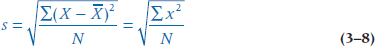
The result, 5.22 (the square root of 27.2), looks more like the right answer. So, in summary, the SD is the square root of the average of the squared deviations of each number from the mean of all the numbers, and it is expressed in the same units as the original measurement. The closer the numbers cluster around the mean, the smaller s will be. Going back to Figure 3–3, Group 1 would have a larger SD than Group 2.
Do NOT use the above equation to actually calculate the SD. To begin with, you have to go through the data three times: once to calculate the mean, a second time to subtract the mean from each value, and a third time to square and add the numbers. Moreover, because the mean is often a decimal that has to be rounded, each subtraction leads to some rounding error, which is then magnified when the difference is squared. Computers use a different equation that minimizes these errors. Finally, this equation is appropriate only in the highly unlikely event that we have data from every possible person in the group in which we’re interested (e.g., all males in the world with hypertension). After we distinguish between this situation and the far more common one in which we have only a sample of people (see Chapter 6), we’ll show you the equation that’s actually used.
Let’s look for a moment at some of the properties of the variance and SD. Say we took a string of numbers, such as the ones in Table 3–2, and added 10 to each one. It’s obvious that the mean will similarly increase by 10, but what will happen to s and s2? The answer is, absolutely nothing. If we add a constant to every number, the variance (and hence the SD) does not change.
The Coefficient of Variation
One measure much beloved by people in fields as diverse as lab medicine and industrial/ occupational psychology is the coefficient of variation (CV, or V). It is defined simply as follows:
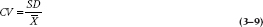
Because both SD and  are expressed in the same units of measurement, the units cancel out and we’re left with a pure number, independent from any scale (Simpson et al, 1960). This makes it easy to compare a bunch of measurements, say from different labs, to see if they’re equivalent in their spread of scores.
But, there are a couple of limitations of the CV. First, although the SD enters into nearly every statistical test that we’ll discuss, in one form or another, we can’t incorporate CV into any of them. Second, and perhaps more telling, CV is sensitive to the scale of measurement (Bedeian and Mossholder, 2000). If we multiply every value by a constant, both  and SD will increase, leaving CV unchanged; this is good. However, if we add a constant to each value,
  will increase but, as we said in the previous section, SD will not. Consequently, CV will decrease as the mean value increases. The bottom line, then, is that CV may be a useful index for ratio-level data where you cannot indiscriminately add a constant number, but should definitely not be used with interval-level data, where the zero is arbitrary and constants don’t change anything.
SKEWNESS AND KURTOSIS
We’ve seen that distributions can differ from each other in two ways; in their “typical” value (the measure of central tendency), and in how closely the individual values cluster around this typical value (dispersion). With interval and ratio data, we can use two other measures to describe the distribution; skewness and kurtosis. As usual, it’s probably easier to see what these terms mean first, so take a look at the graphs in Figure 3–4. They differ from those in Figure 3–3 in one important respect. The curves in Figure 3–3 were symmetric, whereas the ones in Figure 3–4 are not; one end (or tail, in statistical parlance) is longer than the other. The distributions in this figure are said to be skewed.
Skew refers to the symmetry of the curve.
The terminology of skewness can be a bit confusing. Curve A is said to be skewed right, or to have a positive skew; Curve B is skewed left, or has a negative skew. So, the “direction” of the skew refers to the direction of the longer tail, not to where the bulk of the data are located. We’re not going to give you the formula for computing skew because we are unaware of any rational human being14 who has ever calculated it by hand in the last 25 years. Most statistical computer packages do it for you, and we’ve listed the necessary commands for one of them at the end of this chapter. A value of 0 indicates no skew; a positive number shows positive skew (to the right), and a negative number reflects negative, or left, skew.15
The three curves in Figure 3–5 are symmetric (i.e., their skew is 0), but they differ with respect to how flat or peaked they are, a property known as kurtosis. The middle line, Curve A, shows the classical “bell curve,” or “normal distribution,” a term we’ll define in a short while. The statistical term for this is mesokurtic. Curve B is more peaked; we refer to this distribution as leptokurtic. By contrast, Curve C is flatter than the normal one; it’s called platykurtic. The formula for calculating kurtosis, as for skew, would be of interest only to those who believe that wading through statistical text books makes them better people; such people are probably related to those who buy Playboy just for the articles. Again, most statistical computer packages figure out kurtosis for you. The normal distribution (which is mesokurtic) has a kurtosis of 3. However, many computer programs subtract 3 from this, so that it ends up with a value of 0, with positive numbers reflecting leptokurtosis, and negative numbers, platykurtosis. You’ll have to check in the program manual16 to find out what yours does.
Kurtosis refers to how flat or peaked the curve is.
Although kurtosis is usually defined simply in terms of the flatness or peakedness of the distribution, it also affects other parts of the curve. Distributions that are leptokurtic also have heavier tails; whereas platykurtic curves tend to have lighter tails. However, kurtosis doesn’t affect the variance of the distribution.
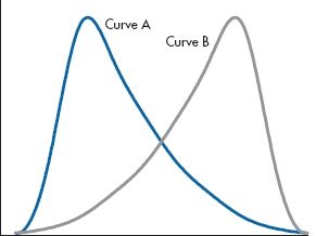
FIGURE 3-4 Two curves, one with positive and one with negative skew.
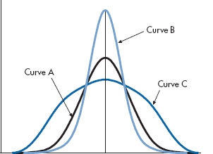
FIGURE 3-5 Three distributions differing in terms of kurtosis.
SO WHO’S NORMAL?
Many of the tests we’ll describe in this book are based on the assumption that the data are normally distributed. But how do we know? A good place to start is just looking at a plot of the data. Are they symmetrically distributed, or is there a long tail to one side or the other? Sometimes we’re reading an article and don’t have access to the raw data, only some summary information. Then we can use a couple of tricks suggested by Altman and Bland (1996). First, we know that the normal curve extends beyond two SDs on either side of the mean. So, for data that can have only positive numbers (e.g, most lab results, demographic information, scores on paper-and-pencil tests), if the mean is less than twice the SD, there’s some skewness present. Passing the test doesn’t guarantee normality, but failing it definitely shows a problem. We can use the second trick if there are a number of groups, each with a different mean value of the variable. If the SD increases as the mean does, then again the data are skewed. If they’re your own data you’re looking at, then you should think of one of the transformations described in Chapter 27 to normalize them.
A more formal way to check for normality is to look at the tests for skewness and kurtosis that we discussed in the previous section. If both are less than 2.0, it’s fairly safe to assume that the data are reasonably normal. However, a better way would be a direct test to see if the data deviate from normality. There are actually a few different statistics for this, but rest assured, we won’t spell out the formulae for them. As with the computations for skewness and kurtosis, only a statistician would think of doing them by hand. The Wilks-Shapiro Normality Test, as the name implies, assesses the data you have against a normal population. The Anderson-Darling Normality Test is a bit more flexible, and lets you evaluate the data against a number of different distributions. In both cases, the number that’s produced doesn’t mean much in its own right; we just look at the p level. Because the tests are looking at deviation from normality, we want the p level to be greater than .05; if it’s less, it means there’s too much difference.
So which one do we use? That’s extremely simple to answer—whichever one your computer program deigns to give you.
BOX PLOTS
Now that we’ve introduced the concept of SD, we’ll briefly return to the realm of descriptive statistics and talk about one more type of graph. One of the most powerful graphing techniques, called the box plot, comes from the fertile brain of John Tukey (1977), who has done as much for exploring the beauty of data as Marilyn Monroe has done for the calendar.17 Again, the best way to begin is to look at one (a box plot, not a calendar), and then describe what we see. Figure 3–6 shows the data for the width of those delightful littleneck clams we first encountered in Table 3–1.
Let’s start off with the easy parts. The “+” in the middle represents the median of the distribution.18 The ends of the box fall at the upper and lower quartiles, QU and QL, so the middle 50% of the cases fall within the range of scores defined by the box. Just this central part of the box plot yields a lot of information. We can see the variability of the data from the length of the box; the median gives us an estimate of central tendency; and the placement of the median tells us whether or not the data are skewed. If the median is closer to the upper quartile, as is the case with these numbers, the data are negatively skewed; if it is closer to the lower quartile, they are positively skewed.
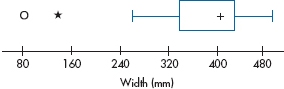
FIGURE 3-6 Box plot of widths of littleneck clams.
The long lines coming out the sides are called whiskers. To fully understand them and their usefulness, we’re going to have to introduce a bit more of Tukey’s jargon. Remember that the interquartile range (IQR) was defined as QU − QL. A step is 1.5 times this value; that is, 1.5 box lengths. The end of the whisker (which may or may not have that small perpendicular line at the end of it) corresponds to the inner fence. For simplicity’s sake, let’s talk about the upper whisker first. If an actual datum point falls exactly at one step, then the inner fence is drawn one step above the upper quartile. However, if a datum point doesn’t happen to be there, then the fence is drawn to the largest observed value that is still less than one step away from QU. The same thing is done for the lower whisker. If a lot of data are about and the distribution is roughly symmetrical, then both whiskers will be about the same length. However, if the data points are relatively sparse on one side, it’s possible that one whisker may be considerably shorter than the other, simply because no datum point is near the step. The outer fence, which is not usually drawn, is two steps beyond the quartile; that, it’s 3.0 times the interquartile range.
A logical question that arises (or should arise, if you’re paying attention) is why the fences are chosen to be 1.5 and 3 times the IQR. These values actually make a lot of sense. If the data are normally distributed, then 95% of the data points would fall within the range defined by the inner fences, and 99% are encompassed by the outer fences.
Any data points that fall between the fences are called outliers, and any beyond the outer fence are called far outliers. Most computer packages that produce box plots differentiate between them, using different symbols for near and far outliers.19 In Figure 3–6, there is one outlier and one far, or extreme, outlier, both falling at the lower end of the distribution.
Just to pull things together, Figure 3–7 labels the various parts of a box plot. Notice that we’ve drawn it vertically rather than horizontally. It can be drawn either way, but when we use box plots to compare two or more groups, they’re probably easier to read in the vertical orientation.
WHEN DO WE USE WHAT (AND WHY)
Now that we have three measures of central tendency (the mode, the median, and the mean), and four measures of dispersion (the range, the index of dispersion, the interquartile range, and the SD), when do we use what? To help us decide, we’ll invoke four criteria that are applied to evaluating how well any statistical test—not just descriptive stats—works:Sufficiency. How much of the data is used? For measures of central tendency, the mean is very sufficient, because it uses all of the data, whereas the mode uses very little. Looking at measures of dispersion, the SD uses all the data, the range just the two extreme values.
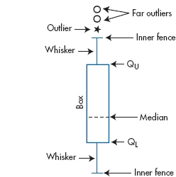
FIGURE 3-7 Anatomy of a box plot.
Unbiasedness. If we draw an infinite number of samples, does the average of the estimates approximate the parameter we’re interested in, or is it biased in some way? As we’ll see when we get to Chapter 6, most of statistics (like most of science) is about generalizing from things you studied (the sample) to the rest of the world (the population). When we do a study on a bunch of patients with multiple sclerosis, we are assuming, correctly or incorrectly, that the sample we studied is representative of all MS patients (the population). We’re further assuming that the estimates we compute are unbiased estimates of the same variables in the population (the parameters). The mean is an unbiased estimator of the population value, as is the SD where the denominator is N − 1. However, if we use Equation 3–8, where the denominator is just N, the estimate would be biased, in that it would systematically underestimate the population value. We’ll explain why this is so in Chapter 7.
Efficiency. Again drawing a large number of samples, how closely do the estimates cluster around the population value? Efficient statistics, like the SD, cluster more closely than does the range or IQR.
Robustness. To what degree are the statistics affected by outliers or extreme scores? The median is much more robust than the mean; multiplying the highest number in a series by 10 won’t affect the median at all, but will grossly distort the mean, especially if the sample size is small.
Applying these criteria, we can use the guidelines shown in Table 3–3.
For each listing, the most appropriate measures are listed first. If we have interval data, then our choice would be the mean and SD. Whenever possible, we try to use the statistics that are most appropriate for that level of measurement; we can do more statistically with the mean (and its SD) than with the median or mode, and we can do more with the median (and the range) than with the mode.
Having stated this rule, let’s promptly break it. The mean is the measure of central tendency of choice for interval and ratio data when the data are symmetrically distributed around the mean, but not when things are wildly asymmetric; a synonym is “if the data are highly skewed.” To use the terminology we just introduced, we’d say the mean is not a robust statistic. Let’s see why. If the data are symmetrically distributed around the mean, then the mean, median, and mode all have the same value, as in Figure 3–8.
This isn’t true for skewed distributions, though. Figure 3–9 shows some data with a positive skew, like physicians’ incomes. As you can see, the median is offset to the right of the mode, and the mean is even further to the right than the median. If the data were skewed left, the picture would be reversed: the mode (by definition) would fall at the highest point on the curve, the median would be to the left of it, and the mean would be even further out on the tail. The more skewed the data, the further apart these three measures of central tendency will be from one another.
Another way data can become skewed is shown in Figure 3–10. If we ignore the oddball off to the right,20 both the mode and the median of the 17 data points are 4, and the mean is 3.88. All these estimates of central tendency are fairly consistent with one another and intuitively seem to describe the data fairly well. If we now add that eighteenth fellow, the mode and median both stay at 4, but the mean increases to 6.06. So the median and the mode are untouched, but the mean value is now higher than 17 of the 18 values.
TABLE 3–3 Guidelines for use of central tendency and measure of dispersion
| Type of data | Measure of central tendency | Measure of dispersion |
| Nominal Ordinal | Mode Median Mode | Index of dispersion Range Interquartile range |
| Interval | Mean Median Mode | SD* Range Interquartile range |
| Ratio | Mean Median Mode | SD Range Interquartile range |
*SD—standard deviation.
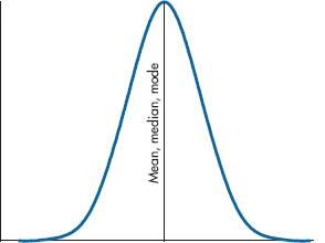
FIGURE 3-8 The mean, median, and mode in a symmetric distribution.
Similarly, the range of the 17 data points on the left is 5, and their SD is 1.41. After adding that one discrepant value, the range shoots up to 42 and the SD up to 9.32.
The moral of the story is that the median is much less sensitive to extreme values than is the mean. If the data are relatively well behaved (i.e., without too much skew), then this lack of sensitivity is a disadvantage. However, when the data are highly skewed, it becomes an advantage; for skewed-up data, the median more accurately reflects where the bulk of the numbers lie than does the mean.
ROBUST ESTIMATORS
Having just told you what to do when, let’s take it back (a bit). We said that the mean and SD aren’t robust estimators, because they’re highly affected by skewness and outlying values, and that you should consider using the median and IQR. That’s fine insofar as describing the data is concerned, but when we move on to inferential statistics (starting in Chapter 7), we’ll see that there are far more statistics that use the mean and SD than use the median and IQR. This leaves us in a bit of a quandary—do we abandon useful statistical techniques, or do we live with the possibility that our answers may be wrong? The solution is to use robust estimators of the mean and SD; estimators that are less affected by oddballs.21
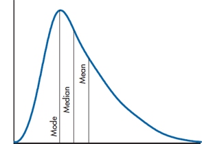
FIGURE 3-9 The mean, median, and mode in a skewed distribution.
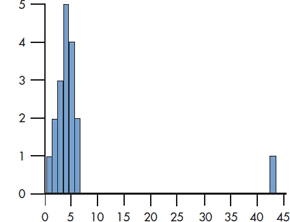
FIGURE 3-10 Histogram of highly skewed data.
The easiest robust estimator of the mean is the trimmed mean (also called a truncated mean). We put the values in rank order, from lowest to highest, and we then “trim” some percentage of the data from both ends. For example, if we had the following 10 data points:

the mean would be 10, which is larger than eight of the 10 values. If we use a 20% trim, we would chop 20% of the data (i.e., two values) from each end, giving us:

which has a more reasonable mean of 6. Statisticians would become apoplectic if you said you were going to throw some data away, but are perfectly comfortable with the idea of “trimming” the data, which means the same thing. In fact, they often recommend trimming 25% of the extreme values.
This doesn’t matter too much if we have a lot of data points, but can result in very small sample sizes if we start off with few data points. So, better than the trimmed mean is the Winsorized mean. This means that we replace the low values that we’ve lost with the lowest remaining scores, and the same for the highest values. Since we’ve eliminated two numbers at the low end, we replace them with 3s, and we replace the two at the high end with 8s, giving us:

with a mean of 5.8, which is fairly similar to the trimmed mean of 6.0 and preserves the sample size.
We can also use these Winsorized scores to calculate a Winsorized SD. For the original data (3-10), the SD was 11.03, which violates Altman and Bland’s (1996) rule of thumb that the mean should be at least twice the SD. The Winsorized SD is a far more reasonable 2.25, which does satisfy our two esteemed colleagues.
OTHER MEASURES OF THE MEAN
Although the arithmetic mean is the most useful measure of central tendency, we saw that it’s less than ideal when the data aren’t normally distributed. In this section, we’ll touch on some variants of the mean and see how they get around the problem.
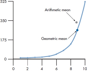
FIGURE 3-11 The difference between the arithmetic and geometric means.
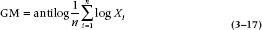
The Geometric Mean
Some data, such as population growth, show what is called exponential growth; that is, if we were to plot them, the curve would rise more steeply as we move out to the right, as in Figure 3–11. Let’s assume we know the value for X8 and X10 and want to estimate what it is at X9. If the value of X8 is 138, and it is 522 for X10, then the AM is (138 + 522) ÷ 2 = 330. As you can see in the graph, this overestimates the real value. On the other hand, the dot labeled Geometric mean seems almost dead on. The conclusion is that when you’ve got exponential or growth-type data, the geometric mean is a better estimator than is the AM.
The formula for the geometric mean is:
The Geometric Mean
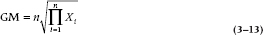
This looks pretty formidable, but it’s not really that bad. The Greek letter π (pi) doesn’t mean 3.14159; in this context, it means the product of all those Xs, So:
Then, the n to the left of the root sign ( ) means that if we’re dealing with two numbers, we take the square root; if there are three numbers, the cube root; and so on. In the example we used, there were only two numbers, so the geometric mean is:

Most calculators have trouble with anything other than square roots. So you can use either a computer or, if you’re really good at this sort of stuff, logarithms. If you are so inclined, the formula using logs is:
Be aware of two possible pitfalls when using the GM, owing to the fact that all of the numbers are multiplied together and then the root is extracted: (1) if any number is zero, then the product is zero, and hence the GM will be zero, irrespective of the magnitude of the other numbers; and (2) if an odd number of values are negative, then the computer will have an infarct when it tries to take the root of a negative number.
The Harmonic Mean
Another mean that we sometimes run across is the harmonic mean; its formula is:
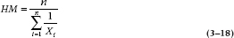
So, the harmonic mean of 138 and 522 is:
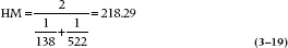
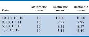
Despite its name, it is rarely used by musicians (and only occasionally by statisticians). Usually, the only time it is used is when we want to figure out the average sample size of a number of groups, each of which has a different number of subjects. The reason for this is that, as we can see in Table 3–4, it gives the smallest number of the three means, and the statistical tests are a bit more conservative.22 When all of the numbers are the same, the three means are all the same. As the variability of the numbers increases, the differences among the three means also increase, and the AM is always larger than the GM, which, in turn, is always larger than the HM.
TABLE 3–4 Different results for arithmetic, geometric, and harmonic means
EXERCISES
1. Coming from a school advocating the superiority (moral and otherwise) of the SG-PBL approach (that stands for Small Group—Problem-Based Learning and is pronounced “skg-pble”), we do a study, randomizing half of the stats students into SG-PBL classes and half into the traditional lecture approach. At the end, we measure the following variables. For each, give the best measure of central tendency and measure of dispersion.
a. Scores on a final stats exam.
b. Time to complete the final exam (there was no time limit).
c. Based on a 5-year follow-up, the number of articles each person had rejected by journals for inappropriate data analysis.
d. The type of headache (migraine, cluster, or tension) developed by all of the students during class (i.e., in both sections combined).
2. Just to give yourself some practice, figure out the following statistics for this data set (we deliberately made the numbers easy, so you don’t need a calculator): 4 8 6 3 4
a. The mean is _____.
b. The median is _____.
c. The mode is _____.
d. The range is _____.
e. The SD is _____.
3. A study of 100 subjects unfortunately contains 5 people with missing data. This was coded as “99” in the computer. Assume that the true values for the variables are:
If the statistician went ahead and analyzed the data as if the 99s were real data, would it make the following parameter estimates larger, smaller, or stay the same?
a. The mode
b. The median
c. The mean
d. The standard deviation
e. The range
How to Get the Computer to Do the Work for You
Descriptive Statistics
- From Analyze, choose Descriptive Statistics → Descriptives…
- Click on the variables you want to graph, and click the arrow button next to the Variable(s) box
- Click the
 button
- Check the boxes you want (will likelyinclude Mean, Standard Deviation,Skewness, and Kurtosis)
- Click

Testing for Normality
- From Analyze, choose Descriptive Statistics → Explore…
- Choose the variables you want to analyze and click the arrow button next to the Dependent List box
- Click the
 button and check Nor-mality plots with tests, then
- Click

Box Plots
- From Graphs, choose Boxplot…
- Simple is the default; keep it
- In the Data in Chart Are box, clickthe button for Summaries of separate variables and click the
 button
- Choose the variables you want to plot andclick the arrow button next to the BoxesRepresent: box
- Click

Trimmed Mean
- From Analyze, choose Descriptive Statistics → Explore…
- Choose the variables you want to analyze and click the arrow button next to the Dependent List box
- Click the
 button and check thebox called M-estimators
- Press
 and then
  , and you’ll get the 5% trimmed mean
1 Even more important, there wouldn’t be any work for statisticians, and they’d have to find an honest profession.
2 “X bar” means “the arithmetic mean (AM)”; it is not the name of a drinking place for divorced statisticians (see the glossary at the end of the book).
3 By now, you should have learned that we never ask a question unless we know beforehand what the answer will be.
4 If you don’t believe us, you can add up the numbers in Table 2–2!
5 This is like the advice to a nonswimmer to never a cross a stream just because its average depth is four feet.
6 It also seems ridiculous to write that the mean stage is II.LXIV (that’s 2.64, for those of you who don’t calculate in Latin).
7 The quantity “almost the same” is mathematically determined by turning to your neighbor and asking, “Does it look almost the same to you?”
8 Another technical statistical term.
9 Except in Italy and Israel, where the number of parties is variable and equal to the total population.
10 The data, not the gonads.
11 These data are kosher, although the subject matter isn’t. However, we couldn’t find any data on hole sizes in bagels or the degree of heartburn following Mother’s Friday night meal.
12 Judging from the numbers, obviously civil servants.
13 Erasing the minus sign is not considered to be good mathematical technique.
14 A definition that excludes statisticians.
15 At least some things in statistics make sense.
16 Usually something we do only as a last resort, when everything else has failed.
17 Unfortunately, he has also done more to confuse people than did Abbott and Costello doing “Who’s on First,” by making up new terms for old concepts. For example, Tukey refers to something almost like the upper and lower quartiles as “hinges.” As much as possible, we’ll try to use the more familiar terms.
18 Actually, there’s no fixed convention for this. Some computer programs use a plus sign, others an asterisk. Tukey himself drew a solid line across the width of the box. But, because there’s little ambiguity, this really doesn’t matter too much.
19 For example, SPSS/PC uses an O for outliers and an E for extreme (i.e., far) outliers; Minitab uses an asterisk (*) for near outliers and an O for far outliers. So much for computers simplifying our lives.
20 From our political perspective, most people off on the right are a bit odd.
21 We wish that there were comparable techniques in other aspects of our lives but there aren’t, so we’ll continue to be plagued by oddballs.
22 Although why you’d want to be more conservative in this (or any) regard escapes us.
Stay updated, free articles. Join our Telegram channel

Full access? Get Clinical Tree


