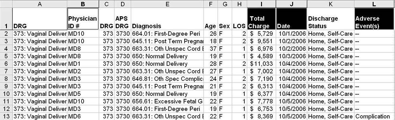
Lean Six Sigma professionals often talk about picking the “low-hanging fruit,” but what if the low-hanging fruit is invisible. I’ve noticed that one of the biggest challenges improvement professionals face is figuring out how to develop improvement stories from the volumes of data that reside in financial accounting systems, electronic medical records, and other data sources. In most cases, the data look like Figures 8.1 and 8.2. They show dates, hospitals, denied charges, physicians, diagnoses, patient age, length of stay (LOS), adverse events, and discharge status. Do some hospitals have higher denied charges? Why are they denied? Do some physicians have more complications, higher costs, or longer lengths of stay?
FIGURE 8.1
Denied claims data.
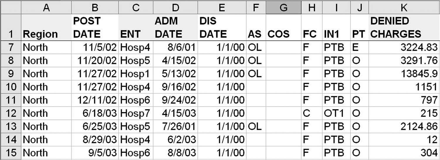
FIGURE 8.2
Delivery adverse-event data.
The data in Figure 8.1 resulted in $5 million a year in increased revenue. It only took an afternoon of data mining and root-cause analysis to figure out how to solve the problem and prevent these denied charges.
These kinds of data remind me of the old joke about the father who finds his daughter digging through a pile of horse manure. When he asks her what she’s doing, she replies: “There has to be a pony in here somewhere!”
Is there an improvement pony in your pile of data? With data such as these, you will want to do some data mining with Excel to find the hidden low-hanging fruit. Every multi-million-dollar improvement project I’ve worked on began with these kinds of data. Haven’t you waited long enough to learn how to use Excel PivotTables to eliminate defects, mistakes, and errors that cause patient harm, aggravate clinicians, and weaken the bottom line?
DATA MINING WITH EXCEL AND THE QI MACROS PIVOTTABLE WIZARD
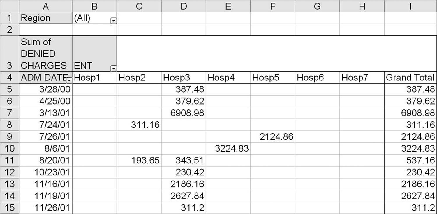
Excel’s PivotTable function can count or sum the number of times a word or phrase occurs with a value. It’s pretty remarkable what it can summarize, but I have found that most people just don’t know how to use it. Many gave up trying to learn. After years of learning how to turn these kinds of data into a pivot table, I developed a mental strategy for organizing the rows and columns. I coded this strategy into the QI Macros PivotTable Wizard to make pivot tables simple. Simply select up to four headings using the mouse and the ALT key (e.g., Region, Entity, Admit Date, and Denied Charges using the data in Figure 8.1). Then choose the QI Macros Data Mining—PivotTable Wizard to create the pivot table (Figure 8.3).
FIGURE 8.3
Pivot table of denied claims.
Data Mining with Excel
Using Excel’s PivotTable function, it’s easy to analyze this kind of data to find improvement stories. Here’s the process:
- Click on any cell in the data. (Excel will automatically select all the rows and columns in your data.)
- Click on Excel’s “Insert PivotTable” (Excel 2007–2016), and then click “Finish” to reveal the pivot table fill-in-the-blank template (Figure 8.4).
- Now simply use the mouse to drag and drop items onto the pivot table fields. Want denied charges by day? Drag “Date” into “Drop Row Fields Here,” and drag “Total Charges” into “Drop Data Items Here.” Then use the QI Macros to create an XmR chart of denied charges (Figure 8.5).
- Want total charges by hospital? Drag “Entity” into “Drop Row Fields Here,” and drag “Total Charges” into “Drop Data Items Here.” Then sort the results in descending order by clicking on the “Total Column” and “Data-Sort-Descending.” Then use the QI Macros to draw a Pareto chart (Figure 8.6).
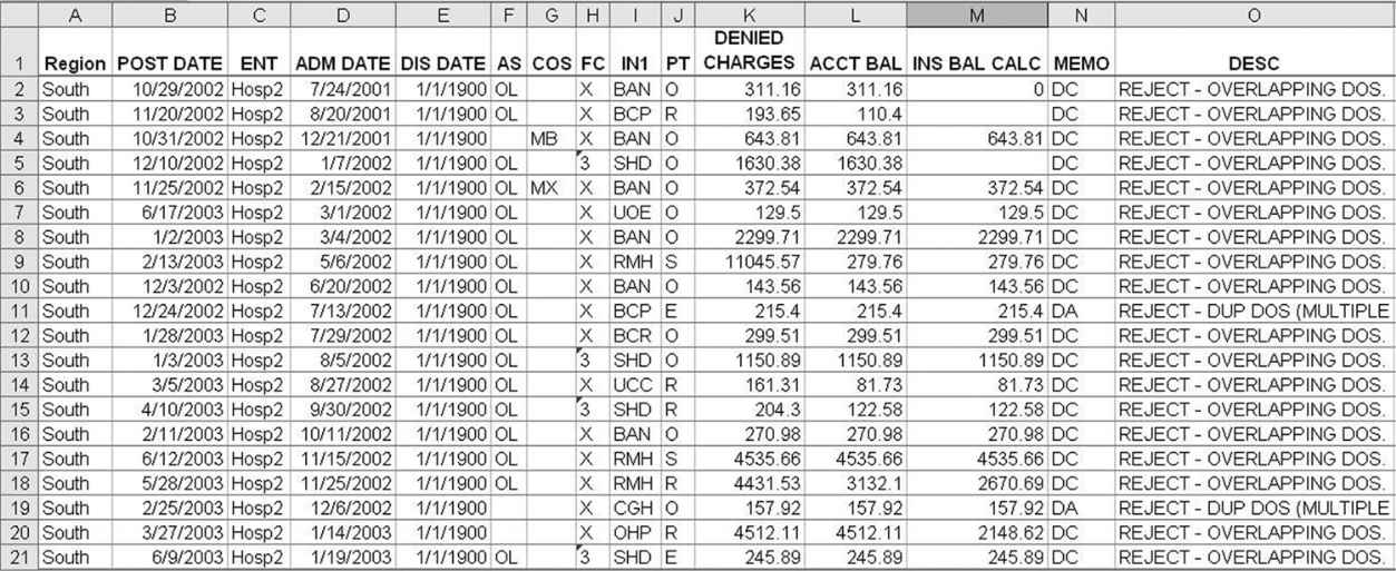
- If you want to see the data that make up any cell in the pivot table, just double-click on the cell. If you double-click on the “Grand Total for Hosp2,” you get the data in Figure 8.7.
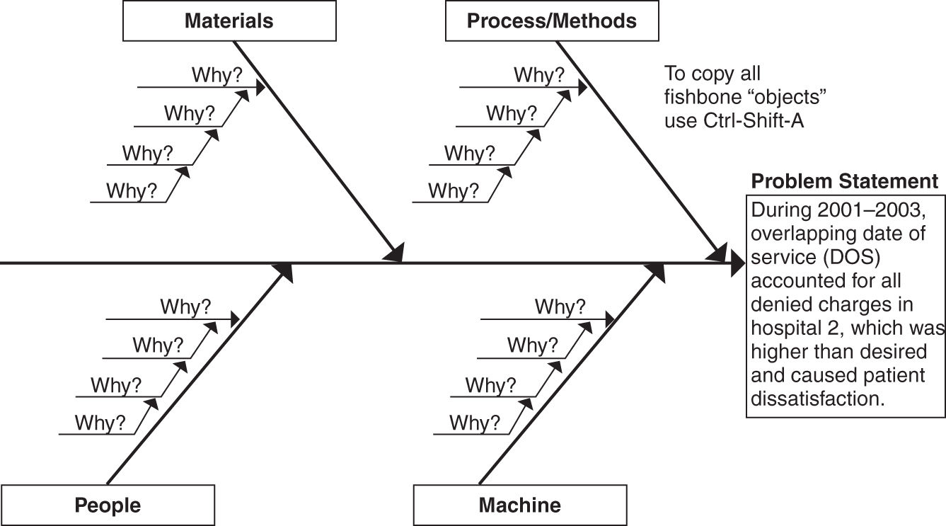
- We then could use pivot tables to analyze just the descriptions, but it’s obvious that rejects for overlapping date of service (DOS) account for all the denied charges.
FIGURE 8.4
Excel PivotTable template.
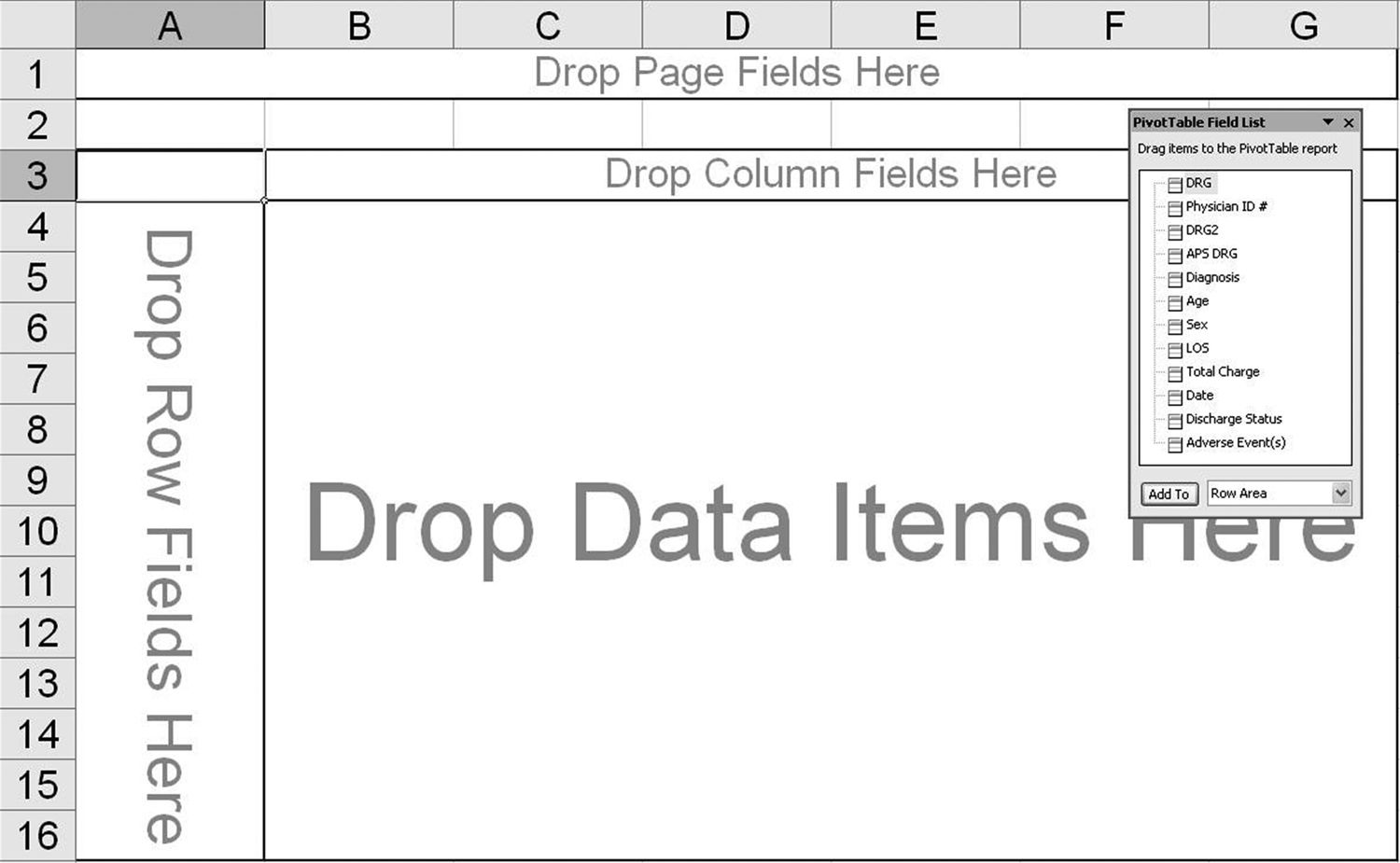
FIGURE 8.5
Total charges by day XmR chart.
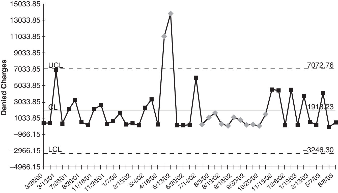
FIGURE 8.6
Denied charges by hospital Pareto chart.
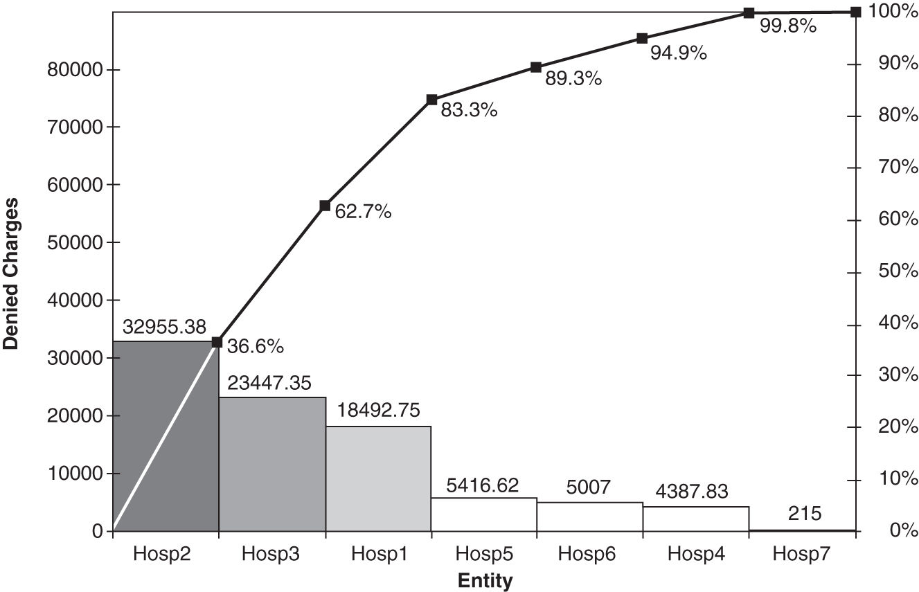
FIGURE 8.7
Denied charges for hospital 2.
Improvement Projects
I usually create control and Pareto charts as I’m mining the data. From my perspective, most improvement stories consist of using three key tools in the right order:
 Control charts
 Pareto charts (two or more levels of detail)
 Ishikawa or fishbone diagrams (Figure 8.8)
FIGURE 8.8
Ishikawa diagram of denied charges.
If you go to www.qimacros.com/trial/hospitalbook, you can download the QI Macros Lean Six Sigma Software 90-day trial. Use the PivotTable Wizard to create pivot tables. Use the Control Chart Wizard to draw control charts. Use the Pareto chart macro to draw Pareto charts. Click on “Lean Six Sigma Templates” to access the fishbone diagram.
Data Mining with Excel and QI Macros Data Mining Wizard
Wouldn’t it be great if you didn’t have to create PivotTables and then run control charts and Pareto charts. Wouldn’t it be nice if you could just push a single button and have the software do it all for you? Now you can!
The QI Macros now have a Data Mining Wizard that will do it all for you. Just click on two column headings (e.g., a date field and then a field of dollars, numbers, or text. In less than a minute, QI Macros will create a PivotTable, control chart, and all related Pareto charts from your data.
Watch video here: www.qimacros.com/training/videos/data-mining-wizard/.
Get the Idea?
You can distill mounds of data down into simple counts and sums using Excel’s PivotTable function. From there, you can draw many Pareto charts and double-click on the pivot table cells that show the biggest “pain” to drill down and do additional analysis.
The data are out there—start digging!
To succeed at Six Sigma, you’ll often have to analyze and summarize text data. Most companies have lots of transactions data from “flat files” such as the ones listed below, but because the data consist of words, sentences, and raw numbers, company managers sometimes have a hard time figuring out what to do with them.
Pivot tables can
 Count the number of times a phrase exists in a column of data (e.g., “complication”)
 Count the number of times a phrase occurs in relation to another column (e.g., “physician” and “adverse events”)
 Count, sum, or average numbers in relationship to another column (e.g., “average age of complications” or “total charges per physician”)
Stay updated, free articles. Join our Telegram channel

Full access? Get Clinical Tree


