Using simple charts, I’ve helped teams save millions of dollars and often in just a few days. The concept is over 100 years old. It’s referenced often in every management book ever written. And it all began with an Italian economist who noticed a simple disparity in incomes. But few people know how to leverage its power in healthcare.
In 1995, I was struggling with the complexities and inherent problems of a huge telecommunications company. Sitting at my desk, I was staring at a vast spreadsheet of facts and figures about postage costs for the company’s bills. With a cranky vice president sitting upstairs waiting for my results, I decided to do a simple analysis. There had to be a pattern to the steady increases in postage costs. It wasn’t the postal service or ride-along coupons, so it had to be something else.
More and more of the company’s bills were being mailed at the 2-ounce rate instead of the 1-ounce rate. Either the postage meters were wrong, or the bills were getting heavier.
On top of this, every month, thousands of bills were returned because of bad addresses. I went through the bins of returned bills looking for any bill over the 1-ounce rate. One by one, I opened them up, looking for the secret to unlock the root cause of increased postage costs.
It took only a few dozen bills to discover the culprit. The company had begun billing for smaller telecommunications companies. Each company got its own page in an already thick envelope. Page by page and company by company, the bill was steadily creeping over the 1-ounce limit. Of course, the product manager who sold the billing service hadn’t priced it to cover the increases in postage costs.
Based on my research, a team redesigned the bill to be smaller, lighter, and more readable. In the year after its implementation, postage costs fell by $20 million a year.
What charts did I use to display the problem and garner support for the redesign?
Control charts, Pareto charts, and fishbone diagrams.
I used them again to save $16 million a year in billing adjustments. And again to save $3 million a year in service-order errors. And $5 million a year in denied claims and $24 million in rejected claims for a hospital system.
Isn’t it time that you discovered the power of pivot tables, control charts, Pareto charts, and fishbone diagrams to laser-focus your improvement efforts?
INVISIBLE LOW-HANGING FRUIT
When my company first got into the quality-improvement movement in 1990, my Florida Power and Light consultants always spoke about “low-hanging fruit just waiting to be plucked.” Two years and tens of thousands of staff hours later, I still hadn’t found any low-hanging fruit.
In any company, if there really is low-hanging fruit, it’s usually visible from everywhere from the emergency department to the management conference room. When it’s that visible, anyone can pluck it with a little common sense and a bit of trial and error.
This is why in most companies there is no visible low-hanging fruit. Somebody has already picked it! And this is what stops most leaders from even considering the tools of Six Sigma; they can’t see any more fruit to be picked.
In company after company and hospital after hospital, though, I have found orchards filled with low-hanging invisible fruit. You just can’t see it with the naked eye. You can, however, discern it through the magnifying lens of pivot tables, control charts, and Pareto charts. They make the seemingly invisible visible. They are the microscopes, the MRIs, the ECGs of business diagnosis.
When Louis Pasteur said that there were tiny bugs in the air and water, everyone thought he was crazy because they weren’t visible to the naked eye. Everyone thought it was just an “ill wind” that made people sick.
In today’s economic times, everyone laments about how hard it is. How an “ill wind” has blown through their business, their industry, and their economy. But have they considered using the modern tools of business medicine to root out the infectious agents in their businesses? Have they taken the time to look for the “invisible” low-hanging fruit in their businesses? I doubt it.
Someone sent me an e-mail today that said that even in the poorest-run companies, he’d had no luck finding the low-hanging fruit. But in every company I’ve ever worked with, I’ve found millions of dollars just waiting to be retrieved from the cauldrons of defects, deviation, and delay. Are you looking for the obvious? Or investigating the invisible?
The low-hanging fruit is always invisible to the naked eye. Turn the magnifying and illuminating tools of Six Sigma on your most difficult operational problems, and stare into the depths of the unknown, the unfamiliar. You’ll invariably find bushels of bucks just waiting for a vigilant harvester.
SIX SIGMA’S PROBLEM-SOLVING PROCESS
As you can see, measures, counts, and data about defects and their origins drive Six Sigma’s defect-reduction process. Without data about defects or deviation, Six Sigma just won’t work. I’m going to suggest that you start with existing data about defects, mistakes, or errors in some part of the hospital’s clinical or operational environment. Most teams get stuck in the define and measure stages of Six Sigma and never get on to the analyze and improve stages. Start with a real problem about which you have some real data, and you’re halfway to success. Then you can leap in to the analyze, improve, and control stages.
DMAIC
While I still think of improvement as following the FISH process—focus, improve, sustain, and honor—the Six Sigma problem-solving process uses the acronym DMAIC (“duh-maic”), which stands for:
- Define the problem.
- Measure the problem (defects or deviation) using control charts, Pareto charts, or histograms.
- Analyze the root causes of the problem using a fishbone diagram.
- Improve the process (i.e., implement some countermeasures and verify results).
- Control the process (i.e., measure and monitor using control charts, Pareto charts, or histograms to sustain the new level of improvement).
I lump Six Sigma’s define and measure steps into focus. If you don’t laser-focus your improvement efforts using real data about defects or deviation, you aren’t doing Six Sigma; you’re just doing some version of gut-feel, trial-and-error, knee-jerk problem solving. Or you’re trying to retrofit your old way of doing things to look like you’re doing Six Sigma. Far too many people start with their pet solution to a problem and try to work their way back to data that will prove their solution. Too few people start from the data and see where they will lead.
GETTING TO LEAN SIX SIGMA
Most successful hospitals that have been around for more than five years get down to about a 1 percent defect rate. I have found from experience that you don’t need a lot of exotic tools to rapidly move up from these levels. Companies I’ve worked with have used these tools to go from 15 percent defects to 3 percent or less in about six months and 3 to 0.03 percent in about two years. Once you get to this level, you’ll be ready to use more exotic tools to design your work processes for Lean Six Sigma. Until you get there, though, you may not have the discipline, desire, or rigor needed to use the more advanced tools.
KEY TOOLS FOR DEFECT REDUCTION
There are four key tools in reducing defects, errors, and mistakes:
 Pivot tables—to count and categorize data in billing systems, electronic healthcare records, computerized physician order-entry (CPOE) systems, and other data systems that can export data to Microsoft Excel. This is where you will find the invisible low-hanging fruit. See the video at www.qimacros.com/Moneybelt/six-sigma-pivottable-projects-video.html.
 Control charts—to analyze customers’ critical-to-quality (CTQ) requirements for ongoing performance. See the video at www.qimacros.com/Moneybelt/control-chart.html.
 Pareto charts or histograms—to focus the root-cause analysis. See the Pareto chart video at www.qimacros.com/Moneybelt/pareto-chart.html. Also see the histogram video at www.qimacros.com/Moneybelt/six-sigma-spc-healthcare-XmR-histogram-video.html.
 Fishbone (Ishikawa) diagrams—to analyze the root causes of the problems or symptoms. See the video at www.qimacros.com/Moneybelt/root-cause-analysis-video.html.
With these four tools, you can solve 90 percent of the problems associated with defects, mistakes, errors, cycle time, or cost—the key problems facing healthcare today.
The Six Sigma problem-solving process (Figure 4.1) also follows the FISH model—focus, improve, sustain, and honor. It focuses on identifying problems, determining their root causes, and implementing countermeasures that will reduce or eliminate the waste, rework, and delay caused by these problems.
FIGURE 4.1
Six Sigma problem-solving process.
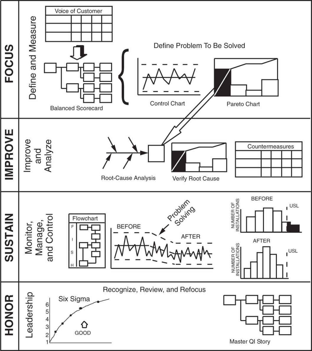
So let’s look at how to apply the problem-solving process to achieve Lean Six Sigma improvements in quality and cost. The steps include
- Define a problem for improvement using data shown as control charts and Pareto charts to select elements for improvement. Often a little data mining using pivot tables is necessary to count and categorize the types of defects, mistakes, and errors. The QI Macros Data Mining Wizard will simplify this analysis.
- Use the cause-and-effect diagram to analyze root causes. Then verify and validate the root causes.
- Select countermeasures to prevent the root causes, and evaluate results from implementing the countermeasures.
- Sustain the improvement using control charts, Pareto charts, histograms, flowcharts, and standard work.
- Replicate the improvement.
Critical-to-Quality (CTQ) Measures
There are only two types of defect-related problems—not enough of a good thing or too much of a bad thing, either of which should be measurable and easily depicted with a control chart. Because an increase in the “good” is often a result of decreasing the “bad,” measures of the unwanted symptom make the best starting place for improvement. Most hospitals want to report patient satisfaction measures, not patient dissatisfaction measures, but measures of dissatisfaction will most easily tell you where to improve. See the video at www.qimacros.com/Moneybelt/six-sigma-ctq-measurement-video.html.
Because reducing the unwanted results of a process is often the best place to begin, the area of improvement usually can be stated as reduced defects, mistakes, errors, rework, or cost in a product or service. These are often two sides of the same coin:
An increase in … | Is equal to a decrease in … |
Quality | Number defective (e.g., injuries, mortality) |
Percent defective (falls per 1000 patient days) | |
DPMO—defects per million opportunities | |
Profitability | Cost of waste, scrap, and rework |
Solving problems is usually easiest when you focus on decreasing the “bad” rather than increasing the “good.” What are some of the current problems in your work area? Are these problems due to defects, deviation, or cost? Some examples include
 Complaints are defects.
 Medication errors are defects.
 Pressure ulcers, venous thromboemboli (VTEs), ventilator-assisted pneumonia (VAP), central line–associated bloodstream infections (CLABSIs), and surgical-site infections (SSIs) are all defects.
 Missed commitments (e.g., operating room cancellations or start times) are both defects and time problems.
 Waste and misuse of supplies, floor space, computers, networks, or people are cost problems.
 Taking care of a patient injured by a medical mistake, fall, or other preventable error is rework.
 “Never events” are a defect (Table 4.1).
 Some hospitals even consider a call light to be a type of defect because it means the nursing staff didn’t anticipate the patient’s requirement.
TABLE 4.1
Never Events
Type of Event | Type of Medical Error |
Surgical | Surgery performed on the wrong body part or wrong patient |
Wrong surgical procedure on a patient | |
Retention of a foreign object (RFO) after surgery or other procedure | |
Intraoperative or post-operative death | |
Product or Device | Patient death or serious disability associated with: |
• contaminated drugs, devices, or biologics | |
• a device that functions other than as intended | |
• intravascular air embolism | |
Patient Protection | Infant discharged to the wrong person |
Patient disappearance for more than four hours | |
Patient suicide or attempted suicide | |
Environmental | Patient death or serious disability associated with: |
• an electric shock | |
• a line containing the wrong gas or toxic sub-stances | |
• a burn incurred from any source | |
• a fall | |
• the use of restraints or bedrails | |
Care Management | Patient death or serious disability associated with: |
• a medication error | |
• a hemolytic reaction due to incompatible blood products | |
• labor or delivery on a low-risk pregnancy | |
• hypoglycemia | |
• failure to identify and treat jaundice in newborns | |
• Stage 3 or 4 pressure ulcers | |
• spinal manipulative therapy | |
Criminal | Care by someone impersonating a licensed health-care provider |
Abduction of a patient of any age | |
Sexual assault on a patient | |
Physical assault on a patient or employee |
How could these be measured and depicted in a control chart to form the basis of an improvement story? Figure 4.2 presents an example of data using vaginal births, costs, and adverse events. See the video at www.qimacros.com/Moneybelt/spc-healthcare-case-studies.html.
FIGURE 4.2
Maternity data.
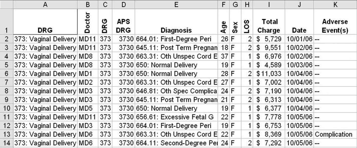
Using Excel’s PivotTable function, it’s easy to summarize these data by day, doctor, diagnosis, sex, length of stay (LOS), age, etc. Once summarized, these data can be drawn as a control chart of charges or adverse events. We could, for example, compare charges by physician [in QI Macros, sort the data by physician (MD) and procedure date, insert a blank row between physicians, and draw an XmR control chart] (Figure 4.3).
FIGURE 4.3
MD control chart of cost variation.
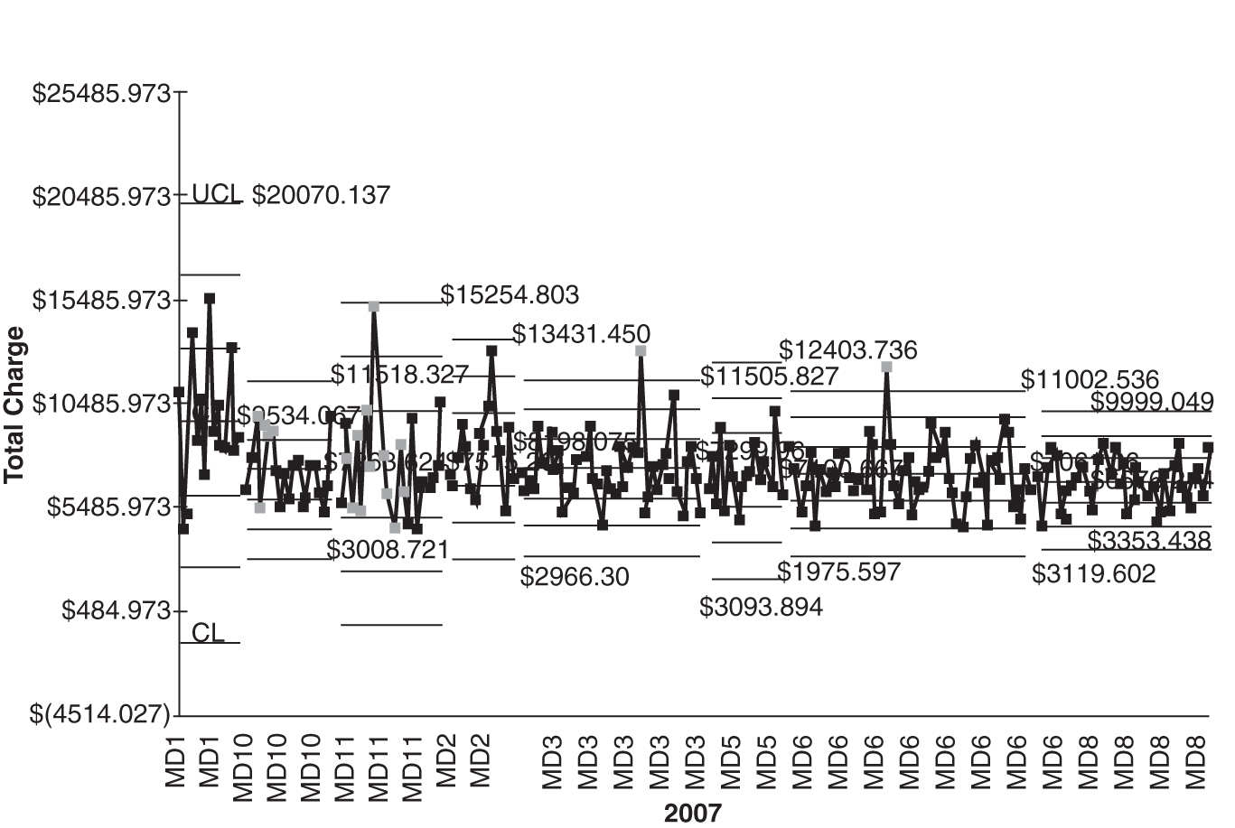
MD1 and MD11 have higher costs and higher variability. MD8 consistently delivers lower cost with less variability. Is there something we can learn from MD8?
If you go to www.qimacros.com/trial/hospitalbook, you can download the QI Macros Lean Six Sigma Software 90-day trial. Use the PivotTable Wizard to create pivot tables. Use the Control Chart Wizard to draw control charts.
Pareto Charts to Focus Improvement
Problem areas are usually too big and complex to be solved all at once, but when we whittle them down into small enough pieces, we can fix each one easily and effectively. This step uses the Pareto chart (a bar chart and a cumulative line graph) to identify the most important problem to improve first. Often, two or more Pareto charts are needed to get to a problem specific enough to analyze easily.
Having the control chart of current performance, you’ll want to analyze the contributors to the problem. A Pareto chart might take any of the following forms based on the original data:
 Defects—types of defects (e.g., what kind of medicine is most often associated with a medication error?)
 Deviation—what’s the reason for variation in door-to-doctor or door-to-balloon (angioplasty) time?
 Cost—types of preventable costs, that is, rework or waste (e.g., radiology rework)
What to Look for in Your Data
Most hospitals have lots of data but sometimes have a hard time figuring out what to do with them. I’ve found that I often use a common strategy for analyzing a company’s data. I usually slice and dice an Excel table in the same way:
- I often have to summarize the defect, error, and mistake data using Excel’s PivotTable function.
- I use Pareto charts to analyze the “total” rows and “total” columns.
- Then I use Pareto charts to further drill down into the biggest contributor in each total row or column.
Figure 4.4 presents data about vaginal births, costs, and adverse events. Using Excel’s PivotTable function, we can summarize the adverse events into a table and then use the data to create a Pareto chart of adverse events (Figure 4.5).
FIGURE 4.4
MD pivot table.
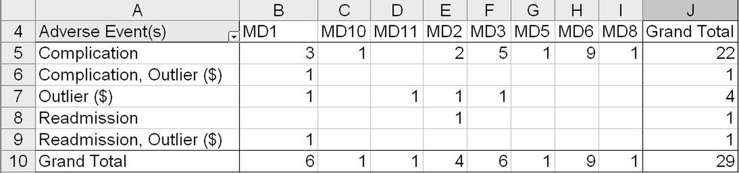
FIGURE 4.5
Adverse events by MD Pareto chart.

MD6, MD1, and MD3 account for 72.4 percent of all adverse events. MD1 had 6 out of 15 adverse events, whereas MD8 had only 1 adverse event in 40 deliveries. Fewer adverse events lead to lower costs and less variability. Again, what can we learn from MD8?
What Else? We could evaluate complications by diagnosis using pivot tables (Figure 4.6) and Pareto charts (Figure 4.7).
FIGURE 4.6
Adverse events by diagnosis pivot table.
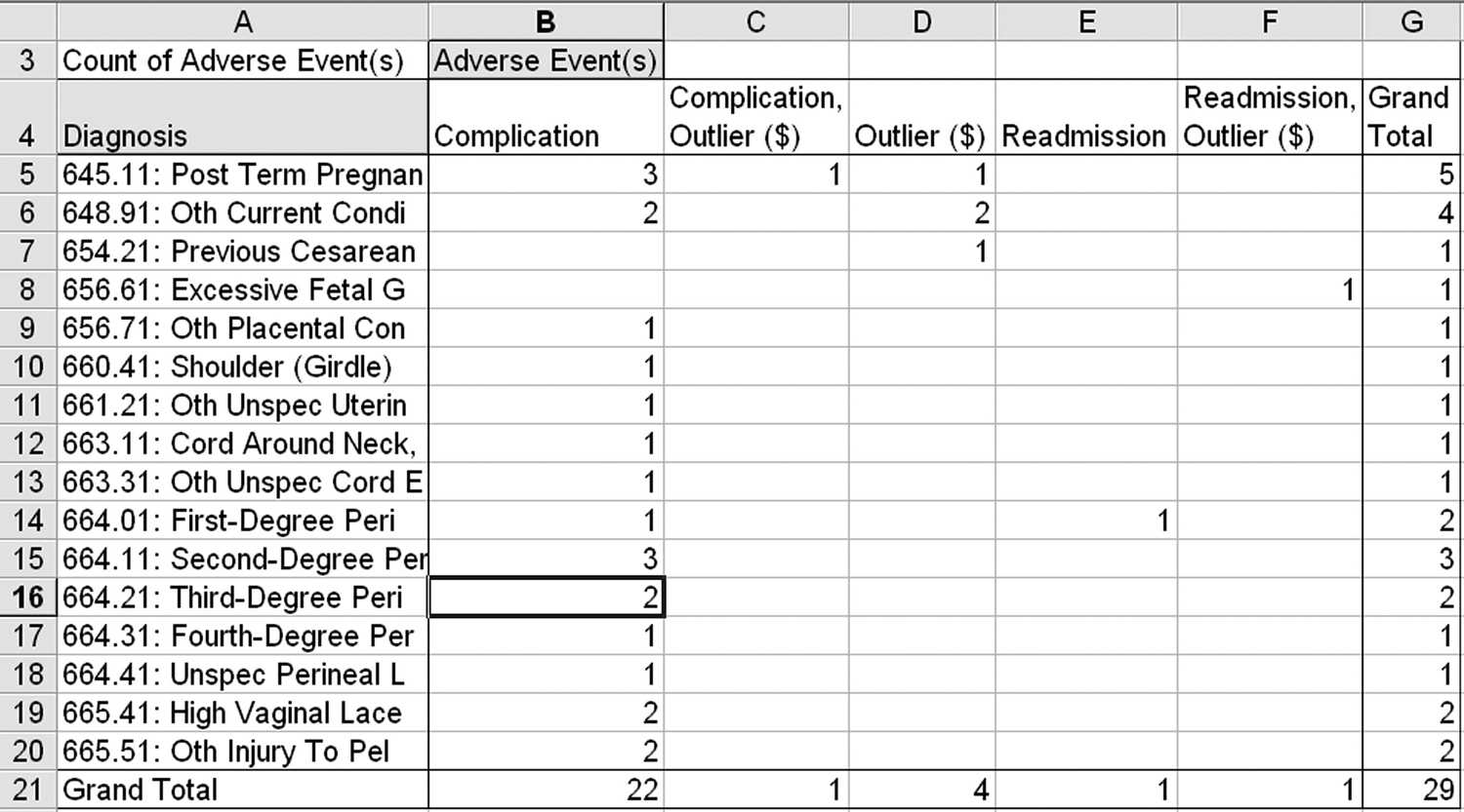
FIGURE 4.7
Adverse events by diagnosis Pareto chart.
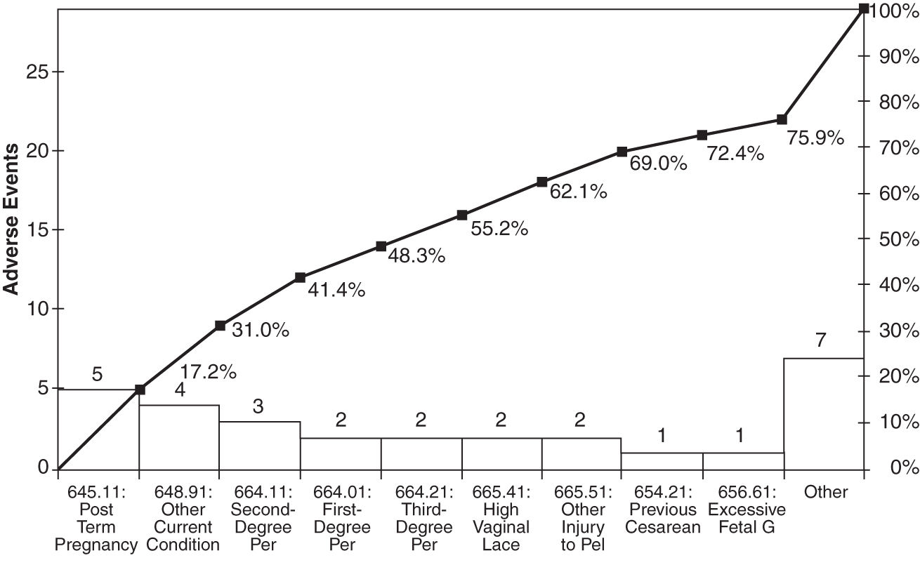
There are many other ways to look at these data: average LOS by physician or complication. And so on. Get the idea? Pareto charts are power tools for finding the 4 percent of your business that’s causing over 50 percent of the waste, rework, and lost profit.
Eliminating “Never Events”
The National Quality Forum (qualityforum.org) has identified various medical errors as “never events”—they should never happen. These include
 Surgical events such as wrong-site or wrong-patient surgery, left-in objects, or death
 Product or device events such as disabilities arising from contaminated drugs or malfunctioning devices
 Patient-protection events such as children discharged to the wrong person, patient disappearance, or patient suicide
 Care-management events such as death or disability associated with medication errors, incompatible transfusions, hypoglycemia, pressure ulcers, and labor and delivery
 Environmental events such as death or disability from shocks, burns, falls, restraints, or toxic substances
 Criminal events such as abductions, assaults, or care provided by someone impersonating a licensed healthcare provider
Because these events should happen infrequently, it’s hard to gather enough data to draw a normal control chart. There are, however, a couple of charts that will assist in monitoring “never events”: the g chart and the t chart.
Time-Between Chart—t Chart. The time-between chart, or t chart, as you might imagine, measures the time between infrequent (i.e., never) events. Using the QI Macros, it’s easy to develop a t chart for any of these never events. Simply enter the date and time of each event in the left column, and the template will calculate the elapsed time between events and convert that into a chart. The example in Figure 4.8 shows days between cardiac arrests in a pediatric unit.
FIGURE 4.8
t chart of days between cardiac arrests.
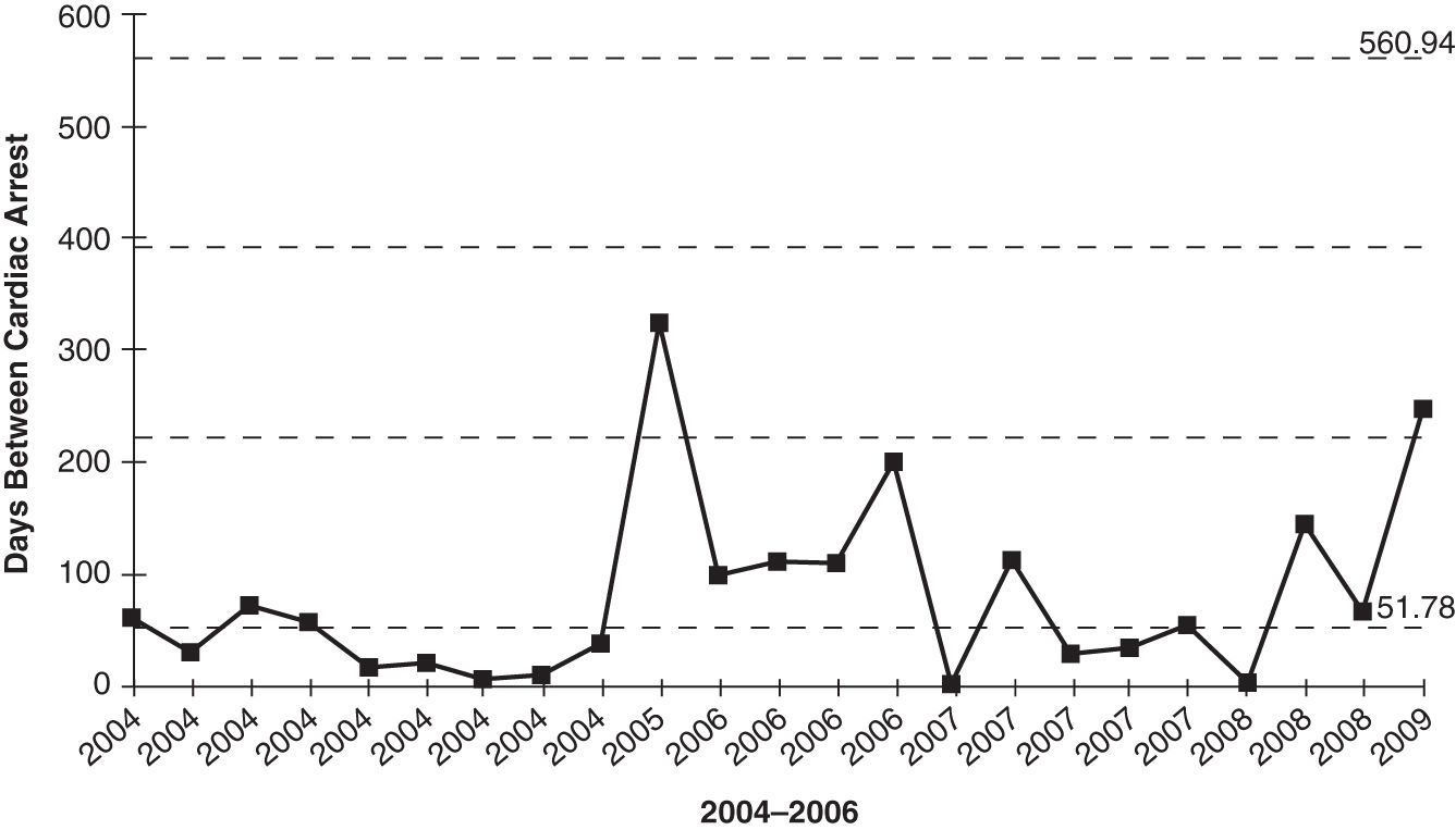
The average is 52 days, with an upper control limit (UCL) of 561 and a lower control limit (LCL) of 0. Obviously, the hospital would like to move these limits up as much as possible and reduce the variation.
As you can see, some form of improvement took place at the end of 2004. In this case, the hospital implemented family-activated rapid response teams (RRTs) in pediatric units. It also looks like the improvement was sustained throughout 2006 but fell back to past performance in 2007. This is not unusual. Most improvements, unless they are woven into the fabric of the hospital, are lost over time. Then the rigor was reinstated in 2008–2009.
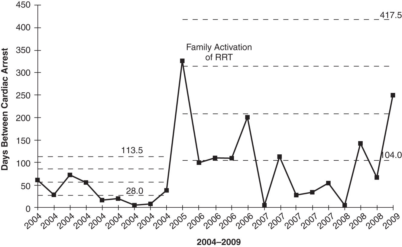
Another way to chart these data is with a g chart.
Geometric-Mean Chart—g Chart. The g chart can handle the data in two forms:
 Time between never events (just like the t chart)
 Number of procedures between never events (e.g., number of surgeries between wrong-site surgeries)
Using the t-chart data yields a similar chart (Figure 4.9). The QI Macros g-chart template has the ability to show one process change, in this case, a change between 2004 and 2005. Notice how the average days between events rose from 28 to 104, a significant improvement.
FIGURE 4.9
Days between cardiac events g chart.
Wrong-site and wrong-patient surgeries are just one type of never event—an error that should never occur. How can you analyze and prevent never events?
- Track each never event with a g control chart.
- Use Pareto charts to analyze the most common contributors to the never event.
- Analyze root causes of “big bar” (i.e., most frequent or most problematic) never events.
- Implement countermeasures, and verify results.
- Monitor improvement forever using a g chart.
If you go to www.qimacros.com/trial/hospitalbook, you can download the QI Macros Lean Six Sigma Software 90-day trial. Click on “Fill-in-the-Blank Lean Tools” to explore the g-chart template for Excel.
Suggestions for Improvement
If you spend all your time calculating totals and averages manually, you may miss the point of what you’re trying to do, or you may avoid the task completely. Learn to use pivot tables.
If you choose the wrong data or the wrong chart, you can end up trying to solve problems that don’t exist. Learn to choose the right chart for your data.
Use Pivot Tables and the QI Macros Together to Spotlight Your Course of Action
 Pivot tables. Use pivot tables to summarize your data in multiple ways.
 Control charts. Use control charts to graph your defect or error data over time to monitor performance.
 Stair-step control charts. Use control charts with stair steps to show differences in variation and central tendency across multiple sources (e.g., physicians).
 Pareto charts. Pareto charts are great for showing differences between categories, not time. Use them to identify the “vital few” not the “trivial many.” Focus on the 4 percent of your defects, mistakes, errors, or categories that provide opportunities for significant improvement.
Stay updated, free articles. Join our Telegram channel

Full access? Get Clinical Tree


